Alternative Histories: NoAarchitecten on Álvaro Siza


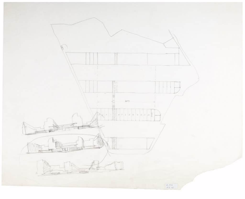
When we look at Siza’s drawing we try to forget the project we know.
We see the beautiful irregularity of a pencil perimeter, defined by obstacles of all sorts.
Within it, the architect added straight lines, an attempt to bring order and create a place to dwell, to find shelter.
Dimensions reveal the ambition of good proportion and suggest functionality. Numbers count.
The edges of the strips try to respond to the capricious border.
Shy they keep a distance, the circle eventually helps out.
The sections show the ambition of shallow buildings and wide streets, volumes moulded to catch the sun and face the sky.
We want to continue the work that was done, but times have changed – forcing us to increase the density.
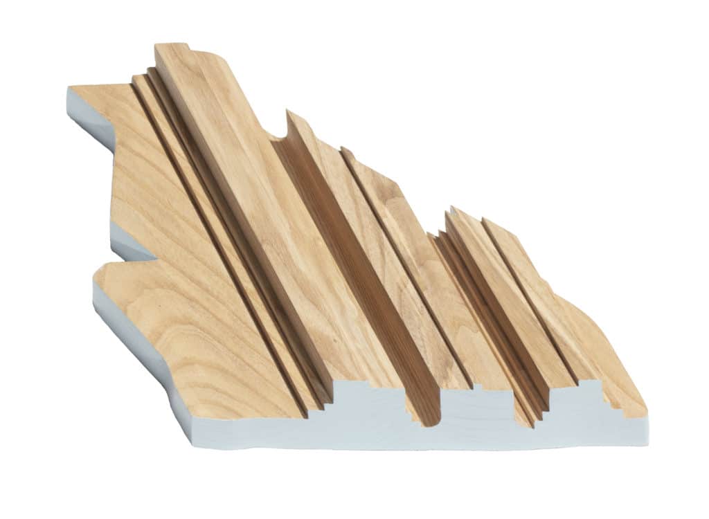
We turn the section upside down, a new silhouette appears. Literally.
Suddenly a street is shaped, no longer flat, a shared space to sit and walk, to ponder alongside the water stored.
– noAarchitecten
