Alternative Histories: Christ & Gantenbein on Louis Kahn
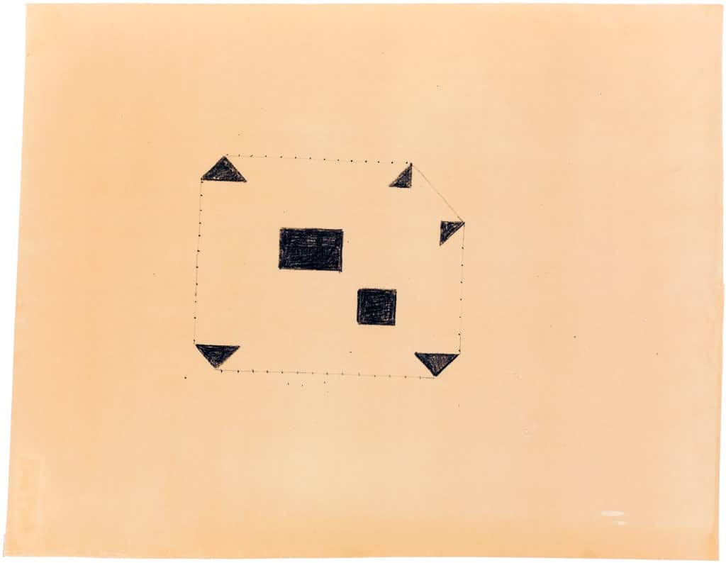
Louis Kahn’s drawing is a floor plan, a typical plan. It is characterised by the stark expression of the poché. The coal-coloured stains lend the drawing the quality of a painting. Their roughness contrasts with the minuscule dots suggesting the mullions of the facade. It’s a sketch on paper, not on tracing paper. Thus it’s a sketch which doesn’t look for variants, but tries to be essential. The drawing.
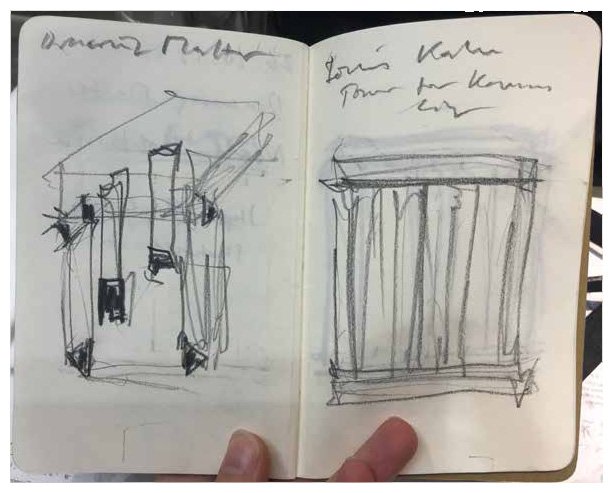
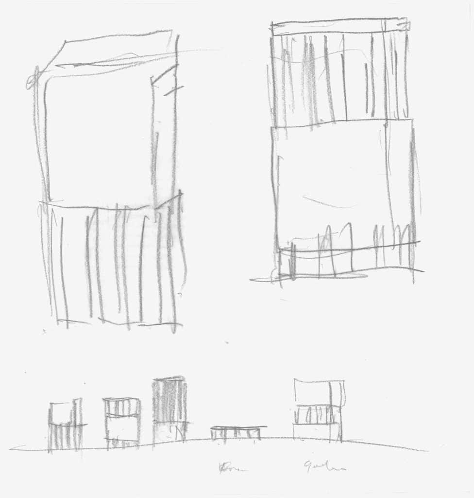
We chose this drawing because we mainly design by sketching. Trusting the hand to define the right silhouette. We sketch with pencil with extra-large lead, the thickness of the line allowing for the needed range of interpretation.
We chose this drawing while visiting the Drawing Matter archive with our ETH Zurich students after spending a week in London and its environs, being led by the idea of the Grand Tour to understand the power of the drawing as a vehicle of cultural interpretation.
We chose this drawing because it reminded us of a building we are currently developing – an office building in Germany. The floor plan is clear, thus we simply speculated on the third dimension.
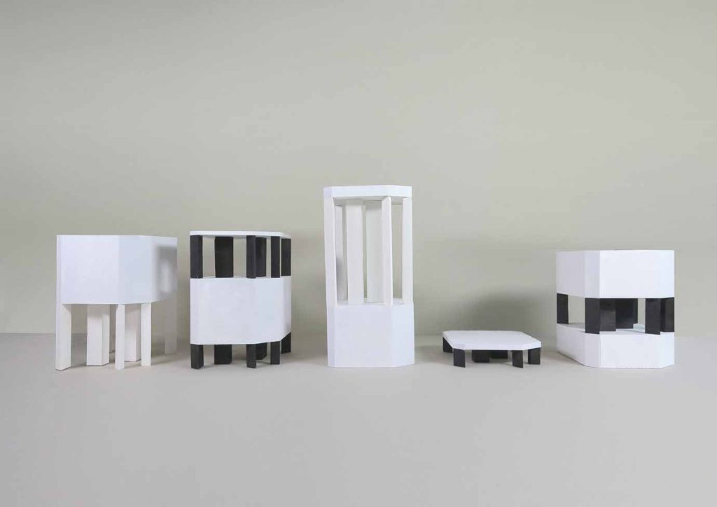
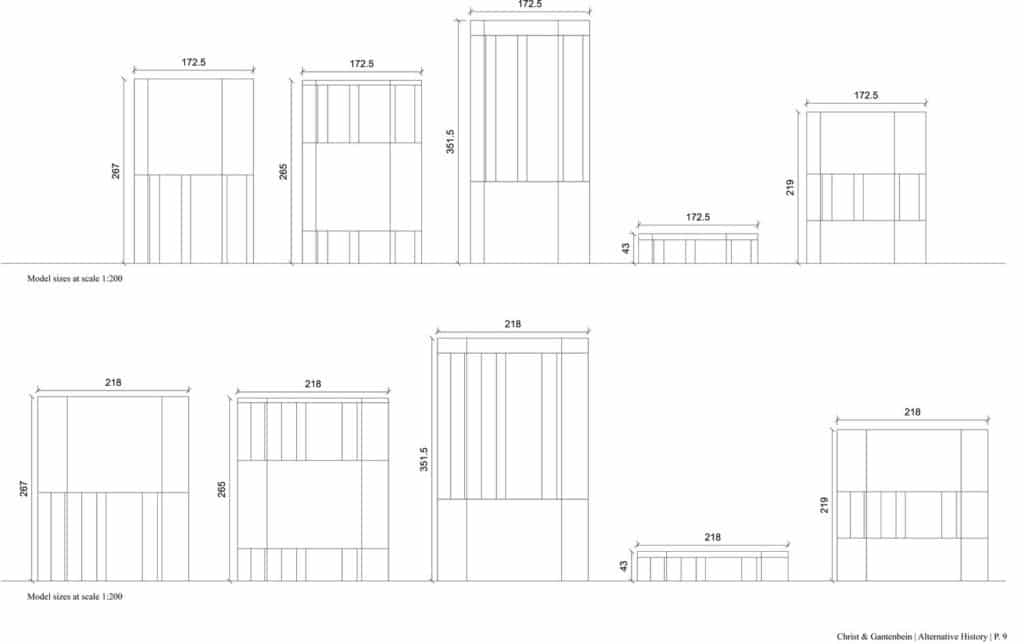
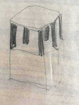
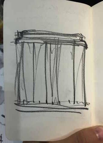
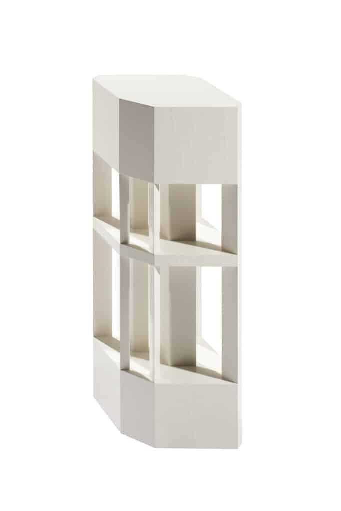
We interpreted the sketch as a building of a tripartite order and varied the height of the main body, of the crown and base. Each volume recalled a different typical object, ranging from a low volume, like a pavilion to a tall figure as slender as a pencil tower. Piling them on top of each other, a tower took shape: base and crown have slightly different heights, while an intermediate technical floor divides the shaft in two different proportions.
And that was it. Just as some uncontrolled lines on a piece of paper can sometimes be a winning scheme, some piled up foam became our hommage to a grand master.
– Christ & Gantenbein
