Materia 3: Red Oxide
This text is the third in a series by Gordon Shrigley titled ‘Materia’ in which the architect meditates on the physical and semiotic nature of a number of everyday construction products. The first and second texts in the series, on render and corrugated iron, can be read here.
Architects are subsumed within an eternal ontology of origin; as our sovereign practice of enclosure, founded on a hard-won ordinance of exactitude, seeks to mobilise earth, water, air and fire, to explore the lexicon of baukunst within the finite arc of materia, which, however hard we try, we are condemned to inhabit.
The bare elemental nature of the world, its crude, lumpen, irrepressibly stubborn character, so haunts the space of possibility that whatever scenario of the future one seeks to explore, we are inexorably drawn back to face the paucity of what material existence has to offer.
Viewed from within the carceral tally of lived experience, we can perhaps forgive those who find dwelling within the literary slipstream [1] a welcome home for expression. Attempts at avoiding the sense of lack that inevitably arises from being bound and dictated to by materia can produce free-floating utopian moments, which allow the fragile space of the imagination to freely wander, within the immaterial space of the picture plane, for however briefly a time.
Hence, we enjoy surveying the archives of the architectural imagination, which present to us how we have dreamt and continue to dream of the many ways to imagine, both form and space, through the language of line.
The desire to supervene the world as we find it, to stand above, is not then to be sullied, as its essential nobility is assured, however many times our wandering paths lead to a projected nowhere or to a well-intentioned authoritarianism.
To stand still and to choose not to wander down another holzweg, however, is to accept the limitations of materia as the very state of things. A call, then, for an elemental ethic, that seeks to be (not more or less than) what we find around us.
It is in this sense that this series of essays on construction materials, suitably hosted by Drawing Matter, seeks to valorise the banal ordinances of everyday materiality over the stories we tell ourselves. So as to found, or re-found, the sense that the desire to supervene, however well intentioned, may have come to blind us to the common value of the simple art of architecture, which as of late has come by and by, to be bypassed by more worldly concerns.
The fascination and struggle with the irrefutable character of materia as projected through the language of line defines, I would argue, the discrete practice of architecture, more than the archetypal question ‘what is to be done?’, and its claim to define us as moral subjects. For architects, whilst this question holds out to us the real possibility of continual renewal, it can also have the effect of creating a deafening logistic that drowns out the very art we profess to extoll, leading some to neglect how one brick may lay upon another. [2]
In contrast, to lay such calls aside is to accept the banality of the material sovereignty of architecture over messianic excess, and is, I would argue, no weakness.
Our cities, as exemplars of collective material achievement, are in the main (Brasília and Chandigarh aside) composed of collections of ordinary mute buildings that signify their inherent humility through modest expressions of mud, brick and stone, rather than the more acculturated material answers to the rhetorical cry ‘What is to be done?’, which, however hallowed, will always be in the minority.
This is not to imply that the struggle for a better future is unworthy, but is to wonder, if of late, such calls for action, especially within the high-octane world of quick-fix media-orientated architecture, have come at the expense of usurping the very dirt that lies beneath our feet for a new anti-aesthetic puritanism.
A good example of an everyday material that pervades the construction industry and remains largely invisible to aesthetic or cultural analysis is the near ubiquitous use of red oxide paint and primer, as a paint finish for most structural steel universal columns, beams, channels and sections.
Within this call for a neue material sachlichkeit however, the use of applied colour will always be a problem.
The distrust of colour within the history of architecture is long and varied. Since the orthodoxies of the Beaux-Arts and early Modernism, however, a fear of colour no longer remains. For contemporary architects the available colour palette is certainly wider than it has ever been and however much this is not reflected within the confines of our built reality, almost any colour is theoretically possible.
I want to argue nevertheless for architects to treat the plethora of applied colour possibilities with suspicion, not to campaign for its dereliction, but to argue for a certain circumspection in its application.
This sense of self-imposed stricture would ask of us to choose an applied colour, not simply to express a psychology of the moment, to emphasise a desired spatiality or to follow a vogue, but to open-up a conversation between the chosen colour and with what is ultimately covered up, underneath, as if between two hardy materials. [3]
The application of ‘the ugliest of all colours’, red oxide, on first iron and then steel alloy products has fascinated me for some time. [4]

Red oxide paint has been used throughout human history in one form or another since we first learnt to daub pigment on a cave wall. The story of the use of red oxide is not an overt history, but a clandestine one. A practice of colour without theory that has on the whole gone under-reported, as if a purloined letter, practiced in plain sight.
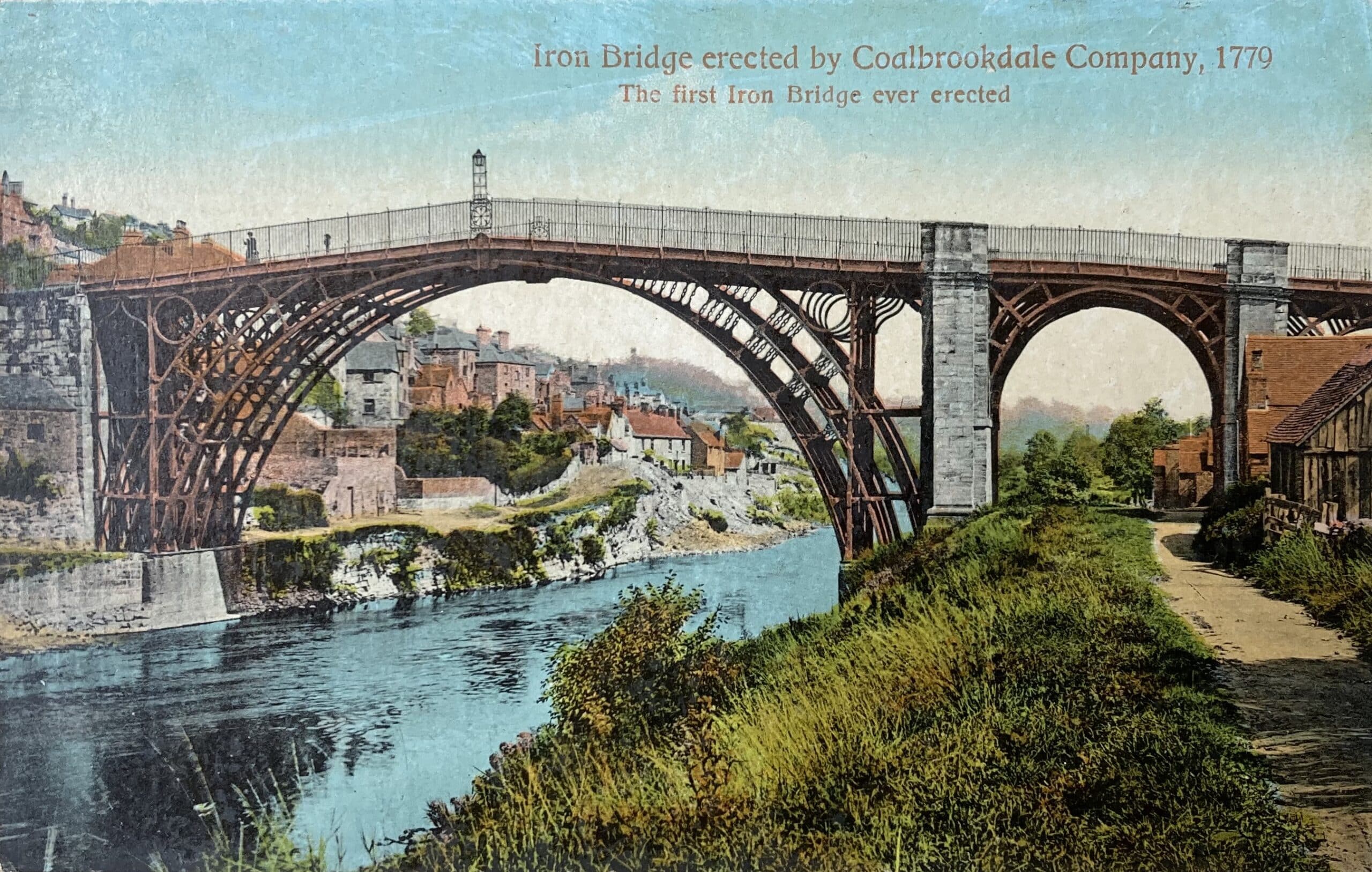
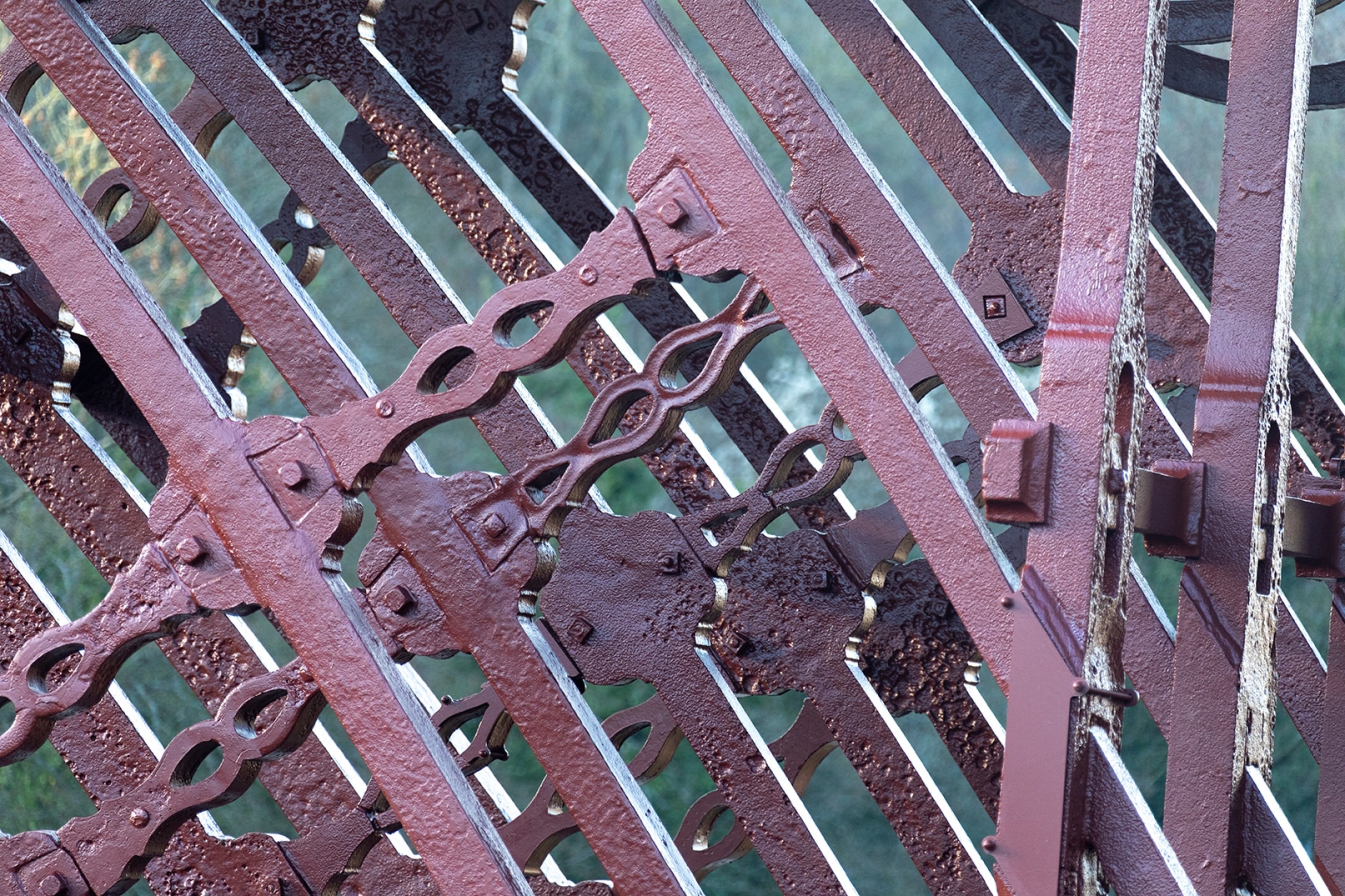
A significant example of the use of red oxide is the recent discovery by colour researchers Crick-Smith, that the original colour of the structural ironwork of Iron Bridge, designed by architect Thomas Farnolls Pritchard in 1781, was red oxide and not metallic grey. [5]
Within this canonical example, I would like to propose that a material relation between red oxide and cast iron metal was established. This was achieved by how the chosen pigment embodies the underlying material link of ferric oxide, the main ingredient of both red oxide and iron metal (and more widely steel alloy) to the most elemental of materia: pure iron, which constitutes thirty percent of the mass of the Earth.
It matters not whether the decision by Pritchard to use red oxide on the iron metal parts of Iron Bridge was conscious or not; the importance of the example is as an illustration only of how colour can be used to effect a material relation between two materials.

Simply put, to create a material relation, the chosen pigment would be required to have a constituent relation with the material to be painted, i.e. an iron-based pigment for iron and steel, a stone-based pigment for stone, a wood-based pigment for wood, a clay-based pigment for ceramic or brick and an oil-based pigment for plastic. In each case therefore the ingredients of the chosen colour would derive, in some manner, from the material to be painted.
The way red oxide paint has been and is continually used more generally then may suggest a way of thinking about the practice of colour and its relation to what is to be adorned or preserved that avoids a laissez-faire outlook towards colour application. Such an approach would proceed, taking Iron Bridge and the everyday use of red oxide within constructive culture as my cue, on the basis of two broad relational strategies.
The first strategy, to reiterate, would effect a material relation between the chosen colour, its material constituent parts and the material to be painted, to imply a homology between elements, as exemplified within Iron Bridge.

The second strategy, leading I think from the first, would be to use the popular meaning of a colour, what it broadly signifies, however weakly, to create a rhetorical relation with the material to be painted.
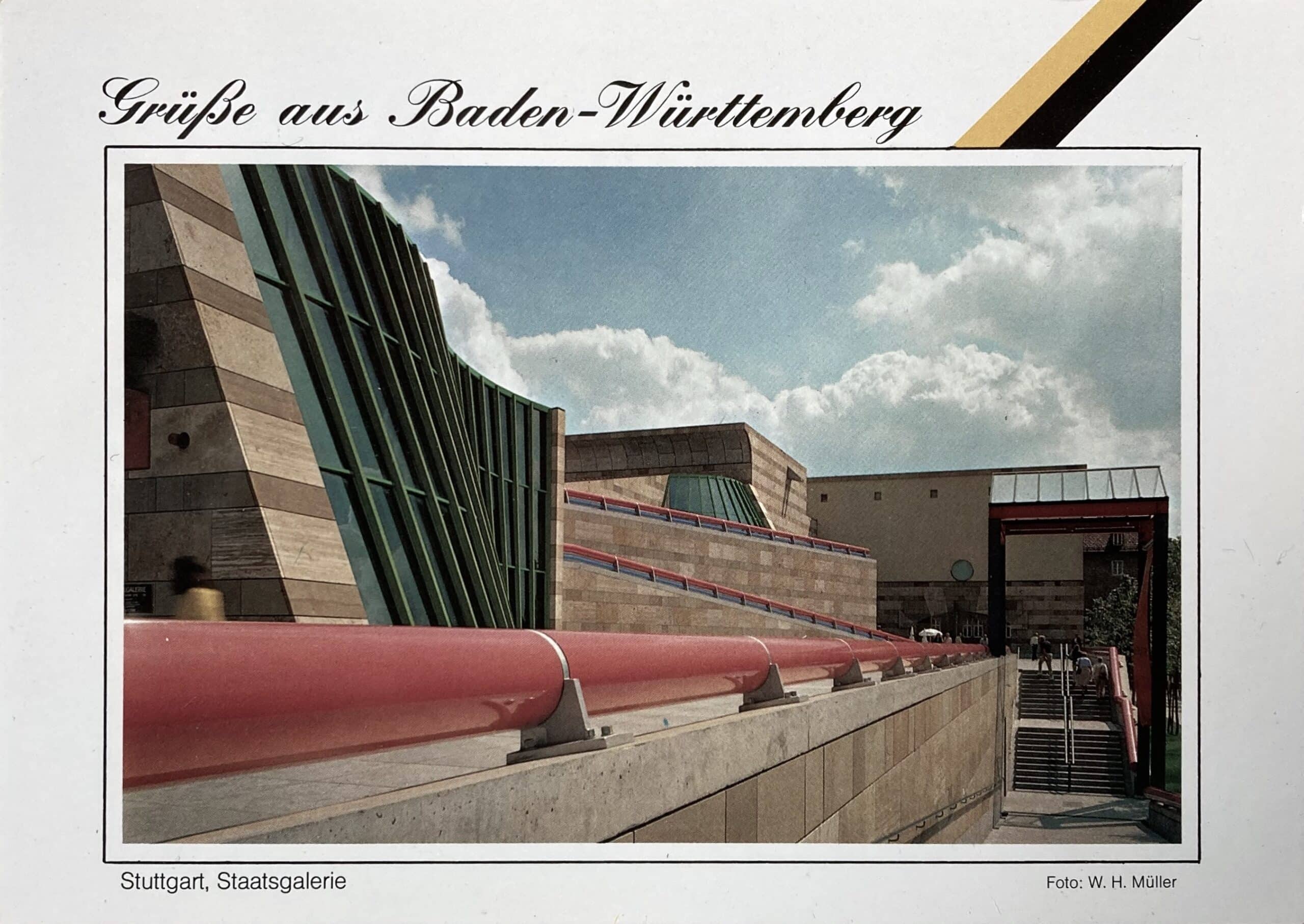
A good example of a rhetorical relation is James Stirling’s Lycra pink and Blue-Tack blue sex-bomb balustrades that curve around the original 1984 Staatsgalerie like vast extruded lipsticks, twinning, through Stirling’s comic imagination, the gigantism of Claes Oldenburg with the architectural equivalent of a Jane Fonda workout, to parody both German naturism and the cartoon monumentality of Paul Troost and Ernst Sagebiel.

These two relational strategies are distinct from an approach to applied colour that would simply seek to decorate, by effecting a laissez-faire relation with what lies underneath.To find examples of the laissez-faire, one need only travel to any modern High Street or Mall, to experience colour in the service of a global brand. Here colour is applied pell-mell to any context or geography and, in the process, sacrifices the material sovereignty of architecture on the cross of a visual identity.
The dominant use of red oxide on metalwork may suggest then a theory of colour, or at the very least an attitude towards the practice of colour application, that would avoid the laissez-faire by instituting a tauter relation between the constituent materiality or semiotic character of an applied colour and what is to be so adorned.
Notes
- Slipstream refers to the tradition of fantastical or non-realist fiction that crosses conventional genre boundaries, mixing science fiction, fantasy, and literary fiction.
- ‘The materials of construction establish the essential shape and character of architectural space. Their structural capacities and aesthetic gesture are inextricably bound to the form of the building. Construction materials are the artistic media of the architect, regardless of how functional, social or site-specific criteria may influence their thinking.’ Georg Windeck, Construction Matters (New York: Powerhouse books, 2016), p. 12.
- The architect Bruno Taut for example, considered colour to be a material, equal to any other construction material. For further details on Taut’s colour theories see: Deborah Ascher Barnstone, The Colour of Modernism, Paints, Pigments, and the Transformation of Modern Architecture in 1920s Germany (London: Bloomsbury Visual Arts, 2021).
- ‘This was especially true for roux (russet), which seemed to combine into a single shade the worst of red and the worst of yellow, and even more so for tanné (tanned), a kind of brownish red or dark russet that many texts from the 1500s offer as “the ugliest of all the colors.”’ Michel Pastoureau, Red, A History of a Colour (Princeton: Princeton University Press, 2017), p. 96.
- In 2017 English Heritage commissioned conservators Crick-Smith, to research the original colour of the existing cast-iron elements of Iron Bridge. Their research revealed that ‘The dark red/brown lead oil paint of the earliest scheme is iron oxide based. However, there is red lead present within the mix, presumably as a metal based drier, acting on the linseed oil.’ Email from Ian Crick-Smith to the author, dated 30 August 2022.

– Niall Hobhouse