Mies: The Horizon

Perusing the slides I had taken of the reconstructed pavilion, I found it difficult to decide which way up they went — an artefact of photography, no doubt. Then I changed my mind. It was not an artefact of photography, but a property of the pavilion itself, a property of which I had not been conscious while there. The photographs had made it easier to discern. Soon after, I was looking at some student sketches of the pavilion, and I discovered that someone else had experienced the same difficulty. He had inadvertently begun to caption his drawing the wrong way up.
Disclosed in our pictures was something quite different from the effect noticed by Kandinsky, and exploited by cartoonists ever since, that non-figurative forms have no privileged orientation. At Barcelona the reversibility derives from the most unlikely source: symmetry. It is unexpected because Mies had gotten rid of vertical bilateral symmetry (the kind we expect), making a conspicuous show of its absence. He then reintroduced it, in quantity, in another dimension, where no one would think of looking for it: horizontally. Horizontal symmetry is inadmissible in classical architecture. There is parity between right and left, and there is disparity between up and down. Things should not look the same when upended. The world turned upside-down is an image of disorder, domestic or political.[1] We understand these metaphors, but what kind of world is it, we might ask, that could be turned upside-down without our noticing? This is the most serene of derangements.
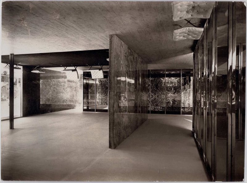
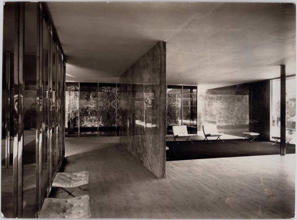
Although incomplete, the horizontal symmetry of the Barcelona Pavilion is very powerful. Its overwhelming strength is attributable to one simple fact: the plane of symmetry is very close to eye-level.
For a person of average height, the dividing line between the onyx panels is indistinguishable from the horizon line. If we believe Mies’s recollections, then we must accept that this is a coincidence. There is, however, some evidence to suggest that Mies was soon aware of the implications of his choice, and that it altered his perception of what he was doing.[2]
Alberti called the horizon line the centric line, a term he also used to describe the diameter of a circle. This indicates that he envisaged it as cutting the field of vision into two equal parts, at eye-level.[3] The plane of symmetry constructed this way, in this dimension, is far harder to escape than is vertical symmetry. The dead-centre, frontal view of a vertically symmetrical object is privileged, but occasional; most of the time we see such symmetries from oblique angles, and so the retinal images of the two sides are not actually the same size. In Mies’s pavilion the plane of symmetry is almost impossible to escape. The eyes are delivered into it by virtue of normal ambulant posture, and so the retinal images of the lower and upper halves are rendered equal. The only way to avoid this is to stoop, sit or squat. I have since looked at as many photographs as I could find of both the original and the reconstructed pavilion. They show that, although nobody ever mentions the commanding plane, most people (and their cameras) occupy it. If the photographs contain figures, notice how their eyes hover around the horizontal joint between the onyx slabs. If not, notice, first, how many elements reflect across this line, then look at the receding contours of obliquely viewed surfaces and notice how nearly identical are the angles from floor and ceiling to the horizon — a property of all perpendicular, rectangular planes in perspective, viewed from mid-height. Notice the difficulty of distinguishing the travertine floor, which reflects the light, from the plaster ceiling, which receives it. If the floor and the ceiling had been of the same material, the difference in brightness would have been greater. Here, Mies used material asymmetry to create optical symmetry, rebounding the natural light in order to make the ceiling more sky-like [4] and the ambience more expansive.
The only carefully constructed perspective drawing of the pavilion which survives indicates that Mies was conscious of this property. It shows the onyx wall divided exactly in half by the horizon. Turned sideways, the drawing reveals a bilaterally symmetrical outline. Such also is the case with Mies’s perspective of the Tugendhat living room, although in that house he used three bands of onyx panelling in the free-standing wall, so that the horizon line would not be visible to advertise the equality of upper and lower portions, as it was at Barcelona. Observers will be more likely to notice what is happening to their vision when their eyes scan this line ( all the other marbles at Barcelona were also laid in three bands). The accidental source, and sole measure, of the powerful but subliminal symmetry was thus erased in the Tugendhat house, which Mies built slightly later. The Barcelona Pavilion has 312 centimetres of headroom; the Tugendhat house has 317.5 centimetres. The Esters/Lange house, begun in 1927, had a similar ceiling height (306.25 centimetres), but did not exploit horizontal symmetry, while perspectives for a number of subsequent projects show it clearly and consistently, including the Gericke House, the Ulrich Lange house, the Hubbe house, and the three courtyard houses. In the drawings, Mies was more inclined to incorporate figurative sculpture than human figures. Often the eye-level of the statue is removed from the horizon line, either by overscaling, as with the Kolbe statue at Barcelona, or because of its recumbent posture. Mies never acknowledged his interest in this phenomenon. It is significant, however, that Le Corbusier, who proclaimed the horizontal line of vision to be an essential feature of man, disallowed the double Modulor height (366 centimetres) for interiors, explaining that he wished to avoid the equalisation of floor and ceiling [5].
The implication of this re-establishment in one plane of a property so completely eradicated in another are not immediately obvious, but it is reminiscent of other tergiversations practised by Mies. Abstraction, materiality, spirit, structure, symmetry, asymmetry — no concept was safe in his hands. Bonta, studying the critical fortunes of the original pavilion, reached the conclusion that it was only an idea; that had been promoted to greatness. But what I saw in the reconstruction was a building that ate ideas.


Excerpted from ‘Mies van der Rohe’s Paradoxical Symmetries’, 1990, in Robin Evans, Translations from Drawing to Buildings (London: Architectural Association, 1997).
Notes
- See, for example, Christopher Hill, The World Turned Upside Down: Radical Ideas During the English Revolution (Harmondsworth, 1975).
- Mies Archive, MoMA.
- Alberti, On Painting, 44, 58.
- Often Mies’s ceilings seem to get light from nowhere. In the exhibit for the glass industry at Stuttgart in 1927, Mies, using many of the materials he would use again at Barcelona, installed a false ceiling of taut strips of white fabric sewn together. This was top-lit to create a luminous surface.
- Conversation with Jerzy Soltan, 1989.
