In his book on photography, Camera Lucida, Roland Barthes introduces the concept of ‘the Punctum’. The Punctum is something in a photograph that etches itself in the consciousness of the viewer. It is often a small detail that evokes emotions long after the gaze has left the picture: an experience that is born in the viewer’s consciousness as something subjective and personal. The Punctum exists outside the photographer’s control and arises from the viewer’s previous experiences. Finding the Punctum in an image can happen quickly, but often it requires some effort and reflection. It is only in retrospect, realising which detail remains in the memory, that the concept clears and grows in strength. The Punctum can be experienced both positively and negatively. It can be a detail that strengthens the image and makes it beautiful, but the Punctum can work in the opposite direction: it can be a disturbing part of an otherwise beautiful picture.
The detail and detailing in architecture can sometimes be related to a concept like the Punctum. In many of Sigurd Lewerentz’s projects there is a kind of concentration on one point, often touching on the detailing, but sometimes on something else. A concentration of a means of expression. It also happens that some parts of his projects are perceived as strange or almost ‘wrong’, other times almost humorous or distant.
1.
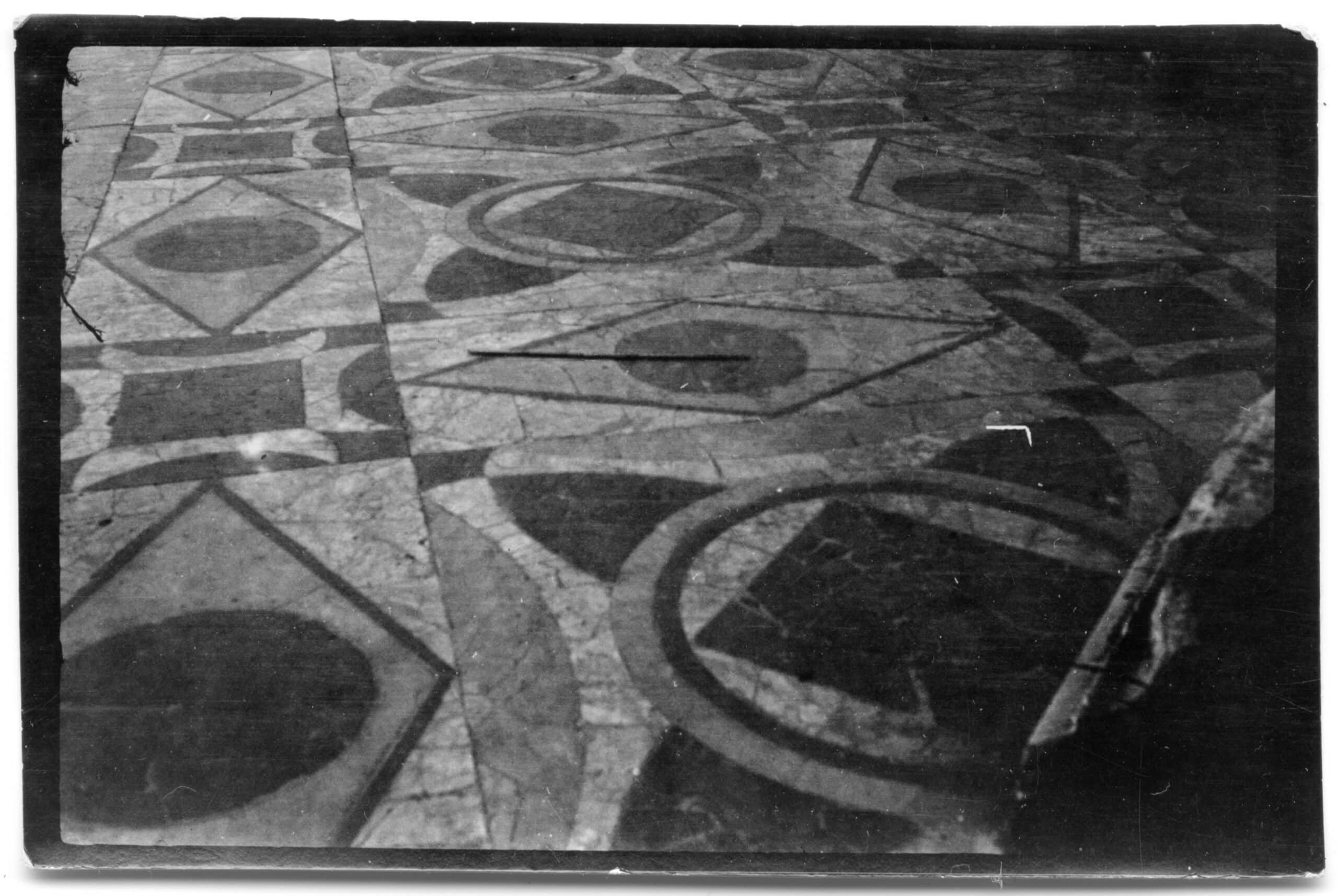
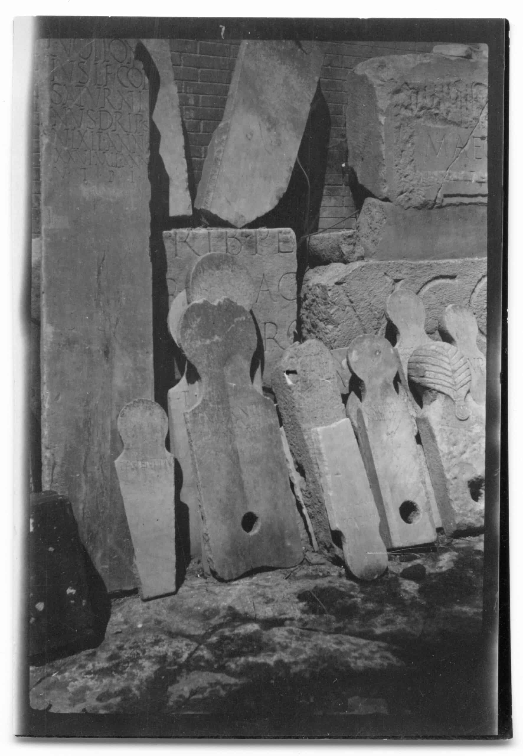
In his travel photographs from Italy taken at the beginning of the twentieth century, Lewerentz does not turn the camera to the conventional motifs, but instead the floor patterns, or the tombstones that are stored in a stone quarry. Fragments without conformity and far from the typical motifs that architects usually photograph on their Grand Tours. Pictures of textures, patterns, and shards. Some photographs were taken in Pompeii, others in Rome, but most lack geographic references.
2.
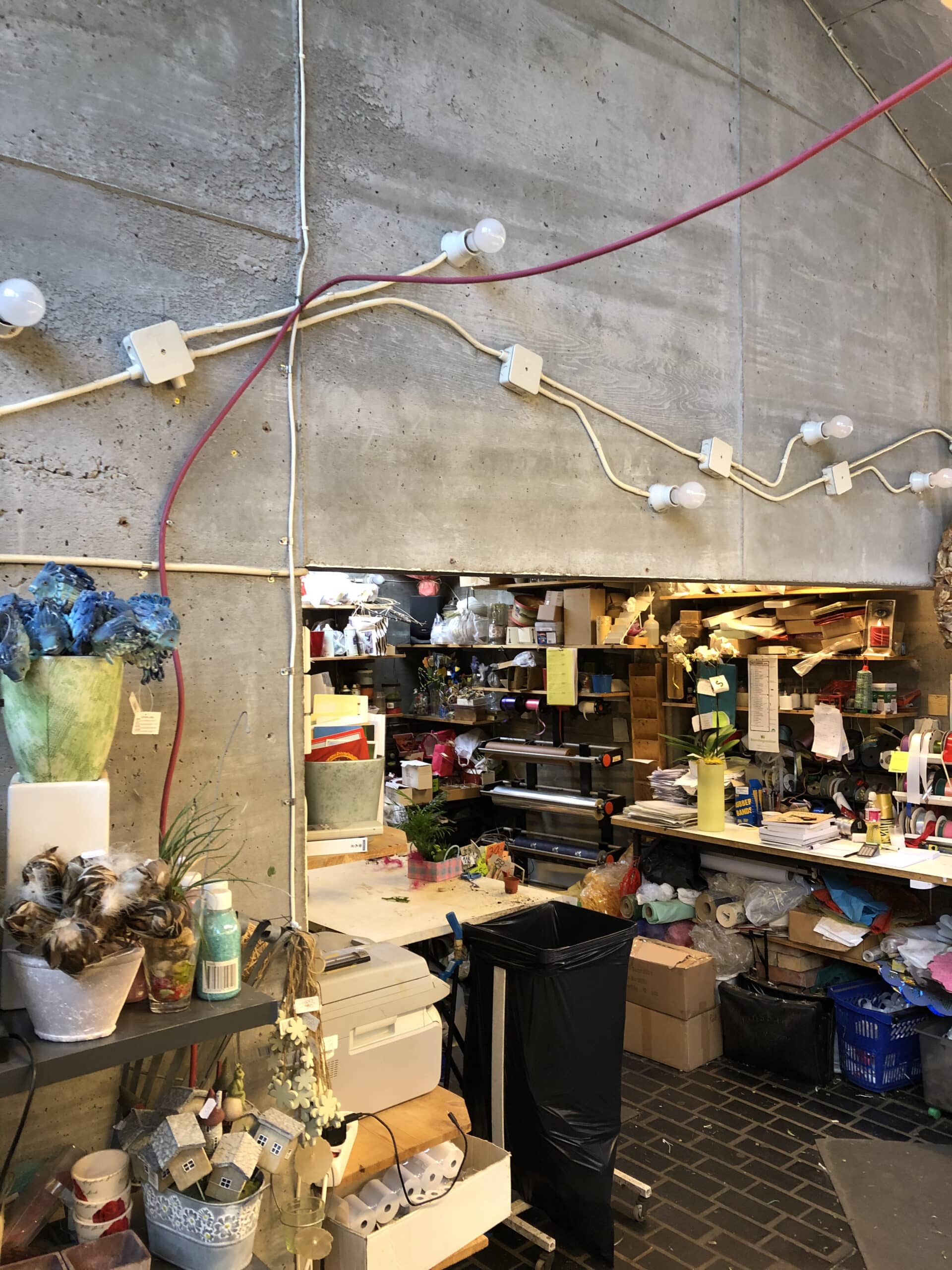
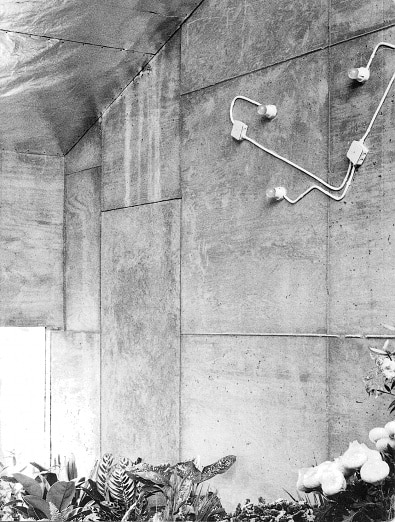
In the interior of the flower kiosk at the Eastern Cemetery in Malmö, the surface-mounted electrical wires of the wall lighting are fixed in an organic meandering pattern reminiscent of the veins of flower petals.
3.
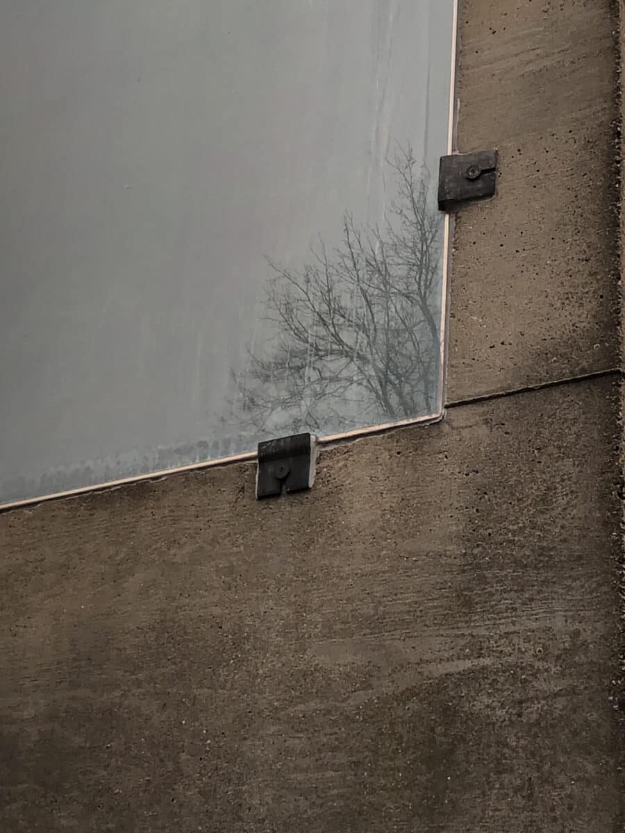
The frameless windows of the flower kiosk consist only of the insulating glass panes. The details are similar to those in Klippan’s church that were designed a few years earlier. The glass is held in place by iron fittings near the corners. The glass panes are not mounted on the outside of the facade as in Klippan, but are recessed so that the outside of the glass ends up aligned with the concrete. The experience of the shiny reflective glass surface together with the matt, slightly rough concrete is striking. There is no mediating element, the boundary between glass and concrete is only a sharp thin line.
An uncertainty emerges in Lewerentz’s answers to the questions posed by Bernt Nyberg during the construction of Klippan’s Church. Lewerentz was worried that the insulating glass seals in shiny metal would be too dominant and that the unprotected edges of the glass could be exposed to vandalism. He was worried also that the windows are fixed and not able to be opened.
4.
The chapel in Forsbacka was built in 1919. It has a skewed plan form. The skew is clear on the floor plan but barely perceptible in reality. The irregular rectangular floor tiles are rotated 45 degrees in relation to the entrance wall.
5.
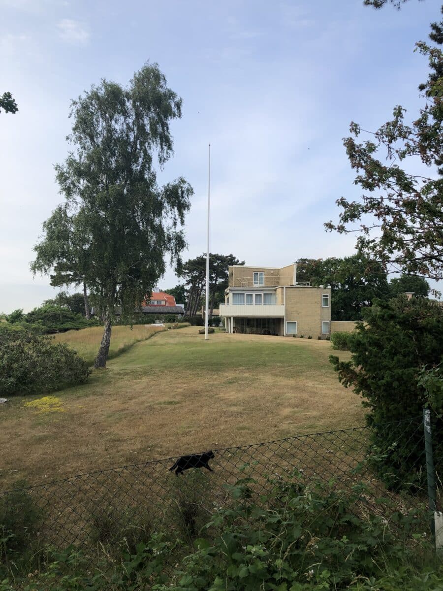
Sigurd Lewerentz and Josef Frank worked during the same period at Bruno Möhring’s office in Berlin in the early 20th century. Later, in the mid-1930s, they each designed a large summer villa a stone’s throw apart in the summer resort Falsterbo in the very south of Sweden. Frank’s villa took on a wavy form, with facades in pink plaster.
Lewerentz’ slightly smaller rectangular house was built in exposed yellow brick with steel details. The two houses are very different. Still, they are Sweden’s two foremost modernist villas, each in its own special way.
6.
The workers’ housing in the Eneborg area in Helsingborg are as simple as a child’s drawing. They have pitched roofs and facades in brown-black Helsingborg brick. The inside of the stairwells stands in stark contrast to the outside. Smooth and polished in softly undulating shapes, white painted and almost sensual.
7.
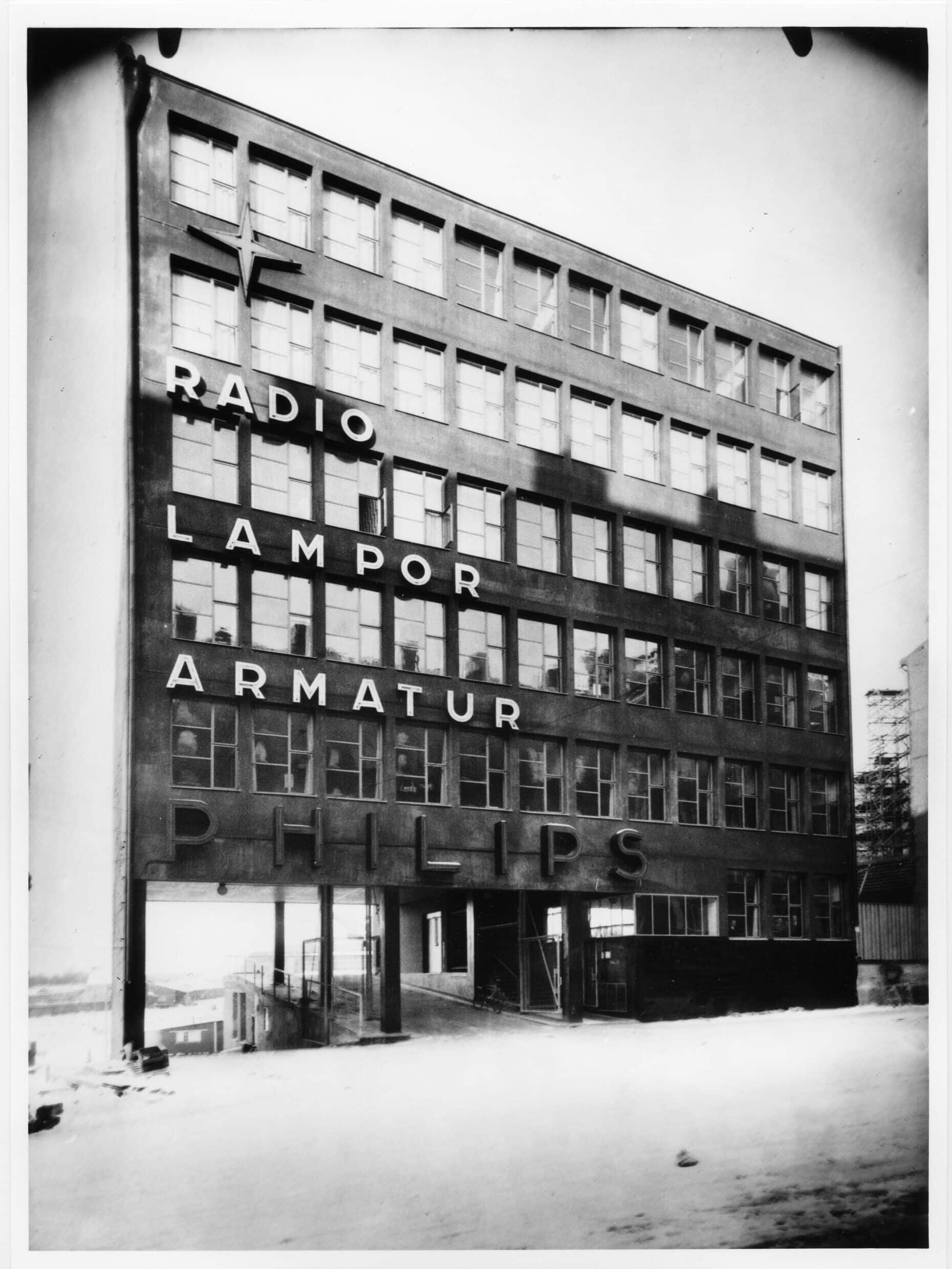
The Philips of Sweden building on Gävlegatan in Stockholm is very present in the streetscape, but at the same time almost immaterial. The typography and neon signs are part of the architecture and more visible than the building itself. The yellow colour, typical for Stockholm, on the parapets between the window bands, was painted directly on that concrete without any stucco being applied.
8.
Lewerentz drew the plan for Valdemarsvik’s cemetery in 1917. The chapel is circular and merged with a gate and a staircase. The massive walls are built of locally sourced stone and are over metre thick at their base.
The round chapel has a roof that is also a narrow spire, reminiscent in shape of a wizard’s hat. At the base, the roof is sixteen-sided, and further up eight-sided. At the top, the roof spire is crowned by a gilded eight-pointed star. The roof spire extends up to 11 metres and is clad with black tarred shavings. The walls of the chapel seem to grow out of the ground. In 1910, Lewerentz was employed by Carl Westman after having him as one of his teachers in ‘Klara skola’. Many of Carl Westman’s villas in Saltsjöbaden have the same kind of plinth. The rocky archipelago landscape continues in a natural stone wall. The wall merges into the base of the wooden house. Nature transcends imperceptibly into the built.
9.
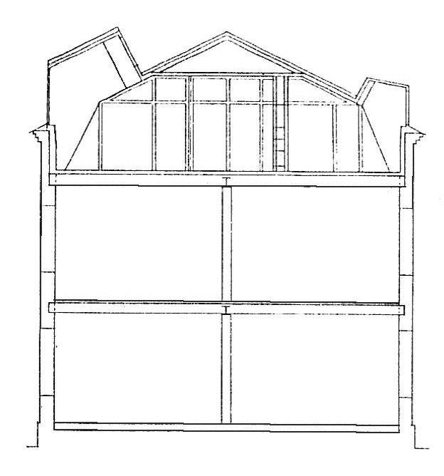
In Lewerentz’s private home on top of the Idesta factory building in Eskilstuna, the two new roof domes have an unusual shape, as if they are facing back and forth. They turn a pointed glazed part with a light inlet up towards the ridge.
10.
The corner windows in the transition between the entrance corridor and the courtyard at the Social Security Administration building, Stockholm, lack the plastered facade pillar that is found between all other windows facing the courtyard. Instead, here a special variant of the window is used that goes over the corners at a 90 degree angle.
11.
In the Resurrection Chapel, the mosaic floor with its wavy pattern, is reminiscent of Italy. Similar floors and patterns are found among Lewerentz’s travel photographs. In the late brick churches, Lewerentz uses square and rectangular Höganäs tiles in standard formats. In a fascinating way, he manages to create new patterns and combinations with these limited means.
12.
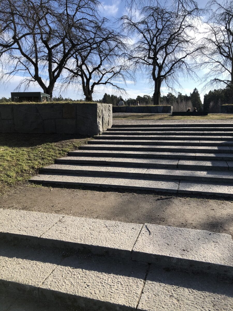
The stairs that lead up to the memorial grove at the Woodland Cemetery decrease in height the further up you go. The steps get lower and lower. The stairs become less strenuous to walk up. The difference is so small that it is hardly noticeable.
13.
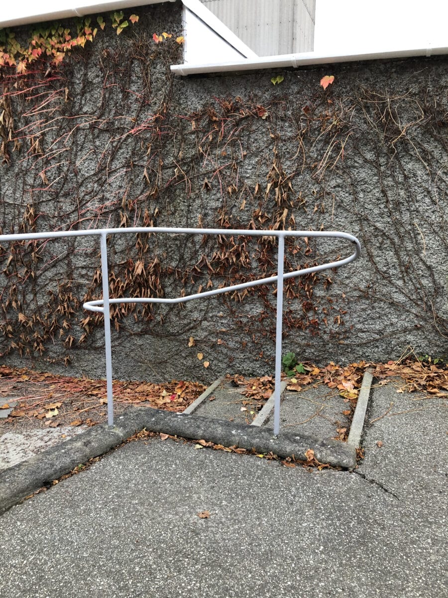
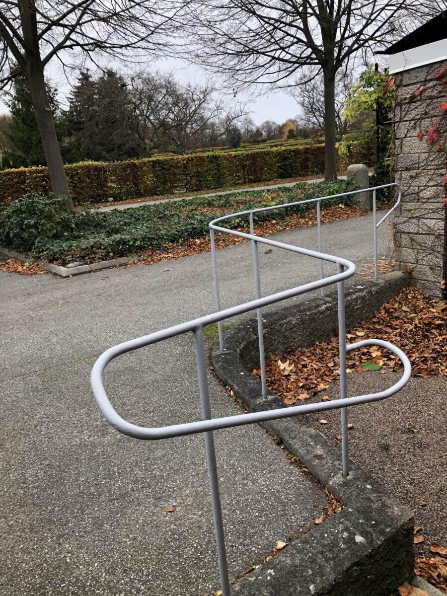
At Sankt Knut’s and Gertrud’s chapels in Malmö’s Eastern Cemetery, there are, on the back sides, stairs that have railings that seem to perform an advanced rhythmic dance, even though the railings only consistently follow all small shifts in height and directions. The railing draws a graceful and precise line that contrasts with the chapel’s materiality and the height of the building volumes.
14.
In Janne Ahlin’s Lewerentz’s monograph, Sigurd Lewerentz, Architect: 1885–1975 (2014), there is an anecdote about the columns in the Resurrection Chapel: ‘Artur [von Schmalensee] and I [Curt von Schmalensee] … got down on the floor and drew the entasis of these seven-meter-high columns at full scale! Then the drawing was sent to Ignaberga masonry, where they turned columns – in one piece!’
Sigurd Lewerentz: Punctum. seeing the detail
– Mikael Bergquist
In his book on photography, Camera Lucida, Roland Barthes introduces the concept of ‘the Punctum’. The Punctum is something in a photograph that etches itself in the consciousness of the viewer. It is often a small detail that evokes emotions long after the gaze has left the picture: an experience that is born in the viewer’s consciousness as something subjective and personal. The Punctum exists outside the photographer’s control and arises from the viewer’s previous experiences. Finding the Punctum in an image can happen quickly, but often it requires some effort and reflection. It is only in retrospect, realising which detail remains in the memory, that the concept clears and grows in strength. The Punctum can be experienced both positively and negatively. It can be a detail that strengthens the image and makes it beautiful, but the Punctum can work in the opposite direction: it can be a disturbing part of an otherwise beautiful picture.
The detail and detailing in architecture can sometimes be related to a concept like the Punctum. In many of Sigurd Lewerentz’s projects there is a kind of concentration on one point, often touching on the detailing, but sometimes on something else. A concentration of a means of expression. It also happens that some parts of his projects are perceived as strange or almost ‘wrong’, other times almost humorous or distant.
1.
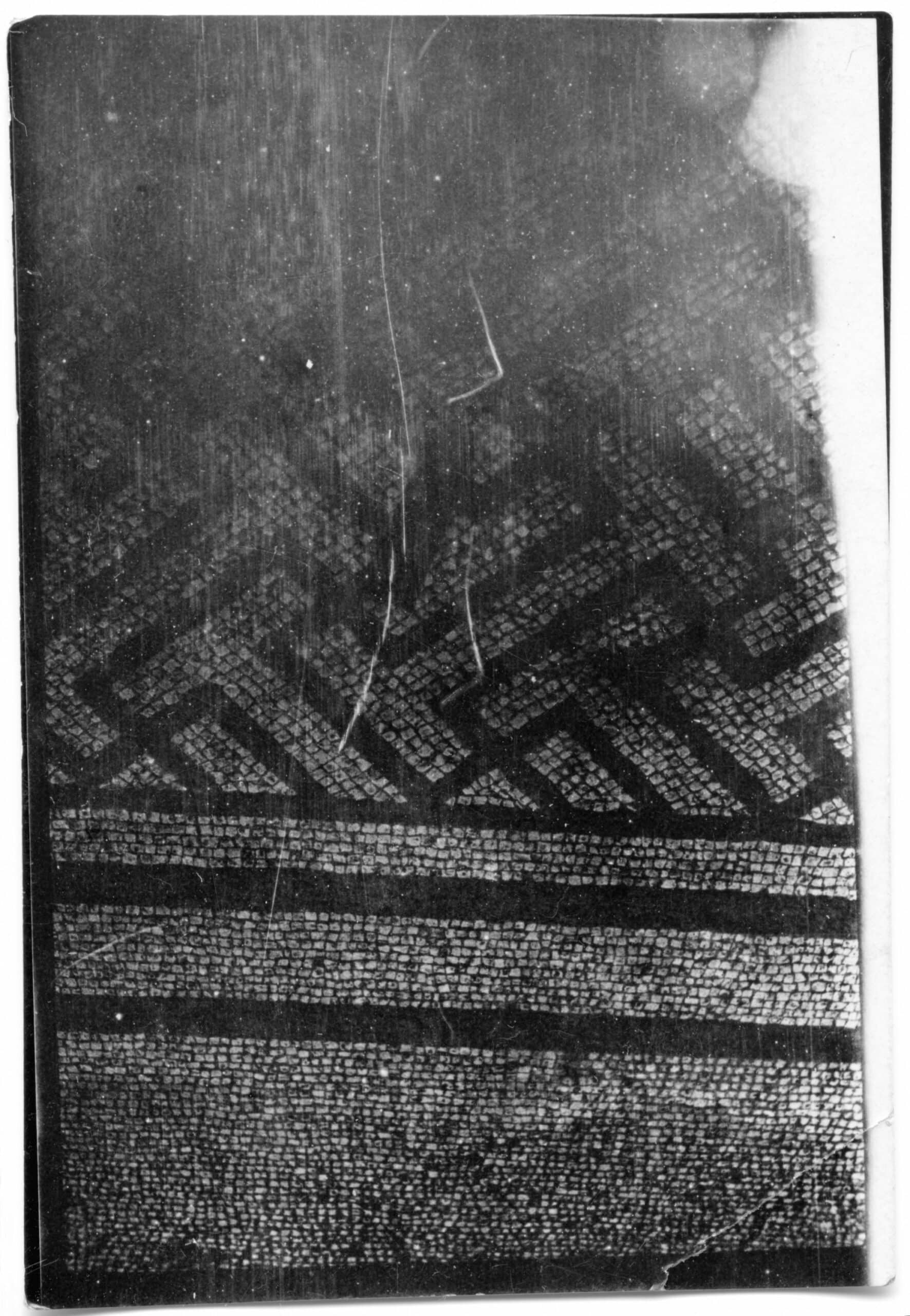
In his travel photographs from Italy taken at the beginning of the twentieth century, Lewerentz does not turn the camera to the conventional motifs, but instead the floor patterns, or the tombstones that are stored in a stone quarry. Fragments without conformity and far from the typical motifs that architects usually photograph on their Grand Tours. Pictures of textures, patterns, and shards. Some photographs were taken in Pompeii, others in Rome, but most lack geographic references.
2.
In the interior of the flower kiosk at the Eastern Cemetery in Malmö, the surface-mounted electrical wires of the wall lighting are fixed in an organic meandering pattern reminiscent of the veins of flower petals.
3.
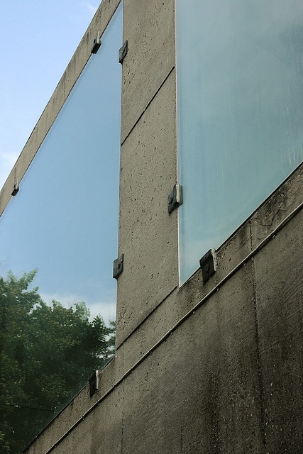
The frameless windows of the flower kiosk consist only of the insulating glass panes. The details are similar to those in Klippan’s church that were designed a few years earlier. The glass is held in place by iron fittings near the corners. The glass panes are not mounted on the outside of the facade as in Klippan, but are recessed so that the outside of the glass ends up aligned with the concrete. The experience of the shiny reflective glass surface together with the matt, slightly rough concrete is striking. There is no mediating element, the boundary between glass and concrete is only a sharp thin line.
An uncertainty emerges in Lewerentz’s answers to the questions posed by Bernt Nyberg during the construction of Klippan’s Church. Lewerentz was worried that the insulating glass seals in shiny metal would be too dominant and that the unprotected edges of the glass could be exposed to vandalism. He was worried also that the windows are fixed and not able to be opened.
4.
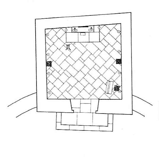
The chapel in Forsbacka was built in 1919. It has a skewed plan form. The skew is clear on the floor plan but barely perceptible in reality. The irregular rectangular floor tiles are rotated 45 degrees in relation to the entrance wall.
5.
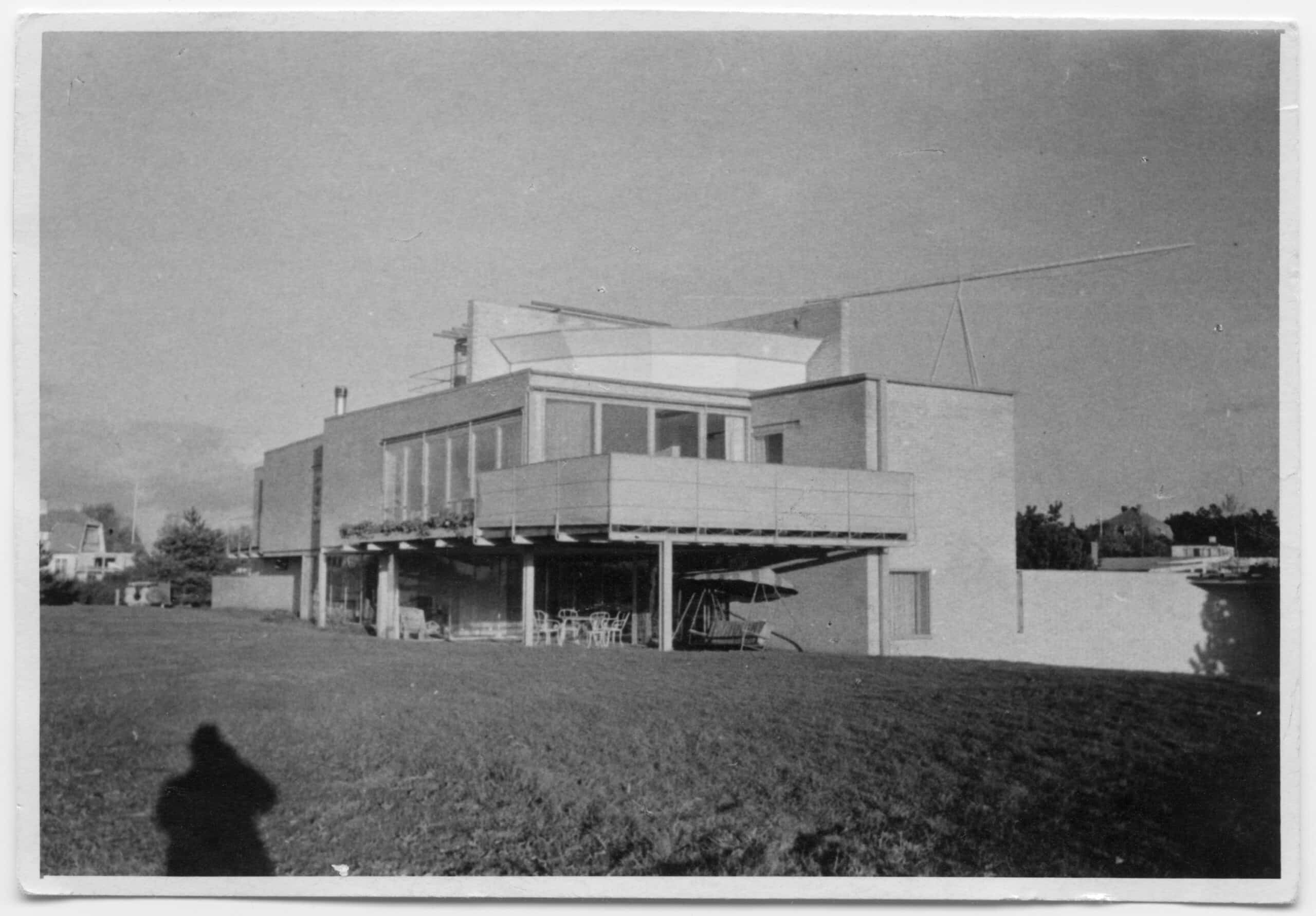
Sigurd Lewerentz and Josef Frank worked during the same period at Bruno Möhring’s office in Berlin in the early 20th century. Later, in the mid-1930s, they each designed a large summer villa a stone’s throw apart in the summer resort Falsterbo in the very south of Sweden. Frank’s villa took on a wavy form, with facades in pink plaster.
Lewerentz’ slightly smaller rectangular house was built in exposed yellow brick with steel details. The two houses are very different. Still, they are Sweden’s two foremost modernist villas, each in its own special way.
6.
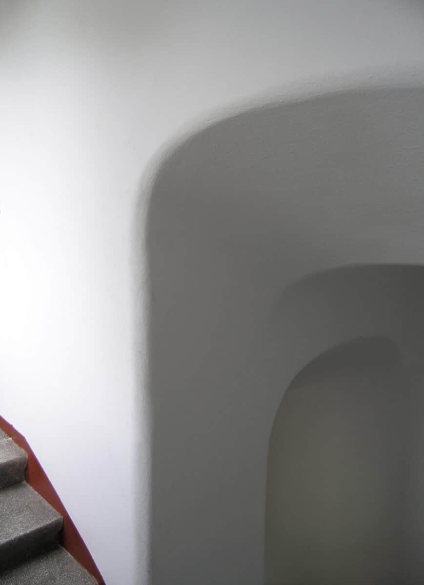
The workers’ housing in the Eneborg area in Helsingborg are as simple as a child’s drawing. They have pitched roofs and facades in brown-black Helsingborg brick. The inside of the stairwells stands in stark contrast to the outside. Smooth and polished in softly undulating shapes, white painted and almost sensual.
7.
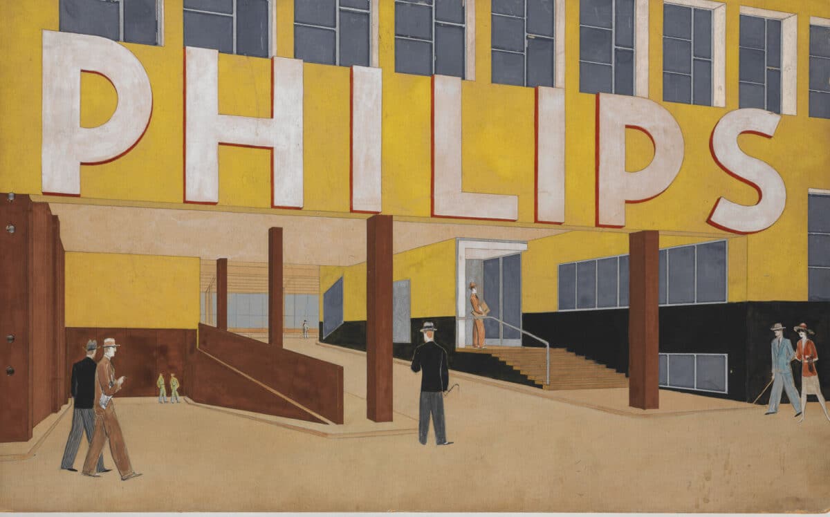
The Philips of Sweden building on Gävlegatan in Stockholm is very present in the streetscape, but at the same time almost immaterial. The typography and neon signs are part of the architecture and more visible than the building itself. The yellow colour, typical for Stockholm, on the parapets between the window bands, was painted directly on that concrete without any stucco being applied.
8.
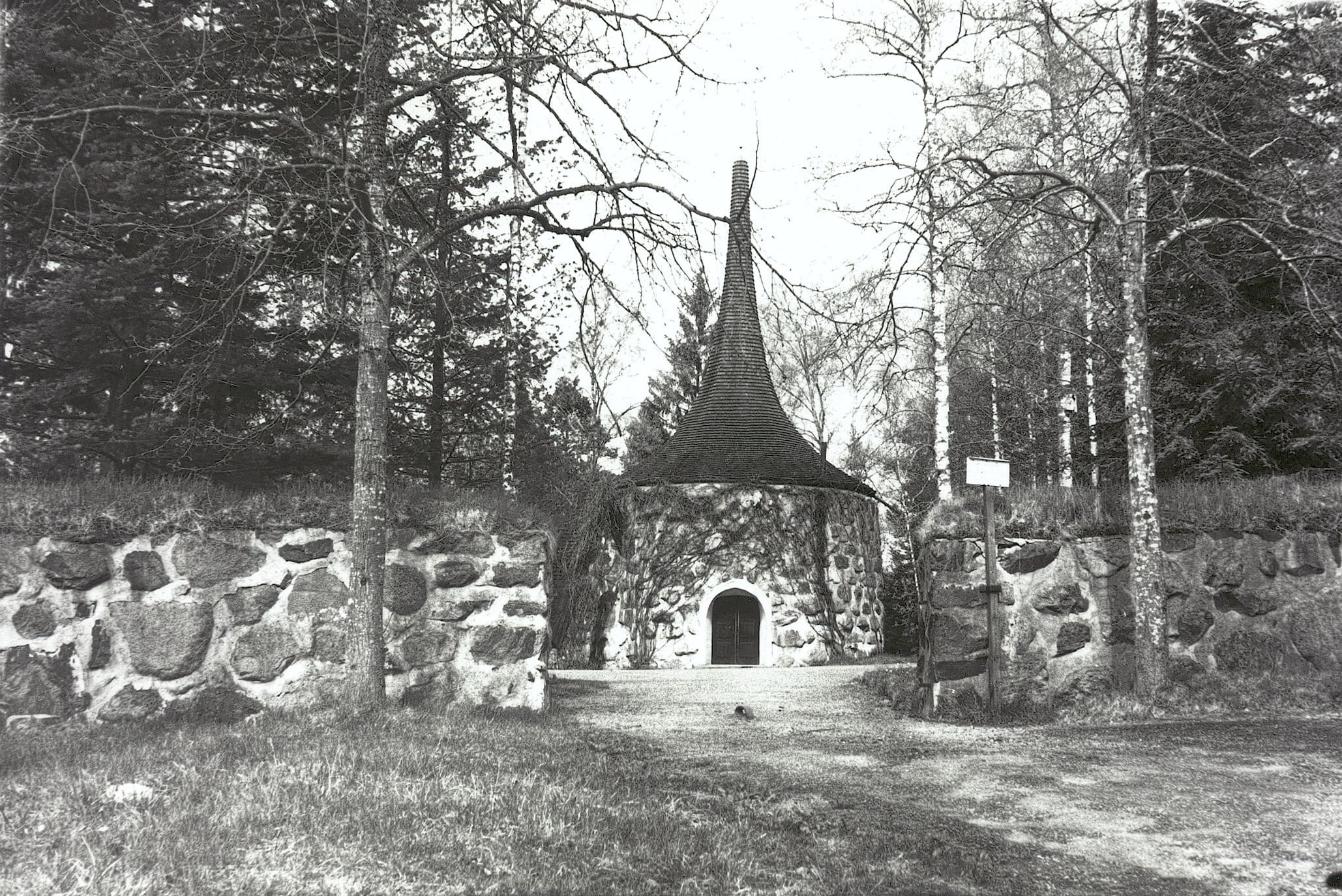
Lewerentz drew the plan for Valdemarsvik’s cemetery in 1917. The chapel is circular and merged with a gate and a staircase. The massive walls are built of locally sourced stone and are over metre thick at their base.
The round chapel has a roof that is also a narrow spire, reminiscent in shape of a wizard’s hat. At the base, the roof is sixteen-sided, and further up eight-sided. At the top, the roof spire is crowned by a gilded eight-pointed star. The roof spire extends up to 11 metres and is clad with black tarred shavings. The walls of the chapel seem to grow out of the ground. In 1910, Lewerentz was employed by Carl Westman after having him as one of his teachers in ‘Klara skola’. Many of Carl Westman’s villas in Saltsjöbaden have the same kind of plinth. The rocky archipelago landscape continues in a natural stone wall. The wall merges into the base of the wooden house. Nature transcends imperceptibly into the built.
9.
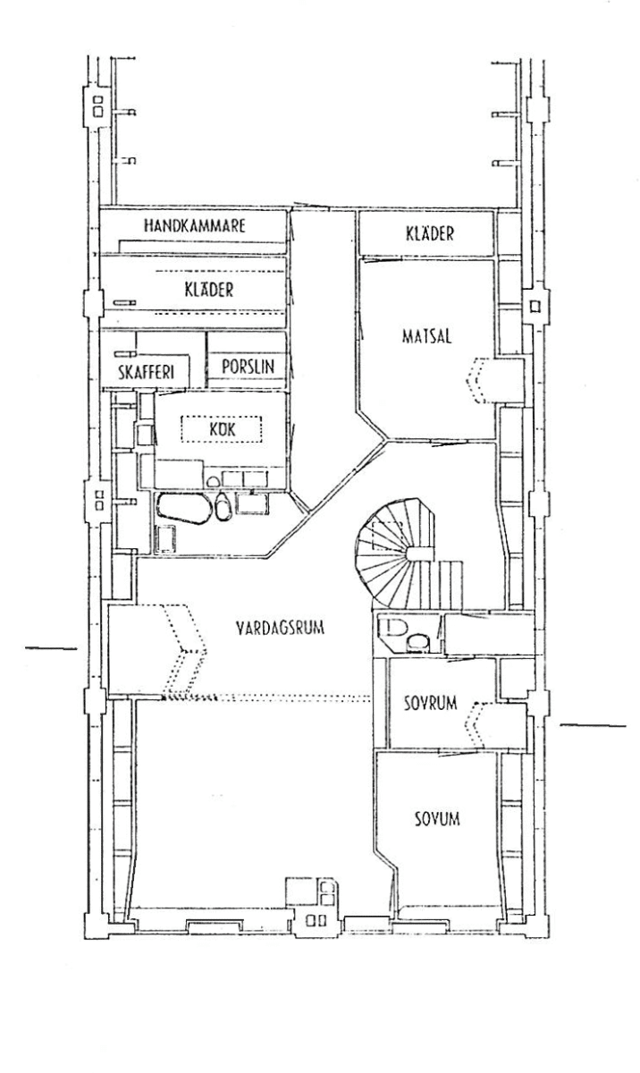
In Lewerentz’s private home on top of the Idesta factory building in Eskilstuna, the two new roof domes have an unusual shape, as if they are facing back and forth. They turn a pointed glazed part with a light inlet up towards the ridge.
10.
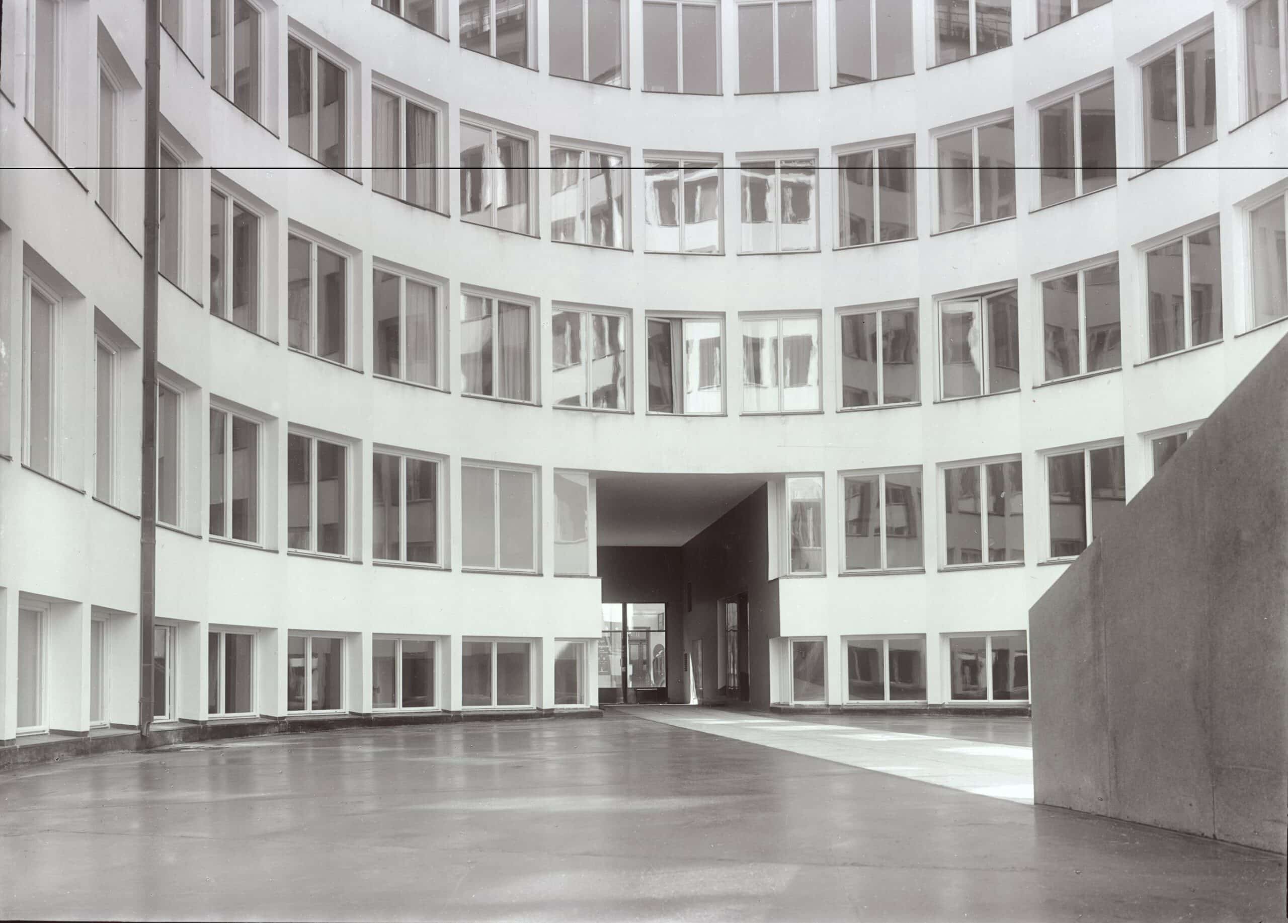
The corner windows in the transition between the entrance corridor and the courtyard at the Social Security Administration building, Stockholm, lack the plastered facade pillar that is found between all other windows facing the courtyard. Instead, here a special variant of the window is used that goes over the corners at a 90 degree angle.
11.
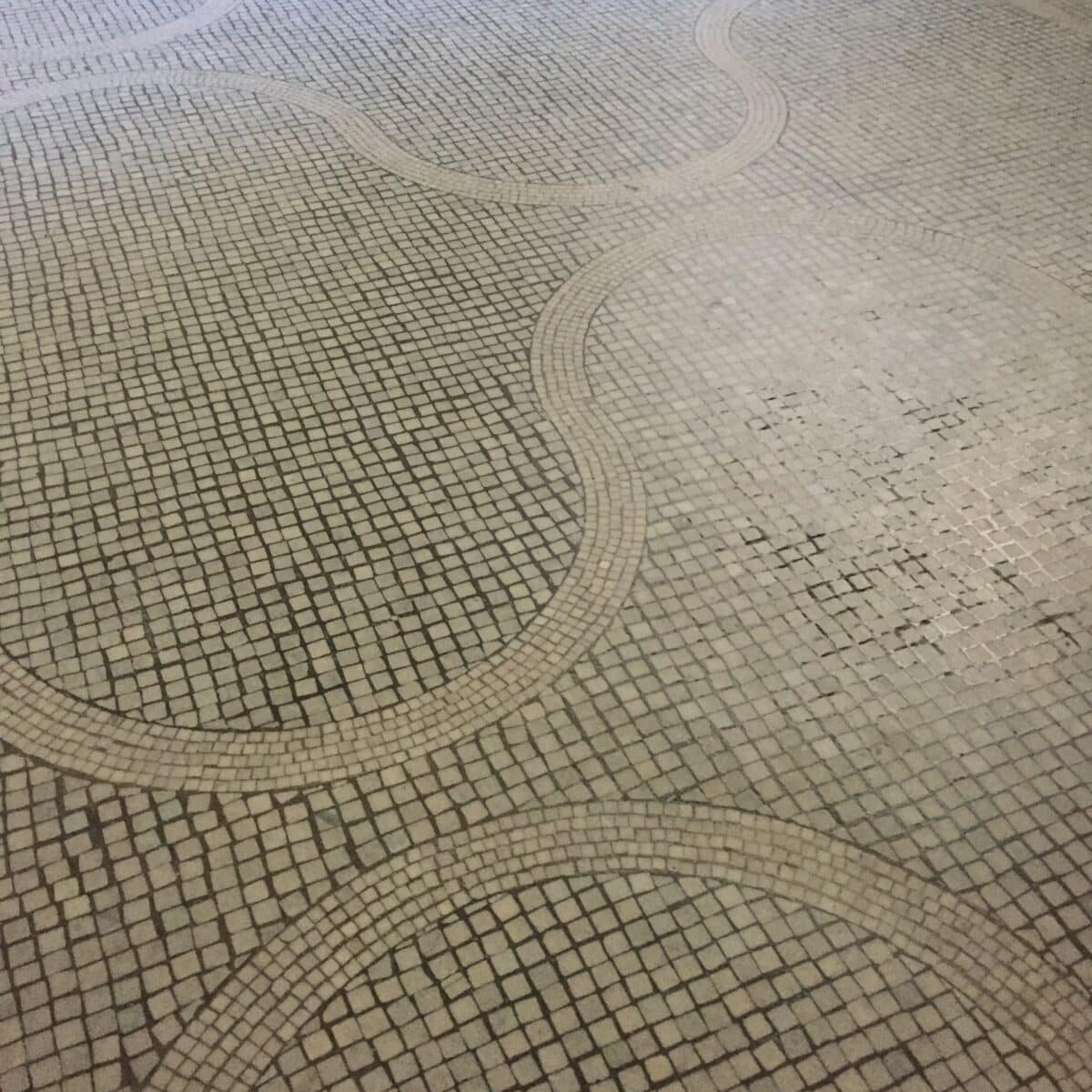
In the Resurrection Chapel, the mosaic floor with its wavy pattern, is reminiscent of Italy. Similar floors and patterns are found among Lewerentz’s travel photographs. In the late brick churches, Lewerentz uses square and rectangular Höganäs tiles in standard formats. In a fascinating way, he manages to create new patterns and combinations with these limited means.
12.
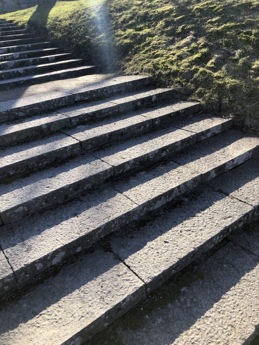
The stairs that lead up to the memorial grove at the Woodland Cemetery decrease in height the further up you go. The steps get lower and lower. The stairs become less strenuous to walk up. The difference is so small that it is hardly noticeable.
13.
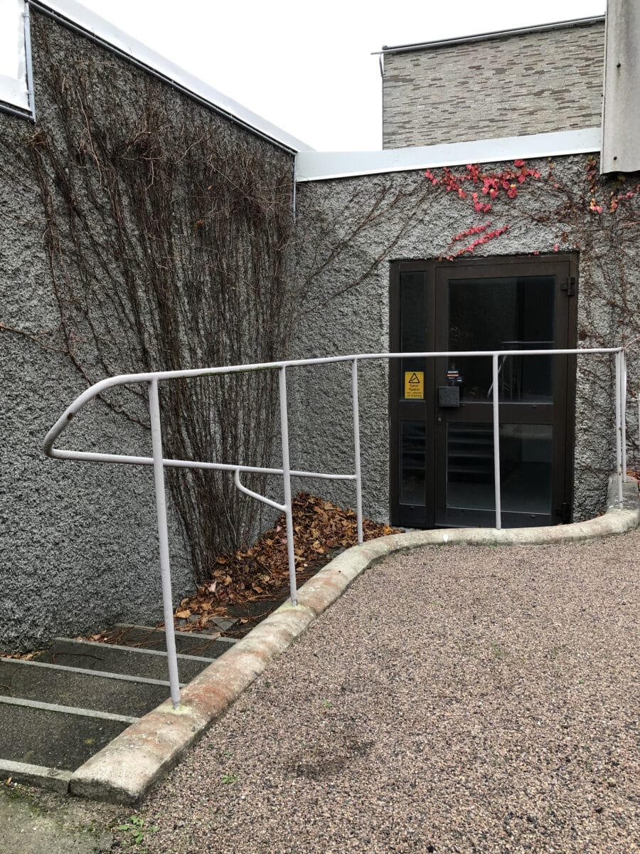
At Sankt Knut’s and Gertrud’s chapels in Malmö’s Eastern Cemetery, there are, on the back sides, stairs that have railings that seem to perform an advanced rhythmic dance, even though the railings only consistently follow all small shifts in height and directions. The railing draws a graceful and precise line that contrasts with the chapel’s materiality and the height of the building volumes.
14.
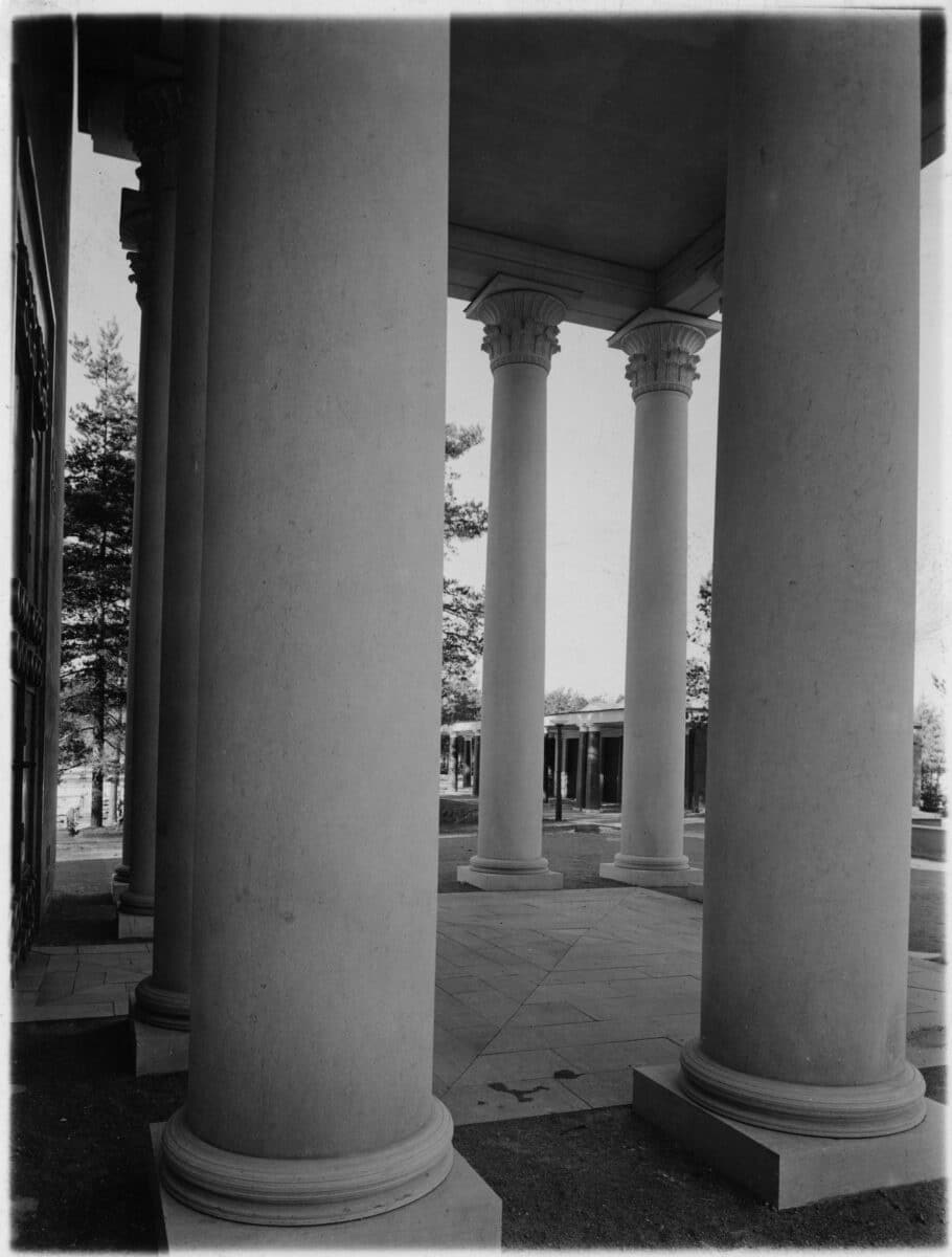
In Janne Ahlin’s Lewerentz’s monograph, Sigurd Lewerentz, Architect: 1885–1975 (2014), there is an anecdote about the columns in the Resurrection Chapel: ‘Artur [von Schmalensee] and I [Curt von Schmalensee] … got down on the floor and drew the entasis of these seven-meter-high columns at full scale! Then the drawing was sent to Ignaberga masonry, where they turned columns – in one piece!’
Related...
Sigurd Lewerentz: Siting the Axonometric
– Stan Allen
Sigurd Lewerentz: Architect of Death and Life (2021): Review and Excerpts
– Caroline Voet
Category
design methodologies commentaries, rants & reflections
Period
c20th
Architect
Sigurd Lewerentz
Medium
drawing photograph
Tags
detail