Materia 4: Brick
This text is the fourth in a series by Gordon Shrigley titled ‘Materia’ in which the architect meditates on the physical and semiotic nature of a number of everyday construction products.
Coarse rectangular lumps of clay mixed with straw and water, small enough to be carried in one or two hands, are laid out in rows on the ground under the scorching dry heat of the Levant, to transmute sticky sludge into hard oblique loaves of earth, thereby inaugurating the most widely honoured building materia employed by our kind: the humble sapien brick. [1]
Stacked, one upon another around roughly circular hollowed-out earthen pits, the sapien brick enclosed our hitherto wandering ancestors within walls of clay, protecting both kith and kin and the sacred hearth from the world outside.
Later, moulded, pressed, extruded, or cut clay forms, invigorated variously with silica, alumina, and metallic oxides, are heated at great temperatures in cavernous infernal kilns to create near identical moduli that promise to hold fast for eternity.
The debt owed by the genesis of brick to the electromagnetic radiant heat of the sun and tendered fire, in all its primitive and later horrific industrial forms, invisibly sinters a message within each brick that whispers to each one of us: fire walk with me. As within any written word, we read a history of its usage and etymology. We can also see within each and every brick an originary bond with the arc of tendered fire. This relationship is inaugurated with the simple act of collecting twigs to build a campfire to cook food, keep ourselves warm and ward off wild animals, and results, ultimately, in the transmutation of matter itself.
It is in this sense that we may understand the art of firmitas as borne of fire.
To make a stout fire wall, one must lay bricks on firm ground in a series of courses. To aid overall stability, we apply a layer of gooey mortar between each vertical and horizontal joint, which when hardened transforms the wall’s many parts into one monolithic self-supporting form.
The sense that a brick wall is a structure is fundamental to what we expect from a wall: to be both strong and the bearer of weight. The everyday perception that a lumpen brick wall represents, in an unmediated and unambiguous manner, how weight is transferred from up on high to the ground, has been understood and accepted for centuries.
But, since we realised that a brick facade could be hung off an internal cast-iron, steel or concrete frame, the ontological basis of brick, as the Herculean bearer of great weight, has overall been unceremoniously demolished.
For an architect who practices in the city of brick, this is a problem. [2] The question remains: should I detail a facade as an appliqué to reveal its underlying structural character, or should I articulate the facade to allude to its former function, as the foundational bearer of weight?
Designing a wall to show its appliqué nature in a straightforward and unambiguous manner, to reveal the real tectonic reality of the wall, would in the first instance appear to be the most honest strategy, as to do anything else is more akin to the art of theatre than the hard-won orthodoxies of baukunst. However, to give up on the rich and complex visual culture of how load-bearing forces can be tectonically articulated as monolithic, trabeated, or arched, is to lose a vast array of compositional strategies and semiotic potential. There are certainly worthy and notable examples of either approach, however the question of how to design a modern hung brick wall has yet, I believe, to be fully resolved.
One way to proceed, beyond such concerns, is to explore the fluid dynamics of hard liquid instead, as the history of the rendered object suggests an approach to form production that effectively renders such ethical lacunae null and void. [3]
If, however, ‘the brick wall’ is to have any future tectonic credibility, outside of a primarily aesthetic surface, I would like to suggest the Monadnock and Kearsage building, designed by architects Burnham and Root in Chicago in 1891, as one model to bridge the gap between the laws of gravity and the flighty curtain. [4]

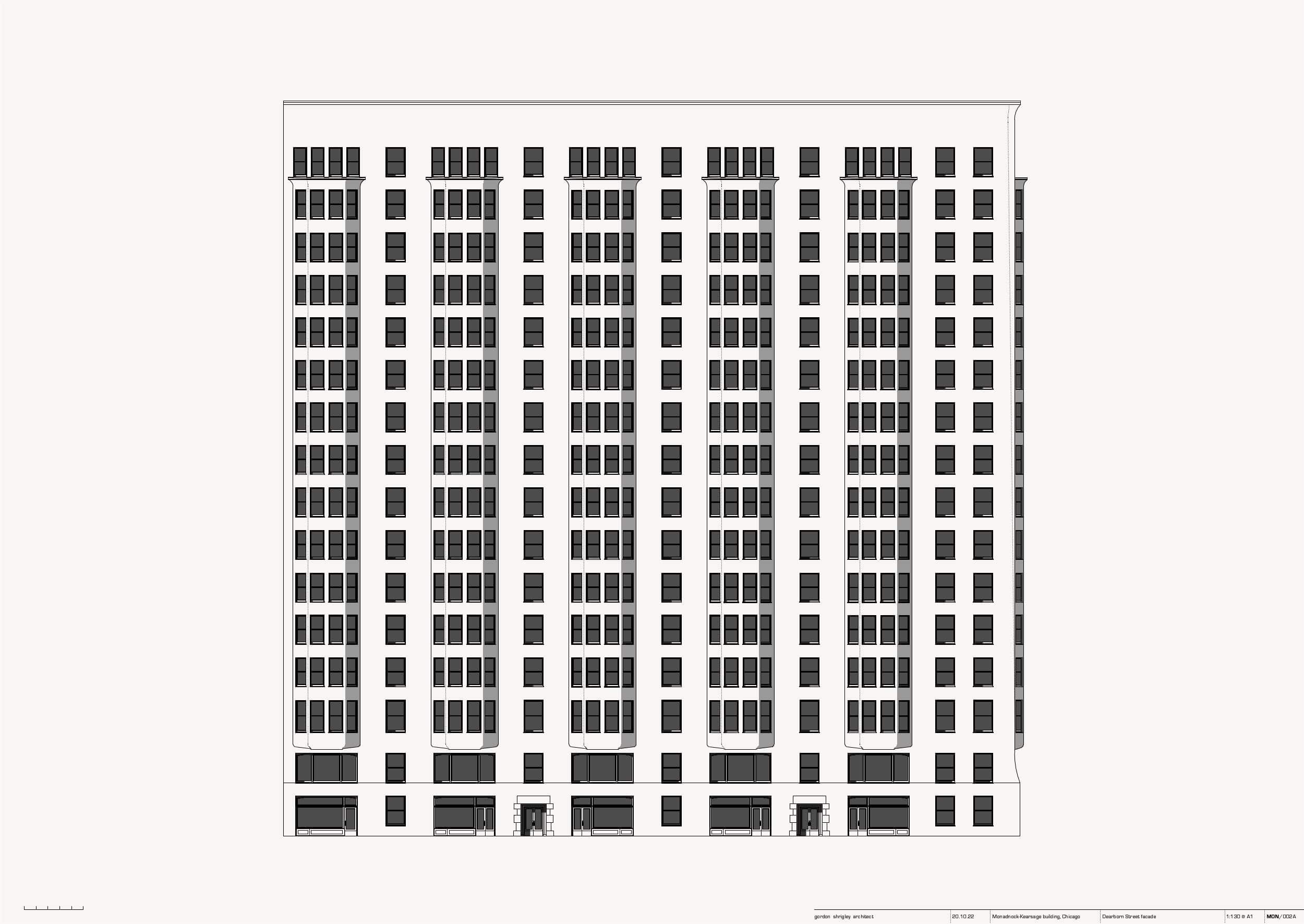
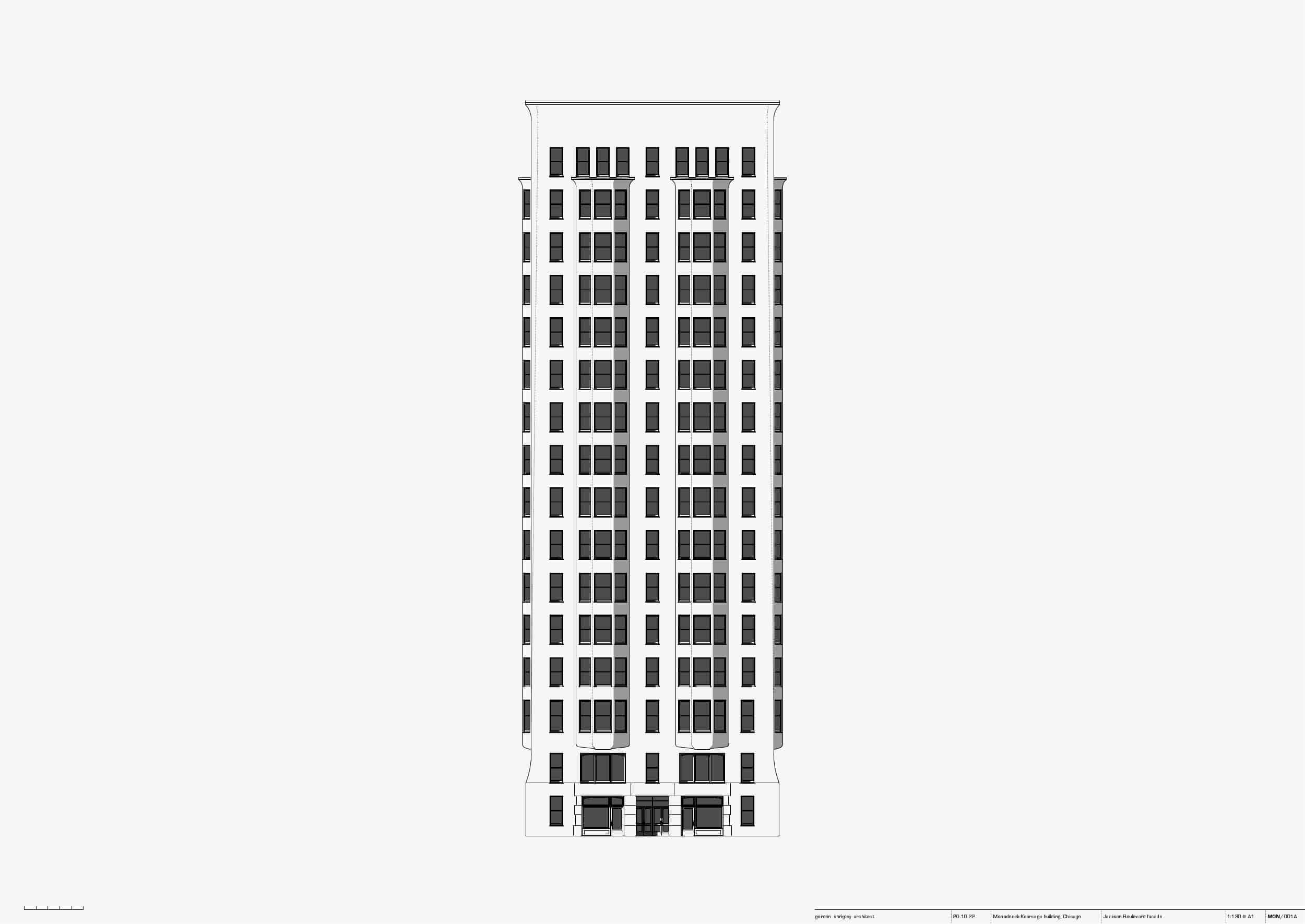
When viewed from either Dearborn Street or Jackson Boulevard, the Monadnock speaks a sombre story that heroically stacks hydraulically pressed brick, upon brick, to celebrate, in startlingly muted rhetorical form, John Wellborn Root’s desire to express ‘the metaphysical truths lying behind the material world’. [5]
Built as Chicago’s tallest office building of the time, the Monadnock appears, due mainly to its cyclopean six-foot thick ground floor brick walls, to be an immense load-bearing brick construction, which labours heroically up into the sky. However, if one looks under its sombre skin, we see a more complex picture, describing a part load-bearing and part hung brick facade. [6]
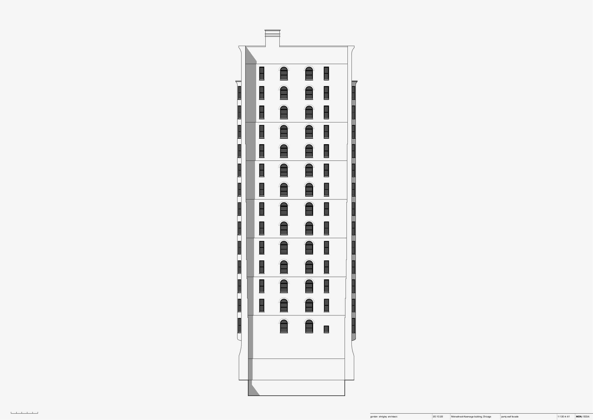
The actual load-bearing elements of the three principal facades of the Monadnock are located therefore either side and between the twelve stacked brick bay windows, which are hung off a series of beams that cantilever out from an internal cast-iron structural cage, which also supports the weight of each floor. The only entirely load-bearing facade of the Monadnock is the oft neglected party wall, which was designed to both contribute to the bracing of the overall structure and to accept an envisaged later addition. [7]

The Monadnock’s facade is therefore not a pure example of either a load-bearing or hung facade, but sits somewhere in between, within an impure grey zone, that mediates between gravity and illusion.
I would like then to concentrate on the Monadnock and Kearsage’s apparent structural ambiguity.
The design and construction of contemporary brick facades has, since 1891, moved almost universally from load-bearing brick to the tectonics of the plattenbau. [8] This can be observed within many contemporary buildings that now employ large brick faced prefabricated concrete panels, bolted onto a structural frame, to affect the illusion of a load-bearing brick wall.
Factory produced facade panels have many advantages for the building industry: speed of construction, high levels of quality control, and the potential diminution of the power of unionised labour as less highly skilled workers are required to construct a building, so keeping wage costs down to a minimum. [9]
Brick facade panels also challenge our perception of what a brick wall should look like. The level of dimensional accuracy that can be obtained under modern factory conditions creates a level of exactitude that counters our collective memory of the well-honed irregularity of a hand-made brick wall, leading to the now common pejorative description of panel facades as wallpaper.
One of the major challenges of panel construction is how to design the junctions between panels.
The now canonical German Democratic Republic’s plattenbau building tradition, for instance, incorporated 20–40 mm wide joints filled with black Morinol, a form of asbestos mastic. [10] The width of these joints, and the sometimes crudity of application, had the effect of rendering these socially innovative projects to look more like a house of cards than permanent architectural form.
Today, panel joints tend to be recessed, much slimmer in appearance, and filled with either silicone, modified polymer, or polyurethane mastic. One of the main failings of panel construction, however, is that although a modern panel facade can initially affect the appearance of a monolithic brick wall, over time, because of airborne pollution and solar radiation, mastic joints can discolour, shrink, or disintegrate, to reveal the true panel nature of the wall. This can cause formerly impressive modern brick buildings, which once had the appearance of solidity, to look rather shabby and insubstantial.
If we still value the semiotic and tectonic potential of brick construction over short-term scenography, panel construction would appear then to have limited utility, in either its authoritarian socialist or liberal democratic capitalist forms.
Nevertheless, given it now appears inevitable that prefabricated panel-based building technology constitutes the future, what can we learn from the Monadnock?

One reading, taking its cue from the Monadnock’s cyclopean parts, points towards reconceptualising the diagrammatic character of a building as two bifurcated pure tectonic forms, two autonomous independent structural entities. This would suggest designing all facades to support their own weight, leaving the internal structure as an independent entity, providing, at the most, lateral bracing. This seductive path holds out the tantalising possibility of exploring the language of thickness and the peekaboo erotic intrigues of poché space, in all its luxurious spatial glory, and yet alas, for most architects, confined within the realpolitik of contemporary forms of industrial capitalism, such avenues remain an illusion. [11]
Alternatively, following the Monadnock’s built reality, a facade could support a part of its own weight only, with the remaining elements supported from within. Here, the structure cage and the facade stand as semi-independent entities, supporting each other in part only, leaving the facade to contain both load bearing and hung elements: a language of aedicular hybridity, of one symbiotic structure inside another, a mélange of semi-autonomy, both one or the other. This strategy would seek to retain the visual language of expressed weight, but as impure form, framed through ambiguity, that breaks to ultimately save, a fragment at the very least, of the sovereign visual tradition of amassed materiality, but here, within a play of the cloak and the dagger.
The tectonic integrity of the brick wall may well then be permitted to retain an element of Root’s desired ‘metaphysical truth’, but only by refusing, I believe, to align itself with either the messianic vicissitudes of gravity or the shimmer of the curtain, so leaving us to explore the architectural equivalent of bad language in all its impure, no-nonsense, bloody-minded forms.

Notes
- Handmade bricks in the shape of curved rectangular loaves, have been dated to 8500–7500 BC, and can be viewed online in the Ashmolean Museum’s collection: https://collections.ashmolean.org/collection/search/per_page/25/offset/0/sort_by/relevance/object/93167.
- It is still the case for any architect designing low to mid-size buildings in London that the principal facade material is brick.
- I refer the reader to my previous Drawing Matter article on the rendered wall: https://drawingmatter.org/materia-render/.
- The Monadnock and Kearsage building, Chicago, designed by architects Daniel Hudson Burnham and John Wellborn Root and completed in 1891.
- Joanna Merwood-Salisbury, paraphrasing John Wellborn Root’s statement, in, ‘Broad Art Criticism’, Inland Architect and News Record 11 (February 1888), pp. 3–5, in Merwood-Salisbury’s Chicago 1890, The Skyscraper and the Modern City (University of Chicago Press, 2009), p. 72.
- For a rigorous analysis of the Monadnock and Kearsage structural system see: Thomas Leslie, Chicago Skyscraper 1871–1934 (University of Illinois Press, 2013), pp. 29–34.
- The party wall facade shows the load-bearing elements of the principal facades in profile as they extend past the stepped load-bearing facade of the party wall.
- I refer the reader to my previous Drawing Matter article on corrugated iron panels: https://drawingmatter.org/materia-2-corrugated-iron/.
- A recent example of modern facade panel construction are The London City Island buildings by architect Glen Howells, which were built from prefabricated insulated brick tile faced panels, craned into place complete with glazed windows, insulation, and internal wall finishes.
- I would like to thank the architect Thomas Reinke for pointing me towards Barbara Leydolph’s dissertation, Ausbau von asbesthaltigen Fugendichtstoffen im Rahmen von Gebäuderückbau und Sanierung (Bauhaus University Weimer, 2007), which provides detailed analysis of GDR plattenbau panel joint construction and materiality.
- I speak here of medium to tall buildings only, as for 1 to 3-storey, load-bearing walls still remain a real possibility.
The Dearborn Street and Jackson Boulevard elevation drawings of the Monadnock and Kearsage building are based on a series of measured plan, section, and elevation drawings by Dieter Sengler completed in 1964 and held at the Library of Congress, USA, which are available online. After close examination, however, I discovered that Sengler’s plans, and elevations do not quite tally. As it would have been easier therefore, for Sengler to have measured the existing plan, than the 16-storey building facade, I have taken Sengler’s plans to be the most accurate description of the location of all windows.
For the party wall drawing, I have based the elevation drawing partly on the period photograph, Dearborn Street, North from Van Buren, dated 1893, held at the Chicago History Museum and also, partly from Dieter Sengler’s survey of the adjacent Monadnock facades.

– Adam Caruso and Helen Thomas