Notations (2016): Review & Excerpt
Notations is a collection of pamphlets in a box. Curating the content in this manner has allowed the editors to present the publication as a physical representation of their thesis that the notebook is a device for the cultivation of individual worlds. The plurality is important.
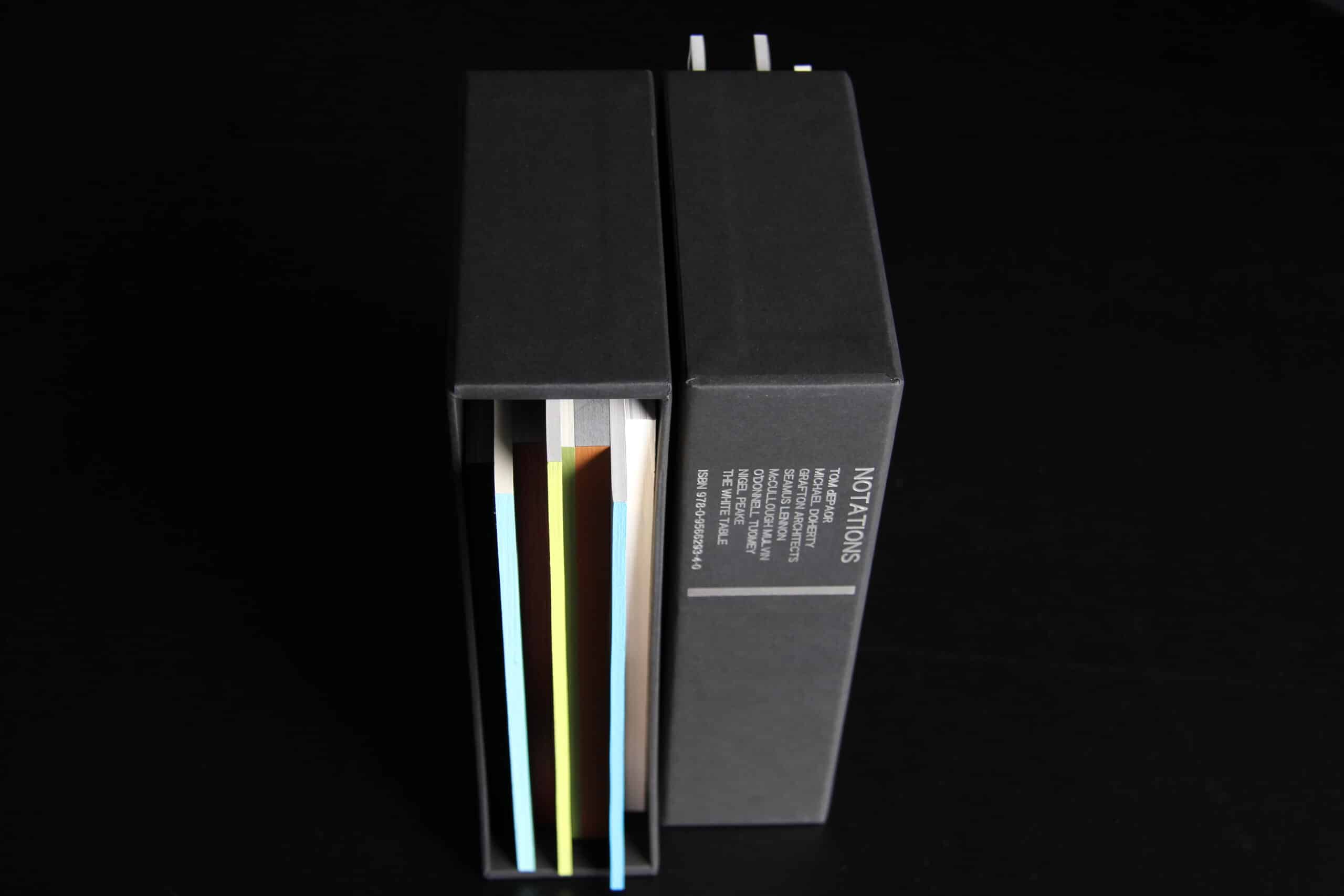
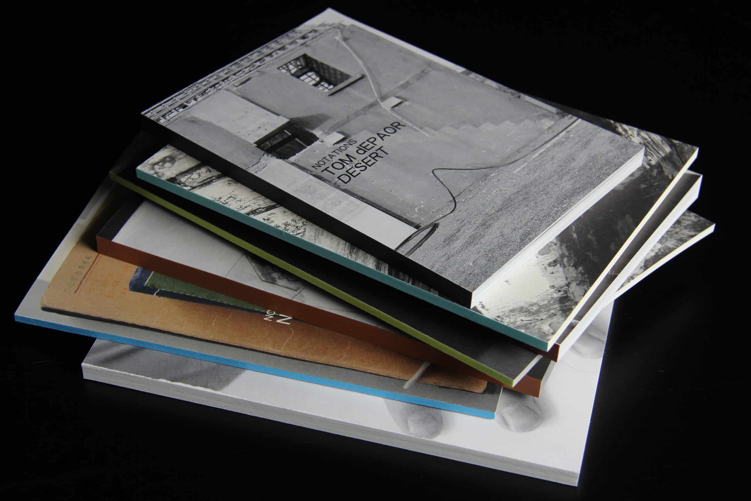
The pamphlets are collected in a black-paper-covered card box with a taper to the open side. The pamphlets of differing heights, widths and thicknesses variously recess and protrude from their enclosure. This precarious arrangement makes reference to an informal collection of documents in a file holder. Each spine of the eight pamphlets has a different colour: white, blue, orange-brown, grass green, lime green, deep red, pale turquoise and brown black. Seven of the eight contain sketches by a specific architect or practice, and are each autonomous in terms of content, layout, paper type and construction.
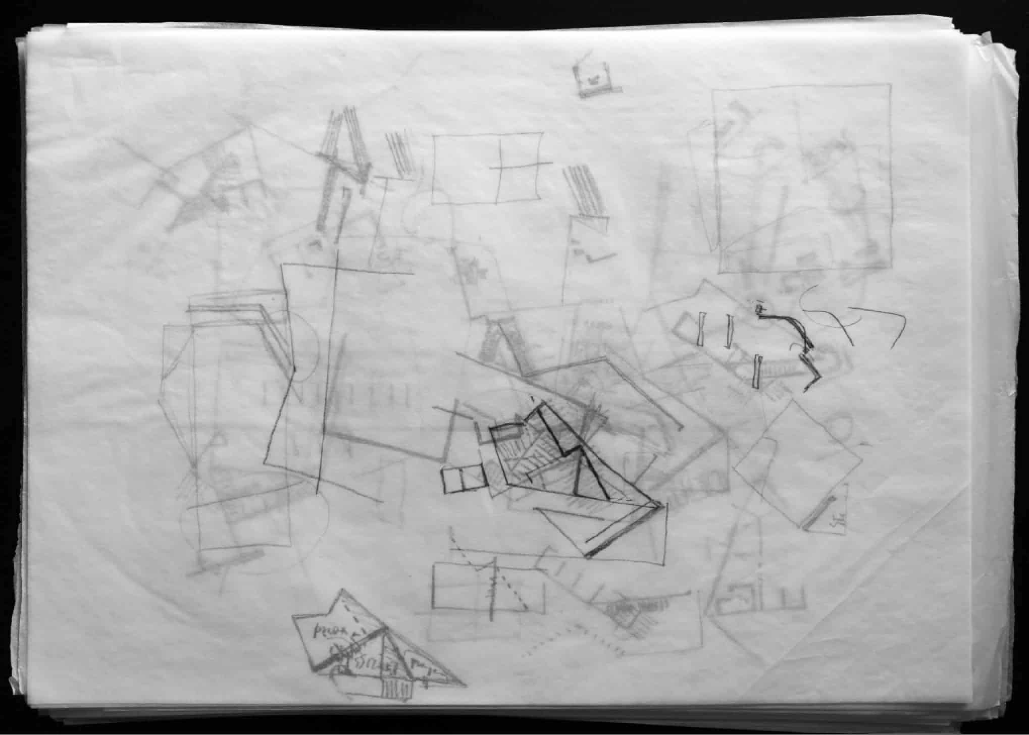
Tom de Paor
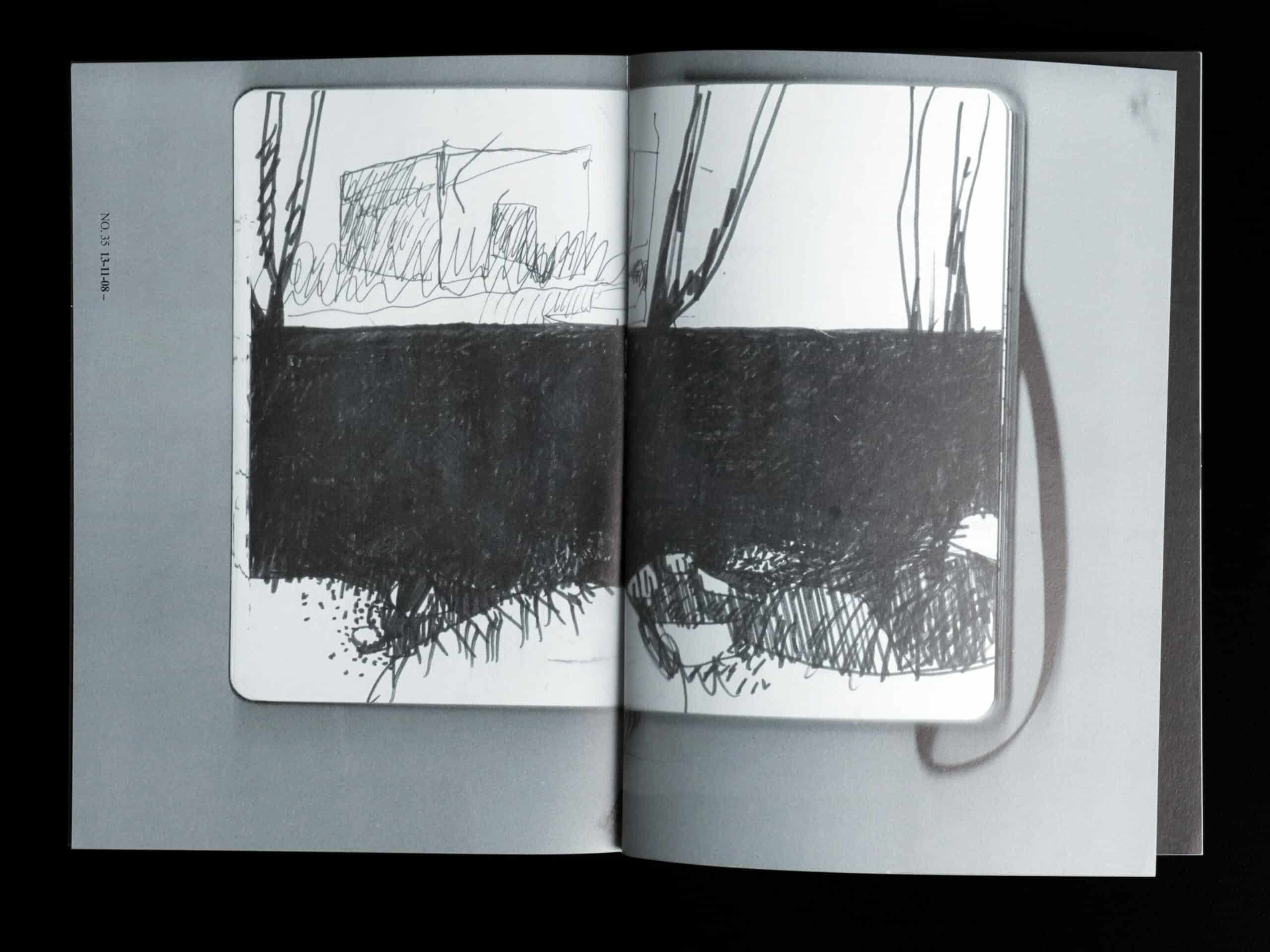
Subtitled ‘Desert’, the first half of this pamphlet contains a series of scans of sketchbook pages; the second half is dedicated to site photographs. The sketchbook pages are reproduced in black and white, rendering the medium used on each page somewhat obscure. The effect is of the texture of a project being worked on. The pages contain an intense collection of pencil scrawls, glued-in photos, bits of text and pen sketches of varied clarity. Forms, figures, details, elements and reference overlap, sometimes beautiful and often cryptic.
The photographic section – all but one also in black and white – appears to document the development of a project from initial site visits through construction. The images are romantic, fragmentary and equally intense (and sometime intensely calm).
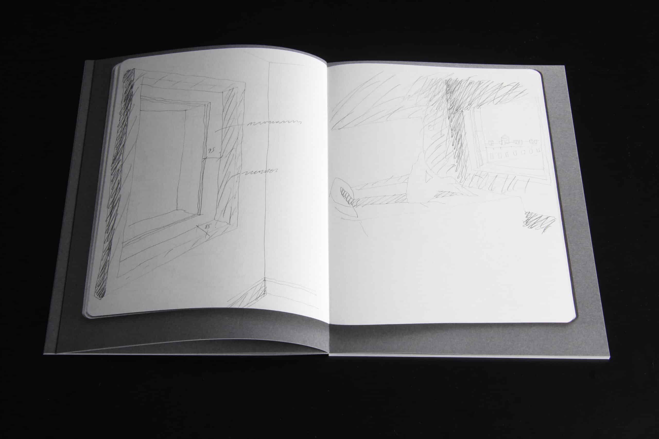
Michael Doherty
The second publication is reproduced on cartridge paper and contains pencil sketches of pieces of landscape and building, supplemented with occasional textual statements. The intensity of this collection is much lower and whilst, initially, the subject matter seems familiarly romantic territory, the studies reveal an eye attuned to acute observation and taxonomy. Sequences of studies on windows and doors, and ‘impacts on marble paving’ in particular, demonstrate rigorous documentary and a carefully judged employment of precision and softness.
Grafton Architects
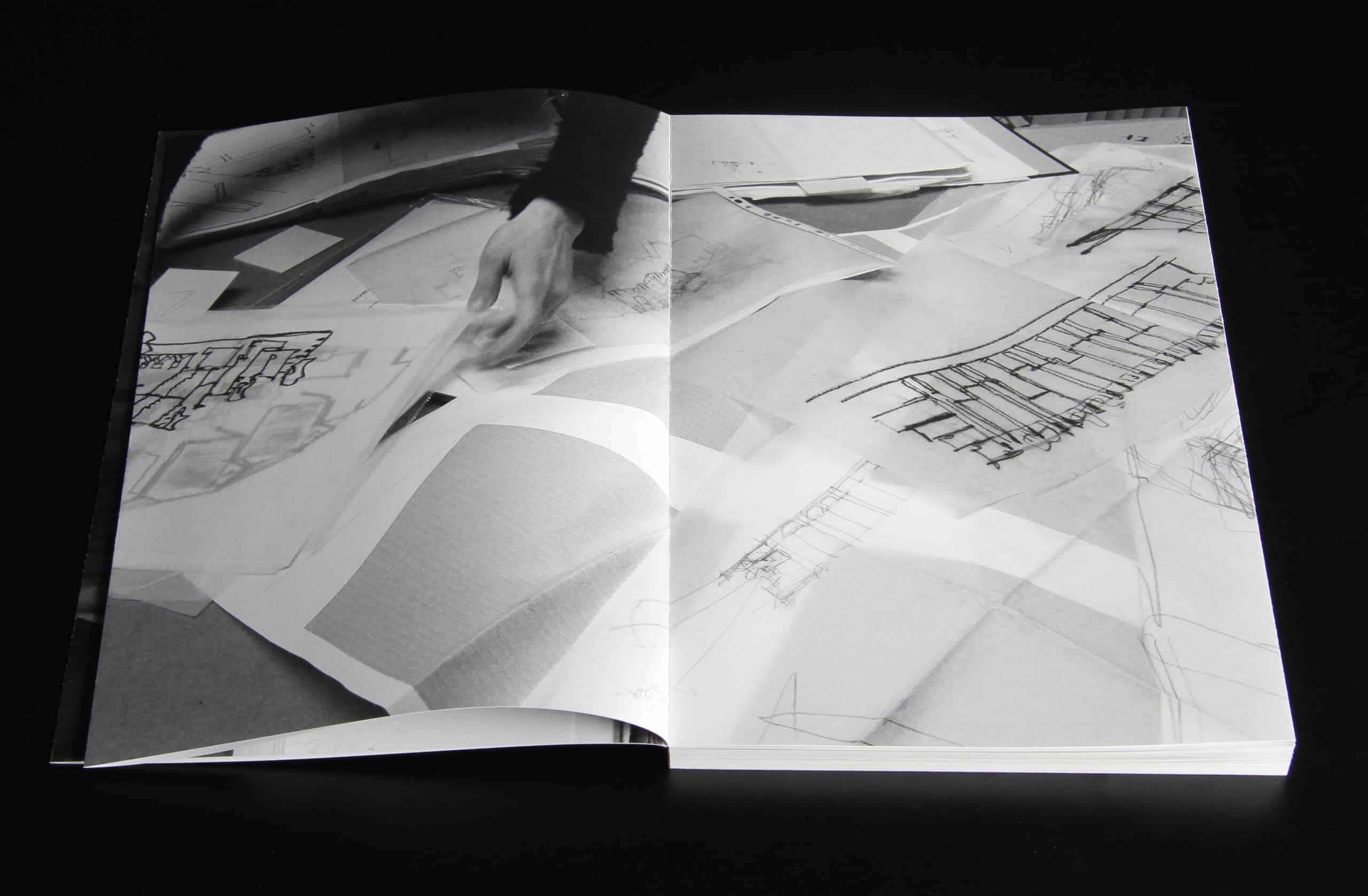
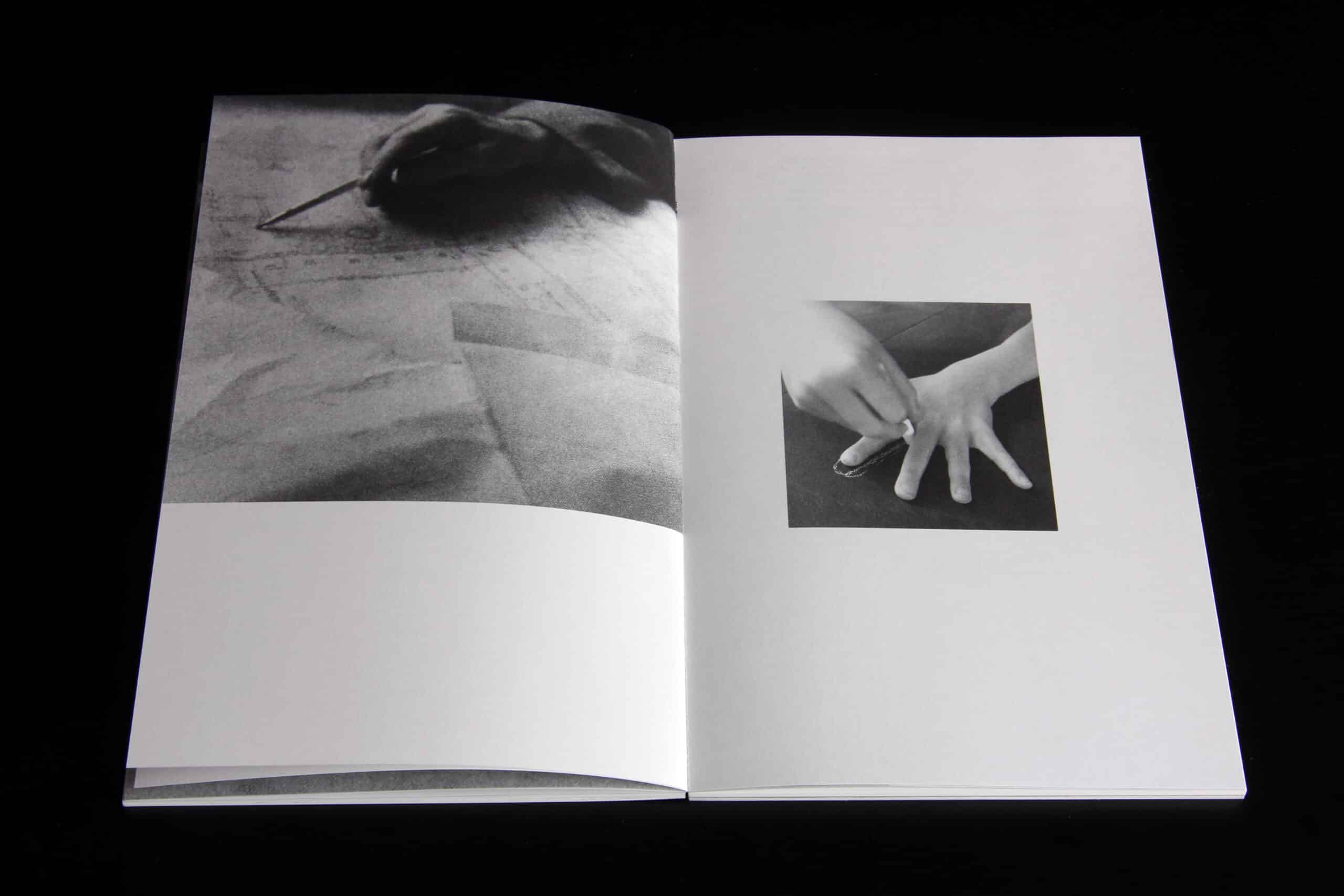
This is one of the thicker documents, partly owing to its binding method. It contains photographs of sketches in the architects’ office taken at different proximities, from an overview of a collection on a table to abstracted details of marks on paper. It attempts to illustrate work in progress – a scenography of the studio perhaps. Unlike other contributions, the space in which the work is made and the hands that contribute make guest appearances. One gets the sense of being deprived of accompanying audio.
The drawings, employing soft-pencil, charcoal, marker and pen, are typically on sheets of tracing paper or in spiral bound notebooks. Some are overlays exploring tangible elements of a project – plan or façade – others are more enigmatic compositions that may or may not relate to a project. Not unlike Michael Doherty’s observations – although varying greatly in technique and subject matter – the dialectic between precision and softness is omnipresent: loose, often illegibly wild, lines and marks are supported by dimensioning conventions that bind the sketches to a measurable reality.
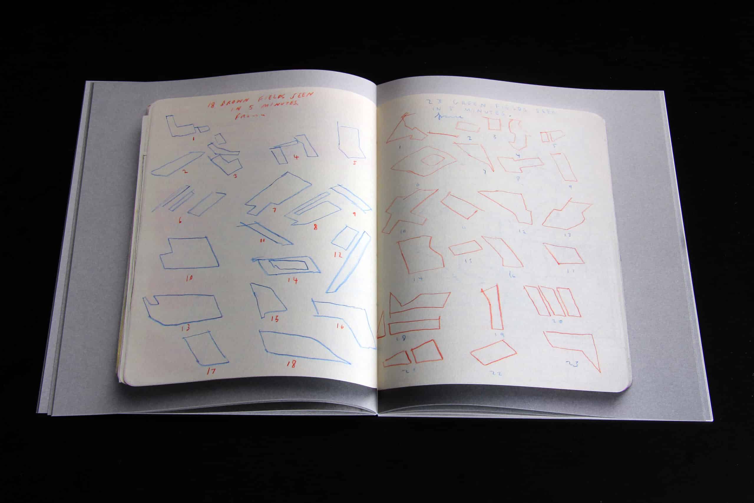
Seamus Lennon
Lennon’s contribution is refreshingly matter of fact. Like the first half of de Paor’s pamphlet, it contains scans from a project sketchbook, including the shape and format of the sketchbook on the scanner bed. This time, the contents are at once more laconic and descriptive.
Each page contains a limited number of economically line-drawn pencil studies that clearly depict building parts, arrangements and situations. Organisation, tectonics and relationships appear in a tangible, deadpan manner – in some instances providing the substrate for a mute kind of wit.
McCullough Mulvin
Subtitled ‘Curious’, this pamphlet has been formatted in a rotating arrangement as two interlocking books, in which the righthand page is always the right way up. One direction appears to deal with drawings related to six projects. The other, a series of observations in the natural and manmade world.
The format offers incidental juxtapositions and cross-readings of textures, patterns and shapes that sometimes coincide as apparently reciprocal ideas.
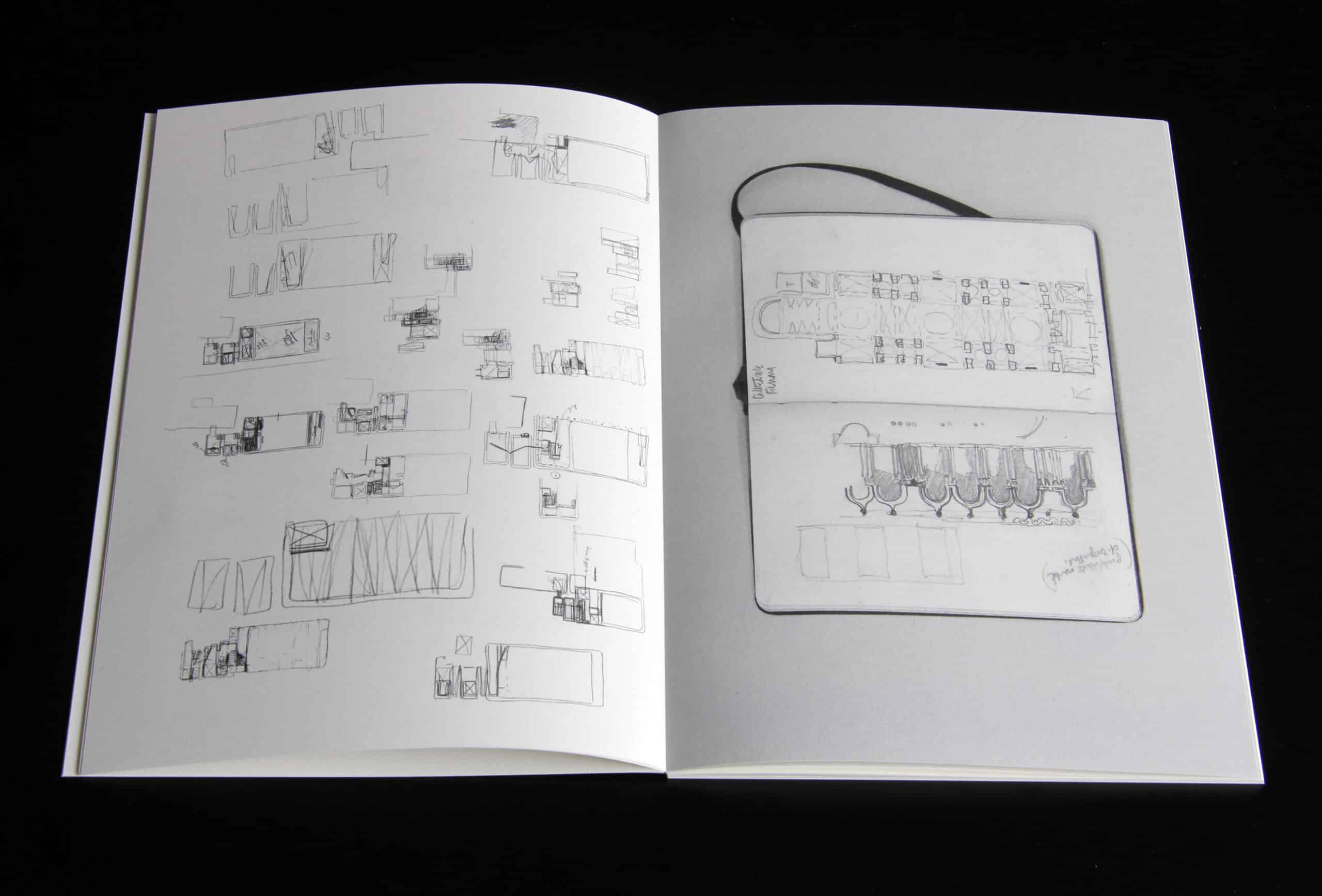
O’Donnell + Tuomey
The other of two thick volumes in the set – this time reproduced on thin paper – is a compendium of images of a stack of sequential sketches on trace. The linear arrangement acts almost like a flick book of developments, digressions and redirections in the layers of study.
The stacking of sketches on semi-transparent paper exposes blurs and ghosts of underlying material, suggesting the significance of iteration and time – and the interdependence of one idea to another.
Nigel Peake
The cover of Peake’s document initially suggests it might be a travel sketchbook – and it might. It contains a series of episodic observations, speculations and anecdotes. What is observed and what is imagined is unclear, but one is struck by the degree to which the content appears analytical. The document exposes the artists well-known and idiosyncratic style as a means for diagramming the world, to an extent that I certainly had not previously appreciated.
The White Table
The final pamphlet in the set is different to the others. It contains a text by Paul Clarke, co-producer of the publication, supported by images from other architects and sources. In fact, it’s not really a text as much a collection of mutually supporting text-parts: written sketches that are analogous to the drawings in the other pamphlets. The texts are poetic (some of it is poetry) and – like the overall project – form an ode to the notebook as a tool for collection and subjective understanding; a receptacle, not so much of documentary, but of imaginative interpretation. This is to say, we tend not to note or draw exactly what we see, but rather what is provoked in our imaginations by what we see – cumulatively augmenting our individual perceptive and projective lexicon.
Clarke explores this train of thought through a series of contemplations on the nature of observation and work; the physical acts of drawing and collecting; the relationship between sight and touch; buildings, city and images. What at first might seem like a general fascination with the notebook – or the idea of the notebook – reveals itself to be a deep and layered body of research and reflections, with the notebook acting as a conduit between the world and the individual, and back out to the world again.
One of the many subtexts of Clarke’s pamphlet concerns a complex process in which notebooks provide both opportunity and record in the nuanced, imperfect and malleable act of communicating – both to oneself and to others – what one sees in the world and what one might project into it. As such, the personal nature of each notebook lends itself to receiving interpretations that might be in tension with the world as imagined by others. Fittingly, Clarke leaves the final word to Ludwig Wittgenstein.
Worlds
Although one might initially suspect the editors of this publication of pursuing a kind of sketchbook-fetishism, Notations clarifies itself as a vehicle for delving into an issue at the very core of architecture: the interplay between one’s individual world and a public profession that deals with a universe of individual worlds. In a way, the seven worlds curated by Tom de Paor, Michael Doherty, Grafton, Seamus Lennon, McCullough Mulvin, O’Donnell + Tuomey and Nigel Peake, are each equally a presentation of the practice’s method or work, and are included as evidence in support of and questioning this condition.
Whilst Clarke’s project focusses on the role of notebooks in the continued world development of architects – legitimate from the most emotional to the most rational – we might also consider it an invitation to acknowledge the worlds made by those who do not keep such documents. Although possibly less self-consciously, other citizens, clients, contractors, funders, engineers, civil servants and politicians have also been working on their own interpretations of the world since childhood: worlds that come together in the collective terrain of architectural projects, and the city more broadly.
Excerpt: from pamphlet eight, The White Table, by Paul Clarke
Together these observations accumulate to give shape, contour and meaning to the complexities of our observed world. Like a Seurat painting, our world is built up through an accumulation of small things: tiny observational intensities like the touch of a brushstroke.
[…]
This urge to collect the world: all we see, and sense of it, with our hands, our mind, and our body, into a different space, is a practice that starts in childhood. The need to find a hidden den – a place that is only ours – is deeply intuitive. Unknowingly, and unconsciously we have curated our ‘own world’ as soon as we could begin to reach out into it as children. The small hand that collects the first stone, the first flower, that starts to draw, that holds forgotten debris like gems, is in fact creating and collecting the contents of a childhood wunderkammer; a subliminal cabinet of curiosities to accompany us on our journey through the world.
As we grow older, our search for alternative pockets, drawers, buckets, bags and structures that once held our childhood world, becomes displaced into new forms and mechanisms. This space, between the optic and the haptic, between the narrative and the emotional, is somewhere both within, and outside the world: a limbo of the imagination where thoughts, perceptions and ideas are collected and transformed.
As children we simply and naturally discovered the world, by collecting it. Without anything to control, or to intervene or to order the things we gathered around us – other than our own invented narratives and stories – we gave shape to our imagination in these secret spaces and collections. Only we knew why, and what, we had surrounded ourselves with. We filled our pockets with our finds, letting them occasionally slip between the gaps in the seams of our clothing. Unseen, but there like shadows on the cave wall, we mysteriously felt through the fabric of our imagination, holding dearly onto the things we had gathered in the world.
Notations (2016) is a collaborative production designed by Peter Maybury and edited by Paul Clarke (pg.clarke@ulster.ac.uk), published by Gall Editions. Copies of the publication can be purchased here.
Richard Hall is a senior associate at East architecture, landscape, urban design in London.
