Turning Point: The US Embassy in Dublin

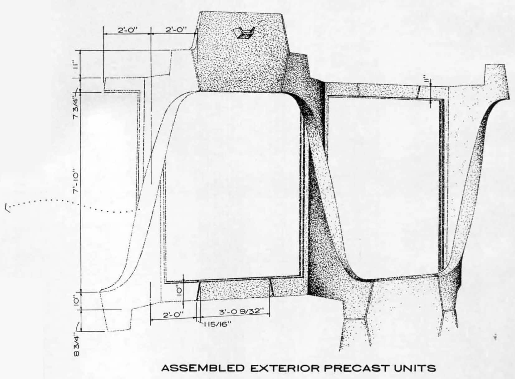
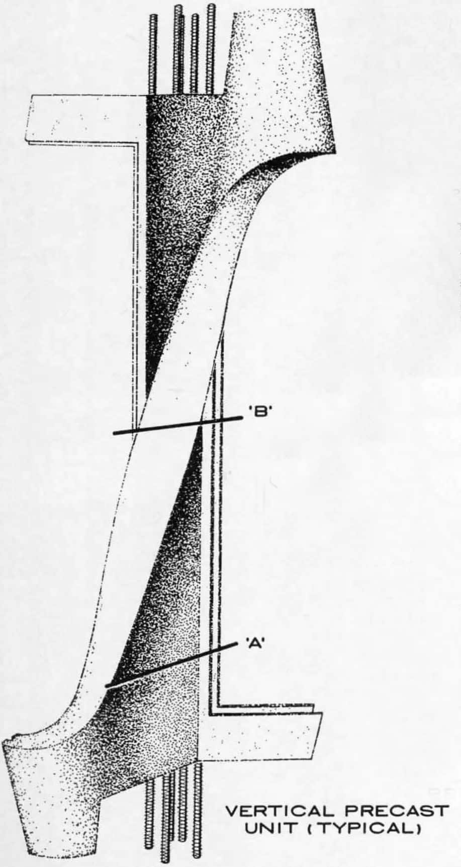
This is an extract of the construction drawings produced by John M. Johansen’s office in 1963 for the cylindrical US Embassy in Dublin. It is a three-dimensional ink drawing of the external precast concrete structure, describing two single-storey bays in isolation. Viewed abstractly it could almost be an anatomical study, a bimolecular structure, an astrophysical trajectory, or perhaps an extract from one of Giovanni Battista Piranesi’s imagined spaces. This drawing tells a fascinating story. It is a preserved fossil of how a parametric shape could be realised before the advent of computer-aided design.
The drawing defies one of the sacred rules of construction drawings – to only provide cold, hard, and clear information. It has the audacity to describe an atmosphere. It indicates the grain of a concrete texture and implies how gradations of light will hit the sensuous curves. This represents the overlap of architecture, in its purest sense – where the scientific (dimensions, material, proportions), meets the artistic (texture, atmosphere, shading).
This chiaroscuro-like texture had another meaning; the architects were imagining a future where car exhaust fumes would blacken the concrete, just as the limestone and portland stone of significant civic buildings in Dublin were at the time masked by soot. [1] They were trying to anticipate and take ownership of this weathering, a similar objective to the facade of Eero Saarinen’s competition-winning entry for the US Embassy in London. [2]
Johansen had won this commission, in his words, due to his earlier reputation as a neo-classicist, a reputation gained from the Palladian inspired modernist houses he designed in New Canaan, Connecticut. [3] Although as the lengthy design process wore on, he was already experimenting with biomorphic forms: blobs and spheres. This building, his largest and most significant to date, was a turning point in his career.
The building was designed in such an economic way that almost all of the structure could be created from four repeated precast moulds. Two for the twisted fins which were mirrored, another for floor segments and another for balcony guards or spandrels. The same external load-bearing facade was used in the interior atrium. The circular form meant no special mould or detail was needed at corners, a typically challenging junction to detail in rectangular precast buildings. [4]

The resultant form, as shown isolated in the above drawing, has a bold, sculptural geometry with no opulence or frills. The twisted shape is more dynamic than a typical rectangular column. It evokes a myriad of comparisons, often accompanied by descriptions calling it ‘skeletal,’ or ‘sinewy’. Some commentators have even drawn comparisons to the weave of an Aran jumper, attempting to marry the US-designed building to its Irish context (and in fact, the architect referenced Celtic tracery in the Book of Kells as his inspiration).
The shape of the twisted precast concrete fins was not arbitrarily dictated with a swipe of a pencil, but rather came after laborious design development. It was part of the sixth design option Johansen presented to the Foreign Building’s Office, which supervised the US Embassy program. When a design was finally agreed, achieving an accurate likeness to the approved drawings was essential. The project had already exhausted six years of taxpayer-funded design fees and objections to the project in the US Congress had caused a political deadlock, that was only resolved with the intervention of John F. Kennedy. [5]
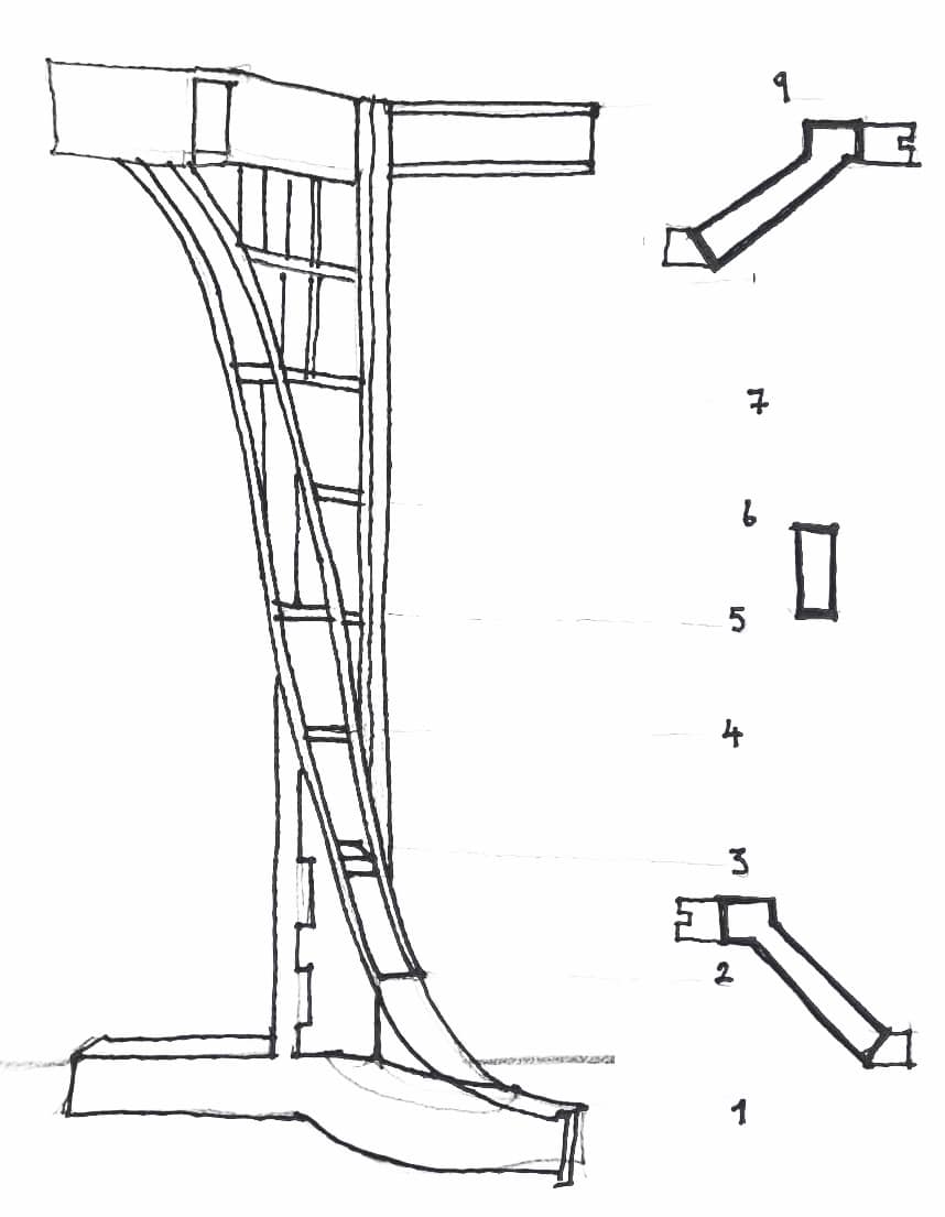
In simple terms, the precast fin’s geometry is a twisted serif ‘I’ shape in elevation. If its lower plan is like an ‘S’, its mid-centre plan is a rectangle and its upper plan is like a ‘Z’. Plans, sections, and elevations only provide a partial description, as the complexity of this shape lends itself to a three-dimensional drawing. The unit rotates a plane of a wall or window by 7.5 degrees and sits on a circular ring beam. When each piece is connected together, the building appears cylindrical, even though its walls are segmented with 48 sides. In the two bays isolated in the assembled facade drawing, it is not immediately apparent that they are an extract from a circular building.
The challenge of these drawings was to guarantee precision in the construction process. The system of precast concrete used was Schokbeton, a patented process where the concrete mixture contained in a mould was vibrated during casting. The concrete mould was placed in a shock table the size of an articulated lorry and raised and lowered by approximately 6mm two hundred and fifty times a minute. This consolidated the concrete mixture, resulting in better strength for thinner forms. Much more intricate and delicate solid profiles could be created that could not be realised in stone or cast in-situ with concrete. [6] This method was favoured by one of Johansen’s mentors, Marcel Breuer, and adopted to acclaim by SOM for the Banque Lambert in Brussels. [7] This suited Johansen’s aspiration for a fluid form inspired by Celtic tracery.

Due to the expertise needed for this method, the pieces could only be fabricated in the Schokbeton factory in the Netherlands. Then began a risky engagement between a young architect who had predominantly only completed houses prior to this commission and a Dutch factory that would have to fabricate the pieces. Schokbeton would have to ‘flatpack’ the building and ship the over 1600 precast units, including balcony guards, transoms, and floor segments, across the North Sea to Dublin. If each precast unit was oversized by 3mm this would result in a net error of 1000mm per floor. With the excavation already complete and concrete foundations poured on-site, this would be a very costly error. The stakes were exceedingly high.
Schokbeton’s craftsmanship was key in bridging the gap between the architect’s imagination and the final precise object. In addition to the above three-dimensional drawings, Johansen’s office produced nine hand-drawn plans at equal vertical intervals up the precast unit. Accounts of the production tell how, to get the desired shape, the eventual concrete form had to be first built in a 1:1 timber model. Schokbeton ‘built’ the plan shapes in obeche, an African wood, and connected plywood strips over them to create a smooth curved geometry for the formwork, resembling the hull of a boat. An epoxy resin was applied over this shape and laminations of fiberglass to 12.7mm thickness. To withstand the vibrations of the shock process the fiberglass moulds were connected to plywood supports and a steel frame.
This method is a low-tech example of two-dimensional information being translated into a three-dimensional framework. The process required significant craftsmanship in the construction of moulds, and skilled cabinet-makers were employed to construct the formwork with tongue and groove connections. The architect visited the factory in the Netherlands on more than one occasion to approve the pieces.

When the pieces finally arrived in Dublin, they were brought by lorry from the river Liffey to the site in the suburb of Ballsbridge, and each piece was installed in 30 minutes. Against all odds, there were no errors. According to the architect’s own account the pieces all fitted perfectly in a circular form with three millimetre gaps between the pieces. This is a remarkable achievement. It is the confluence of architectural and engineering imagination; communication through hand-drawing, and craftsmanship in making these drawings physical.
In producing a form with such incredible precision, the drawings reveal a very interesting set of processes. One notable observation is the change in the way architectural information has been supplied over the last half-century. In order to achieve an accurate three-dimensional object, the designers had to draw two-dimensional plan views. While the three-dimensional hand-drawn views give a sense of the shape, they alone could not inform the constraints required for production at the factory. Today, designers can digitally draw in three dimensions, and either supply extremely accurate two-dimensional views extracted from a digital model, or issue a three-dimensional digital model directly to the manufacturer.
Anyone can appreciate the artistic merit of these sculptural forms when visiting the embassy, but the drawings tell a deeper, meaningful story of the months of consideration and collaboration to make these objects real.
Cormac Murray is an architect and author. He is currently working on a book on the architecture of the American Embassy in Dublin.
This text was submitted to the Archive category of the Drawing Matter Writing Prize 2021.
Notes
- ‘New U.S. Embassy to open on March 17th’, The Irish Times (1963, October 25).
- John Johansen, US Embassy – Dublin (2011) from US-Embassy-Dublin (johnmjohansen.com), p.24.
- John Johansen, A Life in the Continuum of Modern Architecture (Milan: L’Arca Edizioni, 1995).
- Jane C. Loeffler, Architecture of Diplomacy: Building America’s Embassies (New York: Princeton Architectural Press, 2011), pp.218-240.
- Jayne Merkel, Eero Saarinen (London and New York: Phaidon, 2005).
- A. E. J. Morris, Precast Concrete in Architecture (New York: The Whitney Library of Design: 1978), p.165, p.204, p.497.
- Jack Pyburn, Schokbeton in the USA from Concrete and Modernism: Technology and Conservation (Docomomo US, 2018), pp.16-23.
