Construct
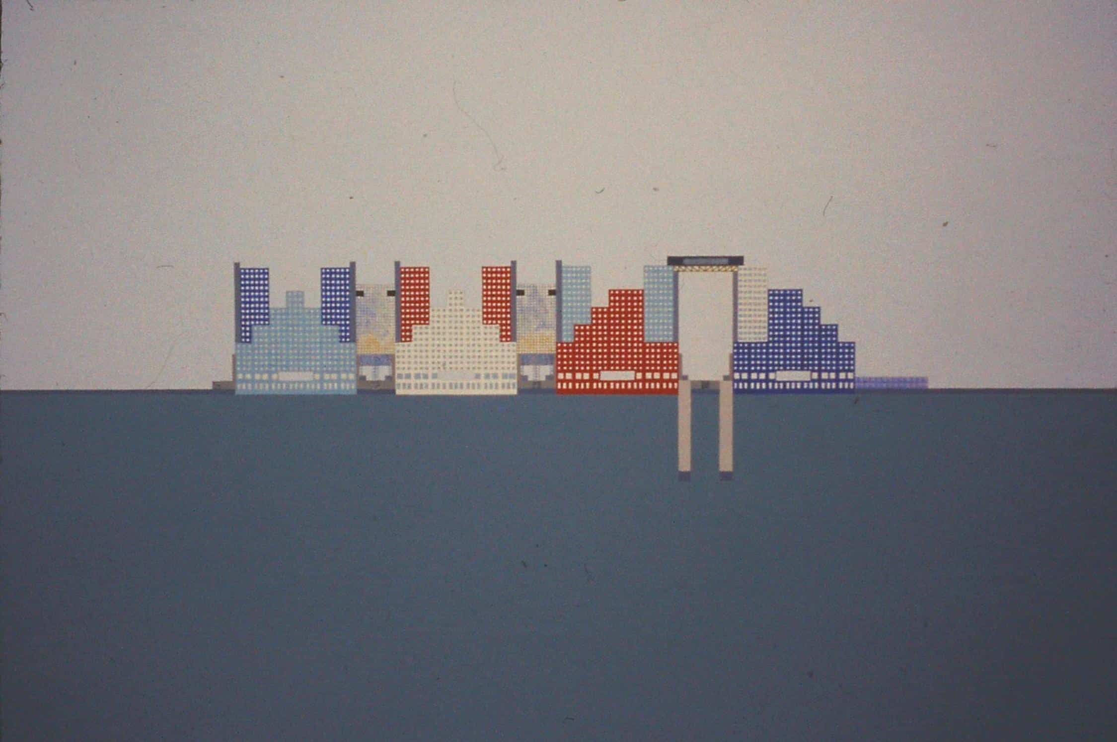
In 1975, OMA (the Office for Metropolitan Architecture) produced two projects for Roosevelt Island (formerly Welfare Island), in New York’s East River, between Manhattan and Queens. The thin sliver of land—historically treated as ‘a storehouse for “undesirables”’ [1]—was undergoing a process of redevelopment under the New York State Urban Development Corporation. By this time, the island had already seen ten years of half-hearted ‘urbanisation’ [2]—a situation that OMA had, in a general sense, undertaken to counter with ‘localised points of very intense and explicit architecture’. [3]
At the south end—on the site of a former smallpox hospital and overlapping with what would become Louis Kahn’s FDR Four Freedoms State Park—Rem Koolhaas conceived the Welfare Palace Hotel (included in the appendix of Delirious New York). Further north, a competition was launched for a large housing scheme, on the west side of the island between the Roosevelt Island Bridge and Pony Field (one of the few OMA schemes for Manhattan not to be featured in Koolhaas’s Retroactive Manifesto—and also not making it into the so-called ‘Ideological Landscape’, as rendered by Zoe Zenghelis). [4]
The housing competition—led by Elia Zenghelis in collaboration with the three other founding partners—applied many of their emerging principles of Manhattanism, while being arguably the office’s first realistic project. [5] The following sections use OMA’s entry to the competition to discuss four (there are more) of their early preoccupations.
Context
Despite contemporary assumptions (largely traceable to a misquotation of ‘Bigness’), OMA emerged from a specific interpretation of the idea of context. [6] They inserted themselves deliberately into the context debate of the 1970s, in a way that was antagonistic and realist. OMA directly opposed the ‘phony and fabricated attempt to resuscitate some kind of architectural past and a Nineteenth—or maybe even Eighteenth or Seventeenth—Century concept of a public realm’. [7]
Rather than attempting to ‘look a bit like the neighbours’ or pacify citizens with images of the ‘good old days’, OMA’s contextualism could be described as radical acceptance. Koolhaas has articulated the journalistic roots of this more than once, as well as the exaggerated analysis needed to glean architectural ideas from found reality. [8] In Manhattan, this had two layers: first, an overarching idea about the city itself, in this case ‘Manhattanism’; and secondly, a particular way of looking at an individual site. While the former can be understood as a general theory for working with the metropolis, the latter depends on further conflicting and contradictory mechanisms.
A given site is subject to ‘the most clinical inventory of the actual conditions […], no matter how uninspiring, the most calculating exploitation of its objective potential’ plus a narrative or symbolic interpretation. [9] As a result, any site (regardless of how insignificant it might seem) becomes a vital fragment of the urban landscape. This tension or mutual dependency of the rational and irrational—between realism and surrealism—is the key to OMA’s ability to both deal with reality and exceed it (something that often causes confusion: replacing moralism with enthusiasm, which still makes many architects anxious).
Alongside the precise content of the brief (always taken seriously by OMA), their approach to the site of the Roosevelt Island competition takes account of all factors: its location on the waterfront, facing Manhattan; the specific ways of access and the many ways the site can be perceived; the implications of the mode of development to which the island has been subjected; its relationship to the urban form of New York; the objects, spaces and activities around the site’s edges; and the opportunities that it can offer its future inhabitants. OMA’s solution is to interpret the site as an outpost of the ‘mother island’—not an escape portal like Coney Island, but an annexe of the metropolis from which spatial and ‘lifestyle’ alternatives can be derived from the same basic rules. [10]
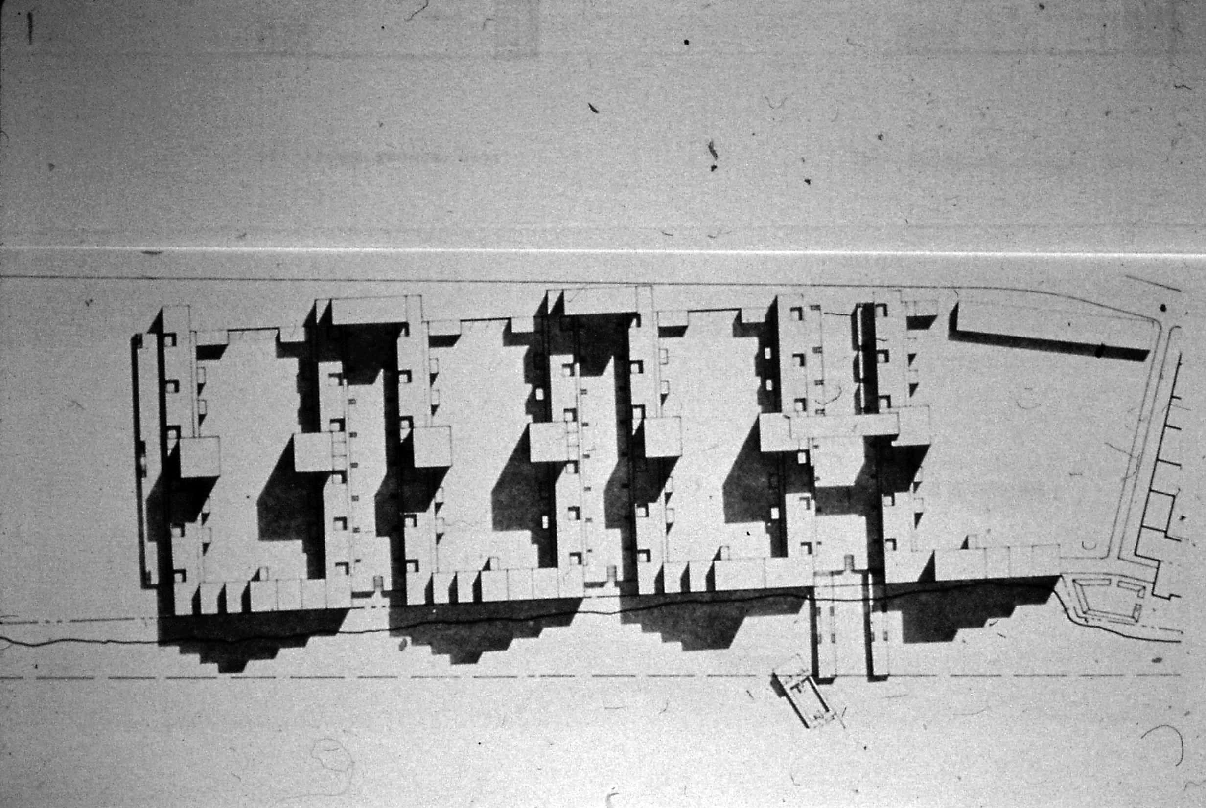
OMA simply extend 73rd, 74th and 75th Street directly from Manhattan, across the East River, on to the site. However, unlike the typical Manhattan approach, they do not provide different architecture for each block, but transform the four-block arrangement into a single—albeit aggregate—urban form (superimposing the adjacent modernist housing complexes on the parti of Manhattan). Into this framework they then interpret, develop and rearrange the primary components of a typical Manhattan block. [11]
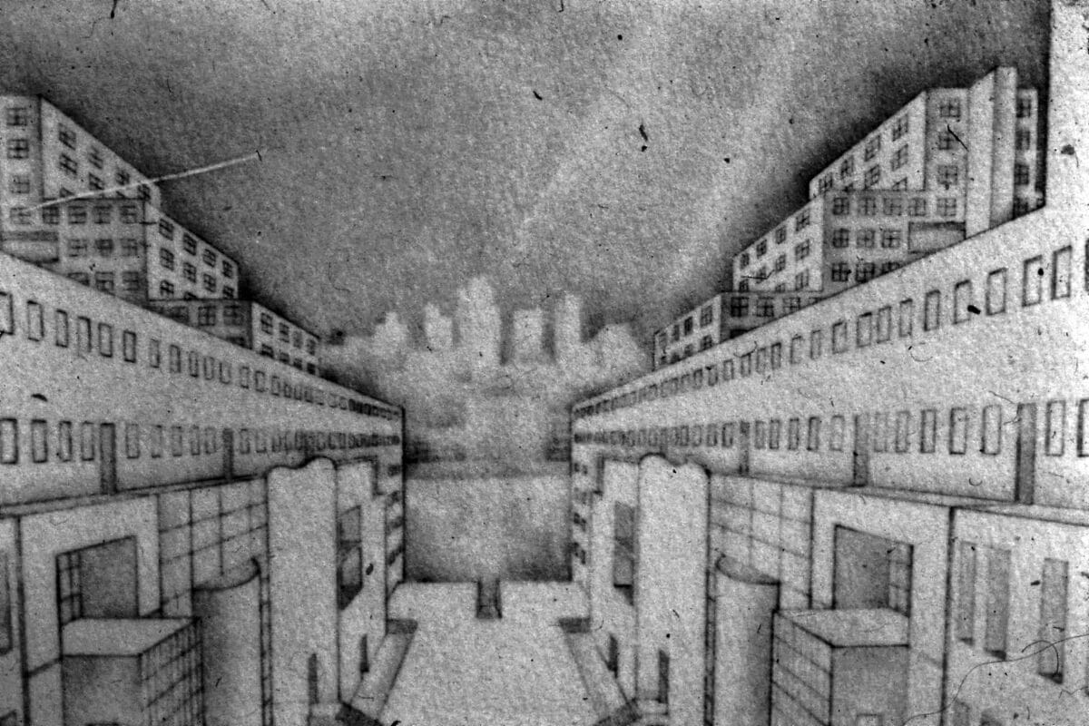
The result of this operation is a kind of offshore domestic resort: a reconstitution of metropolitan components with a greater capacity for homelife and communality. The arrangement takes seriously the question, ‘What is special about living here, opposite Manhattan, and what do I gain from not being over there?’ In this sense—and in line with the logic of The Grid—OMA’s solution is a further contribution to the metropolitan landscape [12]—one that, in an act of unsolicited empathy, could also make sense of Roosevelt Island’s recent past: giving value to an environment that could otherwise be considered ‘people storage’. [13]
Composition
In the early years, OMA were unapologetic in their attitude towards composition. [14] While this (unavoidable) activity had been condemned as frivolous during the preceding decades, OMA’s work during the 1970s and 80s engaged in composition as a pragmatic method as much as a source of enjoyment. Their particular mode of composition—with its roots in strands of Modernism (in art and architecture)—allows OMA to bring things together that might otherwise be considered incompatible, into unique and functional arrangements.
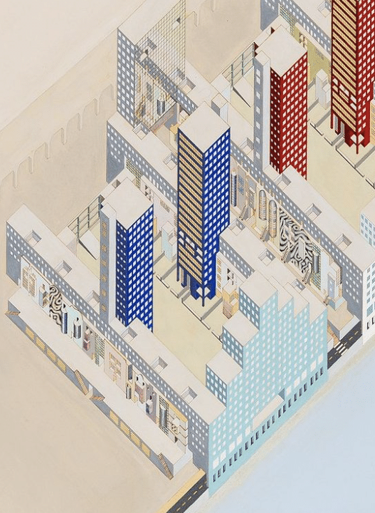
On Roosevelt Island, these parts are formal and functional, urban and symbolic, combining elements of Manhattan’s lexicon with base types from the Modern tradition. Each piece is used for a particular purpose, skilfully arranged and fitted into the overall composition.
The process of putting things together works across scales. A collage of materials is selected for their combination of New York-ness, modernity and luxury. Glazed bricks (referring to the historical New Amsterdam through the colours of the Dutch flag), glass, mirror, plastic and marble are arranged in the overall form, its principal parts, urban and domestic roles, and inward- and outward-facing elements. [15]
These elements are: head or ‘gable’ block; linear slab; mid-block tower; slab tower; ‘brownstone’ facade plane; monumental garden wall; and bridge.
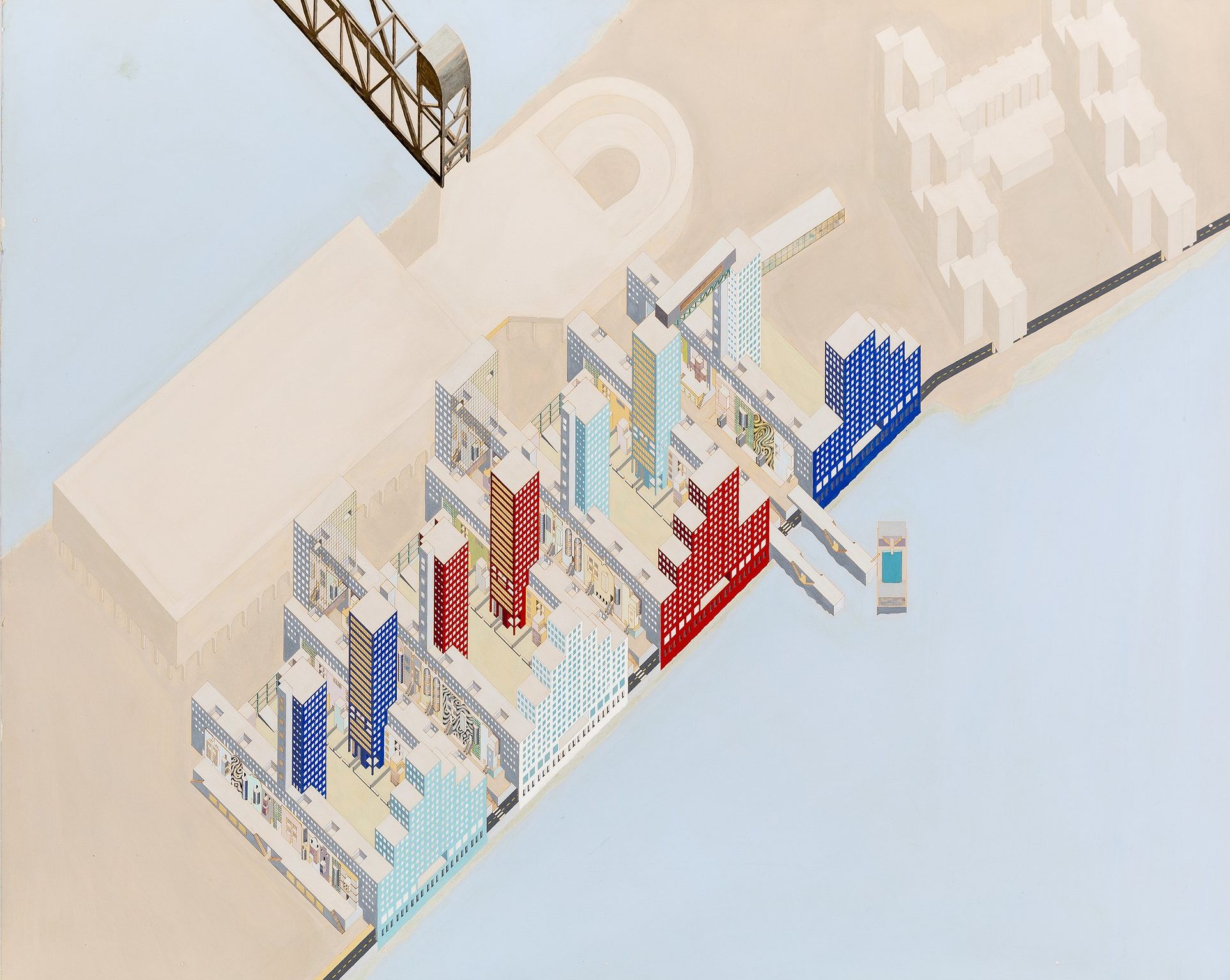
The slabs organise the site east to west, providing the basic urban structure. On the west side, the ziggurat-like head blocks face Manhattan across the East River, providing the main components of the ensemble. Mid-block towers intersect the slabs, facing one another across the gardens and consolidating vertical circulation. On the Main Street side, slab-towers bridge over 73rd and 74th Streets, terminating the composition—with mirrored facades, artificially extending the new streets—and enormous framed boundaries enclose the gardens with a defined but uninhabited edge to the south-east. The bridge rests across the top of two mid-block towers, like a portal towards the Roosevelt Island Bridge, to and from Queens.
A striking quality of OMA’s approach is that it is not only about the composition of an architectural entity, but how it works within the wider metropolitan landscape. At this scale, both the urban form and the building-parts contribute at varying distances. OMA’s arrangements go one step further than ‘The Block Alone’ theorem, being at once autonomous and relational. [16] The figure of the project—composed as it is from identifiable parts—constitutes a legible whole, in the tradition of modernist welfare state ensembles. At the same time, the distribution of the parts engages the whole with New York at a scenographic level, as an urban composition.
Collectivity
In Delirious New York, Koolhaas describes the population of Manhattan as the ‘proletariat’. The project of mass society is central to OMA’s thesis until at least the early 90s. [17] In particular, they have consistently desired to address the possibility of the collective within an increasingly individualised and commoditised world. They regularly expressed their frustration with architectural culture’s lack of engagement in this reality—reserving a special disdain for the inward-looking response of the profession whenever it feels threatened or uncomfortable.
Two themes that run through OMA’s early projects are the possibility of a popular architecture and the explicit inclusion of collective facilities. Leaving aside the complexities of popularity, at Roosevelt Island—as in the group’s other New York projects—the role of communal, recreational and pleasure-giving space is of primary importance.

The arrangement of the brownstone slabs facing on to each street organises the site into bands of street-slab-garden-slab-street, open to the water (OMA will later use a similar perpendicular format to allow visual and physical access to and from the waterfront at the IJ-Plein, in north Amsterdam).
Inside the blocks, the communal gardens are monumental in size and scope for collective life. Towards the city, a ‘riverside colonnade’ runs through the ground floor of the head blocks, linking up the waterfront. The extension on 72nd Street terminates in a pier projecting into the river, ready to dock the floating pool, ubiquitous in early OMA work (myths from the office’s writing and paintings, made concrete in a general arrangement). The bridge, crowning the composition, contains a restaurant with views between Manhattan and Queens.
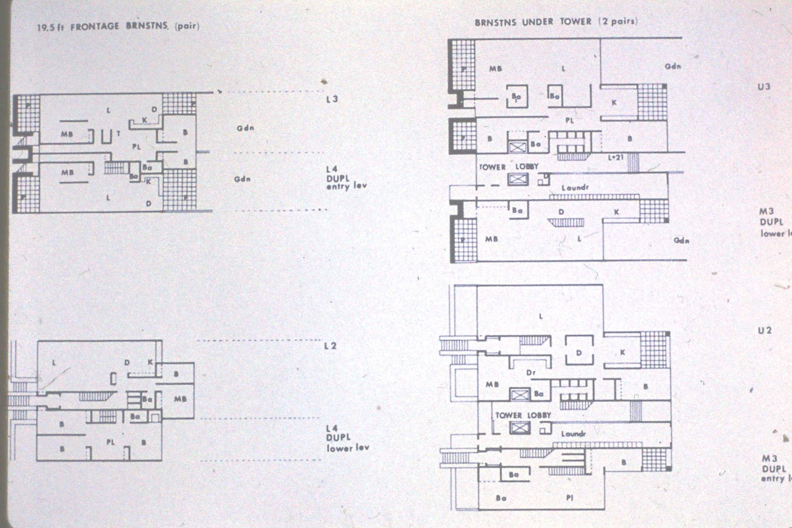
For dwellings, apartments are provided with multiple terraces and balconies, gardens and patios. In the arrangement of the homes, more space is given to those areas associated with pleasure. Purely functional aspects are as compact as possible, with the living, dining, sleeping and recreational areas organised as a larger domestic landscape, each subtly articulated by the distribution of linear walls producing smaller or larger spaces. [18]
In this—and other projects of the time—OMA take up the reins of a discipline with the power (benignly or not) to contribute ambitiously to the experience of everyday life.
Constructivism
Of the many movements that jostled for supremacy in the early 20th century, Constructivism, despite its apparent obscurity, may well be one of the more relevant to our own time (or indeed any moment in which architecture’s operative capacity is in doubt). Anyone who has studied architecture will have come across it as a genre—usually summarised briefly as an appendix to the Modern Movement—but few practising architects (in Western Europe, at least) would be able to express an understanding of it.
Maybe that doesn’t matter. But what does matter is the idea that architecture’s role in the contemporary world can be more than mere mitigation. Constructivism suggested the potential for architecture to engage in contemporary reality without having to choose between activism and practice, citizenship and the discipline. It was an attempt to engage in the project of contemporary society precisely through the means of architecture: space, form, material and organisation.
OMA saw this potential. They also saw its ideological shortcomings in the context of a world in which the public realm (in the Arendtian sense) has been exchanged for a space of consumption, at the expense of either discourse or consensus. In New York, they found that the project of Constructivism was being realised unconsciously. Outside all doctrines (and outside the frame of European aesthetic prejudice) it had proven the natural and logical attitude to dealing with reality: putting things together and making things happen.
In Constructivism, OMA found the potential for architecture to deal with the scale, speed, economy, content and desires of contemporary reality. It was a movement concerned with building a world for an emerging society, in which architecture could play the role of enabler and conditioner. It gave them a theoretical grounding from which to accept external forces and accommodate contradictory requirements as the subjects of architectural composition: the art of synthesising diverse content into coherent projects. To paraphrase Hannes Meyer: ‘architecture is organisation’. [19]
Richard Hall is an architect and, with Emma Rutherford, a founding Director of General Office. Richard is conducting Drawing Matter’s ongoing research into the early working methods of OMA. This research is primarily based on two sources: a close reading of the repertoire of drawings, images and models produced for particular OMA projects, and a series of interviews with contributors to this process.
Notes
- Rem Koolhaas, Delirious New York: a Retroactive Manifesto for Manhattan (New York: Monacelli Press, 1978).
- Ibid.
- Elia Zenghelis and Rem Koolhaas, lecture on ‘OMA projects’ (London: Architectural Association, 1976). Courtesy of AA Archives.
- MoMA.
- Hamed Khosravi, Do You Remember How Perfect Everything Was? The Work of Zoe Zenghelis (London: AA Publications, 2022).
- Rem Koolhaas, ‘Bigness, or The Problem of Large’ in S,M,L,XL (New York: Monacelli Press, 1995).
- Elia Zenghelis and Rem Koolhaas, lecture on ‘OMA projects’ (London: Architectural Association, 1976). Courtesy of AA Archives.
- See lecture here and Rem Koolhaas, ‘We Are Like Surfers on the Waves: Work Methods at OMA’ in Rem Koolhaas: Urban Projects (1985–1990) (Barcelona: Quaderns, 1990).
- Rem Koolhaas, ‘The Terrifying Beauty of the Twentieth Century’ in S,M,L,XL (New York: Monacelli Press, 1995).
- It is also interesting to compare OMA’s approach to that of their mentor and occasional collaborator, O.M. Ungers.
- From a conversation between Elia Zenghelis and the author, February 2022: ‘We decided to just follow – or reinterpret – the typology of Manhattan, which is basically a tower, or large building, at the end of a block; a mid-block tower; and then the remainder of the streets are the traditional New York brownstones.’
- Rem Koolhaas, Delirious New York, op. cit.
- With reference to Peter Carl’s assessment of the understanding of housing in contemporary society.
- See Elia Zenghelis, ‘The Image as Emblem and Storyteller’ (Architecture Foundation and Drawing Matter, 2022) here.
- From a conversation between Elia Zenghelis and the author, February 2022.
- Rem Koolhaas, Delirious New York, op. cit.
- This may still be an undercurrent, but remained an explicit intention in projects such as Euralille.
- ‘In the end, what one was dealing with, in the planning of apartments, was a gradation of spaces ranging from the most public and social to the most private. This gradation had to do, to a certain degree, with volume and size. So, one had to deal with nothing else except big rooms and small rooms. There was no magic to planning an apartment than putting together big rooms and small rooms and the rest would depend on lifestyle.’ Elia Zenghelis from Elia Zenghelis and Rem Koolhaas, lecture on ‘OMA projects’ (London: Architectural Association, 1976). Courtesy of AA Archives.
- With reference to Werner Möller and Tim Leik (eds), The Co-op Principle – Hannes Meyer and the Concept of Collective Design (Leipzig: Spector Books, 2015).
