Writing Prize 2020: Drawing People

Representations of people are central to our ability to inhabit drawings, to make sense of them, understand their scale, their atmosphere, their character: to exist in the world that the drawing constructs. These images of people are immediately recognisable by all, but are we all able to recognise ourselves amongst those who populate the drawn world?
Because they are our yardstick, we measure ourselves against representations of people as much as we measure against them the buildings they inhabit. Far from being a benign, apolitical community, the host of tiny characters to which we are exposed tells us something about how society – through the lens, hand and pocket of the draughtsperson, client, company, etc. – perceives us. Looking at the people on the page is in many ways reflective of how an image of society is fabricated, held and reproduced.
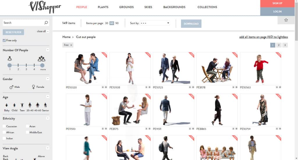
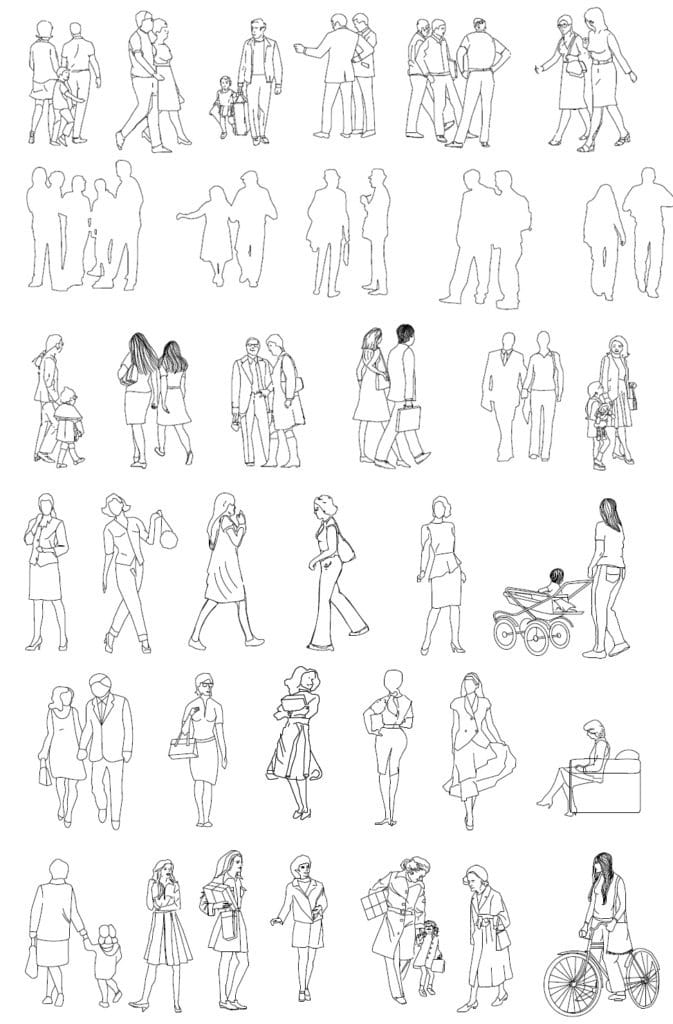
Given the centrality of people in our depictions of space, it is surprising how little attention is paid to whom we draw, why and how we draw them, and the role that they play in the drawing. It is a common joke in our profession – and especially in education – that we see the same CAD blocks or cut-outs over and over again. Who could forget the ubiquitous toddler with the red balloon? But behind this humour is a more serious set of issues that lie at the heart of drawing practice, namely, the limited way we represent people within drawings, which enables us to disregard with expedience much of the gamut of society we design for.
Depictions of people in drawings are so conforming that they could almost be described procedurally by a set of rules. Such a ‘taxonomy’ of people in drawings might go as follows:
- All CAD people are slim, and European. They wear normative clothing appropriate to their gender (which is, of course, never anything except one or the other). They have sensible hair and unremarkable features. They would be welcome to join even the most conservative of family dinners.
- If they are doing sports, they are men, unless it is an activity allowing for revealing outfits, in which case they are women.
- If they are construction workers, they are men. If they are dancers, they are women.
- If they are men, they stand in groups, suited, pointing confidently, stroking their chins and agreeing with one another. They carry briefcases. Their body language is assertive and self-assured.
- If they are women, they carry shopping, or push prams. They’re fashionable, slim and attractive. We see their bare skin. Their breasts and hips are exaggerated, and their bodies are projected towards the viewer. They stand either sexually or submissively. If the drawing is detailed, they have perfect teeth (no gaps), inflated lips, and a coquettish expression. A radiant smile is fixed to their faces.
- If there is a child, there is a mother. If you see a man and woman together, it is because there is a child. The man is slightly in front, the woman looks up at his face (graciously). The child runs happily towards the viewer, clutching a red balloon.
- If there are two men together, or two women together, they are just friends.
- If they are not fully ambulant, or possess any disability at all, they are either elderly people or wheelchair users. They don’t have tattoos or piercings. They don’t have crutches or slings. They have the normal number of limbs.
- If there is an elderly person, they are not doing anything except looking elderly (graciously). They have spectacles, and probably a walking stick, and their back is curved and hunched. They look frail.
- If there is a wheelchair user, they do the same thing as all the others, which is sitting back patiently like a prop, waiting to be moved. They are usually male, and they all wear the same clothes. An ugly, voluptuous jumper swallows their body to save the draughtsperson the extra work.
- If they are not slim, then their bodies are hidden. Return of the Jumper. There are no big people, and all bodily proportions are ‘normal’.
- All men are 6ft. All women are 5ft 6ins. If they are old then they are a bit shorter (because of the hunched backs).
- If they are not white, it is highly unlikely that they are black, or going about their business alone. If they are, they must smile broadly so as to be unthreatening. If they come in groups, they are insulated by a throng of white people. They are downloadable in separate file-packs, classified solely by race. They wear types of clothing that emphasise their status as outsiders.
- If you do see non-white faces, then they are of ‘normal’ gender, physique and ability. If they are in any way different then it is only ever in one dimension. This world is yet to even imagine the idea of intersectionality.
- But don’t worry: if their skin is the ‘wrong’ colour, or their body is the ‘wrong’ shape, or their hair the ‘wrong’ style, you can change it in Photoshop.
- If they help you sell the building, then use them.
- And if you can get a picture of them on your camera, they are fair game.
It’s a complicated web of issues, though we are all aware of the problem. The wide gaps in law and code surrounding the data privacy of the body, and the profit-driven demands of a particularly vampiric form of capitalism, enable the perpetuation of this behaviour. However, a long history of research and activism (including that which boils over yet again on to our streets today) calls out how white supremacy polices whose bodies can be understood as human, and, consequently, can freely navigate both drawn and built space. This demands that we reform.
Fortunately, there are already a number of designers and artists who are challenging the structures endemic to architectural drawing. We can look to them for inspiration:
Escalalatina is a project that foregrounds the use of Latin American people in drawings – and, with this, their stories and lives – in an accessible format. By encouraging people to define themselves as a ‘cut-out’ scale, they aim to raise visibility of themselves within the architectural community. (https://www.escalalatina.com/quienes-somos/)
Vector_Vault works to diversify the range of people visible within vector-based cad blocks by producing drawings of under-represented bodies. Their work is specifically aimed at students and other non-commercial uses. (https://vectorvault.webflow.io/about)
Nonscandinavia presents a range of image types, all focused on showing a wider variety of people than is currently available. They are transparent about the often complicated legal classification of these images, and this helps people to make informed decisions and think critically about the use of another person’s body. (https://www.nonscandinavia.com/about)
These groups represent just a sample of the movements challenging the rules of representation. In doing so, they are creating new ways through which we can start to break down – and rebuild – the conventions that architects use to construct built and imagined environments. No doubt the route to the large-scale, institutional change that is so desperately required will be bogged down by arduous bureaucracy and inertia, but it will also involve many careful, creative and seismic changes that all of us can begin making now. One, fittingly, is by drawing. A call to remedy might read like this:
Draw.
Draw people who are real.
Draw the people in your office, and especially those who are not.
Draw the people in your home, and those you welcome into it.
Draw your friends and lovers, and their friends and lovers.
Draw those you meet on the street.
Draw those you read about in stories.
Draw those you imagine in dreams.
Draw those who are erased, ignored, and invisible.
By drawing, let us re-humanise the page and its proposal.
Not every single drawing must always show every possible type of person. The necessity of any type of mediation, owing to the use of limited formats like the page, is that it shows some things and omits others: the decisions we make therein grant the drawing its descriptive power. But when it comes to architectural drawing, and when the same omissions recur, it reveals to us that there is a problematic pattern of erasure which we practise and perpetuate.
The opening prompt of this competition asks us all to consider what drawings reveal. My offer is that drawing reveals our biases. Drawings are as much a constellation of values and beliefs as they are of lines and hatches, and in this way, to look into our drawings is to look into ourselves. I do believe that we can make change happen, but to do so requires us to keep an active eye on our pen as it draws, and to start to challenge the mythologies that it weaves around us.

This text was the winner in the long form category (1000–1500 words) of the Drawing Matter Writing Prize 2020.

– Daniel Innes