Patrick Gwynne: Colour by Numbers
Preferring the sterile white look, most British modernist architects shied away from colour, considering it to be the domain of the interior decorator—the ‘woman’s role’. But Patrick Gwynne (1913–2003) always loved to use colour in his designs, with sensitivity and knowledge.
As a budding architect in the mid-1930s, Gwynne purchased a box of colour plates based upon the colour theory of Nobel Prize winning chemist and amateur artist Friedrich Wilhelm Ostwald. Produced by German publishers Unesma, the set was distributed in Britain by Winsor and Newton. It would have cost a fair bit, but by the age of 21 Gwynne was already on his third open-top sports car, a yellow and black Wolseley Hornet in which he and a boyfriend toured Europe, visiting modern buildings like Mendelsohn’s Schocken department store and the houses of Stuttgart’s Weissenhof Estate.
Colour harmony was in the air when Gwynne purchased his set, especially amongst the advanced modernists. Le Corbusier had written on the spatial effect of colour and produced his own swatch book of harmonies for a Swiss wallpaper company. And big developments on colour emanated from the Bauhaus throughout the 1920s, with a stellar group of artist-teachers—Itten, Kandinsky, Klee, Albers—developing their own colour systems, all principally influenced by two theorists, Adolf Hölzel and Ostwald himself, who Walter Gropius had invited to speak at the school. Also influenced by Ostwald were the Dutch De Stijl group, including artists Mondrian and Van Doesburg and, in architecture, Rietveld. Ostwald first published on his colour system in 1917, and this is the source of Gwynne’s set.
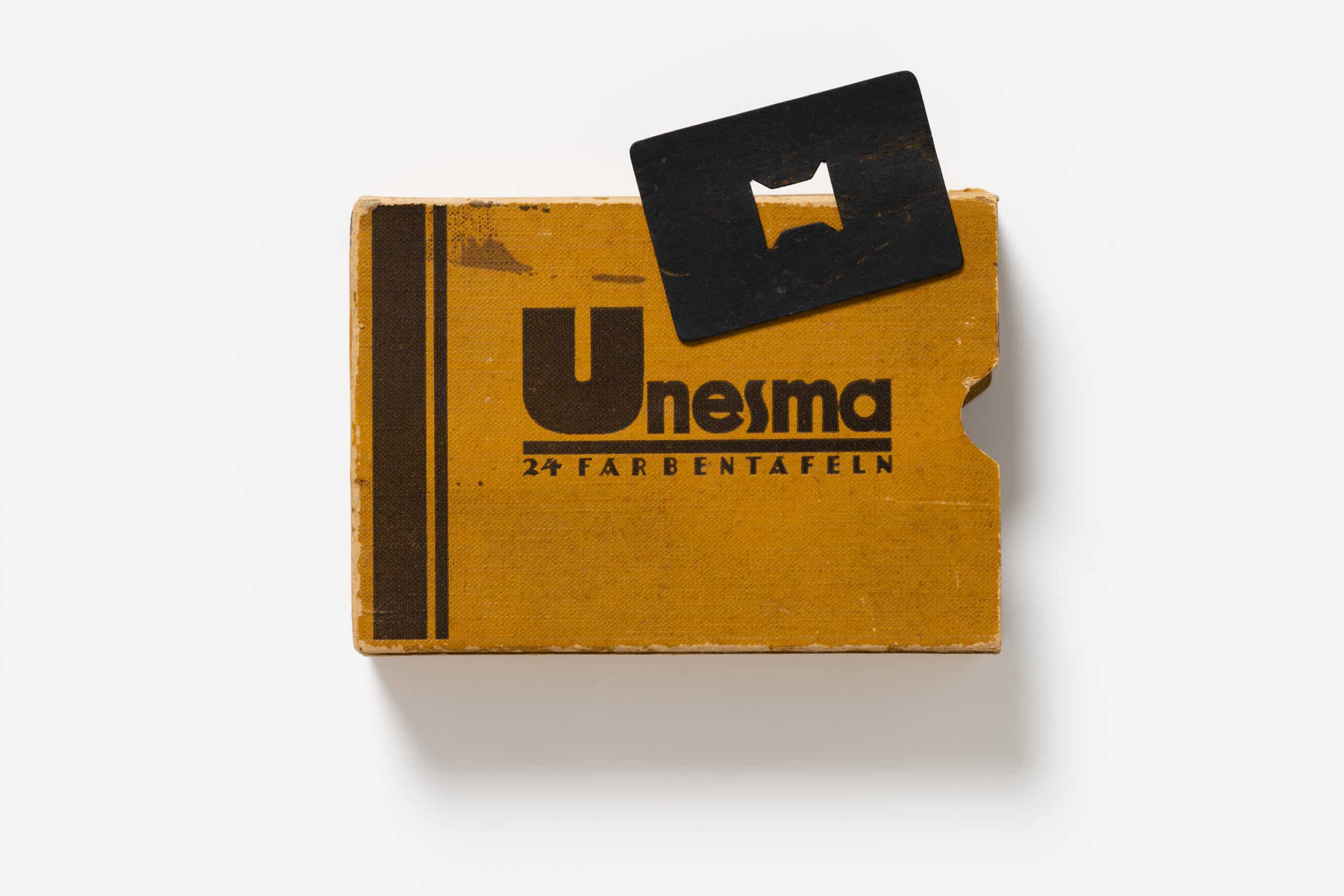
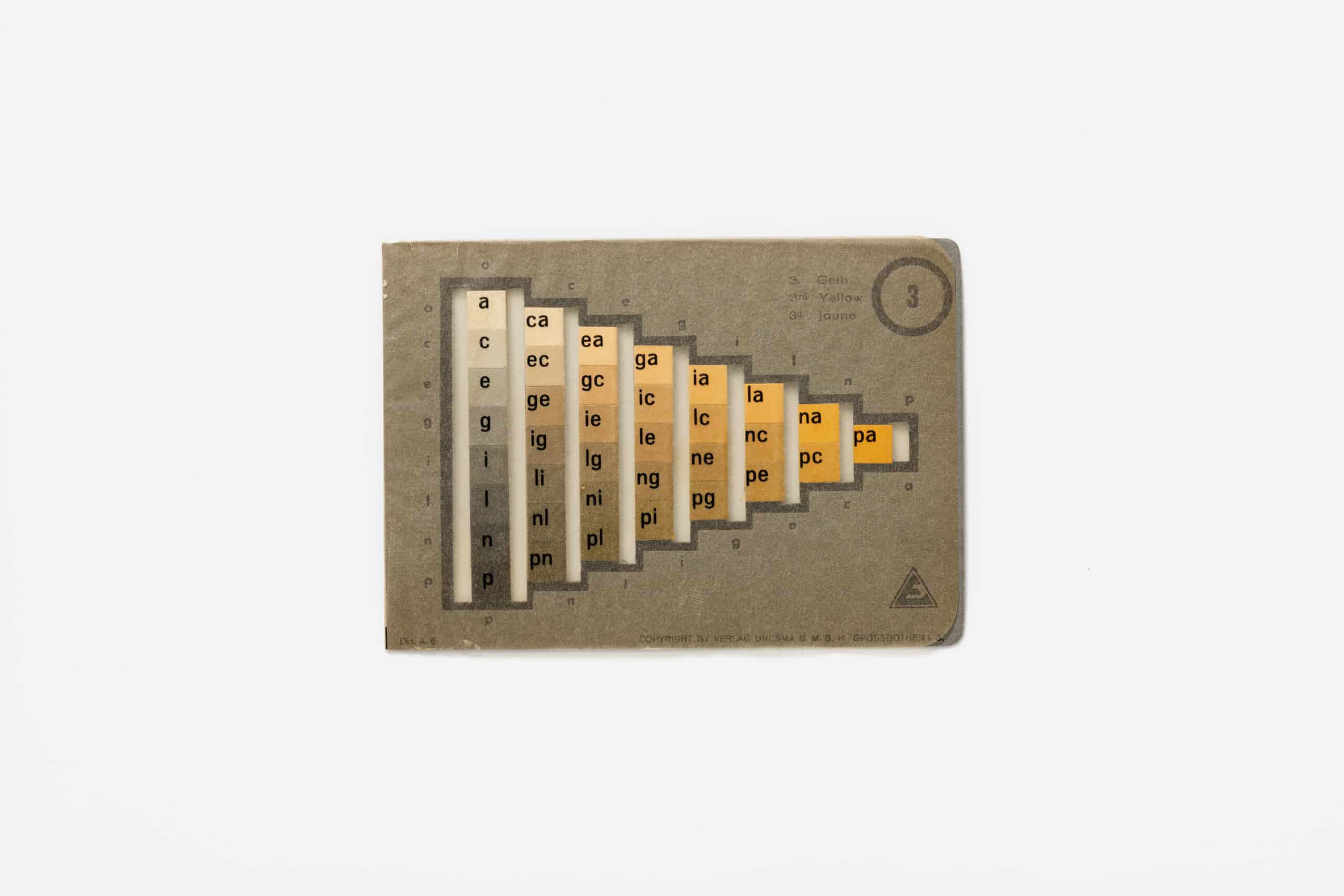
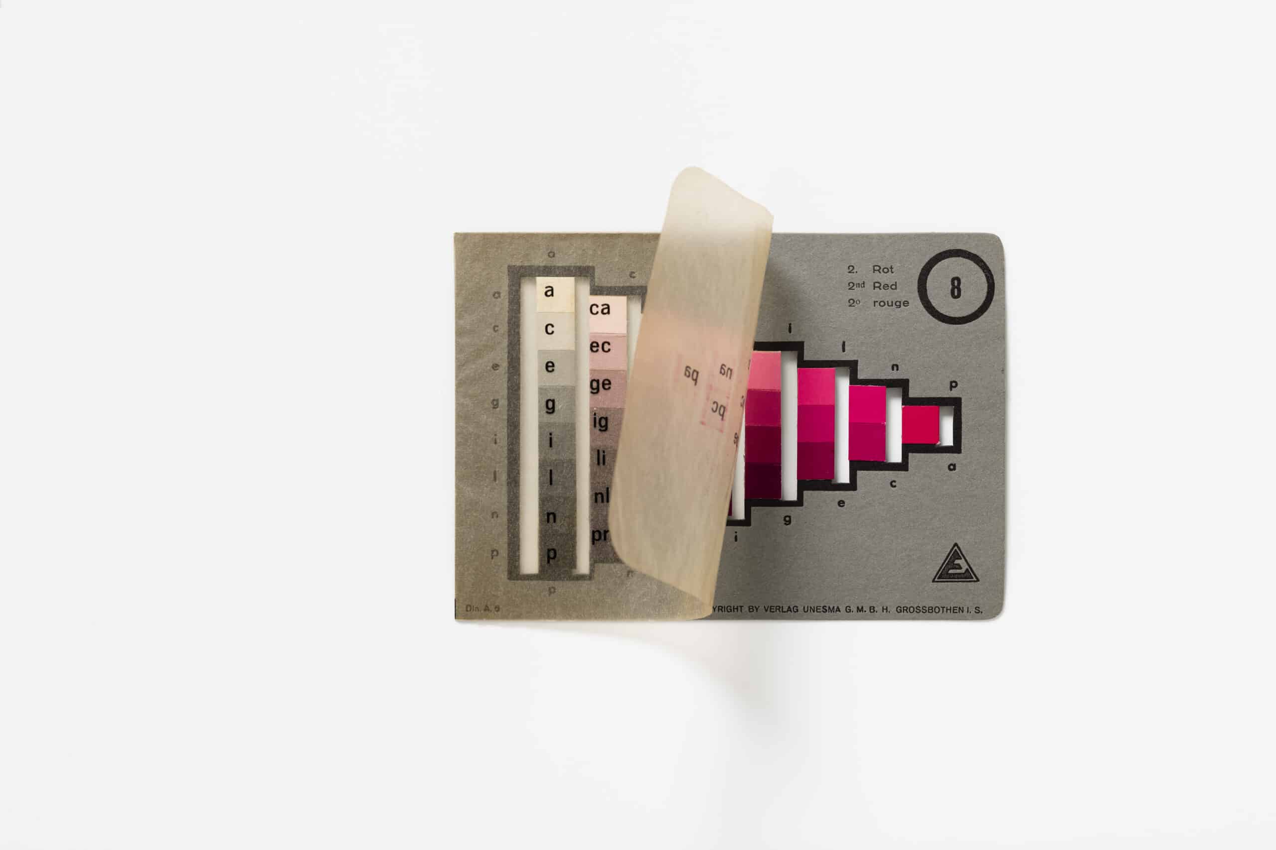
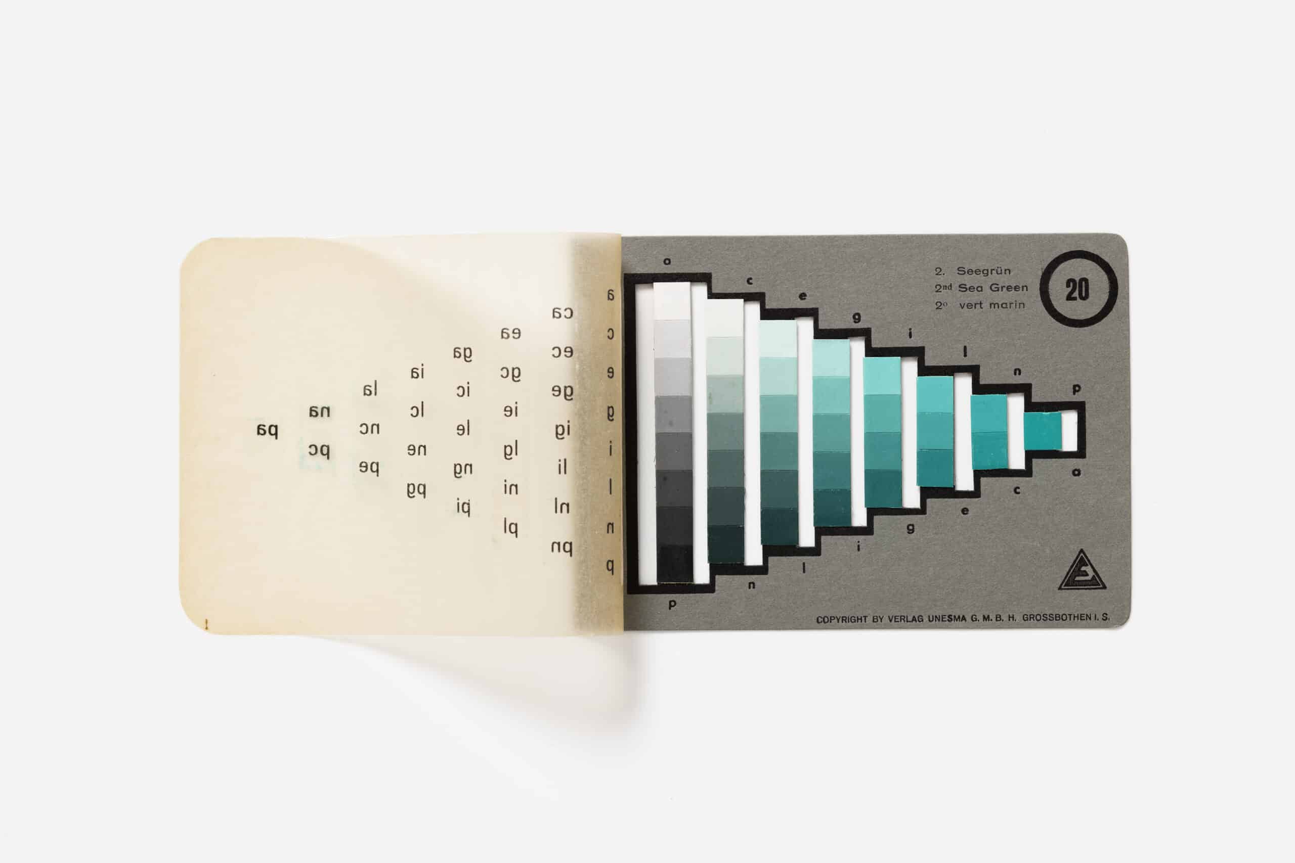
Gwynne’s box is pocket-sized. (They came in other formats, some large and elaborate.) Measuring about 6 x 4 x 1¼ inches, it consists of 24 plates. The 36 colour squares of each plate are arranged in a triangle, the left column always the same, the ‘neutral scale’, a graduation of eight squares between white and black; the paint chips narrowing on the right to one of the three hues of the principal colours: yellow, orange, red, purple, blue, turquoise, sea green and leaf green. The little box therefore offers up 680 hues, meticulously hand-painted and numbered, as the English instruction manual explains, for easy use via telephone and telegraph.
The systematic methodology of Oswald’s set would have appealed to Gwynne’s strong sense of order and rationality. The British market had nothing else like it: the newly formed British Colour Council only produced its Dictionary of Colour Standards in 1934, and it was not theoretical, simply given over to naming colours, and fabricated mainly as bits of dyed ribbon and wool aimed at the textile industry.
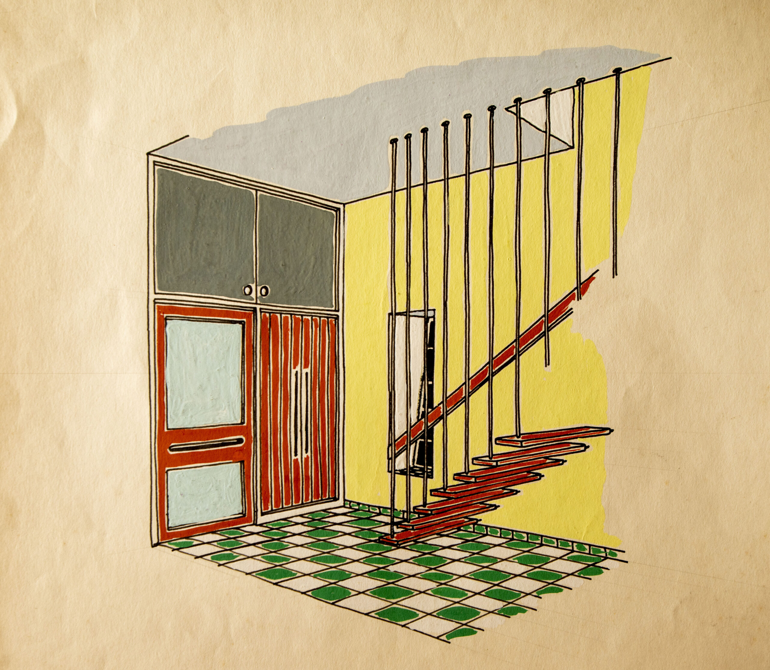
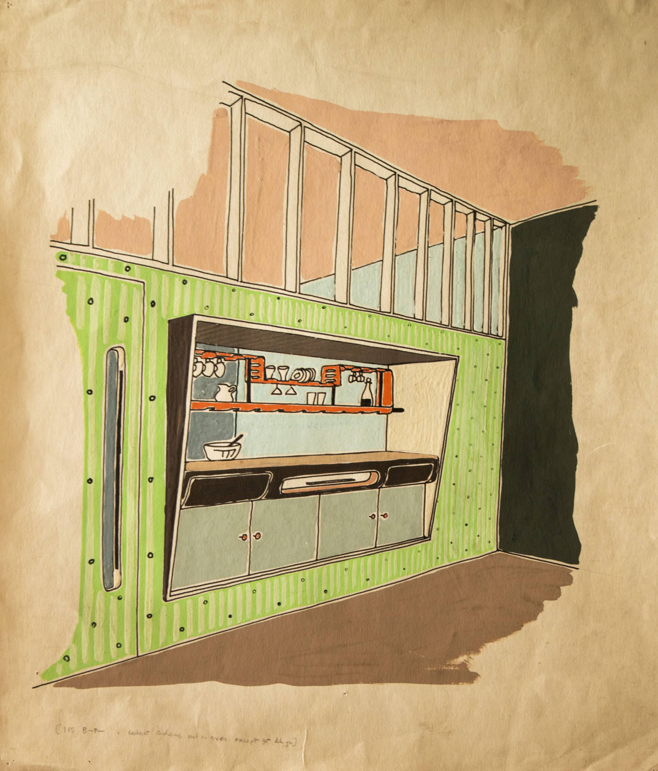
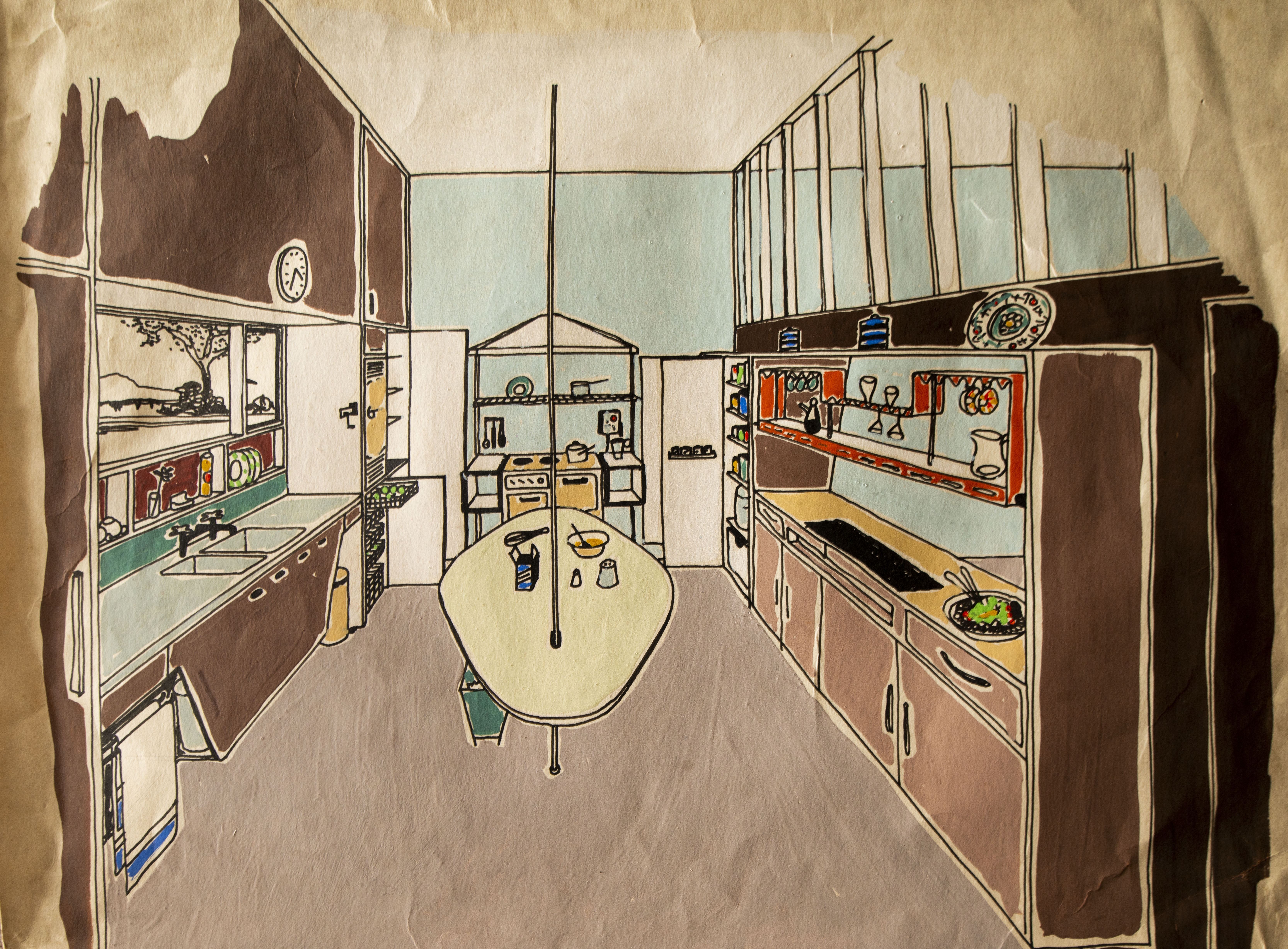
Gwynne used his set, cutting out little windows in card to isolate the colour plates and finding harmonies to apply to his own work. Most notably, in his first major job after the war—a house in Blackheath, south east London, for property developer Leslie Bilsby and his family—Gwynne made a series of gouache design drawings saturated with colour, the hues drawn from Oswald’s plates.
A few years after acquiring the set, Gwynne completed his modern masterwork, The Homewood in Esher, the family home he would live in for the rest of his life (now owned by the National Trust). In The Architectural Review (1938), he carefully articulated the colours applied inside and out: the concrete painted ‘ivory white’, soffit ‘pale blue’, balcony windows ‘brick red’, ‘grey steel frames’, dining-room wall ‘rendered in warm buff with inset chocolate lines’, and so on.
In later years, he transformed its garden façade with the floating colours of large enamelled steel panels by Stefan Knapp. And in the ten acre landscape, he created a series of interconnecting specialist gardens, including one given over to ‘blue and white’, another to ‘grey and yellow’, colour combinations of the harmonious use of Oswald’s ‘neutral scale’ with principal hues.
Neil Bingham’s new book Patrick Gwynne (Twentieth Century Society/Liverpool University Press, 2023) is available now. Find it here.
