Mies: The Berlin Building Expostition (1974)

The following text is excerpted from Oppositions 2 (1974): 86–91.
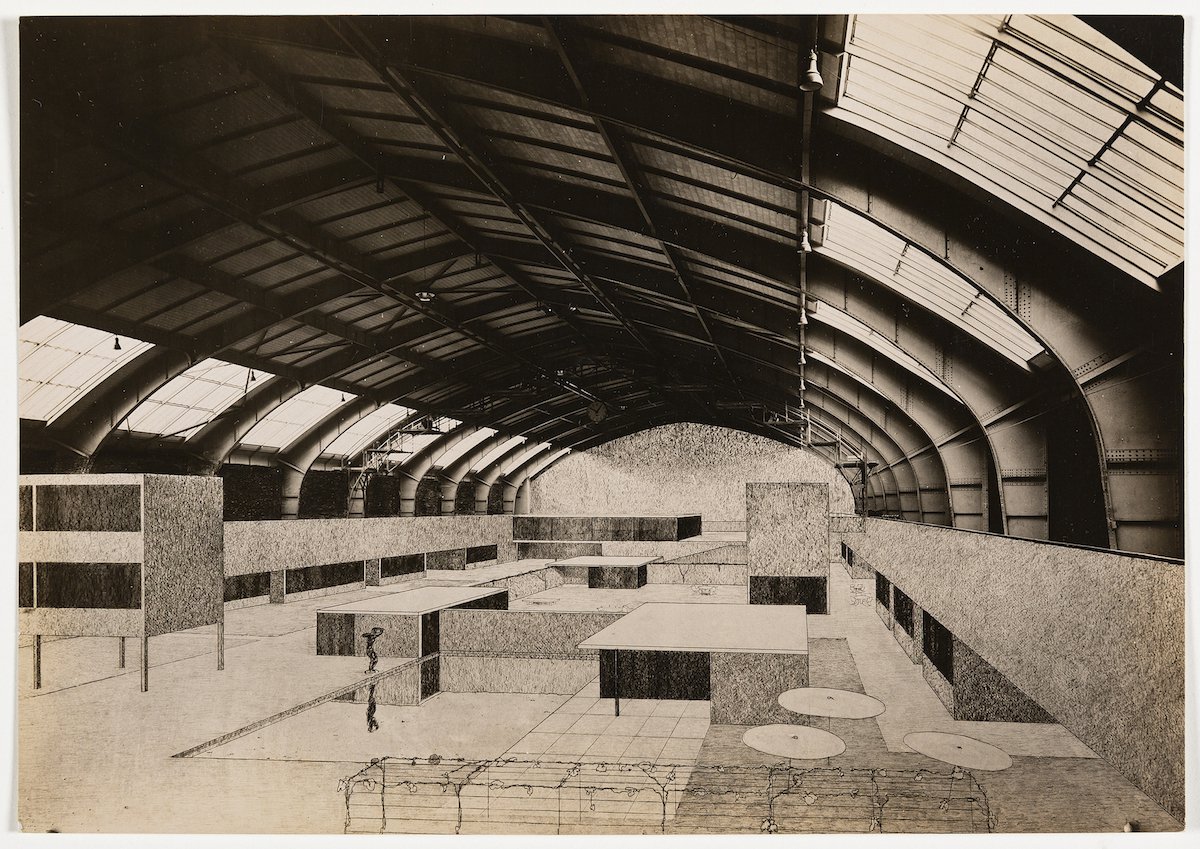
The Berlin Building Exposition of 1931 was the largest of its kind ever to be held. With Teutonic thoroughness every material, every method, every theory that had to do with building was shown in the Exposition. The result of this thoroughness, plus an extraordinary lack of funds for proper presentation, made the exposition, with brilliant exceptions, boring.
The two sections which held the main interest for the layman at least were the International City Planning exhibit, in which, incidentally, America showed up extremely poorly, and the hall devoted to the Exhibition of the Modern Dwelling. This latter, of which Mies van der Rohe was the Director, is the only part of the Exposition which merits discussion from a strictly architectural point of view.
Here two principles of exhibition were employed which American architectural societies might well imitate. In the first place, the Director alone has complete charge of choosing the architecture to be represented. Were New York Exhibition Committees to adopt a like procedure, it would preclude English Tudor houses being shown next to aluminum ones. Moreover, industrial exhibits are selected and arranged by the Director. This would preclude such dreary monotony as the second floor of the League shows. Such an understanding with the Director has a further advantage of creating much better advertising for the exhibiting company than the former hit-or-miss-method. The result of the new system in Mies’ hall is a clear expression of contemporary architecture in the International Style. Even men such as Erich Mendelsohn, who would be considered among the most modern in America, were omitted from the German show.
This severe restriction in the type of architecture shown is not surprising after the recent Expositions in Stuttgart, Vienna, Brunn, Dresden and Skockholm, which were all strictly International in style. Only in England and America does modern architecture have to rent shop windows in order even to be talked about.
What is surprising, especially to an American, is that Mies van der Rohe was chosen to direct this section; the best architects so seldom receive official recognition. In America, since the days of Sullivan at least, contempt for the great amounts almost to tradition. But Mies has a reputation as Director of Expositions that awakens the respect of the most conservative architects. In the Stuttgart Exposition of 1927, he directed the building of the most famous group of houses in the International Style.
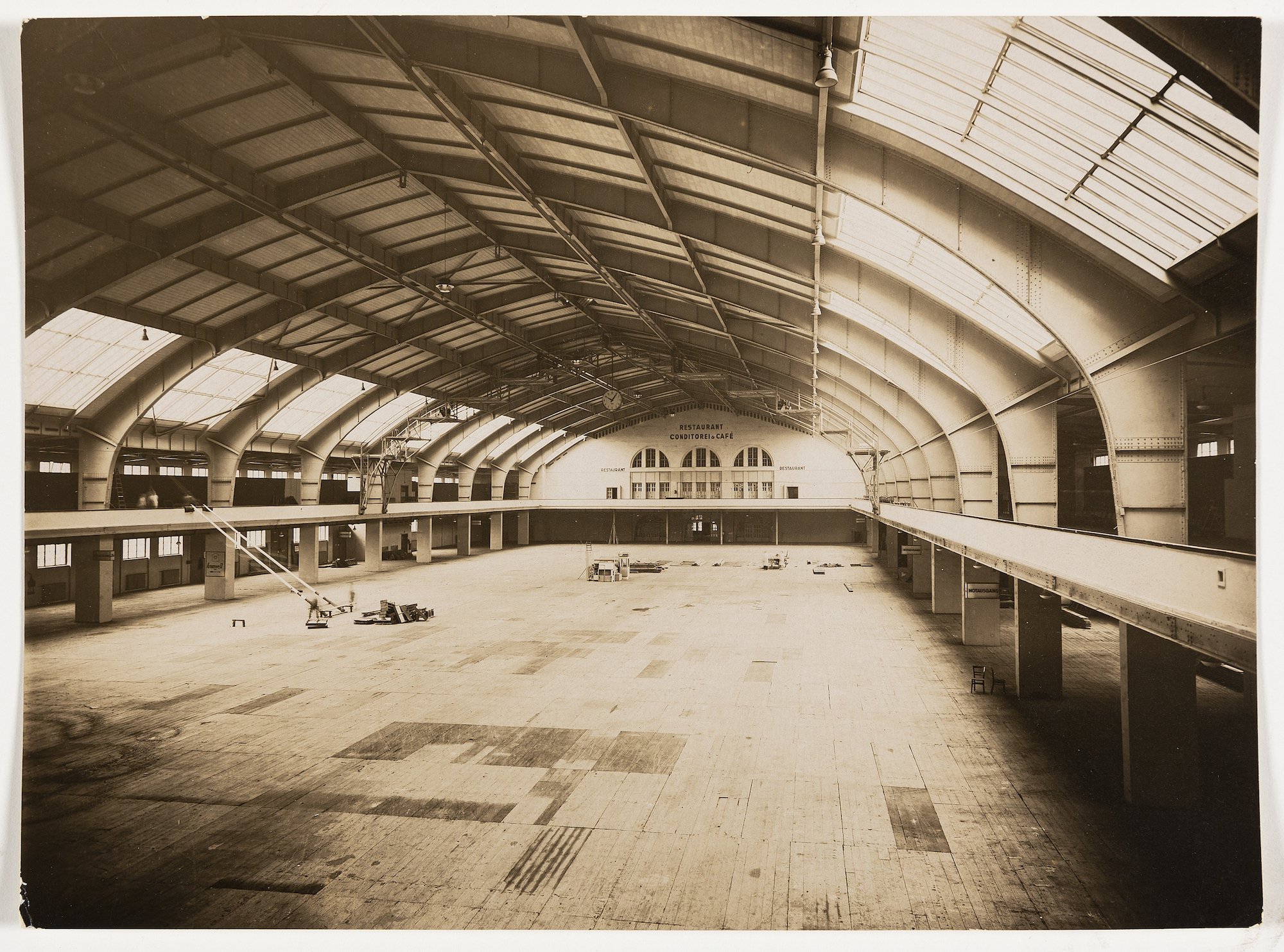
The Exposition this year, built only temporarily and inside a hall where false lighting spoiled much of the effect, has not the importance of the Stuttgart Exposition. Also the time is not so propitious. In 1927 the International Style was struggling for recognition. In 1931 a like Exposition is no great novelty. While not startling, it supplies on the other hand proof of the integrity of a style that in the past four years has persisted without any essentially new developments.
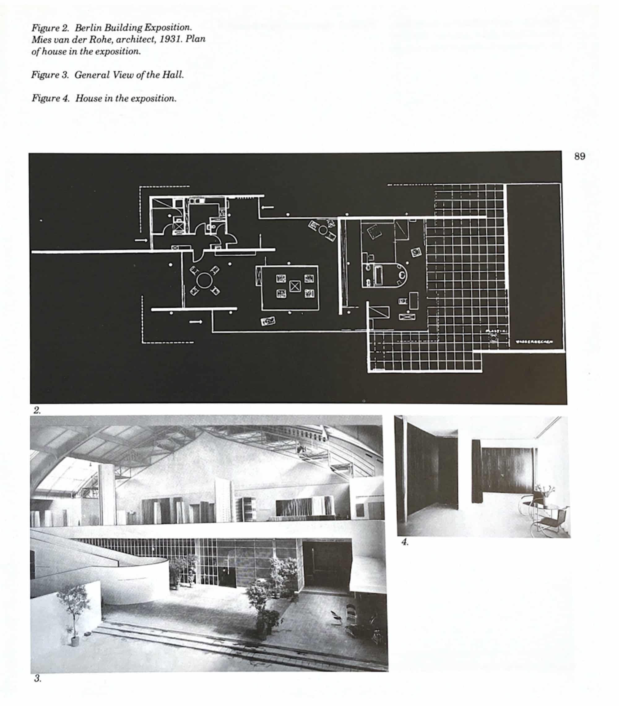
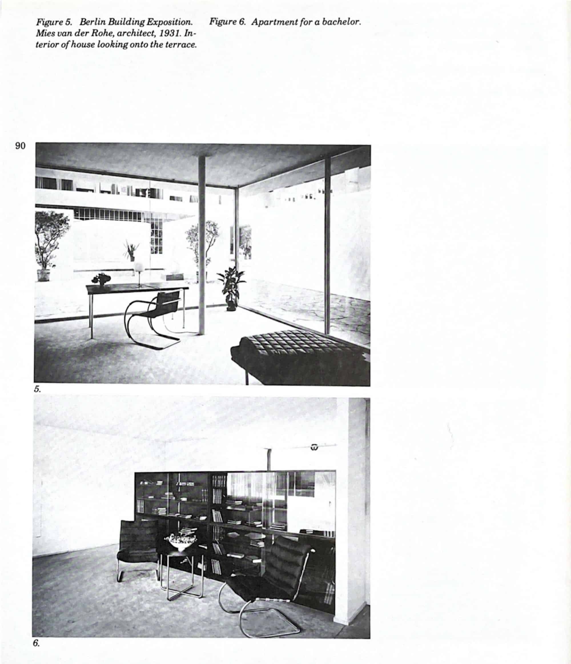
The most important single exhibit was the one-story house by Mies himself. It was built on the same principle as that of his Pavilion in the Barcelona World’s Fair in 1929. A large flat roof slab with partitions both solid and transparent divides the space as convenient. Instead of the usual facades patterned by window openings, there are interlocking planes of glass and stucco. This three-dimensional type of composition defies photography or even appreciation from but one point of view. Only by walking through the building, can an idea of its beauty be obtained. The solid partitions do not stop with the roof but run beyond and enclose part of the garden. Thus the bedrooms, though for practical purposes enclosed in the glass wall, are, in feeling, as large as the space enclosed by the solid wall.

There are only two interior doors in the house, the ones which connect with the service quarters. Elsewhere they are replaced by overlapping spur walls which may be enclosed by heavy velour curtains.
The glass walls are let electrically into the ground, making of the whole interior a porch entirely open to the garden. At night the dark silk curtains preserve privacy.
The interior of this house shows the simple device Mies uses to achieve his effects — the contrast of chrome steel posts against the plain white plaster or richly grained woods, blue silk hangings and the leather upholstered chrome chairs on a dark brown carpet. There are no patterns anywhere, nor any moulding on the wooden panels. There are no windows, only glass walls. The materials themselves and the contrasts give elegance and beauty.
This way of designing a house to include part of the garden within its walls, to have as elements not absolutely separated rooms but, with spur walls for partitions, a single space, is typical of Mies’ interpretation of the modern style.
The layman has peculiar difficulty in appreciating the house when he sees it for the first time. He is likely to miss the usual doorways and windows; the face seems lacking; the walls do not follow the roof line. Yet there is actually no confusion. The construction system is absolutely regular and the roof plane is a simple rectangle. The lines of the walls, as shown on the plan, make a well-balanced abstract drawing. The house appears to be spread out loosely, but a strong sense of order binds the whole.

Americans always ask two questions about living in such a house: ‘What about privacy in a glass house?’ ‘How can it be heated in winter, or kept cool in summer?’ The answers are simple. The transparent glass walls open toward the garden which is presumably large and private. In the bedrooms the partition walls outside the house provide privacy. Toward the street, what glass is necessary is either frosted or covered by net curtains. Experience in such houses has proved that heating is not difficult, although, naturally more expensive. The problem of the sun is solved by the projecting roof slab.
The German critics have quite another set of objections to the house. In post-war Central Europe partly because of lack of money, partly on political grounds, there has grown up a faction of young architects who believe that architecture, to be of value, must be directed to a social end. Mies’ house does not fulfil such a proposition. It is admittedly luxurious. It could not possibly have use as workers’ dwellings. The faction of sociologists claim, therefore, that Mies’ exhibit has no value for contemporary architecture and though this claim is exaggerated, there is some justification. The problem of the expensive house does not exist in Germany today, and hence the problem of housing the poor cheaply and well is extraordinarily acute.
Walter Gropius, the builder of the Bauhaus, is one of the most prominent architects of this sociological persuasion. He constructed for the Exposition the common-rooms of a large workers’ apartment house that is much the same as his exhibit in Paris of 1930 at the Salon des Artistes Decorateurs, the clean lines and simple form of which stood out so prominently amid the French exhibits.
These architects often stress in their projects at least the expression of needs which people, in their opinion, ought to have. Thus in the exhibit of Walter Gropius, and in that of his co-worker, Marcel Breuer, there is emphasis on sport, although in the latter’s work it is again the house of a well-to-do man. With this sociological point of view, seems to go a worship for the purely technical as such. Breuer uses the standard Zeiss-Ikon spotlights for instance, believing apparently that because they are technically perfect they must be aesthetically good. Gropius always employs the latest artificial composition such as lincrusta or trolit — one often suspects, just because they are new. He is at his best in a room such as here pictured. The arrangement of shower cabins on the left, for example, the white lacquered wood panels, alternating with the brilliant red rubber curtains, has a clean machine-like rhythm. The house for sport of Marcel Breuer shows an ingenious method of giving that sense of openness and space which is essential to modern architecture. The house is composed of one large room to be used for living and sport. In a row off this are tiny cabins which may be shut off by collapsible walls of felt and leather. The three other illustrations are of sleeping, bathing and dressing cabins.

The rest of the Exposition hall contained houses and apartment interiors by most of the leaders in the International Style in Germany. There was nothing, however, outstanding. Otto Haesler, the most practical and prolific builder in the International Style, was represented by an earlier design which in no way measures up to his best work.
Joseph Albers, a teacher at the Bauhaus, exhibited a modern room without steel furniture, which showed that style is not dependent on any one material.
The industrial exhibits in the hall were placed in the gallery. The principle that the exhibits should be chosen and arranged by the Director met with such success at the Barcelona World’s Fair in 1929 that it was adopted again this year in Berlin. Even Wertheim’s, the ‘Macy’s’ of Berlin, voluntarily submitted to this dictatorship. Lilly Reich, who has long worked with Mies van der Rohe, was in charge of the exhibits.
The theories of display, insofar as it can be considered a part of architecture, have changed much in recent years. In shop windows in New York, for instance, the progress has been from the crowding of windows with all the wares to the display of one shoe or diamond on a velvet ground, and from that to the ‘modernistic’ settings in Saks’ windows.
In Europe at least two other types have succeeded to this Saks’-window period. One is practiced by such masters as Moholy-Nagy and Herbert Bayer. Instead of using arbitrary angles, circles, zigzags and cylinders of the Saks’-window School, these men, drawing undoubtedly partially from Russian Constructivism, employ settings that are, or seem to be, actual constructional units. Much use is made of moving arrows, startling primary colours and shiny materials such as chrome steel, tubing and glass.
Lilly Reich’s displays represent the other new type Whereas in the Saks’-window period cork and silver paper cylinders seem to be put on display, and the constructivist work, primary colours and metal tubing, in Lilly Reich’s glass exhibit it is obvious that glass is being displayed.
Lilly Reich, instead of composing a setting in which the articles of display are later placed, makes up the composition of the articles themselves, leaving the background as simple as possible. The effect avoids bareness because in the case of small objects, many are used, and in the case of glass or stuffs, large amounts are shown.
Repetition was once considered monotonous in advertising. Under Bauhaus’ leadership repetition is at last recognised as the best means of attracting attention.
Another principle of display is that whatever the setting, it must be made of good permanent materials which lend their elegance to the objects displayed. Thus in the Wertheim display, Frau Reich has used black transparent plate glass, framed by chrome bands.
In the glass exhibit the sheets of glass in steel sockets make the design of the display and so deceptively simple is this three-dimensional design that the visitor remembers vividly the colours and texture of the sheets of glass and is quite apt to forget the underlying cleverness of the designer.
This type of display has not yet reached America. Yet the International Style of architecture itself was not heard of until a few years ago. Now, however, through the work of established forms like Howe & Lescaze, and in the projects of dozens of young men throughout the country, the style is gaining ground.
