Architectural Typefaces

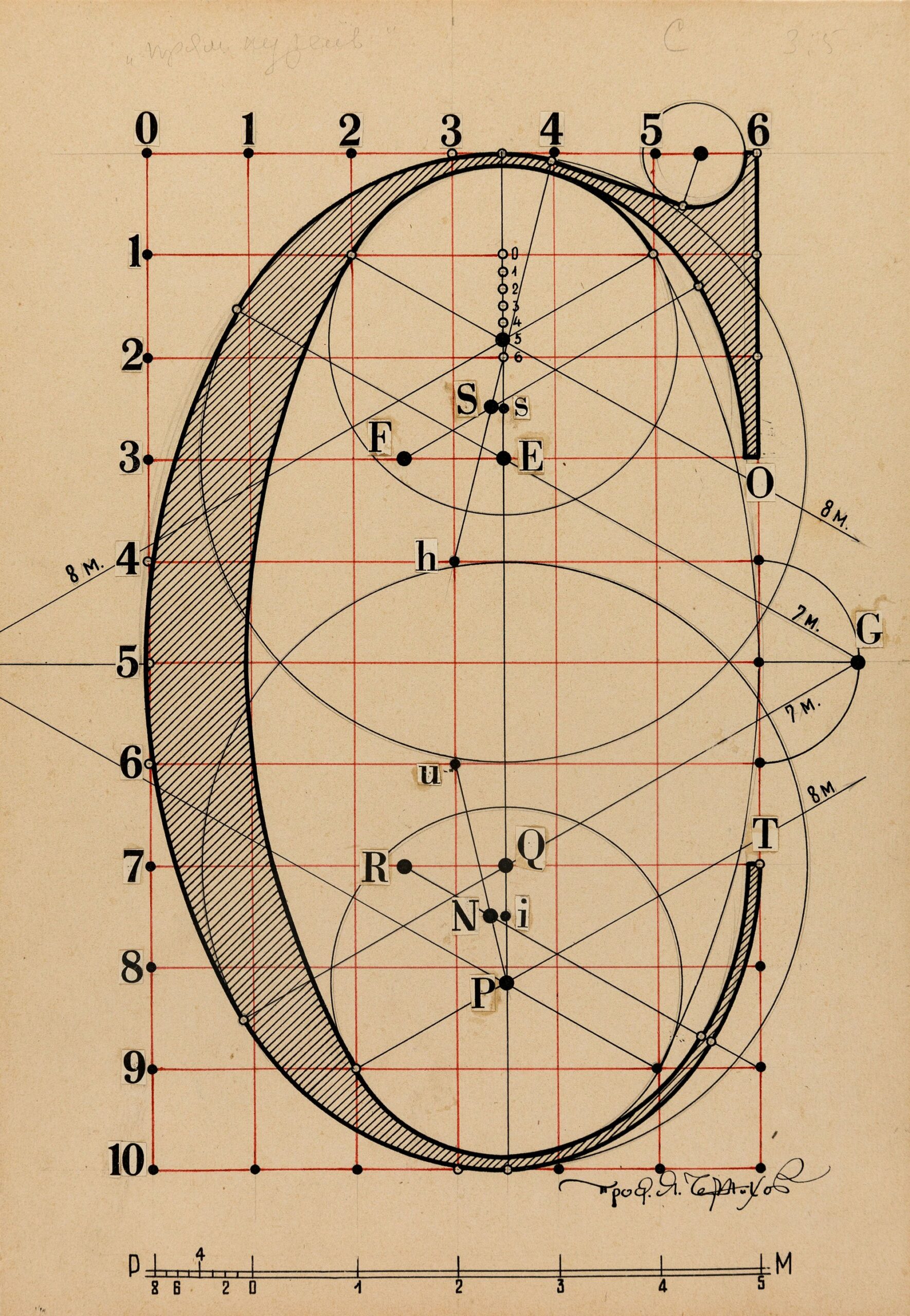
It is a drawing of a C. A rather normal looking C, a bit condensed perhaps. Its thick and thin parts are distributed along a vertical axis, rather than a diagonal one, so in typographic terms it is a modern C. To me it also looks a bit British, because it only has that single serif, while a French modern C, for example, might have two, top and bottom. It is positioned on a grid of 60 squares (10 × 6), each unit potentially divided into a further six. These subdivisions serve as the origin points for circles of various diameters that seem to define the curvature of the letter, and for diagonal lines whose purpose is at best obscure. Marked in black, and identified by pasted up letters, these points look a bit like constellations on a star map. It seems like a very complicated way of drawing a C.
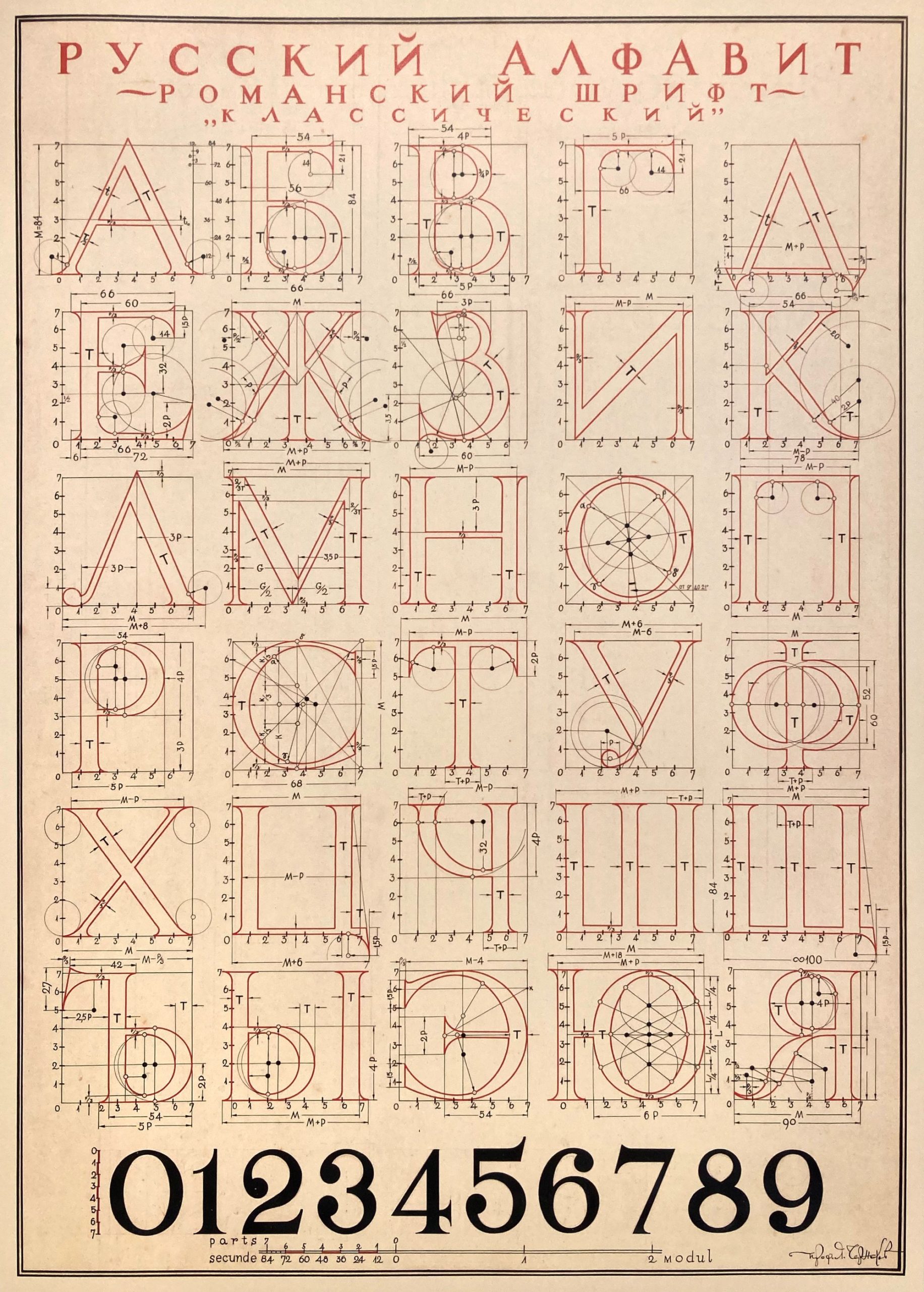
Actually this is not a plan. It is instead a meticulous analysis drawn by Iakov Georgievich Chernikhov, and you might now assume that it is a Cyrillic S. The Russian constructivist architect, graphic artist and theoretician had long studied the elements and laws of composition, publishing several books on the subject, and teaching students enrolled in the Research and Experimental Laboratory of Architectural Forms and Methods of Graphic Art – a course he established in the late 1920s as an alternative model to architecture and design work. His avant-garde position, however, didn’t sit well with the Soviet authorities, and from the 1940s Chernikhov withdrew from his practical work. Although he continued to find ways to teach, he turned his focus to the interests that would sustain him for the rest of his life, most notably his drawings of architectural fantasies, but also the study of letterforms. Scouring the dustiest corners of Moscow’s libraries, he gathered all the material he could find on the subject, from its origins and history to application in architecture. He was fascinated by the idea that the shapes of classical letterforms – Roman square capitals, such as the ones found at the base of the Trajan Column in Rome – were the products of a modular, geometrical construction. Until his death in 1951, Chernikhov would sit at the desk of his Granatny Pereulok apartment, producing dozens of detailed letterform drawings such as this one, recording their structure on the basis of rigorous measurements. This work was meant to form a book titled Architectural Typefaces, which would present a series of carefully annotated tables of Cyrillic and Latin capitals traced in black and red ink, often accompanied by matching numerals (he would later tackle other writing systems but using less geometrical approaches). The project was left unfinished, and a selection of drawings, compiled by his wife Sofia, would only be published in black and white several years after his death in The Construction of Letter Forms (1958), with additional comments by N Sobolev.

As a type designer, what seduces me, besides the undeniable quality of Chernikhov’s graphic skills, is the sheer complexity of these visual descriptions, which give as much attention to a letter as an architect determining the proportions of a building. From a practical point of view, the letters walk a very thin line between accuracy, and, well, absurdity. What were they really intended for? Are they, like a plan drawn by the architect, instructions that would allow another to reproduce these letterforms exactly? Perhaps an engineer or a builder could find this useful, but I doubt that a trained lettering artist or punchcutter would have paid much attention, preferring to rely on their eyes and hands alone.
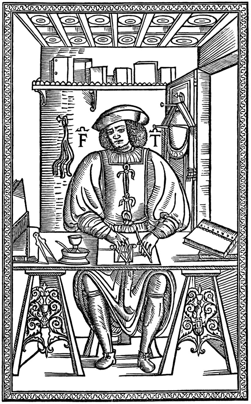
Chernikhov was certainly not the first to attempt to describe the supposed geometrical construction of letters and was very much aware of the work done on the same subject several centuries before him. During the Renaissance, many treaties dealing with ideal (or divine) proportions were published, and some of their authors took upon themselves to apply their theories to letterforms, sometimes with a perhaps objectionable degree of mathematical precision. The most famous examples include Felice Feliciano’s Alphabetum Romanum (1463), Fra Luca Pacioli’s Divina Proportione (1509), Francesco Tornellio’s Opera del modo de fare le littere maiuscole antique (1517), Albrecht Dürer’s Underweysung der messung mit dem zirckel un richt scheyt (1525) and Geoffroy Tory’s Champfleury (1529). [1]
But none of these studies (including Chernikhov’s) can be considered as the blueprint for an actual typeface – in other words, one that is cut as a set of steel punches, which in turn is used to produce the copper matrices made for casting letters in type metal, whose finished forms are then inked and printed. However detailed they might be, they have no practical purpose in this regard. A type designer, or punchcutter, has to make sure that a set of letters feels like a coherent ensemble. But here, the letters are always considered in isolation, with seemingly little interest to which may come next, so no attention is accorded to a letter’s sidebearings (the amount of space on its left and right). And because necessary optical illusions are ignored (curved letters need to be drawn a bit taller than flat ones as to appear the same height), if the letters were to be deprived of their underlying canvas and somehow assembled into a word, the result would appear unbalanced and inelegant. Which, ironically, is far from the ideal of order and perfect proportions that the authors had in mind.


The earliest recorded production drawings for a typeface were made in France for the Romain du Roi, first used in 1702 to print Médailles sur les principaux événements du règne de Louis le Grand avec des explications historiques. The project was part of the Description des arts et métiers, a proposed study of craft techniques to be undertaken by a committee appointed in 1693 by the newly founded Académie des Sciences – it is in this context that committee member Sébastien Truchet first defined the typographic point. [2]
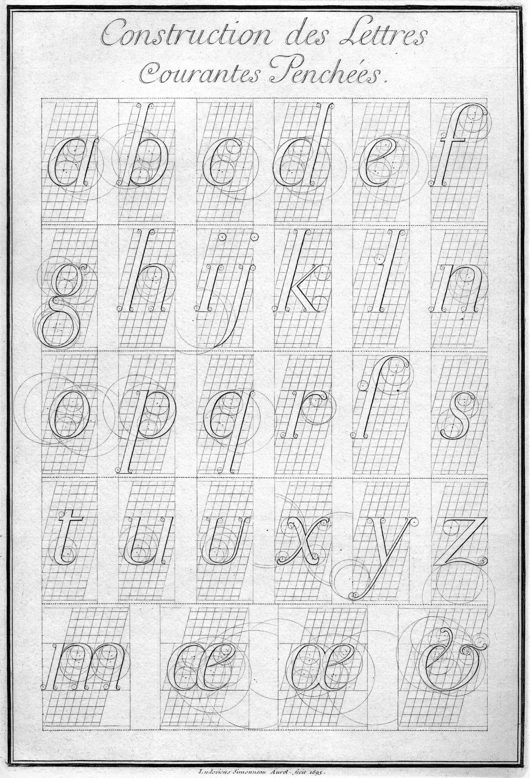
The first Romain du Roi drawings were engraved by Louis Simonneau in 1695 on a large grid of 64 squares (8 × 8). In drawings made a few years later each square would be further subdivided into 36, equaling a total of 2,304 squares. While the way curves are described follows a similar approach as in those earlier Renaissance studies, they cannot be regarded as the same thing – the Romain du Roi letters were new, and not records of any existing letterforms. The drawings also include lowercase letters, diacritical marks and italics, as expected in a project of this scale, and were completed by detailed information about sidebearings. But this degree of precision is not of much practical use when cutting punches by hand, and their production had to rely on the interpretation of the source material by committee punchcutter Philippe Grandjean, who succeeded in giving his type the warmth that the former lacked. [3]
However absurd this complicated way of describing letters might seem when it comes to actually designing type, I love Chernikhov’s drawings all the same. His work is so full of attention and care in its composition and execution, but it would be wrong to only consider these as technical drawings. Instead I like to think that, diving so deeply into this ideal geometrical world, made of lines and numbers, Chernikhov might have found a way of escaping the feeling of being alienated in his own country. A different sort of fantasy.
At the same time, in going to the trouble of developing a set of such intricate rules, it’s tempting to think that Chernikhov is not just describing but defining what a Cyrillic S looks like – or what a good Cyrillic S looks like. As Eric Gill, in his 1931 Essay on typography, famously wrote: ‘Everybody thinks he knows an A when he sees it; but only the few extraordinary rational minds can distinguish between a good one and a bad one, or can demonstrate precisely what constitutes A-ness. When is an A not an A?’
But I probably don’t need rules to answer that question. Does it even matter? Chernikhov’s journey in the study of letterforms might be seen as innovative or provocative, and that in itself is better than any definite answer. There’s no right or wrong way to draw an A, or a C or an S. In the end, if it looks good, then, maybe, it is.
Notes
- Its rather long subtitle probably deserves its own footnote: Auquel est contenu L’art et Science de la deue et vraye Proportion des Lettres Attiques, qu’on dit autrement Lettres Antiques, et vulgairement Lettres Romaines proportionnées selon le Corps et Visage humain. Among his achievements as a professor, editor, librarian and printer, Tory is known for introducing into French the apostrophe, accents and the cedilla.
- In the spirit of the times, Truchet, a Dominican priest, was also a mathematician, hydraulics expert, watchmaker and inventor, and is known for his analysis of decorative patterns.
- Even if they can be regarded as a theoretical exercise, the Romain du Roi drawings are still important documents. They are displayed at a ‘resolution’ that could not be approximated by the contemporary production techniques, and some plates even show a ‘sloped’ roman in place of an italic (obtained by an affine transformation of the grid of the rectangular grid), anticipating technologies that would only become available in the late twentieth century.
