Siza and the Limits of Representation
Over the years in which the collection of Drawing Matter has been formed we have come to understand that the most productive discussion of architecture is actually about the precise relationship between the drawing and ‘its’ building.
One good rule is that an architect with a powerful idea is always going to be frustrated, will always be trying to push the conventions and techniques of representation that are available. In this, it never matters who the drawing is for: client, contractor, profession, the public – or indeed the designers themselves.
We even argue, more reliably than the other way round, that the good building does actively produce the ‘good’ drawing; but also that approaching a drawing by an architect with any quality standard borrowed from the world of art (an error committed as frequently by the its audience and by its maker) is always distracting; often, it is misleading or dangerous. Be just as wary of pretty drawings as of easy buildings.
We sometimes play a game, of asking whether this tension between designers and their tools of communication – the tension clearly itself so productive – could suggest an implicit, and quite unconscious, search for some not-yet-invented method or technology?
Imagine, say, being able to offer the builders of Chartres the rules of linear perspective? Or at the end of 1820’s giving Henri Labrouste, as he surveyed the ruins of Rome, a camera?
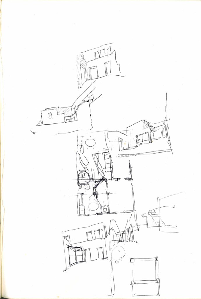
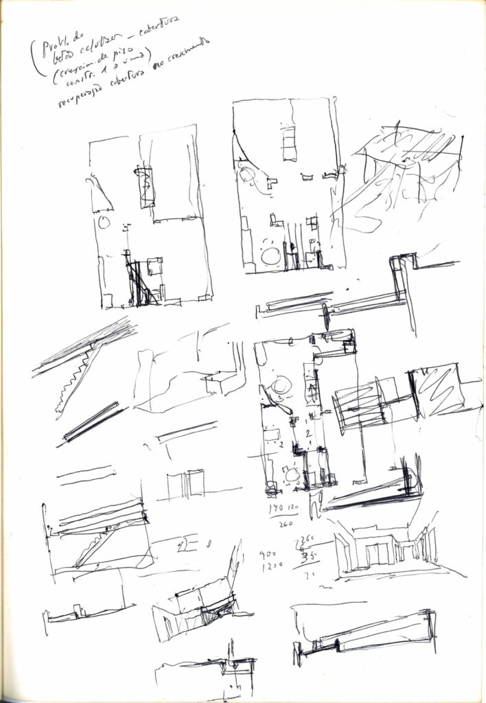
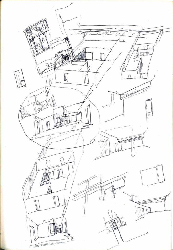
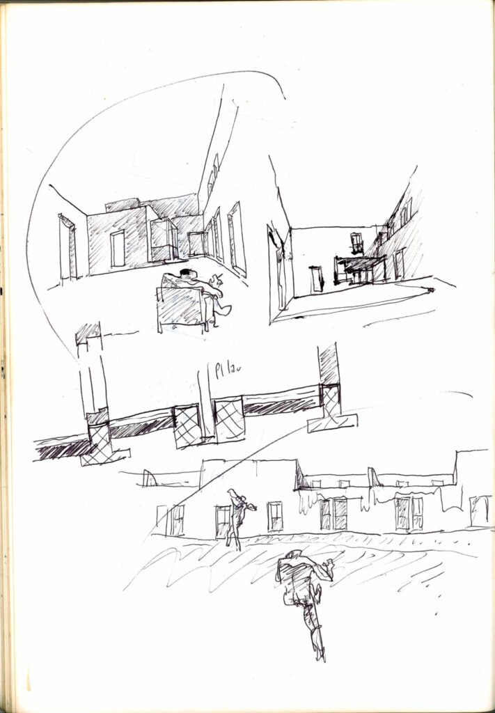
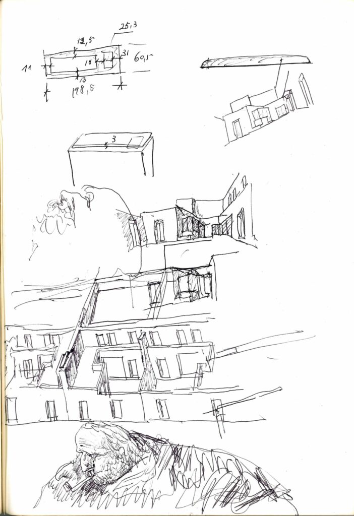
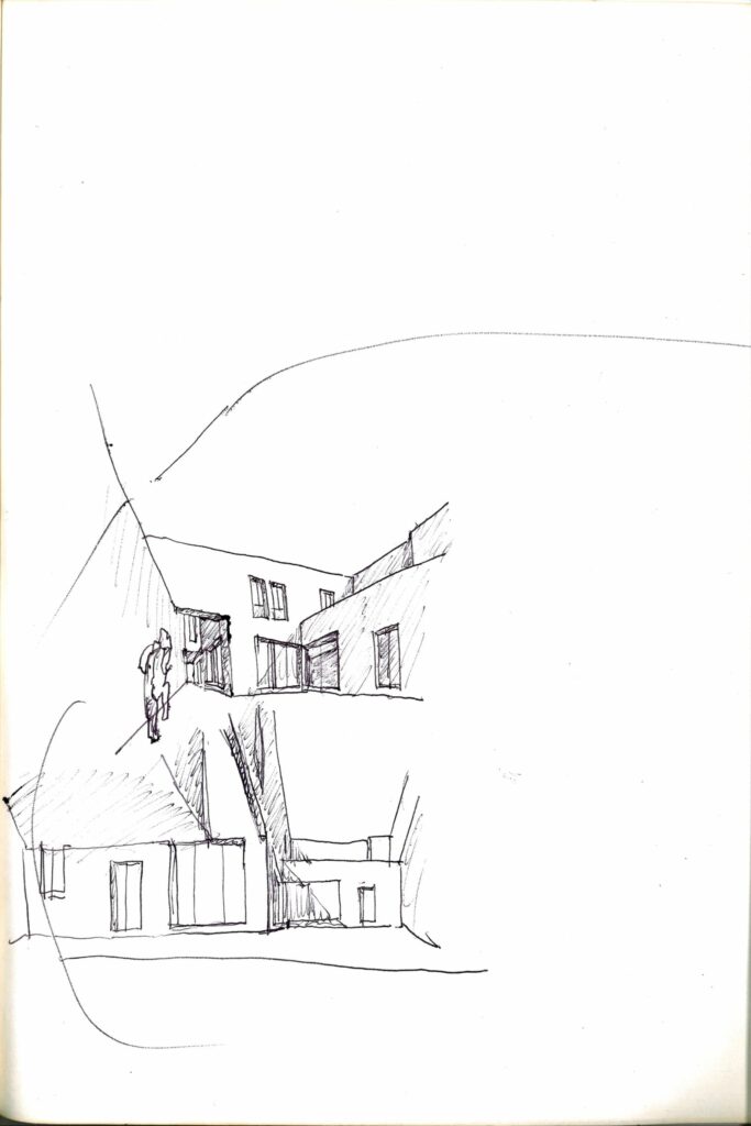
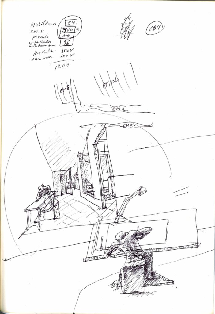
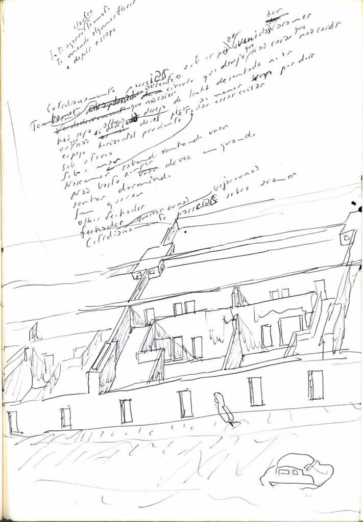
Or even, of making available the next generation of digital technology to Álvaro Siza, as in December 1977 when he drew again and again in Caderno 13 a particular view of the houses in Malagueira, and then tried the effect of the same composition seen from somewhere else? Is there a suggestion of an effort of imaginative displacement in his familiar habit of setting himself within such sketches – of the viewer and draughtsman seen, and seeing, in the same perspective? With the right programme, and a mouse, it would have been so (too?) easy.
