Between the Layers: Transparent Paper as a Modernist Architectural Design Environment
The following is an excerpt from Fabio Colonnese’s essay, ‘Between the Layers: Transparent Paper as a Modernist Architectural Design Environment’, published in Digital Modernism Heritage Lexicon (Springer Tracts, 2021). The editors have prefaced this with a short summary of the full essay.
The essay describes transparent paper and its operative and theoretical contribution to the practice and education of architects in the nineteenth and twentieth centuries. Existing literature on the topic is scarce, and many instances of these rely on limited or anecdotal sources. The text provides a deductive reconstruction of the complex relationship between architects and their favourite medium.
It begins with a historical summary of its manufacturing and use, documenting the production of its fifteenth-century antecedents and its gradual rise in popularity over subsequent centuries. This discussion extends to its growing significance in the late eighteenth-century in the education of artists and early photographers as a means of reproducing master works, a process through which students would learn the techniques of notable precedents. The analysis is complemented by a concurrent examination of the role of transparent paper within the professional design process, which at first primarily served to simplify existing processes of drawing production, and changing the patterns of labour within the industry. It notes how this use developed towards an increasingly creative mode, allowing for increasingly sophisticated forms of spatial analysis — and generation — through the method of layering.
The act of layering is framed as an essential aspect to the medium of transparent paper. The text charts its role as a tool in twentieth-century landscape and planning disciplines to its implementation in architectural practice, grounding the discussion in the examples of ‘deconstructivist’ architects and artists. Throughout this discussion, transparency is understood as a central, creative aspect of the medium. This ‘medial experience’ is grounded in the wider context of related media, making reference to the methods of Modernist architects and photographers, filmmakers and video game designers. The notion is organised around the distinction between ‘literal transparency’, namely that which is literally seen as being optically transparent, and ‘phenomenal transparency’, which is the seeing of a final drawing as a flat projection of a configuration of multiple volumes and surfaces.
The discussion of transparent paper as a medium is elaborated by a description of its myriad names and physical qualities, and the personal, near-emotive regard in which it is held by its most fervent users. It considers the potential influence of variations in its thickness and texture, pointing to the highly differing drawing techniques used on it by different architects. It is concluded by locating this analysis within the context of CAD drawings and their use within practice, highlighting its peculiar power as a contemporary creative force.
Excerpt: Transparent Paper as a Design Environment
Like any tool, a sheet of paper is neither innocent nor neutral. The size, proportion, opacity, reflectivity, microscopic fabric, or visible texture of a sheet can deeply influence not only the trajectory of a line but even the development of an architectural project. As stated by Matthew Mindrup, ‘an architect who works in diverse media knows that different materials have different effects and affects that resist the draftsman’s will to create desired forms’. [1] While opaque, rough paper may contribute to a textural drawing suggesting unpredictable spatial effects, tracing paper, with its attractive hard and smooth working surface with low friction has often been preferred for quick sketching, especially when combined with charcoal, thick pencil or pen, but also gorgeous presentation drawings, like the 1930s designs of the Italian architect Enrico del Debbio made with precise strokes of charcoal.
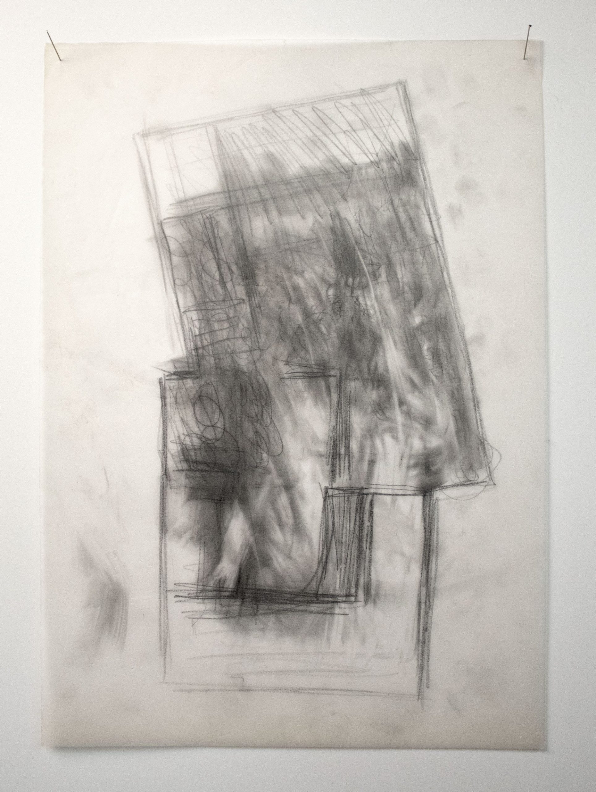
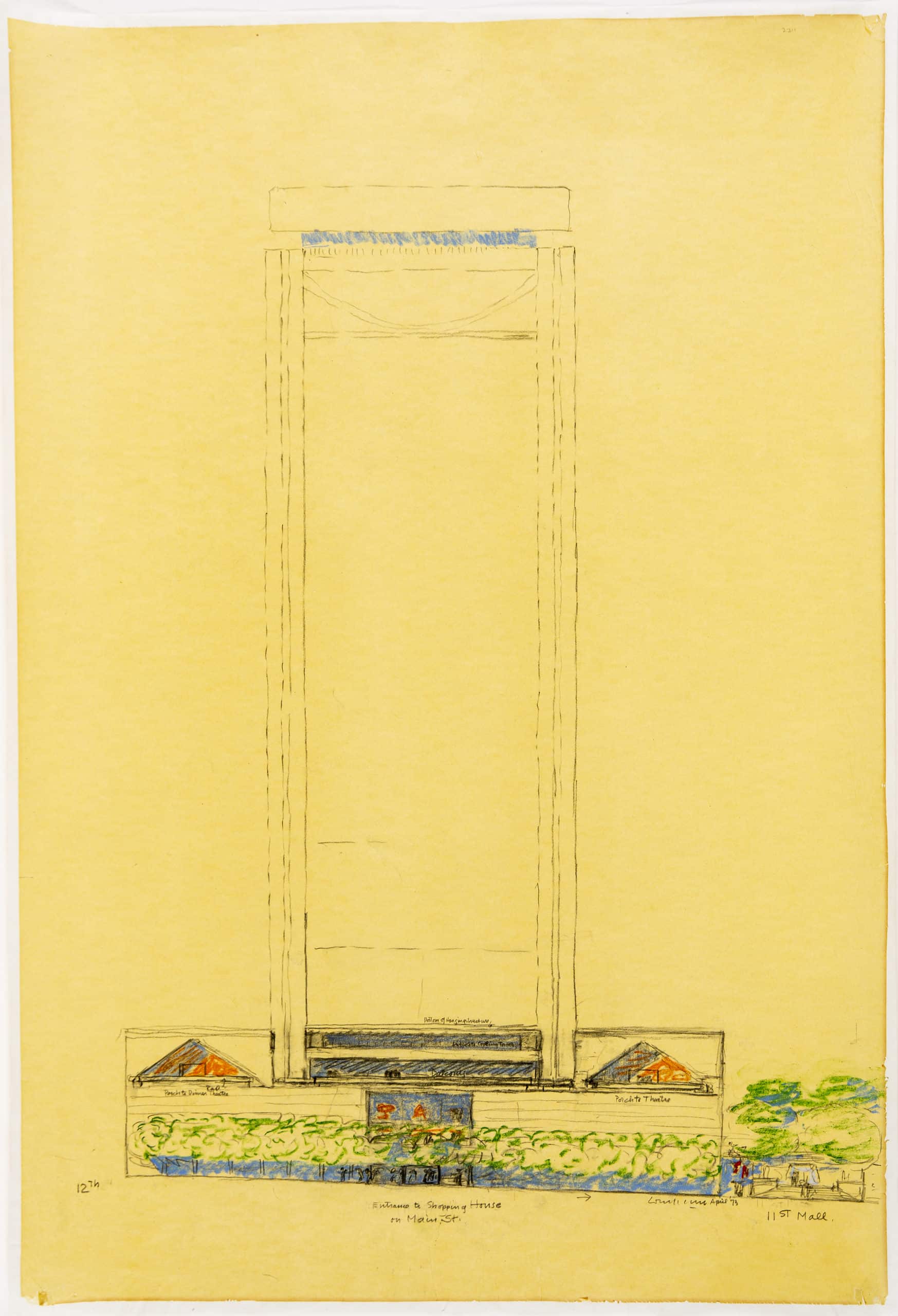
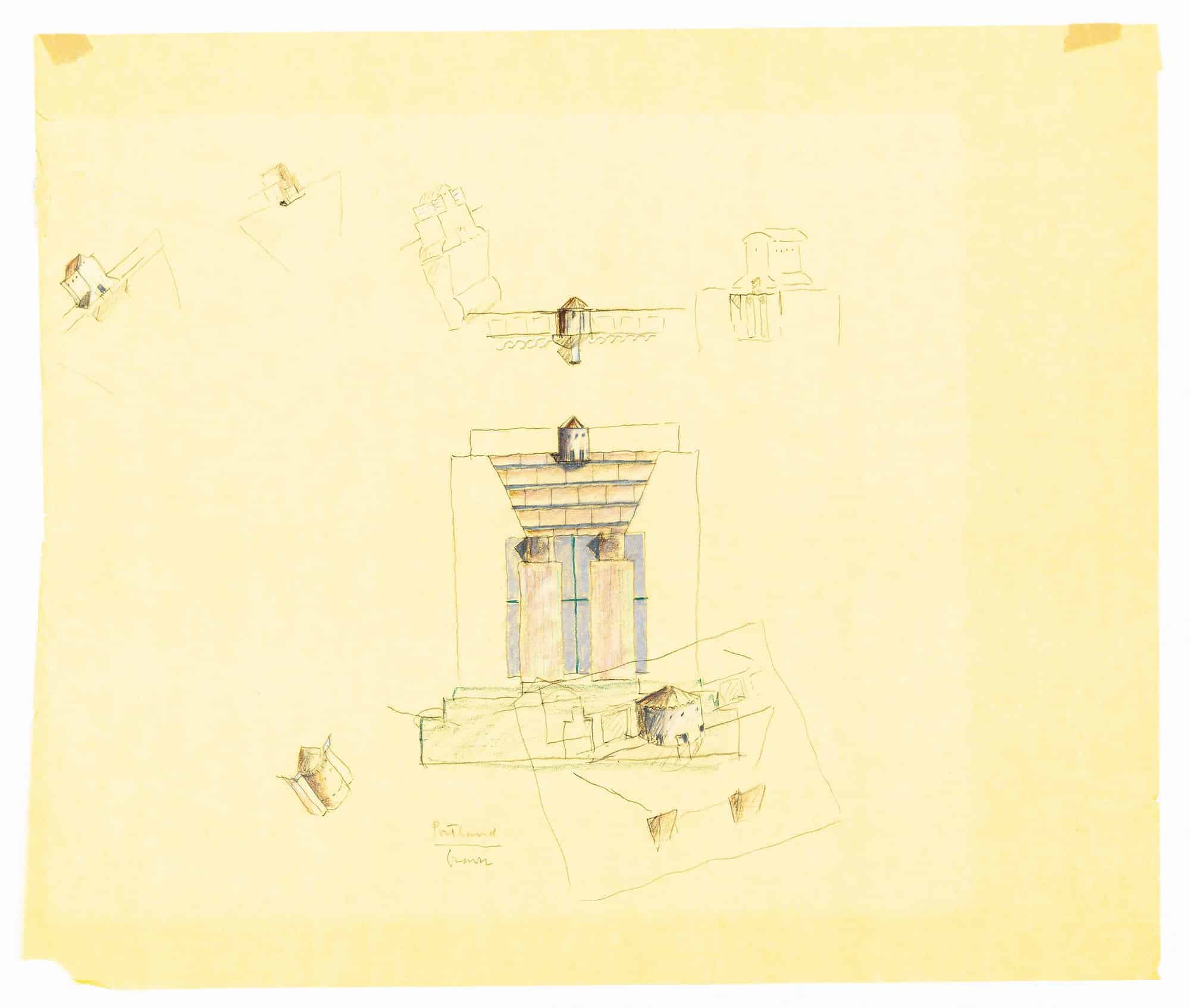
Charcoal was also used by Peter Zumthor in sketching plans for the Thermal Bath in Vals, Switzerland, as it allows an efficient representation of the heavy stone blocks while the paper suggests the steam of the hot water, the dim light and the atmosphere of the baths. [2] An apparent thickness or haze effect is also achieved by taking a picture of the curling sheet when it is not perfectly flat and a slight shadow is cast below it. Zumthor gives a lot ‘of importance to the imperfection of drawing as a tool to help the architect discover new projections arising from the site, programme, and a building method of construction’ and ‘encourages architects to explore the construction of representation as a method to give voice to places that have not yet found physical presence’. [3] At the same time, a tracing paper taped onto a site plan chart provides designers with a soft, guided starting because the underlying web of lines works as a visual comforting reference, while the white opaque surface of a blank sheet may intimidate or even paralyse them.
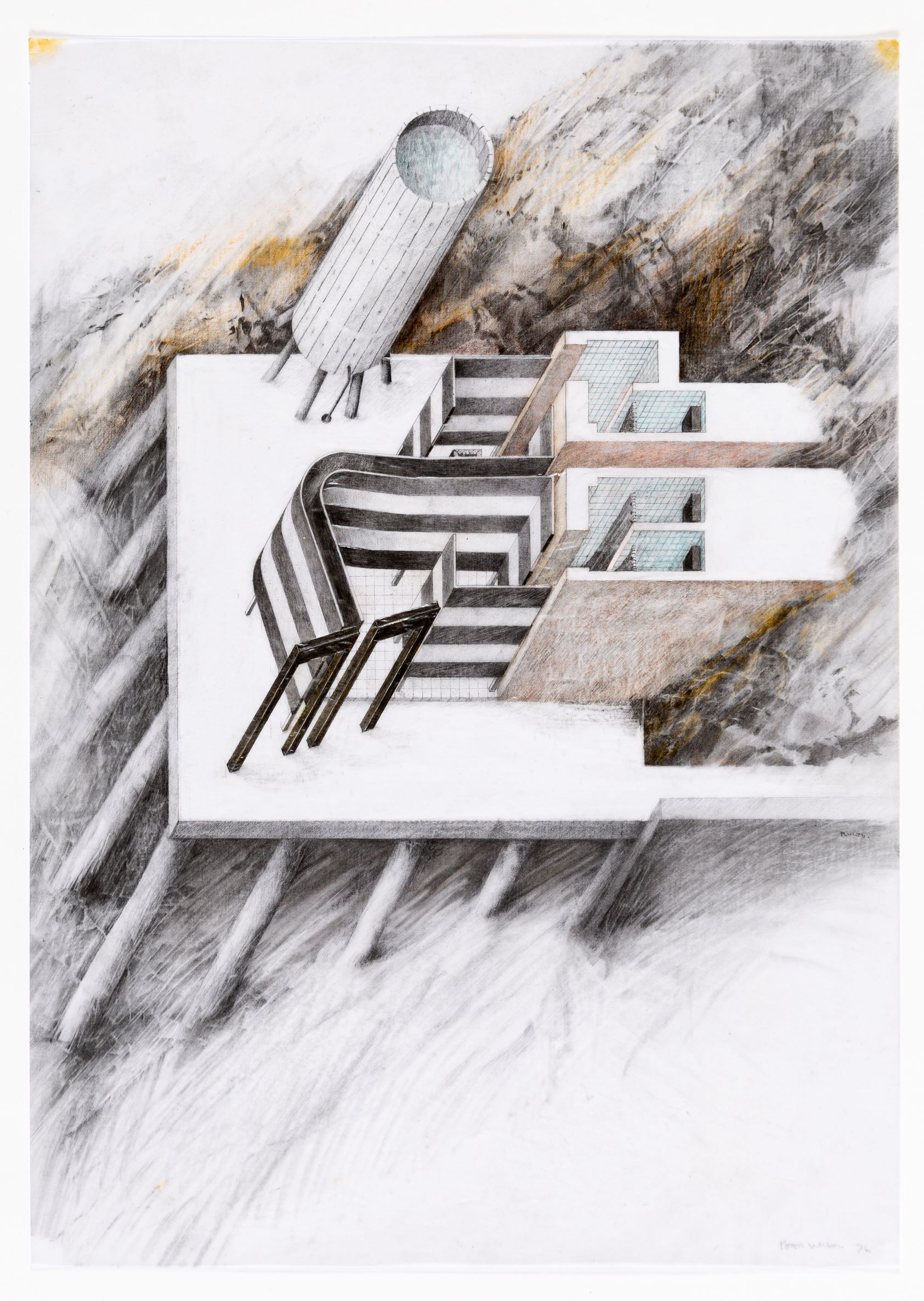
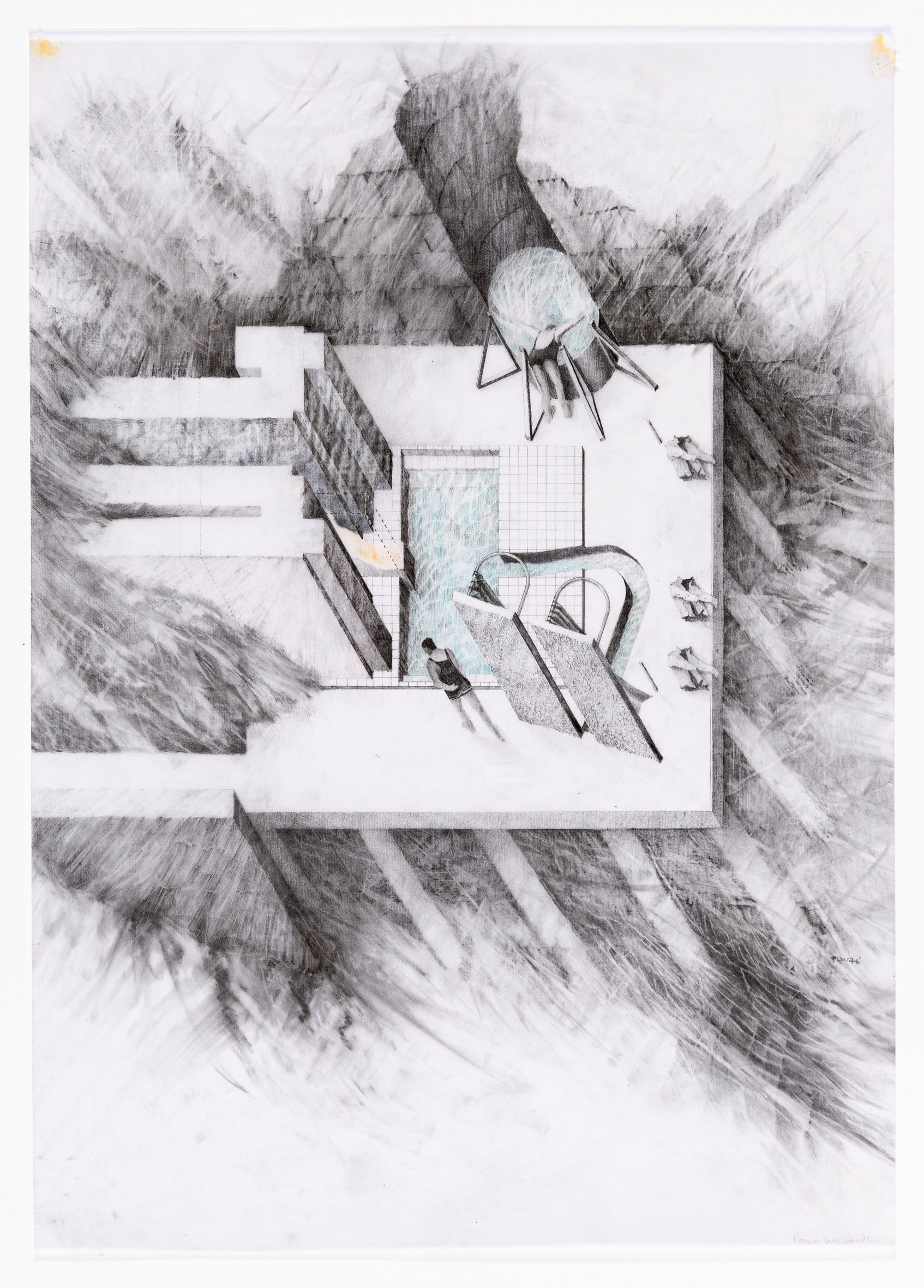
Still today, a sheet of tracing is the first and more sensitive interlocutor of many designers. It is the place where single shots from the whirling stream of their thoughts suddenly take shape to produce an expressive system of visible marks. These marks belong no more to the world of ideas but are something autonomous playing with the light crossing them that can visually feedback and address the creative process itself. In this sense, the act of drawing is the consequence of many parallel inputs: a cerebral process of mental exploration; the visual feedback coming from the paper; the bodily sensations resulting from pressing and carrying the pencil tip onto the paper surface. In particular, the American architect Cass Gilbert described the art of ‘architectural draughtsmanship’ as a mediation between the sight and the touch: ‘sketch mouldings and shapes of things by handling them as well as by looking at them, so that by feeling the contours of the moulding with the fingers you can determine the shape as well as by looking at it’. [4]
However, architects learnt how to use tracing paper not only to study and critically develop projects by others, but also ‘to engage the current state of the coordinated set of drawings in a provisional, trial and error fashion. The designer can provisionally override, add, modify, copy, shift, rotate and mirror elements, in rapid succession, without interfering with the precious accumulation of complex information already achieved […] in the specious present that this augmented medium affords to the designer’. [5] While distilling ideas by overlapping lines and marks, this practice introduces the concept of ‘forgetting’ as a sort of natural process of selection of ideas. Layer after layer, something is forgotten in order to let something else come out: ‘putting a layer is a two-edge sword of allowing yourself to forget, but also allowing yourself to pull out what is important’. [6]
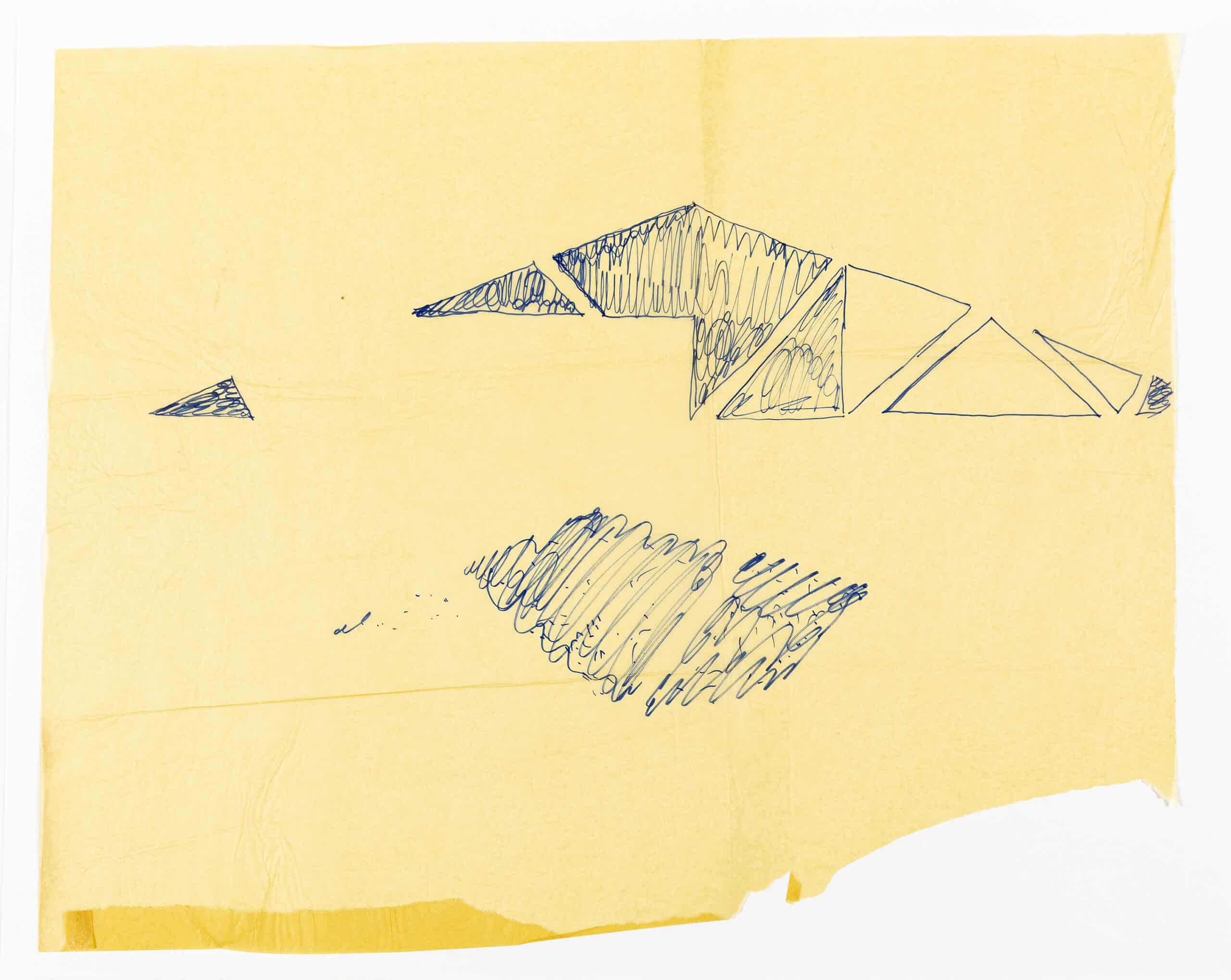
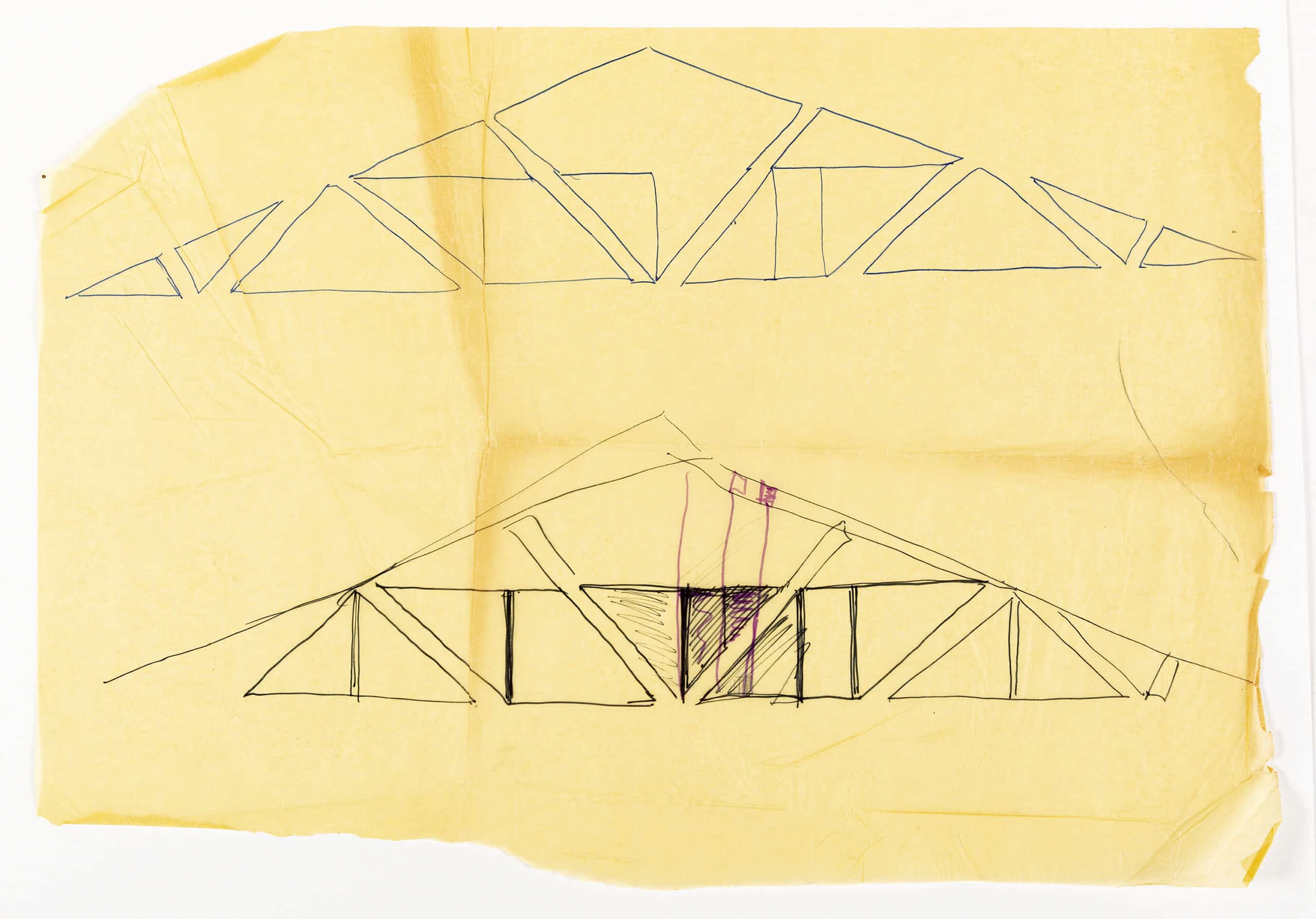
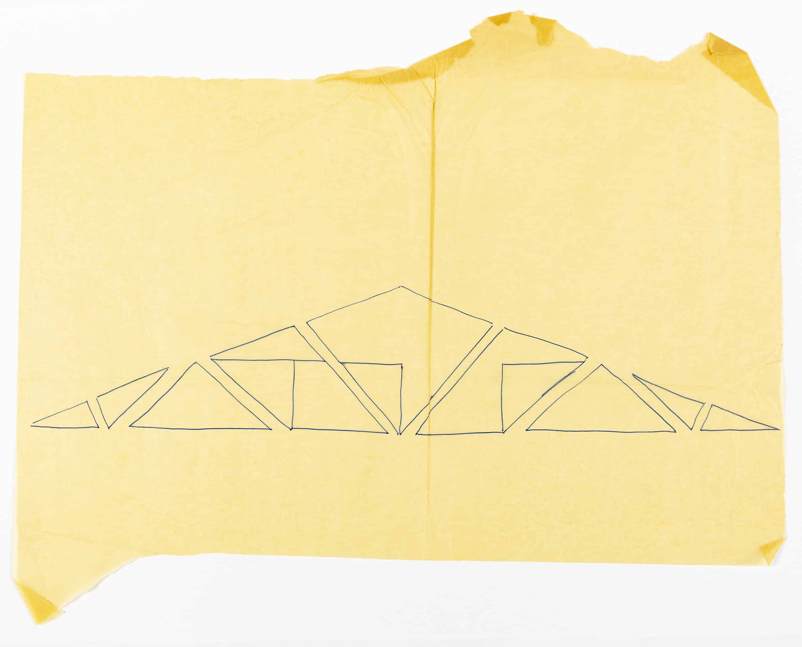
Opaque paper records every trace onto a single layer. Sketching on it, architects are gradually forced to use thicker lines by softer pencils, ink pens, white ink, and markers in order to let the meaningful results out of a confused cloud of lines while they are prevented from keeping the passages in chronological order. On the contrary, a stack of tracing paper allows organising the design process in separate steps which generally correspond to single exploration attempts from a shared base. Almost in analogy with the digital morphing procedure, this property can be used to relate the persistent elements along the formal definition, to identify the several branches of the process, to get more critical and aware of any single choice, to attribute a scientific structure to the process and to optimise the method and workflow.
This practice also fostered a shift in the common consideration of the support. An opaque sheet of paper embodies the physical concept of the tabula, a two-dimensional panel onto which the drawing is constructed line after line, like an actual building. A heavy sheet of transparent paper embodies the perspective concept of the picture plane, where the image appears through a projection-and-section process after an object or a graphical palimpsest. A pile of transparent layers is a different medium with a specific ‘visuality’ in which the drawing seems almost to surface from beneath. It is something more than a two-dimensional tool: it is a sort of space or environment, a three-dimensional system of interrelated layers suggesting at least three interpretations.
In its ‘horizontal’ interpretation, this medium suggests a peculiar thickness. It can be perceived as something intermediate between the ordinary paper and a three-dimensional model, whose features and applications could be analogically derived. The practice of sketching onto sheets of tracing paper fixed over a topographic map of the site make the sketches share the same scale, and allows for direct coordination of formal relationships between the levels of a building and between these and the environment, even with archaeology-oriented implications. This practice effectively transforms the graphic support into an analogical model of the building, providing the architects with the opportunity to compare solutions visually, to make the process reversible, and literally, to see an architectural project as a pile of overlapping interrelated layers.
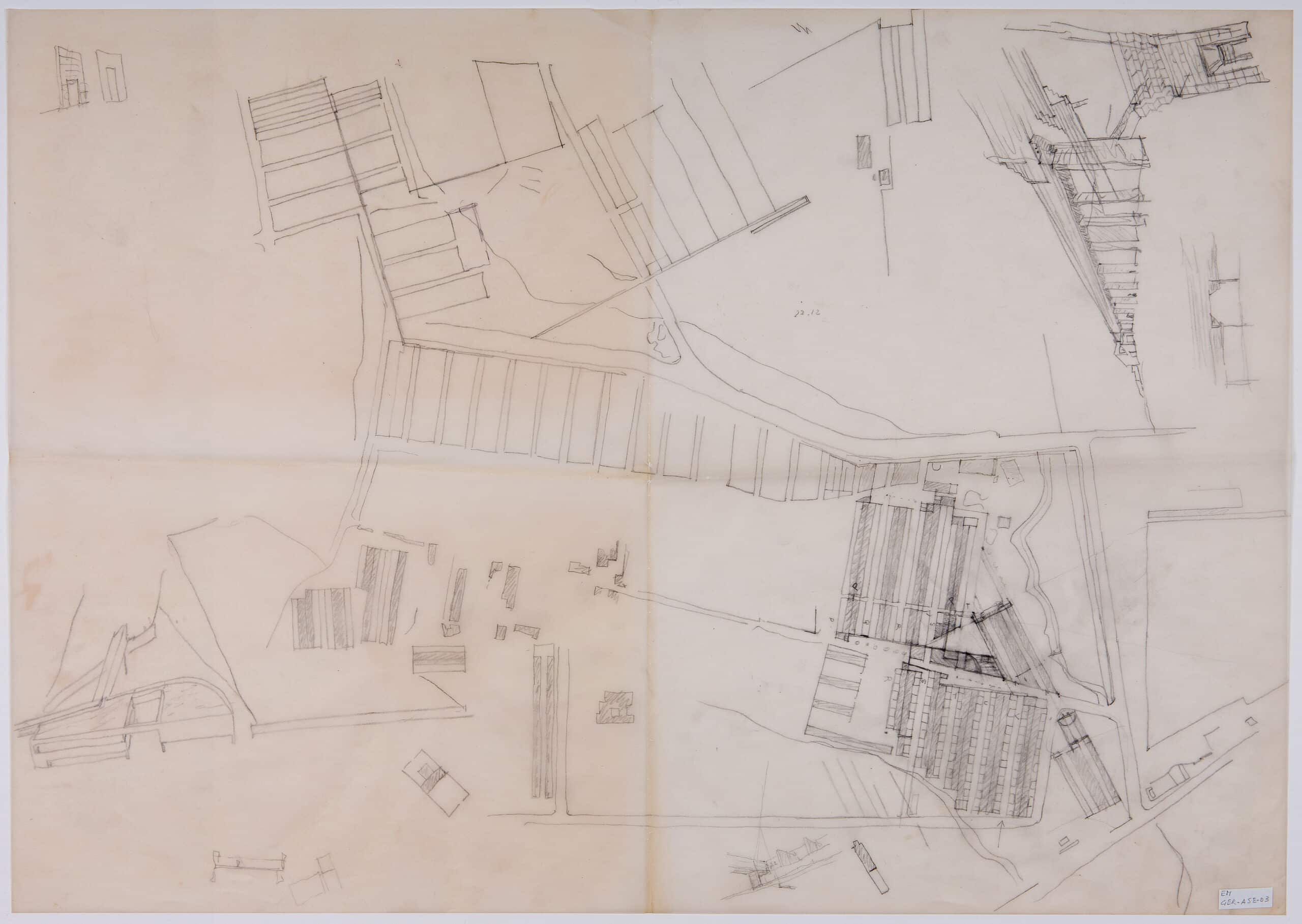
In its ‘vertical’ interpretation, this medium suggests a peculiar depth, which requires the designer to perspicere, to ‘look through’ the layers to ‘see clearly’. The visual experience of the sketched lines through the layers can be analogous to Leonardo da Vinci’s concept of prospettiva aerea; the layers in a theatrical peep show; the experience of a foggy day or a steamy place. Moreover, moving the early sketches gradually from the top to the bottom of the pile, covered by the latest sheets full of variants, introduces a timeline factor. Filtered by the layers of paper, the vision reveals a sequence recalling Etienne-Jules Marey’s chrono-photography, the layers representing temporal units of work or film frames that are subjects to the montage.
In its ‘oblique’ interpretation, this medium suggests a peculiar attitude to embody precedents, case studies and ready-made pieces in the design and representation process. Semper believed the number of architects copying their colleague’s masterpieces would have increased considerably. The easiness to copy and compare provided by transparent paper surely changed the way to consider architectural precedents from the past, evolved the collaborative work in a designing team, and promoted the involvement of extra-architectural materials into the architectural representation, like scientific illustrations or the human figures used as scalies. [7]
Fabio Colonnese is PhD and Research Fellow at the Department of History, Drawing and Restoration of Architecture, Sapienza University, Rome. Find more of his research here.
Notes
- Matthew Mindrup, ‘The Resistance of Factures in Drawing out Architectural Constructions’, in The Material Imagination: Reveries on Architecture and Matter, ed. by Matthew Mindrup (Routledge: London, 2016).
- Céline Drozd, Virginie Meunier, Nathalie Simonnot, Gérard Hégron, ‘What Tools and Modes of Representation to Reflect an Architectural Atmosphere?’, (EAEA: Cottbus, 2009). Accessed 21 Dec 2020.
- Mindrup, ‘The Resistance of Factures in Drawing out Architectural Constructions’.
- Mary Beth Betts, ‘From Sketch to Architecture: Drawings in the Cass Gilbert Office’, in Inventing the Skyline: the Architecture of Cass Gilbert, ed. by : Margaret Heilbrun (Columbia University Press: New York, 2000), pp. 7–79.
- Patrick Schumacher, The Autopoiesis of Architecture: a New Framework for Architecture, 2 vols. (Wiley: London, 2011).
- Wanda Lau, ‘Architects’ beloved yellow trace becomes a mobile app’, Architect, 2012. Accessed 21 Dec 2020.
- Fabio Colonnese, ‘Human Figure as a Cultural Mediator in Architectural drawings’, in Cultural Influences on Architecture, ed. by Gülşah Koç, Marie-Therese Claes and Bryan Christiansen (IGI Global: Hershey, 2016), pp. 90–129.
