Drawing with Rafael Moneo, Madrid 1984

I arrived in Rafael Moneo’s Madrid office in early 1984. I had graduated from Cooper Union two years earlier and spent 18 months working for Richard Meier in New York. I met Moneo in 1978 when he was teaching at the Institute for Architecture and Urban Studies, but I don’t think he actually remembered me. When I wrote, hoping to work in Madrid, he hired me on faith, confident that someone trained at Cooper Union and Meier’s office would be, at the very least, a competent draughtsman.
The office at that time was on the ground floor of the house where Moneo lived, in the modernist colony of El Viso, north of the centre of Madrid. There was a reception desk but no receptionist. Sometimes Moneo would sit there to use the manual typewriter. Once, having been mistaken for the receptionist, he sent someone away who came inquiring after ‘Señor Moneo.’ There was a small bathroom but no hot water. The studio was spare, but not austere: a functional and matter-of-fact workspace.
The studio was unusually busy when I arrived, in the final stages of the invited competition for the Atocha Railway Station (which may have been what prompted Moneo to reply to my letter, some six months after it had been sent). A handful of students and young architects had been recruited to finish the drawings, and unusually, we worked weekends – which did not prevent work stopping one special Sunday for Moneo to take the entire office to the bullfights.
I was given the task of making an axonometric drawing showing the assembly of the pre-fabricated roof lanterns on the roof of the long-distance station. People in the office were impressed by the American-type crane I drew, as they were by my extensive collection of circle and ellipse templates. Staff in Moneo’s office made do with minimal equipment – a few triangles, flimsy Spanish parallel bars, sharing around a single adjustable triangle, known in Spanish as pico de pato: duck’s beak. In this way, I was introduced to the drawing conventions of Moneo’s office: everything drawn in pencil, exclusively 2H lead, the softness of which meant that it had to be sharpened constantly in order to keep the lines crisp, but also that it was very sensitive to the draughtsman’s touch. Subtle tonalities could be achieved by varying the pressure to create different line-weights. The drawings always anticipated materiality and construction; there were few blank surfaces; brick coursing was hatched, concrete was stippled, and each joint and material transition notated. Shadows were sometimes cast (unusual in a technical drawing) but a cast shadow could clarify a profile in ways that would otherwise be unintelligible in an abstract line drawing. The lines that formed the hatches ended with a slight punctuation, shading into the boundary line to form an accentuated edge to the hatched field.
The key, I soon learned, was not to overwork the drawing – freshness and immediacy were the qualities sought after, which demanded concentration, efficiency and a sense of knowing when a drawing was complete. Despite the density of information, and the labor-intensive methods, it was expected that drawings would be executed quickly. I believe it had something to do with the Spanish workday – with a long break in the middle of the day, you are more inclined to finish one task in the morning, and another in the afternoon, as opposed to the conventional workday where morning bleeds into afternoon. But it was also in service of clarity and concision: understanding exactly what each drawing was intended to convey and communicating that information with a minimum of elaboration. Rafael was famous in the office for roaming from desk to desk, making corrections, and asking each one in turn, ‘but why isn’t it finished yet?’
All of the drawings were done on 20-gram Canson tracing paper, which to my American sense of touch conditioned on ink and mylar, seemed unbelievably flimsy, similar to the sketch paper we used in the States. After working up a draft of my first drawing, I asked where they kept the good paper for the final version, only to be told the delicate paper I had been working on – by this time, torn, creased and repaired with cello-tape – was the only paper ever used. The conventional pattern of tracing over a first draft to make a clean copy was rare; the traces left by the construction and measuring lines – the evidence of its making – gave directness and honesty to the drawings. The thinness of the paper demanded high levels of concentration; it was prone to tearing and difficult to erase. But it was also very responsive, and over time I learned to appreciate the subtlety of the medium. The lines had a physical depth as the paper gave way under the pressure of the sharpened pencil. There was little distinction between study drawings, working drawings and presentation drawings; all were done on the same paper, and all received the specially prepared rubber stamps that served as the title blocks. I don’t think I remember a single drawing prepared explicitly for a client. Clients were expected to be able to read drawings, and to respect the expertise and judgement of the architect.
Atocha was a brilliant introduction to the culture of the studio, and probably had a profound impact on my later thinking – the essay ‘Infrastructural Urbanism’, which argues for the agency of a hybrid architecture/engineering approach to urbanism and public space, certainly owes a debt to that experience. Atocha seemed to me to be a very pure form of architecture operating at the scale of the city. The serial assembly of attenuated columns, structural umbrellas and cast-iron roof lanterns that form the expansive roof presents measure and material variation in a manner that a conventional steel and glass shed could never achieve. The structure has something of the spatial character of a hypostyle hall, or the Mosque at Cordoba, but executed in rigorously modern materials.
After the Atocha competition the studio settled back into routine work with a smaller staff – between four and five, despite a fairly full agenda of work. Among other projects, I was assigned to work on the ‘Proyecto de Montaje’ – the installation of the collection – for the Museum in Merida. With the structure and glazing finished, the construction was essentially complete. Because the structure is the finish at Merida, both inside and out, there was no separate phase of finish work, or exterior envelope, as is common practice today. Rather it was a question of outfitting the elemental brick structure to prepare it to function as a museum: lighting, electrical installations, handrails, grilles, vitrines, pedestals and in the offices, casework, doors and furniture. In this way I became very familiar with the building, which I visited regularly.
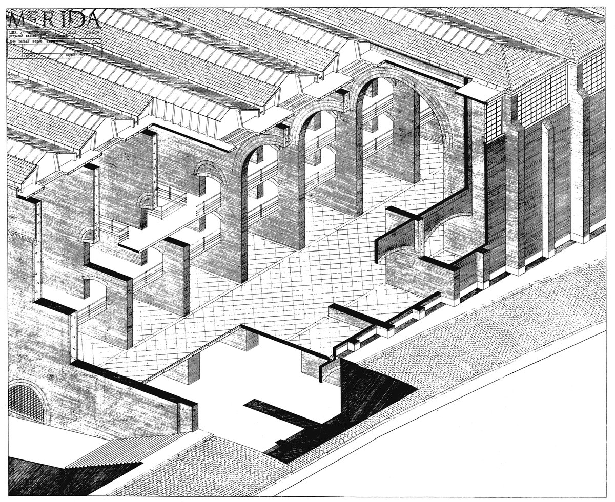
There are, in fact, two sectioned axonometrics of the Museum in Merida. The first one, from an elevated viewpoint, was done before I arrived, by Enrique de Teresa. It is, properly speaking, a working drawing. It was completed while the detailed design of the Museum was still being worked out, and it both defines and anticipates the construction to come (dated September 1980 on the stamp). The point of view and the section cuts are designed to focus on key moments that needed to be studied in order to clarify and explain the design. Moneo prefers a flatter axonometric view, as opposed to a direct projection from plan. Hence the angles in this drawing are quite shallow and there are no 90-degree corners. This more closely approximates natural vision, but also means that while every point is measurable, it has to be constructed in three-dimensional space. In this way, the construction of the drawing parallels the construction of the building.

This earlier drawing, stresses the relationship of the building to the ground, showing the elements of the structure, from the piers in the basement archeological zone to the cross walls of the museum proper and in turn the reinforced concrete skylights and tiled roof. The level change from south to north is highlighted, with a dense hatching indicating the weight of the cut-away earth as well as showing a generous access stair that allows pedestrians to navigate the level change. The buttressing of the enclosing west wall is shown in both elevation and section, emphasising the weight and mass of the load-bearing walls and the use of traditional construction techniques.
Above all, the drawing calls attention to one of the building’s most notable but rarely remarked upon features: the intersection of the serial order of parallel walls with the curving profile of the adjacent street to the south. This is, in many ways, the fundamental question that building poses: how to convert the system of parallel arched walls – which suggest ancient aqueducts and imply an endless linear infrastructure – to a closed, finite building that can function as a public institution on a dense urban site? The solution lies in the complex elaboration of the southern building envelope at 90 degrees to the order of the cross walls. The relative thinness of these enclosing walls is consistent with their character as infill, but this requires the introduction of a secondary buttress midway between the regular interval of the cross walls. This buttress is a double-functioning element, which reinforces both the basement retaining wall in one direction and the thinner street wall above in the opposite. The gap it creates opens a skylight into the basement, allowing daylight to wash over the brick retaining wall, introducing indirect light to this shadowy, below-grade space. The inset street wall stops short of the cornice. A large factory-style window fills the gap, and behind it, a secondary enclosing wall, supported by a relieving arch, blocks the south light, bouncing indirect light down into the perimeter of the galleries, washing over the textured brick envelope. All this is explained in the drawing, using the didactic character of the cut-away axonometric, which can show the progressive building up of the structural elements as well as strategically expose what is covered over in the completed structure. The cut-away axonometric mimics the experience of visiting a building under construction, when the structure is still incomplete.

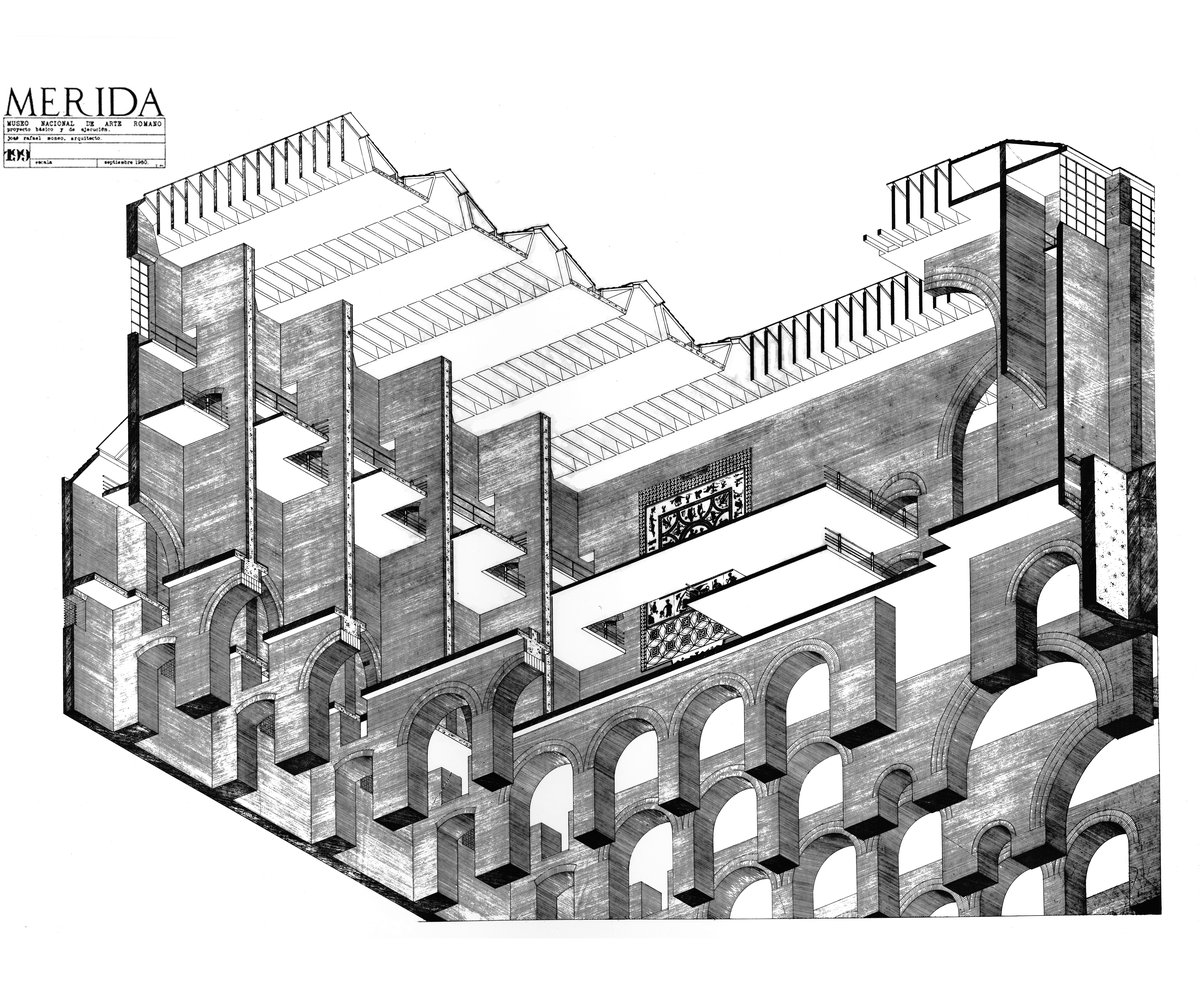
To be honest, I don’t recall the exact circumstances of making the second axonometric. It was towards the end of my stay in Madrid, when Moneo was preparing to depart to take up his position at Harvard’s Graduate School of Design. It may have been to fill some slack time at the office, or as part of an exhibition of Moneo’s work scheduled for the GSD that I helped prepare. To be certain, it was Moneo who dictated the worm’s eye view, and I recall making a few studies to fix the angle, which also showed the sectional elaboration of the south façade but focused on the main nave and highlighted the scale of the cross walls. In this case, the drawing process was extended (ten days perhaps?) and there was a constant dialogue with Moneo over specific decisions of where to cut and what to stress. Consistent with my involvement with the installation of the collection, this is a drawing that describes the outfitting of the structure to function as a museum. The passerelles that are threaded through the walls and afford access to the first and second levels are emphasised, and a large Roman mosaic mounted vertically on one of the brick walls creates a focal point near the middle of the drawing. The unrelenting materiality of the brick is more evident in this drawing, which underscores its contrast to the smooth undersides of the reinforced concrete floors, bridges and the roof. The seriality and modulated repetition are more insistent, as the ranges of cross walls and arches extend back in depth, contrasting to the tighter rhythm of the delicate reinforced concrete fins of the skylights cut in cross section. I would say that Enrique’s hand is softer, resulting in an overall texture that balances repetition with incident, and highlights the relationship of interior and exterior. My drawing is more forceful, somewhat more mechanical (more American?), invested in repetition and structure. And the consequence of the worm’s eye view is to focus more exclusively on the interior space of the Museum.
In general, axonometric drawings tend to turn buildings into objects, often floating in abstract and undifferentiated space. From Van Doesburg to Eisenman, the use of axonometric projection has signalled a desire to align architecture with nonrepresentational art practices. In Moneo’s practice, as shown in early axonometric drawings for Bankinter in Madrid or the Town Hall of Logrono, the ground and context are always shown, locking the building into its site. But the effect of floating in space is hard to avoid in the worm’s eye view. Moneo has noted that the earlier drawing, by de Teresa, ‘helps us to understand the movement in the museum’. The view from above calls attention to the floors, and all of the paving patterns, inside and outside are carefully delineated. The drawing bleeds off the page on all sides; the effect of this is to treat the building less as an object and more as an urban fragment locked into a specific site condition. The worm’s eye view – with clear reference to Choisy – accentuates the relationship between plan and structure. By definition, a worm’s eye must be cut at plan level – in this case the basement archeological zone – and the logic of the structure as it develops upward is clearly explained, but there is no reference at all to context or the ground. For example, the worm’s eye view shows some of the variations that were introduced into the regular rhythm of arches at the basement level to accommodate the archeological remains, but the remains themselves (which belong to the site) are not shown.
What the worm’s eye viewpoint does better than almost any other form of representation is describe the spatial experience of a three-dimensional enclosure. While the plan anticipates movement, structure and spatial organisation and section maps out profile and scale, it is fundamentally the plane of the ceiling – domes, vaults and skylights – that condition our experience of space. The first thing anyone does on entering an expansive space is look up. The worm’s eye allows the architect to study and describe the enclosing effect of the architecture overhead – which is why Choisy employed the worm’s eye view to explain vaulted construction. In this case, what is most striking is the contrast between the textured brick in the vertical plane, and the whiteness of the paper that indicates the smooth underside of the reinforced concrete floor slabs. Moneo insisted on clean flat ceilings (no beams, no articulation), a reference to Le Corbusier’s abstract ceiling planes, very consciously juxtaposing ancient structure with modern.
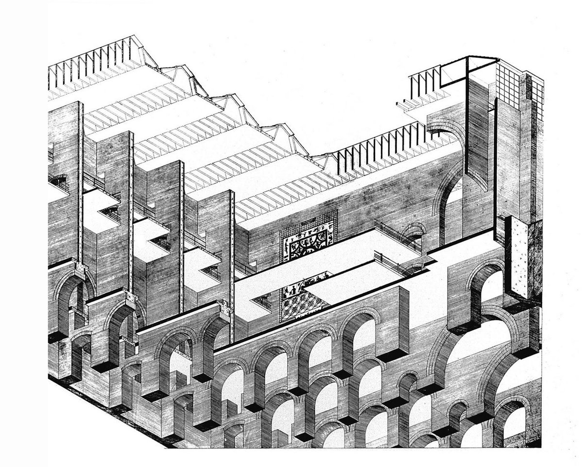
There is a final chapter to the story. I always had a suspicion that of the two drawings, Moneo preferred the first. This is consistent with my own conviction, and something I tell my students repeatedly: that a drawing done genuinely in the spirit of working out an idea, with all the doubts, hesitations and uncertainties intact, will always be better than one done self-consciously, after the fact, to prove a point. It may have had something to do with the softer hand of the first, but I believe above all it was the effect of the worm’s eye point of view, and the sense of the buildings as an object floating in an imaginary space. While artificial, the axonometric view from above approximates a possible view in the world (say from an elevated perspective); the worms’s eye view could never be achieved in reality. This is, on the one hand, what makes it such a powerful analytical tool – again recalling Choisy’s didactic use of the worm’s eye to explain structure – but in the end I believe it is simply inconsistent with Moneo’s realist orientation, which always wants to understand a work of architecture in its actual context. And so, as preparations for the Harvard exhibition were coming to a close, Moneo took a critical look at the drawing and suggested cutting 10-15 centimetres off the left side. This means that the drawing now bleeds off on the left as it does on the bottom and the right side, more effectively locking it into the page, and focusing attention on the interior space of the drawing as opposed to the building as object.

Ironically, of the two sectioned axonometrics, it is this drawing that is more frequently reproduced. The worm’s eye view is perhaps more spectacular, easier to understand and more didactic.And since the drawing was photographed before it was cut down, the version circulating in the public domain does not accurately represent Moneo’s final vision with all its quirky, and slightly contrarian qualities – qualities that have contributed to his ongoing creativity and originality.
