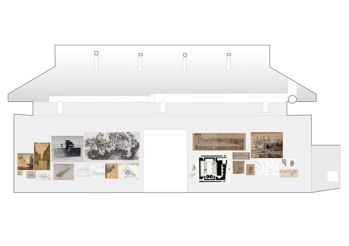
This is a Drawing Room, a with-drawing room. It is simply a love-declaration to the architectural drawing. Four walls, three large doorways. One end calmer, the other more open.
The first thing decided is a table-bench; the drawing flat on the tabletop – like when you draw it – and a bench to sit on, resting, withdrawing from the tiring Biennale.
Daylight, ever changing.
A concrete floor which is like a petrified beach, cool and warm at the same time. The two colours divide the bench: cool and light grey underneath the warm heavy grey, thus lifted, floating.
Ground – Floor
The first predicament for encounters, where we are seen, upright, open.
In this drawing room, there is a large floor space to stroll across.
Like the floor staged for events in Florence, in the drawing by unknown hand from the 1650s – an open ground.
Quite contrary, the Ponis drawing on the same wall acts on space almost physically; absorbs you into depths of dry Sardinian darkness, a labyrinthine escape from light. Disorientating. A plan incorporating the liberation from the control of overview; only chance and memory to guide you – recreation of a wilderness forever lost?
Bernt Nyberg’s school playgrounds are no children’s game. Strong, sophisticated geometry carved from dark mass into renaissance gardens is his gift to the child; considered as a full personality and as capable of architectural sensitivity as any grown-up, freed from condescending preconceptions.
I wanted the large drawings to hold the room in an almost physical spatial configuration that projects through and across; enlarged to address the scale of the room, but also to consume the gaze into worlds beyond the room.
The smaller ones are for more intimate, prolonged encounters.
Temple – Shed
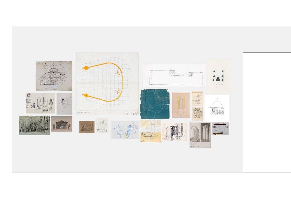
Björn Hedvall’s blueprint of the Grand Cinema in Stockholm demonstrates intricate architectural work; he inserts this beautiful dream world into a set of existing apartment blocks, negotiating the site’s varying levels and heights, choreographing the route away from reality, through carefully detailed spaces. The blueprint is proof of his mastery. In the section all is revealed, and you can then locate the bold halo for ceiling lighting in the auditorium.
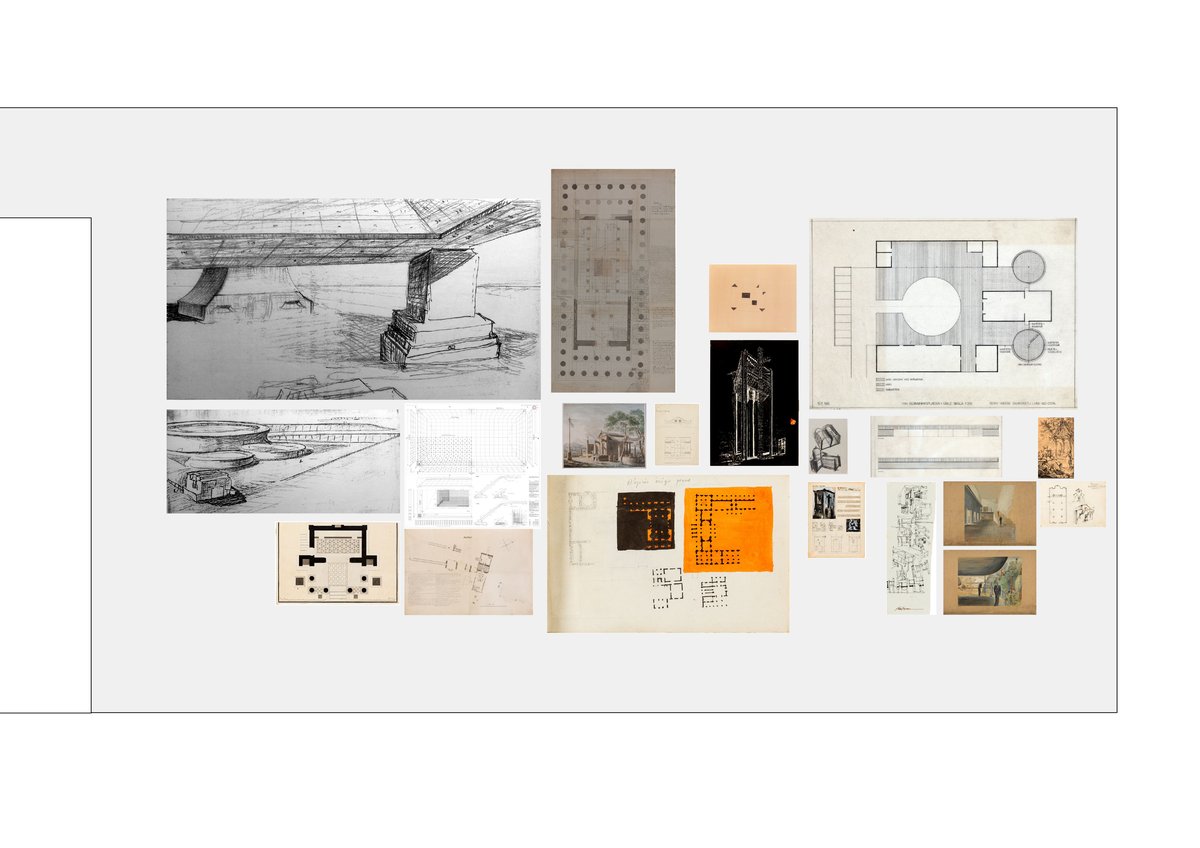
Certain drawings are greatly enlarged. Louis-Hippolyte Lebas’s travel and study sketches from 1804 in a tiny notebook are blown up to poster scale. Yet nothing is lost: the moment of precise observation, in front of Inigo Jones’s building project, pinned to the rag vellum in black and bright-orange plans, remains intact. A moment made permanent through magnification.
While Sir John Soane’s plan and elevation of pig sties remains small on the wall, it is no less a provocation of our preconceptions. A temple-shed for an animal closer to us than most in its genetic set up.
Alonso de Santos builds north of Madrid a community centre to last a thousand years,. His works belong with the neighbours on the wall: the Parthenon in Cockerell’s survey drawing and the Isis Temple at Pompeii – a temple, incidentally, visited mainly by women, freedmen and slaves.
Free space is not necessarily clean, and it is often conquered.
Niche – Stoa
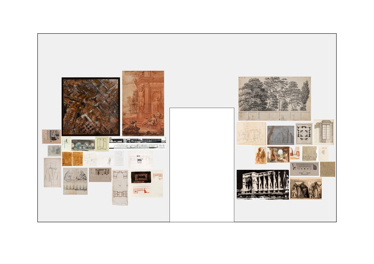
Chernikhov’s small architectural fantasy – a vision of a city as a carpet of industries, offices, apartment blocks – sliding between utopia and nightmare, is blown up to a huge tapestry with tacit presence. Next to it, in Oppenord’s Capriccio, you inhabit the monument, creating rooms in the open, casually indulgent.
Chet Kanra made in 1965 a competition entry for a huge business district in Perugia, for which he was awarded. The stunning megastructure, reminiscent of Khaju bridge in Isfahan, fuses the inhabited monument and infrastructure into one.
Walter Pichler’s ambiguous drawing makes the entrance become a fold – the form folded into itself – as a construction of circular niches, rising from the ground as a spaceship.
The architectural drawing is a thinking tool, developing approximations into design. Dietmar Blow’s survey transcends intense architectural skill, combining measure, observation, abstraction, annotation, attention, precision, tacit recording and analysis, through the pen-stroke by hand on paper.
But who has more fluently mastered the art of niches – of unfolding liveable worlds in the mystery of slanting, slipping ordinariness – than Tony Fretton, in his thousands of drawings for Lisson Gallery?
For architectural projects, that means expanding the interpretation of the brief way beyond the prescribed and beyond the immediate client, onto a wider collective of unknown users. It’s a hidden contract with the outcast, the frailest, those who have no say. It carries by necessity a clandestine element of generosity and unlikely dignity.
Most difficult, it sometimes even means – to refrain from building. To fight for doing nothing. Building nothing is hard, requires stubborn attention and persistent care.
To make the places where we don’t need to do anything, buy anything, be anyone – just be.
The freedom of architecture lies partly in its physical durability in contrast to its perishable cultural code. Thus architecture, even with sometimes high levels of oppressive history, may be overtaken, changed, re-appropriated, entirely freely and differently. The conquest of such places is not then in their destruction, or even re-use, but in their re-appropriation – and hence is felt maybe even stronger – as free space. The inhabitation of the monument – since it is a monument.
Because, on the other hand, with an address to the work of art, from which it used not to be severed, architecture possesses (can possess) also an aura of permanence, ‘of something immortal achieved by mortal hands.’
Therefore free space is, as I see it, above all a beyond-measurable utility.
But we can be there, receive our shadow, become visible again, in silence, untouchable; we can be heard, or better – be forgotten, unseen. Feel.
Hannah Arendt, in The Human Condition, says it infinitely better than I ever could:
Because of their outstanding permanence, works of art are the most intensely worldly of all tangible things; their durability is almost untouched by the corroding effect of natural processes, since they are not subject to the use of living creatures, a use which, indeed, far from actualizing their own inherent purpose — as the purpose of a chair is actualized when it is sat upon — can only destroy them. Thus,their durability is of a higher order than that which all things need in order to exist at all; it can attain permanence throughout the ages. In this permanence, the very stability of the human artifice, which, being inhabited and used by mortals, can never be absolute, achieves a representation of its own. Nowhere else does the sheer durability of the world of things appear in such purity and clarity, nowhere else therefore does this thing-world reveal itself so spectacularly as the non-mortal home for mortal beings. It is as though worldly stability had become transparent in the permanence of art, so that a premonition of immortality, not the immortality of the soul or of life but of something immortal achieved by mortal hands, has become tangibly present, to shine and to be seen, to sound and to be heard, to speak and to be read.
Mind – Space
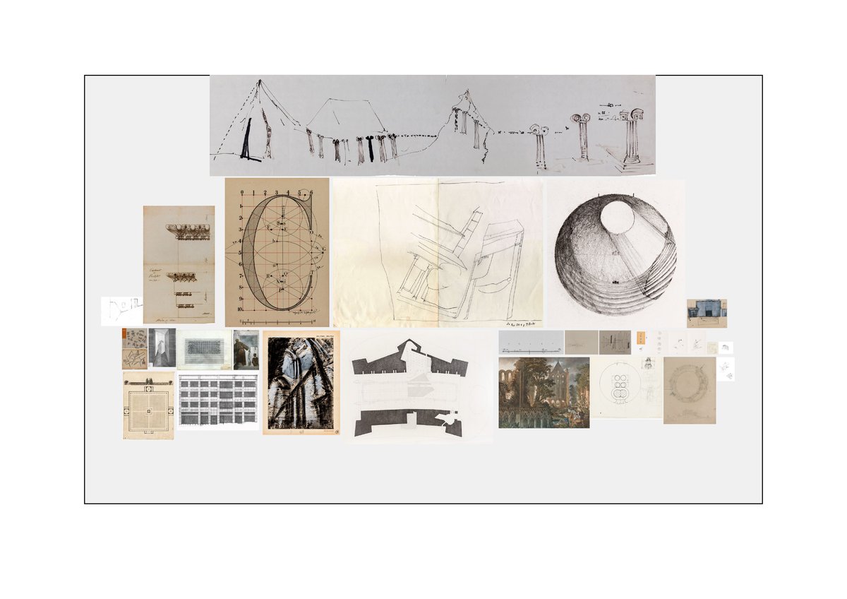
Sculptor Staffan Nihlén draws receding and expanding spaces. In many ways, his works bring you closer to fundamental architectural issues, which one can only attempt to explore by (endless, repeated, tireless, renewed, interested, distracted, intuitive) looking – seeing – and drawing.
Veronese – political painter, boldly freeing himself from clients conventions, draws on a blind door in San Sebastiano in Venice a monk leaving the choir, addressing a black boy. Five different and sliding spaces are indicated in this fresco fragment, down and out into something finally undefined and possibly endless, a horizon. The drawing is architecture and art inseparable. It is timeless and delicate, raw and sensitive – evocative.
Superstudio’s plan of infrastructure inhabiting Fortessa da Basso is irresistible. Massive, super light techno-aesthetic in the weight of the fortress.
In Innocent’s Dream, Florian Beigel and Philip Christou redraw Giotto from a postcard, October 2017: St Francis struggling to hold up the falling temple in Pope Innocento’s dream. The architect’s predicament for the future is captured in this drawing I love so much.
Crowning all is Gordon Matta-Clark’s evolution of architecture from tent to column in one flowing stream of ink.
Elizabeth Hatz’s Exhibition LINE, LIGHT, LOCUS is at Venice Biennale 2018, Giardini, The Central Pavilion, Room 11.
Elizabeth Hatz: Line, Light, Locus
– Elizabeth Hatz
This is a Drawing Room, a with-drawing room. It is simply a love-declaration to the architectural drawing. Four walls, three large doorways. One end calmer, the other more open.
The first thing decided is a table-bench; the drawing flat on the tabletop – like when you draw it – and a bench to sit on, resting, withdrawing from the tiring Biennale.
Daylight, ever changing.
A concrete floor which is like a petrified beach, cool and warm at the same time. The two colours divide the bench: cool and light grey underneath the warm heavy grey, thus lifted, floating.
Ground – Floor
The first predicament for encounters, where we are seen, upright, open.
In this drawing room, there is a large floor space to stroll across.
Like the floor staged for events in Florence, in the drawing by unknown hand from the 1650s – an open ground.
Quite contrary, the Ponis drawing on the same wall acts on space almost physically; absorbs you into depths of dry Sardinian darkness, a labyrinthine escape from light. Disorientating. A plan incorporating the liberation from the control of overview; only chance and memory to guide you – recreation of a wilderness forever lost?
Bernt Nyberg’s school playgrounds are no children’s game. Strong, sophisticated geometry carved from dark mass into renaissance gardens is his gift to the child; considered as a full personality and as capable of architectural sensitivity as any grown-up, freed from condescending preconceptions.
I wanted the large drawings to hold the room in an almost physical spatial configuration that projects through and across; enlarged to address the scale of the room, but also to consume the gaze into worlds beyond the room.
The smaller ones are for more intimate, prolonged encounters.
Temple – Shed
Björn Hedvall’s blueprint of the Grand Cinema in Stockholm demonstrates intricate architectural work; he inserts this beautiful dream world into a set of existing apartment blocks, negotiating the site’s varying levels and heights, choreographing the route away from reality, through carefully detailed spaces. The blueprint is proof of his mastery. In the section all is revealed, and you can then locate the bold halo for ceiling lighting in the auditorium.
Certain drawings are greatly enlarged. Louis-Hippolyte Lebas’s travel and study sketches from 1804 in a tiny notebook are blown up to poster scale. Yet nothing is lost: the moment of precise observation, in front of Inigo Jones’s building project, pinned to the rag vellum in black and bright-orange plans, remains intact. A moment made permanent through magnification.
While Sir John Soane’s plan and elevation of pig sties remains small on the wall, it is no less a provocation of our preconceptions. A temple-shed for an animal closer to us than most in its genetic set up.
Alonso de Santos builds north of Madrid a community centre to last a thousand years,. His works belong with the neighbours on the wall: the Parthenon in Cockerell’s survey drawing and the Isis Temple at Pompeii – a temple, incidentally, visited mainly by women, freedmen and slaves.
Free space is not necessarily clean, and it is often conquered.
Niche – Stoa
Chernikhov’s small architectural fantasy – a vision of a city as a carpet of industries, offices, apartment blocks – sliding between utopia and nightmare, is blown up to a huge tapestry with tacit presence. Next to it, in Oppenord’s Capriccio, you inhabit the monument, creating rooms in the open, casually indulgent.
Chet Kanra made in 1965 a competition entry for a huge business district in Perugia, for which he was awarded. The stunning megastructure, reminiscent of Khaju bridge in Isfahan, fuses the inhabited monument and infrastructure into one.
Walter Pichler’s ambiguous drawing makes the entrance become a fold – the form folded into itself – as a construction of circular niches, rising from the ground as a spaceship.
The architectural drawing is a thinking tool, developing approximations into design. Dietmar Blow’s survey transcends intense architectural skill, combining measure, observation, abstraction, annotation, attention, precision, tacit recording and analysis, through the pen-stroke by hand on paper.
But who has more fluently mastered the art of niches – of unfolding liveable worlds in the mystery of slanting, slipping ordinariness – than Tony Fretton, in his thousands of drawings for Lisson Gallery?
For architectural projects, that means expanding the interpretation of the brief way beyond the prescribed and beyond the immediate client, onto a wider collective of unknown users. It’s a hidden contract with the outcast, the frailest, those who have no say. It carries by necessity a clandestine element of generosity and unlikely dignity.
Most difficult, it sometimes even means – to refrain from building. To fight for doing nothing. Building nothing is hard, requires stubborn attention and persistent care.
To make the places where we don’t need to do anything, buy anything, be anyone – just be.
The freedom of architecture lies partly in its physical durability in contrast to its perishable cultural code. Thus architecture, even with sometimes high levels of oppressive history, may be overtaken, changed, re-appropriated, entirely freely and differently. The conquest of such places is not then in their destruction, or even re-use, but in their re-appropriation – and hence is felt maybe even stronger – as free space. The inhabitation of the monument – since it is a monument.
Because, on the other hand, with an address to the work of art, from which it used not to be severed, architecture possesses (can possess) also an aura of permanence, ‘of something immortal achieved by mortal hands.’
Therefore free space is, as I see it, above all a beyond-measurable utility.
But we can be there, receive our shadow, become visible again, in silence, untouchable; we can be heard, or better – be forgotten, unseen. Feel.
Hannah Arendt, in The Human Condition, says it infinitely better than I ever could:
Because of their outstanding permanence, works of art are the most intensely worldly of all tangible things; their durability is almost untouched by the corroding effect of natural processes, since they are not subject to the use of living creatures, a use which, indeed, far from actualizing their own inherent purpose — as the purpose of a chair is actualized when it is sat upon — can only destroy them. Thus,their durability is of a higher order than that which all things need in order to exist at all; it can attain permanence throughout the ages. In this permanence, the very stability of the human artifice, which, being inhabited and used by mortals, can never be absolute, achieves a representation of its own. Nowhere else does the sheer durability of the world of things appear in such purity and clarity, nowhere else therefore does this thing-world reveal itself so spectacularly as the non-mortal home for mortal beings. It is as though worldly stability had become transparent in the permanence of art, so that a premonition of immortality, not the immortality of the soul or of life but of something immortal achieved by mortal hands, has become tangibly present, to shine and to be seen, to sound and to be heard, to speak and to be read.
Mind – Space
Sculptor Staffan Nihlén draws receding and expanding spaces. In many ways, his works bring you closer to fundamental architectural issues, which one can only attempt to explore by (endless, repeated, tireless, renewed, interested, distracted, intuitive) looking – seeing – and drawing.
Veronese – political painter, boldly freeing himself from clients conventions, draws on a blind door in San Sebastiano in Venice a monk leaving the choir, addressing a black boy. Five different and sliding spaces are indicated in this fresco fragment, down and out into something finally undefined and possibly endless, a horizon. The drawing is architecture and art inseparable. It is timeless and delicate, raw and sensitive – evocative.
Superstudio’s plan of infrastructure inhabiting Fortessa da Basso is irresistible. Massive, super light techno-aesthetic in the weight of the fortress.
In Innocent’s Dream, Florian Beigel and Philip Christou redraw Giotto from a postcard, October 2017: St Francis struggling to hold up the falling temple in Pope Innocento’s dream. The architect’s predicament for the future is captured in this drawing I love so much.
Crowning all is Gordon Matta-Clark’s evolution of architecture from tent to column in one flowing stream of ink.
Elizabeth Hatz’s Exhibition LINE, LIGHT, LOCUS is at Venice Biennale 2018, Giardini, The Central Pavilion, Room 11.
Related...
The facade is the window to the soul of architecture: Venice Architecture Biennale, 2018
– Adam Caruso and Helen Thomas
Permanence
– Elizabeth Hatz
Category
drawing histories on their own work commentaries, rants & reflections
Period
c21st
Architect
Elizabeth Hatz
Medium
collage digital
Tags
exhibition venice biennale (exhibition)