T.O.P. Office and the Accademia Bridge

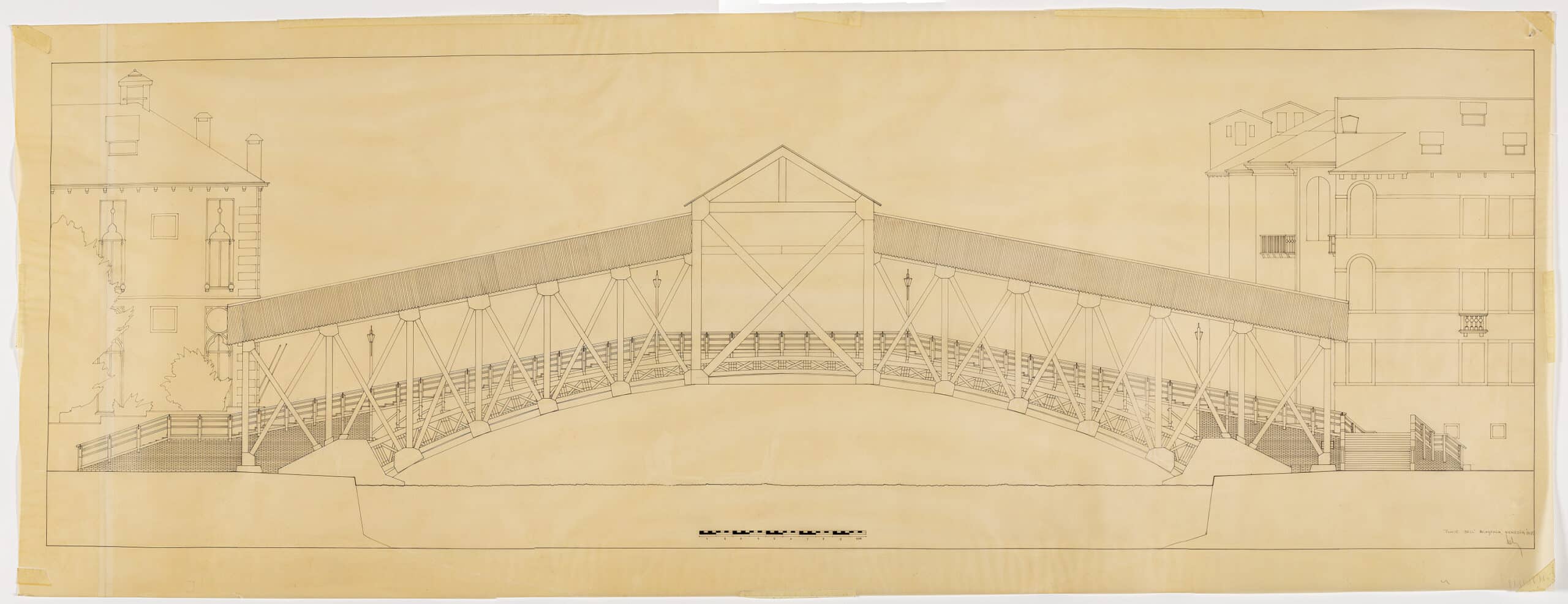
In a way, this project was architecturally ‘ready-made’. Our proposal for the Accademia Bridge can best be seen as an example of recycling and reuse. Formally, it sublimates what is available from a limitation of resources and materials. In the concept lies a wink to the (still naive in my opinion) postmodernism promoted by the architecture biennial of 1980, on the one hand, and the iconic Rialto Bridge on the other.
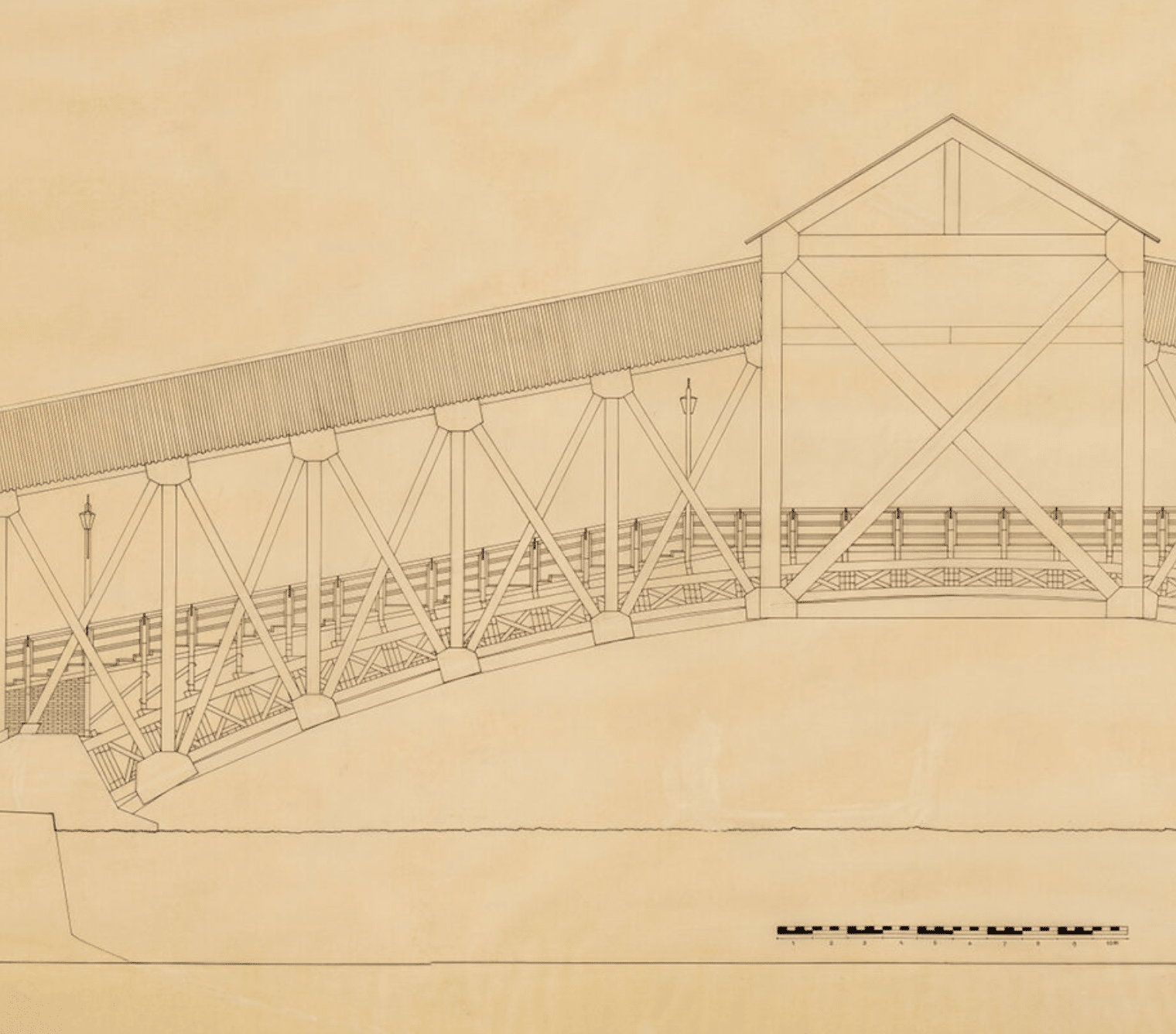
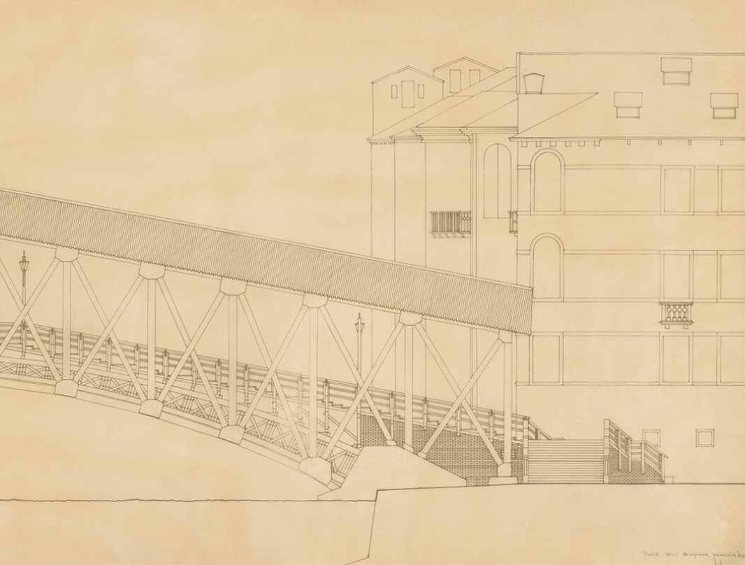
At the time of the competition, I had been working in Switzerland regularly for a couple of years. I knew that wooden bridges there usually have a roof, not only for the comfort of the users but also to protect the construction from the elements. So the answer proposed by the T.O.P. office was to keep and protect the existing ready-made bridge with a king-size roof inspired by the world-famous Rialto Bridge, solving at the same time, the questionable stability of the bridge, as noted in the competition text.
Urbanism was reinvented a hundred years ago by Le Corbusier, using urban beauty and order to significantly improve living conditions. In sharp contrast to today’s ‘delirious world’, where people are expected to serve the city, Le Corbusier imagined his Ville Contemporaine serving its three million inhabitants—what an idea!
In the late 1960s, during my last year of training, modernism had worn off. Le Corbusier had drowned, and we were led to believe that all soulless, ugly, and failed, market-driven, modern city projects were Le Corbusier’s fault. I began to understand that the architect’s task and liability were about to drastically change and that the successful architect of my generation would be the one who could make interesting architecture without much building (or with limited resources and materials).
I realised that for my generation, the scale of the city would have to be supplemented within the scale of the ‘Spaceship Earth’ concept. The Venice project is completely in line with this vision, and with my adage that far too much reckless, frivolous and energetic construction was taking place.


The T.O.P. office was deliberately set up in 1970 as an architectural firm that could function, as much as possible, independently of assignments, and with the conviction that it would be better to reduce the spatial impact of building and to build less. This was at times difficult, as I was perceived—against my will—as the bearer of this difficult message. During our first decade, we invented a new working framework focused on two disciplines, namely (urban) architecture and visual art using a lot of media, scales and perspectives.
In the 1980s the T.O.P. office was doing a great number of visual experiments and formal research in search of an appropriate form, as always with a touch of humour. For example the theme ‘Scale & Perspective’. The drawings for the Accademia Bridge, aesthetically and qualitatively executed in large format on tracing paper, and the photocopies coloured with watercolour, are to be seen in that realm. Some of them were framed and shown in art galleries.
