Diagrams: Hans van der Heijden in Conversation with Richard Hall
Hans van der Heijden is an Amsterdam-based architect. He co-founded biq in 1994 with Rick Wessels before establishing his own office, Hans van der Heijden Architect, in 2014. During this timeframe he has developed a recognisable and idiosyncratic drawing repertoire, the origins of which can be traced back to his education at TU Delft in the 1980s. The following is an extract of a conversation between Hans van der Heijden and Richard Hall on 22 April 2021, discussing the architect’s drawing practice.
Courtesy of Hans van der Heijden Architect.
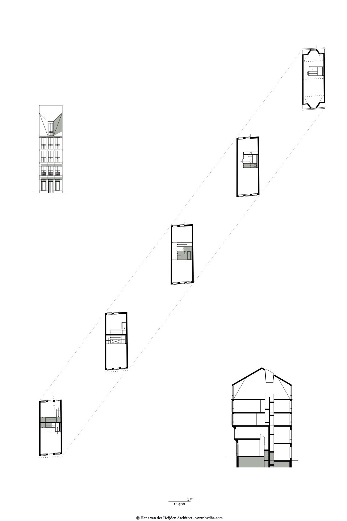
Richard Hall: My interest in your drawings is kind of two-fold. Firstly, I’m interested in drawings that are economical in their means and precise in intentions: drawings that are direct. Secondly, I’m fascinated by the role of repertoire in architectural work: in terms of method, representation and, of course, the built outcomes. There are a few recurring drawing types in your practice which appear in almost all projects, with consistent graphics and conventions. One type I’m especially interested in are what you call ‘diagrams’. Could you talk about this mode of drawing a little?
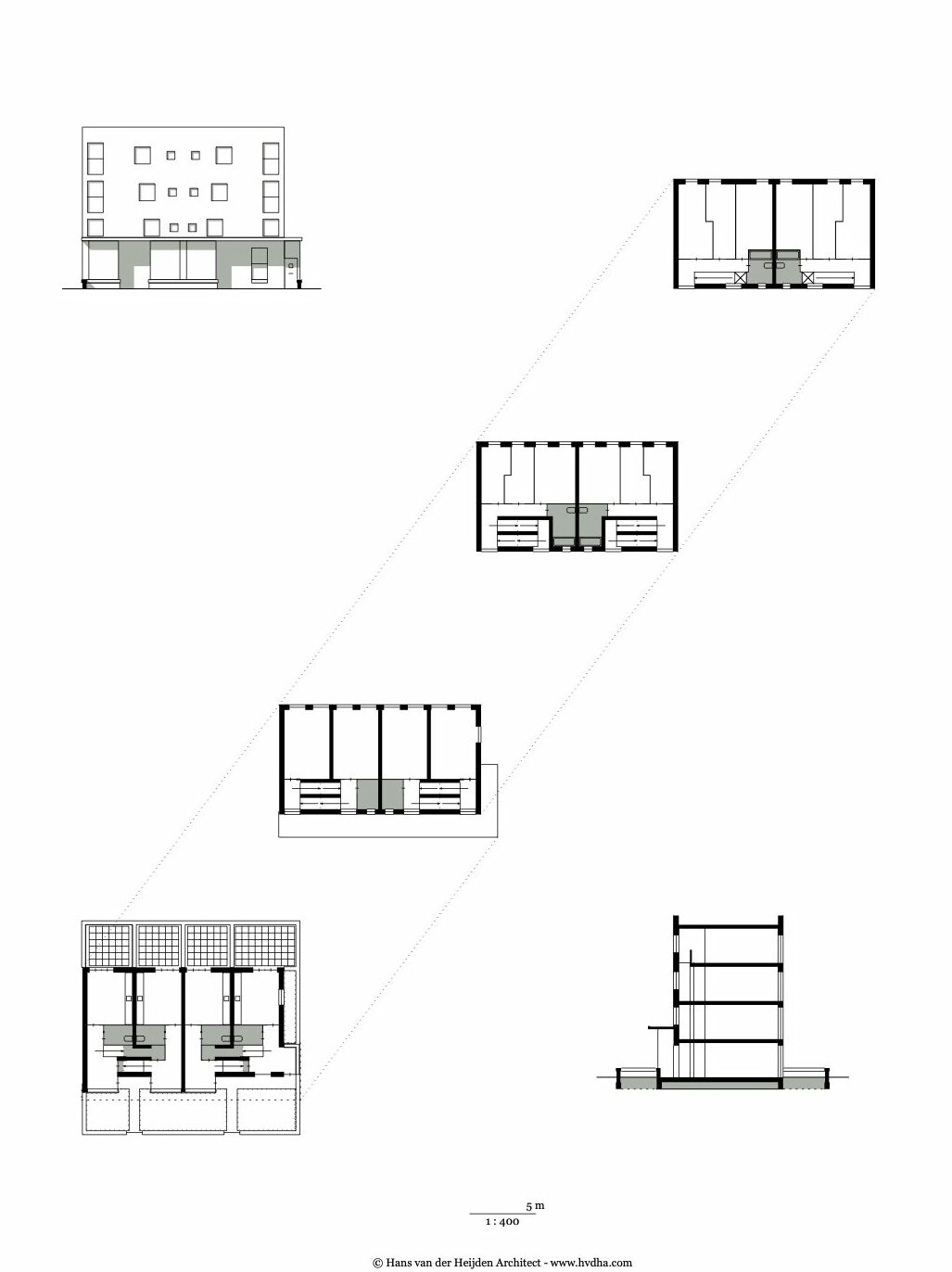
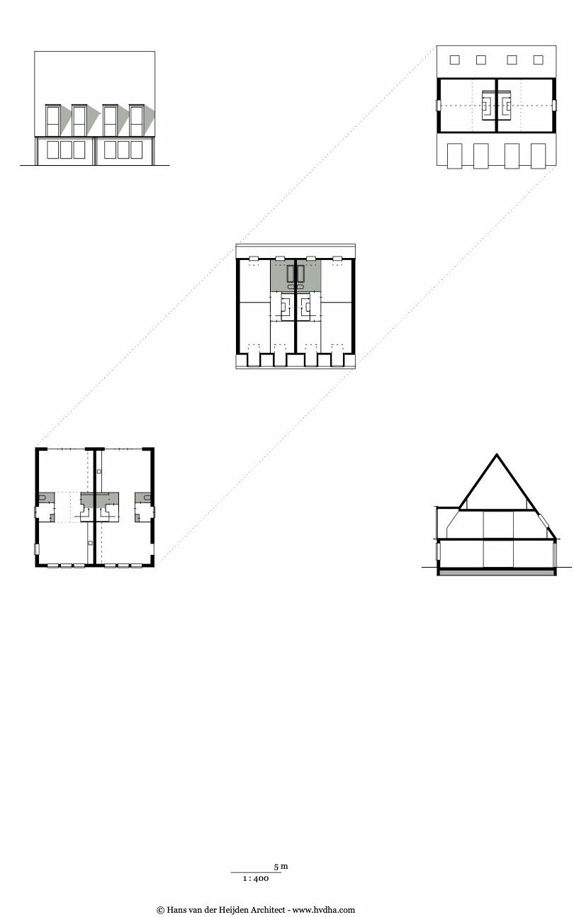
Hans van der Heijden: The first reason for making those diagrams is that they are instrumental in the design. I finish the preliminary design with a diagram that establishes a consistent relationship between the plans, section and facade. It’s almost emblematic – there are no details yet – but it is also a kind of contract with the client and other stakeholders: this is, in rough terms, what we are going to do. I try to make these diagrams robust. They are not too fragile or sensitive to the inevitable attacks that happen in social housing design.
The second reason is completely different: at some point we decided to make a catalogue of what we’d done – and in fact to make new diagrams of built projects where they hadn’t already been produced – to make the schemes comparable. Schemes that were filed and stored away suddenly had a relevance because they fitted into a development or a series. Some of these were schemes where the attacks on the diagram were quite violent in the construction process, but at this diagrammatic level some of them suddenly had importance. It struck us that sometimes they revealed interesting steps in the development of the practice.
RH: And you started making them during the biq years?
HvdH: They started there. I have to say that this developed slowly. There’s an article that was published in arq called ‘The Diagram of the House’, from 2001, which was the first time that I articulated this idea that you could have something between the type and the actual manifestation of the project. [1] Something that did have specificity – topographical solutions, proportions and so on – and was simultaneously open to negotiation. In 2008 there was an opening show for the Bluecoat arts centre in Liverpool that we built, and for that occasion I made some very simple façade drawings – again very emblematic. The Bluecoat drawings were reductions of a project that was already built, and in the years after we tried to swap this over and deliberately make those drawings before we started detailing a project. In the years after that they became instrumental.
RH: So, they’re emblematic of the primary intentions of a project?
HvdH: We say task definition.
RH: Were there any particular precedents or influences for these drawings?
HvdH: In Delft the influence of what has later dubbed as Teachers Modernism that developed in the Seventies and Eighties was unavoidable. [2] I was trained to make crisp black and white drawings that were meant to reduce existing buildings to make them understandable, because the excess of information that architectural drawings sometimes have was left out. That partly explains the didactic dimension, but there is an aesthetic dimension in the drawings themselves too. I’ve always liked to draw. I still draw by hand a lot as well as on the computer. I like the computer because of the incredibly thin lines and acute graphic qualities that are possible. A friend of mine called my drawings ‘calligraphy’, I guess he finds them neurotic [laughter]. Beyond this aesthetic dimension the format offers the possibility of making your own associations between the plans and sections and the image.
Courtesy of Hans van der Heijden Architect.
Courtesy of Hans van der Heijden Architect.
RH: Let’s talk a little bit about your publication Schema van het Huis. [3] This document records all your projects up until that point. Each is described through this drawing convention along with a realised photo or model photo. The document is incredibly rigorous in its repetition and adherence to this convention… it’s like a 140-plus page PDF or something. Why did you feel the need to do that?
HvdH: At some point I made a monograph together with Karin Templin called Street Architecture. [4] She had this rather wild idea to compare my housing to Florentine urban architecture. I had invited her, as a practising architect who also shares an interest in type, housing and urban design, to have an active voice in the document. She photographed all sorts of Florentine architectural items and catalogued them in a very strict way: always the same scale, always shot frontally. She was quit dogmatic about that. Then, she asked, ‘do you have details?’. Of course, I had details – and then she kept asking for all sorts of information that was stored away in the office and never meant to be published or whatever.
So, although I liked to think that every single detail drawing that leaves the office looks nice, seeing all this material together, it really was chaos. I made the decision to redraw everything, which was an enormous amount of work. I did most of it myself in evenings and weekends… it really was monk’s work. But very nice to do, and therapeutic because through drawing these diagrams suddenly all schemes make sense. Even things that were not built make sense, and that sort of evenness opened the way to talk about schemes that, in a way, were lost.
When that book was finished this diagram thing was simply a new project. Some of the diagrams were already in Street Architecture. It came from that. How nice it would be to have all of these floor plans in one volume?
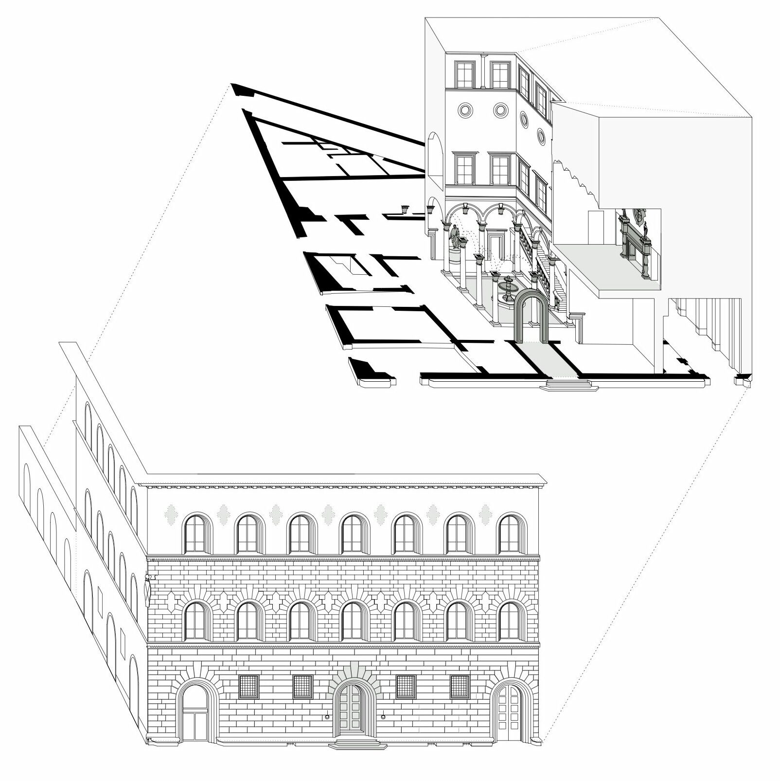
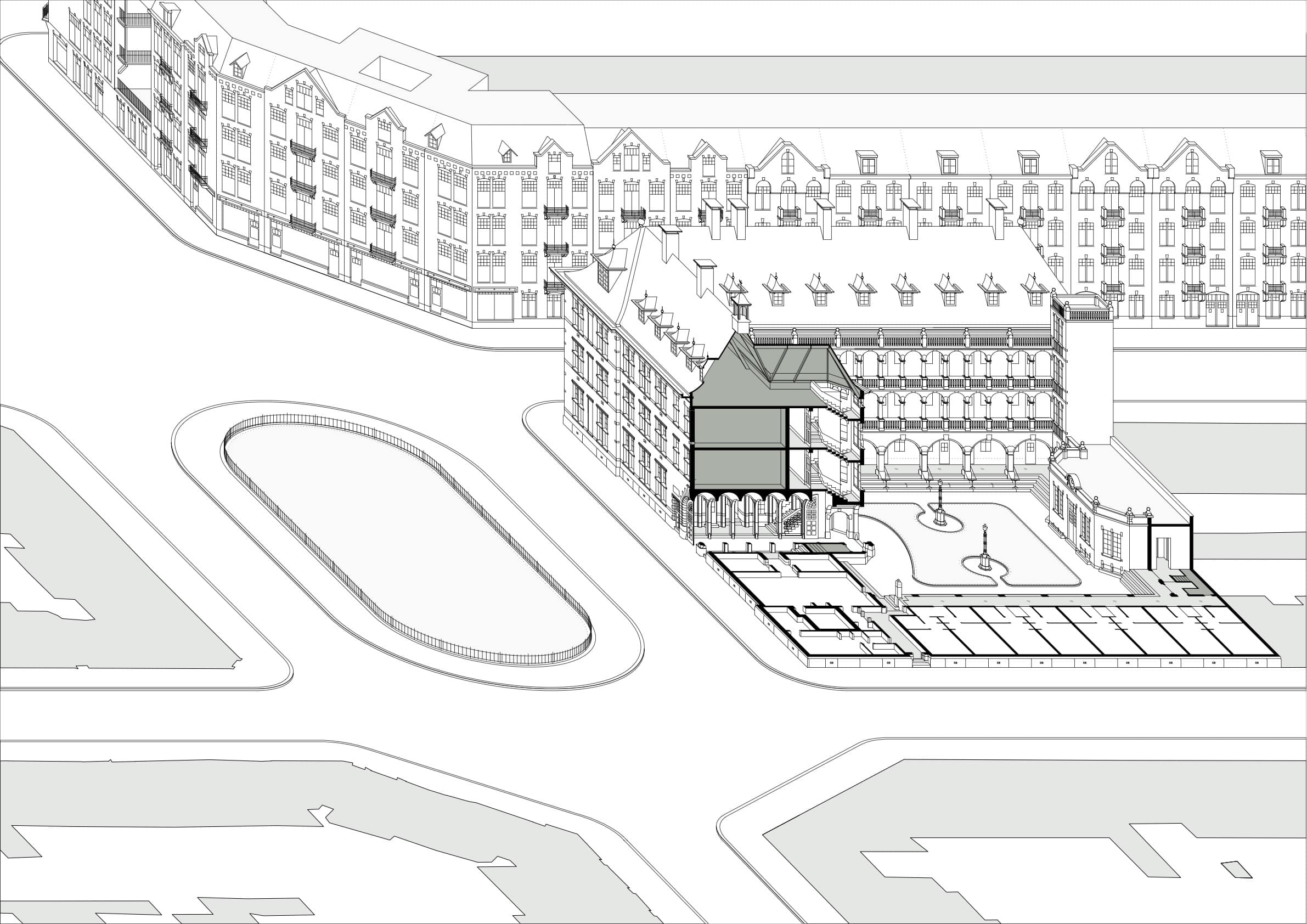
RH: Street Architecture, and the reference to palazzi, reminds me that you use these drawings as a research tool too. You draw precedents in this way – also with nice cutaway isometric drawings.
Courtesy of Hans van der Heijden Architect.
Courtesy of Hans van der Heijden Architect.
HvdH: Yes, at this moment that’s the big thing: I’m drawing palazzi [laughter]. I’m doing isometrics a lot. I’m now documenting the only real domestic palazzo that we have in The Netherlands, built in 1909. [5] It’s a smashing building, but even historians don’t know about it. I found it by coincidence, and because there’s no material it’s a lot of work to really get it done. But as you say, I learn from it, and I also show it to my students. My students have to work in the same way, so it’s an example for them.
RH: You mentioned the analytical drawings of Teachers Modernism earlier. I guess this relates back to that way of trying to understand architectural examples?
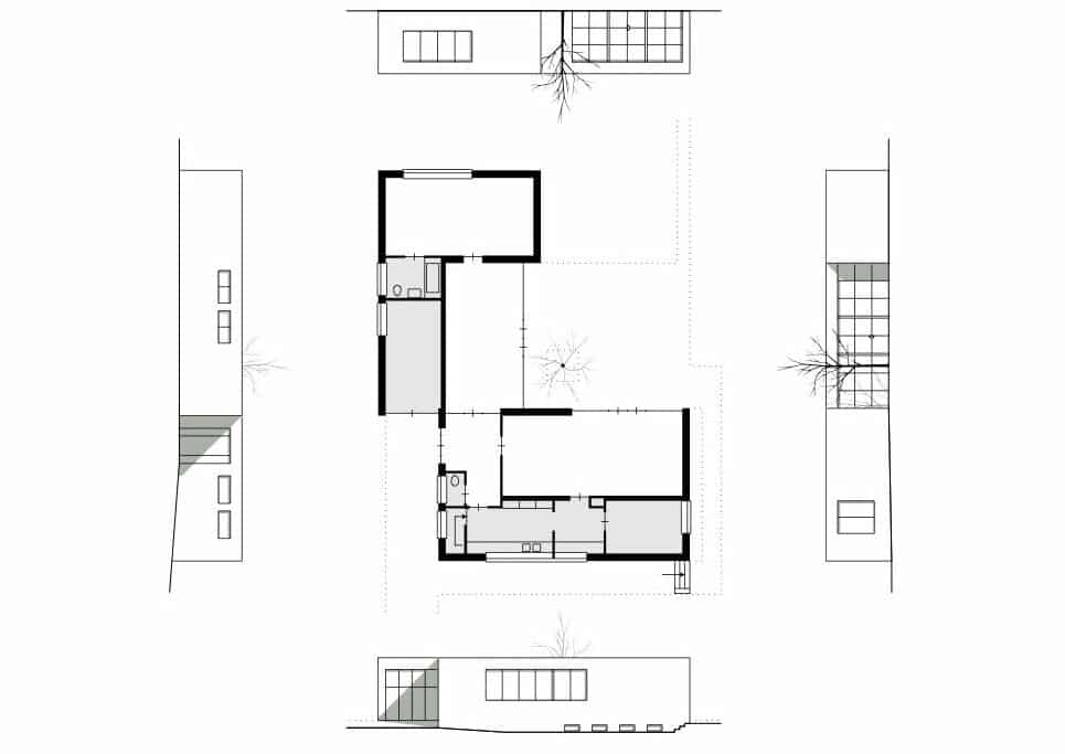
HvdH: I’m getting increasingly suspicious about of the truth that drawings suggest. Last year we went to Berlin to see Haus Lemke by Mies van der Rohe – which is an incredible house – and in all of the books you see the version of the house before it was value engineered. Sometimes you see a small stamp-sized plan of how it was executed, but even that one is not correct. So, I made a lot of photographs there, and by counting bricks in the façades I made what I now call an ‘as built’ drawing of the house. That drawing doesn’t exist, and you find out lots of things. There’s a tree in the court, and if you take the mid-point of the tree, you can rotate and mirror all sorts of lines in the drawing from this point. At some point the master must just have drawn a quick symmetrical line somewhere.
Courtesy of Hans van der Heijden Architect.
Having this observation in mind, I’m investigating the palazzo typology with Karin Templin and my colleagues at Rotterdam, Theo van de Beek and Like Bijlsma. We set this palazzo studio every year and each time we go to a different Italian city to study palazzi. [6] Of course, many of them were built in the Renaissance and it’s almost by definition that the drawings are incorrect. The drawings are quite often made rectangular, even when the sites were un-rectangular. Believe it or not, in Giorgio Grassi’s book on Alberti there’s one spread where you see a photograph of the building next to a line drawing made by historians and a technical analysis about how the different stone slabs are quarried – and they are actually bigger than the building suggests. [7] You could argue that the complete spread is about how the joints are – you have this photographed reality and you’ve got this technical essay – but it’s remarkable what the historians do. It’s a palazzo with pilasters and then irregular sheets of stone in between, and the historians make these regular. But looking at the picture below you see that these joints are made completely intentionally, because the pieces of stone are actually much bigger than they appear in the building. If you then realise that the first palazzi revealed their rubble walls, only later to be replaced by rusticated basements and so on, I think there is a kind of tectonic message in this: an orderly rhythm of columns and beams with non-load-bearing rubble between. I always had this blind belief in, and admiration for, Italian historians, but… [laughter].
RH: What do you hope the students to learn from that?
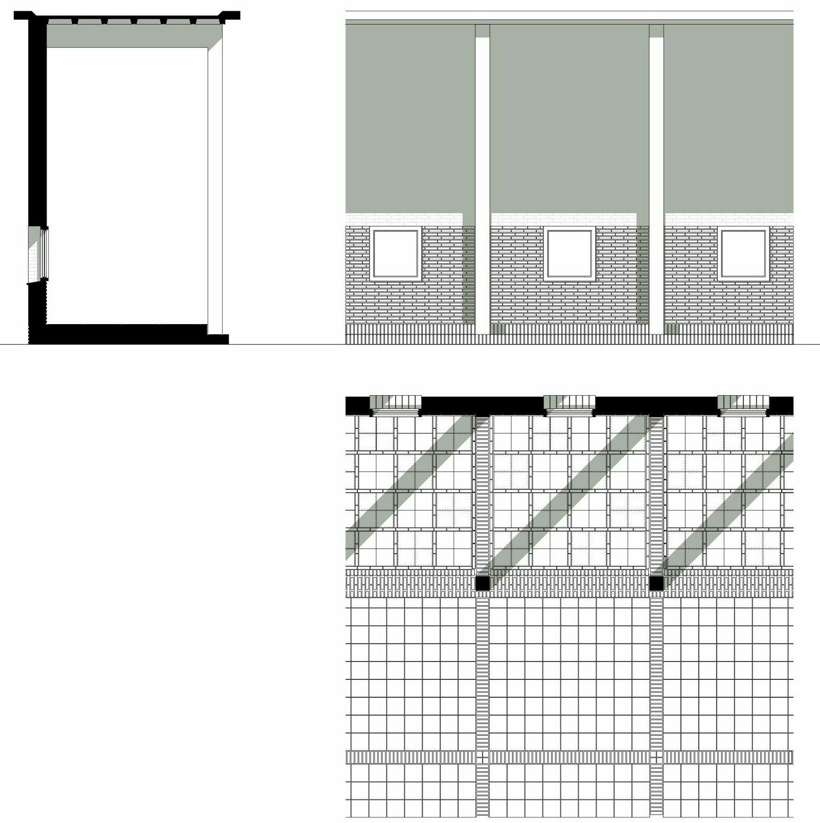
HvdH: Well, drawing is also very important in the studio. To the dismay of the staff, we forbid students to make models. In the first design stage the students have to make a diagram, very much along the lines of what I’ve been talking about, and immediately also a 1:20 coloured façade section – which they find scary, because they are educated that this comes last. But you can think about structures already at a stage in the design process when you don’t know exactly how the windows are. You can draw information from it. We start from the abstract small scale and the very concrete big scale and then converge. Subsequently, the detailed level starts informing the diagrammatic level and vice versa – and the schemes proceed incredibly quickly. It’s amazing, because students are not trapped in that circular, intuitive design method that’s advocated in schools.
There’s pleasure in building. I remember that one of the students talked about the stonework in one of his Roman palazzo. I explain how it was quarried and cut on site, and then I encouraged them to feel that the bottom of the sills were still sharp. 700 years later you could still hurt your hand. That haptic quality of buildings is rather essential to me. The other thing the students learn is to leave behind some of their fear of old stuff. By having them study the bloody thing as built, they concentrate on how it’s made, how it’s put together, what the structural rules are etc., and in the wake of that enthusiasm, they start reading and telling you about Renaissance design doctrines.
But it’s not what we start with. We don’t hammer out the ideology and say, ‘ok, this is it, please confirm what you’ve read in the books’. I like to think of construction practice in the Renaissance being very down-to-earth. I don’t know whether it’s relevant to this discussion, but when I redrew the Palazzo Gondi by Sangallo in Florence, I tried to imagine what Sangallo’s instruments were to make architecture, because the word ‘architect’ didn’t even exist. There were guilds for all professions, but not for architects. In fact, he was a sculptor himself. All he had was his authority, but he had no mandate. So, how do you make buildings then? My hunch is that he imposed geometry on the site: it was an irregular site and he imposed a grid. A grid is objective – and a grid in those times was not value free, it showed the hand of god – and, this is totally speculative, but I think he worked together with the other guilds: with the people who made the rubble walls, the carpenters, the foundation makers and also the stone masons. But he didn’t sign the whole thing as a gigantic piece of sculpture so to speak. Rather, Sangallo accurately added those elements underlying the diagrams of Palazzo Gondi. He sculpted the capitals of the columns in the cortile, the railing of scale aperto and the fireplace of the sala at the piano nobile. It’s unbelievable that you have a fireplace that is five by two-and-a-half metres with fragile plant leaves that are a millimetre-and-a-half thick – and they’ve never broken.
There’s nothing new in architects who can’t micromanage their buildings, finding their own ways in construction practice and simply influence what they are able to.
RH: This is super interesting. Overlaying what you’ve just described onto the previous comments about teaching: this way of looking at things and recording things is demystifying. To a certain degree, it’s democratising the information.
HvdH: Yes!
RH: Basically, it’s just a building. It’s not magic. It might be a very beautiful building – it might be exceptional – but it’s nevertheless a building made of stuff. So, it should be possible to understand it in those terms: how is it put together? What are the reasons it was put together in this particular way? The spatial sensations one experiences are the result of selecting physical stuff and putting it together in a certain sequence. I think architectural discourse often ignores this simple reality or tries to mystify it in a way I consider very unproductive.
HvdH: Thank you for that remark. I’ve never thought about it in quite that way, but you’re absolutely right: it’s democratic. I think it’s a big thing that architecture is shareable. Today architecture is presented as expensive wine. You must know about wine in order to enjoy wine, and you have to know everything about architecture in order to be impressed by architecture. That’s silly. You can take that further: we’re now witnessing in all western countries a thorough disbelief in the expert, and the democratisation of judgements. I think the response to that on the side of architects cannot be to behave in an even more difficult way. We should engage with that process and demonstrate what we are and what we can bring to the process – what we can do that other professions can’t do. What all of these diagrams do, and what Sangallo did, is basically making an integration of all sorts of varying information. The ethos of the stoneworkers, the ethos of carpenters, the design grid, the irregularity of the site. Even in those times, budgets were difficult, you had to convince people, you had to wheel-and-deal.
I think the architect’s mind is rather unique because we can do just that. We can play these simultaneous chess games in our head. We should be able to give simple answers to complex questions.
RH: This is what’s nice about students being asked to simultaneously draw a diagram and a 1:20 façade section in their first exercise. It focusses this sense of the architect as a generalist – sitting in the middle of things – suturing disparate information together with some clarity. And, that this isn’t a linear process: you don’t start in one place, set a course and end up where you aimed for. The process is live, and one has to move nimbly and freely between things. In a way, this is why diagrams are such a preoccupation of mine: they give you a device through which you can take all of that complexity and refract it into a format that one can always refer back to, to check that things are on track. Even as you’re accepting all of the uncontrollable complexity native to a project, diagrams are one means of shaping it all into architecture – into a project – rather than simply an accumulation of decisions.
HvdH: That’s exactly it! You might compare the primitive look of the diagram and our current BIM model. After all, a BIM model isn’t a drawing anymore, and it also doesn’t integrate, it simply stores information – it accumulates. It’s a very abstract thing, and the promise – and this is perhaps the reason why architects are so frantic to become the BIM-masters in projects – is that finally, finally we can micromanage the project. Finally, we are in full control of all the nice ironmongery and the nice light switches and water taps and the things you see in design magazines. Well, we aren’t. But also, there’s this serious problem that you only see a glimpse of what you get when the BIM models are printed or
issued in PDF format.
RH: Right. It takes a second to get your head around the fact that they’re primarily about data, not drawings. It’s clearly about coordination, but that’s quite different from the kind of integration you’re describing.
HvdH: Sure. I learn from my students in this regard. When teaching on the college type, I took the students to Cambridge. They also had to draw this 1:20 façade, and there was one student who had a hyper-nice 1:20 drawing. But what had she done? She had taken one of her high-res photographs, corrected the angles and put it on a CAD drawing with only the outlines of the façades, and made the scale right. She was happy with it, and I said ‘yes, but do you see that there are corner blocks? And that these corner blocks are three bricks high, but that there also three bricks in-between?’ The blocks were offering a scale in this neo-Gothic building – a sub-scale that is in-between the entire façade plane and the window, sills and keystones – a whole repertoire that comes from that module. My student, however, replied: ‘yeah, but in my office, I’m doing BIM models, and for us brickwork is a texture‘.
Such stories reveal that the BIM model at the moment isn’t really smart enough to locate all of the different bricks as things. Façades are a mere texture, something that comes later, or has to be
solved on site or something.
RH: And when one actually gets around to drawing the building to brick dimensions, the proportions and relationships begin to change…
HvdH: Which is so important. It’s not really a case of drawing manually, but even drawing on the computer the student realises that the stones where that big – and she developed a sense of the scale of the building in her head. I’m rather sure that she profited from that when she was designing, because she was used to exploiting the BIM expertise that she had – making nice 3Ds – but now she wasn’t allowed to make 3Ds she had to sit down and draw sections and plans and façades and try to imagine
how big she was herself within a digital world.
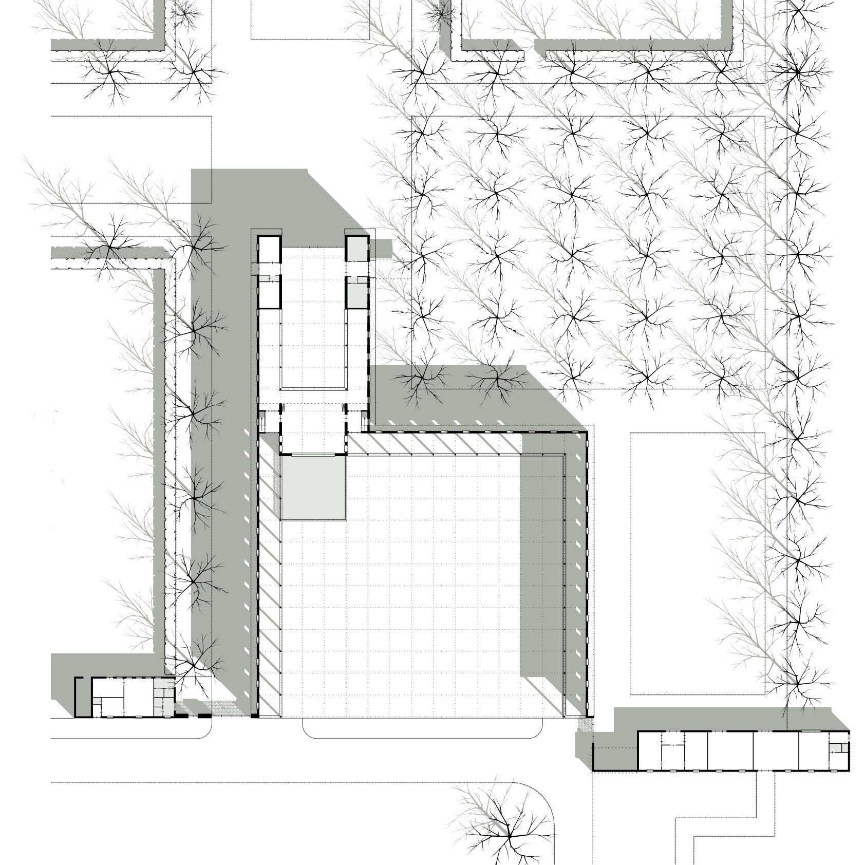
RH: We’ve talked about diagrams, cutaway isometrics and large-scale façade drawings. I’ve noticed that in other drawing types you follow similar basic conventions. You draw site plans in a specific way with one line weight, a reduced number of lines for the context, one tree symbol, and only the building you’re working on casts a shadow. Another might be the line-drawn 1:250 elevations with heavy cast shadows sitting behind the lines, in a kind of Grassi-like Italian tradition and, although I don’t want to talk about sketches because we then get into another territory, your sketches also have a particular aesthetic. All very consistent in their own way, and each apparently serving a particular role. I find this system of having several set drawing types with set scales and set conventions extremely fascinating.
Courtesy of Hans van der Heijden Architect.
HvdH:
Well, there’s a story to that as well [laughter]. At some point we decided that we needed a house-style. Wouter Overhaus designed it. [8] As an Amsterdammer he had come to see us in Rotterdam and the first thing he said was: ‘there’s something wrong here [laughter]. Everything I note when I enter your building, and go into the elevator, and go into your office confirms the hardworking, directness of Rotterdam. But now I see all of these drawings on the table and a) they are always different, and b) they always try to please’. His advice was to straighten up all of our products, really everything: models, photos, renders, drawings, everything, everything. ‘Because that is your house style. When there are ten drawings on the table, people should be able to see immediately, that’s your drawing’. After that we started to make everything so regular, as you describe.
One of the things Wouter said – and this remains noteworthy – is: ‘we will make a house-style for you in which you simply have to type. Just keep typing, not thinking, not worrying about the layout, because that’s ready. That’s what you need to do in your drawings as well. You need to worry about what you are making and not worry about line weights. You can simply assume that it’s good and concentrate on the content, because architectural drawings are nice in themselves’. Returning to our own belief system was productive in terms of efficiency in drawing, but also marking out who we were.
Admittedly, that process caused pain. We had a session with Wouter with the largest table in the office filled with all of our products, and we asked him what he thought. He really was very brutal saying, ‘that should go, that should do, that should go…’. Within 15 minutes there was an enormous pile of rubbish, and there were just one or two things left and he said ‘these two, these matter’ [laughter].
RH: And you’re still using a variation of these conventions today pretty much. Do you ever break the rules?
HvdH: Yes, but I don’t fiddle around with everything each time. I’m not a wine drinker [laughter]. I simply lack that sort of sensibility. Every isometric is new because the content is different. In the drawing that I’m making now, the joints of the brickwork are important, but if you treat them as lines they become overly present. So, the experiment is to find a grey and a transparency that remains visible within the drawing. So, for that particular drawing, that is the thing to worry about, but not the other colours or line types or whatever.
Courtesy of Hans van der Heijden Architect.
RH: I can sympathise with this. My whole interest in economy of drawing is related to the possibilities afforded by limiting one’s choice – and a deliberateness about when to make choices. I’m much more interested in the content and composition than sophisticated graphical games with lots of tricks and post-production. I think it can be highly productive to try to use as few tools as possible to clarify what one is doing. Something I was suspicious of when teaching was the culture of seductive graphics as a smokescreen. If you draw in a limited and flat way, it’s all laid out bare in front of you. You have to have ideas: there’s nowhere to hide…
HvdH: You’re naked…
RH: I think this is very powerful when designing things.
HvdH: I’ve forgotten to mention the early OMA work. That was very important for me as a young student in Delft in the Eighties. There was a lot of mediocrity going on in that university. Aldo van Eyck and Herman Hertzberger were there, who constantly quarrelled with our mini version of O.M. Ungers. And then, suddenly, Koolhaas arrived out of nothing. My father, who worked for the Dutch government at that time, brought home an enormous pile of black and white drawings of the panopticon prison
project in Arnhem. We thought they were made with the computer, but they were not. Someone in this office had constructed the panopticon dome three-dimensionally each time in these drawings. It is as you say: they smacked you in the face because there was nowhere to hide. It was just the architectural idea and also a sort of hidden humour. I could relate to that. As a young student I was intimidated by the ‘wine drinkers’ in the faculty, but these drawings were so simple. There was enormous truth in them.
RH: This is really interesting to hear. Before I started studying architecture I worked as a builder in parallel to doing an art foundation course at a college. One of the teachers with an interest in architecture suggested various good examples to look at. Much of which seemed rather cryptic. Meanwhile, I’d found S,M,L,XL in the library, and it was exactly as you’re describing: there was this directness and a complete disregard for the bullshit often associated with ‘architectural culture’. That totally blew me away. I also didn’t know anything about wine…but OMA – despite, or maybe connected to, its particular brand of avant-garde pretension – was just so fantastically dry and open. It made it possible to get excited about architecture as a world of ideas with direct, operational value. It was a revelation.
HvdH: I had similar difficulties at university. I didn’t speak the cultural language – my parents were not uncultured, my father was a civil servant – but I was suddenly surrounded by people who had to design a house and a shop, and then said, ‘actually, around the corner is an espresso bar and a gallery, where you can go on Sunday mornings to have an espresso and look at art’. In 1981, I didn’t even know what espresso was – and I thought, ‘wow, that’s smart that you can think of all these things and add it to your
project’. I needed Rem in order to discover that this was bullshit.
RH: My final question is a slightly odd one… I think you’ll like it [laughter]. In one of the talks you gave for the Architecture Foundation last year, you eluded to the virtues of ‘lazy architects’. [9] Actually, Eric Lapierre also gave one of these talks, where he suggested that part of his interest in rationalism was about being able to ‘make a project in an easy way’. [10] I imagine that to some extent both statements are slightly flippant, but interesting nonetheless. I don’t think what’s being suggested is apathy, but rather an attitude to how one locates energy. I think this is connected to much of what you’ve been saying in this conversation. Are these drawings we’ve discussed enabling a kind of productive laziness?
HvdH: I like to design by thinking rather than by sweating. I’m a firm believer that the ratio helps you to stay in control of the things that you make. As the opposite of that, no matter how much I admire Álvaro Siza, he once said that ‘good architects work slowly’. That’s a mystification. It’s not my own experience and it makes no sense. I’d much rather read ten books and then maybe I can use one of them partly to inform a design, than spend the same amount of time designing the same bloody thing again and again. I would find that very, very boring.
RH: Let’s end with that. Thanks Hans.
Notes
- Hans van der Heijden, ‘The Diagram of the House’, arq Vol 5 No 2 (Cambridge: Cambridge University Press), 110-125.
- The term “institutional modernism” (“onderwijzersmodernisme”) was coined by the critic Hans van Dijk and refers to the dominance of modernism in the architecture programme at TU Delft, the largest architecture degree course in the Netherlands. Hans van Dijk, ‘Het onderwijzersmodernisme’, Archis 6. (1990), 8-12.
- See: https://hvdha.com/en/diagram-of-the-house/
- Karin Templin, Street Architecture: Work by Hans van der Heijden (Amsterdam: Hans van der Heijden Architect, 2018).
- Lutherhof at Staringplein in Amsterdam, design by D. van Oort, 1909.
- See: https://hvdha.com/en/palazzi/
- Giorgio Grassi, Luciano Patetta, Leon Battista Alberti Architetto, (Florence: Scala Group, 2005), 222-223.
- Walter Overhaus is creative director of the design studio Overhaus in Amsterdam: www.overhaus.nl
- Hans van der Heijden, Working with Type (for the Architecture Foundation’s 100 Day Studio online lecture series, May 2020): https://www.youtube.com/watch?v=Z7ANLjjg33I
- Éric Lapierre, Marvellous Architecture: Reason as Architectural LSD (for the Architecture Foundation’s 100 Day Studio online lecture series, May 2020): https://www.youtube.com/watch?v=r3acwSYrY-k
