fala: renders
– fala
This is the fourth of eight articles in which the partners at fala examine different approaches to drawing and imagery within their practice as designers.
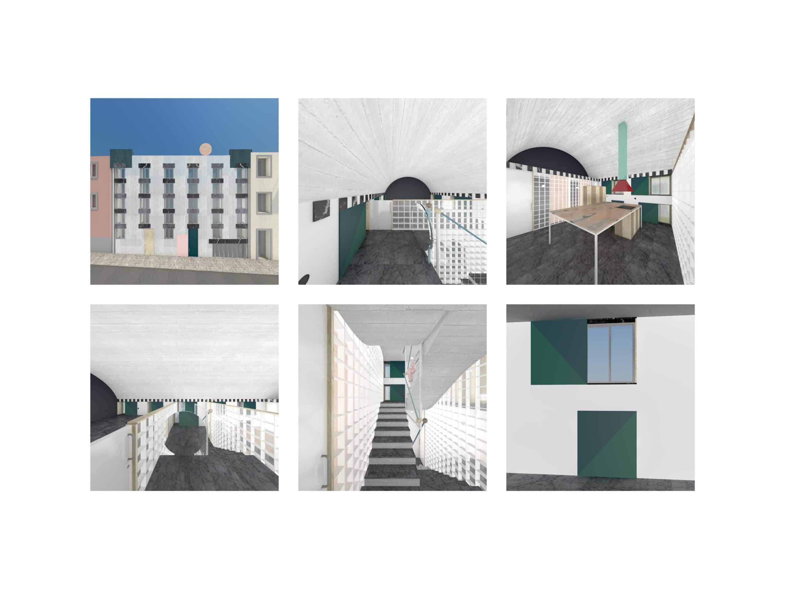
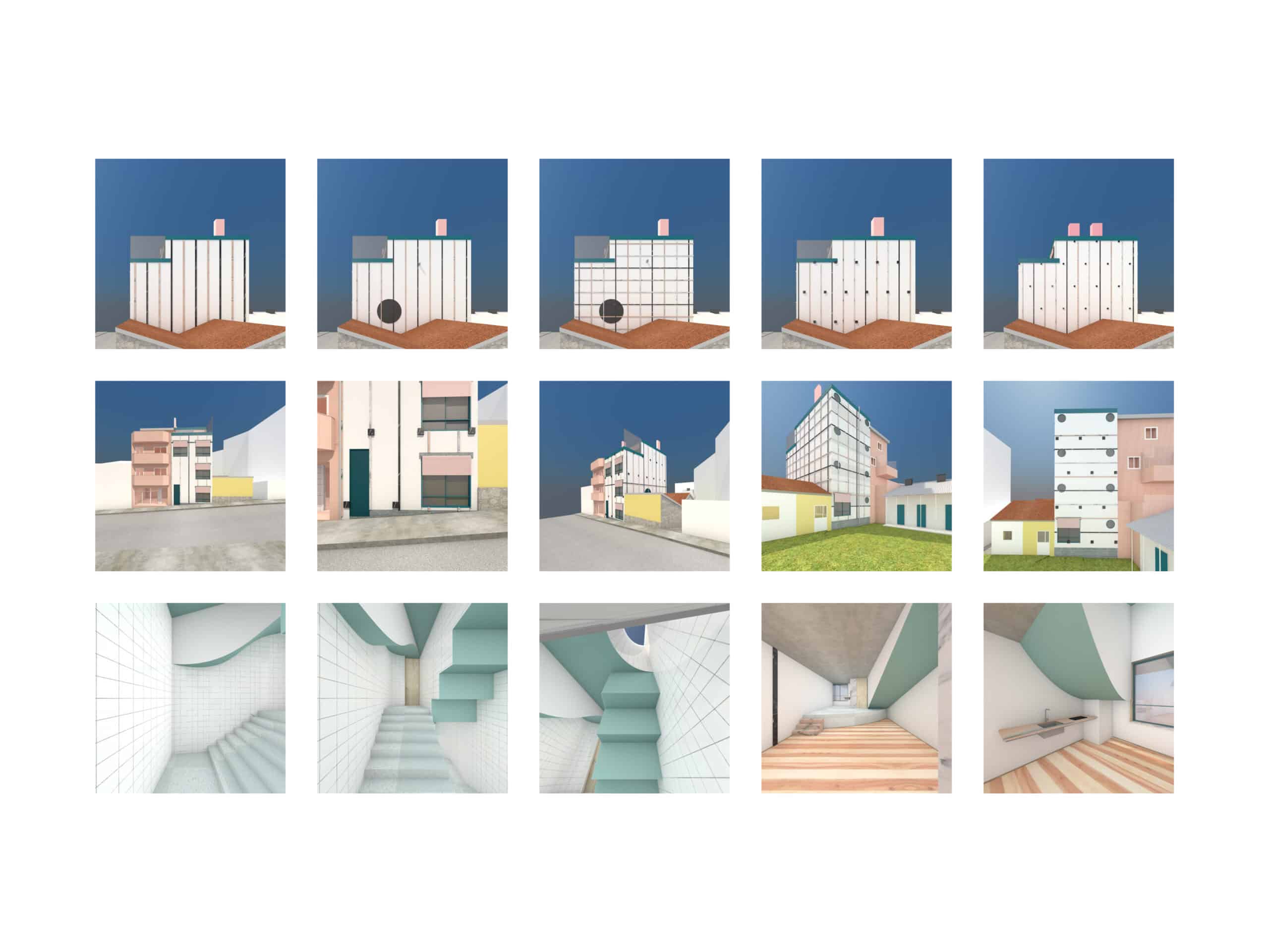
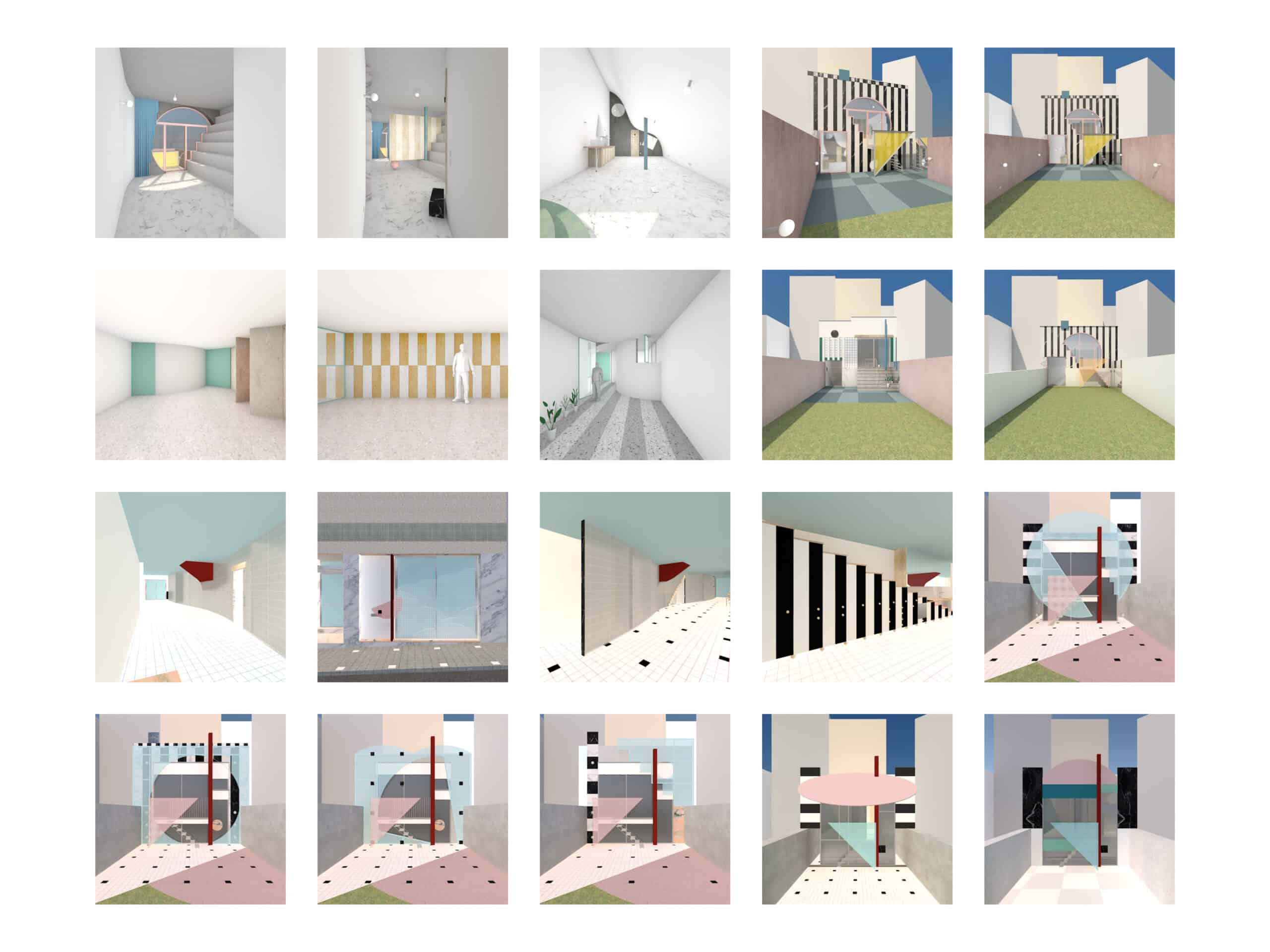
Low-resolution images are humble and straightforward. The textures are blunt and the colours are strong. Ambient occlusion is mostly off. Light, shadows and reflections are rarely under control (see the vulgar blue sky and acid grass). These images could be elaborate screenshots of old computer games. Another way to put it is that we are bad at rendering. But then again, being good was never the goal.

Each render takes five seconds. And every folder contains dozens of images with subtle variations. The ceilings go from white to concrete, to different tones of blue, pink and green. Terrazzo, tiles, marble and wood floors are interchangeable. Elevations have all kinds of ready-made patterns. Doors are open, closed, half-open or half-closed. Each space is studied through a number of points of view and perspectives. Cameras zoom in and out. Twenty combinations of colours and textures multiplied by ten perspectives add up to a couple of hundred images every day. These images provide a version of reality that, at some point, becomes quite necessary. They accompany execution drawings. They help navigate through the concept phase. They rarely convince our clients because of their lack of glamour. But we always find exactly what we are looking for by quickly browsing through the files of seemingly similar views.


Besides understanding the geometry of the space and its relationship to its context, 3D renders give clues about plugs, skirtings, joints and door handles. These images were never meant to be final or presentable. We can’t (or shouldn’t) submit renders like these as competition proposals. When looking at them collectively, they constitute a series of trials and errors. They are marked and sketched on. They are corrected and refined. Most of them are never built. Some become records of older versions of projects that we actually might have preferred. Spaces are relentlessly tested, taken apart, and put together until they are complete. The renders compose a crude ‘fala universe’ of built projects and possible buildings that never were. The spaces are not romanticised. They are not inhabited by people, furniture or objects. They are raw versions of themselves, as if no one has moved in yet. These images are dry facts. In a way, they are somewhere between caring and not caring at all. The not caring perhaps applies to the lousy technical side that we ignore on purpose. Practicality is favoured over visual quality. The caring is our rigorous attention to detail – utmost precision that goes as far as placing plugs and lights – and the insane number of tests to find the one.
