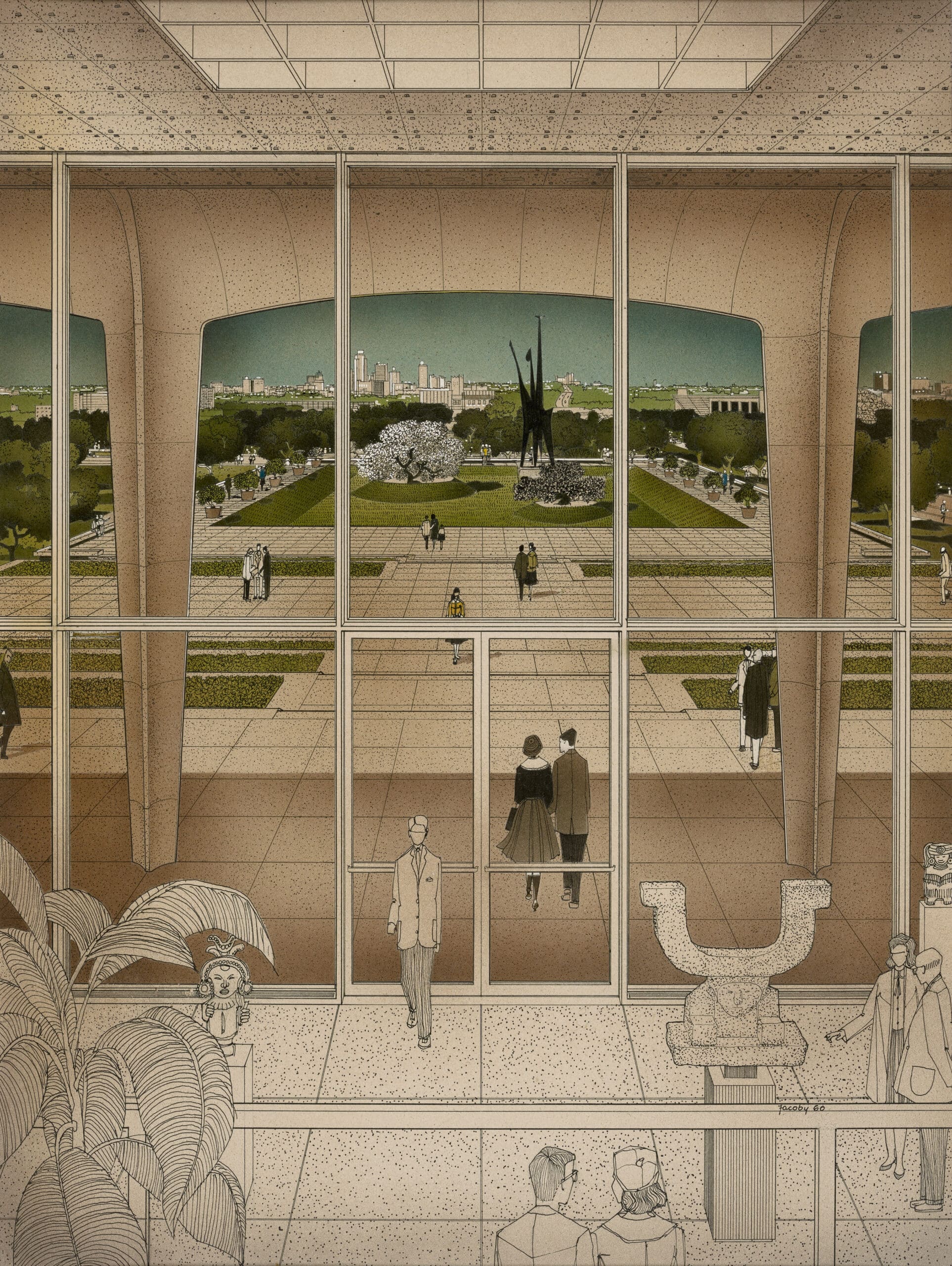
Helmut Jacoby: The Amon Carter Museum

You can stand on the balcony of Philip Johnson’s Amon Carter Museum today and see the same view of Fort Worth that Helmut Jacoby drew up in 1960. Not much has changed. Apart from the fanciful New-Mexican art in the foreground (his invention), the same hot Texan sun, the same protective loggia, the same sloping gardens, and the only partly-changed view of downtown’s modest skyline (still today less brash than its close neighbour Dallas).
Helmut Jacoby had an extraordinary output of work in the late twentieth century. A trained architect, Jacoby’s technical proficiency and inspired viewpoints appealed hugely to the exacting demands of prestigious US commercial clients and their architects. He worked for all the greats in the US—Gropius, Pei, Saarinen, and Johnson, and later in his career for a European stable of designers including Foster, Günter Behnisch, and Derek Walker in Milton Keynes. Jacoby’s laid-back but super-real perspectives took the precisely lined plans and sections produced by architects at the time and created snapshots of a humane sunlit vision of happy people, a considerate architecture with luxurious greenery.
A contemporary of Jacoby, Philip Johnson’s stylistic journey began with him defining the International Style at the Museum of Modern Art in New York in 1932, embracing High Modernism with Mies van der Rohe at the Seagram Building (1954 –1958), and concluding with the Post Modernist fantasy of the Lipstick Building (where Bernie Madoff had his offices) and Chippendale-topped AT&T building (now 550 Madison Avenue), both in New York. Johnson’s attitude to design was eclectic; trying something new was part of the architect’s duty. He said, in 1955: ‘A style is not a set of rules or shackles… [it is] a climate in which to operate, a springboard to leap further into the air’.[1] The Amon Carter marks one of the architectural pivot points, a change in design vocabulary for Johnson as he moved away from the influence of Mies. This can be seen in the rich non-orthogonal surfaces, new materials, and detailing.
Johnson’s productive oeuvre on the East Coast has overshadowed a remarkable catalogue of his work in Texas. Here, Dallas/Fort Worth and Houston vied for his attention. The energy and ambition of these cities and their clients matched Johnson’s drive and determination. As Johnson remarked of Fort Worth, ‘[…] it was a cow town on the one hand and big commercial centre pushing its way up from behind on the other[…]’.[2] The commission for the gallery, in 1958, came from one of those serendipitous moments in an architect’s life. At a dinner party Johnson met Amon Carter’s daughter Ruth Carter Johnson (no relation to the architect), who was seeking an architect to design a museum to house her late father’s collection (featuring the spectacular Wild West prairie paintings of Frederic Remington and Charles M. Russell, amongst others).
Carter senior, a publisher and owner of the South’s most successful newspaper, Fort Worth Star-Telegram, had bought the site on Camp Bowie Boulevard from the city a decade earlier: a raised plot on the west of the city part of a complex of exhibition lands that is now home to many museums, including the 51-year-old Kimbell art Gallery by Louis Kahn and Tado Ando’s Museum of Modern Art (as well as the uniquely flamboyant Cowgirl Museum). Crucially, the site had a long view towards downtown—a feature brilliantly exploited by Johnson in the design, linking the museum visually with the visible source of Amon Carter’s fortune. The layout is simple—‘a box with a porch’ as Johnson described it.
A two-storey loggia on the east fronts a full-height glazed wall facing onto the sloped entrance garden, with the skyline of Fort Worth in the distance. The ‘box’ is a great hall mirroring the loggia outside running the full length of the plan, backed by a sequence of small galleries on two levels (originally offices), and the balcony on the upper level where Jacoby took his viewpoint. The date (1960) of the drawing, whilst the museum was under construction, and the meticulous detail (including the rogue artwork) suggest this was for presentation purposes. It is now in the collection of the museum.[3]
Notes
- Philip Johnson, Philip Johnson: Writings (New York: OUP, 1979), 227–231.
- George S. Wright, Monument for a City: Philip Johnson’s Design for the Amon Carter Museum (Forth Worth, Texas: Amon Carter Museum, 1997), 28.
- See also Frank D. Welch, Philip Johnson and Texas (Austin, Texas: University of Texas Press, 2000).
Malcolm Reading is an architect inspired by modern and mid-century modern design, and the era’s use of drawings to advance change in architecture and social purpose. He is the co-author of ‘Lubetkin and Tecton: architecture and social commitment’, and co-leads Malcolm Reading Consultants, the global provider of design competition services.
This text is one of the selected responses to the Open Call: Storytellers, Observed—an inquiry into the origin and circumstances of a single drawing (or series of drawings), observing the ways by which each achieves the specific purpose for which it was made. For further information click here.
