Herbert Matter
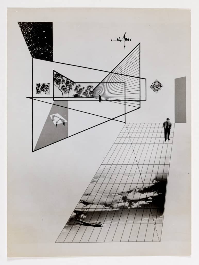
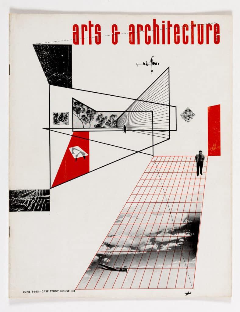
This is the work of the Swiss photographer and designer Herbert Matter, who after a short career in New York had moved to California in 1943 with his wife, the American painter and art critic Mercedes Carles. Both were friends and associates of Fernand Leger, with whom Herbert had been a student and whom he had assisted in mural commissions; and Mercedes had studied, alongside Ray Eames, under Hans Hofmann. Deeply involved with the emerging New York movement in abstract art, they moved to California with an intimate knowledge of new art and a close acquaintance with many of its major figures, counting Alexander Calder and Jackson Pollock among their friends.
Arriving in Los Angeles late in 1943, they joined the studio of their friends Charles and Ray Eames as graphic exponents of the studio’s design endeavours, and in a number of capacities with John Entenza’s recently revamped monthly, California Arts and Architecture (now retitled and re-cast as a progressive design journal rooted in the prolific modern art and design practices of Los Angeles, but with an increasingly international perspective). Charles Eames at that time served as the magazine’s principal associate editor, while Ray was designing most of the covers and graphics.
By January 1945, when Entenza launched the magazine’s Case Study House programme, Matter had already contributed at least two covers, run a section of his own photographic work and, most notably, designed the extraordinary diagrams, visuals and layout for the special issue of 1943, in which Buckminster Fuller and the Eameses laid out their ambitious postwar program for industrialised and prefabricated mass housing. Matter continued to publish his photos of ‘earth formations’ in a continuing series which the editors saw as a stimulus to modern design, while Mercedes wrote regular essays and reviews on new painting. Beginning with the first Case Study cover of January 1945 and ending only some time after the couple had returned to New York in 1946, nearly all the magazine’s covers were designed by Herbert Matter, often (as seems evident in this case) adjusted in collaboration with the publication’s art director, Robin Park.
The convention of two-tone non-pictorial covers that Matter followed in his designs for Arts and Architecture had been established by Ernest Born in the mid-1930s for the two leading illustrated design magazines in America, Architectural Record and Architectural Forum. While this graphic strategy followed precedents in the European avant-garde, mass-market publishers (who began acquiring design monthlies for the American newsstand trade in the mid-thirties) needed a particularly bold, economical and open expression of it in order to catch the eye from moving traffic or across a crowded rail terminal. In orchestrating and uniting these graphic ensembles, the use of exaggerated perspectival frameworks and lines, cast on the diagonal, was unusually effective. This was an approach Matter had developed in New York in his covers for Time Inc’s short-lived progressive architecture magazine Plus from 1938 to ’39, and used again in his advertisements for Container Corporation of America, where it serves to catch and hold the eye amid the dense surrounding pages of popular illustrated monthlies. Matter placed tiny schematic figures or objects within these implied architectural structures to draw the reader in, as if looking into the distance, and evoke a natural pause.
While the cover for June 1945 is, as we shall see, the most directly architectural of all Matter’s graphics, it also carries a broad and quite specific synthesis of the magazine’s subjects (modern painting, design and sculpture represented by tiny figures of a Calder ‘Constellation’ mobile, a Mondrian ‘Boogie-Woogie’, a variation on the 1945 glass table of Noguchi, a barely discernible photograph of what might be an early Pollock, Hofmann or Mercedes Matter, and a photo of Raymond’s 1935 DC-3). In the final cover an ‘earth formation’ is added to the left-hand margin, perhaps to suggest generic patterns of textile design which – with Dorothy Liebes and others – was another fundamental subject in the magazine’s repertoire and in its consideration of furnishing for the case studies. Indeed, the magazine published nearly all of these specific icons between 1943 and 1946, and Noguchi’s realised coffee table was later presented as the primary example of modern furniture appropriate to the Eameses’ own Case Study house. The human figure is represented both by a foreground cutout, most probably of Charles Eames, and a vector that picks up on the graphic language used in Matter’s 1943 presentation on prefabrication.
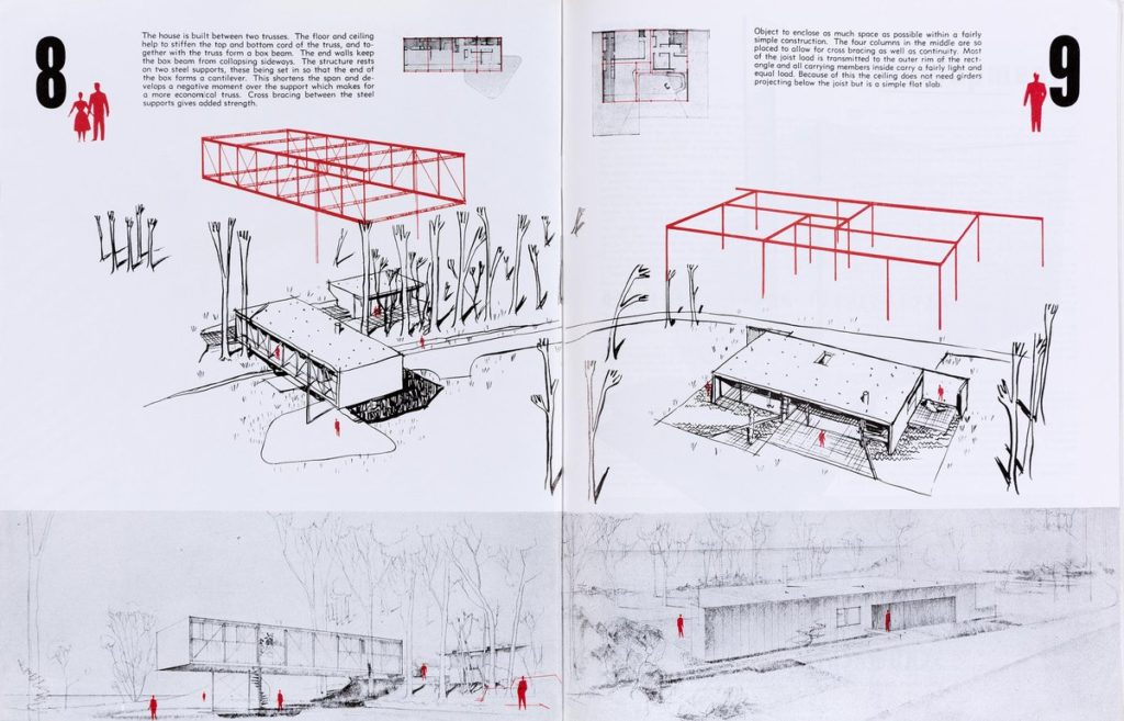
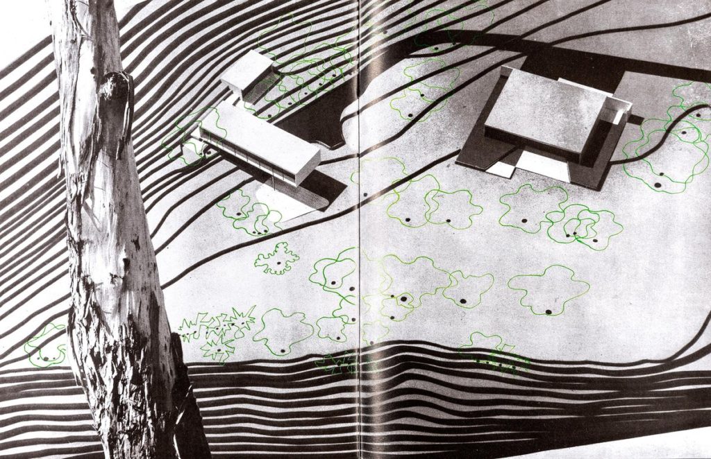
More significantly, the abstract architectural framework is organised from the viewpoint of the two case study houses (no 8, a home and studio for the Eameses, and 9, a residence for Entenza), which the Eameses and Eero Saarinen were developing at the time. The case study programme was designed for the real world. Each of the projects had a known site, a committed client, and the full specifications for construction, finish and furniture; and indeed most were built and opened for public view within a few months of the design appearing in the magazine. Hence the stand of eucalyptus on the cliff above the ocean is taken from a photograph on the actual site of Case Studies 8 and 9, presented more or less exactly at the distance the trees would be seen through the glass wall to the west of the Entenza house.
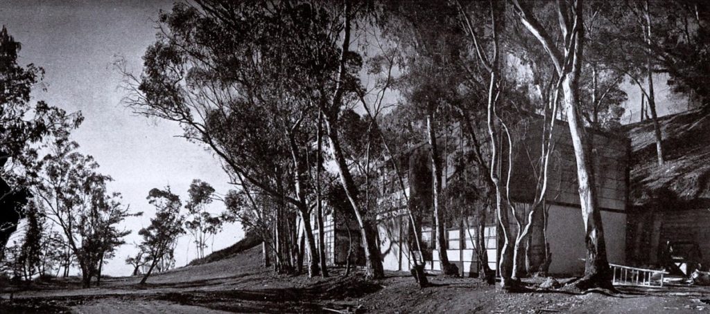
As the Eameses acknowledge in publishing their initial proposals (with graphics by the Matters) in the December issue of 1945, the houses were at this stage ‘simply an idea of dwelling’ – in which the Eames studio was conceived as a single-storey bridge facing the ocean, rather than the two floors in line with the hill and at right angles to the vista, which emerged as the project eventually developed as ‘Case Study House for 1949’ – and which is now such a familiar icon in the history of the modern movement. It is fascinating that the ruled lines of Matter’s cover proposal nearly five years before are in fact truer to the idea as it was eventually realised than to the concept as it then stood, predicting the great grid of retaining wall in the lines of the high structure to the right, and the grounded framework of steel supporting the sense of an open interior, which we have come to recognise as one of the fundamental reference points for architecture in the postwar world… and after.
