Pan Scroll Zoom 1: Fabrizio Gallanti
This is the first in a series of texts edited by Fabrizio Gallanti on the challenges in the new world of online architectural teaching and, particularly, on the changing role of the drawings in presentations and reviews.
In this episode Fabrizio writes of his own experience as a tutor and critic at the University of Montréal and the School of Architecture at McGill University, Montréal.
As this project evolves and gains momentum, it might become the basis of a small publication. We welcome comments and ideas at editors@drawingmatter.org.
In the era of online teaching, drawings have become pieces of cinema. They are conceived as fragments of an audio- visual montage. They are presented to distant audiences by means of screens, using some of the techniques of photography and movie-making.
Within a matter of days, entire cohorts of architecture students and tutors across the world transited from modes of pedagogy based on intense face-to-face conversations to systems of remote learning. In academic jargon and in contracts, these exchanges are the crucial ‘contact hours,’ all of a sudden contactless.
What were for years remote possibilities, conveniently ignored in our lateral vision – the MOOC, the Skype tutorial, the webinar – have surged up to form, inescapably, the landscape of higher education. Before the cataclysmic COVID event, many declined to even indulge in such a scenario – ‘I don’t believe in online lectures. I think it is essential to be in front of my audience’ or ‘You cannot replicate the desk critique without being there – how can you sketch a suggestion on a screen!’
For years, a certain rarefied elite of visiting professors has criss-crossed the globe on intercontinental flights, or within Europe on high-speed trains, to deliver their three-hour seminars and meet their design-studio students, deliberately ignoring the wonders of Zoom. Actually, almost no one had ever heard of Zoom before March 2020.
All day-by-day exchanges within schools of architecture came to a screeching halt in the briefest span of time, and, whether imposed by the governing bodies of schools or assembled in a gesture of responsibility by concerned professors, an array of digital tools has been hastily employed to save the semesters. Distances have been erased, and everyone, either living a few blocks from the school or a thousand miles away, has access to an uncharted territory of exposed domestic lives and expanded time-zones.
Some institutions purchased licences for specific items of software and distributed them to their faculty. Different hierarchical levels became even more apparent: professors and assistant professors might have obtained them very quickly, assistants and TAs not always so easily. Other universities, either because cash-strapped or plunged into a leadership vacuum, just hoped that people were able to fend for themselves. Issues of equity were raised: what if students have no computer or a reliable Wi-Fi connection? What will grading look like? Almost no one was offered any structured training and in the rare cases where it was available it was delivered in excruciatingly narcotic fashion. Everyone had to improvise, juggling between Zoom, Teams, Exchange, Skype, Messenger, various Lives (Instagram, YouTube, Facebook), resorting to the smartness and generosity of the more agile and digital-savvy students to identify tricks and shortcuts. Ancillary systems where material can be uploaded and manipulated, such as Mozaik or Prezi, were tested. Doubts about how better to use Zoom were debated over-long faculty and staff meetings… on Zoom.
Architectural drawings have become the focal point of the novel pedagogical interaction that has occurred in design studios since March. We all switched. The desk critique, the intimate moment when the advancement of the project is discussed between students and tutors, has migrated to private online sessions. Tight scheduling tightened as imaginative reasons for delays are unacceptable. It is impossible to manage the fluid interaction of many people simultaneously present in the same room, and so rigorous consecutive sessions of 30 to 45 minutes have become the norm.
Presentations and pin-ups where the entirety of the course gathered are now a multiplication of tiny squares on the screen, with everyone, at least apparently, remotely present. Sharing and un-sharing the camera, raising hands, muting and un-muting microphones, learning gestures that make one appear to be concentrating while actually multi-tasking, making sure that no echo is re-entering the feed, have contributed to a new development in polite communication, a choreographed interactive dance.
Mid-term critiques and final reviews have followed exactly the same protocol, with the addition of some external participants to the same grid of headshots. Interestingly, software has obliterated many unspoken degrees of power relationships, which are instead inherent in such moments as occur in a real place. No one was ‘working the room,’ as there was none: the professor who can make or destroy one’s career and the scrupulous, shy TA at their side are reduced to the same size square – no coffee to be fetched, no small talk about jet-lag. For students, anyway, these external characters have never really mattered: they are just part of a repetitive routine that happens every six months.
Almost all courses benefited from several weeks of ‘presential’ learning before they migrated to the online format, so that students and tutors all became acquainted with each other and were capable of establishing a minimum level of familiarity. What will happen in the fall, when design studios will start online from day one, is uncertain.
Every formal critique or final review online, regardless of the software or the institution, followed the same pattern: a brief outline of the objective and structure of the studio from the professor, the guest critics quickly introduced, and then a succession of presentations by the students, followed by comments.
PSZ
In almost every case, students avoided extended prologues and started to explain their projects, sharing their screen online, quickly adjusting what they wanted to display and proceeding to talk over a series of consecutive slides. There were no faces, accoutrements or postures to look at and decipher; no models or drawings deployed in space over which the eye could wander; rarely were videos or animations shown, so as to avoid the risk of the system crashing; no one dared to interrupt and ask annoying questions such as ‘Could you please rephrase that?’; there were no requests to go back and forth in the slide-show; everyone carefully watched and listened, in silence. That was precisely the moment when the magic of cinema started.
Jean-Luc Godard has often said that modern cinema is more the art of sound than of image. His documentary series Histoire(s) du cinéma (1988–98), in which his grainy voice is imposed over found footage, still frames and flashing lettering, emphasises that concept. What, in the real space of a design studio, would have been quite dull displays became instead almost hypnotic and well-rehearsed readings of texts over slideshows. Many of the presentations were reminiscent of the experimental movies by Chris Marker, an author close to Godard, of titles such as La Jetée (1962), or Les Statues Meurent Aussi with Alain Resnais (1953), with voice-overs and music deployed over a succession of still photographs.
In the students’ presentations, drawings appeared as punctuation points in the unfolding narrative, anchors upon which to relaunch and illuminate the discourse, immersing the observers in a multimedia experience, right in their homes. And then, the best students started to do something else.
Pan
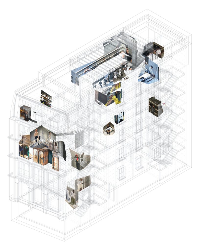
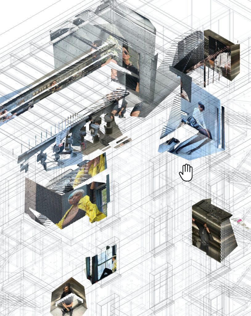
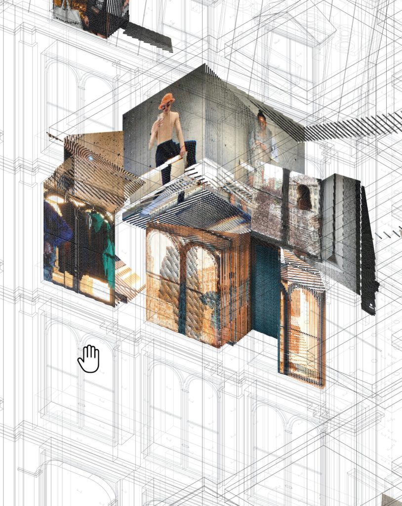
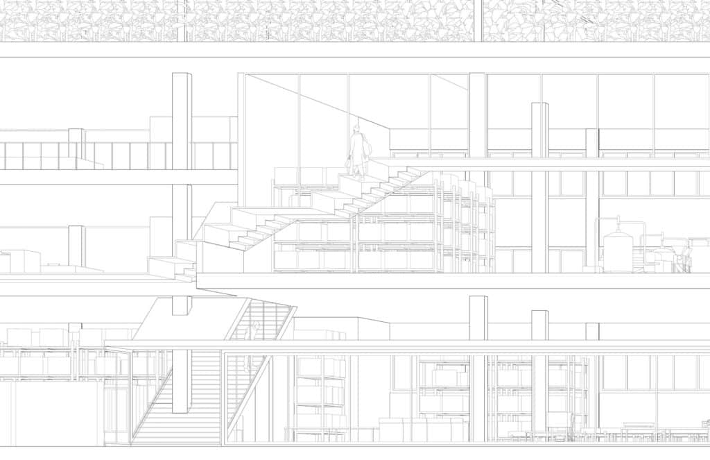
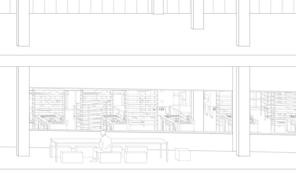
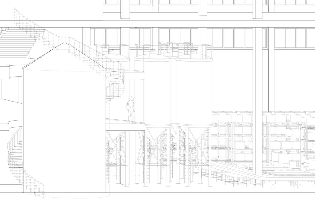
One drawing, frequently a plan or a highly detailed perspectival rendering, would initially be displayed in its entirety – full-screen – to provide a general overview, then, after a few seconds, swiftly enlarged, to become more legible in one area. At this point the narrator, sometimes assisted by another person, would move the drawing around, using the ‘pan’ control, in order to stop at particular points of interest, inviting the observer to focus on specific features. Small adjustments in the scale of the image would facilitate further interrogation. The audience follow a visual drift, the screen presenting a dynamic perception of the drawing in moments of movement, alternating with periods of stillness. Sometimes, to further enhance this visual technique, cursor arrows or scribbled notations are employed, live.
In documentary making, this technique is known as the ‘Ken Burns effect’ – a feature made available by the same in Apple products. It is drawn from its extensive use by the American documentarist Ken Burns, although it predates his practice with the name ‘animatics’. The technique was implemented by Burns following a suggestion by the photographer and film-maker Jerome Liebling. Burns also credits the 1957 documentary City of Gold, co-directed by Colin Low and Wolf Koenig and issued by the National Film Board of Canada, as the first example of the method. The technique is very convenient when original footage is not available. Action is produced in still photographs or paintings by slowly zooming in on subjects of interest and panning from one to another. The importance of the voice-over is crucial, as every step is accompanied by the identification of the subject, and complemented with additional information or comment. When the image itself contains content that might constitute a revelation – such as the presence in the same frame of persons who claim not to know each other, for instance – a more forensic and slightly self-congratulatory tone is struck.
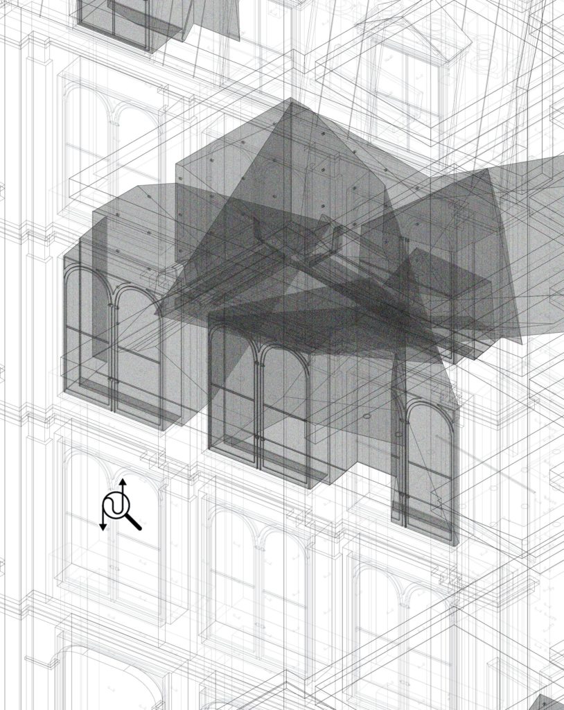
While the ‘Ken Burns effect’ is a niche element within the movie industry, pan and zoom graphic functions are central to any drawing created with CAD software. Architects, students and draftsmen spend long hours in front of the screen, mouse in hand, constantly using these commands. Nevertheless, during final presentations in schools such erratic wandering, not following any established logic, disappear behind the display of polished outputs. In the My Building, Your Design: Seven Portraits (2017) exhibition by David Hartt at the arts Institute in Chicago, curator Maite Borjabad commissioned a specific work in order to show the complex AutoCAD archives of the Seattle Library by Rem Koolhaas/ OMA. On a screen it was possible to look at the hypnotic footage of a camera following the movements around the opened CAD file of a section. A draftsman was contracted to recreate the production of the drawing, and visitors in the gallery watched on another screen. What Zoom has now made possible is the means to navigate others’ drawings not in silence, as in that exhibition in Chicago, but guided by a voice.
Scroll
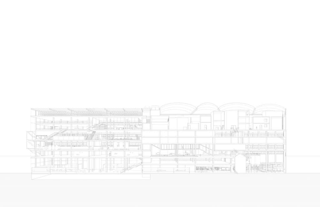
Another way of presenting a drawing to remote Zoom observers was the scroll. A page would open with a portion of the entire drawing on the screen, often a longitudinal section or an axonometric, and then, slowly, a horizontal slide would move the drawing to reveal it in its entirety. The motion was predominantly from left to right, like when reading a text, and was, again, accompanied by a descriptive voice. Stops and movements were carefully controlled. In cinema such horizontal movement of the camera is known as tracking. It was used for the first time in 1914 in the epic movie Cabiria, directed by Giovanni Pastrone, shortly copied by D.W. Griffith and Cecil B. DeMille. It is different from the dolly, where the camera moves towards or away from the subject – a technique favoured and tweaked by Alfred Hitchcock –, while with tracking the camera runs parallel to the movement. Either it follows a moving subject who would otherwise leave the frame, such as in the six-minute scene in The Sacrifice (1986) by Andrei Tarkovsky, or it allows a landscape or a portion of decor to be showcased, almost as if looking out of the window of a car or train in motion, as in the seven-minute shot of a traffic jam in Weekend (1967) by Jean-Luc Godard. In order to stabilize the image and avoid any vibrations in early early productions, the camera was installed on a cart mounted over railings, limiting the entire length of the take. The launch of Steadicam in 1975, a mechanical system of levers and springs that eliminates most vibrations, allowed wider possibilities and durations of movement. In the case of cheap budgets, a supermarket trolley is a successful substitute for the complex rail and cart systems of traditional movie-making.
The scroll movement of the drawing is akin to such cinematic tools, but it is also rooted within the tradition of architectural representation itself. Large drawings were consulted, amended, drawn and corrected by scrolling, keeping a portion of them flat on a table and two rolls at the extremes. Amendments made by architects and draftsmen were enacted through scrolling horizontally over the drawings, diminishing the size of one roll while augmenting the other. This allowed them to maintain a scaling adequate enough to provide fine detail and nuance, which would have otherwise been lost using a smaller ratio.
An example of this graphic technique can to be found in the stunning isometric painting Along the River During Qingming Festival by the court painter Zhang Zeduan (1085–1145), a five-metre long scroll depicting the daily life of the people and landscape in the capital of the Song dynasty, Bianjing.
Zoom
In pan or scroll mode, students frequently zoomed into drawings to clarify some aspects of their projects. An entirely different approach was created when the zoom was conducted in a more rigorous way. Successive enlargements were presented in sequence. Often, it was not the same drawing to be moved and manipulated, but rather a series of separate slides or pages. The reason for this choice depended on the fact that the centring of any zoom is inaccurate and difficult to control when performed on the same page. Each enlargement allowed a better view of particulars, in some cases, reaching the grain and precision of construction and technical details (1:5 to 1:1). These narratives, often conducted with a subtle management of suspense and surprise, are, of course, reminiscent of the experimental movie Powers of Ten (1977) by Ray and Charles Eames. But when a slower pace – instead of the Eames’s syncopated acceleration –, was employed, observers were allowed to slowly perceive and discover further information, subtly placed around the drawings. In the best cases, students paused their narratives, allowing time for the eye to wander. At each click, the level of graphic precision was adequate for its scale, thus playing in the opposite way of a CAD file. In fact, when one zooms in or out of a digital drawing when the scale is too large, all you see on the screen is a dark knot of overlapped lines; when the scale is too small the screen appears desolately empty. Recovered through Zoom and zoom was the capacity of the analogic drafting expertise to use the quantity of graphic information adequate for each scale (no toilets drawn in at a 1:500 contextual plan; the layers of wall construction in a 1:10 section). These slower presentations allowed for previously undetected components to emerge, exactly like the grainy figures of the successive enlargements of the same shot of two lovers in a London park, taken by David Hemmings, the element at the core of the movie Blow-Up (1966) by Michelangelo Antonioni. That such a movie was an important commentary on the complex relationship between fixed and moving images resonates with the sensations that the online experiences of projects have allowed us to feel collectively.
In the minutiae of each consecutive passage of their zooming process, students expressed the richness of their design and guided the audience into a comfortable rabbit-hole of graphic seductions. To quote Roland Barthes, the surprise offered by details can become ‘the shy beginning of pleasure.’
What this conversation around architectural ideas has revealed to us is the joy of watching and listening, strangely brought back by digital tools and online displays.

– Andrew Clancy