Lauretta Vinciarelli: Homogeneous and Non-Homogeneous Grids
The following text is excerpted from Rebecca Siefert’s recent book Into the Light, the first comprehensive study of the work of Lauretta Vinciarelli. The book is available to purchase here.
The grid is loaded with symbolism and history: it is emblematic of origins, order, systems, utopias and dystopias, and the inevitable susceptibility to disruption. It is a mode of organization (during the Enlightenment era, it was used to organize building types) as well as a means to reduce information or images to the essentials (an ‘x’ and a ‘y’ axis). As such, the grid was central to classical Greek urban planning, neoclassical architecture and Beaux-Arts planning, but was also a trope of early twentieth-century modernist art and architecture, not to mention minimal and conceptual art.
For Vinciarelli, the grid served as both a generator for design and a critique of the modernist application of this device for organizing architectural space. Vinciarelli employed a variety of devices that relied upon the grid during this time. The breakdown and analysis of type, especially when presented in axonometric projection was privileged for creating a high degree of geometric abstraction (she later used the axonometric for a number of drawings for projects in Marfa, for example).
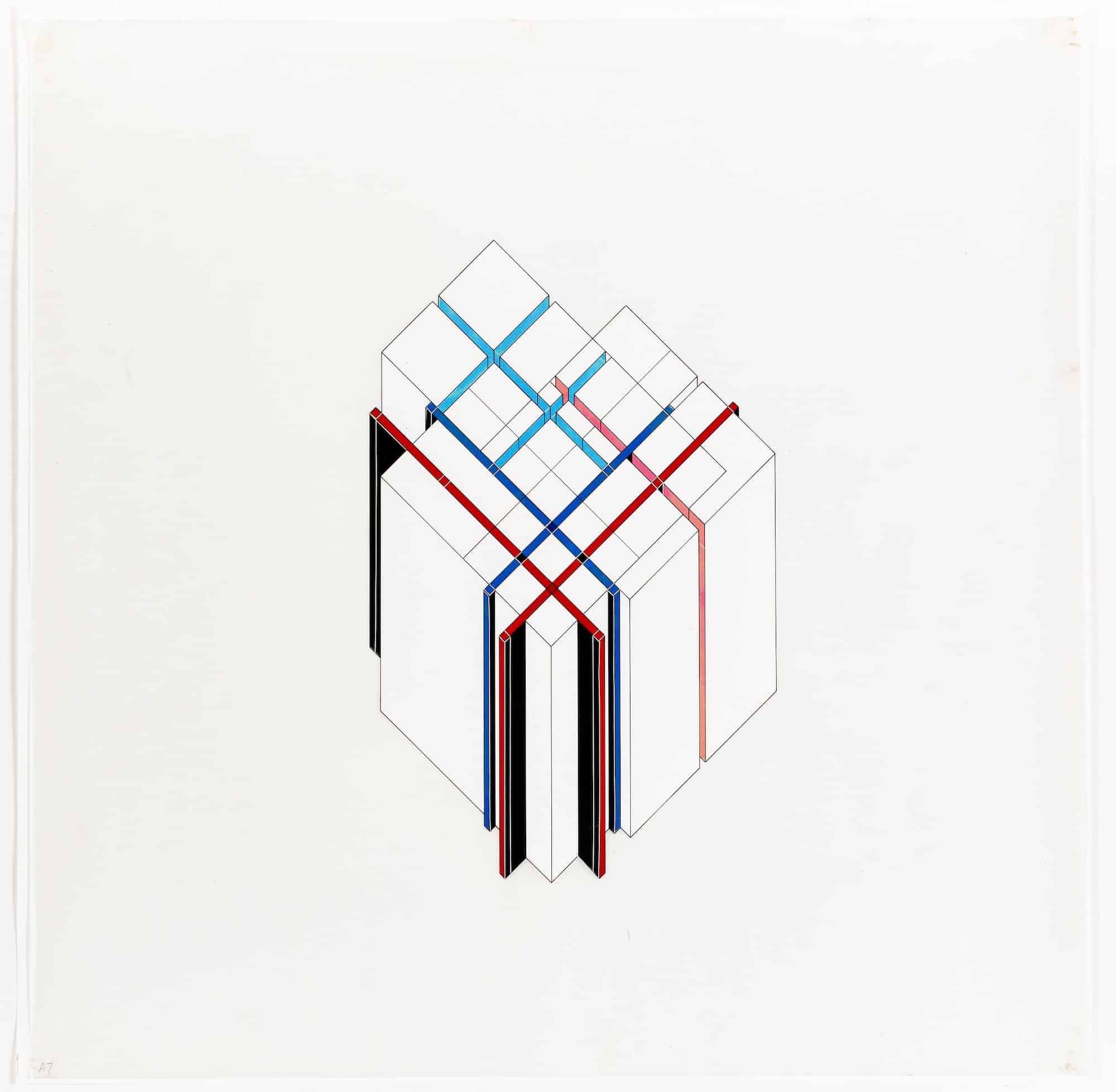
Indeed, axonometry was a device favoured by a number of architects in the 1970s, most notably Peter Eisenman; however, Vinciarelli’s examples from the mid-1970s are architectural schemas transformed into precise and diagrammatic art. The diagram, a product of the Enlightenment, was yet another device, a ‘vehicle of progress’, as Anthony Vidler has argued, and could be considered an instrument of suspended reality – a utopia, in other words. [1] These are some of the ways that the grid was pervasive, and problematized, in Vinciarelli’s early works on paper. The return to drawing could be interpreted as a nostalgic move, or an indication of a sudden disengagement with the socio-political upheaval and concerns of the times. However, for Vinciarelli and many of her generation, drawing was a useful tool with which one could re-examine the failures of modernist architecture. As she explained in reference to this decision,
‘I thought that, if we had . . . this desire of overcoming the contradictions of the Modern Movement, we should begin from the beginning. We should try to find certain basic contradictions or errors in their doctrine, and try to see how to develop something less contradictory than that.’ [2]
Here the grid – rather than structure, technology, finances or empiricism, for example – acts as the generator for design. To ‘begin from the beginning’ thus meant to return to the foundations of modern architecture, which she saw as intertwined with the foundations of composition: ‘what is composition, and how is composition achieved,’ she stated, ‘which is the very basic means that was narrated from the Modern Movement.’[3] The aim was to start from this two-dimensional (or what Vinciarelli termed the ‘bi-dimensional’) plane, and eventually move into three-dimensional space, ‘to arrive at architecture at a certain point’. [4] This strategy was indicative of larger trends accompanying the revival of architectural drawings in the 1970s, as will be seen.
The Homogeneous Grid series, begun around 1973, was a starting point, Vinciarelli explained, composed of two sets of discourse: one was based on the ‘homogeneous’ grid; the other centered on the bi dimensional plane which, as the name implies, divides the picture plane into equal parts. Composed of two grids laid upon one another – one horizontal and vertical, the other diagonal – the result was a surface evenly divided into triangular spaces. This was the ‘very basic means’ to which Vinciarelli referred and which, she lamented, was ‘still the basis of architectural composition’. [5] She used the grid and the bi-dimensional plane to consider the notion of a spatial fabric in her works of the 1970s and, later, in her collaborations with Donald Judd.
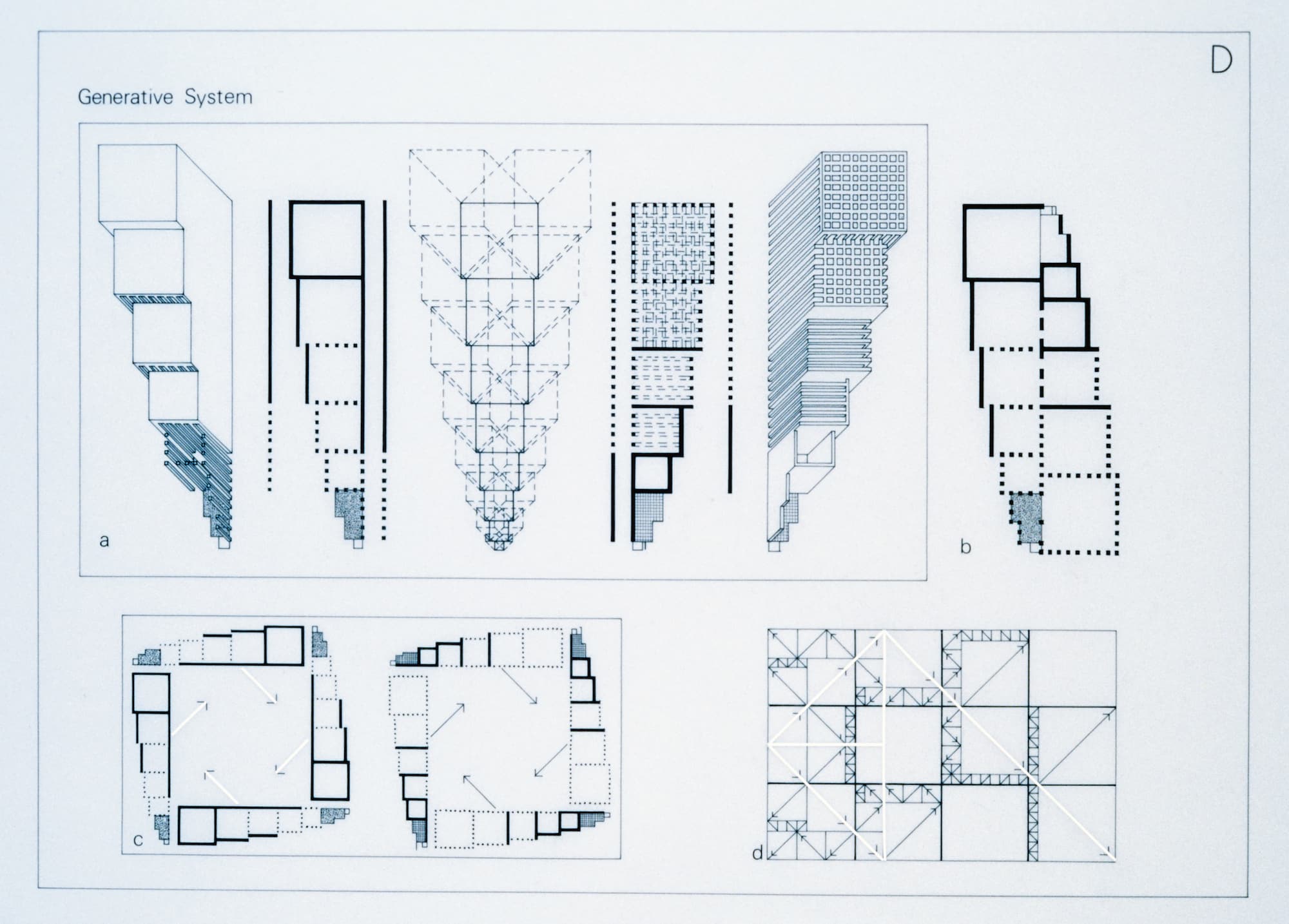
In the Non-Homogeneous Grid series, in contrast, as the title suggests, Vinciarelli divided the surface into unequal parts, distinguishing these works from the previous series. Based on a ‘generative system’ within sets of varying grids, which she outlined in a drawing and text from c.1973–5, the resultant drawings were seemingly predetermined. The process consisted of several steps: first, a ‘catalogue of spatial situations’ was considered, ‘from frames and boxes progressing to multiple enclosures and walls’, which were transformed in plan via triangulation; next, the bi-dimensional grids were translated into ‘cubic modules’ and finally, the initial spatial situations were juxtaposed with the modules, which ‘generates a series of rules for the composition’ – this would eventually define the spatial fabric, Vinciarelli explained. [6]
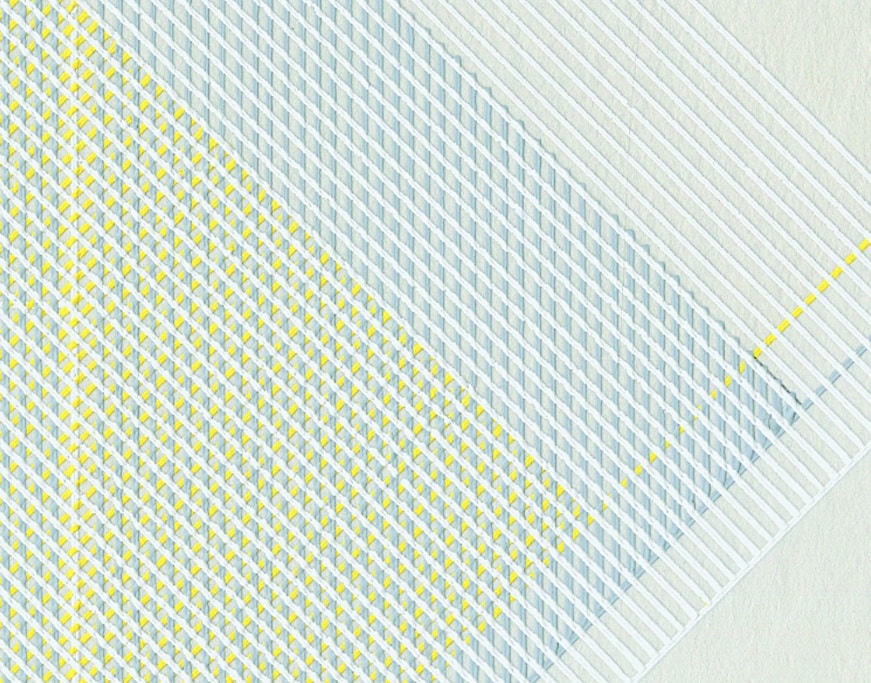
Both series were created with tempera (and sometimes still-visible pencil) on board. The paint was applied using a Kern ruling pen – a drafting tool – resulting in crisp, raised lines, similar to thin strips of vinyl tape. Using the Kern pen required an enormous amount of skill, a steady hand and even pressure. The layers of paint create a tapestry of woven and striped patterns, a pushand- pull between two dimensionality and three dimensionality that recalls textiles. By their very nature, textiles are both a physical, three-dimensional object and yet read as a two dimensional plane when resting flat on the floor or flush against a wall. The abstract and schematic quality of these works also suggests maps, indicating paths of circulation, like an aerial view of a city or country; or a ‘fabric’ of some kind in each case, in which there are solids, voids and points of connection. In this way, Vinciarelli’s works recall comments she made during a 1978 lecture at the New School in New York, in which she referenced a ‘catalogue of spatial situations’ based on the same cubic module, which was nevertheless defined in very different ways. ‘For instance,’ she stated, ‘[in] the first drawing it is defined by a floor of grass, a floor of water, or a floor of bricks.’ [7]
These drawings, Vinciarelli contended, ‘are purely generated by the grid themselves . . . I was all the [while] choosing the same configuration which was produced by the grid.’ [8] Her only ‘intervention,’ Vinciarelli noted, ‘was that of choosing colors.’ [9] While it is true that the placement and development of each grid determines the composition and complexity of each drawing, her description implies a sterile conceptualism that this series simply does not reflect. Within the Non-Homogeneous Grid series are sets in different color palettes – some in pale canary yellow, some in light dusty rose – each paired with light gray on a white background. Like Agnes Martin’s (1912–2004) paintings from the same era, we see a pastel palette, which is stereotypically interpreted as ‘feminine’, although for both artists the colors related to the surrounding landscape. For Martin, the pastel palette reflected the washed out desert hues of Taos in New Mexico, while for Vinciarelli the pastel pinks and golden yellows might relate to the unique Mediterranean light of Italy. [10] The colors could also be references to the hues she associated with local building materials, such as tufa, the red variety of which is a pinkish limestone found in the Puglia region of Italy and which she proposed to use in her Puglia project. Martin’s evocative titles (On a Clear Day, a series of screenprints from 1973, for example) and her quivering, hand-drawn lines, spanning large-scale canvases, however, are a far cry from Vinciarelli’s exacting lines and purely descriptive titles.
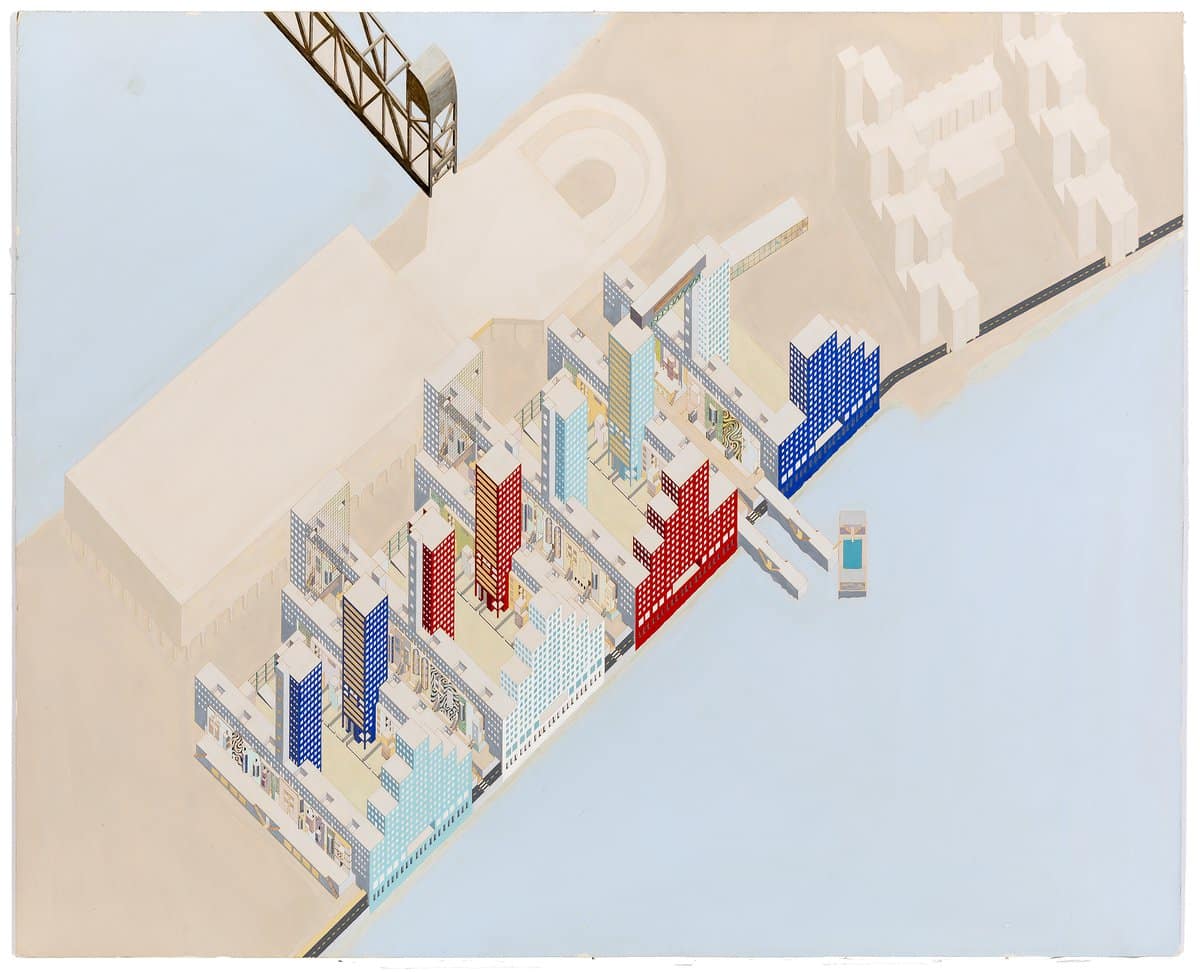
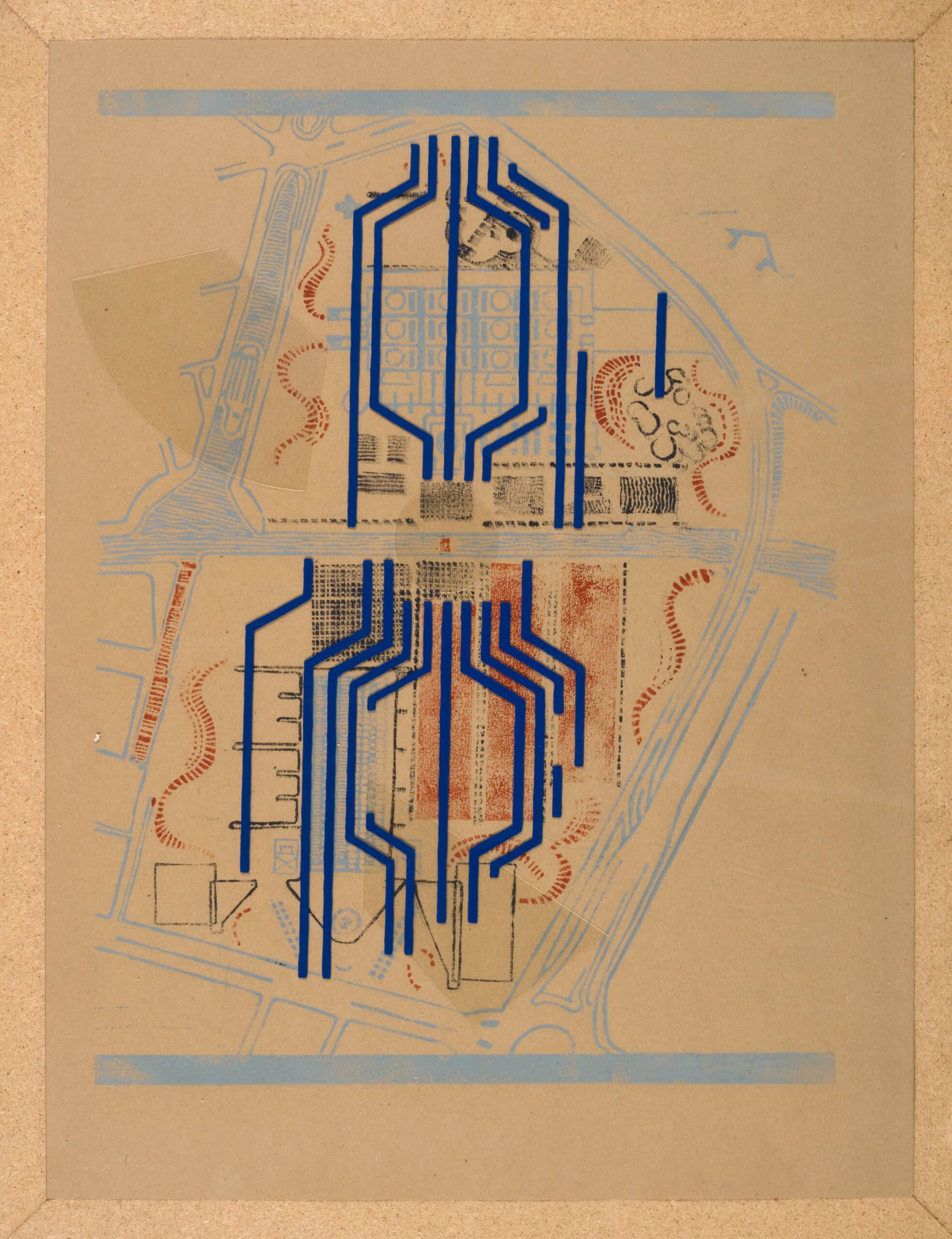
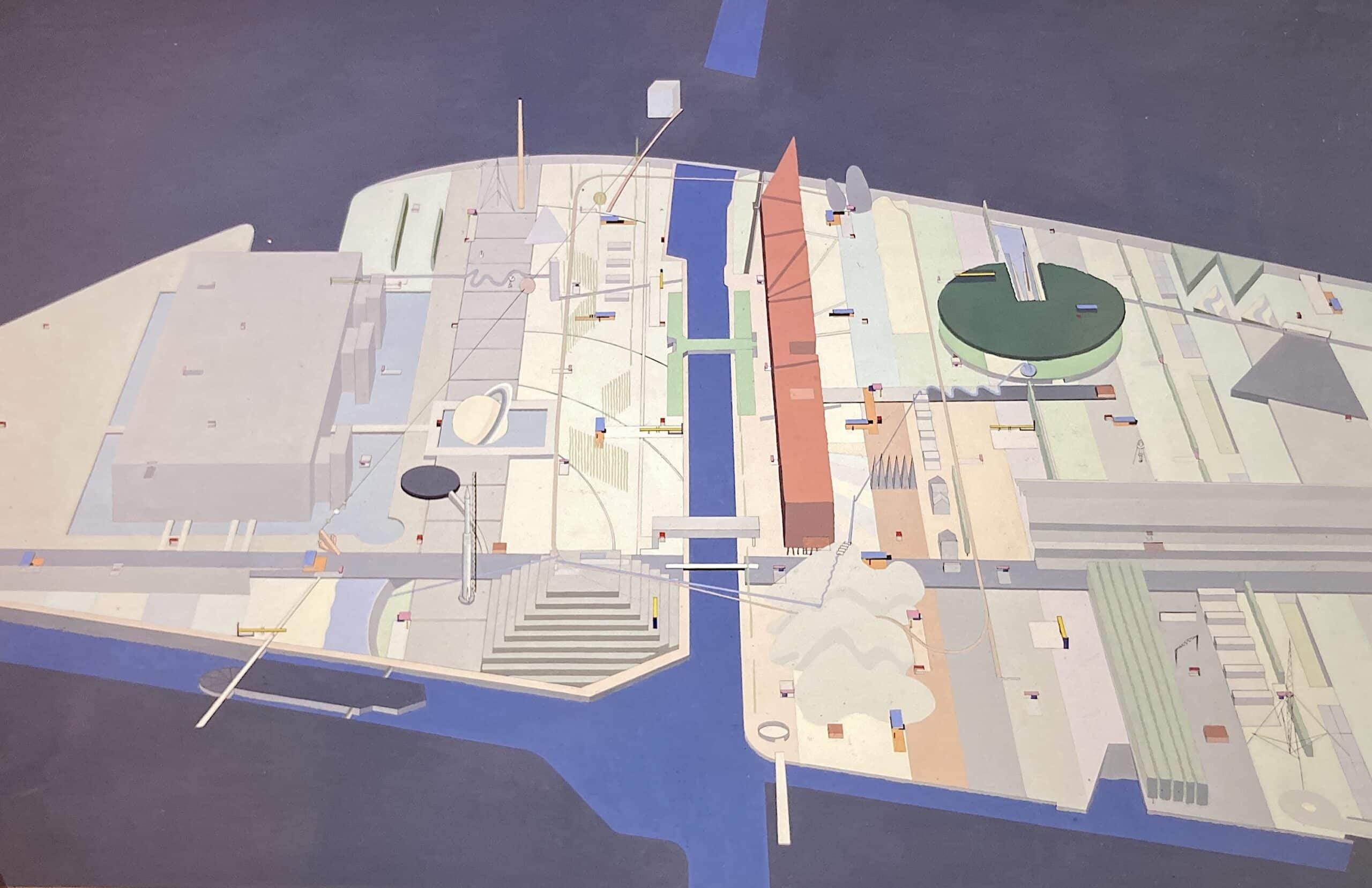
For architects living in New York in the late 1970s, such as Vinciarelli, Eisenman, Bernard Tschumi and Rem Koolhaas, the order and rigidity of the grid served not only as a chance to overturn hierarchies and privileged thinking, but also as a playground for transgressions (hence its importance to deconstructivism). [11] In Tschumi’s project for the Parc de la Villette – a competition for Paris conceived in 1982 while he was involved in the ReVisions study group with Vinciarelli and others – the rationality of order and logic is always liable to devolve into disorder. Red ‘follies’, for example, were spread throughout the park on a grid as a series of ‘points’, which were then disrupted by a layer of ‘surfaces’ (open planes of grass or pavement) and ‘lines’ (paths of circulation), none of which necessarily correspond to one another. Vinciarelli’s Non-Homogeneous Grid, like Tschumi’s Parc de la Villette drawings, was based on an overlay of several different grids, ostensibly a foundation for order and clarity; however, whereas the Parc de la Villette’s serpentine lines and alternation of rigid and biomorphic geometric forms result in a Kandinskyesque image, Vinciarelli’s drawings maintain a strict geometric appearance which camouflages her divergences from the homogeneous grid.
In this way, her drawings are not unlike Sol LeWitt’s diagrammatic work, such as his Variations on an Incomplete Cube (1974), which is characteristic of the systematic and serial nature of his work and
illustrates what Donald Kuspit has described as ‘Rationalistic, deterministic abstract art’, linking it to the legacy of the Renaissance by means of mathematics, reason and the human mind. [12] Yet, as Rosalind Krauss sees it, LeWitt’s work is not necessarily grounded by a logical and complex system of mathematics; opting for a linguistic metaphor, she describes it as ‘babbling’, random nonsense – a ‘lack of system’, if anything. [13] She compares LeWitt’s work, and even that of Judd and Robert Morris (1931–2018), to the existential literature of Samuel Beckett, describing it as an endless repetition devoid of any underlying logic or endpoint: ‘To get inside the systems of this work . . . is precisely to enter a world without a center,’ she states, [14] a description which echoes the labyrinthine carceri (prison) etchings of the eighteenth-century Italian artist Giovanni Battista Piranesi (1720–78). Vinciarelli’s generative system was, however, in a sense both ‘rationalistic’ and an entry into ‘a world without a center’. As Vinciarelli explained, the set of rules that determine her system began as completely ‘arbitrary’, [15] resulting in compositions that appear simultaneously systematic and nearly impossible for the viewer to decode.
The influence of semiotics was formative here. Semiology emerged as a new disciplinary approach reflective of the linguistic turn in architecture during the mid-1960s, while Vinciarelli was at La Sapienza, and it was instrumental in the development of her Non-Homogeneous Grid series. Italy was a hotbed of such philosophical and theoretical developments: Umberto Eco’s foundational semiotic text, Opera aperta (The Open Work),[16] was published in 1962 and the Turin-based journal Strumenti Critici (Critical Tools), a key forum for structural-semiotic discourse, was founded in 1966. [17] As Manfredo Tafuri explained, ‘The renewed interest in semiology and linguistics was in fact based upon an interpretation of form as a potential complex of relations,’ in other words, ‘of the initial form perennially awaiting completion by its inhabitants.’ [18] For Vinciarelli, much like her use of typology as a system rather than a model, the openness and constant state of becoming of her investigative drawings offered a multitude of possibilities rather than a single solution to an architectural problem. As she later reflected in a 1988 essay, ‘the notational system of architecture, for the reader who by training can decode it, has a strong evocative power: that of composing the building, in the imagination of the reader, with precision.’ [19] This collaborative element would appeal to the generation of 1968, but it also formed part of the critique of mainstream modernist architecture. [20]
The grid was thus also a kind of semiotic vehicle for transgression. In a lecture at the New School for Social Research in New York City in 1978, Vinciarelli acknowledged the importance of this theoretical underpinning in her early years: ‘I was very involved in semiology years ago, just when I was doing for instance the drawings with the lines.’ [21] As she shifted from the Homogeneous to the Non-Homogeneous Grid (between c.1973 and 1975), she tilted the grid on a diagonal; by Vinciarelli’s own description, rotating her grid on an angle and creating ‘triangulation’ (something Vidler picked up on in his review), was a way to imbue her works with ‘meaning’. As Vinciarelli stated, ‘the moment that I put [the grid] on a surface and I want to go further, in the sense that I want to do other operations on it, I need at that point another system, of numbers or whatever, to have an indication.’ [22] Vinciarelli explained why she moved from the homogeneous grid to the non-homogeneous grid, since, in her view, ‘to go further’, to allow the grid to produce meaning (or ‘speak’, in other words), you must introduce differences. Unlike Krauss, who has made claims of the grid’s ‘imperviousness to language’, stating that ‘the grid promotes this silence, expressing it moreover as a refusal of speech’, [23] Vinciarelli described it as ‘mute’. The ‘muteness’ of the homogeneous grid is a result of the homogeneity of each square; without points of ‘difference’, the grid is incapable of speaking, of proffering any ‘suggestion of meaning’, [24] as she explained. Here, Vinciarelli seems to echo the ‘deconstruction’ of Jacques Derrida: ‘difference is the systematic play of differences, of the traces of differences, of the spacing by means of which elements are related to each other’; it produces a ‘becoming-space’ that makes ‘activity’ possible within a ‘generative movement in the play of differences’. [25] Vinciarelli’s series thus acted as a critique of the ‘mute’ modernist grid, which she believed could not function at the semiotic level but ‘only at the syntactical level’. [26]
Architectural historian Branko Mitrovic has argued that the linguistic turn in architecture ‘left no space for aesthetic formalism’, which he insists is a necessary basis of architectural communication and analysis, ‘In order to communicate successfully the spatial properties of objects . . . we need to describe them visually.’ [27] Although Mitrovic neglected examples like that of Vinciarelli, who drew upon semiotic theory in the development of her drawings, she too, recognized its limitations later. In a 2009 lecture, she recalled: ‘Little by little I was more and more interested in understanding the nature of my trade, and I don’t think that necessarily semiology is a good part. I think that I can have a series of explanations and clarifications through it, but I don’t think I can attach the essence of what is mainly visual.’ [28] Although semiology has its use as a theoretical tool to understand the source of her drawings, Vinciarelli ultimately approached them less from a theory-laden interpretation and more from an aesthetic one.
There was certainly an emerging market for architectural drawings in the 1970s; however, Vinciarelli’s aim was to move architectural drawing away from the empirical, pragmatic constraints of practice. [29] As such, she drew a distinction between art and architecture, insisting that the Homogeneous Grid and Non-Homogeneous Grid series (and even some of the Puglia project drawings) were decidedly art rather than architecture. ‘Architectural drawings have a tradition of their own,’ Vinciarelli reminded the audience during her 1978 lecture at the New School, ‘which I think is not so easy for artists to understand . . . because those [types of] drawings refer to very specific conventions which pertain to the culture of the architectural project . . . for exigency of comprehension and communication.’ [30] Despite the increasing fluidity between art and architecture, this was an important distinction that was at the forefront of architectural discourse in Rome when Vinciarelli was a student. The Gruppo Romano Architetti Urbanisti (Roman Group of Architects and Urbanists, G.R.A.U.), who came together at La Sapienza in 1964, addressed this in a 1968 statement: ‘The problem posed here is architecture as art. Art is thought . . . that takes place and is realized through the special organization of the signs and technical material specific to each art.’ [31] In other words, architecture is an autonomous art form that operates within its own set of codes like any other art form, a philosophy close to medium specificity. Although this philosophy seems strangely disengaged from not only building, but also politics, Vinciarelli believed that drawing could in fact rescue architecture from market corruption. This position ‘offers architecture, and culture in general . . . the possibility of generating new content,’ as Mary McLeod explained, and ‘to the extent that architecture can generate such forms, it plays a positive, if limited, role in the creation of new material relations.’ [32] Vinciarelli’s discussions of her work from the early 1970s address this potential for generating form and countering market forces, yet she also drew upon the ‘art-for-art’s-sake’ forms of mid-century American painting, namely abstract expressionism.
Speaking specifically about her Non-Homogeneous Grid series, Vinciarelli explained that she was striving to create work that would result in a certain ‘affect’ in these otherwise quite minimal pieces: ‘I was interested in these “drawing-for-drawings” [sic] and I know that the less informative and direct manner this work was, [the] more affecting it was.’ [33] By removing the need for her drawings to be ‘informative’ in a way that standard architectural renderings need to be, and by removing the need for her artwork to be evocative of something beyond lines on a plane, her work could become pure ‘affect’, by her definition. Again, recalling the language of abstract expressionism, she continued: ‘And what can happen is that “affecting” can become more, let’s say, more active in a way. Because there is no other excuse to look at that but to be affected. And what is in front of you can hardly do anything else but affect you.’ [34]
It is difficult to imagine that Vinciarelli was speaking about these quite minimalist drawings using such emotionally expressive language. Based on her descriptions of ‘affect’, one could – as is done in the fourth chapter here – just as easily relate this statement to her later watercolors, whose rich colors, forceful linear perspective and mysterious luminosity directly engage the viewer. However, these drawings of the 1970s suggest a similar affect achieved through different means, via links to postwar art and architecture. Connections to the immediate postwar context should come as no surprise, considering that Vinciarelli’s professors at La Sapienza University (such as Quaroni) had their most productive years in the 1940s and early 1950s, working in the neorealist vein. However, the suggestion here is that her work also aligned with – and indeed was influenced by – American abstract expressionism and the emphasis on scale, the individual and emotional affect.
There are some notable parallels between the aims of Italian neorealist architects and abstract expressionist painters, although the two are rarely linked. [35] Yet, there was a shared assertion of individuality and an emphasis on humanism, as outlined in the section on housing in the Italian Fanfani Law of 1949, titled ‘Plan for Increased Employment and the Construction of Workers’ Houses’. The ‘Fanfani Plan’ was named after the Minister of Labor and Social Security Amintore Fanfani, and was later renamed the National Insurance Institute (Istituto Nazionale delle Assicurazioni, or INA-Casa). [36] According to the authors (Amintore Fanfani and Annetto Puggioni, Head of INA-Casa), architects designing residential buildings should ‘[keep] in mind the spiritual and material needs of man, of a real man and not of an abstract being’. [37] Whereas neorealist architects were focused on expressing the individual character of each building, abstract expressionist artists likewise asserted their own individuality (as seen in Jackson Pollock’s drip, Barnett Newman’s ‘zip’, etc.); artists like Newman (1905–70) and Mark Rothko (1903–70) also sought to achieve a spirituality or transcendence through large scale and intense color. The shared aim to avoid formulaic repetition and the importance placed on ‘spiritual’ needs in the aftermath of the Second World War should not be overlooked. As Bruno Reichlin explains, ‘spontaneity, chance, and a rediscovered value of the street are themes that deliberately abandon the beaten paths of a modernism that adhered narrowly to a strict rationalism and functionalism, which defined the neorealist aesthetic.’ [38]
Similar to the ‘all-over’ compositions of Pollock (1912–56) and others, neorealist architects spoke of design that integrated building(s) and environment into a complete urban fabric. As outlined in the Fanfani Plan, ‘the greatest care should be taken so that . . . the overall visual impression will prevail over the single element’. [39] Judith Rodenbeck has also drawn a link between postwar painting – the likes of Pollock – and postwar architecture – the likes of Peter and Alison Smithson (or neorealist architects in Italy, for that matter):
both draw upon variation within a larger system, creating a ‘new compositional strategy’ that involved the fluid articulation of relatively autonomous parts rather than their subordination to an idealized geometric schema – a kind of discrete all over strategy; importantly, this approach was predicated on the careful observation and detailing of the vernacular and of everyday life as well as respect for its materiality. [40]
One might assume that the grid, another kind of ‘all-over’ device itself, is anathema to the work of Pollock and other gestural painters of the late 1940s and early 1950s. However, as Krauss has pointed out, the grid functions both in the realm of concrete matter (the stark two-dimensionality of the picture plane) and in a spiritual realm (as a sense of limitlessness). [41] In Vinciarelli’s work, the emotive capacity of the grid is achieved by soft, pastel colors, a dynamic, diagonally-oriented composition, and a consideration of the viewer’s presence and how the work will affect them. By diverging from the standard homogeneous grid, she rendered the picture plane more ‘active’ and aimed to suggest some sort of ‘meaning’, and, as she explained, ‘you can get inspired by that’. [42]
Drawings based on the grid or on a predetermined system are rarely discussed as capable of affecting the viewer in the way that Vinciarelli described. Yet, according to Eva Meltzer, even 1970s structuralist and systematic conceptual and minimalist art deemed ‘antihumanist’ should be re-evaluated through the lens of affect. [43] Even when the artist has removed their self as subject (in the work of Robert Morris, for instance), systems can actually evoke emotion by engaging ‘the fading possibility for self-consciousness and self representation – the fear . . . of being rendered pure discourse.’ ‘In so doing,’ Meltzer states, ‘[Morris’s] systems produce affective side effects. They create a space for feeling.’ [44] Minimalist scholar James Meyer has noted that the minimalist penchant for simplification similarly resulted in a kind of ‘affect’, as in the stripe paintings of Frank Stella (b. 1936). [45] Instead of creating ‘a space for feeling’, however, Stella’s paintings prompt a decidedly negative affect: ‘There is “nothing” in Stella’s paintings apart from these stripes,’ Meyer writes. ‘No expression, no sensitivity, no symbolism . . . Purgation produces affect.’ [46]
In an echo of Stella’s famous dictum, ‘What you see is what you see’, [47] Vinciarelli seemed to contend that her Non-Homogeneous Grid works were similarly devoid of symbolism, stating ‘the line was not about something else outside the page’. [48] That being said, she understood that ‘in the field of visual art, nothing is meaningless’, in contrast to literature where one could ‘construct a meaningless sentence’ by disregarding rules of semantics and syntax. ‘But in visual art,’ she continued, ‘even if I do a line just like this, it’s a line, so I think it functions differently from literature.’ [49] This, despite the fact that linguistic terms still dominated discussions of her work, which she described as a matter of metaphor: ‘the power of a sign or a symbol of a sign, or elements since we’re speaking of architecture – the capacity of suggestion, but not necessarily suggesting something outside itself, but also of itself.’ [50]
I would argue that for Vinciarelli – as for Agnes Martin – the grid could be both tangible and transcendent at the same time. From Martin’s 1964 ink on paper works, such as Stone and Wood, to her 1973 series of screenprints, On a Clear Day, the latter of which were contemporaneous with Vinciarelli’s Non-Homogeneous Grid series, the grid opens the work to meaning, meditation and reference. Both straddled the line between the ‘affect’ of abstract expressionism and the ordered geometry and seriality of minimalism. Yet, as will be seen, Vinciarelli’s drawings – and her use of the grid in particular as a point of origin – had architectural, political and formal implications, as modes of reconsidering the spatial fabric in an abstract or theoretical way.
Rebecca Siefert’s recent book Into the Light is the first comprehensive study of the work of Lauretta Vinciarelli, available here.
Notes
- Anthony Vidler, ‘Diagrams of Utopia’, in The
Activist Drawing: Retracing Situationist Architectures from
Constant’s New Babylon to Beyond, edited by Catherine de
Zegher and Mark Wigley (Cambridge, MA: The MIT Press,
2001), p.85. - ‘Lecture: Lauretta Vinciarelli’ (1978), Giuseppe Zambonini papers.
- Ibid.
- Ibid.
- As quoted in Susana Torre, ed., Women in American Architecture: A Historic and Contemporary Perspective, p.176.
- Ibid.
- ‘Lecture: Lauretta Vinciarelli’ (1978), Giuseppe Zambonini papers.
- Ibid.
- Ibid.
- Louis Kahn’s (1901–1974) pastel sketches of the early 1950s during his travels to Italy and Greece come to mind here as well.
- I would like to thank Mona Hadler for clarifyingthis point.
- Donald Kuspit, ‘Sol LeWitt: The Look of Thought’,Art in America, vol.63, no.5 (September–October 1975), p.48.
- Rosalind Krauss, ‘LeWitt in Progress’, October,vol.6 (Autumn, 1978), pp 46–60.
- Ibid., p.60.
- ‘Lecture: Lauretta Vinciarelli’ (1978), Giuseppe Zambonini papers.
- Umberto Eco, Opera aperta (Milano: Bompiani,1962). Note that Eco’s text was published six years before Roland Barthes’s Death of the Author (1968).
- For more on structuralism and semiotics in Italy, see Teresa De Lauretis, ‘The Shape of the World: Report on Structuralism and Semiotics in Italy’, Books Abroad, vol.49, no.2 (Spring 1975), pp 227–32.
- Manfredo Tafuri, History of Italian Architecture, 1944–1985, translated by Jessica Levine (Cambridge, MA: MIT Press, 1991), p.89.
- Lauretta Vinciarelli, ‘On Croset’s Idea of Narration’, in Architectu(re)production, edited by Beatriz Colomina (New York: Princeton Architectural Press, 1988), p.245.
- Alan Colquhoun, ‘Postmodernism and Structuralism: A Retrospective Glance’, Assemblage, vol.5 (February 1988), p.14.
- ‘Lecture: Lauretta Vinciarelli’ (1978), Giuseppe Zambonini papers.
- Ibid.
- Rosalind Krauss, ‘The Originality of the AvantGarde’, in The Originality of the Avant-Garde (Cambridge, MA: MIT Press, 1986), p.158.
- Ibid.
- Jacques Derrida, ‘Semiology and Grammatology: Interview with Julia Kristeva’, in The Routledge Language and Cultural Theory Reader, edited by Lucy Burke, Tony Crowley and Alan Girvin (London: Routledge, 2000), pp 241–8.
- ‘Lecture: Lauretta Vinciarelli’ (1978), Giuseppe Zambonini papers.
- Branko Mitrovic, ‘Architectural Formalism and the Demise of the Linguistic Turn’, Log, vol.17 (Fall 2009), pp 20–1.
- ‘Lecture: Lauretta Vinciarelli’ (1978), Giuseppe Zambonini papers.
- Marta Gutman, in conversation with the author, New York, January 3, 2018.
- ‘Lecture: Lauretta Vinciarelli’ (1978), Giuseppe Zambonini papers.
- Gruppo Romano Architetti Urbanisti, ‘G.R.A.U. – Crescita di una teoria: Breve antologia degli scritti dal 1964 al 1981’, in G.R.A.U. isti mirant stella: architetture 1964–1980 (Roma: Edizioni Kappa, 1981), p.9. ‘Il problema che qui poniamo è l’architettura come arte. L’arte è pensiero . . . Pensiero che si attua e si realizza mediante la organizzazione particolare dei segni e materiale tecnico specifico di ciascuna arte.’ Translation by the author.
- McLeod, ‘Introduction’, in Architecture, Criticism, Ideology, edited by Joan Ockman, p.10.
- Lauretta Vinciarelli, lecture at The Spitzer School of Architecture at the City College of New York, 2009, author’s transcript of DVD recording.
- Ibid.
- Joan Ockman wrote a compelling essay highlighting the correspondence between abstract expressionism and ‘corporate modernism’ in Cold War America. See Ockman, ‘Midtown Manhattan at Midcentury: Lever House and the International Style in the City’, in The Urban Lifeworld: Formation, Perception, Representation, edited by Peter Madsen and Richard Plunz (New York: Routledge, 2005), pp 177–203.
- For an extensive study of the INU and INA-Casa projects, see Stephanie Zeier Pilat, Reconstructing Italy: The Ina-Casa Neighborhoods of the Postwar Era (Surrey, England: Ashgate Publishing Limited, 2014). As Zeier Pilat points out, the program was instituted not only to address the desperate need for housing, but also for employment.
- As quoted in Bruno Reichlin, Antony Shugaar and Branden W. Joseph, ‘Figures of Neorealism in Italian Architecture (Part 1)’, Grey Room, vol.5 (Autumn, 2001), p.84.
- Ibid., p.85. Emphasis original.
- Ibid., p.84.
- Judith Rodenbeck, Radical Prototypes: Allan Kaprow and the Invention of Happenings (Cambridge, MA: The MIT Press, 2014), p.30.
- Rosalind Krauss, ‘Grids’, October, vol.9 (Summer 1979), pp 50–64.
- ‘Lecture: Lauretta Vinciarelli’ (1978), Giuseppe Zambonini papers.
- Eva Meltzer, Systems We Have Loved: Conceptual Art, Affect, and the Antihumanist Turn (Chicago: University of Chicago Press, 2013), p.22; Frederic Jameson, ‘Postmodernism, or the Cultural Logic of Late Capitalism’, New Left Review, vol.146 (July–August 1984), pp 53–92.
- Meltzer, Systems We Have Loved, p.21. Emphasis original.
- James Meyer, ‘The Minimal Unconscious’, October, vol.130 (Fall 2009), pp 141–76.
- Ibid., p.153. Emphasis original. Despite Stella’s claims, titles like the infamous Die Fahne Hoch! are hardly devoid of associations, and for those who have experienced the moving simplicity and monumentality of installations at Dia: Beacon or Marfa, it is easy to see how one can be affected by such minimal and conceptual works.
- As Stella states in his interview with Bruce Glaser, ‘Questions to Stella and Judd’, Artnews, vol.65, no.5 (September 1966), pp 55–61.
- ‘Lecture: Lauretta Vinciarelli’ (1978), Giuseppe Zambonini papers.
- Ibid.
- Ibid.

– Rebecca Siefert