Infinite Patterns in I. M. Pei’s Furniture Diagrams
In 1969, the Cleo Rogers Memorial Library, designed by I. M. Pei & Partners, was completed in the small town of Columbus, Indiana. According to project architect Ken Carruthers, who was obsessed with the golden ratio, the building rigorously employs ancient proportional systems.
Fully opaque on its east and west facades, the curious monolith is clad in Flemish bond brick and has tall, slender windows set back between structural piers on the north and south sides. In his unpublished memoir, Carruthers describes the building as a ‘lofty classical pavilion, more like an asymmetrical Erechtheion’, that frames a civic plaza with its neighbour, the First Christian Church (designed by Eliel Saarinen and realised in 1943). The plaza would eventually be punctuated by a gift from Columbus’ famed patrons, the Miller Family, who commissioned Large Arch from Henry Moore at I.M. Pei’s suggestion. Pei reportedly observed his own children playing around a smaller version at the Museum of Modern Art in New York City and thought that a similar statue at a larger scale would balance the void between the two buildings. Cast in Berlin, then shipped across the Atlantic Ocean to New Orleans, the bronze statue sailed up the Mississippi and Ohio Rivers to Louisville before being transported on a flatbed truck to Columbus.
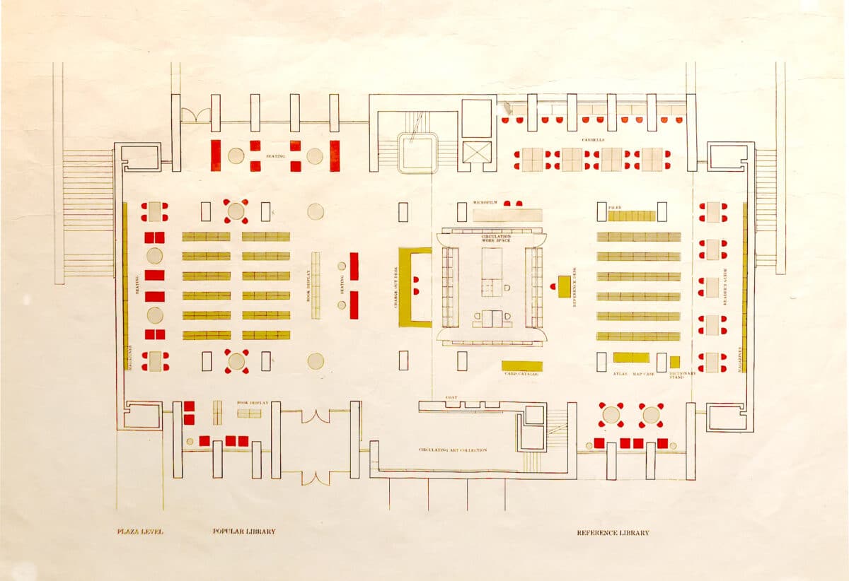
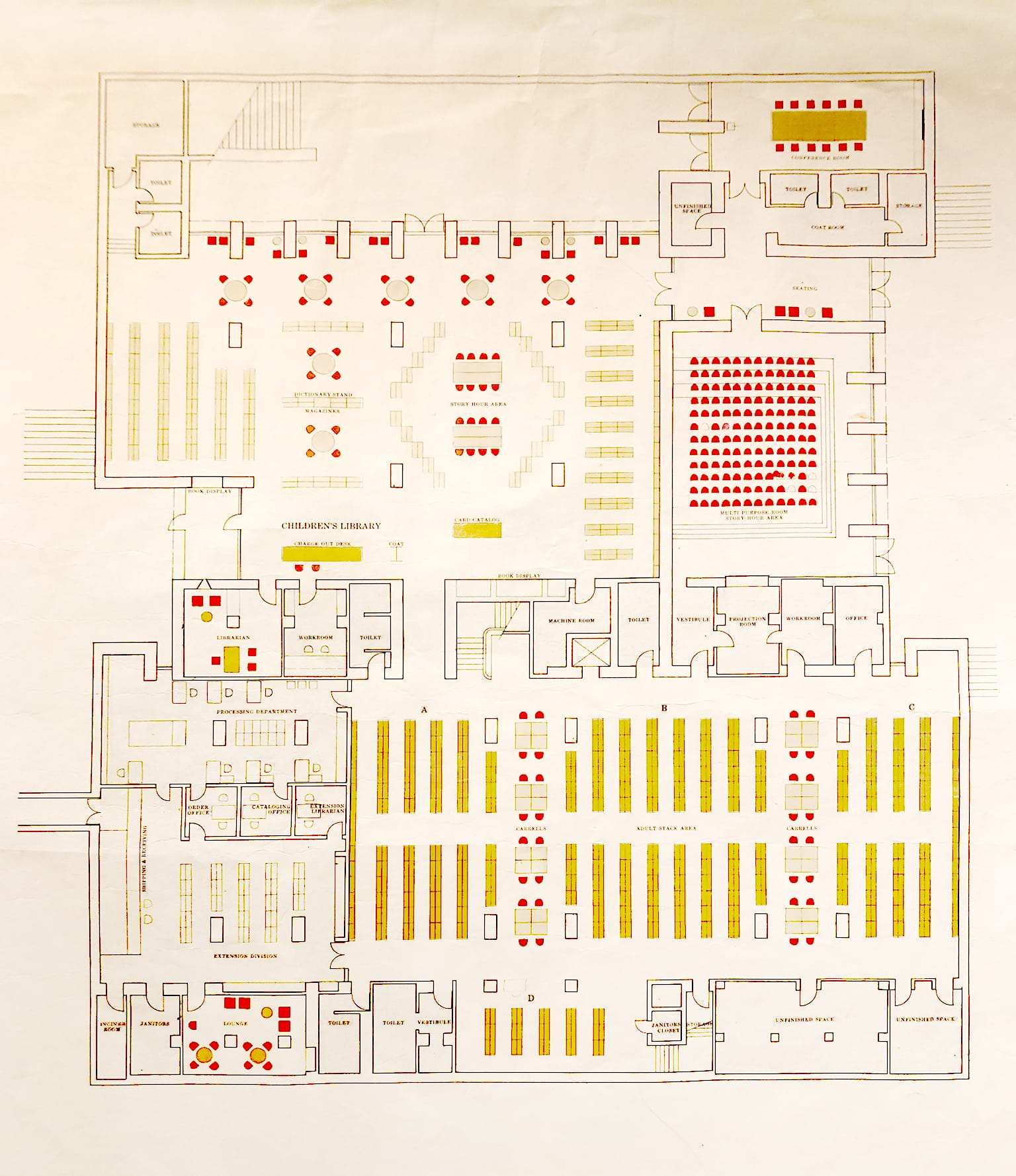
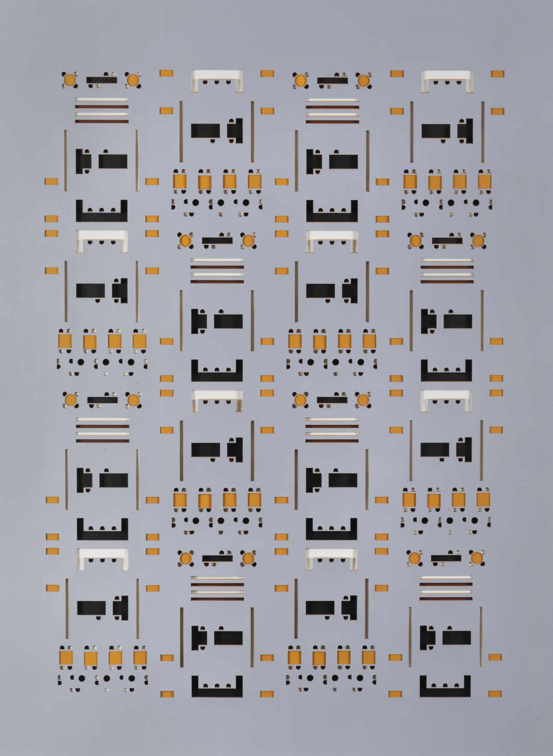
Large Arch and the library have endured as beloved artefacts in the city’s public realm for five decades. In 2019, while conducting research for an exhibition honouring the library’s fiftieth anniversary, a strangely compelling set of diagrams was discovered in the archives located on the lower level beneath the primary reference room. Architects at Pei’s office overlaid colourful shapes highlighting the organisation of furniture throughout the building onto architectural plans. Having searched through multiple construction and presentation drawings in the archives, these diagrams immediately stood out because of their unorthodox visual character. The colourful patterns create a textile-like quality on the page that is playfully syncopated with the building’s formal order. Each symbol represents a chair, table, desk, or bookcase that corresponds with a colour-coded key organised by furniture type. The palette primarily comprises tan, ochre, and bright red colours, which abstractly references the subtle color variations of the building’s brickwork. In fact, the library’s original chairs were upholstered in a bright red fabric that continued as a motif in the carpet of a small, multipurpose auditorium that was dubbed the ‘Red Room’.
The diagrams instill in the viewer a hypnotic cadence; as if one had been offered a glimpse of the building’s surprising cellular structure through a microscope. It is difficult to pinpoint a precedent that produces a similar effect. As a pattern language based on repetition, they imply a woven matrix-like one of Annie Albers’ great tapestries, and they share the improvisational character of Mondrian’s Broadway Boogie Woogie. They are also reminiscent of many Native American artworks and textiles, where symbolic markings are mirrored and rotated to create rhythmic fields. Surely, this reading of them is tainted by a subjective predilection for colour and pattern in my own work and the kind of inspirational precedents that an architect or artist might readily keep at hand for reference. The fact is, these diagrams were produced to clearly illustrate the location of furniture in the library for would-be installers, or to demonstrate a simple layout for the client. They stemmed from a functional necessity, rather than a desire to make poetry; but their practical origin is precisely what augments their unexpected, magnetic beauty.
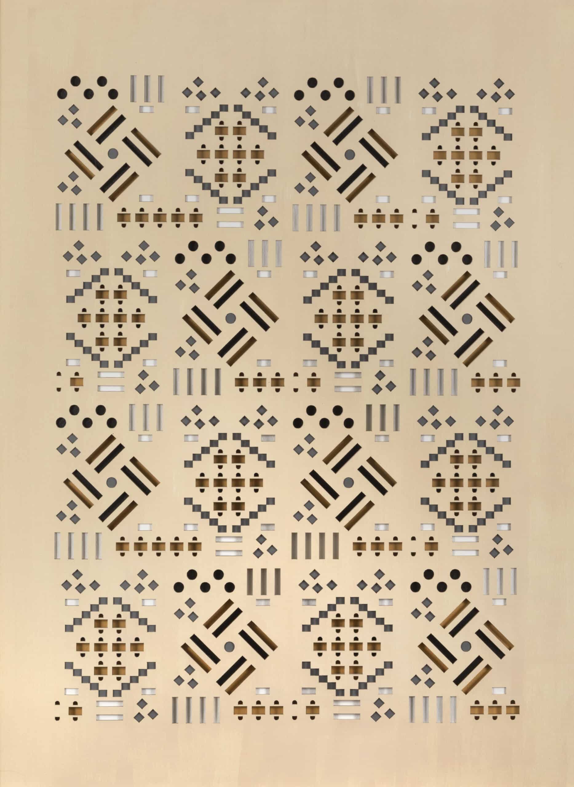
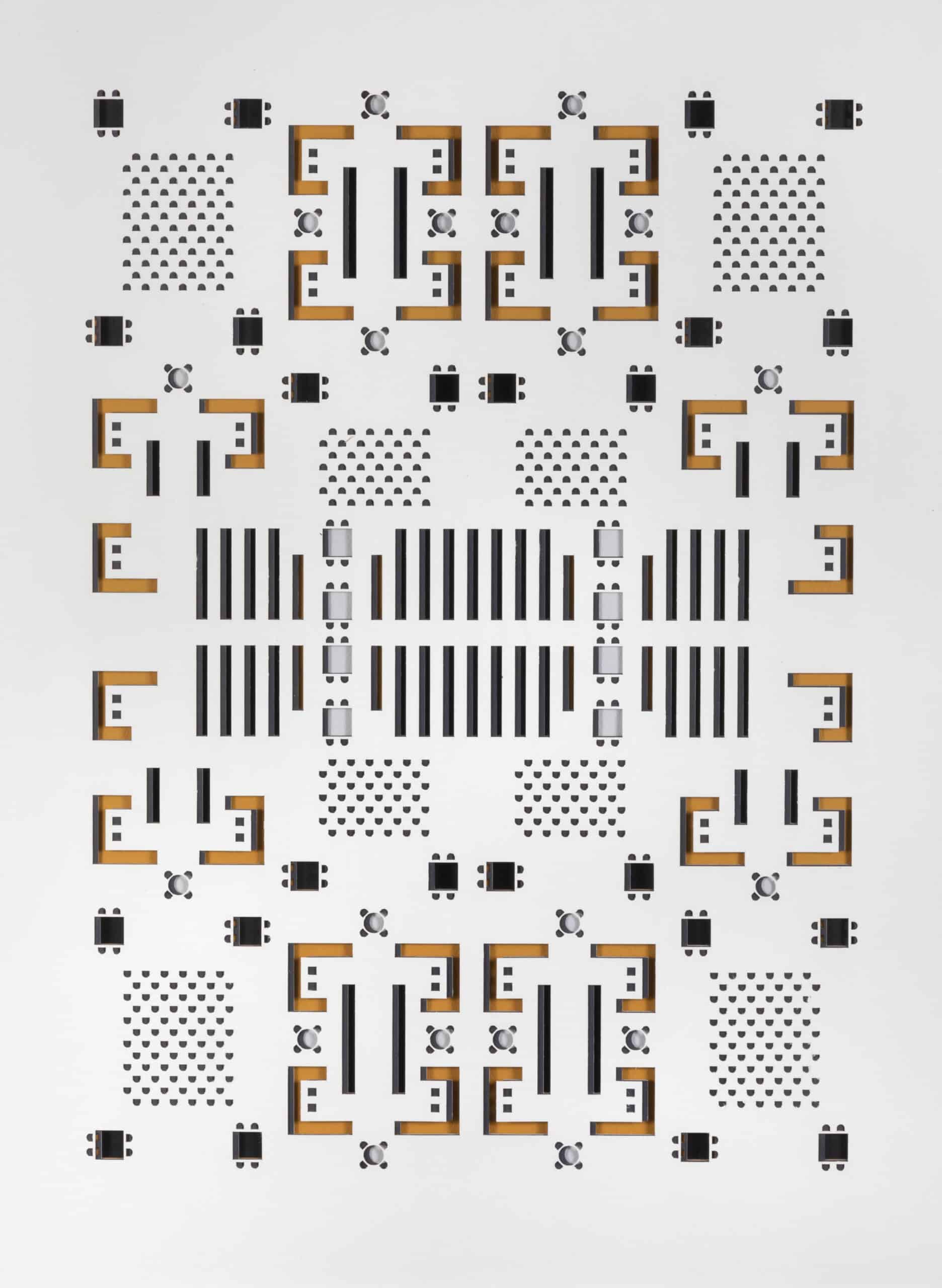
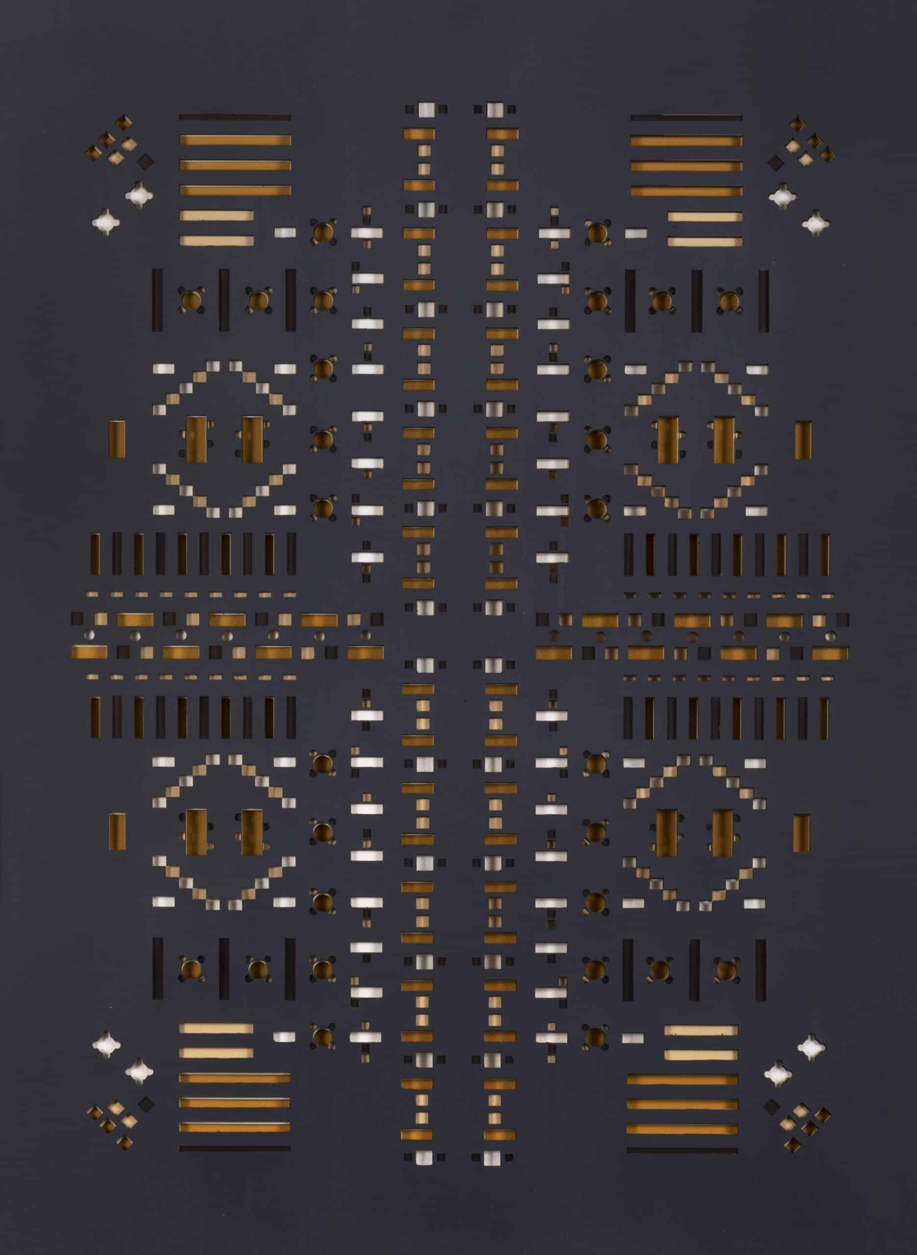
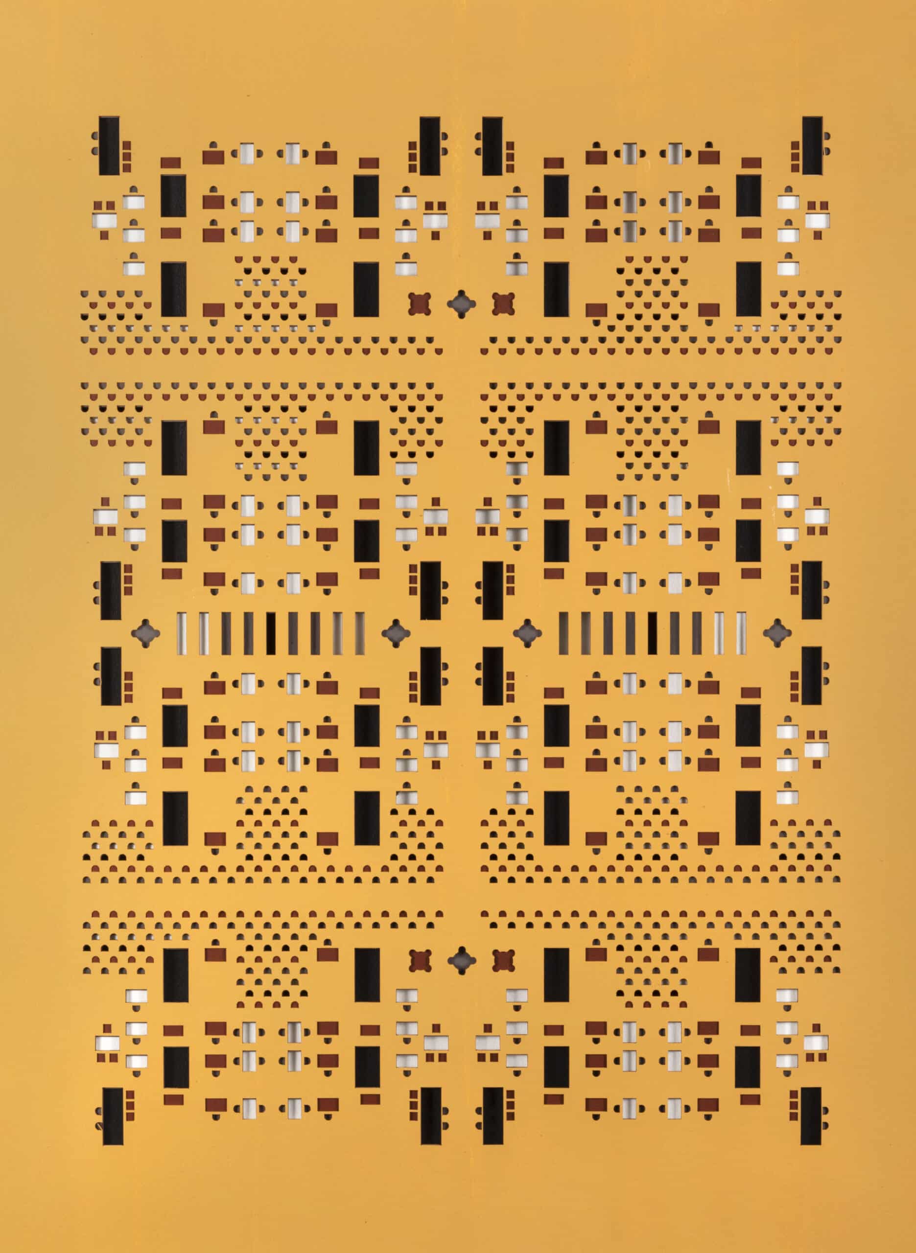
Compelled by their unique representational qualities, my partner and I decided to explore the latent grammar of the diagrams in a series of layered constructs. One by one, we digitally traced the plan shapes from scanned images of the original drawings, thus removing them from the context of the library’s rooms. Floating in the abstract ether of digital space, we began to relate them to one another in new ways. Fragments were mirrored, arrayed, copied, and rotated, which allowed the figures to take on new meanings in an endless stream of permutations. The lack of gravity on the computer screen prompted us to bring the new patterns back into the physical world. We devised a plan to use a CNC laser machine to cut the shapes out from cold-pressed watercolour paper in layers according to furniture type. Each one was hand-painted in a palette that loosely referenced the original brick-themed hues of the diagrams and then stacked in a precise order to reveal different colours within the depth of a single frame.
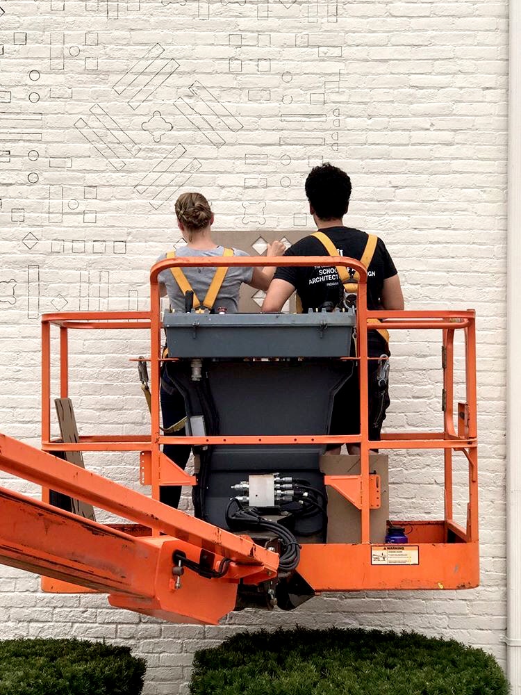
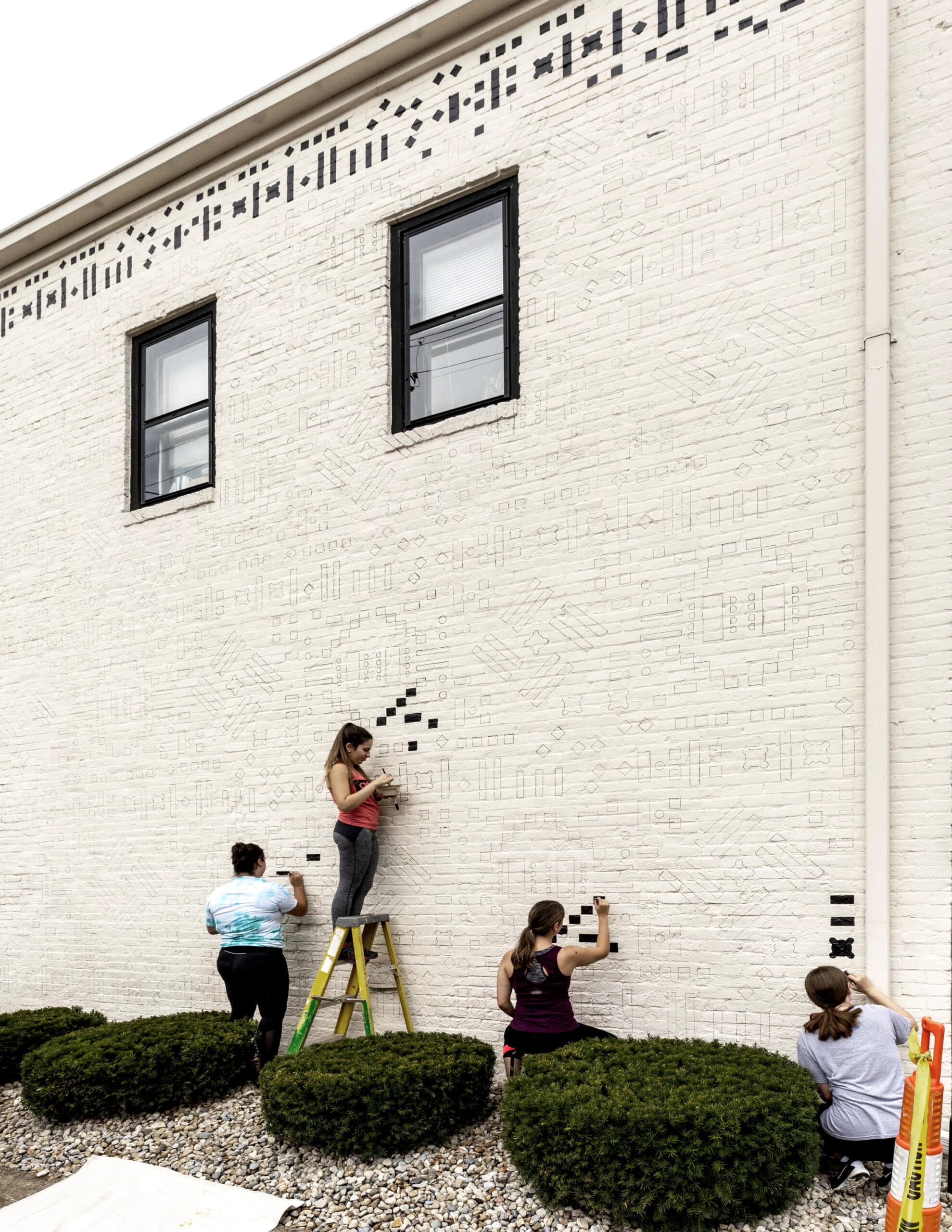
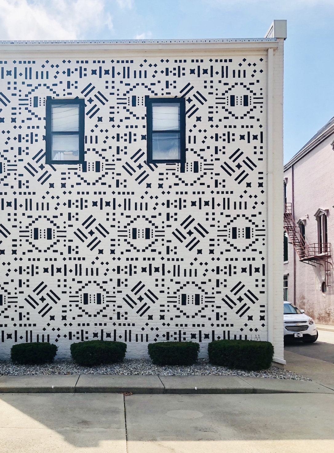
Ten resulting compositions were shown at the 411 Art Gallery in Columbus during one of several exhibitions and events honouring the library in its fiftieth year. In one final interpretation of the work, we decided to engage the urban scale of the city. The gallery occupies the lower level of a building on a quiet street downtown and its east facade (a largely blank, masonry wall) faces the library located a block away. An enlarged pattern was hand-drawn directly onto the wall using a series of eighteen custom stencils. Each outline was subsequently filled in with black latex paint to achieve a continuous figure ground across the entire surface, which is interrupted only by two, symmetrically composed sash windows for the apartment upstairs. The reading of furniture is practically erased at this scale for viewers with no knowledge of the artwork’s archival connection.
There is an idea, from The Library of Babel by Jorge Luis Borges, that lingers in the background of the entire project, which can be described as a series of archival translations. In the story, the narrator concludes that the library must be both, ‘limitless and periodic’ since a traveler moving through it in any direction would eventually find that, ‘the same volumes are repeated in the same disorder (which repeated, would constitute an order: Order itself)’. The archive is often conceived as a static vault that aims to preserve. Yet in this case, a limited set of diagrammatic hieroglyphs from the building’s past served as fodder for a potentially infinite series of reconfigurations. It shows how an archive and library, though bound by finite architectural space, can perpetuate endless discovery.
Daniel Luis Martinez is Assistant Professor at Indiana University’s J. Irwin Miller Architecture Program and co-founder of LAA Office.
This text was entered into the General Archive category for the 2021 Drawing Matter Writing Prize.
