Syon House and the Afterlife of Architectural Drawing
His writing is not about something; it is that something itself. [1]
I knew very little about the eighteenth-century architect Robert Adam prior to June 2014. When challenged to respond to his drawings of the Long Gallery at Syon House, my impulse was to visit and draw my way through the building as a whole. In what follows, the actual experience of Syon House becomes a vehicle for understanding its drawn representations. This took place first and foremost, not through words, but through drawings of my own, the outcome of approximately five days’ work over a number of weeks. These drawings were first presented in the library of London’s Soane Museum, a space in which ‘containment is virtual, depth real… an exact reversal of that which could be applied to Adam’s work’. [2]
My approach was by way of making a modest contribution that would complement the immensely detailed art-historical knowledge of my partner in dialogue at the Soane, Adriano Aymonino. As a practising architect, architectural drawing is inextricable from the activity of design: reflective but always transformational, speculating as to what could be. My explorations seek to approach Adam’s drawings empathically through their own medium: orthographic projection, carried out by hand. This allows a close analysis of the decisions taken by Adam in relation to the existing building; however, this in itself was not my principal aim. My work is intended to invoke — in a positive sense — the uncertainty underlying Adam’s presentation drawings, rescued for posterity by Sir John Soane. Works such as Adam’s elevations of the Long Gallery are only now museum pieces; it is my belief that they were once part of an unstable, evolving body of thinking: spaces of imaginative encounter. I will therefore address not the intended meanings of Adam’s design for Syon House, but its after-effects: what the project reveals about the ongoing paradoxes of architectural drawing, whose relation to actual experience is never entirely transparent, and whose reality is ultimately impossible.
I
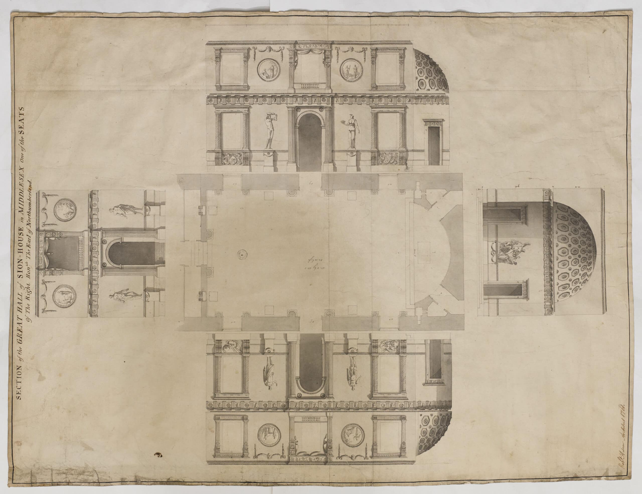
The opening pages of Robin Evans’ 1989 essay The Developed Surface display a composite drawing of the Great Hall at Syon House dating from 1761 (fig.01). [3] To one side are established the facts of its commission, ‘Sion House, in Middlesex’, being ‘one of the seats of the Right Hon[ourable] Earl of Northumberland’. The sheet formed part of a scheme by Adam to transform a grand sixteenth-century courtyard house, itself constructed on the site of a medieval abbey, into a ‘palace of Graeco-Roman splendour’. [4]
Adam’s drawing shows a selection of ancient architectural motifs incorporated into a room of imposing, four-storey, scale. A plan in the poché tradition is encircled by elevations of each vertical face, carefully rendered in wash to give the impression of three-dimensional modelling. Yet, on closer inspection, certain aspects disturb the initially reassuring surface. Doorways are rendered in dark wash in all four elevations, suggesting perforation of the wall; however, all the windows but one are left white. Even more curious is the title that was given to the sheet: ‘Section’ — the vertical ‘cut’ through the building — is the one type of drawing which is in fact missing, suggested only in the faint outline around the very edge of each elevation.
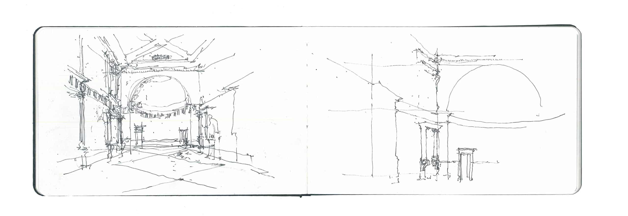
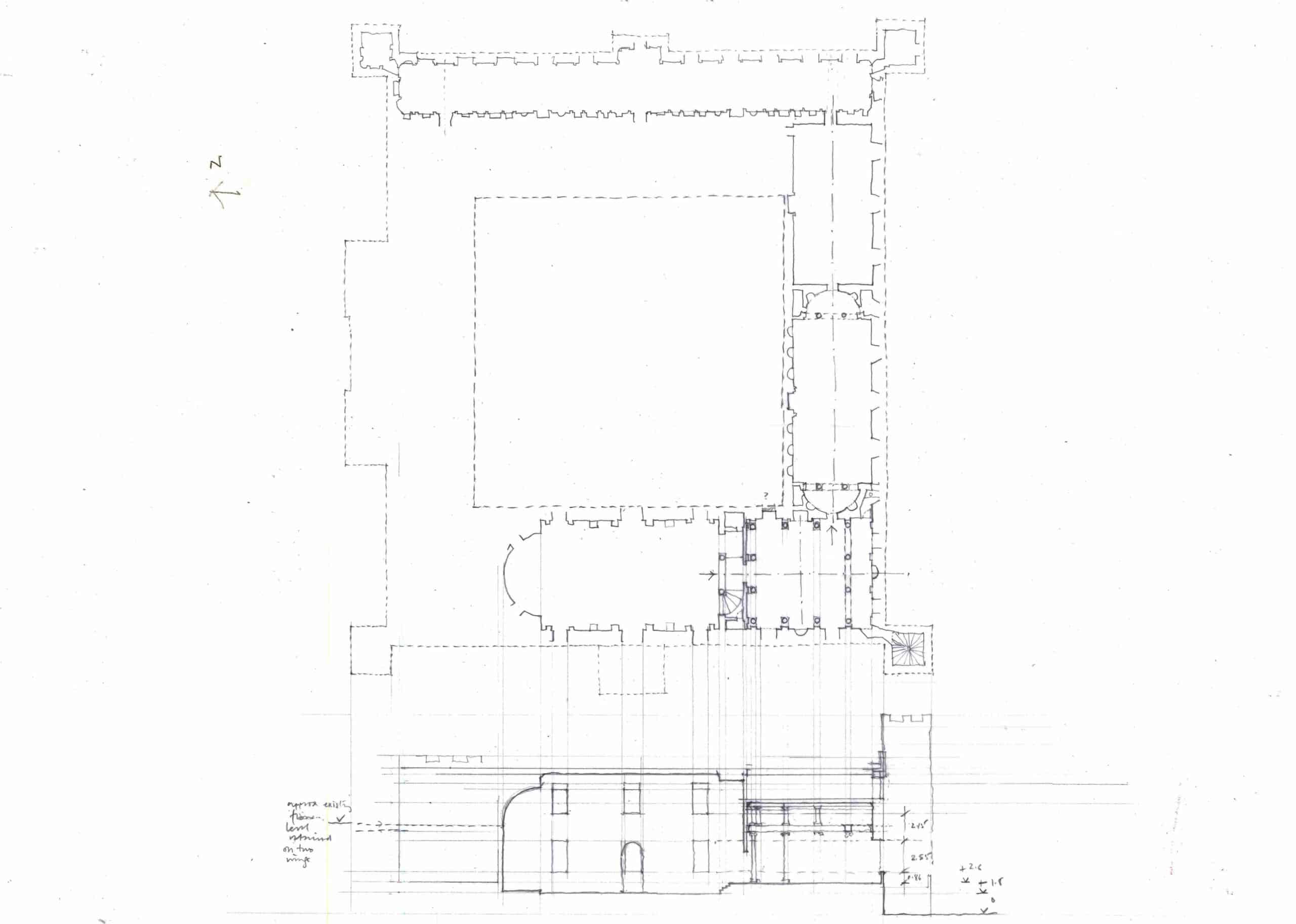
As executed, the Great Hall at Syon is recognisable from the drawing in most respects (fig.02); however, its notably light and transparent quality is absent from Adam’s representation, where the whiteness of the windows suggests solidity rather than perforation. The one window shaded by Adam (or his assistants) to suggest its openness has not been incorporated into the space. As opposed to the others opening into the exterior, this window would have opened into an adjacent first-floor room, for the Great Hall cuts through the house and occupies the full height of the building (fig.03, lower part).
The flourishing of the ‘developed surface’ drawing, in which a single room is essentially displayed as a paper box that has been unfolded onto the sheet, is shown by Robin Evans to be coeval with the fashion for richly ornamented interiors in grand late eighteenth-century British houses, with each room decorated individually and appearing distinct from the others. Although Evans does not elaborate on his chosen frontispiece, his essay proffers a series of remarkable observations on the implications of this drawing method for architecture — and Robert Adam in particular — of which this drawing is perhaps emblematic. Evans demonstrates that the precondition for the virtuosic variety of décor celebrated in Adam’s work is the equality in relations between rooms established by the ‘circuit’ plan. In the arrangement favoured by Adam, rooms are arranged not in a radial gradation from grandest to most humble (Evans calls this ‘hierarchical’ planning), but in a continuous ring. [5]
If, like beads on a string, all the rooms are the same in their overall relationship to one another, they are made different in every other conceivable aspect. . A concatenation of interiors of magnified individuality dispels any sense of latent sameness; each room is its own little empire of activity, illusion and colour…Once we recognize the strategy of pitting individuality against equality we can understand why the developed surface interior drawing was so appropriate to the houses and villas of the 1770s, 1780s and 1790s. [6]
At Syon House, the ‘circuit’ plan was to an extent already suggested by the existing building, in which wings of approximately equal dimensions are arranged around a square void. However, the rooms altered by Adam bring a new sensibility to this plan, not solely the product of working with the given conditions (figs.03-06). As Evans observes:
A good deal of Adam’s work involved additions to, or conversion of, existing buildings. In such circumstances individual description of rooms made some sense. Yet even when dealing with commissions for completely new buildings he would produce characteristic paper-thin fold-out designs for each interior. [7]
The abolishing of the ‘hierarchical’ seventeenth-century house plan in favour of the continuous circuit is clearly palpable in the drawing of the Great Hall, even though this depicts only a single room. The sense of the promenade — the necklace, to use Evans’ analogy — is underscored in the visual weight given to the doorways and to the one window which would have opened to an adjacent interior space. In the drawing there is no difference between a door leading to the exterior and one leading to an adjacent room. Paradoxically, this proves to be consistent with the treatment of the windows proper, for the developed surface drawing technique cannot be expected to address anything which lies beyond the notionally depthless internal skin of the room — an enveloping surface, depicted in adoring detail, which has been folded in on itself. The openings which have been treated as such in the drawing are those which would lead from one condition of the circuit to the next; windows that violate the integrity of the developed surface by making contact with the world beyond the highly controlled decorative scheme of the architect would disrupt the order of the drawing and therefore appear to all intents and purposes as part of the wall. This curious spatiality is reinforced by the absence of the titular section, for, as Evans notes, it is the inclusion in later architectural drawings of the sectional cut around each elevation which finally ends the tradition of the developed surface interior. The section reveals the connections between rooms which the developed surface obscures; it breaks the illusion possible in the purely elevational drawing. With Soane in particular, Evans finds, the section radically alters the course of architecture. [8]
II
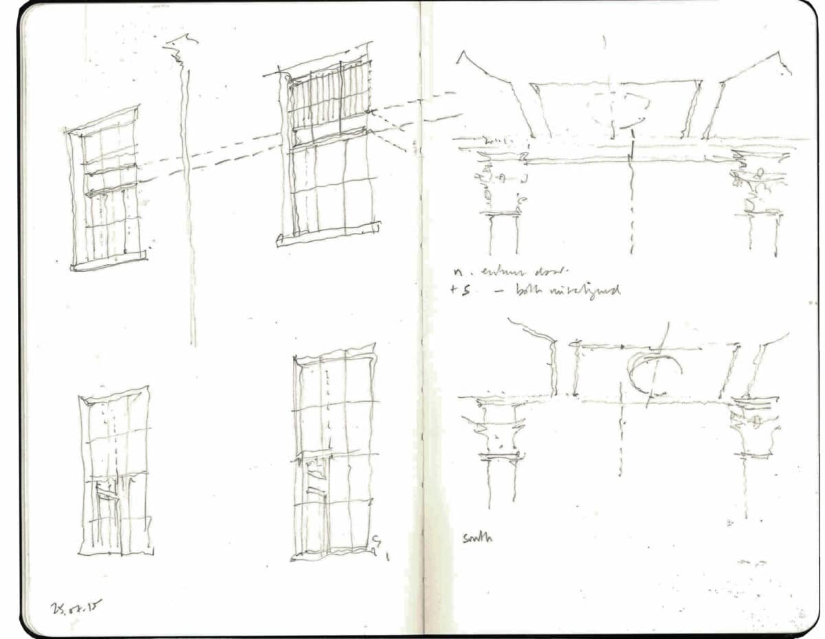
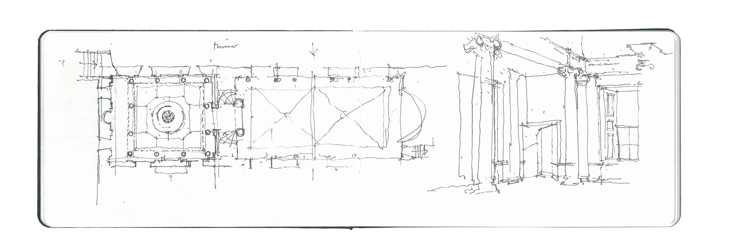
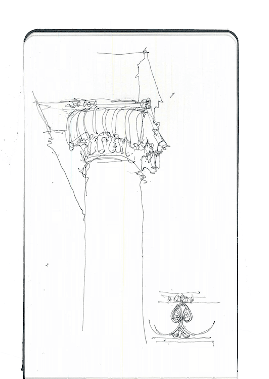
The apsidal termination of the Great Hall at Syon stands in contrast to the opposite end of the room (fig.07). In the former, the great expanse of the room’s internal skin is stretched into a curved surface, where, in the latter, a free-standing screen of columns spans across the space, framing a recess containing the door to the next room in the sequence of interiors executed by Adam. In an unsettling move, the frieze at first-floor level, which curves obediently into the apse, detaches itself from the wall to be supported by columns at the other end of the room. It is as though a piece of the elevation drawing had become exposed on both sides. This foreshadows the treatment of the next interior — the so-called Ante Room — in which the rectangular footprint provided by the existing shell has been re-centred through the deployment of a free-standing colonnade to the South end (figs.07, 08). The resultant nine-square peristyle is effectively centred on the pier between the existing windows in the West wall, with a corresponding arrangement of doors in the East wall leading to the next room in the suite. The free-standing columns reduce the presence of the low doorway in the corner of the existing volume, which leads into one of the bastions visible from the exterior. The door itself is rendered as a piece of the wall, further obscuring its incongruity with the new architecture (fig.07).
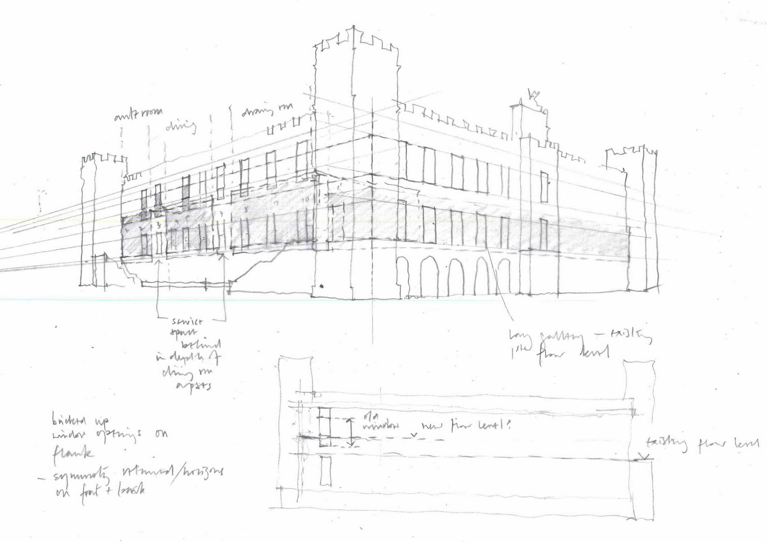
Viewed from the grounds of the estate, the South elevation of the building is at odds with the West facade through which we entered the Great Hall (fig.09). While the datum of the ground floor windows is consistent between the two elevations (indeed around the whole building), the first-floor windows to the South have clearly at some point in their history been raised, with areas of infill masonry outlining the original lower horizon. This lower horizon remains intact on the West façade, where, on closer inspection, the raised first-floor level cuts across the two windows over the Ante Room, the lower half of the windows evidently having been boarded over to create the Adam interior (fig.06). These adjustments would have allowed the first floor to be raised along the whole of the South wing, creating the ‘attic’ storey above the colonnade in the Ante Room. Indeed all three rooms in the South wing benefit from this added generosity in height.
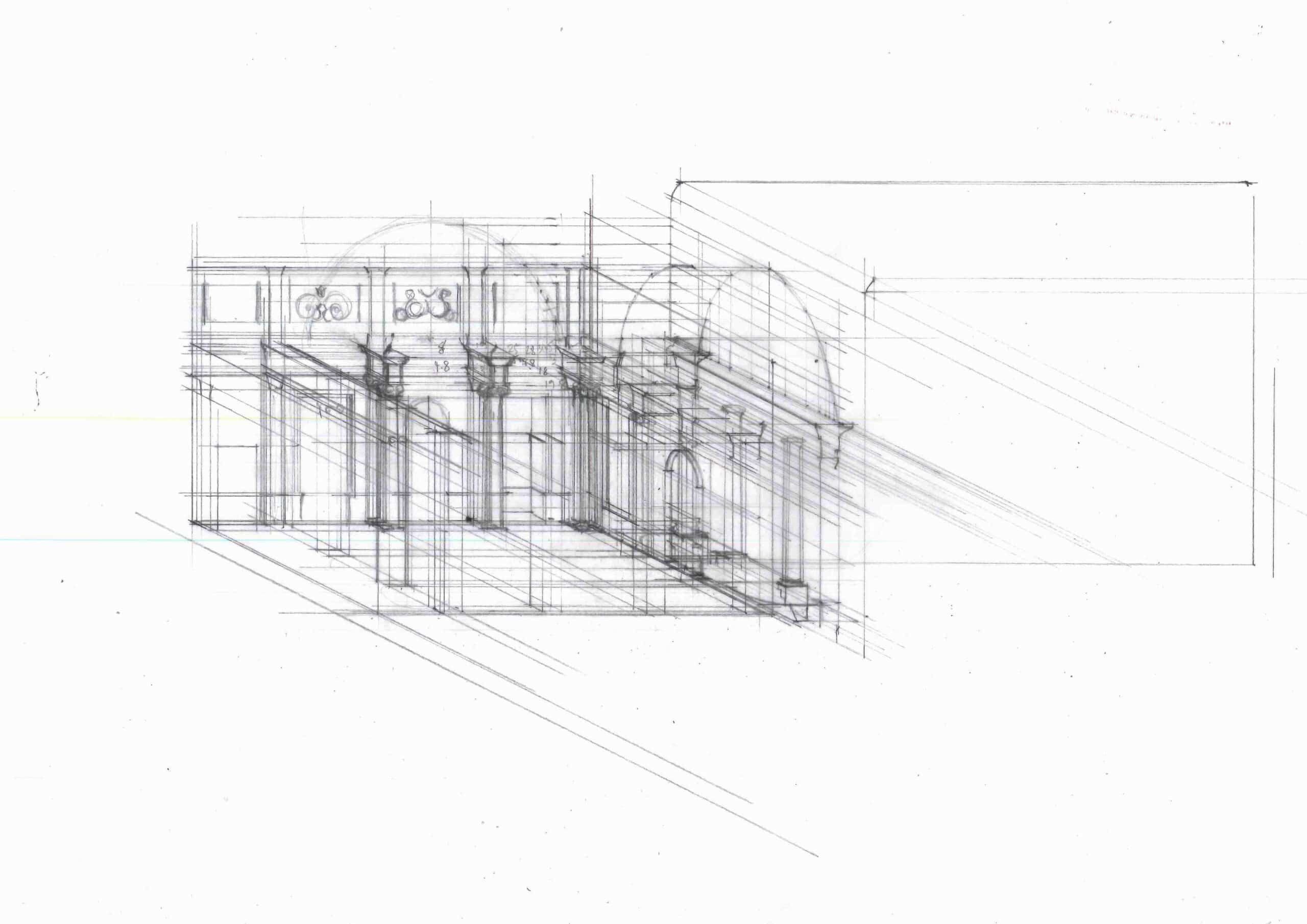
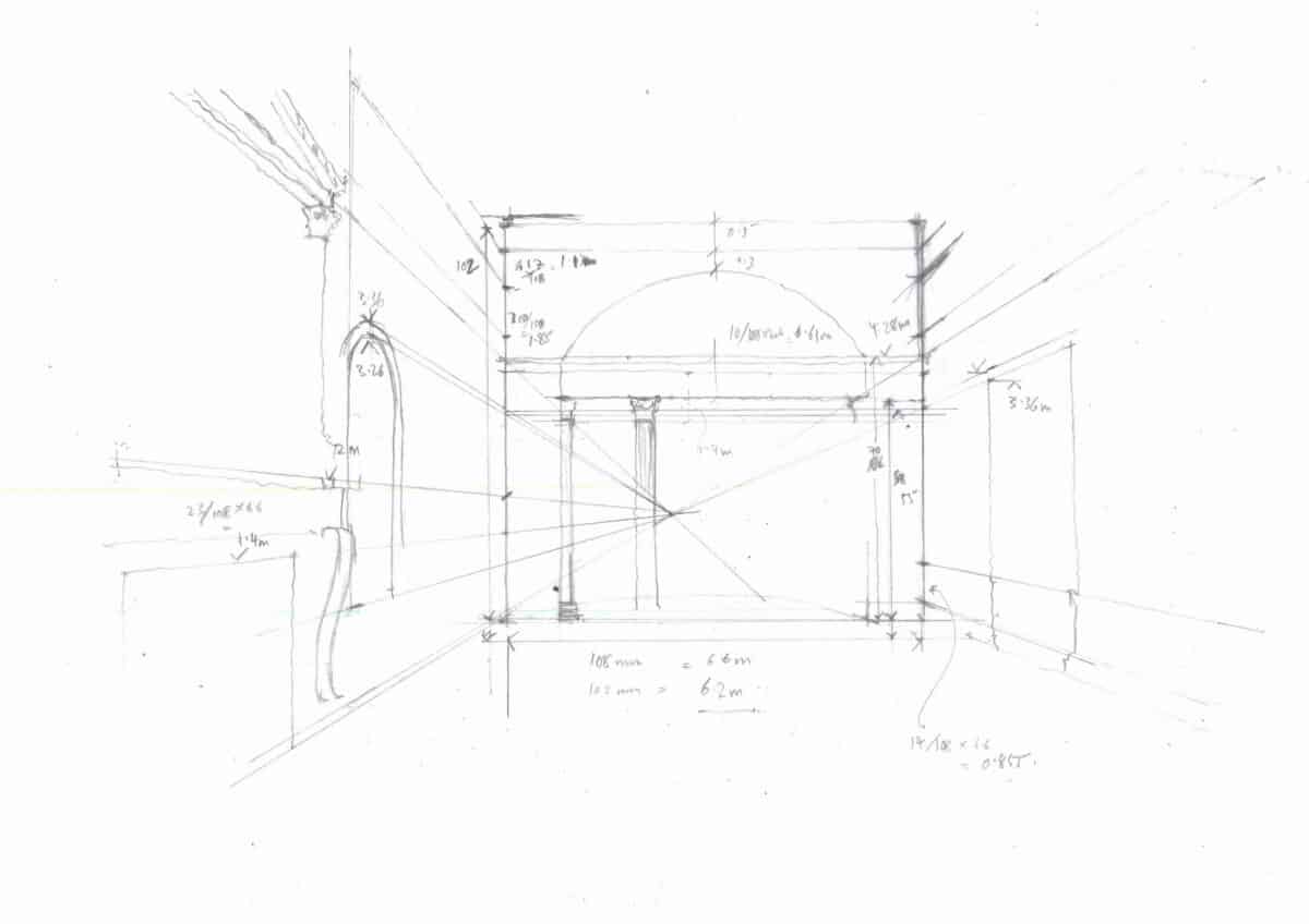
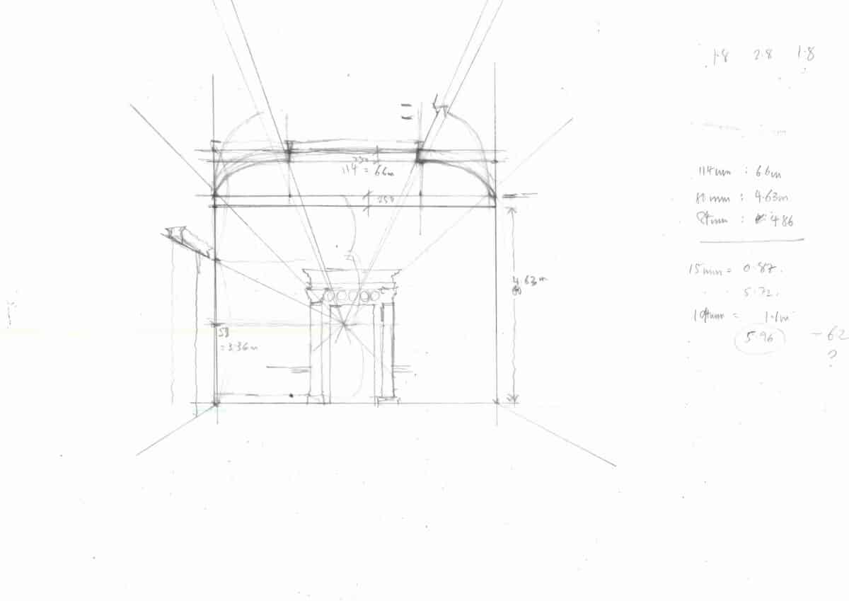
The rooms themselves are markedly different in internal treatment, which at first glance obscures the underlying matrix on which their decoration has been elaborated. Tracing the main datum lines in each room in relation to eye level by reversing the perspective suggests that the horizons of dado and window cill, top of door and cornice are all essentially consistent throughout the sequence (figs.10-12). [9] In addition to the equality of relations between rooms in the horizontal dimension observed by Robin Evans, this also suggests an underlying uniformity in the vertical plane.
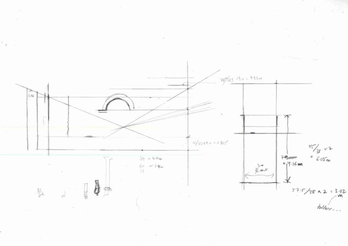
Arriving at the end of this sequence into the East Wing of the house, we enter the Long Gallery, a room spanning the full length of the range but only half its width (fig.13). The height of the room is approximately two-thirds of that established in the Ante Room and its neighbours in the South wing. While an ‘attic’ storey is implied by mouldings and panelling within the room, the raising of the first floor was not implemented in the East range owing to the refurbishment of the first floor rooms shortly before Adam’s project was undertaken. [10] Unlike the other four rooms in this refurbishment project, Adam’s design for the Long Gallery was therefore implemented within the constraints of the existing floor levels.
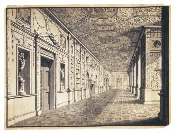
The Long Gallery is 41m (136 feet) long and roughly one-tenth of this in width. Its interior is characterised by an extremely low relief in both the panelling of the walls and the coffering of the ceiling, all of which are painted and gilded. The feeling of compression after the experience of the South range rooms is marked, particularly since this is the end of a sequence that began with the quadruple-height entrance hall. The East wall is perforated by eleven existing windows, the West wall by three doorways and two fireplaces, between which built-in bookcases have been created to convert the room into a library. At either end of the room, doorways open into the bastions at the corners of the building. Adam’s treatment of the South wall is provocative: the door to the bastion is concealed as part of the panelling, while the window adjacent to this, which would have interrupted the applied rhythm of his pilaster treatment, is hidden behind a hinged false bookcase (figs.14-15). [11] With these panels open, the thinness of the architecture is poignantly exposed.
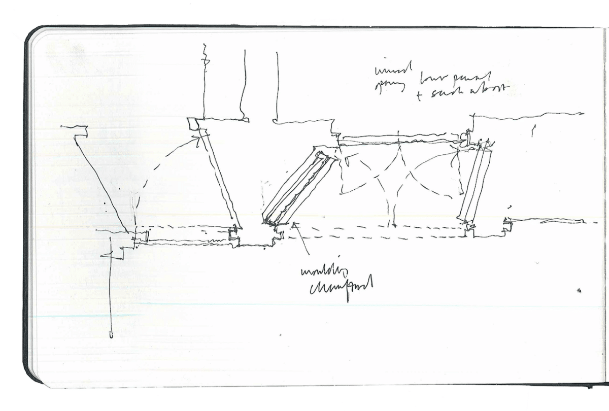
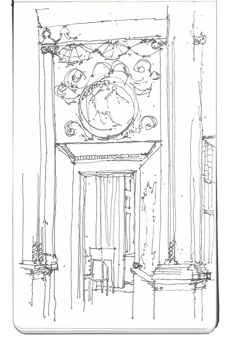
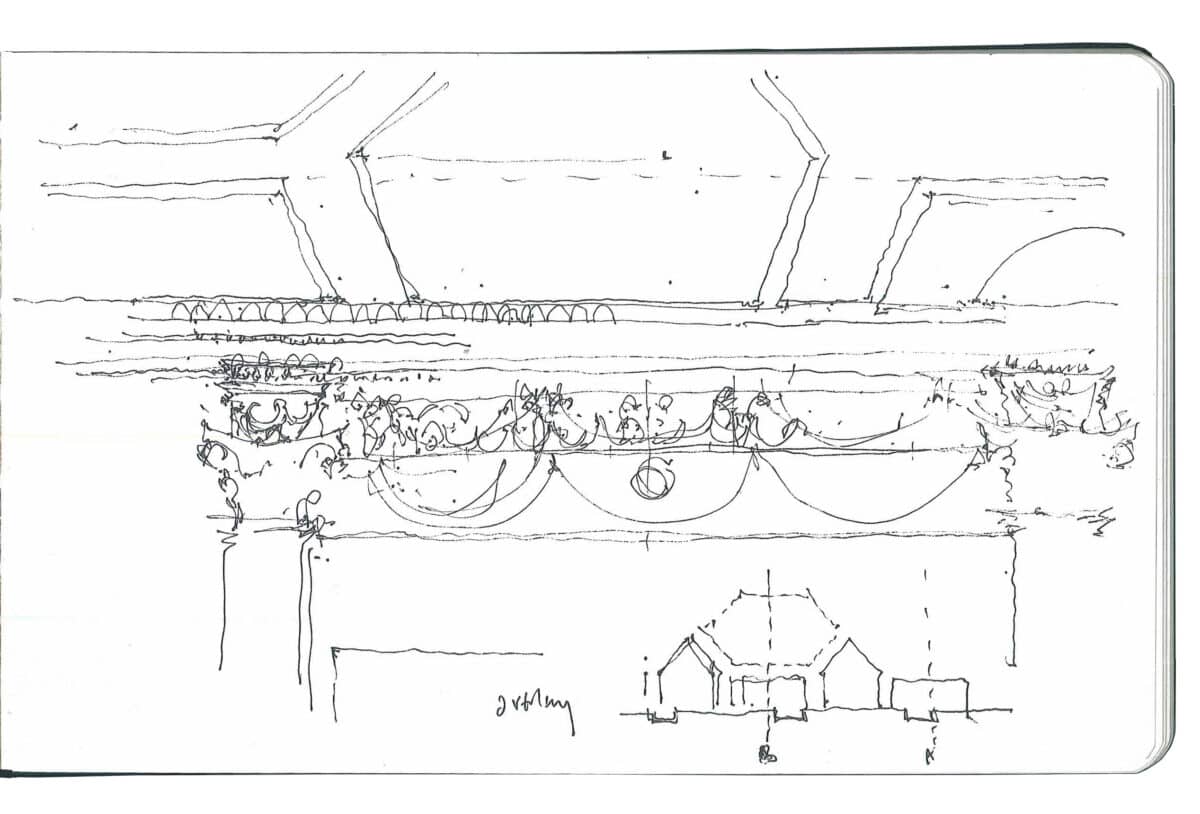
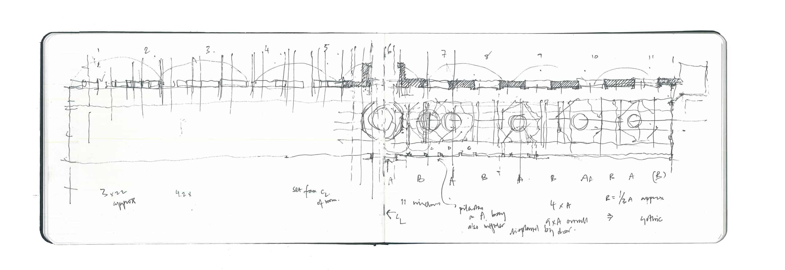
Owing to the extremely elongated proportions of the plan, it is difficult to understand the rhythmic relations between the East and West walls of the space. Of necessity one perceives the gallery in what is effectively a one-point perspective, looking down its length. This is also how Adam chose to represent the room for publication — the only perspective drawing of any of his interiors that he seems to have published. [12] Positioning oneself against the West wall and looking East provides an alternative understanding, however. While the ribs of the ceiling panels emerge from the pilasters on the West wall, it becomes clear that they do not align with the pilasters to the East (fig.16). At this point, a seam in the developed surface interior asserts itself: the decorative skin no longer folds smoothly across the junction between ceiling and wall. The effect momentarily suggests the dissolution of the room into separate, orthographically-generated planes. The spectre of the unfolded paper box hovers in the background.
III
The cross axis of the Long Gallery is consistent and clearly visible from the central doorway, but the gradual divergence of ceiling and wall rhythms is harder to trace in situ (fig.17). It is only by assembling Adam’s drawings of the room that this relation, and its implication for the architecture more broadly, can begin to be understood.

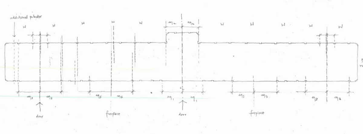
The reflected ceiling plan preserved in the Soane Museum records the scheme approved by the client which was effectively implemented in the interior we see today (fig.18). Tracing the pilasters from this plan reveals the disjunction in rhythm between the two long sides of the room (fig.19). Assembling the plan, reflected ceiling plan and internal perspective onto one sheet allows the three-dimensional relations between the different facets of the enveloping surface to be made clearer (fig.20). Adam has employed a three-bay arrangement of four pilasters, with a wider central bay, in each space between the five existing apertures of the West wall. This motif appears to be part of a grid that is applied across the whole ceiling and underlies its more complex geometries. Every fourth bay in the grid is wider, with the pattern being set from a wide bay in the central doorway of the West wall, where any misalignment between the two long sides of the room would have been visible on entry. The grid therefore unifies the West wall and the ceiling and works with the central window in the East wall. To either side, however, the pre-existing windows displace the pilasters on the East wall from the grid.
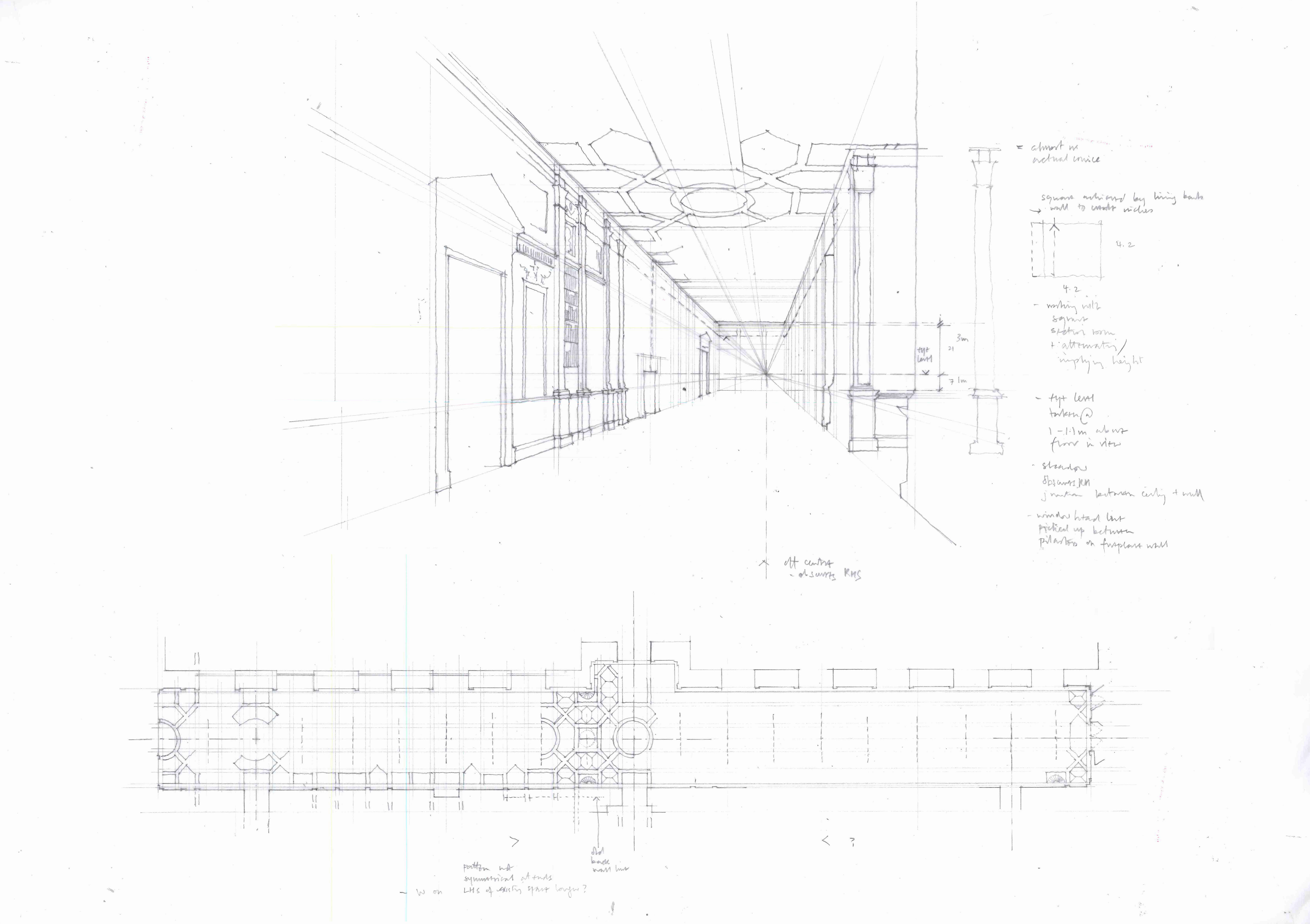
Adam has skillfully adjusted the proportions of the existing shell to lend it as much verticality as possible. The attenuated pilasters have been positioned as high as possible, with the capitals effectively hitting the underside of the perimeter moulding on the ceiling (fig.20). This creates the curious impression that the customary entablature has been folded across the joint between ceiling and wall. The depth of the bookcases appears to have been subtracted from the original width of the room, carefully establishing a square proportion to the two end walls which makes the ceiling appear higher. The perspective drawing reinforces all these sleights of hand: the vanishing point is placed off centre, focusing on the West wall of the room where Adam presumably had greater freedom to implement his design given that there was significantly more wall to window compared to the East side. The disjunction of rhythm between the ceiling and the East wall is, therefore, less visible and is further obscured by being in shadow. Finally the horizon line has been set at approximately one metre above the floor — roughly waist height — adding further to the illusion of verticality (fig.20).
Working backwards to the existing shell as it might have been prior to Adam’s intervention makes his achievements and challenges the more striking (fig.21). However, it also invites architectural speculation.
The imbalance of openings in the room, with the highly perforate East elevation and largely solid West wall, was re-calibrated by Adam: the West wall was disguised to become as articulate as the East, if not more so. This was achieved by imposing a new rhythm (fig.22).
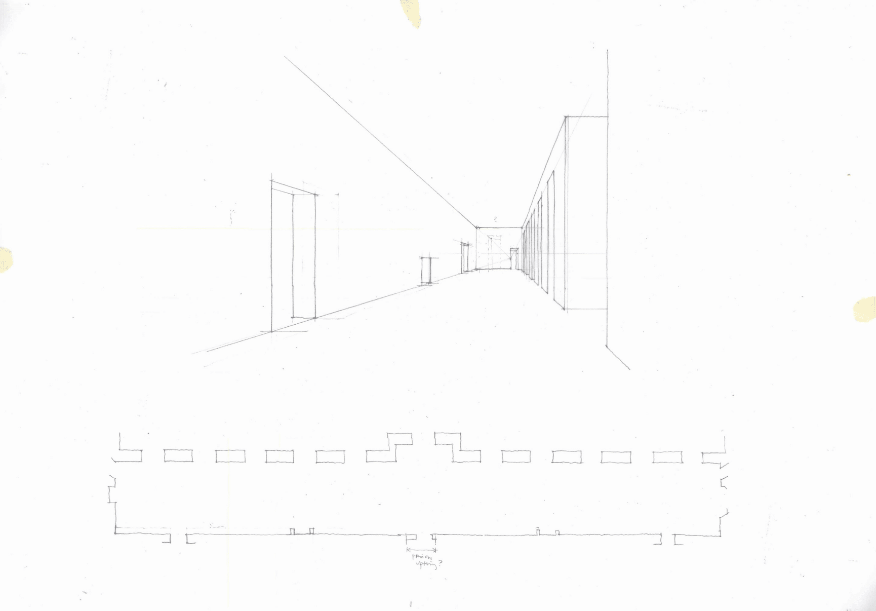

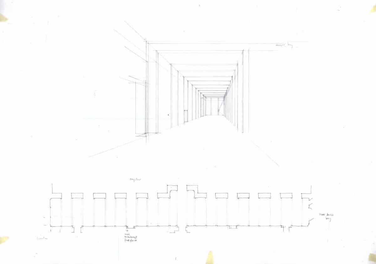
The opposite approach — working with the existing dominant rhythm of the windows — would also have been possible. This would have coordinated both primary walls with the ceiling in a unified, regular order. The effect would have been reminiscent of an ancient stoa (fig.23). [13]
With this underlying matrix, it is possible to imagine re-introducing variation in height and width of pilaster, in the proportions of the cornice, the balance of solid and void in the bookcases, adjusting these elements to work more with the inherent proportions of the shell (figs.24-27). The grouping of pilasters to imply a sequence of bays along the length of the room — a striking aspect of Adam’s aspiration to introduce ‘movement’ — could also be adopted within the regular spacing, by retaining the original wall plane of the room around the doorways and fireplaces, with only the bookcases projecting further into the space (fig.27). [14]
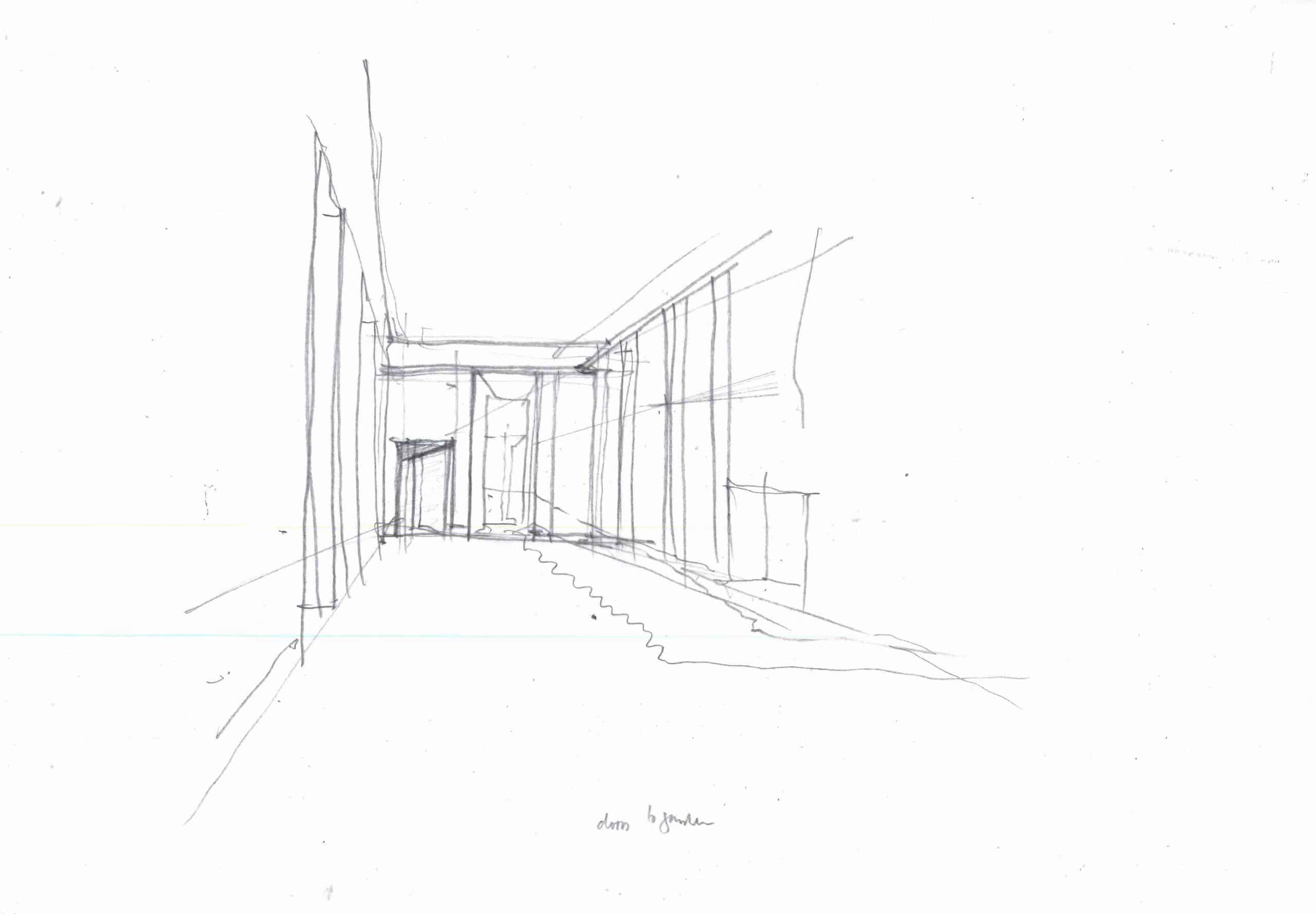
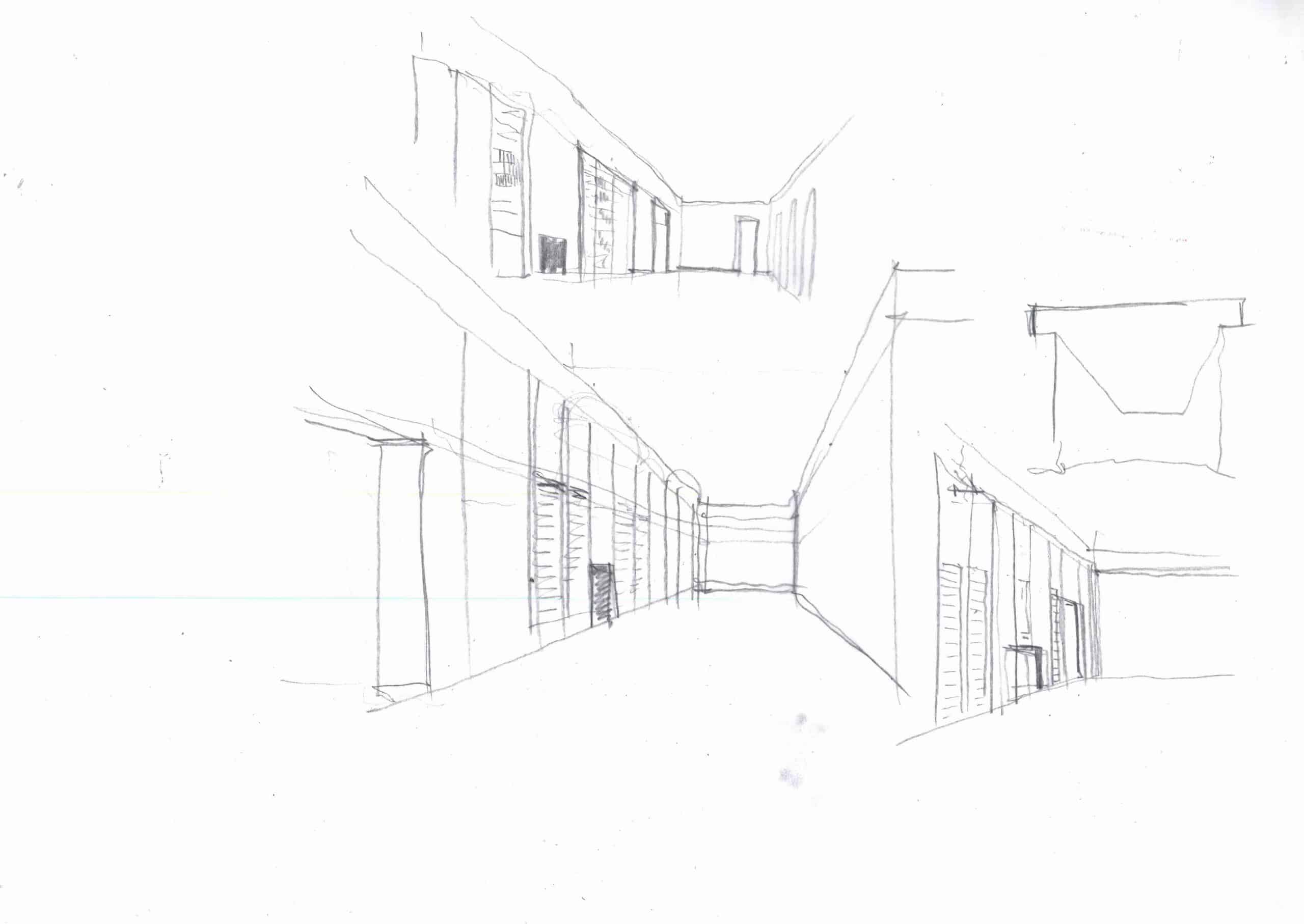
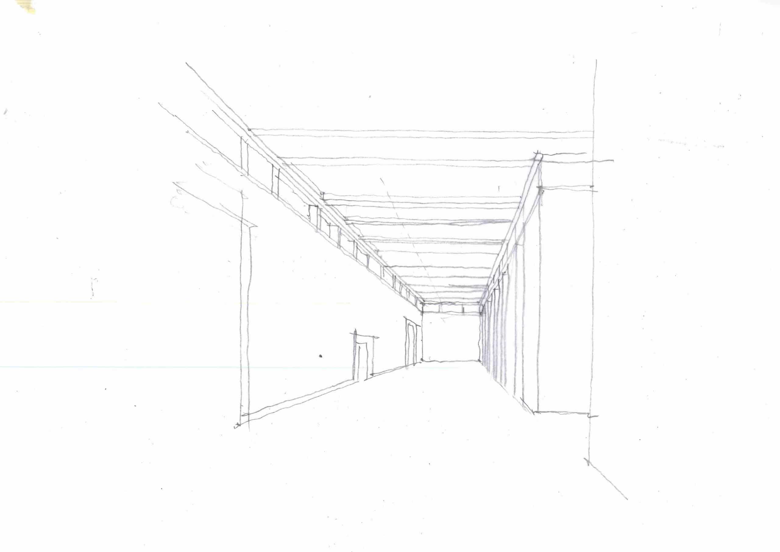
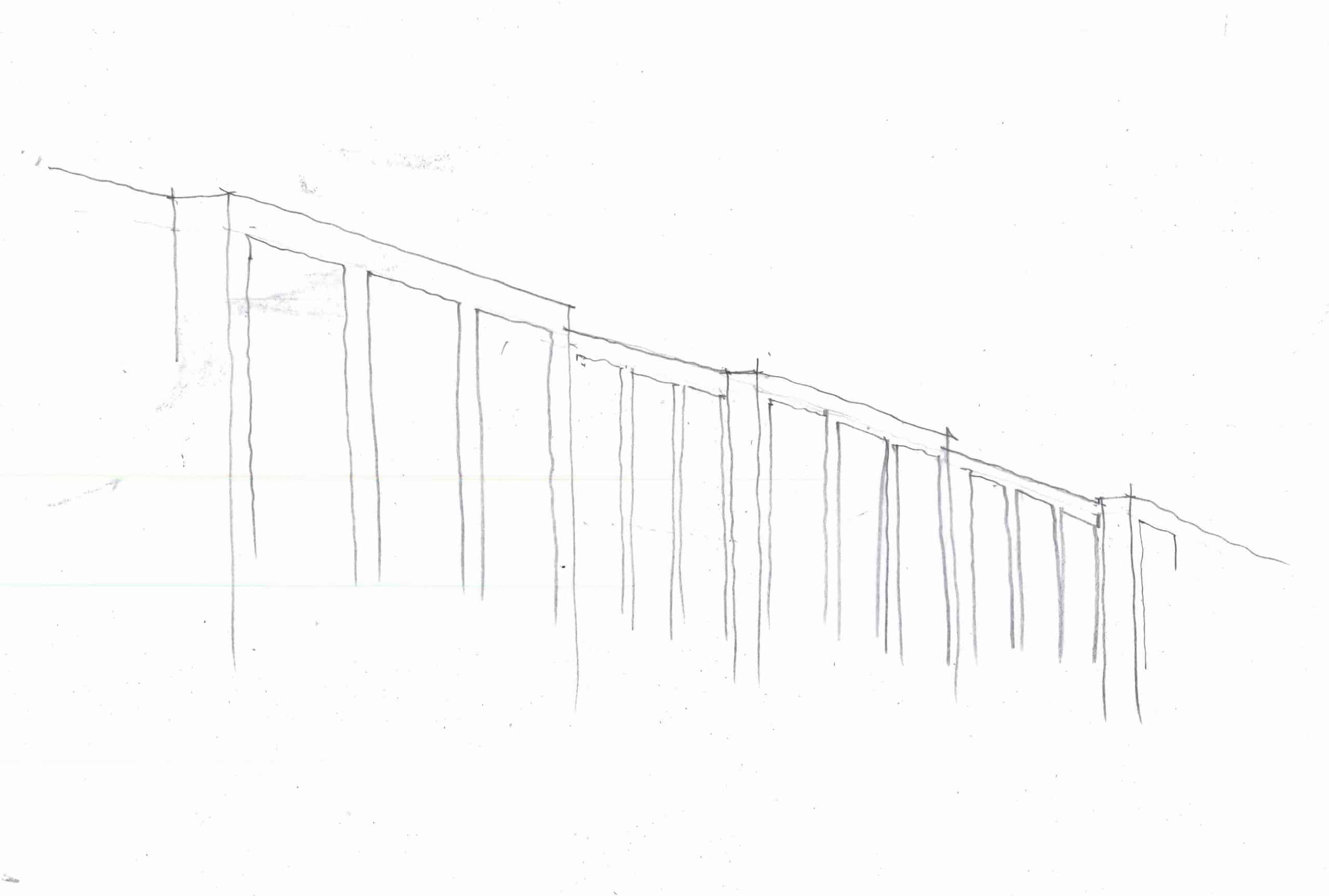
It would be perfectly reasonable to ask whether any of the speculations on offer here actually improve on Adam’s design. For our purposes this is beside the point. My drawings are not intended as didactic; they are, for me, the only possible response to a question requiring spatial investigation and to a number of unsettling sensations induced by the room itself, particularly as to its scale and the applied quality of its ornamentation. To go further than this: it is only through drawing that I am able to find the questions which Adam’s architecture raises. Drawing alternatives reveals what is troubling more clearly: the thinness of the decoration and the immense effort to imply a taller, grander room than was possible both contribute to a feeling of pressure, tightness, compression. The assertion of the new architecture over the existing shell is triumphant; yet this is an aspirational architecture which, of necessity, must in some way remain unrealised. Adam could probably have worked with the existing characteristics of the room, revealing its latent matrix instead of imposing a new order. For his own reasons — possibly a combination of necessity and architectural ambition — he chose not to. It is this sense of an imagined architecture, existing always in a realm beyond that of the given situation in which it is to be realised as building, which lends this room its air of improbability, belying both its successes and, perhaps, its shortcomings.
IV
Until recently I believed that the unsettled aspect of the Long Gallery ultimately derived from Adam’s attempts to imagine depth where none exists, the result of drawing persistently in elevation. Robin Evans reminds us that the opposite is true:
It is a painterly architecture that compares with the developed surface, intent on illusion, but it is not the illusion of depth that is sought, it is the illusion of flatness. [15]
This may seem at odds with some of the elements at Syon House which are free-standing, articulated ‘in the round’. I take it in a less literal sense, for while it is evidently a statement influenced by the examples in Adam’s work where the architecture barely emerges from the wall plane, it is not limited to these instances. Rather, it seems to me that Evans is describing a distinctive tendency visible in Syon House as a whole. A freestanding colonnade — such as that in the Ante Room — is effectively depthless.
Evans’ extraordinary insight places Adam’s work at odds with the Western European architectural tradition of fictive depth. Roman wall paintings are illusions of depth, but the illusion is explicit: the painted architecture is clearly applied to a real, flat, wall that forms the boundary of the actual space in which we are standing, and this is part of its pleasure. The low-relief ornamentation of Alberti’s Sant’Andrea in Mantua approaches the quality of a drawn surface; yet this is an articulation of a massive form of tremendous, muscular presence, thereby operating in the tension between a newly (re?)discovered world of noetic architecture (orthographic drawing) and the actual implementation of volumetric depth. In my eyes, the work at Syon House cannot be grouped with either of these cases.
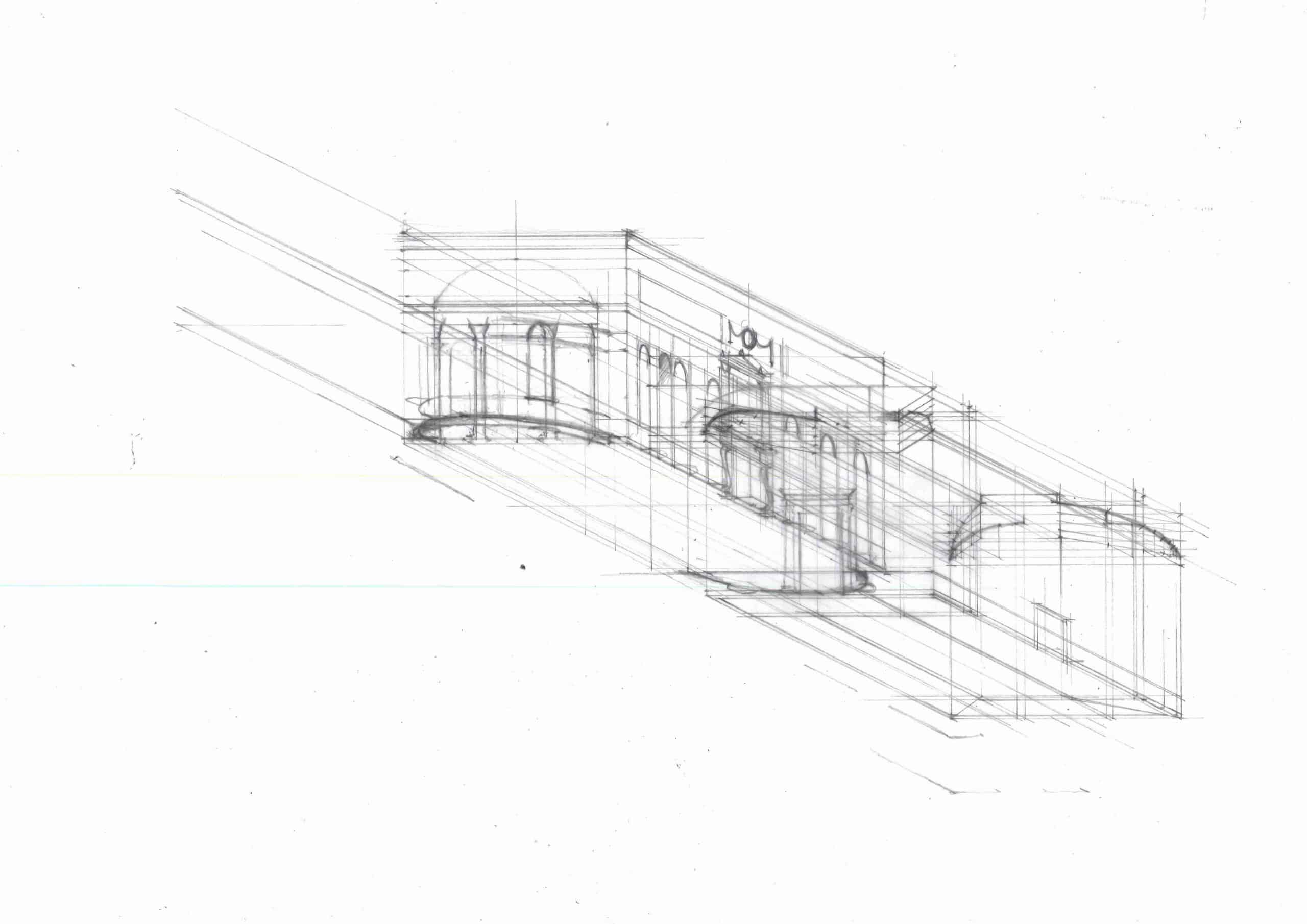
Here we are fortunate that among the drawings in the Soane Museum is an earlier scheme for the Long Gallery, also by Adam, which makes the project’s actual relations with previous architectures more apparent (fig.28). The drawing reveals a range of architectural motifs applied to the existing room. Five giant arches appear along the West wall, their form derived from Roman catacombs, for Adam’s patron had commissioned a room reminiscent of an ancient columbarium, a repository for cremation urns. [16] The scale of these arches contrasts strongly with the temple fronts which are curiously squeezed into the spaces between windows on the opposite side of the room. At times the latter directly touch the window frames, such that it is difficult to imagine how they could have been successfully realised with any degree of relief (fig.29).
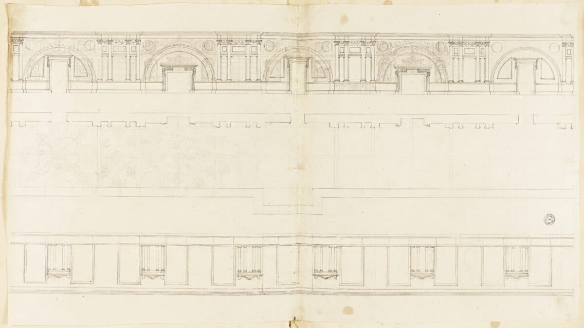
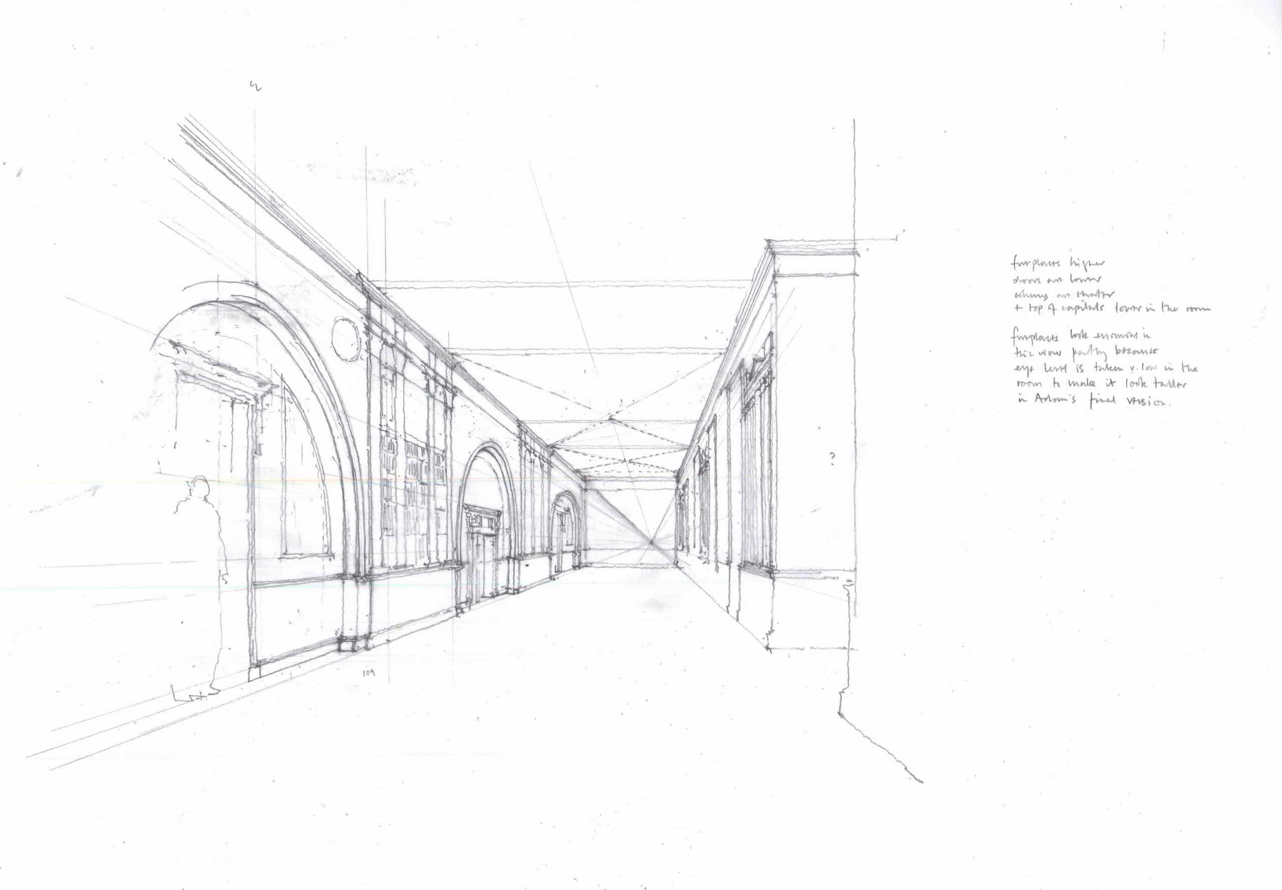
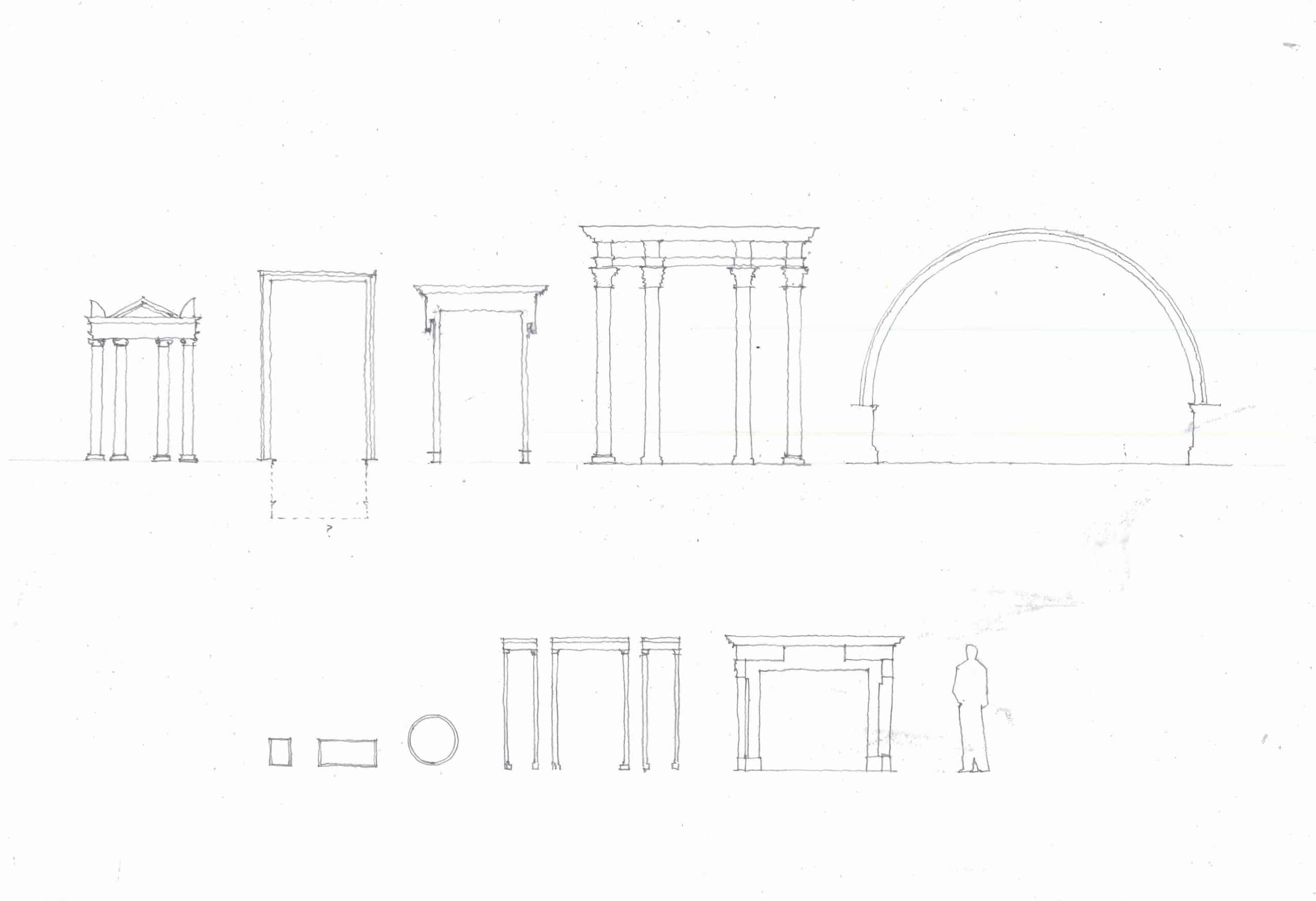
This early drawing of the Long Gallery suggests — as John Summerson describes — that Adam’s approach was to assimilate diverse architectural sources, with gradual adjustments to find a new, personal interpretation of antiquity. [17] Thus the pilasters on the West wall appear wider, with a more conventional entablature, than eventually realised. The struggle to establish an appropriate new scale for the existing Jacobean gallery is perhaps even more apparent when all the motifs in Adam’s early drawing are laid out side by side and compared to the height of an average person (fig.30). Adam was famous for his direct recording of antiquities and — unlike some British architects of previous generations — widely travelled. [18] Nonetheless, the combinatory approach to references displayed in this intriguingly awkward design suggests that the medium of communication between the interior imagined in Adam’s drawing and its sources is, ultimately, paper. Once a building has been subjected to the process of scaled orthographic transcription, its parts become open to deployment as distinct motifs, for the orthographic drawing can only capture one aspect of the building at a time. In the early Adam drawing for the Long Gallery, I think we are seeing the results of reversing this process: disembodied architectural motifs being re-scaled from drawings, to suit application to an existing interior. We might describe this as collage.
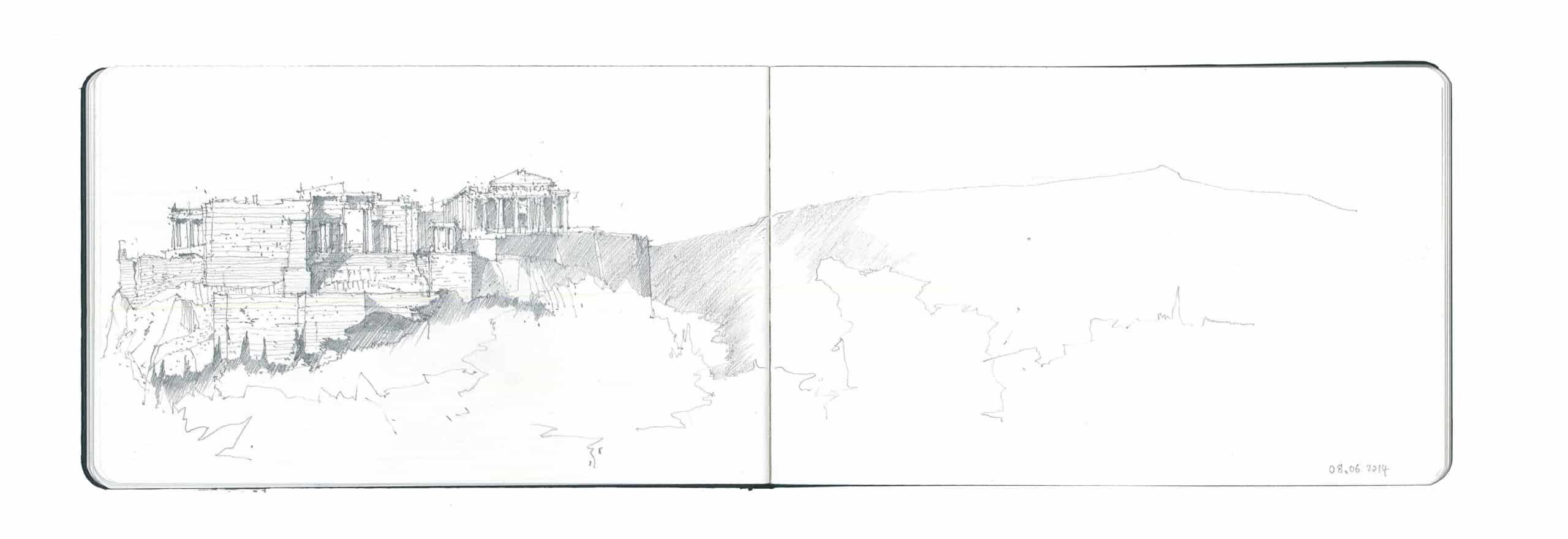
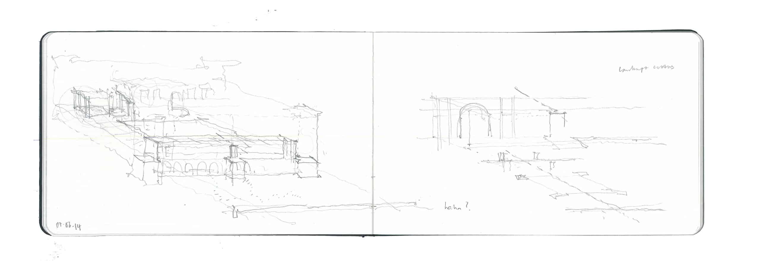
For my present purposes, what is striking in all this is not, perhaps, the eclectic combination of references — consistent at Syon House with the iconographic use of printed sources in the decorative motifs — so much as the possible insight into the parallel existences of Syon House as a building and imaginary, potential architectures, articulated through — and aspiring towards – drawing. [19] A few days after visiting Syon House I returned to Athens, the city of my childhood and early adolescence, to bury my father’s ashes. The day before the ceremony I found myself again on the remarkable route paved by Dimitris Pikionis between Philopappou and the Acropolis. Here is a topography of ‘movement’ in quite a different sense: both Pikionis’ additions and the ancient complex are impossible to describe adequately in plan or elevation. Yet my drawing, made from a position near the Pnyx, flattens the Acropolis onto the page, with little apparent recession (fig.31). The purpose of making a drawing of this kind is perhaps to react to some immeasurable quality that is inherent in the building under scrutiny — to bring out its architecture. In the drawing of the Acropolis complex, the inherent dynamism of the ensemble is placed in tension with the flatness of the representation; conversely, at Syon, the architecture’s aspiration toward flatness provokes three-dimensional interrogation (fig.32). The sketches of Syon House are, I think, consistently seeking to capture the actual degree of physical depth, or relief, being employed, to understand how far this architecture has departed from drawing.
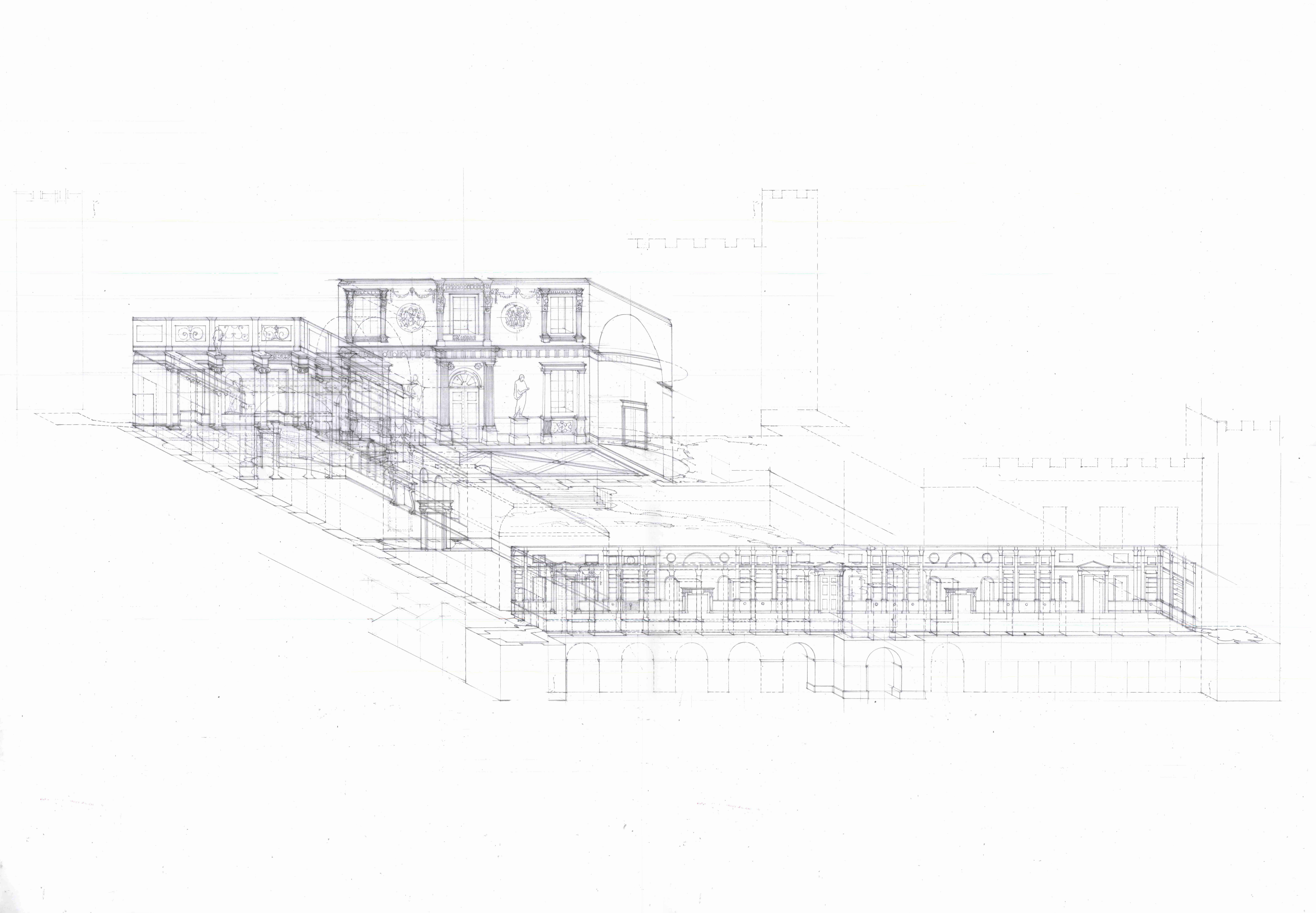
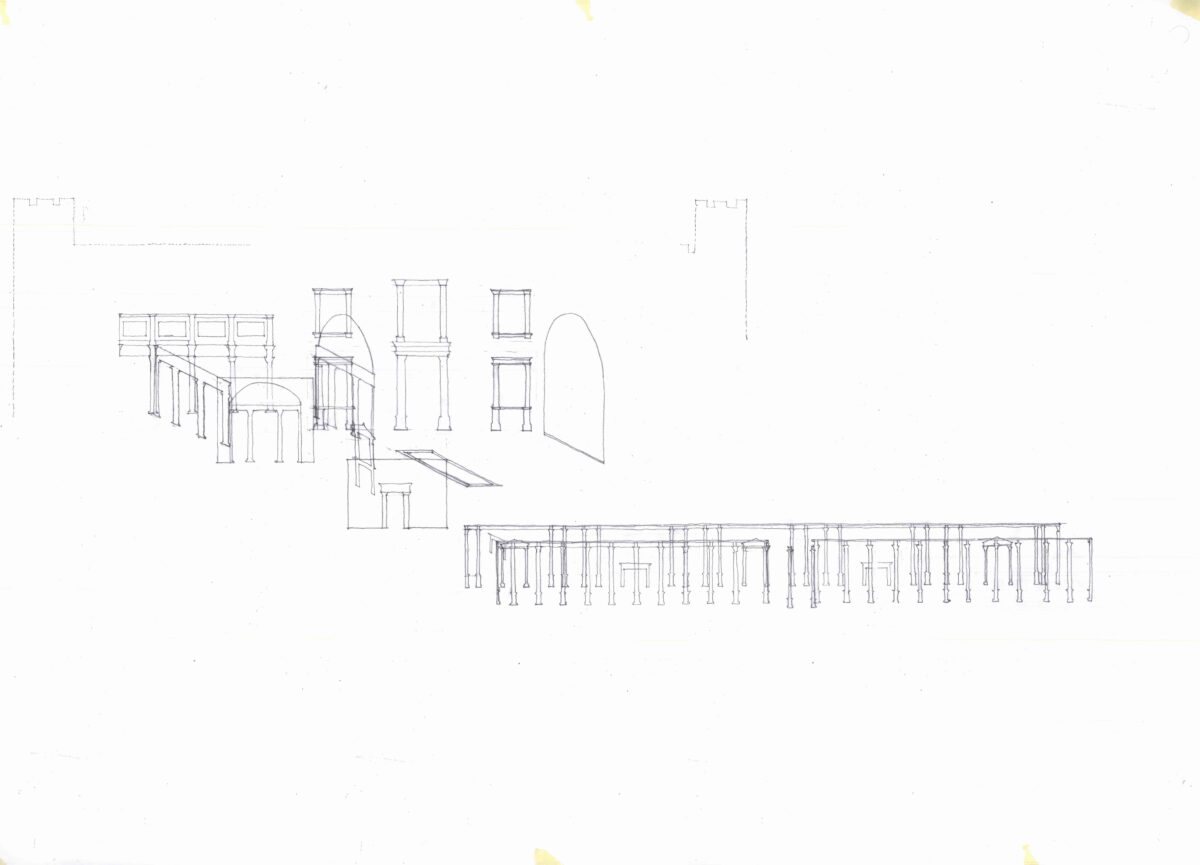
I believe that the uncanny quality of the interiors at Syon is ultimately to do with the spectre of paper architecture that haunts Adam’s renovation. What is true of the Long Gallery is true of the project as a whole: it seems to me a virtuosic assembly of disparate architectural elements with a broad and unsettling diversity of provenances and scales, whose disembodiment is facilitated by the process of architectural drawing. This is most apparent when all five of the Adam interiors at Syon House are drawn together (fig.33). Without the Jacobean shell, the boundaries between the rooms are dissolved, the paper boxes come apart. Here we see the columns in the Long Gallery together with those of the Great Hall, the disparity in magnitude heightened by the egalitarian disposition of rooms in the ‘circuit’ plan. My own, no doubt anachronistic, sense of this ensemble is one of multiple fragments in découpage, magnified or reduced as the circumstances might demand, ultimately aspiring towards paper (fig.34).
V
If the above is to be believed, the Long Gallery at Syon House is a low room trying to be a tall one, a library trying to evoke a tomb, a building trying to become a drawing. It is impossible for me to make any of these assertions definitively; nor is that my intention. What I have set out is an approximation, in words, of an inquiry undertaken through architectural drawing, or, more properly, design.
It may be inevitable for a piece of research undertaken by an architect to be simultaneously a design project. Perhaps it is equally understandable that a building should approximate a drawing, to the degree that it wishes to be considered architecture. The ability to see drawings in buildings, and buildings in drawings, may be the particular misfortune of the architect, for it is well known to most practitioners that architectural drawing frequently generates conceptions that cannot be realised to the satisfaction of their author. Yet the obverse is more to the point: architectural drawings cannot entirely encompass the lived experience of a building. They exist in parallel with this life, in anticipation of its reality but also outside it. We might call this a meta-tectonic, or perhaps para-tectonic, reality. The enigma of architectural drawing — the difficulty in defining its status as drawing — lies, I think, in this paradox. This is an assertion of architectural drawing as a valid means of inquiry into the world around us, as the outcome of an active search for order which is immanent in what we perceive. Yet it is also an assertion of all that remains beyond the scope of the drawing, which cannot be articulated explicitly, but, instead, can only be lived: the drawing’s afterlife.
Architectural drawing perhaps most closely approaches the mystery of lived experience when it becomes design, as opposed to illustration, for, in the act of focusing on the re-making of our surroundings it enters a state of uncertainty that discloses the impossibility of circumscribing one’s embodied experience. Under these circumstances, drawing becomes an activity grounded in a concrete situation, a quest for something unattainable which finds meaning in its incompleteness. Experienced in this way, architectural drawing comes to life. Architecture might be described as the continual negotiation between these aspects of embodied thinking, emerging from — and receding back into — concrete existence via the speculative realm of drawing in a continuous cycle. To borrow Robin Evans’ term, translation from drawings to the lived experience of buildings becomes unsettling if it is too direct, too apparently unproblematic. I put my faith in architecture that resists drawing as much as inviting it, architecture that accepts its impossibilities and ‘hold[s] to the now, the here’. [20]
This text by Freddie Phillipson was first published in Drawing Matter Dialogues: The Long Gallery at Syon (2016) (out of print).
Notes
- Samuel Beckett, Our Exagmination Round His Factification For Incamination of Work in Progress (Paris: Shakespeare and Company, 1929), p.14, quoted in Jennifer Bloomer, Architecture and the Text (New Haven and London: Yale University Press, 1993), p.7.
- Robin Evans: The Developed Surface: An Enquiry into the Brief Life of an Eighteenth-Century Drawing Technique in Translations from Drawing to Building and Other Essays, Architectural Association, London, 1997, p.223
- Ibid. pp.194-195.
- www.syonpark.co.uk/explore/about-syon-house/great-hall.
- Evans, p.204.
- Ibid., pp.206-207.
- Ibid., p.204.
- Ibid., p.223; the turning point, Evans notes, is Soane’s drawing of the vestibule at Pitzhanger Manor.
- Here I worked from a copy of Adam’s published plan of Syon House, kindly provided by Adriano Aymonino, to establish a base dimension for each internal elevation.
- I am grateful to Adriano Aymonino for his insight into the history of the commission.
- It is not clear what happened to the equivalent window at the other end of the room. While the doorway to the North bastion is visible, the panelling continues across the location where the window would logically be; it would appear that the window has been simply blocked.
- Adriano Aymonino, conversation in May 2014.
- A precise survey would be required to verify whether the regular scheme could have been implemented as sketched out here; however, it appears as though a small reduction in the width of the fireplaces, keeping the flues intact, may have been possible to enable pilasters on the West side to replicate the spacing of the existing windows to the East.
- ‘Movement is meant to express, the rise and fall, the advance and recess, with other diversity of form, in the different parts of the building, so as to add greatly to the picturesque of the composition’, Adam quoted in John Summerson’s Architecture in Britain, 1530-1830 (New Haven and London: Yale University Press; 1993), p. 394.
- Evans, p.210.
- Adriano Aymonino, conversation in June 2014.
- Summerson, p.395.
- Ibid., pp.381-382.
- Adriano Aymonino’s insight into the use of printed sources in the decoration of Syon House.
- James Joyce, Ulysses (London: The Bodley Head, 2007), p.153.
