Hans Poelzig: Decorating the Empty Centre
‘Artists such as Poelzig, prevented from building in real life, have been driven to create Expressionist cinema architecture […] But in the long run, pasteboard fantasy creations […] can never be satisfying fodder for the architect; he has an inner urge to conceive and erect buildings in which real people come and go, creations that will last, that belong not to the world of theatrical backdrops but to that in which real people live.’
– Siegfried Kracauer, On Skyscrapers
In 1919 the Grosses Schauspielhaus opened in Berlin. It was intended as a theatre for the masses with 3000 seats; a space to bring together a community that had been torn apart by war and technological advancement. At a moment in history when Germans were questioning how they could relate to their rapidly changing cities, new modern design and one another, this theatre was a space where a collective dream could take shape.
The design was conceived by Hans Poelzig, an architect deeply interested in factories and theatres. His essay, The Modern Factory, revealed a conviction that permanent architecture no longer fit the bill. Instead he was an early proponent of ‘loose fit’ buildings, whose interiors could rapidly respond to the changing needs of their occupants.
An interesting choice for German dramaturge Max Reinhardt, to make when commissioning an architect to bring to life his vision for a theatre. Reinhardt’s search for an architect had not been an easy one and had spanned a decade that included the first world war. Originally, he bought an old building once occupied by a circus, with the intention of tearing it down and starting again. Then came the carnage of WWI and its budget tightened; the circus building was kept as it had enough seats, and Poelzig was invited to coordinate the retrofit.
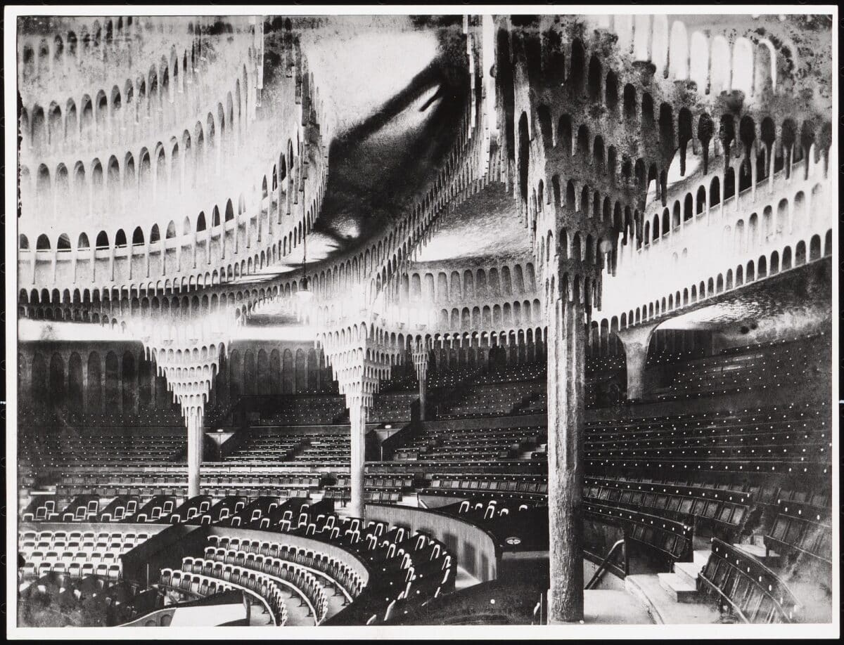
Despite these constraints, we can see through photographs of the time that Poelzig achieved a series of deeply strange, impressive spaces. One image shows the auditorium with its abundant seating, whose roof has been clad with what can best be described as stalactites (the building became known as the stalactite cave), hung in concentric rings radiating outwards from the oculus of the central dome. At the end of each point was a light, all in different colours, that created a constellation once darkness descended. Even the house lights were installed using an elaborate system of mirrors to create a diffuse glow.
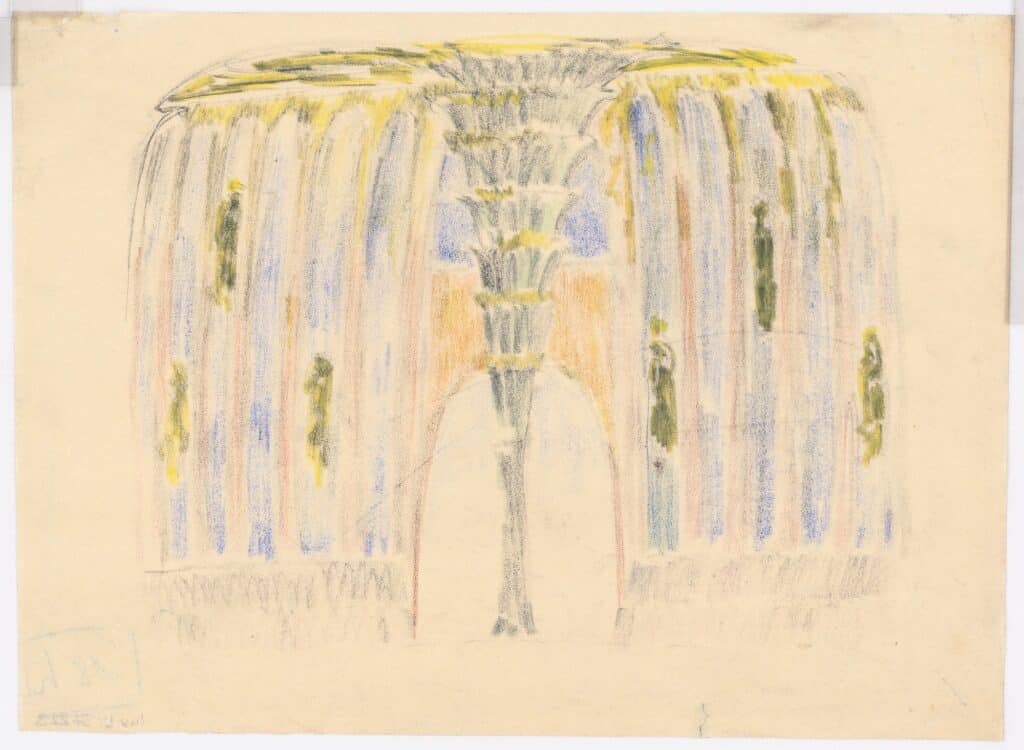
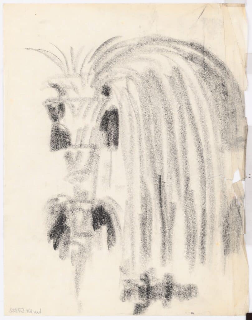
In the circulatory spaces we see columns transformed into fountains with abundant fluted plasterwork. Again, lighting is disguised and diffused; colour is abundant. What the black and white photographs of the time belie is the vibrant greens, yellows and pinks that greeted theatregoers as they came off the street. The facade was where Poelzig had the least effect. Here, instead of elaborate cladding, he installed a kind of frieze of arches and painted the whole thing red.
These effects were all in service of a Gesamtkunstwerk, a ‘total work of art’; a communal interior that could envelop building and body in a space for collective imagination. Importantly these interiors were to be understood in psychological as well as physical terms. Poelzig was creating a building which sought to be a symbol, around which would rally a community insulated from the alienating effects of modern technological progress and production.
Decoration had a specific place in the creation of these spaces and symbols, but it was specifically circumscribed. In Poelzig’s words:
‘Every real tectonic constructional form has an absolute nucleus, to which the decorative embellishment[…] lends a varying charm. First however, the absolute element has to be found.’
Here he makes it abundantly clear, the tectonic nucleus must subsume the decoration, if decoration is to be countenanced.
Given Poelzig’s stance, contemporary criticisms of the theatre were damning. One of the most significant cultural critics of the time, Siegfried Kracauer, said Poelzig had succeeded only in creating a ‘pasteboard fantasy creation’ or in other words a building of purely ‘decorative embellishment’. For him, the building came apart at the seams. The lighting stagnated where it was meant to flow. The junctions between newly installed plasterboard and existing wall were awkward and ungainly. The transitions between spaces and materials were jarring. For Kracauer, this went beyond a merely aesthetic affront, instead what the Grosses Schauspielhaus had accomplished was a dangerous distraction from reality. It was advertising.
Critics in 1919 echoed Kracauer’s sentiments, so do contemporary historians for the most part, dismissing the Grosses Schauspielhaus as a massive folly. A product of expressionist caprice that was quickly subsumed by the more successful expressions of modernism, like those produced by the Bauhaus.
The question is then surely, why, if Poelzig was convinced that decoration could only proceed from an ‘absolute nucleus’ did he produce a project so apparently overwhelmed by it? Of course, every designer or artist knows the gaping chasm that can emerge between idea and drawing. Every architect is intimate with the gaps, some small, some large, between drawing and building. The hand has a will of its own, and so do builders.
Perhaps, then the appropriate place to look for the centre of the theatre’s tectonics is in his drawings. Poelzig’s drawings for all his projects, built and unbuilt are mesmerising. He produces a confident line in thick graphite, sometimes in monochrome, sometimes in splashes of colour. He alternates between drawing in detail, the fountain columns for instance, and drawing hulking massive forms.
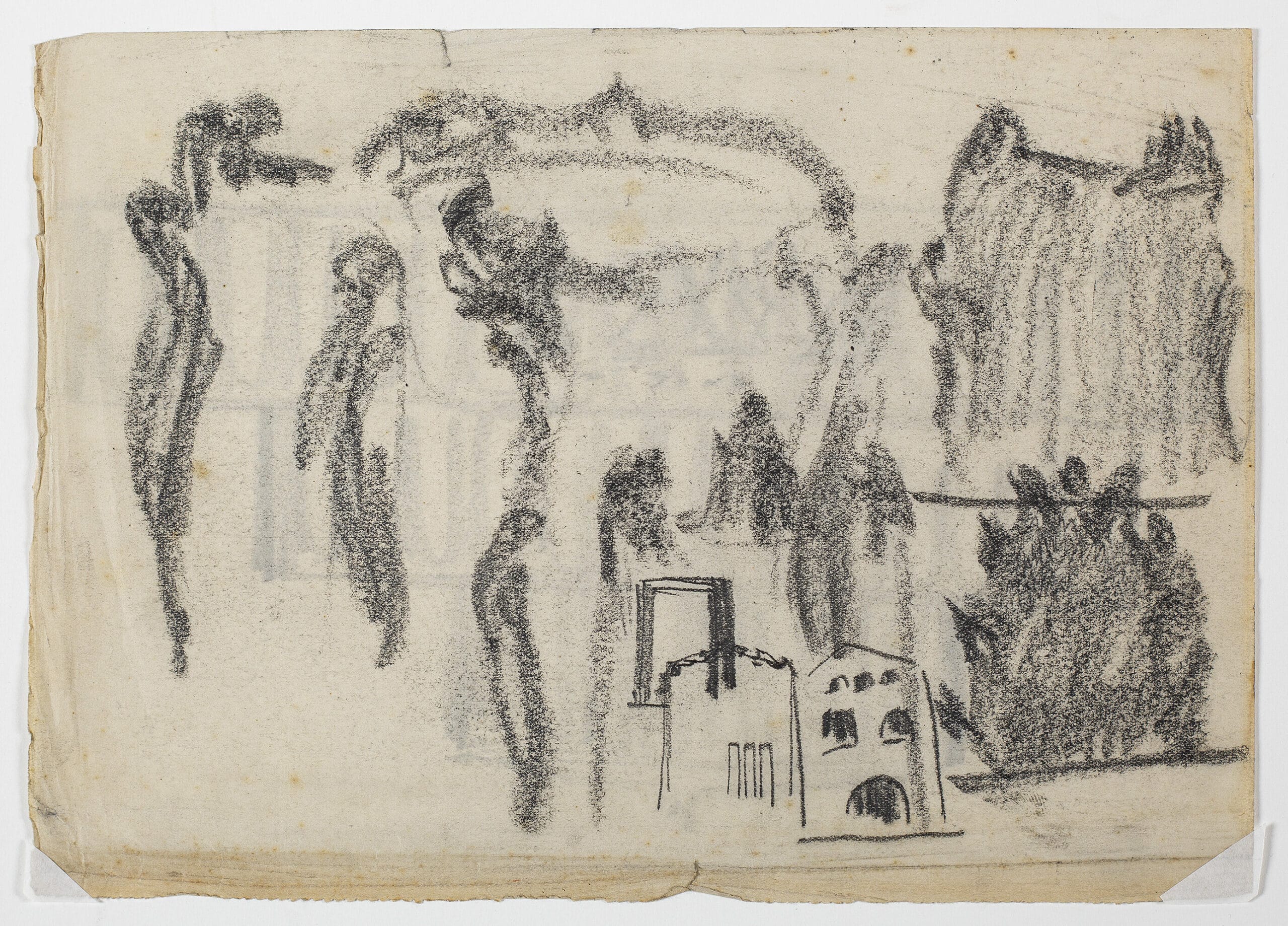
The drawings for the Grosses Schauspielhaus run the gamut from quick expressive sketches to carefully rendered perspectives. One set of sketches in particular (DMC 2190.4) shows us the architect wrestling with the facade, repeating the arch over and over, experimenting with introducing windows in various patterns. The final sketch goes inside, with curling flames describing what? A stage? A ceiling? A column? These organic forms are so clearly at odds with the small elevation he hashes out at the bottom of the page. Polezig’s struggle is clearest in this moment where we can see the marked distinction between the existing building and the organicist tectonic he sought to introduce.
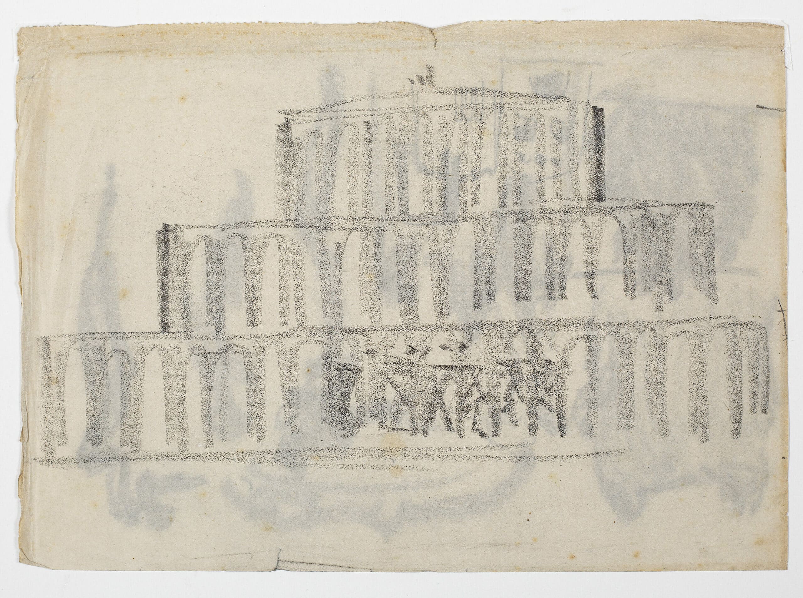
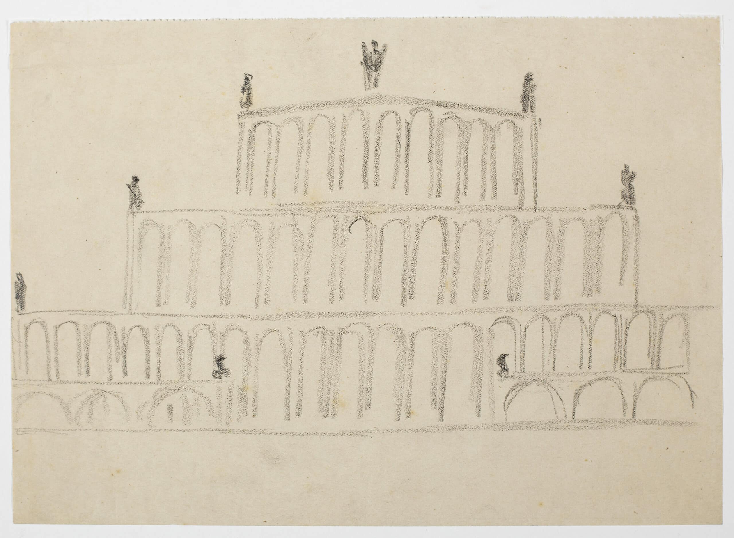
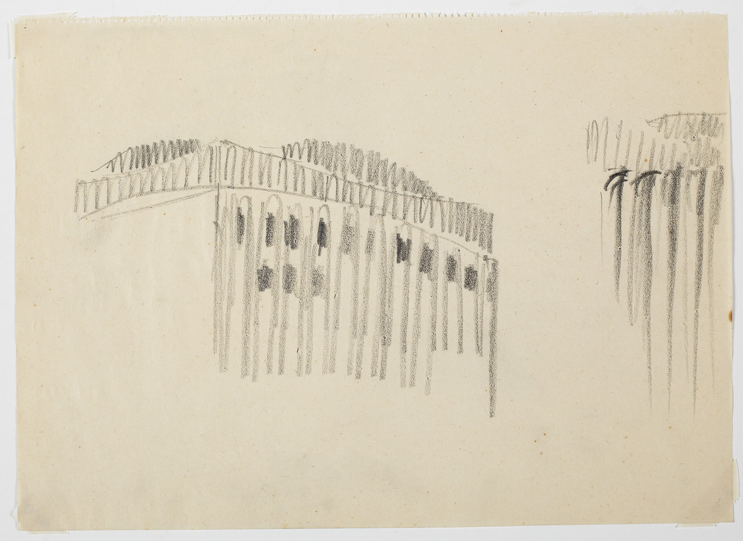
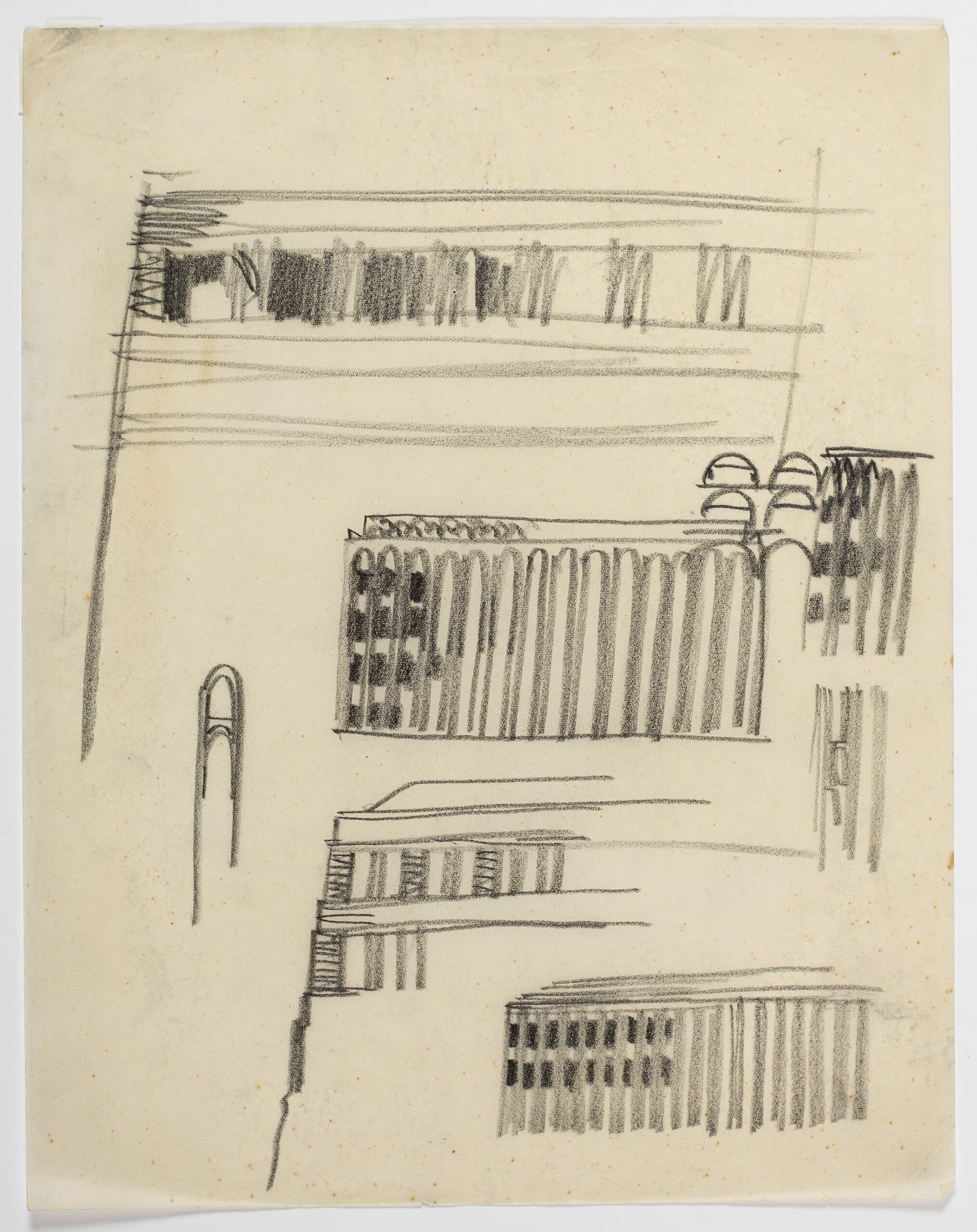
Perhaps it was due to budgetary constraints that Poelzig failed to satisfyingly reconcile this struggle; failed to protect the nucleus from being overcome by decoration. Perhaps, it was shoddy building. What feels dishonest though is to say that the building had no nucleus at all. To reduce it, as Kracauer did, to advertising.
Especially now, with the building demolished, the drawings hold their own against photographs and plans and sections. The drawings are beguiling, articulate and descriptive. They are decorative, yes, but also consistent and essential. They have a nucleus. They last as rich imaginative tools in a world in which real people live.
Hana Nihill is currently the Architecture Programme Coordinator at the Royal Academy of Arts.
This text was submitted in the long form category (1000–1500 words) of the Drawing Matter Writing Prize 2020.
