The layers found in Bovenbouw Architectuur’s collages are analogous to the layering in their architecture – there to be unravelled by those willing to search. Sometimes ruinous, never complete, they are a representation of uncanny worlds where chimneystacks become doors, tyres become classical pediments and windows are adorned with eyelashes. They occupy a space between the ordinary and surprising, sitting in parallel to the studio’s built work, which oscillates between tectonic restraint and playful gestures.
It is perhaps this latter sense of playfulness that lends itself to the choice of paper as a medium to explore and express space. Paper offers a degree of ambiguity and fragility that leaves space for one’s imagination to take hold. Paper also acts to reduce and is a way to test form and apply colour, to remove materiality, to simplify, to focus upon the essence of the space itself. Manipulated in the hands of Bovenbouw, it recalls a child-like delight in the act of making architecture, a delight that can be elusive today.
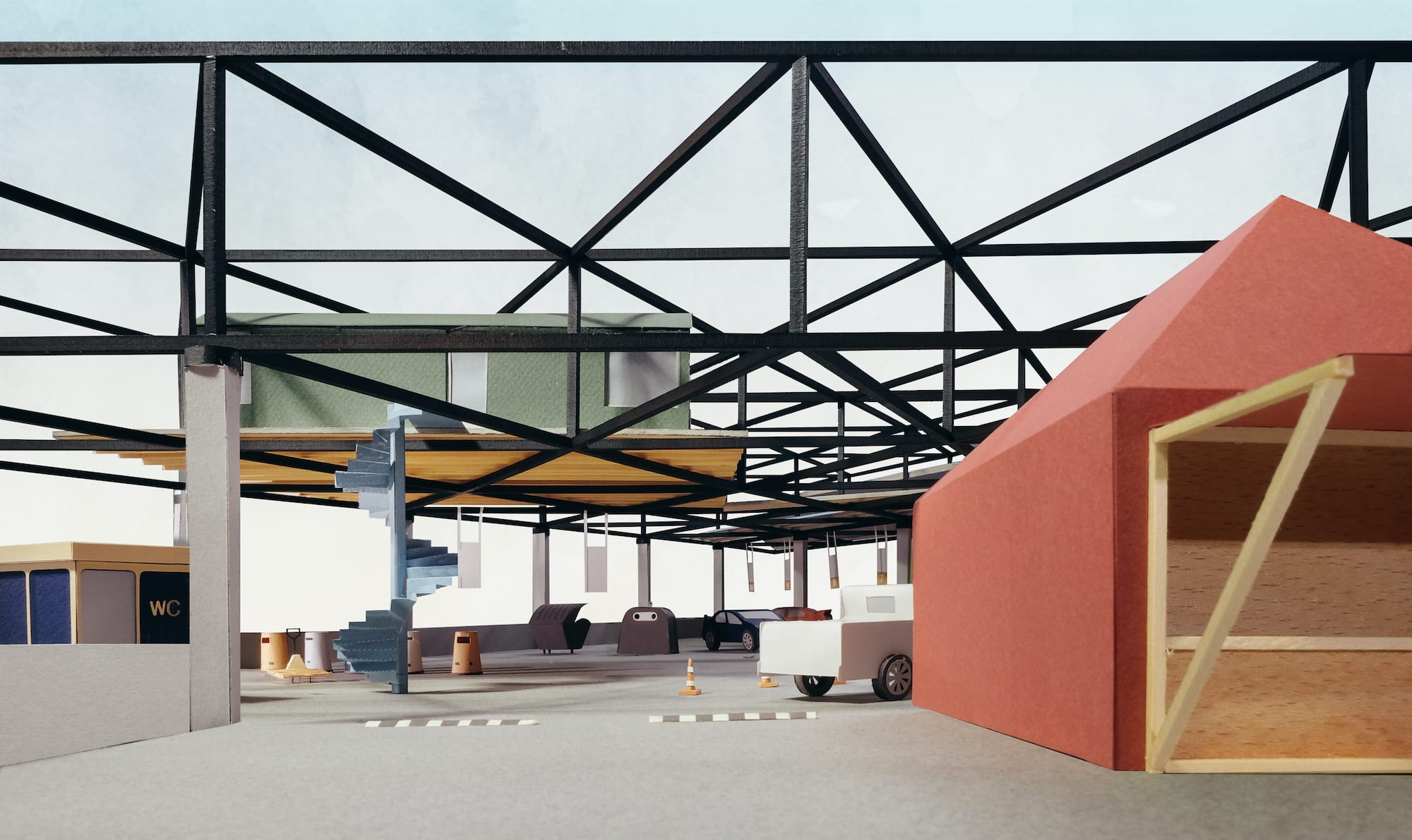
The studio has pushed the medium of paper further than most, embracing a fluid relationship between collages and models, with photographs of delicately constructed paper models becoming collages in their own right – snapshots into other worlds. They are both propositional and at once their own being, offering us an insight into Bovenbouw’s collective imagination. This blurring of collage and model is most explicit in the vivid photos of the Anderlecht container park model, where grey paper columns with tyres for capitals, support a black space frame – a radical inversion of the conventional horizontality of waste recycling plants into a more vertical and suspended programme. This competition proposal is a striking example of Bovenbouw’s ability to find exoticness in even the most banal briefs and the model reflects this as a vibrant paper simulation of the real world. It reminds me, somewhat abstractly, of stop-motion TV series from my childhood. There is a sense of innocence to this colourful world, complete with paper cars, paper traffic cones and paper glass recycling banks.
At the recent ‘House of the Explorer’ exhibition at deSingel in Antwerp, Bovenbouw’s first solo retrospective, a model of an auditorium projected a film that flicked through scenes within other models – worlds within worlds toying with the idea of reality in an almost Borgesian jest. The model was cut into the wall, emphasising its role as a portal. On the surrounding walls a number of paper collages hung. No photos of the physical work were present. There was again a reduction, to paper constructs and drawings.
The collages captured a number of Bovenbouw’s projects, both built and on site, and helped to unite the studio’s remarkably disparate oeuvre. The earliest is of a police station in Schoten, a project born of a fascination with the banal module of the concrete block. A police station called for a robust materiality and blockwork achieved this in an economically viable way, yet the blockwork ultimately transcends its banality through design, reminding me of Aldo van Eyck’s ability to manipulate blockwork at the Sonsbeek Pavilion. Interestingly, the cutaway axonometric portrays the project incomplete with blockwork pealed back in places to reveal key rooms, as if under construction or as a ruin. I sense a nod to Joseph Michael Gandy and his ruinous depiction of John Soane’s Bank of England. ‘The interior will be revealed to you like a meat pie with the crust removed’ accompanied Gandy’s watercolour at the Royal Academy in 1830, extracted by Soane from Le Diable Boiteux – a culinary simile that I think Bovenbouw’s founder Dirk Somers would enjoy, resonating with the humour at play in the studio.
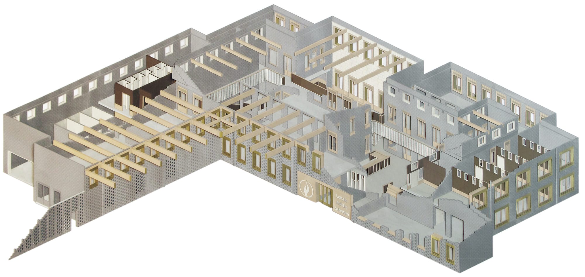
Bovenbouw translates literally into English as Superstructure. The evoked associations to radical 60s paper architecture are hard to ignore, however they are translational misrepresentations. The Dutch definition is far more modest, referring to the part of a building above ground and is essentially a phase of construction, a sentiment this collage points towards: a shell has taken form, primary beams float suspended in space, but it is not complete. The cutaway expresses the humble double blockwork skin and glulam structure, but does not attempt to impress in the way Soane’s thick monumental walls stood in rejection of the brick and plaster construction typical to Regency London. This sense of humility can be found throughout Bovenbouw’s work and seems to arise from the studio’s interest in the ‘everyday’, aligning with Dirk’s central philosophy to be ‘free from the compulsive desire to be avant-garde’.
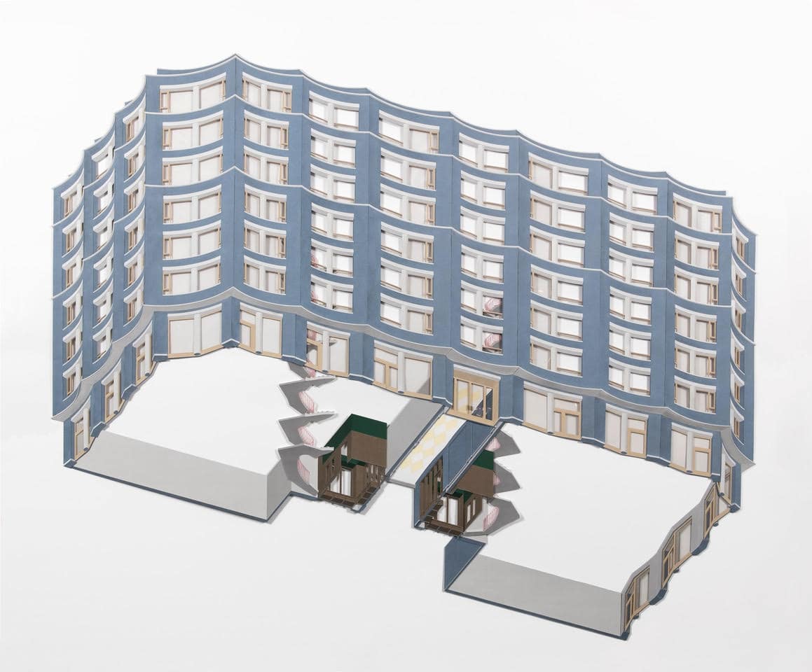
A later collage depicts the billowing blue façade of the Cadixstraat housing block, with its subtle evocation of ripples formed in a blue brick, quietly suggestive of the adjacent sea. The viewpoint is from below, a worm’s eye projection, perhaps looking up from watery depths. It is hard not to think of James Stirling and his investigations into the fifth elevation. Only the communal staircase and lobbies are portrayed internally, defining the ground plane of an otherwise floating volume. It is a drawing fundamentally about a façade. In this regard it could be read as a drawing about the city, of what this bookend to the larger courtyard building gives back to Antwerp’s docklands. The paper bays also have a relief that create shadows and depth behind the façade, to lift the scalloped panels off the page. This depth is not literal; it is purely an illustrative device.
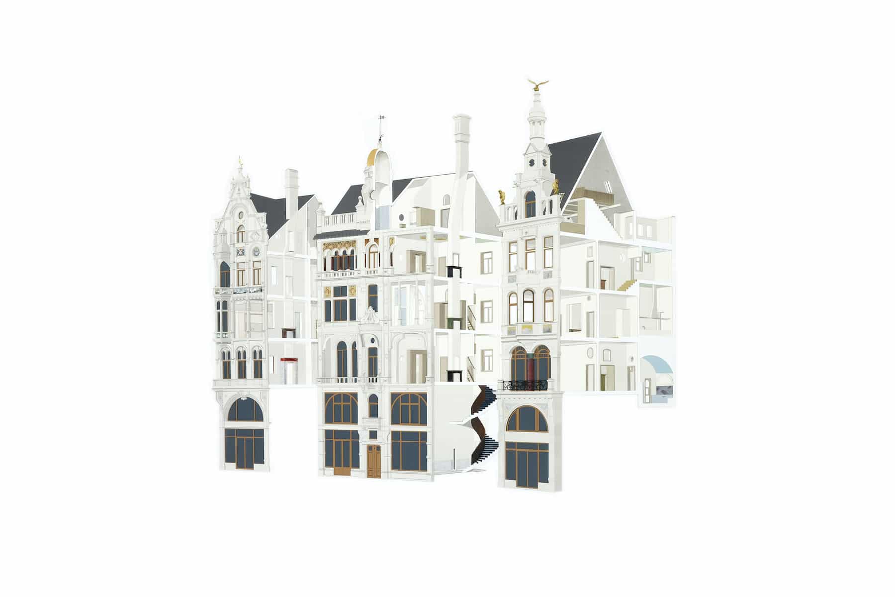
A third collage attempts to illuminate the complex maze of the Leysstraat refurbishment in central Antwerp, where Bovenbouw united three imposing and eclectic 19th Century apartment buildings to form a single whole. Described by Dirk Somers as an exercise in ‘empathy’ and ‘improvisation’. An intuitive and emotive approach to building that is very difficult to portray in photos or drawings. The collage alludes to the playful world carved out from within. There is a parallel, albeit at a different scale, to John Soane’s house and the joining together of three existing terraces to make one complex organism. The collage is composed almost as a triptych with three sectional cuts dissecting the project to afford curated glimpses in, yet we sense there is more. The existing building lines provided natural breaks, allowing the ornate Dutch gables and asymmetric spires to remain intact, whilst putting the internal emphasis on the chimneystacks. Vertical obsolete towers that are punctured by doorways and a window. Apertures of all shapes and sizes pierce the fabric throughout to frame living rooms and kitchens beyond. One opening in particular cuts through the chimneystack above a marble fireplace to appear like a mirror set upon the mantelpiece, a playful spatial device with a plethora of potential literary references.
Returning to the collages as a series, it is worth considering that they are consciously not painterly or atmospheric. There are no applied shadows and they are not animated with figures or life. Perhaps they are a rejection of digital (or even post-digital) representations of architecture? Whilst various viewpoints are employed, each collage shows the project in its totality. They will never be experienced this way but that is not the point. Each building demanded a unique representation leading to very deliberate cutaways, precise like surgical incisions, to reveal what is of significance in each case. In fact, to suggest that the austere blockwork of Schoten shares an author with the billowing blue façades of Cadixstraat or with the playful interiors of Leysstraat or with the space frame of the Anderlecht container park requires a certain stretch of the imagination. Yet, this is the brilliance of Bovenbouw’s architecture and the drawings reflect this as idiosyncratic narrations, imaginative and playful, that are ultimately meaningful objects in their own right.
Ciaran Scannell is an architect based in London and Antwerp.
Bovenbouw Architectuur: One Paper Model and Three Paper Collages
– Ciaran Scannell
The layers found in Bovenbouw Architectuur’s collages are analogous to the layering in their architecture – there to be unravelled by those willing to search. Sometimes ruinous, never complete, they are a representation of uncanny worlds where chimneystacks become doors, tyres become classical pediments and windows are adorned with eyelashes. They occupy a space between the ordinary and surprising, sitting in parallel to the studio’s built work, which oscillates between tectonic restraint and playful gestures.
It is perhaps this latter sense of playfulness that lends itself to the choice of paper as a medium to explore and express space. Paper offers a degree of ambiguity and fragility that leaves space for one’s imagination to take hold. Paper also acts to reduce and is a way to test form and apply colour, to remove materiality, to simplify, to focus upon the essence of the space itself. Manipulated in the hands of Bovenbouw, it recalls a child-like delight in the act of making architecture, a delight that can be elusive today.
The studio has pushed the medium of paper further than most, embracing a fluid relationship between collages and models, with photographs of delicately constructed paper models becoming collages in their own right – snapshots into other worlds. They are both propositional and at once their own being, offering us an insight into Bovenbouw’s collective imagination. This blurring of collage and model is most explicit in the vivid photos of the Anderlecht container park model, where grey paper columns with tyres for capitals, support a black space frame – a radical inversion of the conventional horizontality of waste recycling plants into a more vertical and suspended programme. This competition proposal is a striking example of Bovenbouw’s ability to find exoticness in even the most banal briefs and the model reflects this as a vibrant paper simulation of the real world. It reminds me, somewhat abstractly, of stop-motion TV series from my childhood. There is a sense of innocence to this colourful world, complete with paper cars, paper traffic cones and paper glass recycling banks.
At the recent ‘House of the Explorer’ exhibition at deSingel in Antwerp, Bovenbouw’s first solo retrospective, a model of an auditorium projected a film that flicked through scenes within other models – worlds within worlds toying with the idea of reality in an almost Borgesian jest. The model was cut into the wall, emphasising its role as a portal. On the surrounding walls a number of paper collages hung. No photos of the physical work were present. There was again a reduction, to paper constructs and drawings.
The collages captured a number of Bovenbouw’s projects, both built and on site, and helped to unite the studio’s remarkably disparate oeuvre. The earliest is of a police station in Schoten, a project born of a fascination with the banal module of the concrete block. A police station called for a robust materiality and blockwork achieved this in an economically viable way, yet the blockwork ultimately transcends its banality through design, reminding me of Aldo van Eyck’s ability to manipulate blockwork at the Sonsbeek Pavilion. Interestingly, the cutaway axonometric portrays the project incomplete with blockwork pealed back in places to reveal key rooms, as if under construction or as a ruin. I sense a nod to Joseph Michael Gandy and his ruinous depiction of John Soane’s Bank of England. ‘The interior will be revealed to you like a meat pie with the crust removed’ accompanied Gandy’s watercolour at the Royal Academy in 1830, extracted by Soane from Le Diable Boiteux – a culinary simile that I think Bovenbouw’s founder Dirk Somers would enjoy, resonating with the humour at play in the studio.
Bovenbouw translates literally into English as Superstructure. The evoked associations to radical 60s paper architecture are hard to ignore, however they are translational misrepresentations. The Dutch definition is far more modest, referring to the part of a building above ground and is essentially a phase of construction, a sentiment this collage points towards: a shell has taken form, primary beams float suspended in space, but it is not complete. The cutaway expresses the humble double blockwork skin and glulam structure, but does not attempt to impress in the way Soane’s thick monumental walls stood in rejection of the brick and plaster construction typical to Regency London. This sense of humility can be found throughout Bovenbouw’s work and seems to arise from the studio’s interest in the ‘everyday’, aligning with Dirk’s central philosophy to be ‘free from the compulsive desire to be avant-garde’.
A later collage depicts the billowing blue façade of the Cadixstraat housing block, with its subtle evocation of ripples formed in a blue brick, quietly suggestive of the adjacent sea. The viewpoint is from below, a worm’s eye projection, perhaps looking up from watery depths. It is hard not to think of James Stirling and his investigations into the fifth elevation. Only the communal staircase and lobbies are portrayed internally, defining the ground plane of an otherwise floating volume. It is a drawing fundamentally about a façade. In this regard it could be read as a drawing about the city, of what this bookend to the larger courtyard building gives back to Antwerp’s docklands. The paper bays also have a relief that create shadows and depth behind the façade, to lift the scalloped panels off the page. This depth is not literal; it is purely an illustrative device.
A third collage attempts to illuminate the complex maze of the Leysstraat refurbishment in central Antwerp, where Bovenbouw united three imposing and eclectic 19th Century apartment buildings to form a single whole. Described by Dirk Somers as an exercise in ‘empathy’ and ‘improvisation’. An intuitive and emotive approach to building that is very difficult to portray in photos or drawings. The collage alludes to the playful world carved out from within. There is a parallel, albeit at a different scale, to John Soane’s house and the joining together of three existing terraces to make one complex organism. The collage is composed almost as a triptych with three sectional cuts dissecting the project to afford curated glimpses in, yet we sense there is more. The existing building lines provided natural breaks, allowing the ornate Dutch gables and asymmetric spires to remain intact, whilst putting the internal emphasis on the chimneystacks. Vertical obsolete towers that are punctured by doorways and a window. Apertures of all shapes and sizes pierce the fabric throughout to frame living rooms and kitchens beyond. One opening in particular cuts through the chimneystack above a marble fireplace to appear like a mirror set upon the mantelpiece, a playful spatial device with a plethora of potential literary references.
Returning to the collages as a series, it is worth considering that they are consciously not painterly or atmospheric. There are no applied shadows and they are not animated with figures or life. Perhaps they are a rejection of digital (or even post-digital) representations of architecture? Whilst various viewpoints are employed, each collage shows the project in its totality. They will never be experienced this way but that is not the point. Each building demanded a unique representation leading to very deliberate cutaways, precise like surgical incisions, to reveal what is of significance in each case. In fact, to suggest that the austere blockwork of Schoten shares an author with the billowing blue façades of Cadixstraat or with the playful interiors of Leysstraat or with the space frame of the Anderlecht container park requires a certain stretch of the imagination. Yet, this is the brilliance of Bovenbouw’s architecture and the drawings reflect this as idiosyncratic narrations, imaginative and playful, that are ultimately meaningful objects in their own right.
Ciaran Scannell is an architect based in London and Antwerp.
This text was submitted in the long form category (1000–1500 words) of the Drawing Matter Writing Prize 2020.
Related...
Liquid Paper
– Mark Dorrian
fala atelier: Seriously Playful
– Jack Huang
Alternative Histories: Bovenbouw Architectuur on James Gowan
Category
design methodologies drawing techniques & materials office cultures commentaries, rants & reflections
Period
c21st
Architect
Bovenbouw
Medium
collage drawing model
Tags
projection (axonometric isometric) exhibition public space