Pan Scroll Zoom 15: Other Architects
– Fabrizio Gallanti, Grace Mortlock and David Neustein
This is the fifthteenth in a series of texts edited by Fabrizio Gallanti on the challenges in the new world of online architectural teaching and, particularly, on the changing role of drawings in presentations and reviews. In this episode Fabrizio talks to Grace Mortlock and David Neustein of the Sydney-based practice Other Architects about teaching at the University of Technology, Sydney, during the pandemic.
Fabrizio Gallanti: You previously told me that you found yourselves in a bit of a predicament when, due to Covid distancing, you were required to adapt your teaching to a completely new format based entirely online. Can you tell me a bit about this experience?
Grace Mortlock: When we teach, or when we have previously taught, we have always been conscious of the need to create a good studio environment. We take interstate trips with our students and try to foster engagement with the project and each other. During our initial week of teaching online, we couldn’t see how that would be possible. There was an urgent need to understand the available technology and to figure out how we could actually make it work for us, in order to reframe the terms of engagement.
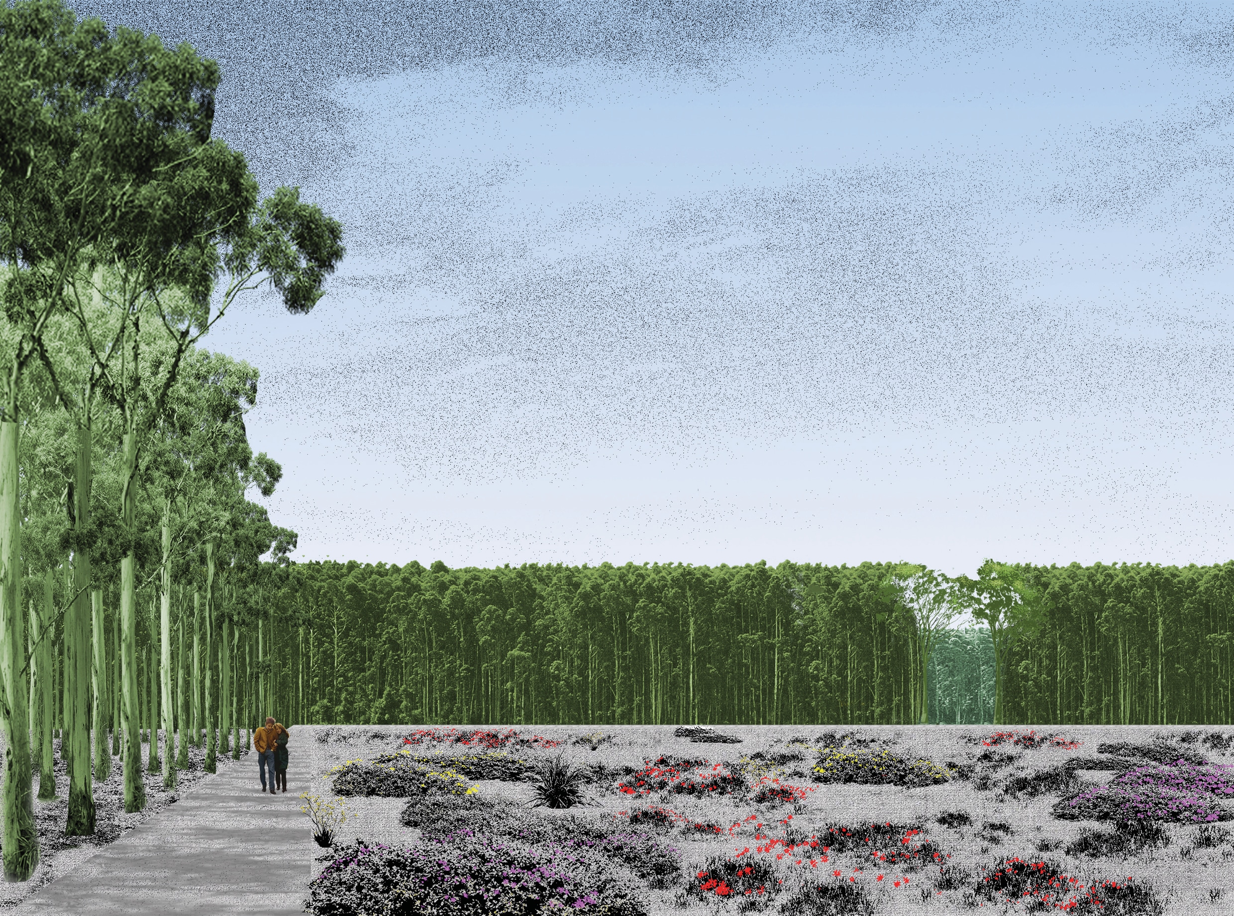
David Neustein: We made a big gamble because we had no time. Ordinarily, we like to think for a long time about the studio subject matter, and we like it to be very connected with what we’re interested in. In this instance there was a particular site, a particular project and a particular set of relationships already in place, and we were already quite committed. We were intending to study the transformation of a former copper slag emplacement into a natural burial ground. The site had a 16 metre-deep pit and adjoined a natural wetland. Soon after reports of the first Australian Covid cases, the architecture faculty put a freeze on student site visits and excursions. So, that project was completely thrown out the window. In its place, we were given a week to come up with something that was plausible and productive, while navigating all of the still-developing constraints around isolation. It could easily have been a complete failure. We had to ask for a great deal of trust from a group of students who we essentially had never met.
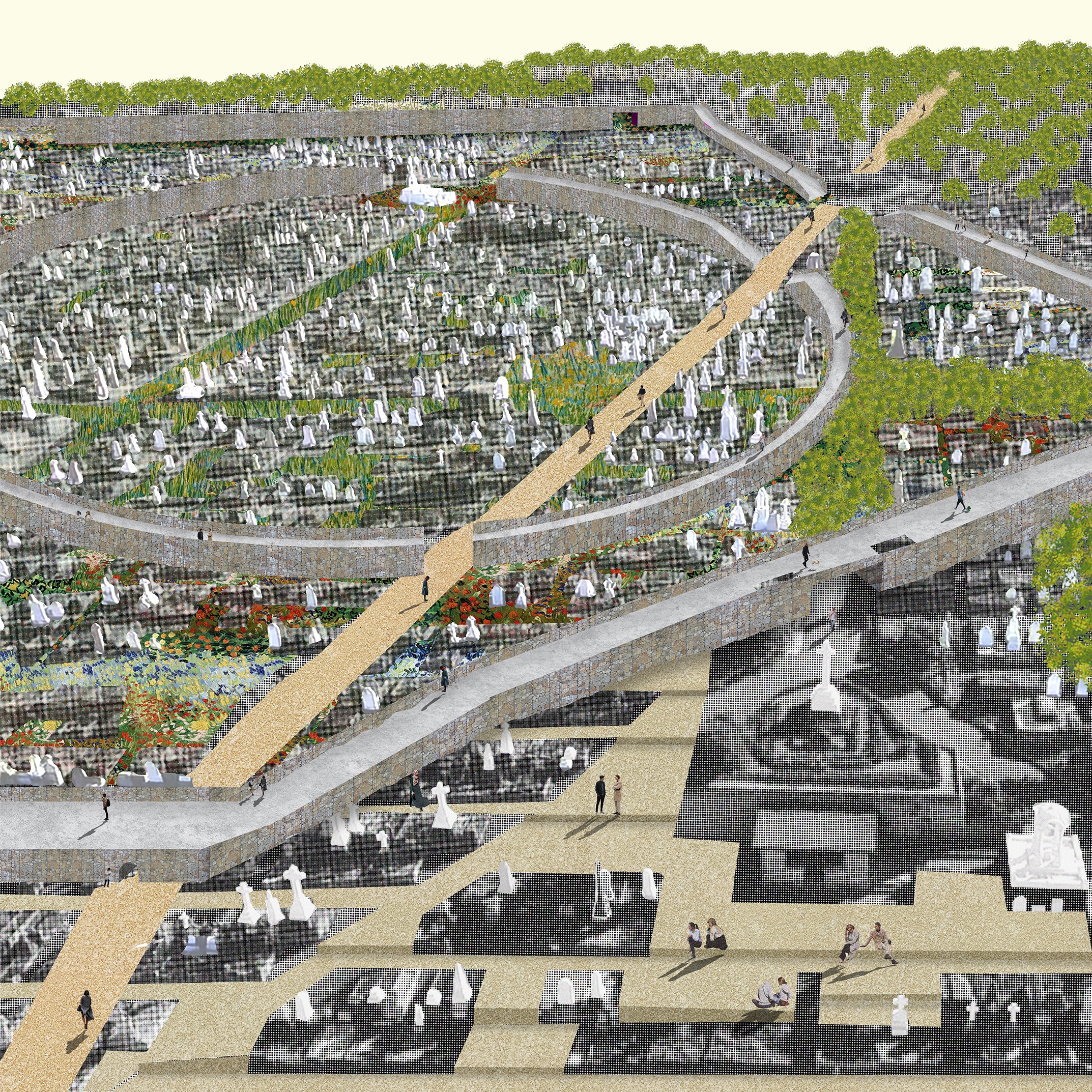
GM: Instead, we asked the students to find all of Sydney’s old cemeteries, divide them amongst themselves, visit on their own (taking safety into their own hands), draw the existing conditions, and report back to us. We asked for the drawings to be carefully observed and produced. Unlike our planned project, the brief had yet to be determined. What we learned was that while each individual cemetery was not particularly remarkable, seen together they actually constituted a fairly radical set of approaches to thinking about use and preservation, landscape, ecology.
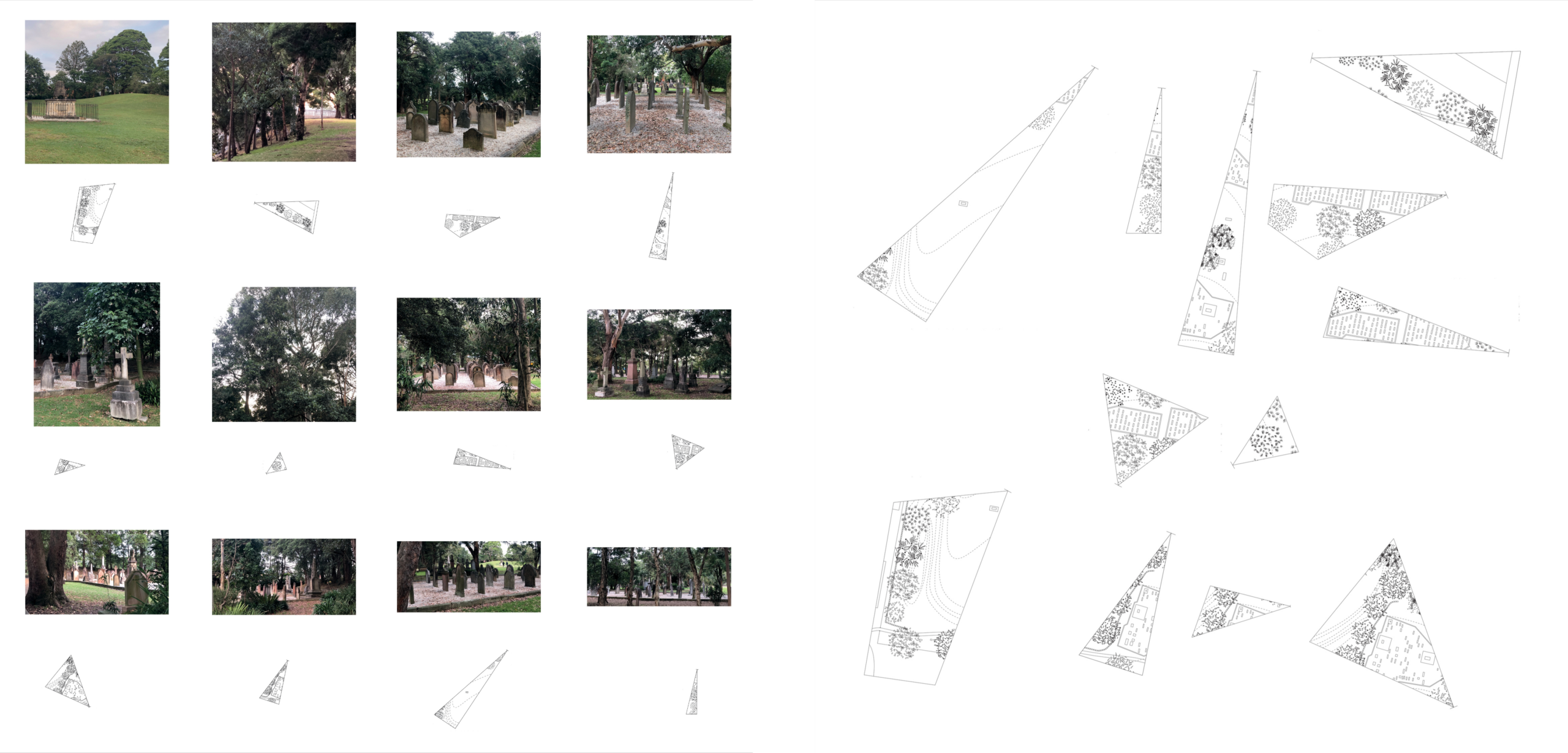
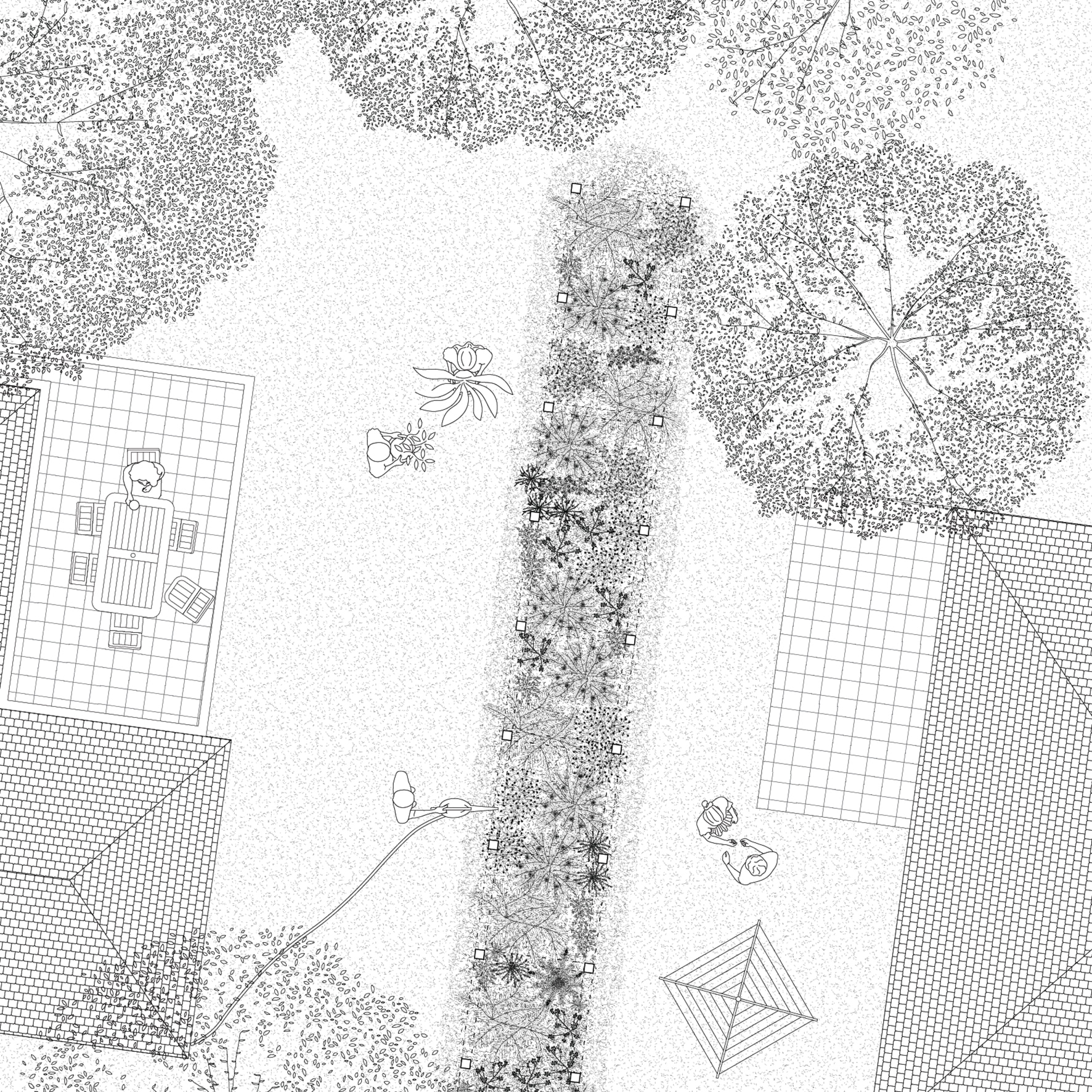
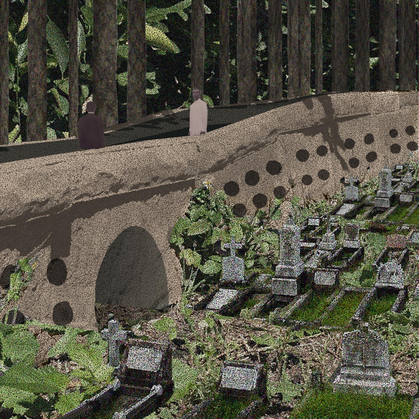
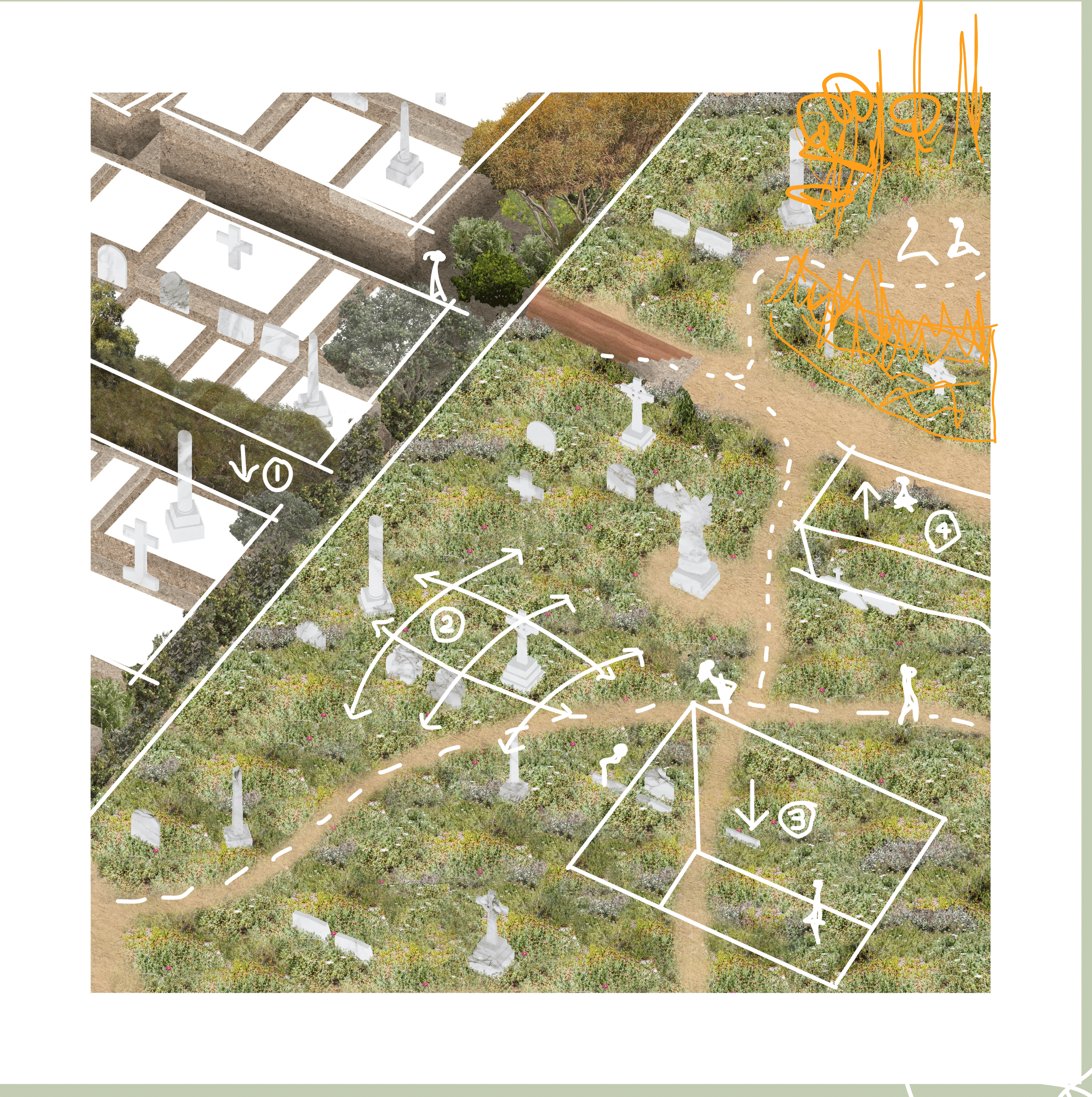
DN: If you took what had happened in one cemetery and applied it to another, you suddenly had an incredible proposal for transformation and reuse. Take for example St Thomas’ Rest Park (above), a tiny and little-known cemetery in Cammeray, north of Sydney Harbour. The cemetery was established in a period in the early 19th century when there were a large number of deaths due to a pandemic that mostly struck children. The cemetery was clearly unprepared for this influx and so the burial allotments were laid out in a haphazard manner, many of the graves were inadequately made, and the cemetery almost immediately fell into disrepair. In the 1970s the local council hired a group of landscape architecture students to revitalise the cemetery. These students made some astonishing decisions. They chose to salvage whatever tombstones were still intact, consolidate them into little raised enclosures, and lay soil and turf over the other graves. What you have today is a park with a few concentrated islands of dense graves floating within a sea of grass. It has become a really popular dog park, and due to Covid restrictions on gyms we found it was also being regularly used by people who were exercising and lifting weights. Interestingly, none of those things were problematic in combination. The presence of the graves didn’t stop people from wanting to walk their dogs there, and the people working out weren’t shamed for being disrespectful to the cemetery.
GM: According to Australian law, burial places are supposed to be maintained in perpetuity. But in this case some of the larger tombstones were retained in place and the ground was simply raised over the surrounding gravesite. Normally when you’re in a cemetery you don’t want to walk across the graves, but here there was no sense of where the grave began or ended, leaving you free to walk in whatever direction appealed. Seen together, the whole thing represented a fundamental challenge to the prevailing wisdom of how to preserve cemeteries.
DN: That was just one example, but in total the students produced this repository of information that was richer than if we had asked them to study the copper slag emplacement as originally intended. The quality of the drawings was directly connected to the quality of insights. The better students started to understand that the more precisely they drew things, the more material they had to work with, the better their observations and the clearer their ideas.
GM: At first, when we started teaching it felt like there was a real barrier between us and the students, without physical contact, like talking into the void. But by utilising a shared digital pin up space, being able to draw together with them and leaving the video chat window in the background, we were able to have great conversations. In the end it was a very similar experience to a typical studio project.
FG: What makes for a successful studio?
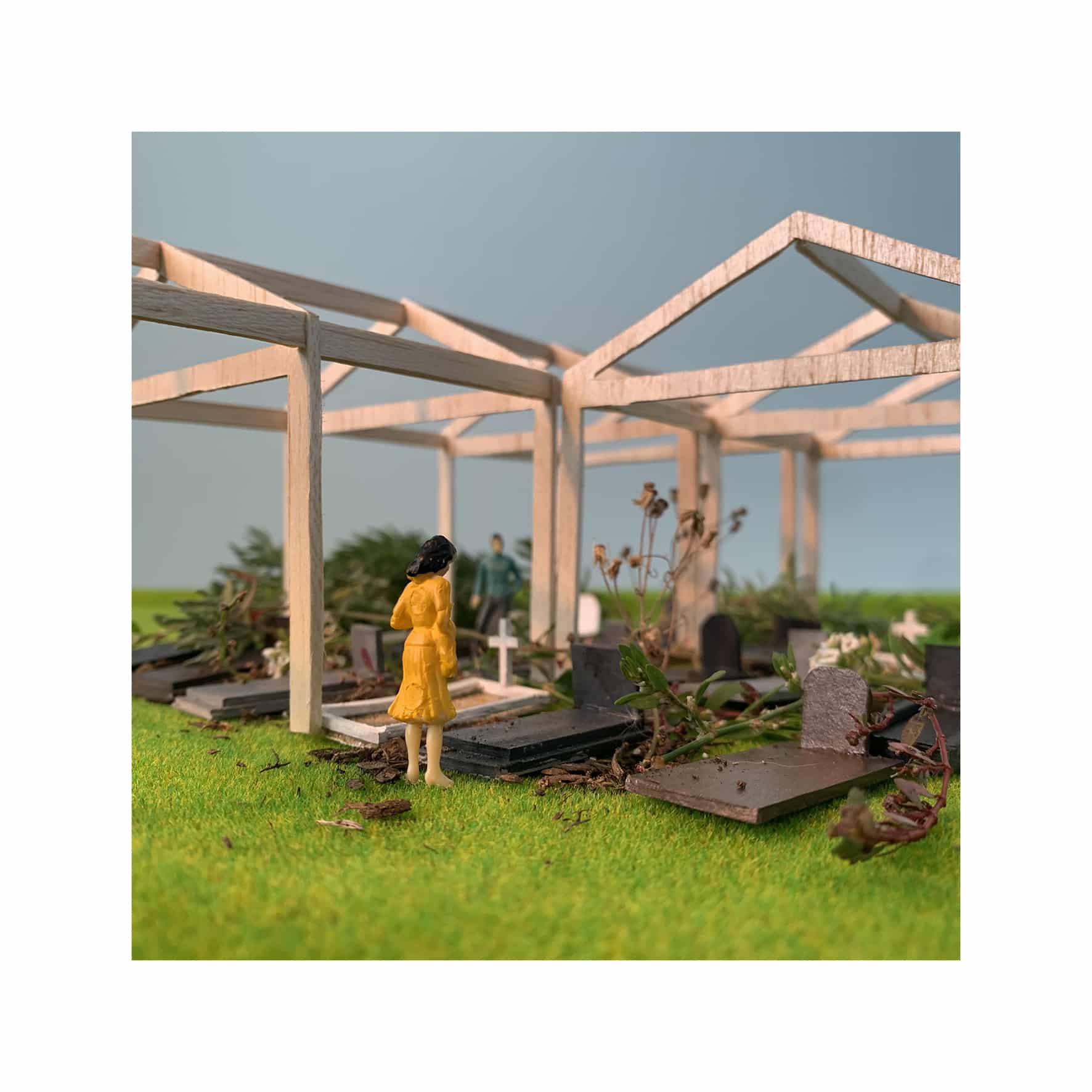
DN: We feel that there are two elements that make for a successful studio. The first element is precision. We try to transmit a care for how things are drawn, for the process of drawing as a means of defining the project. We encourage our students to simplify their work, and simplify what they are trying to achieve, so that they can put their main energy into that effort. And that leads me to the second element. The most important outcome is when students are able to take ownership of their ideas, interests and work, and are able to defend and discuss their choices.
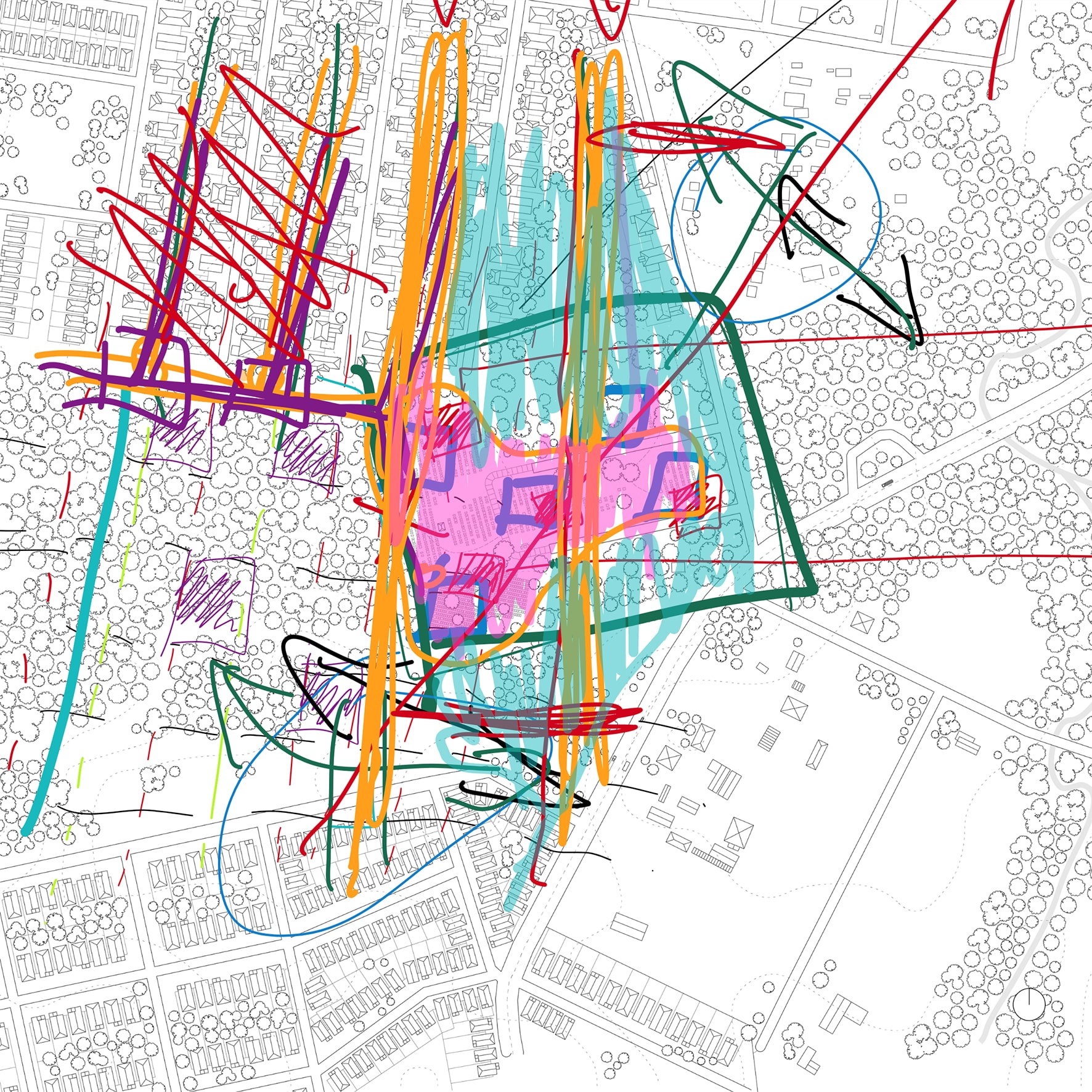
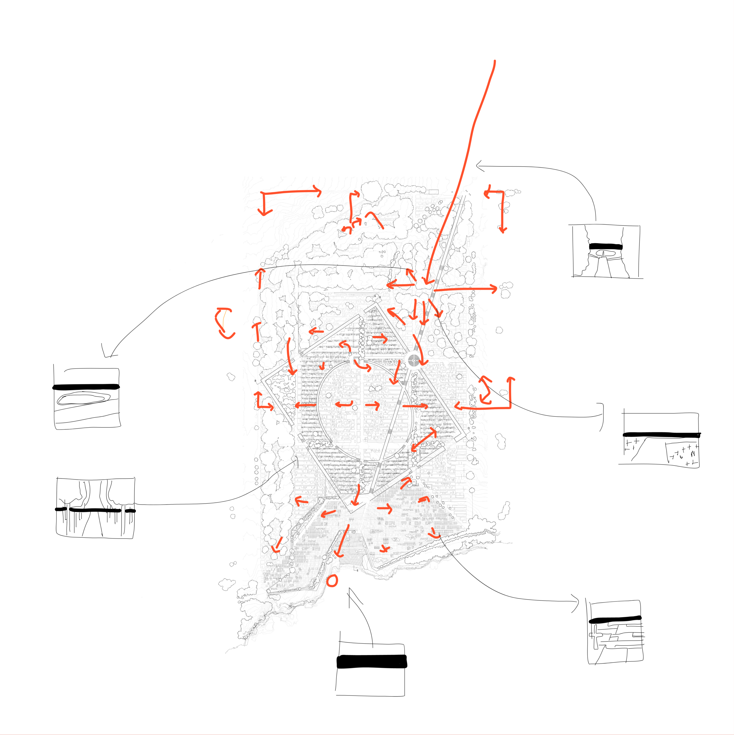
FG: The drawings that you sent me have a lot of scribbles over them. They give the impression of multiple hands and not just one student. It seems that what is lost in not being together anymore, in this quasi-mythical idea of the good studio environment, is compensated for by the fact that the drawings become the sole focus of conversation.
GM: We were all able to zoom into the drawings and draw on top of them. By all, I mean not only the tutors or the students presenting, but also the other students who would come in and ask questions about the project. The engagement around the drawing was so much better than it had ever been in person. I’d suggest that the novelty of using this medium, and the novel circumstances of the first lockdown, certainly contributed to this energy and enthusiasm.
DN: Nobody wanted for their architectural studies to be derailed, so they threw themselves into the studio with intense vigour. They had nothing else to do in their days and it became a lifeline for a lot of students. Pragmatically, normally you cannot get more than two or three students around a drawing. I’m short-sighted, so I need to be very close in order to look at detailed drawings. Scale became very malleable in the digital space, and you began to see things that previously you might not have noticed.
GM: Beyond that, each pair of students had a dedicated pin-up space with all of their work on it. If there was something that they had shown the week before and then discarded, you could ask them to revert back to that drawing. Formerly, when we met with our students in physical space, you would ask them about a drawing that they had shown you the previous week, only to learn that–
DN: It’s gone! It’s in the bin! That file has been superseded! Now the digital space creates an archive of the whole process, and you’re therefore able to assess where students are up to in reference to what they’ve worked on previously.
FG: Could you define what you mean by precision in architecture? Do you mean precision in the Modernist sense, an obsession with architectural detail, drawing at 1:1 scale with every screw and bolt dimensioned and accounted for?
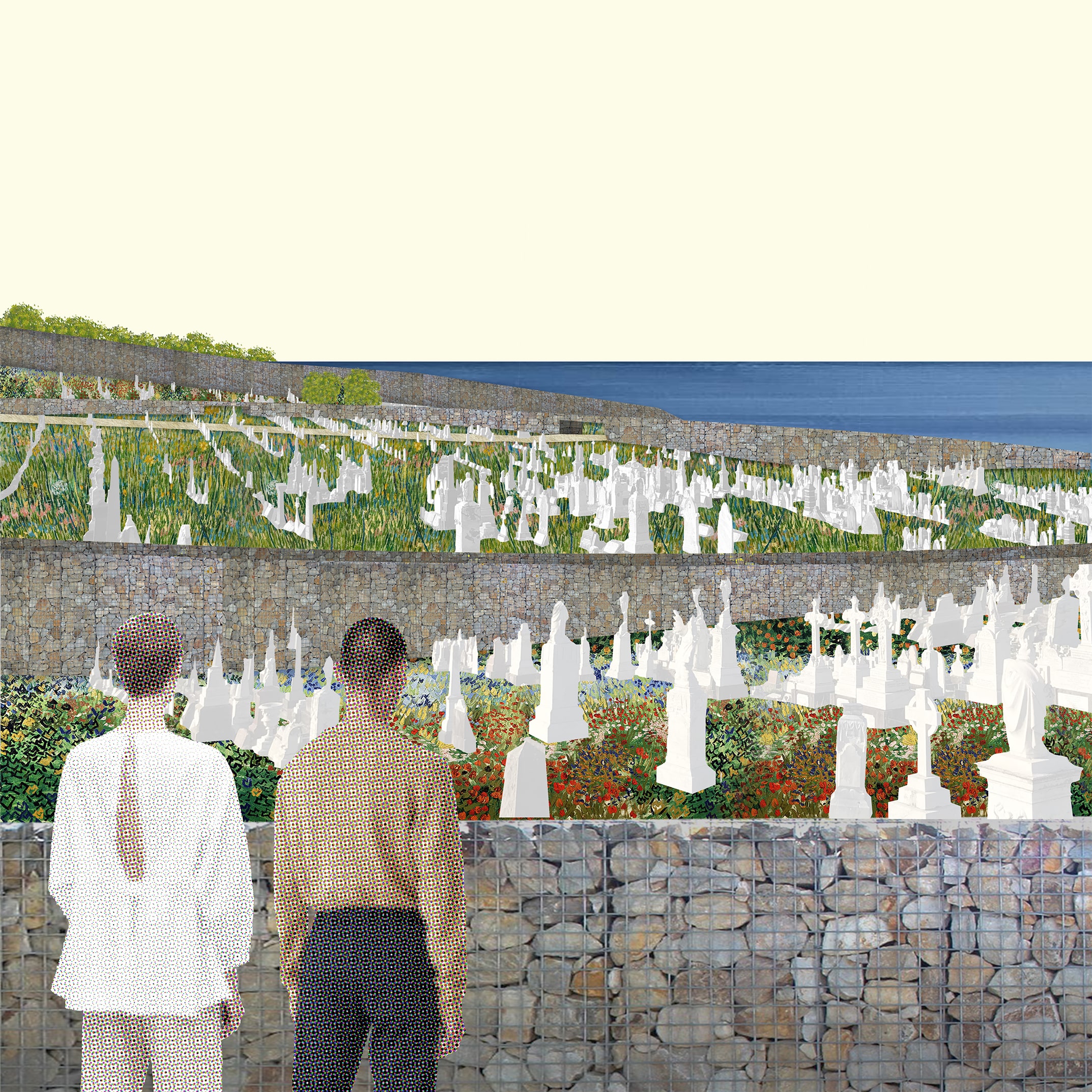
DN: For us, precision equals the clear alignment of intentions and outcomes. In terms of our own architecture, we measure precision by how closely what we hoped to achieve matches how the end product is actually used over time, and so can be hard to judge. In the context of the design studio, it’s about the student saying: these are the things that I think are important in the project, these are the observations I’ve made about the situation, here’s how I plan to intervene, and this is what I think the intervention will bring to light. The studio process is about testing these assertions and seeing whether they hold true. Coming back to what we were saying earlier, we would prefer that a student restrict their efforts to a single wall, so long as the design of the wall reflects the student’s aims and intentions. We would like the student to carefully consider the difference between making that wall half a metre thick, four metres thick, as thin as a drawn line, this height or that height, to test whether it should rake at an angle, be embedded in the ground or float above the ground… to investigate all of those things that are fundamental properties of spatial thinking and that are communicated in certain ways in architecture. For us, learning control of the architectural repertoire is learning how to align what you say you want to achieve with what you do, and of course this can never be entirely mastered.
FG: Is an interest in construction and tectonics relevant to this teaching?
GM: We try to teach the students that it’s a part of their toolset. It’s part of understanding their ideas but it’s not the most important thing.
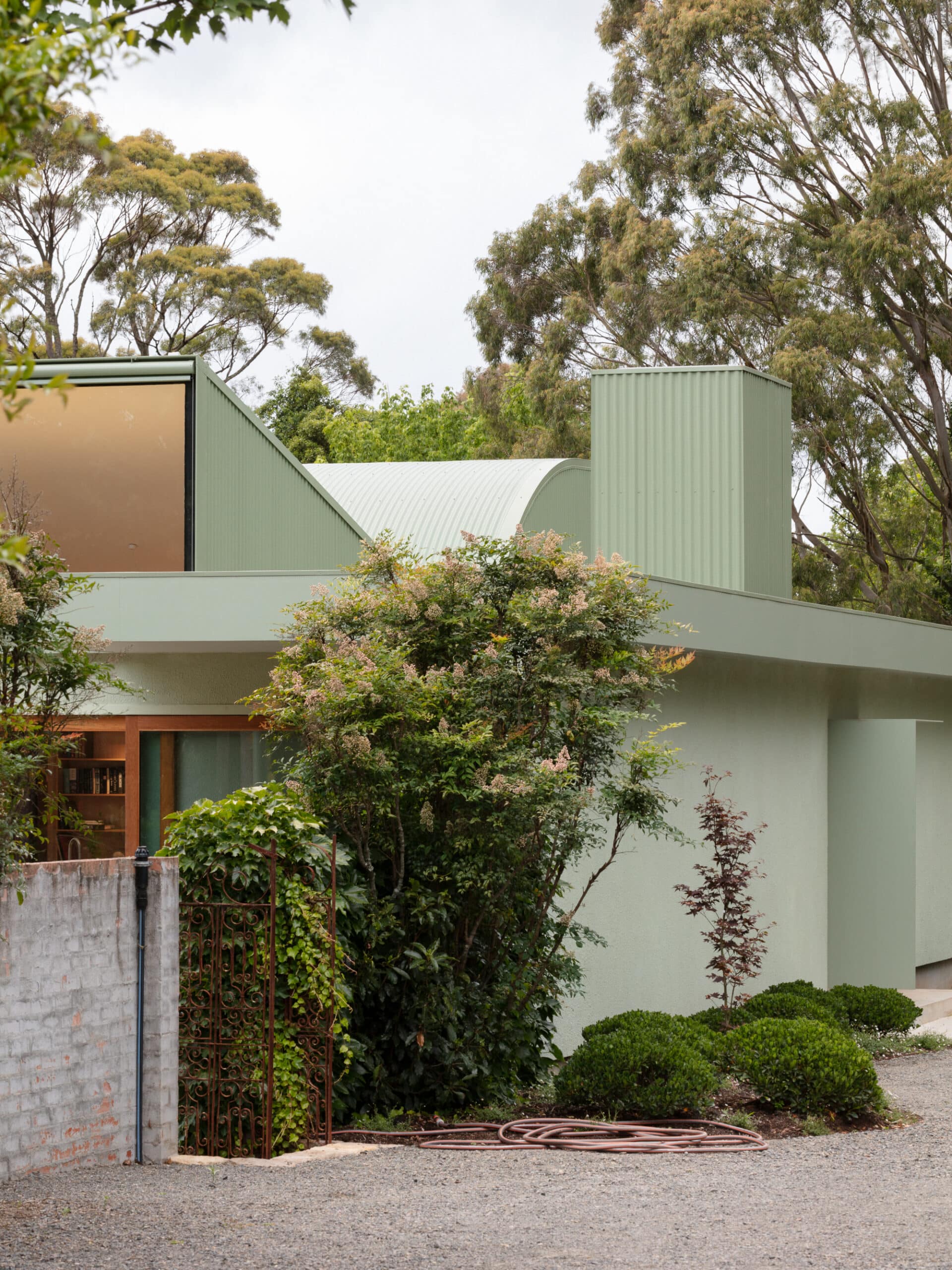
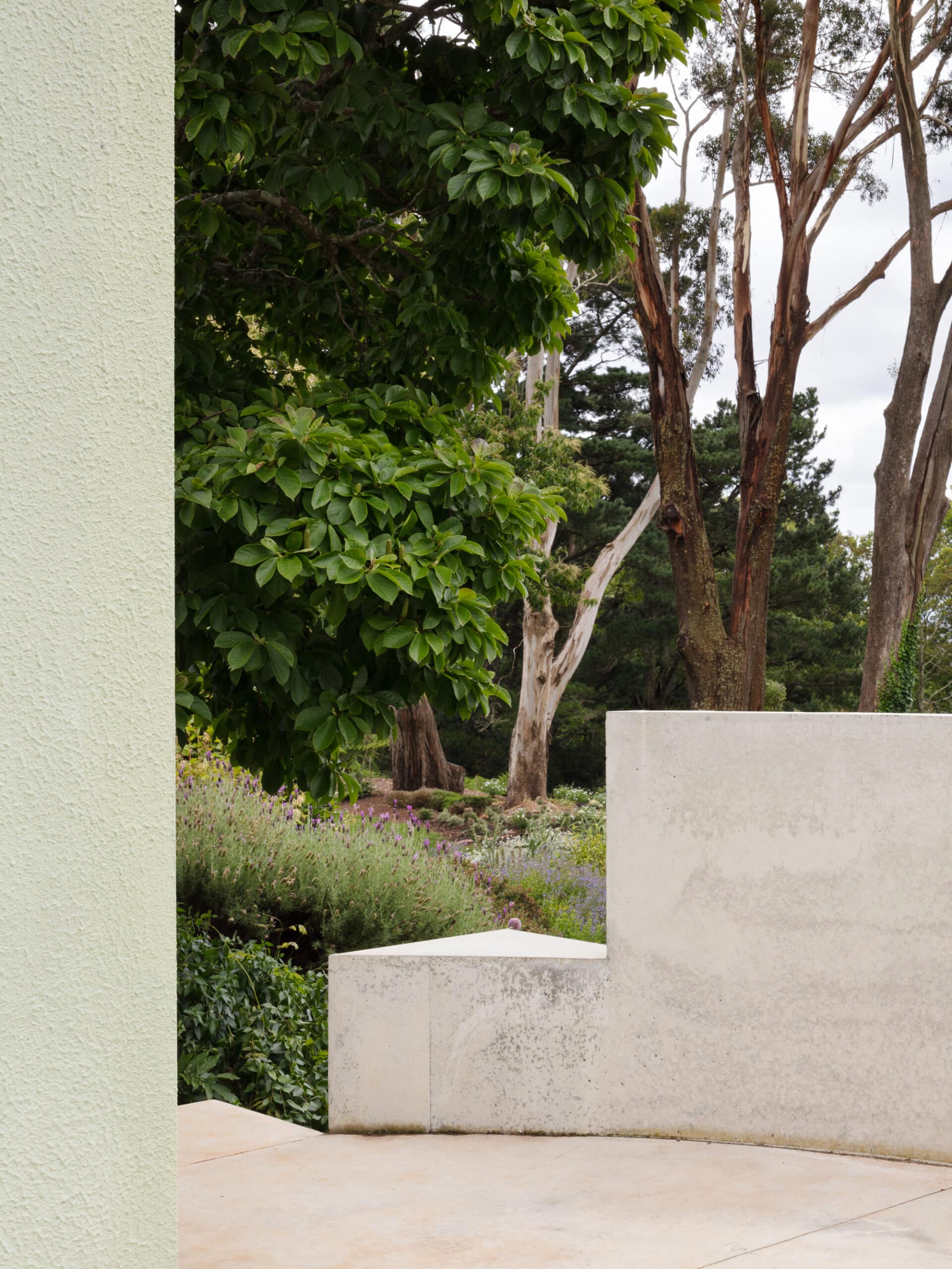
When we were at architecture school we were told: it’s always about truth to materials, it’s always about expressing the substance’s innate qualities and patina. You would never think to use paint, you would never use an applied finish, you would never cover something, everything had to be revealed and expressed and celebrated. What we’ve learned from our colleagues overseas is that, sometimes, painting a room in a certain colour can be as effective as building that room in a different shape. When it comes to making a space feel humane or lived in, a pot plant can be as important as a column. There needs to be a sense of proportion between the methods and the outcomes. So sometimes cladding something and hiding it achieves a result that would not have been possible if the materials were revealed. In a lot of contemporary architecture there’s an interest in singularity and minimalism that means that you can never have a functional kitchen, or someone can never have storage space, and we are expected to celebrate such results as a victory over the banality of the client! We prefer reality and ambiguity. We like the everyday, we welcome the challenge of all of these things coming together. Sometimes that involves letting a surface be painted rather than expressed.
DN: What tends to happen in the studio is that, when a student asks us a question, we espouse the simplest solution we can think of. We’re generally not asking them to produce a Scarpa-esque archivolt in order to create a really complex and spectacular form that will look great on the first panel of the presentation. We’re more about practicality. We ask: how do you think that will be made? Ok, let’s talk about existing systems, let’s try to find images of comparable construction examples. Knowing what a retaining wall looks like might help you decide where you want the wall to begin or end, or when you’ve created a problematic junction. But if you actually get to that point with a student, in the short time allocated each semester, with all of the other ongoing complications? Wow. That’s the dream: to get to the point where you start to talk about how big the footings might be, or having an angle of repose so that the ground doesn’t slip away, that’s beauty.
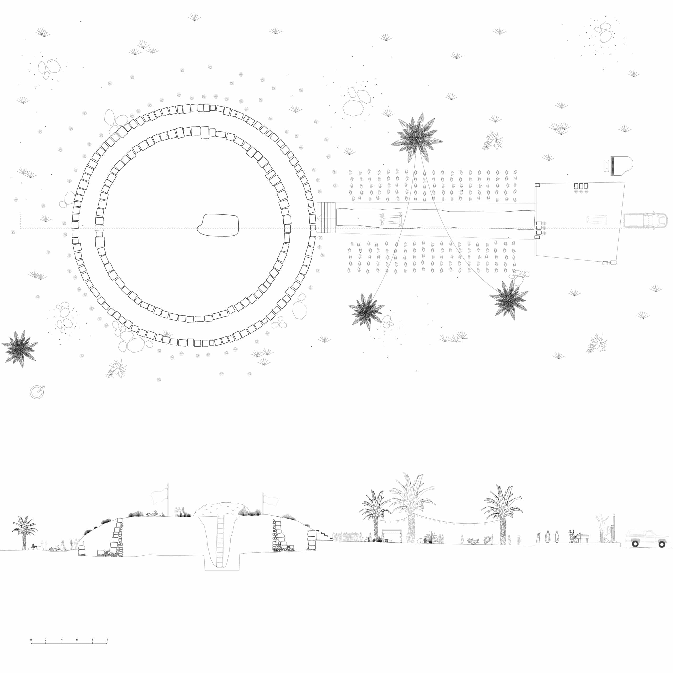

GM: Where we start with our students, when they’re coming to present their projects, is to define the story that they’re trying to tell. That’s something that we really try to instil in the students and that’s one of the points of precision that we are looking for. We try to enable them to speak clearly about projects, as simply as possible. We really dislike lengthy and florid descriptions. The story should be easily understood, laconic.
FG: Let me ask you, then, how you might be using references in your pedagogy?
GM: We think that references are really important and we encourage our students to not just look at images but to source and interrogate the drawings.
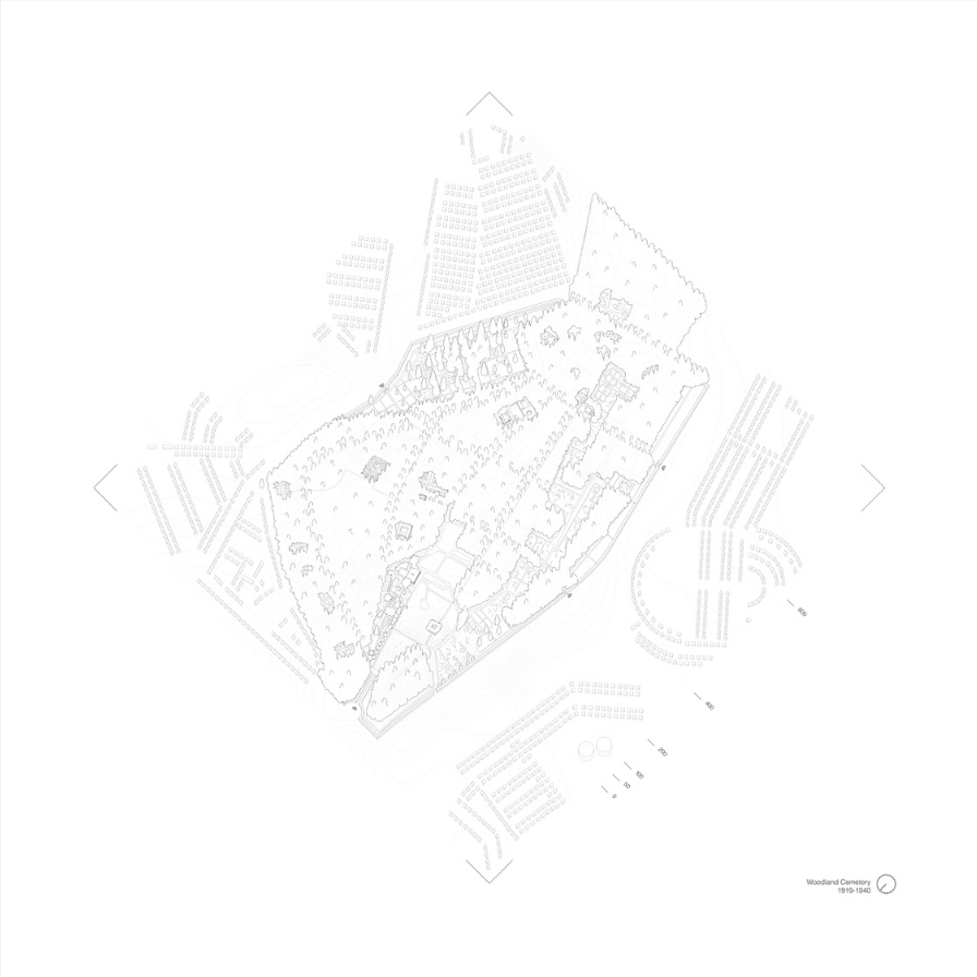
DN: That is something Grace is doing all the time, we will be talking about a student’s project and she will be dropping in reference after reference in real time. At the beginning of this most recent studio, we asked our students to study very archaic references, some of the oldest funerary monuments and structures. Then we had them analyse some modern projects, including Asplund and Lewerentz’s Woodland Cemetery – you can’t really do a cemetery studio without the students having a really fundamental understanding of that project – Miralles and Pinós’ Igualada Cemetery, which is my favourite project of all time, and Scarpa’s Brion Tomb.
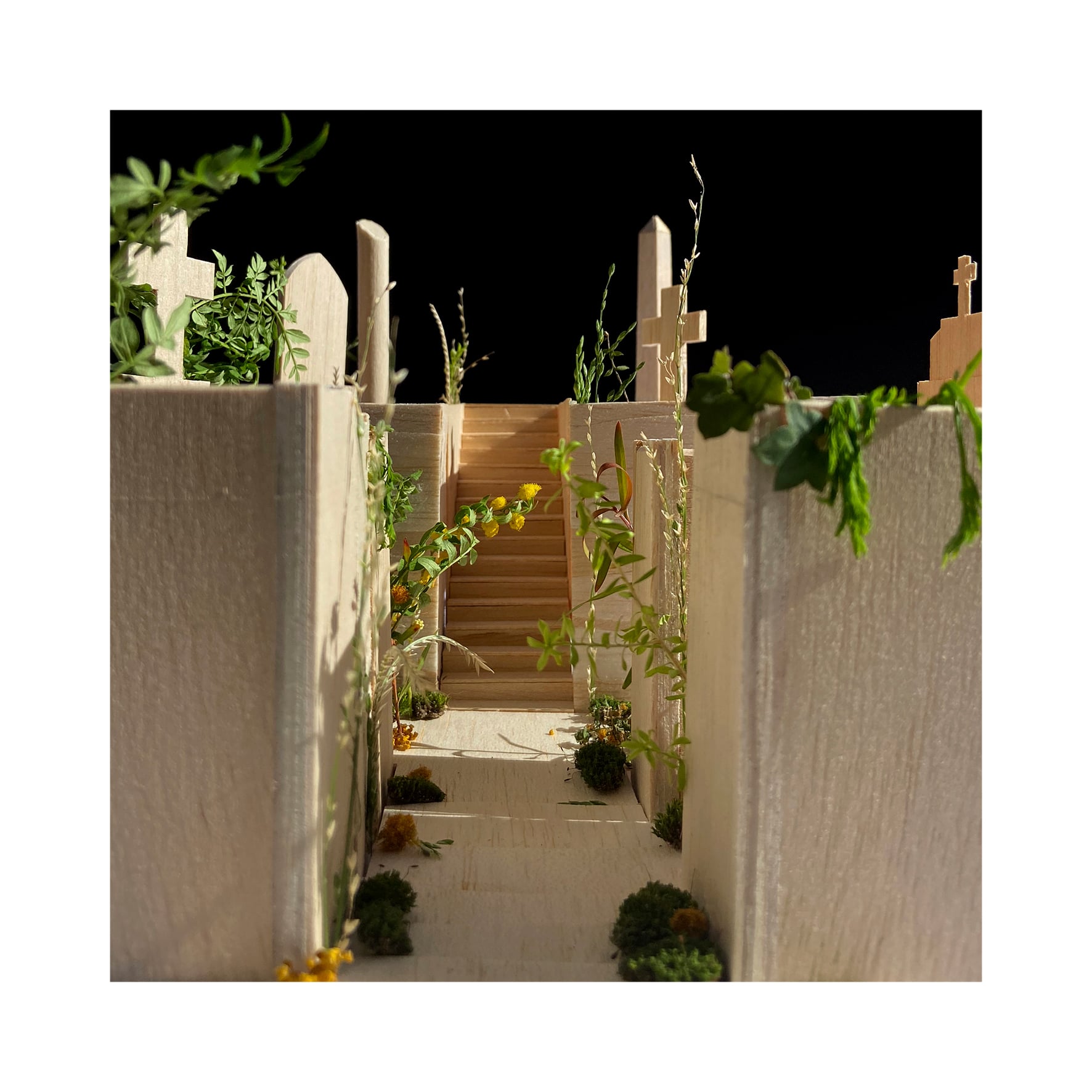
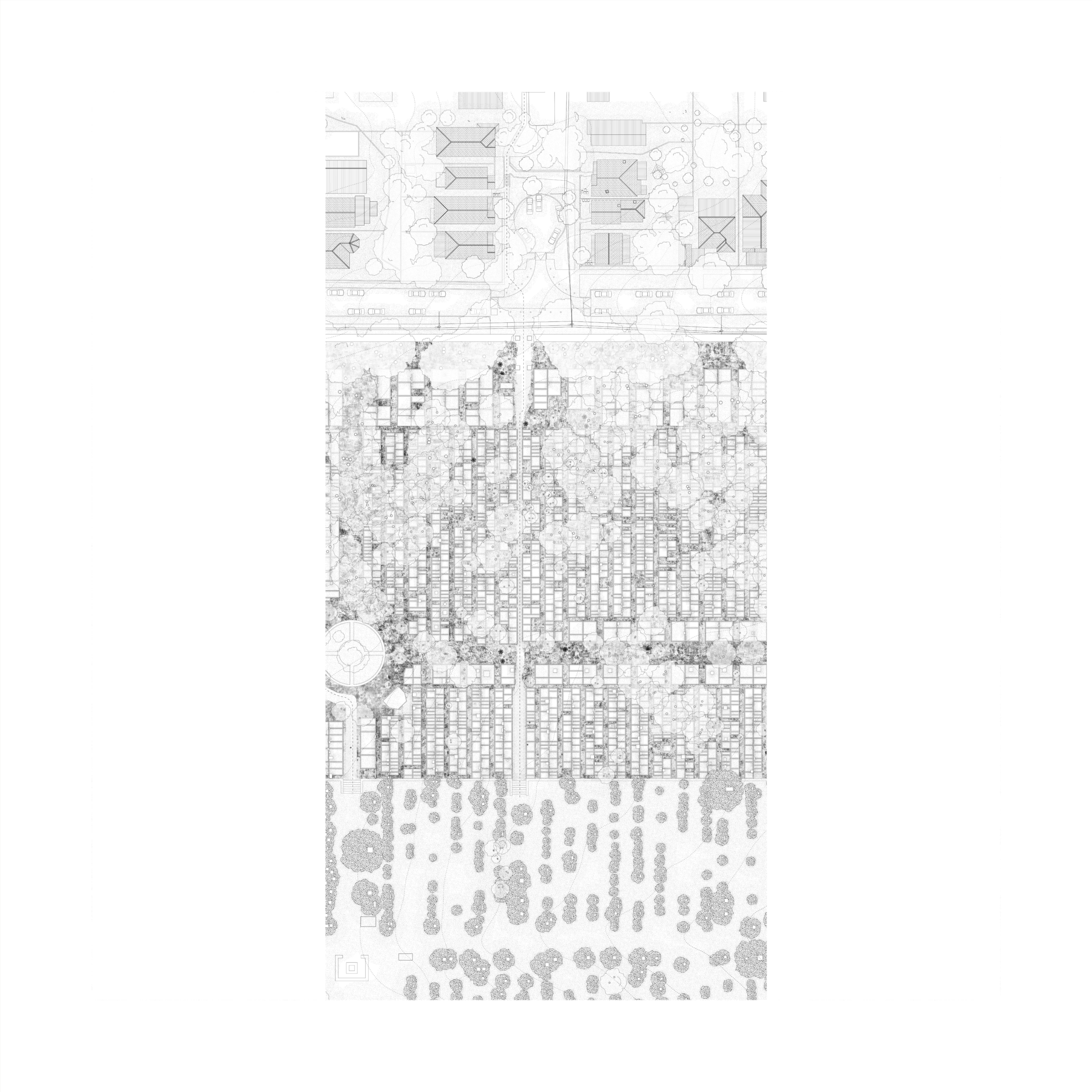
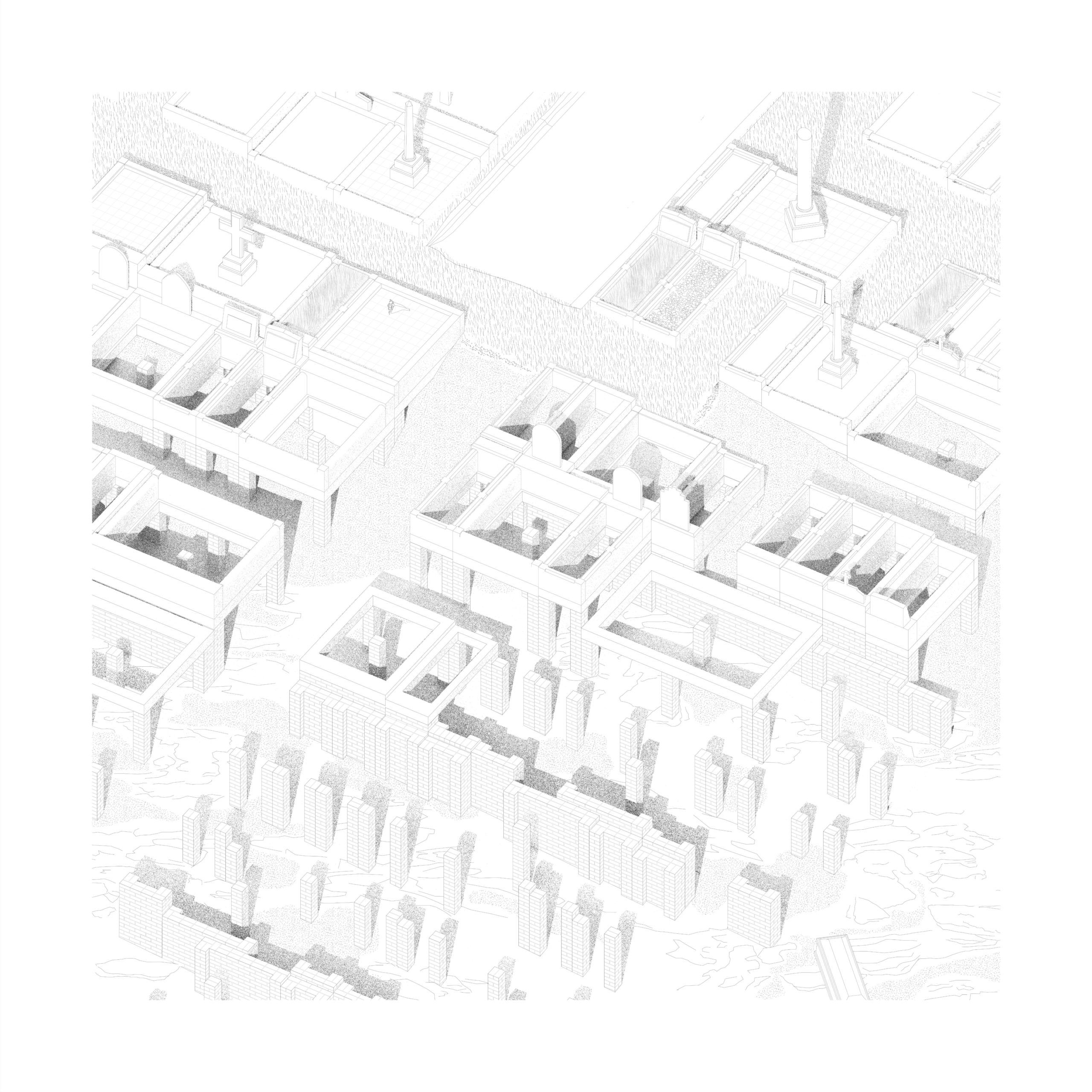
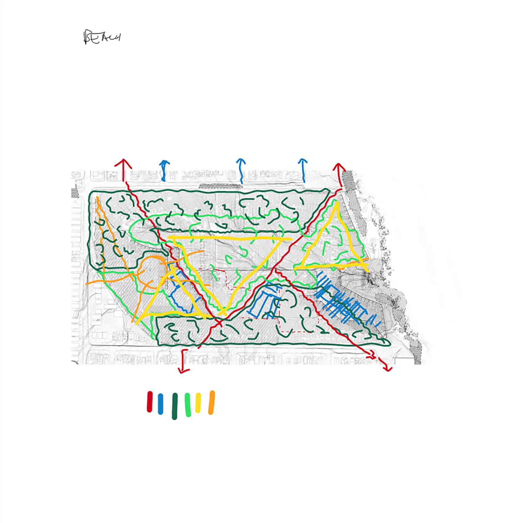
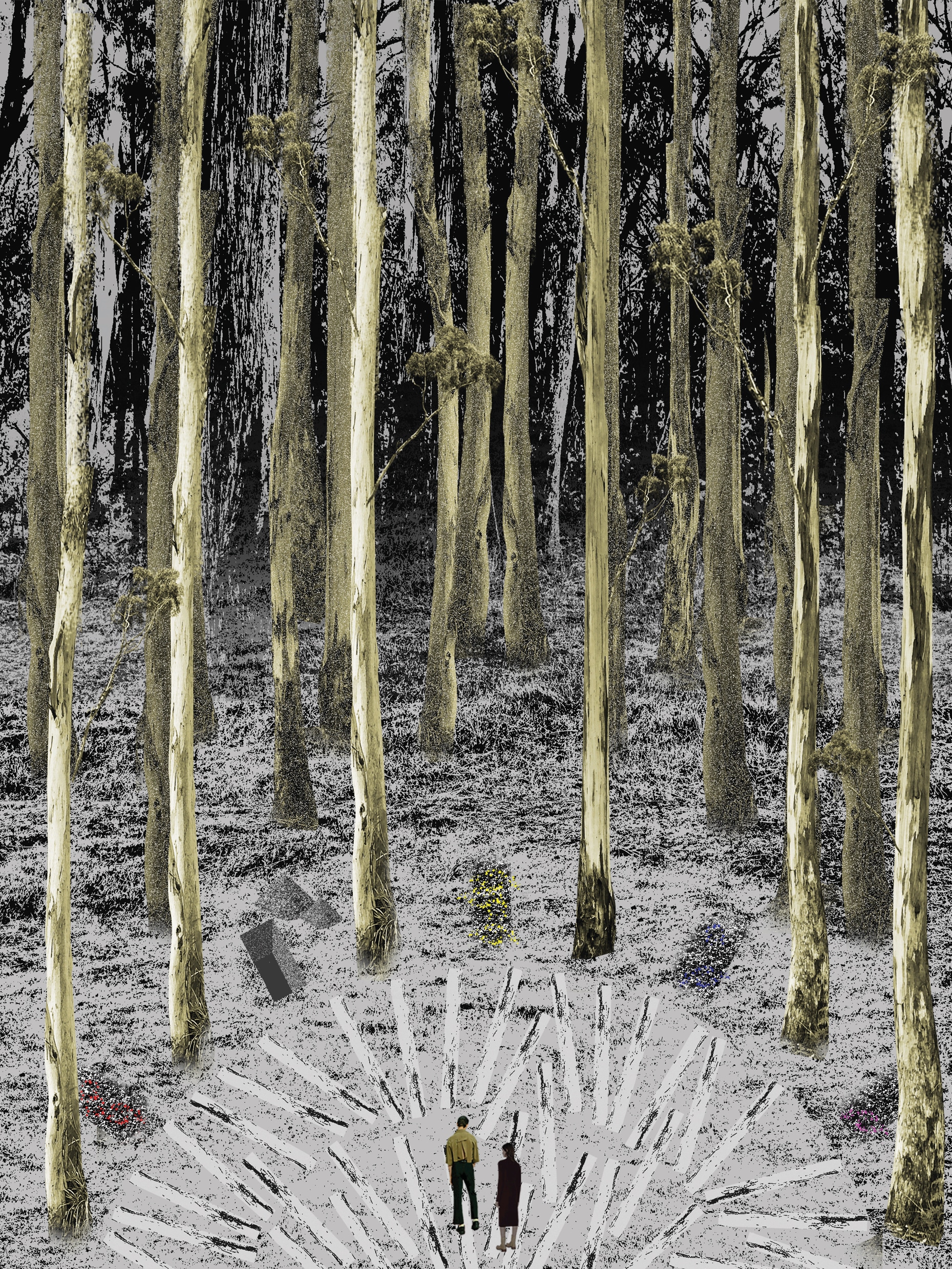
GM: We talked about these fundamental modern projects and then the students had to produce models and drawings and analytical diagrams. Ultimately, the intention is to get them to reconstruct those projects and to understand the logic of their component parts, why decisions were taken and what those decisions enable. We had one pair of students who identified that Woodland was a gravel quarry that had been reimagined as a dense Pagan forest. Ceremonial spaces were created as symbolic forest clearings, as the use of cremation meant that the landscape need not be filled with graves. This enabled an understanding of the cemetery in reverse, as a set of voids rather than a field condition. Deciding what to occupy and what to clear became very important in their work.
DN: We had another pair of students who had this simultaneously brilliant and incredibly obvious insight during the studio. They observed that historic cemeteries were always designed as idyllic and open landscapes. They were never drawn to include graves, because the graves were too complicated to draw, there were too many of them, and the precise pattern of arrangement had yet to be determined. As these spaces were never envisioned as fully occupied, once full they radically changed in character. Cemeteries were intended to provide spaces apart from the congested city for contemplation and reflection. But these open landscapes were never set aside and protected, so today there is simply no space remaining for that purpose.
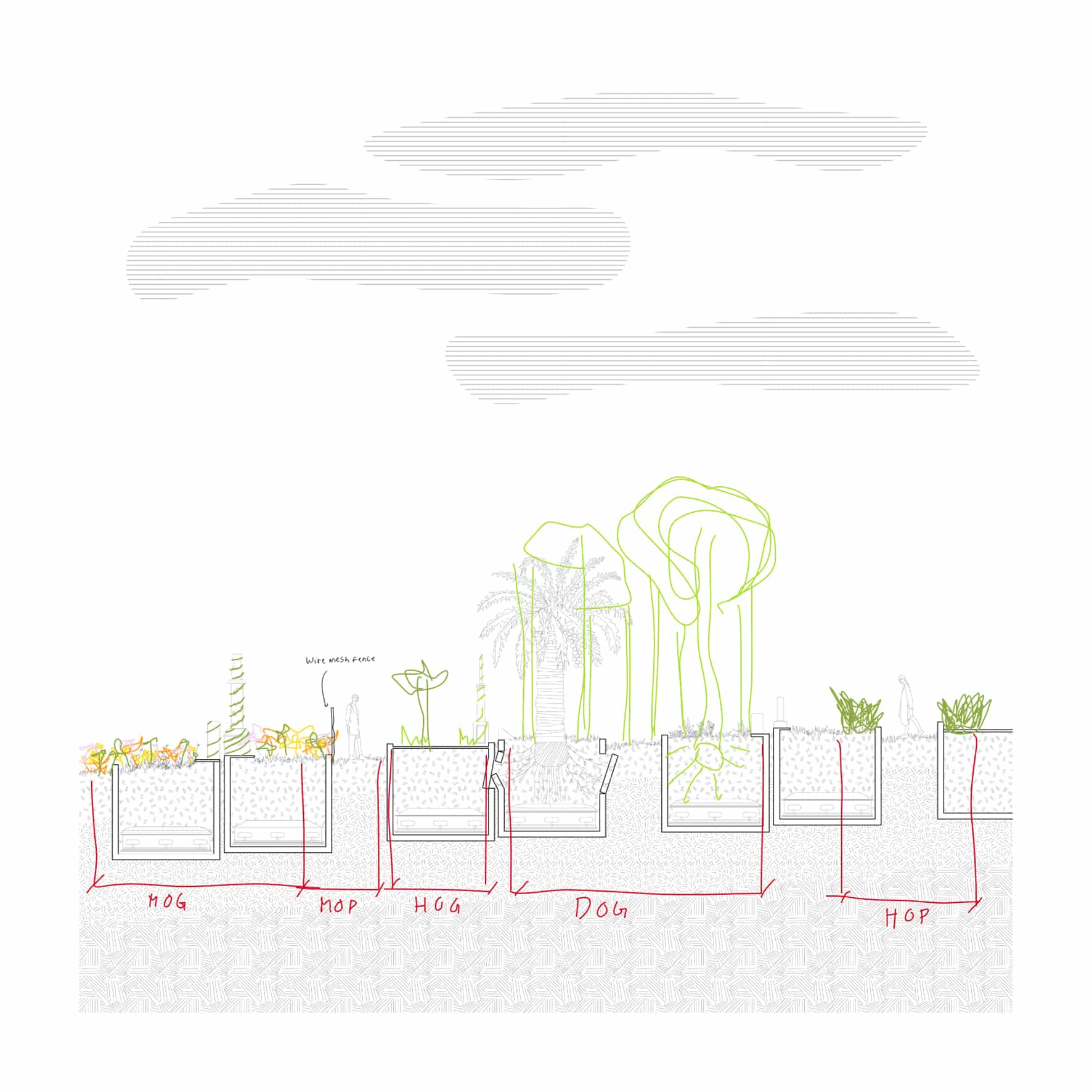
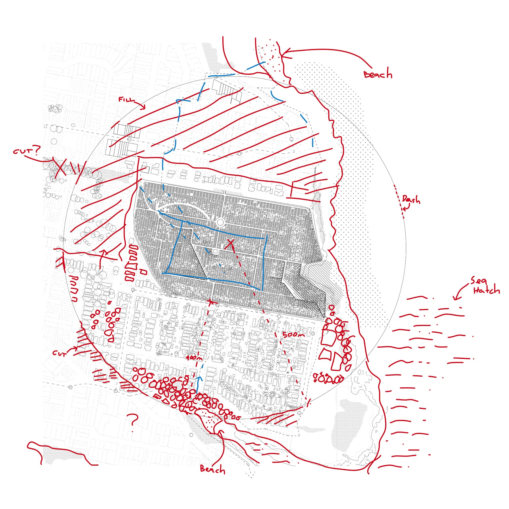
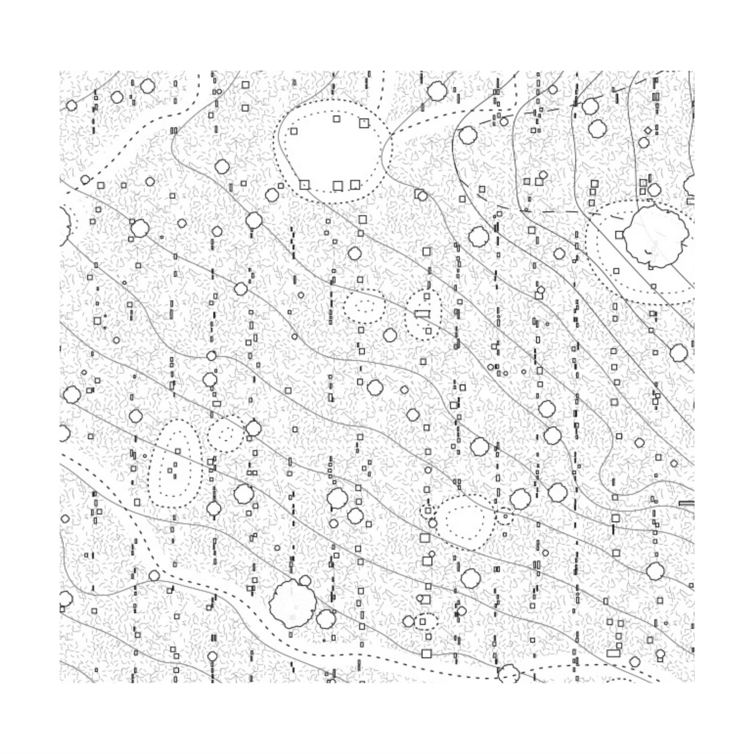
GM: I think that you can really only get such genuine insights from the use of references and by actually drawing places and projects from scratch. It is typically even better when the students have to piece an example together from lots of different artefacts and sources.
FG: How do you control the interaction between your professional interest in cemeteries and what happens in the studio? And how might your experience with these new teaching tools, discovered out of emergency, inform your professional practice?
DN: The first question is easier to answer. Our initial interest in cemeteries was based on an obsession with those quintessential Modernist and 20th century funerary projects. These are examples of pure, total works of architecture, where everything from the landscape down to the tiniest detail of a memorial has been considered. We felt that it was strange that there wasn’t as much interest today in making cemeteries. Comparatively, there is still so much interest in making art museums, but art museums don’t always lend themselves to this kind of incredibly symbolic, rich, emotional, powerful and very long term project. It is very hard in every aspect of architecture to work on a project where there is some kind of symbolic meaning or purpose, it is a given with cemeteries. All of our initial thinking was about those sorts of monumental, symbolic, strong and constructed spaces. We saw our work as designing buildings within some other person’s landscape. Teaching studios about cemeteries meant that we had to take responsibility for the landscape, there was no external consultant, no collaborator for the students to generate a context, so we had to start to develop our own positions and start to, in a very under-qualified way, teach landscape design alongside architecture. And now at UTS we have been identified as being half-architecture and half-landscape.
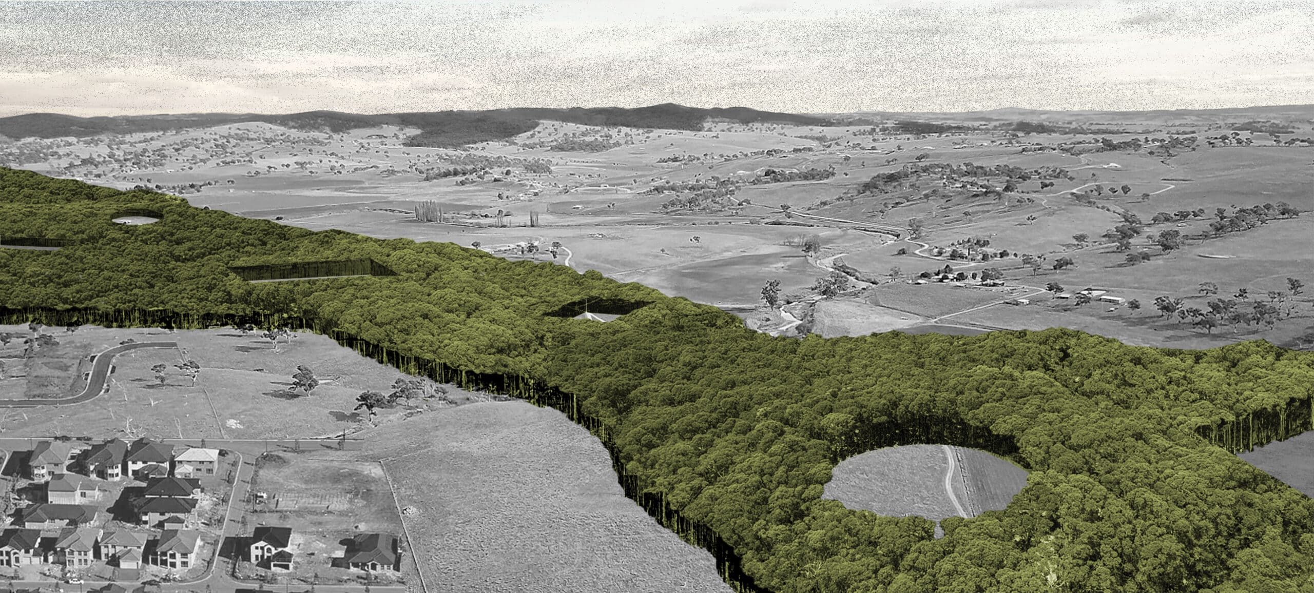
Also, by necessity, in initiating these studies we had to ask what was happening in contemporary cemetery thinking, and to look at all of the different sorts of technologies and vectors that are influencing the design of cemeteries today, things like promession, alkaline hydrolysis and Recompose. We learned a lot through our students about natural burial, which is obviously very old but is having a sort of resurgence in contemporary society because of its relationship to sustainability and ecology. So much so, in fact, that it has become our main interest. The most important work we are doing is with a company called Earth Funerals, a not-for-profit that is establishing natural burial grounds all over Australia in which there is no architecture, or almost no architecture. The architecture is in the plan, or in thinking about the visitor’s experience. We are exploring audio wayfinding, there is certain gear you wear for different weather situations and almost no physical structures that you would normally define as being an architectural project. On the other hand, we are talking about spaces that will last for a hundred and fifty years or more. In that time buildings come and go, forests emerge and trees can be harvested, so these projects have stretched us far beyond our normal thinking and required us to be a lot more broad and flexible in our approach. So teaching and research has led us away from our presumptions or preoccupations and towards projects that no longer resemble anything like our past interests.
In terms of the second part of your question, we now use Conceptboard virtually every day in the office, it has become part of our array of tools used for design collaboration and communication with clients.
FG: And this is something that you only discovered because of the Covid crisis?
DN: From Guillaume Othenin-Girard at HKU. Without Guillaume’s suggestion we never would have known it existed.
GM: Beforehand, we printed things out and drew over the top of them. Now, the freedom of being able to just place something in a digital space, immediately draw on it, and then send it to someone, or have staff or collaborators come in and draw over it, democratises everything. We never want to operate in the way where we are the master architect drawing and then we have someone else carry out our work. We always want our work to evolve in conversation. This digital platform helps that to happen.
We started our undergraduate studies by drafting everything by hand. We moved on to computational drawing soon afterwards , but even today the challenge is, when you make things in digital space using particular software, how do you get these artefacts out and make them legible to others? That is always where the problems happen. The digital pin-up board offers an interesting reversal, where it’s about bringing physical things into computational space in order to share them with others. Before, only the architect was seeing what was happening in her little on-screen world, and what was shared with other people was the output of that activity. Now there is probably a bit more of an opportunity to bring people in.
