Retail Therapy

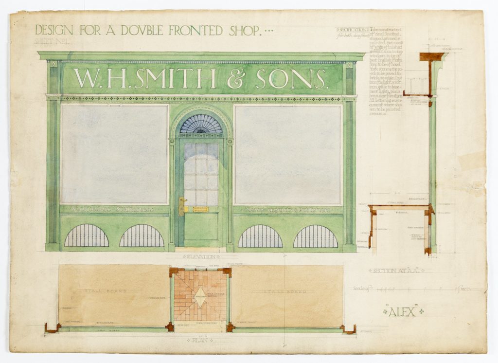
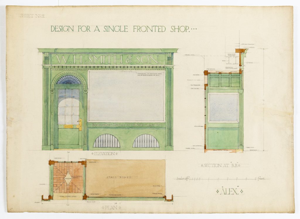
Alexander Scott Carter (‘ALEX’) was born in Britain and studied art and architecture at the Royal Academy Schools from 1905-08. In late-1912, he left Britain and settled in Toronto. The two drawings selected illustrate the excerpt from A. Trystan Edwards’ Good and Bad Manners (1924), were Carter’s submission to a competition run by the newsagents and stationers, W H Smith c.1910.
In architectural design the size of the human unit must always be borne in mind. It is nowhere more necessary to observe this maxim than in the determination of the scale of shop fronts, for here not only is the tendency to an undue magnification of parts most strongly encouraged by those who seek to impress us with the importance of commerce, but the particular architectural scale adopted is immediately set in relation to a constant stream of pedestrians and vehicular traffic. As far as the scale of buildings is concerned the temptation to error is greatest on the very occasion when the error is likely to appear most flagrant. This might be counted a fortunate circumstance if a critical public opinion could be relied upon to check the error when it occurs. But where this public is non-existent or inarticulate, the directors of commerce have complete licence to erect structures which in their contumelious bearing towards us poor ordinary human beings give the maximum of offence. Let me begin by contrasting two types of shop-front, one of which extends a delightful hospitality to the passer-by while the other seems imbued with a determination to make him look insignificant. The one says ‘this is your street, here are your shops; pray make yourself at home,’ while the other affirms in strident tones: ‘I am Big Business, and don’t you forget your subordinate station, you proletarian mouse.’ A notable example of the first type of street was old Regent Street, which better than any other shopping thoroughfare expressed the spirit of geniality. The scale was perfect, for while the parts were small enough to keep us in countenance, the composition of the street as a whole could not but impress us by its extraordinary dignity. But it was the kind of wealth of character which does not inspire awe but puts the humblest person at his ease. The aristocratic and democratic ideals, alike for ever necessary to mankind, came simultaneously to architectural fulfilment in Regent Street; and commerce had far more honour from this circumstance than it is likely to gain by its present attempt to repudiate both these ideals.
Excerpted from Good and Bad Manners in Architecture, 1924.


– Philippa Lewis