Fronts and Faces
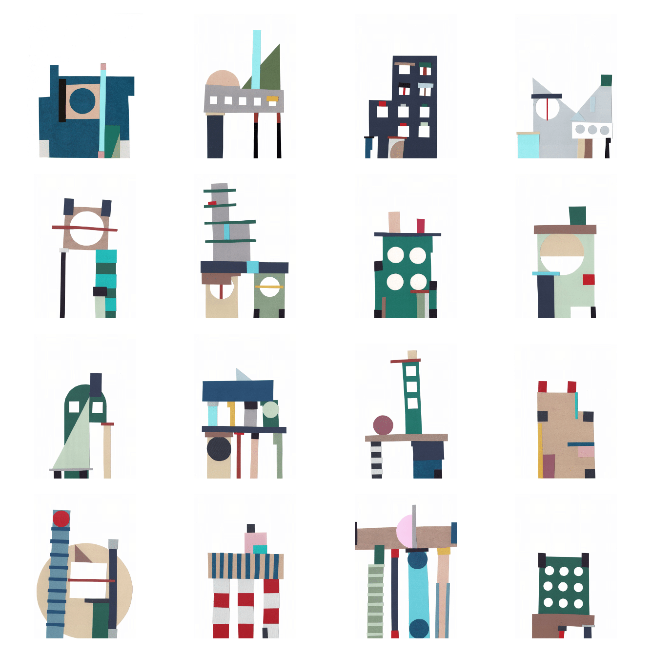
The paper is cut without measuring. Rulers and set squares are neglected. Scissors are preferred over cutters and cutting mats. Circles are traced from nearby cups and glasses. The lines are never quite parallel. The edges are askew and the angles are uncertain. Alignments, perfect geometries and round numbers are not the goal. Things don’t quite match if you look close enough.
The background is neutral. The same white A4 printer paper, always vertical. The format varies between A4, A5 and A6. The blank sheet is repeatedly torn in half. The first colourful piece of paper lands on the lower edge of the canvas. There is no sketching beforehand, decisions are made as things go.
Leftovers are actively participating in the process. It often starts from scraps. Different pieces are shuffled, rotated and juxtaposed. Elements are systematically added and discarded until a convincing assemblage is formed. A big round window is glued, and the cutout from that circle defines the next figure. The main pursuit is figure. These figures constitute a facade each time – paper collages become an endless machine of frontal elevations.
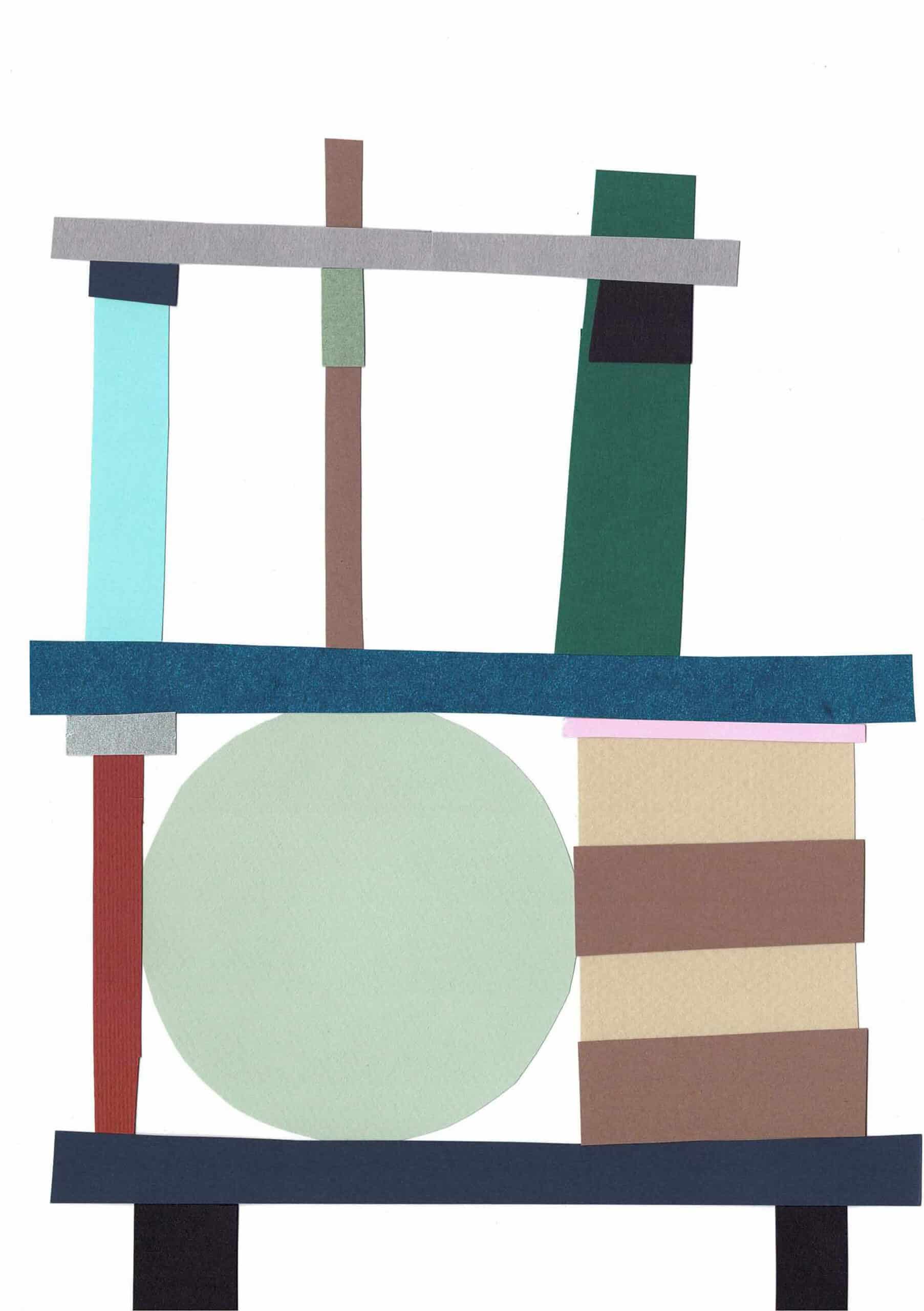
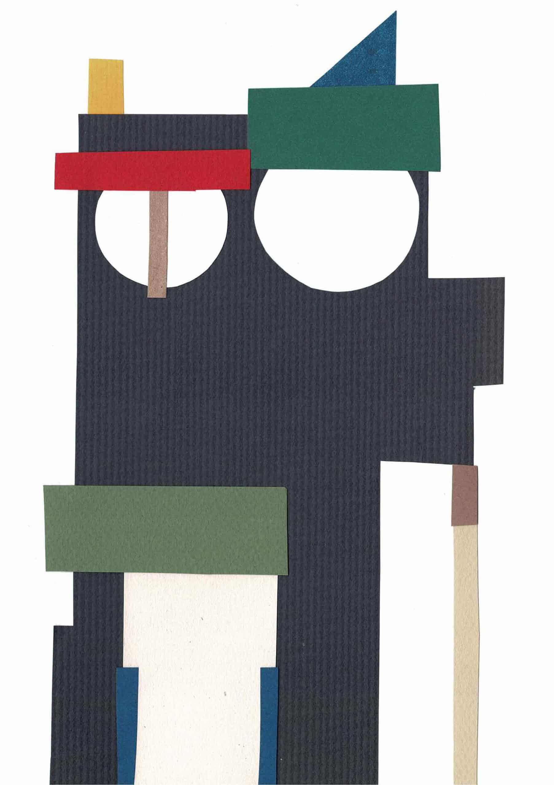
The compositions are elementary. The colours are vivid. Some have a clear scale, others are abstract. Some make sense and could almost be understood as buildings, others just don’t. Some are cute. A few resemble cats or giraffes. Basic elements of architecture are at play here: columns, doors, oversized windows, shutters, lintels, complex silhouettes, off-centred chimneys. The window is often too big, columns are too tall or chubby. But exaggeration is favoured. Stripes and dots repeatedly occupy uneven surfaces. Symmetries are broken. The vocabulary is set, and its themes repeat. A friend said these figures are a mixture of Peter Märkli and Ettore Sottsass – flamboyant figures within a white canvas. Fragile compositions carried out in bright colours.
These paper collages are inseparable from fala (the architecture practice where I work). A facade is frequently a project within a project. They assume certain recurring themes and elements and take these to the extreme to tackle frontality. They are much less accurate. They make use of ideas that were refused by clients. They recall Robert Venturi and Denise Scott Brown, Aldo Rossi and Itsuko Hasegawa. Moreover, these collages operate within the same scale as most of our projects. They are the possible faces of typical two-level houses stuck in between other buildings. They are decisively flat, with no interest whatsoever in volume. They are a logical continuation of what is drawn, discussed and produced in the office.
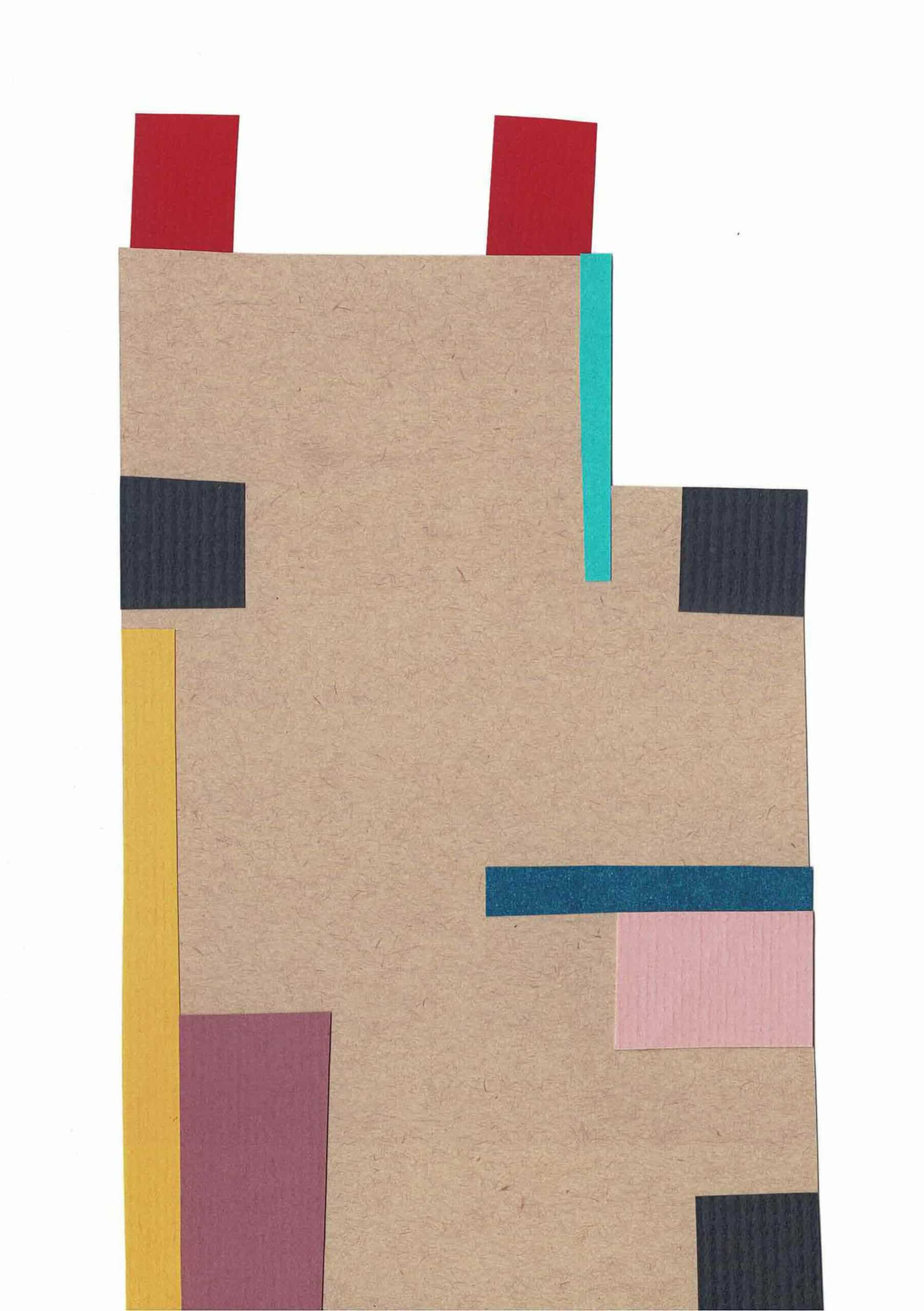
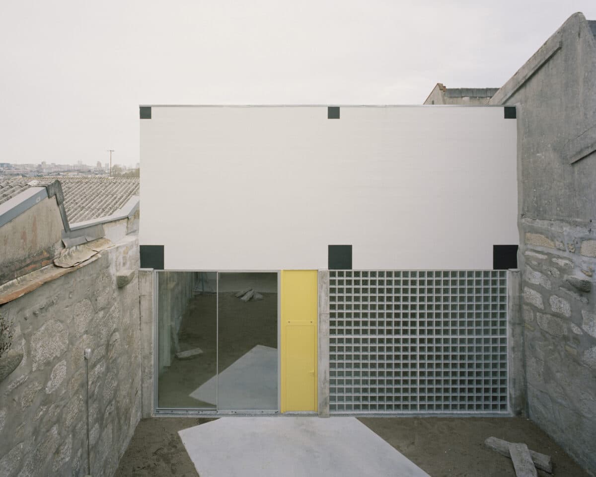
This collection is a naive study on facades. Facades that are masks, grumpy faces or small-scale billboards. It is a primitive exercise in composition, a repeat turnabout of elements. Broken walls, columns, round windows and doors are cut, assembled, discarded and reassembled again. Some are fragile and unstable, others stand confidently on their feet. It is handmade. One takes five minutes and another takes an hour. Some are purposeful, some are totally accidental. It is a continuous study that is both intuitive and intentional. Who knows? Maybe there is something valuable in these collages. Perhaps they become a form of practicing architecture that remains bi-dimensional yet open. Gradually, it constitutes a peculiar language and informs upcoming projects. The process continues to question, experiment and navigate within its own awkward universe of whimsical facades and possible buildings.
Click here to find a series of articles in which the partners at fala examine different approaches to drawing and imagery within their practice as designers.
