Concept of Proof
We talk of the invisible drawings that birth a project, but words persistently catalyse and crystallise thought, providing spur or anchor for the meandering of mind and hand in the extrication of architectures. Publication, specification, contract, critique—words. Our history and very conceptual frameworks rely on the productive and ‘dangerous inversions and hallucinations that word and image can effect on each other.’[1]
While we have delved deeply into architectural drawing dialogues, into the equipment, systems and tactics that have formed the ‘guide rails’ for imagination, their bedfellow—the text—has a marvellous process behind its otherwise invisible realisation.[2]
*
The work herein was made in a letterpress residency. Though I thought only of words and writing initially, the tools and techniques have brought about a slow slippage in the artefacts I am making from verb to image, provoking spatial thought (nothing is safe from architecture).
The weight of these archaic machines prompts a stunning recalibration from working inside a digital cloud. Touching benches and components in cast iron, steel, lead, wrenches one back: Galileo’s Sidereus Nuncius was printed this way in 1610.
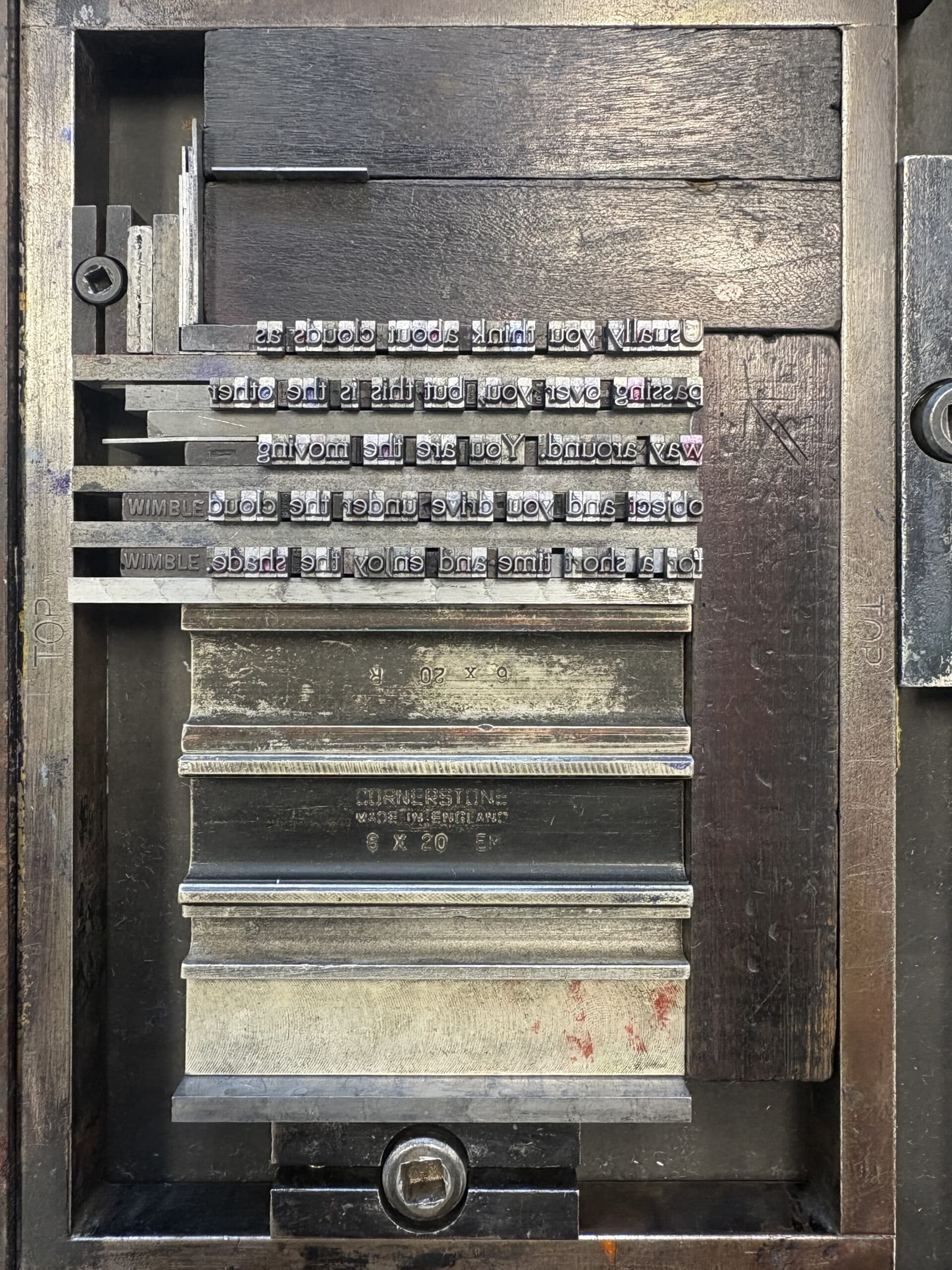
In a letterpress workshop, time slows. Nothing can be done quickly. The process that goes into a singular artefact is immense. Setting, locking, painting, pressing, unlocking, cleaning, filing—an unavoidable meditation.
In this space, textual and drawn work have become deeply enmeshed. I think of drawing as the movement of medium from one location to another. Pencil to page, of course, but sun ray to photosensitive paper: virtually any translation that leaves a substrate changed. A letterpress is no different, using pressure to move ink from one surface to another.
The title of my residency, Concept of Proof, proposed an embrace of total experiment in which all makings are final, and none are final. The usually unseen must, in the eventual exhibition, be exposed. Through undisciplined use, the presses have become a little like drawing machines…
Road Thoughts
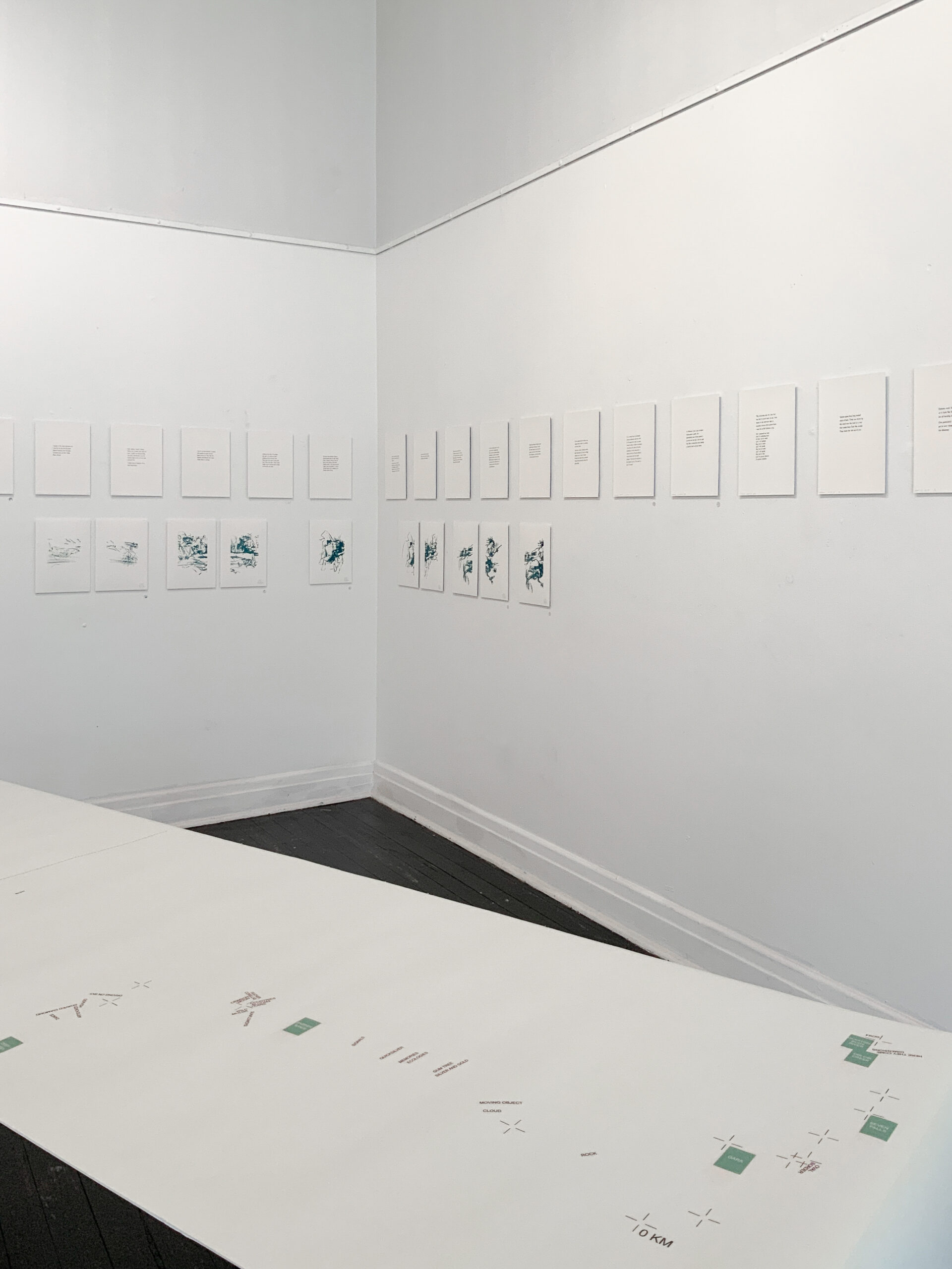
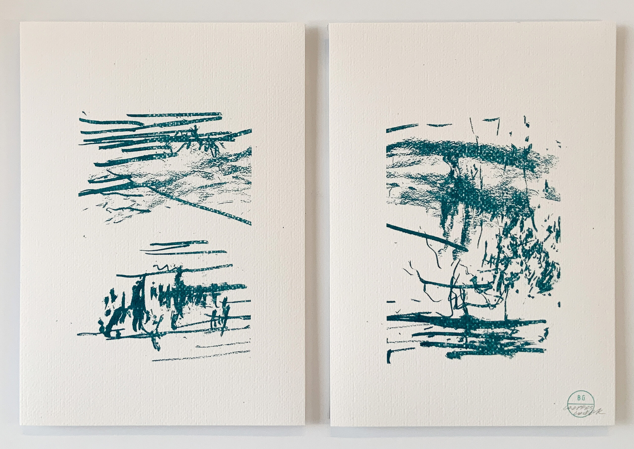
In 2021 I was an involuntary expatriate of my home state. In a bid to corral the coronavirus, Western Australia’s border was closed. Unmoored, I spent 48 days and 7000 kilometres living out of my car. A small odyssey—frightening, wondrous, liberating—I dictated observational thoughts into my phone throughout. Pressing these is the first project. I also made charcoal drawings when I camped, usually near water, and these sought to capture two attentional fields: the visual and the aural. The paired nature of the sound drawings reflects the binaural nature of hearing. These drawings have been reproduced using a risograph printer.
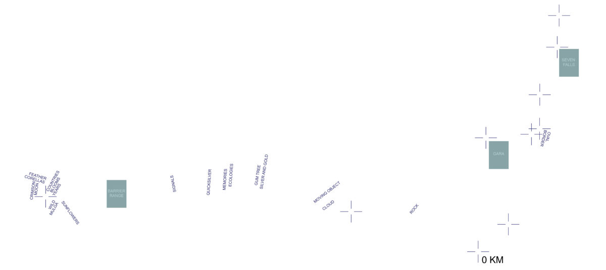
Digital map of path from Newcastle NSW (0km) to Perth (7130km). Titles correspond with the location and orientation of each Road Thought. Teal rectangles locate risograph reproductions of charcoal drawings. Crosshairs indicate where I slept. 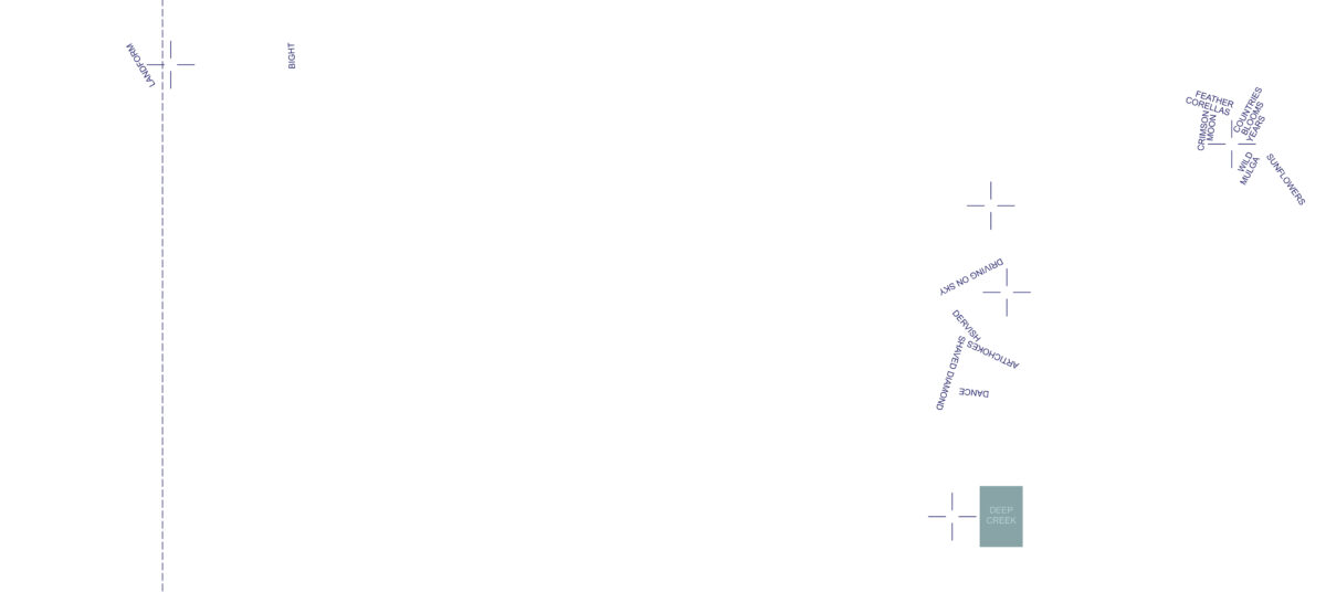
Digital map of path from Newcastle NSW (0km) to Perth (7130km). Titles correspond with the location and orientation of each Road Thought. Teal rectangles locate risograph reproductions of charcoal drawings. Crosshairs indicate where I slept. 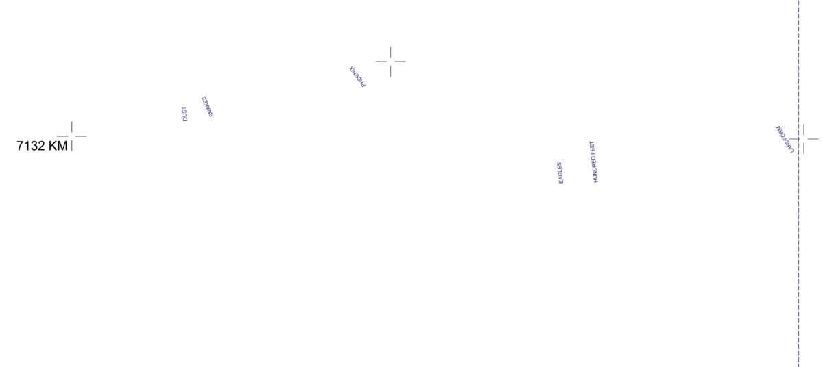
Digital map of path from Newcastle NSW (0km) to Perth (7130km). Titles correspond with the location and orientation of each Road Thought. Teal rectangles locate risograph reproductions of charcoal drawings. Crosshairs indicate where I slept.
The body texts are in deep indigo ink. Recalling Edward Tufte’s observation of how Galileo’s star figures caused braille-like intrusions on text pages, I worked with pressure alone to deboss cardinal points around each, relating to the direction I was facing in writing them.[3] The W is often missing. Withheld, it does not enter the frame until I am allowed through the border.
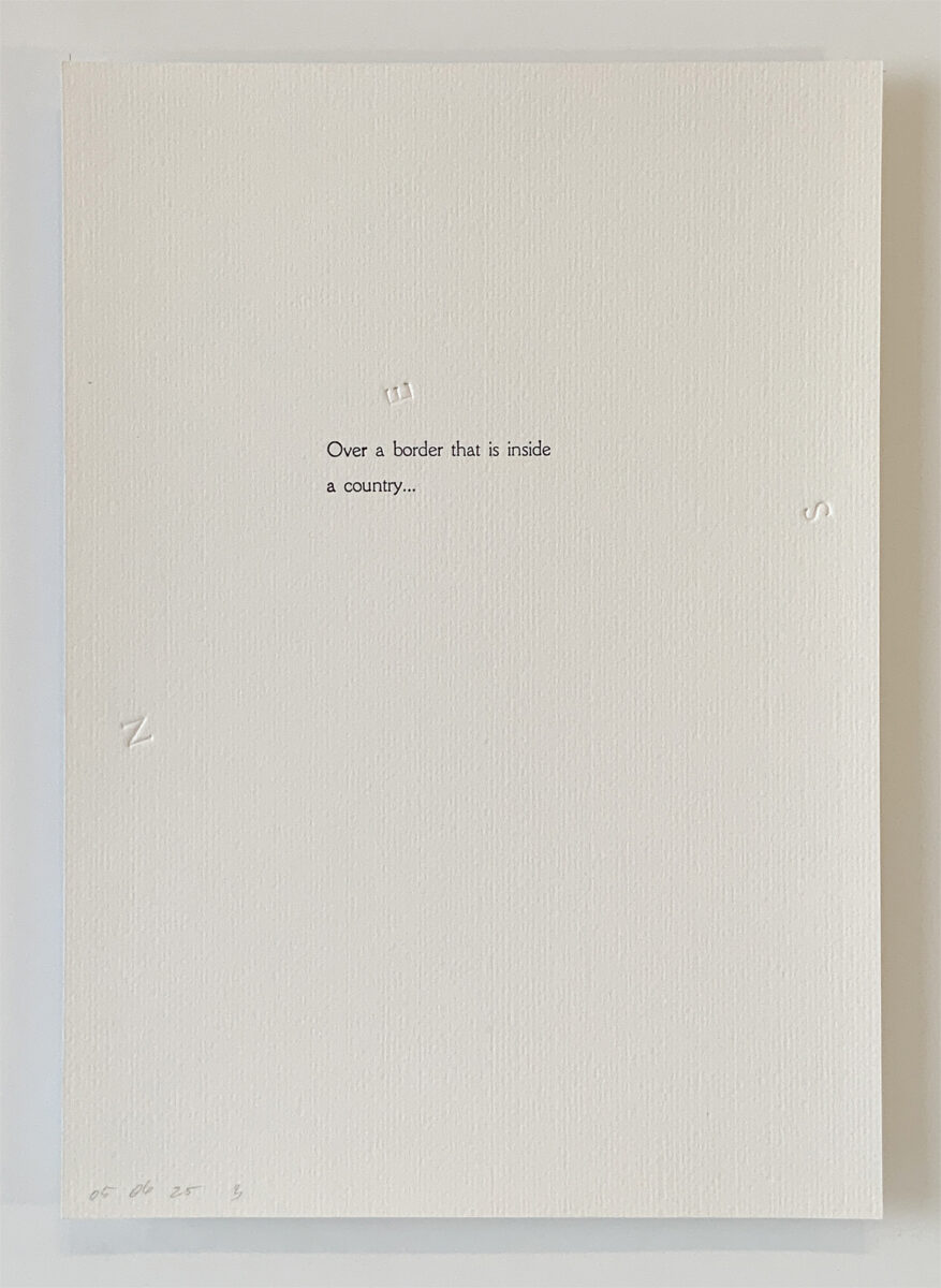
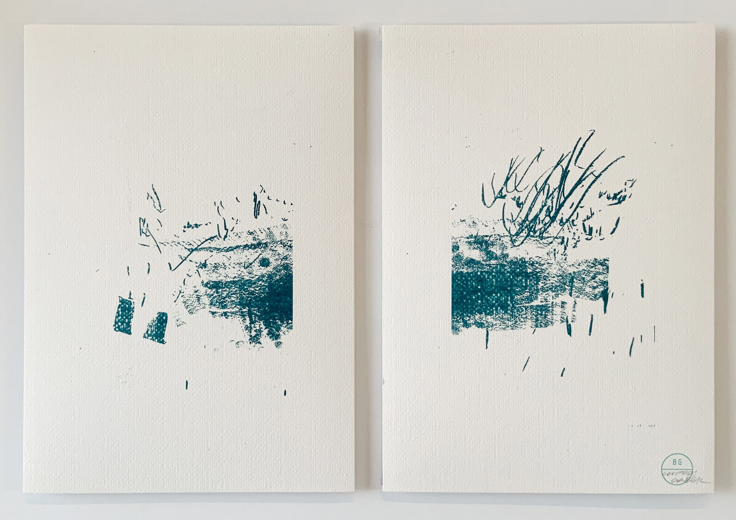
Road thoughts, Indigo ink and debossing on 320gsm Freelife Felt paper, 210 × 297 mm. 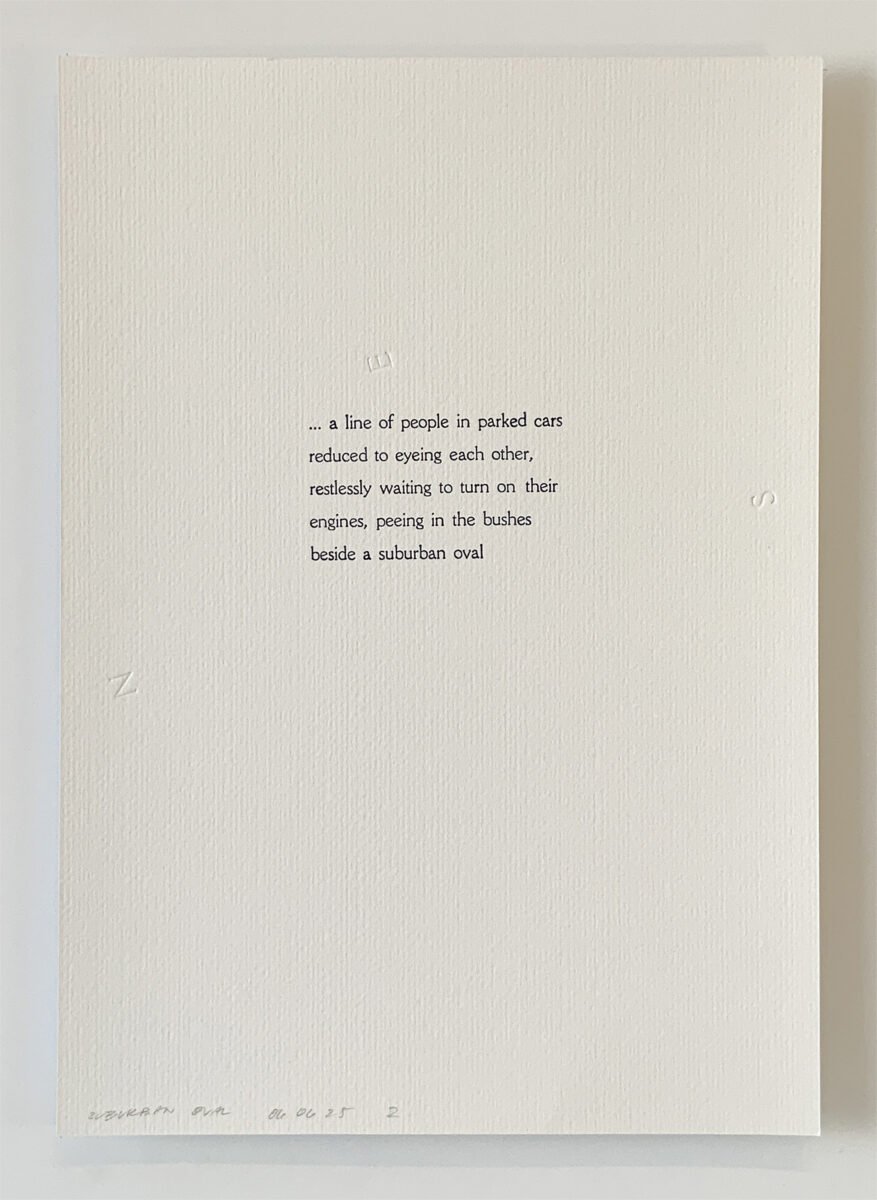
Road thoughts, Indigo ink and debossing on 320gsm Freelife Felt paper, 210 × 297 mm. 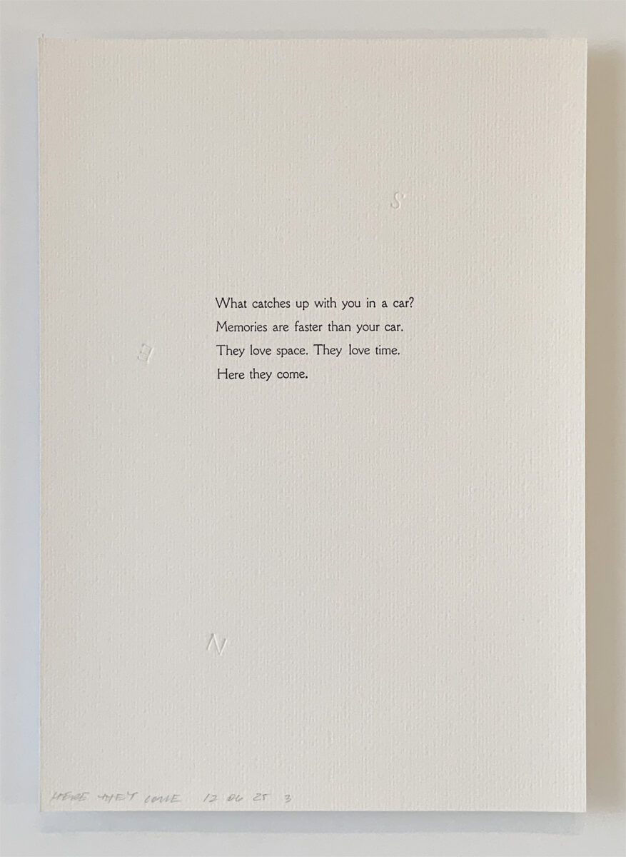
Road thoughts, Indigo ink and debossing on 320gsm Freelife Felt paper, 210 × 297 mm. 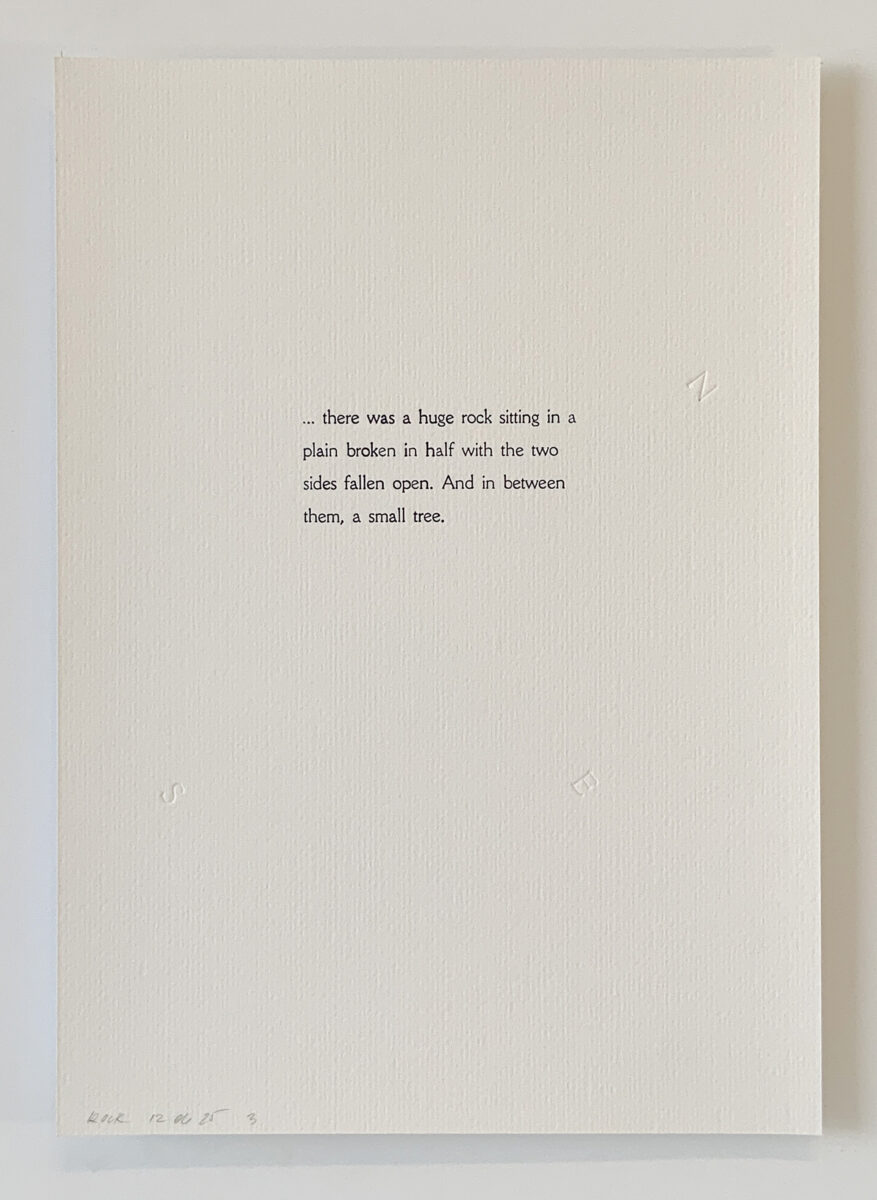
Road thoughts, Indigo ink and debossing on 320gsm Freelife Felt paper, 210 × 297 mm. 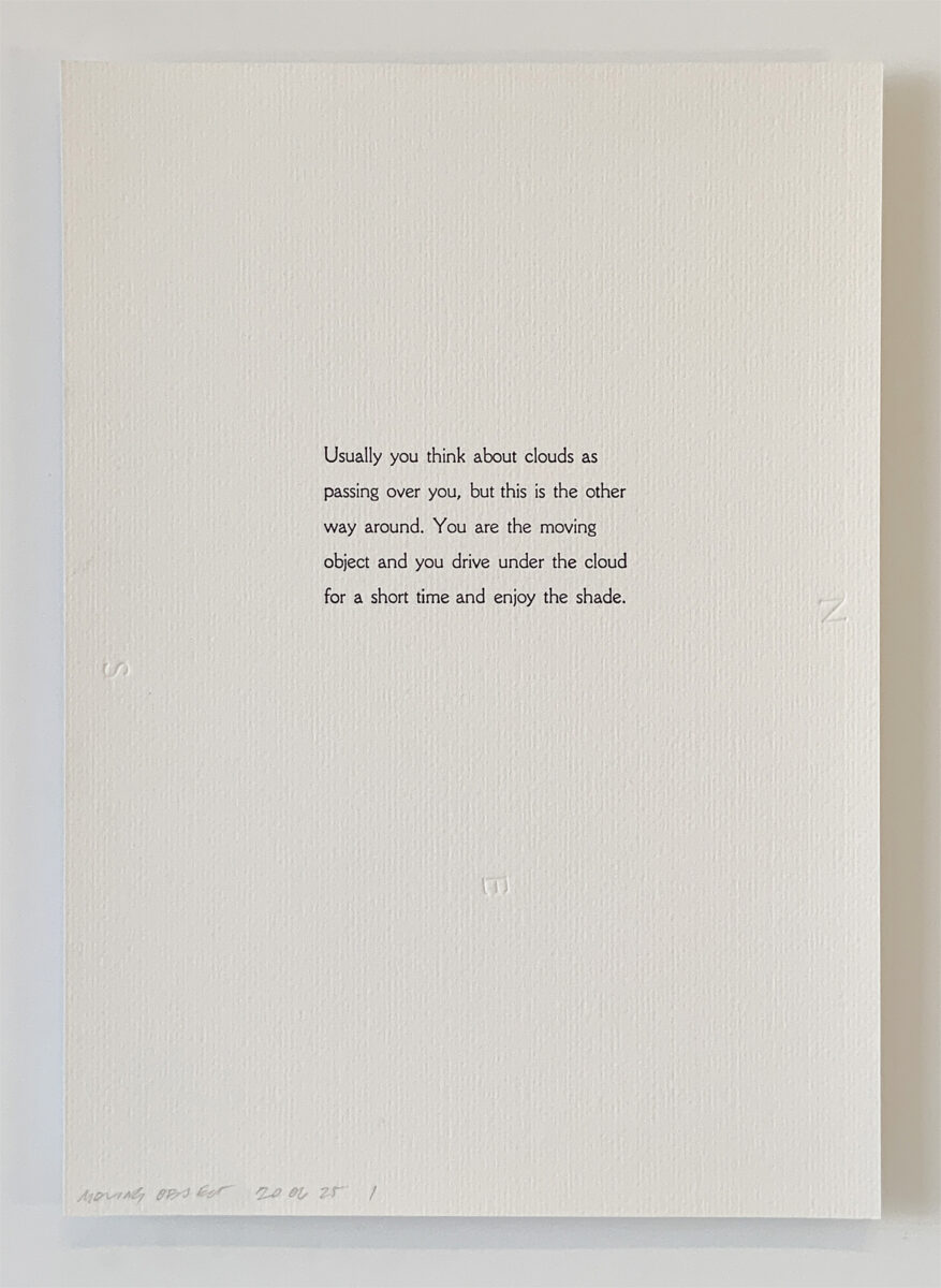
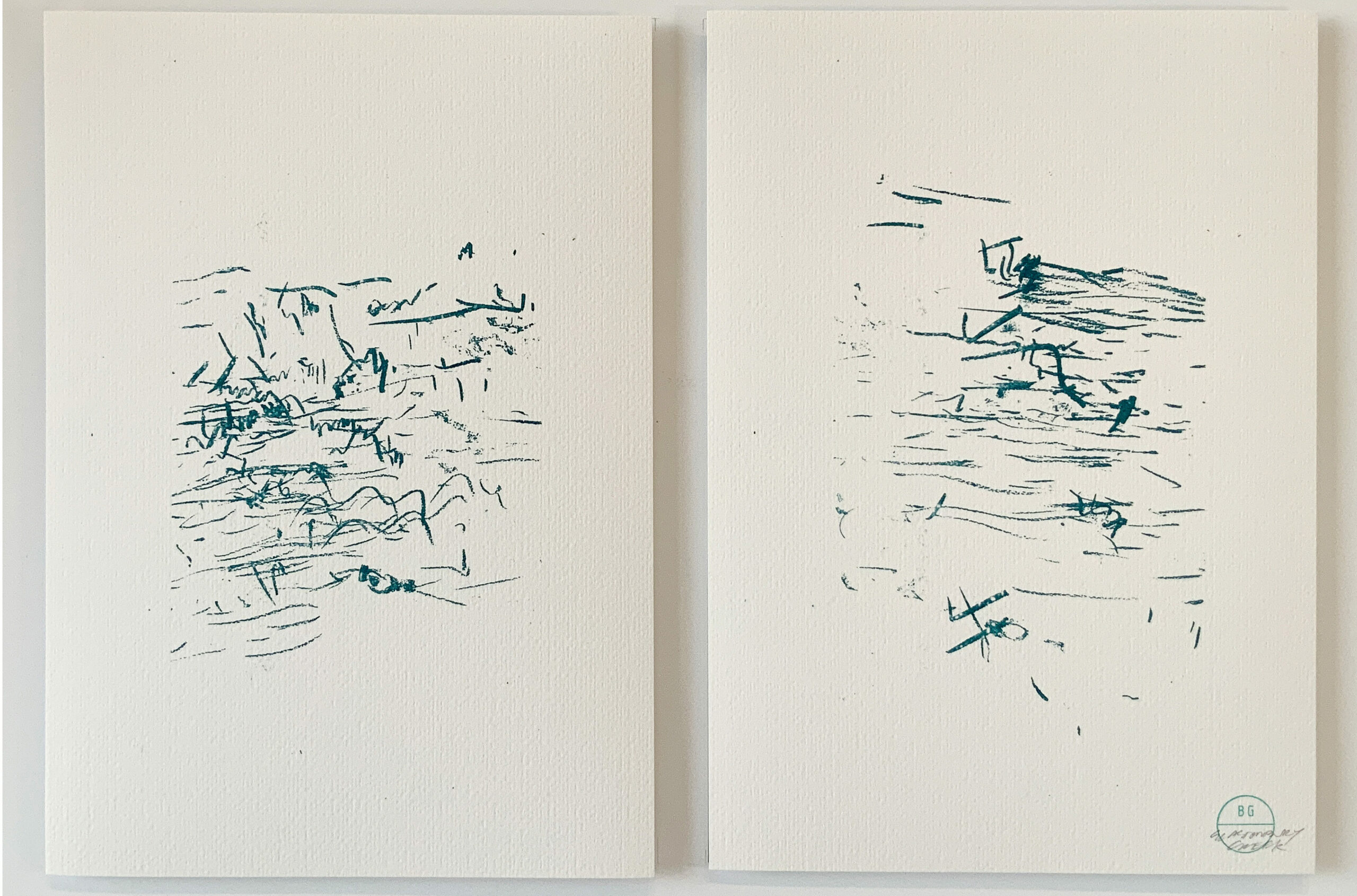
Road thoughts, Indigo ink and debossing on 320gsm Freelife Felt paper, 210 × 297 mm. 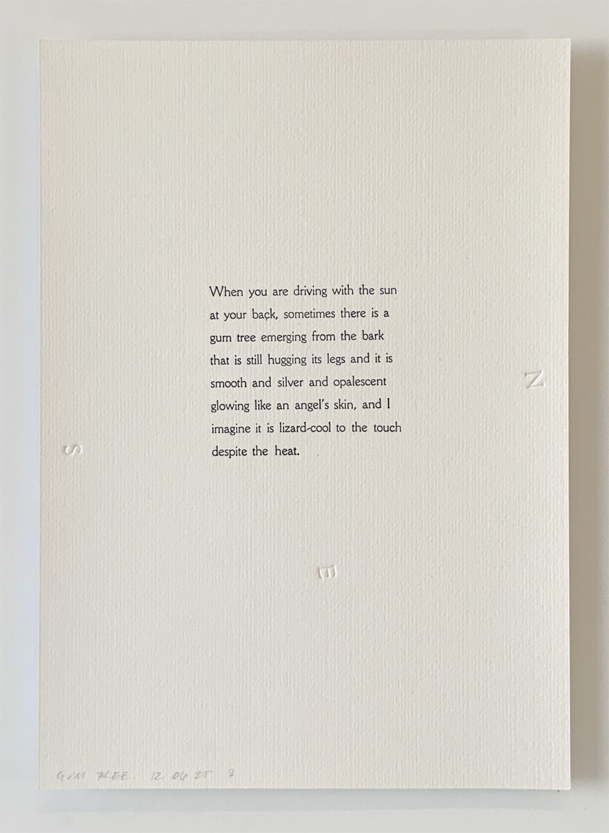
Road thoughts, Indigo ink and debossing on 320gsm Freelife Felt paper, 210 × 297 mm. 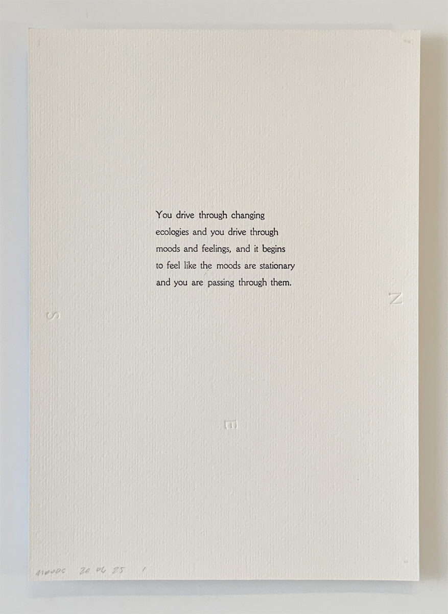
Road thoughts, Indigo ink and debossing on 320gsm Freelife Felt paper, 210 × 297 mm. 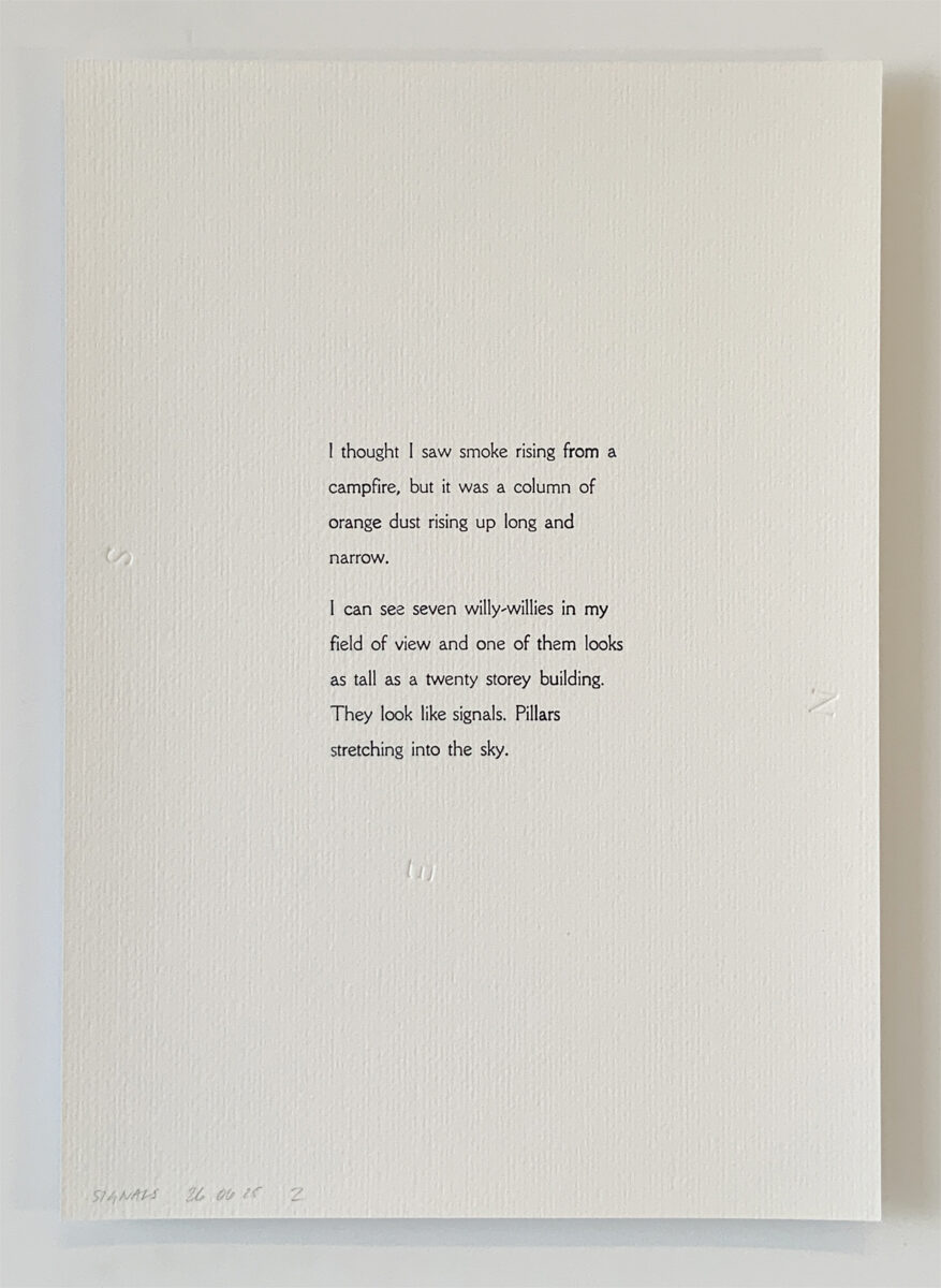
Road thoughts, Indigo ink and debossing on 320gsm Freelife Felt paper, 210 × 297 mm. 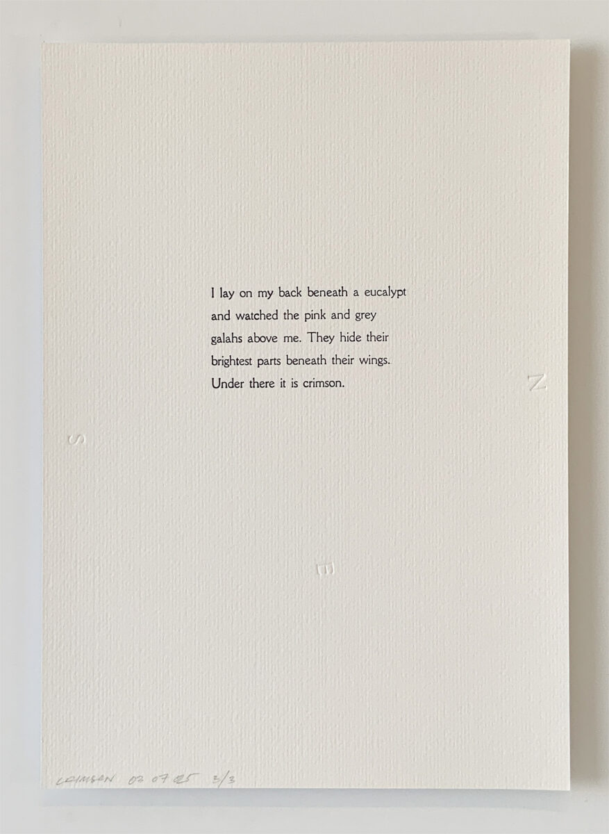
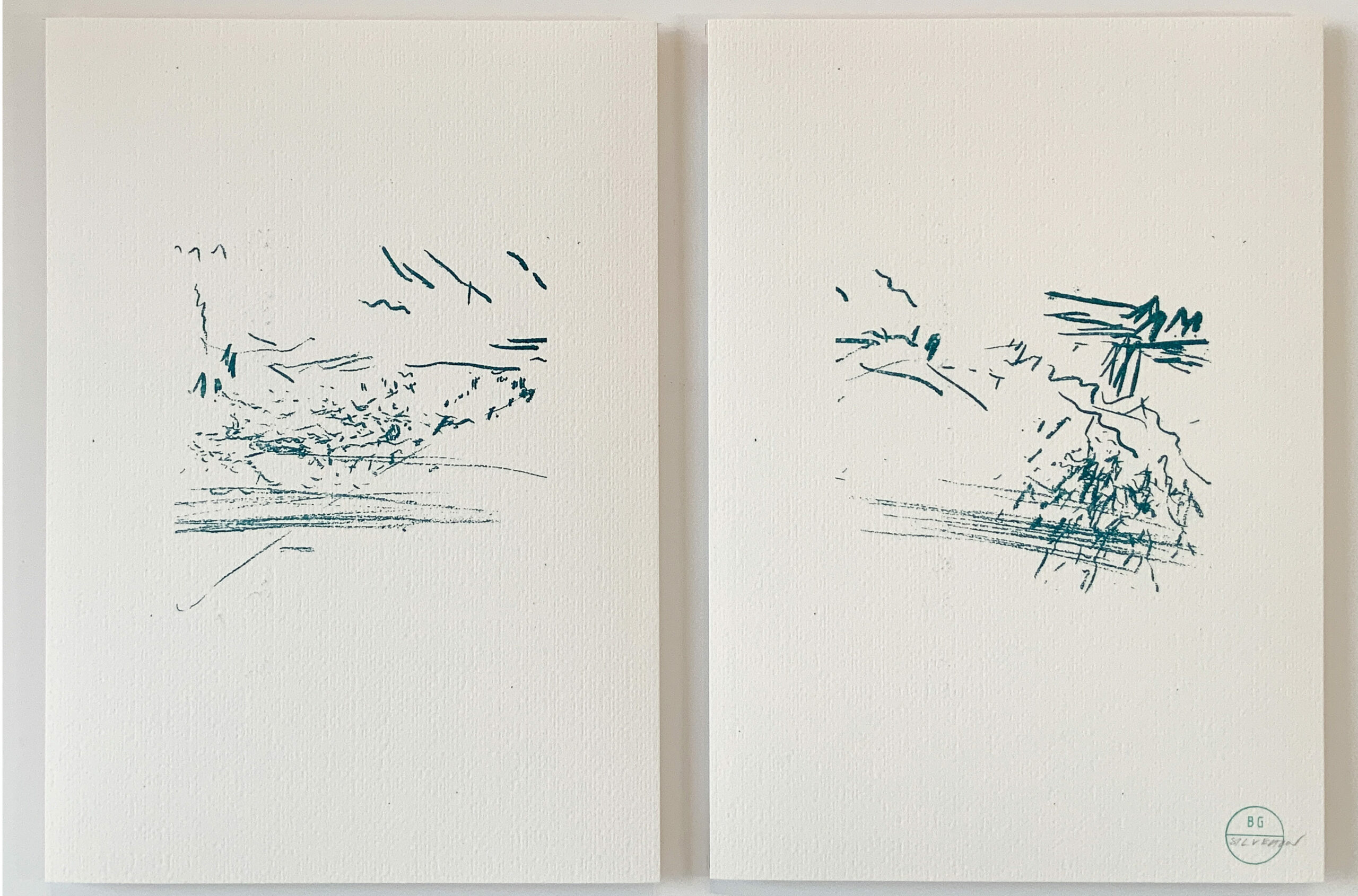
Road thoughts, Indigo ink and debossing on 320gsm Freelife Felt paper, 210 × 297 mm. 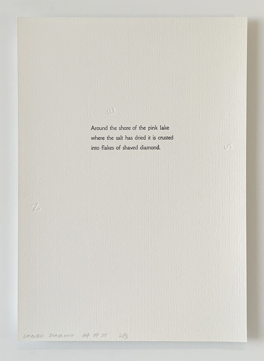
Road thoughts, Indigo ink and debossing on 320gsm Freelife Felt paper, 210 × 297 mm. 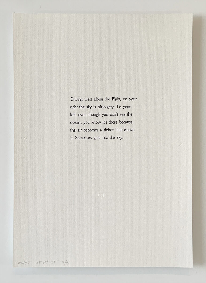
Road thoughts, Indigo ink and debossing on 320gsm Freelife Felt paper, 210 × 297 mm. 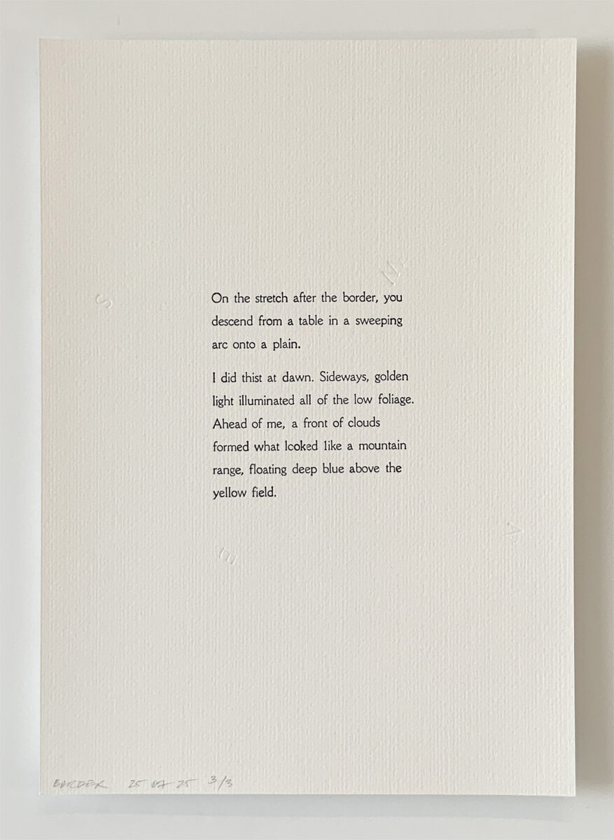
Road thoughts, Indigo ink and debossing on 320gsm Freelife Felt paper, 210 × 297 mm. 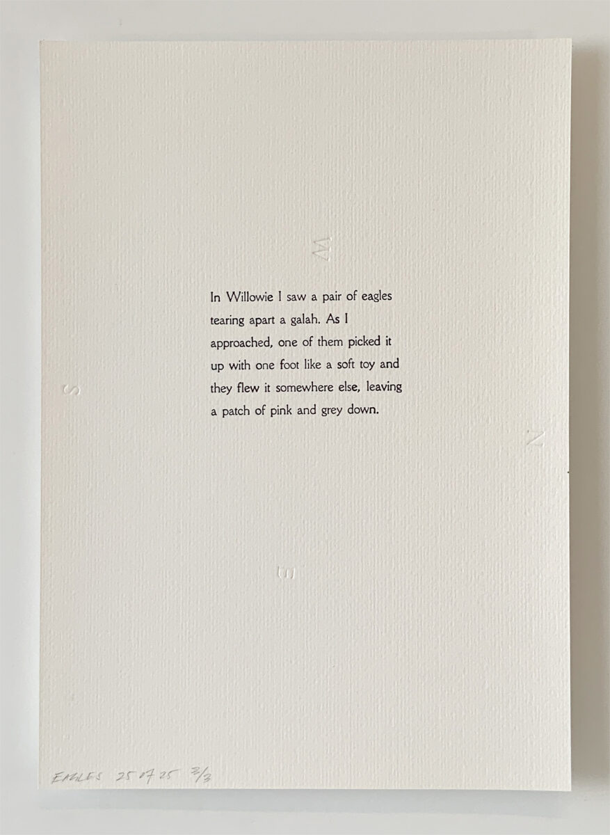
Road thoughts, Indigo ink and debossing on 320gsm Freelife Felt paper, 210 × 297 mm. 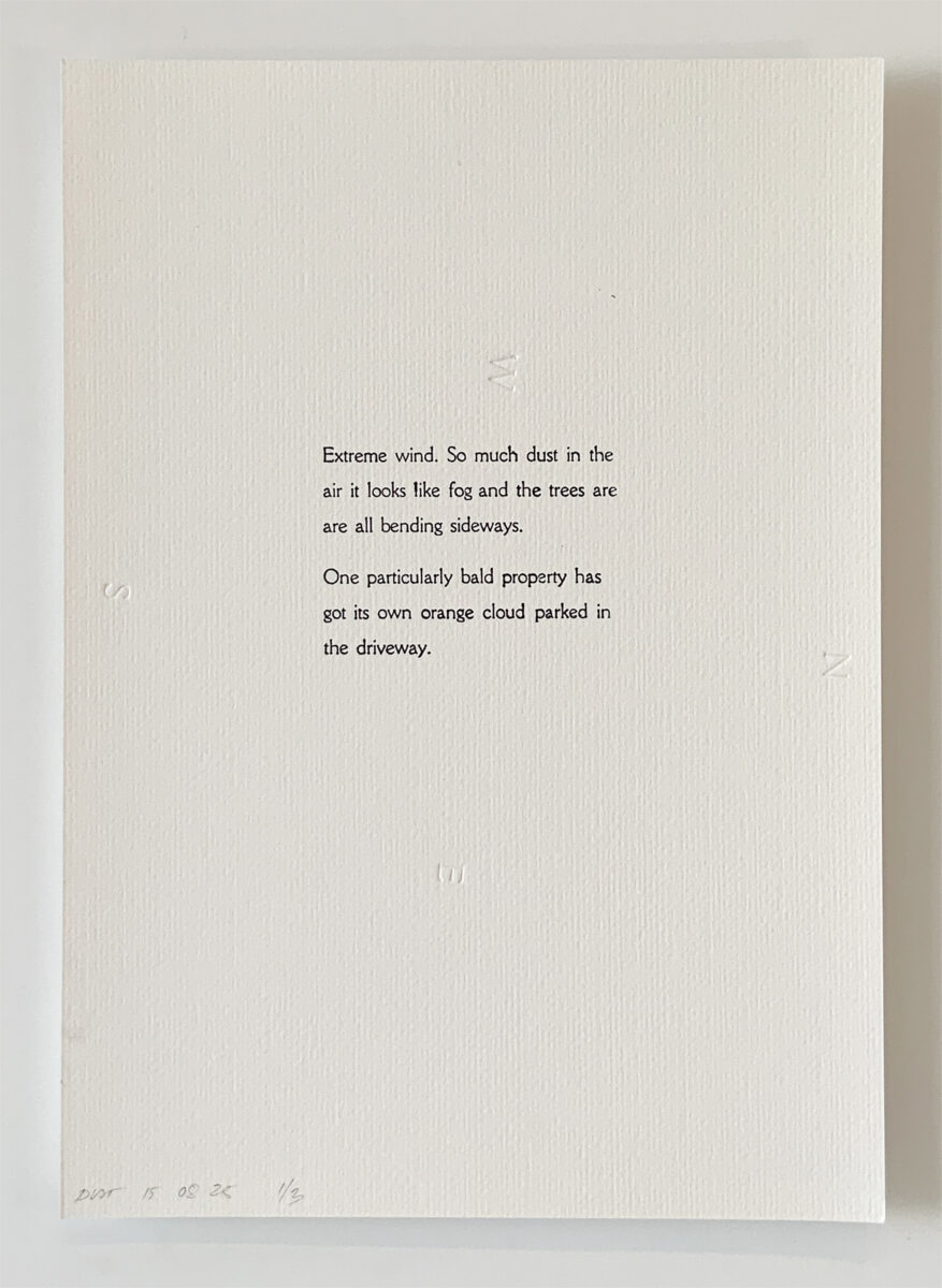
Road thoughts, Indigo ink and debossing on 320gsm Freelife Felt paper, 210 × 297 mm.
My road thoughts were sometimes garbled voice-to-text I later had to interpret. Locations were not noted. Now, years later, I have found I can take myself to each moment in time and space precisely and orient myself. The sun in the memory tells me, or a geographical feature. I can only relate this memorability to the binding up feeling, place, and the act of recording—a powerful confluence.
In this way, the road thoughts are spatialised. They are cartographies, only textual. A path is made visible. Fleeting thoughts are pinned down.
Curation of the artefacts can work in two ways—with text upright and the cardinal wheeling, or with north upwards, pages spinning, the text’s orientation describing my trajectory.
In a frisson with Tony Fretton’s intoxicating title, Everything I Saw Became Important, I feel that a car is a kind of flying camera—the windscreen a lens through which you attend, sometimes fiercely, to the world around you. Landscape and memories have a strange way of overlapping, one or the other intermittently snapping into significance. It is remarkable how, even in the oblique mental and visual state of a long drive and through such a limited frame, things swim toward you and become wildly potent.
Similarly, boundaries delimit but do not restrict a field of experiment in the letterpress. All must occur within the leaden dimensions of a chase.[4]
Weird Words
From the mental mire of the workshop emerged an intense noticing of words, ones that pricked my conscience or caught my eyes. I kept a list in my phone of phrases that were made obscure by repetition, that roll around in the mind, or have multiple meanings.
How could I use the equipment to strangemake the words? To bring out their meaning, or the feeling of saying them? It may be unsurprising that one of the phrases I worked with was about drawing. I have long been preoccupied with the meaning of the word drawing—its simultaneous pushing and pulling, its suitability for memory and also tangible material, whether ochre or blood.
Dispensing with ink, I began making work in pairs, one debossed into a region of soluble graphite as if foil paper, and a counterpart moving its residue to a new page.
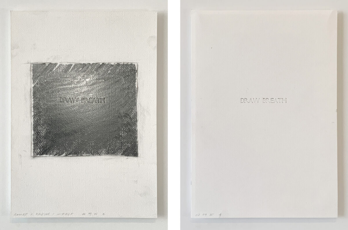
Weird Words, Mixed media (ink, debossing, graphite, charcoal, pastel, aluminium foil) on 320gsm Freelife Felt paper, 210 × 297 mm. 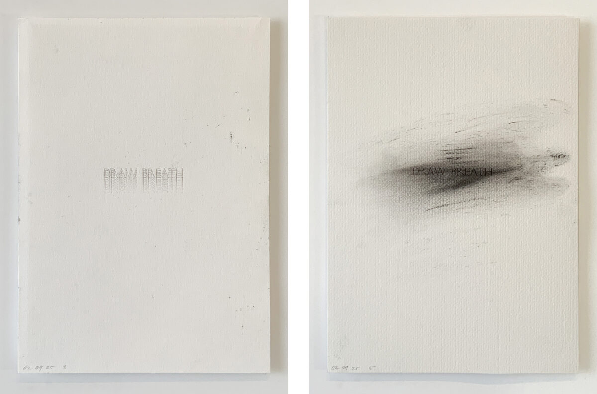
Weird Words, Mixed media (ink, debossing, graphite, charcoal, pastel, aluminium foil) on 320gsm Freelife Felt paper, 210 × 297 mm. 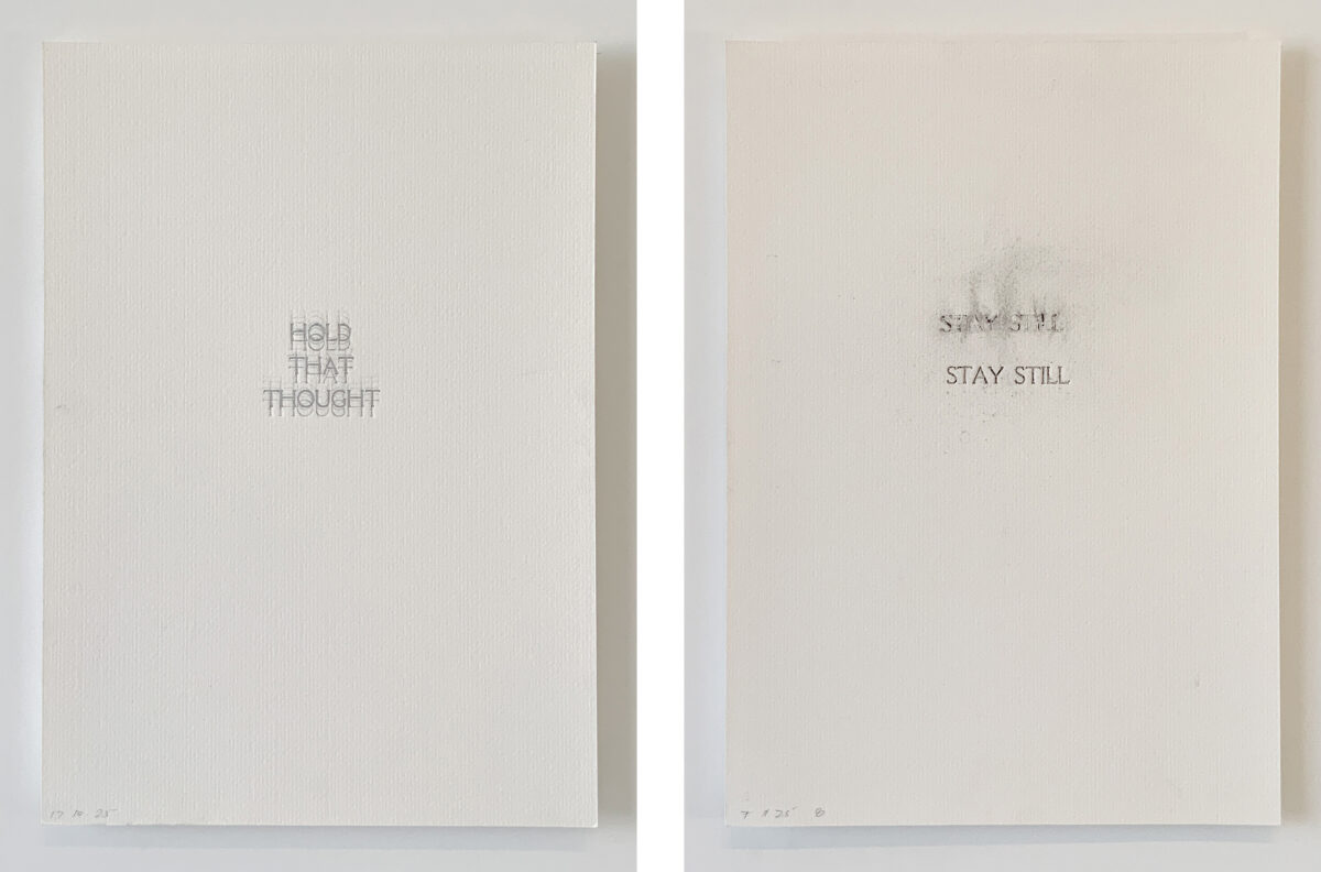
Weird Words, Mixed media (ink, debossing, graphite, charcoal, pastel, aluminium foil) on 320gsm Freelife Felt paper, 210 × 297 mm. 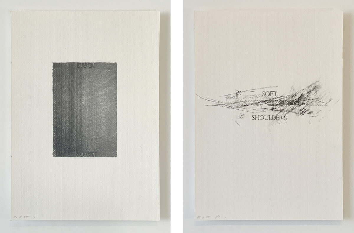
Weird Words, Mixed media (ink, debossing, graphite, charcoal, pastel, aluminium foil) on 320gsm Freelife Felt paper, 210 × 297 mm. 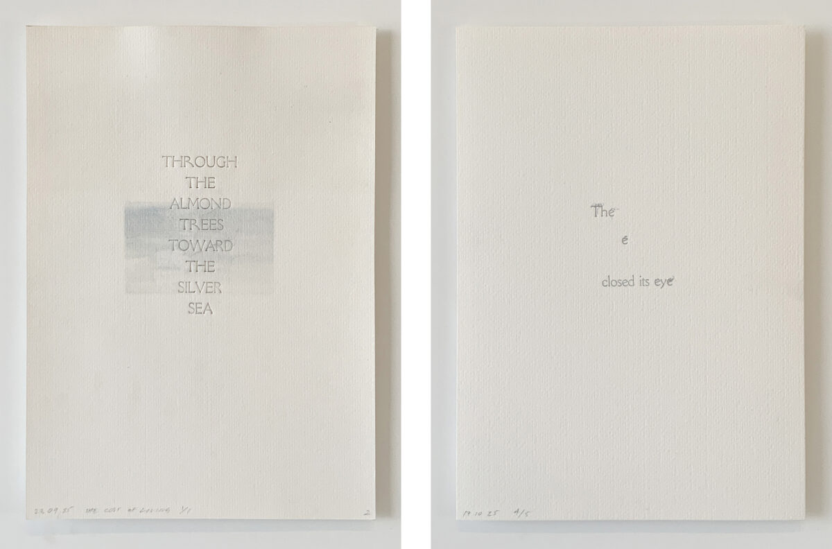
Weird Words, Mixed media (ink, debossing, graphite, charcoal, pastel, aluminium foil) on 320gsm Freelife Felt paper, 210 × 297 mm. 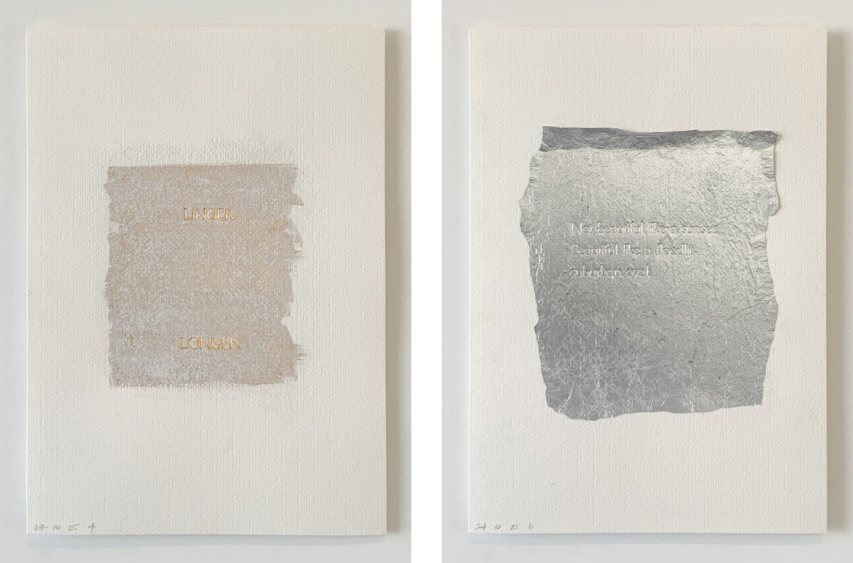
Weird Words, Mixed media (ink, debossing, graphite, charcoal, pastel, aluminium foil) on 320gsm Freelife Felt paper, 210 × 297 mm. 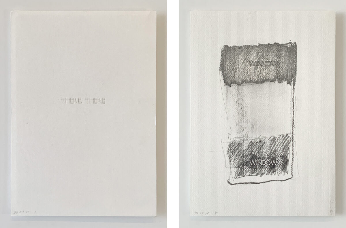
Weird Words, Mixed media (ink, debossing, graphite, charcoal, pastel, aluminium foil) on 320gsm Freelife Felt paper, 210 × 297 mm.
The thought occurred to keep pressing, and to make the work dynamic by slipping the paper slightly until the graphite dissipates. And so, the work fades, holding the rhythmic reiteration of lungs filling and letting go.
Then came the urge to draw with the words… graphite moved to charcoal, and sweeping and dusting it brought bodily expression into the word-feelings. Thinkfeel—yes—this is what is happening.[5]
*
A set of frames—windscreen, phone, chase—are the condensers that herein squeeze meaning out of place and onto the page. Drawing on, drawing with, drawing first or after—pressings of media by hand or by machine are now enmeshed. Residue that is usually cleaned away becomes the next work, or an otherwise sacrificial backing sheet becomes a new piece.
From a decisive intention to an experimental drift, the title of the work has been unpredictably inflected: the conventional naming systems of printmaking (proof, 1/5, 3/5) have become meaningless. Every work is 1/1.
The author is indebted to the Perth Letterpress Workshop’s Artist in Residence programme, particularly to Brendan Hibbert and Kate Nightingale at NMTafe. Special thanks to Brett Mitchell.
Notes
- So Mayer, Introduction to Derek Jarman, A Finger in the Fishes Mouth (London: House Sparrow Press, 2024).
- Robin Evans, ‘Translations from Drawing to Building’ AA Files, No. 12 (Summer 1986), 11.
- Edward Tufte, Beautiful Evidence (Graphics Press LLC, 2006).
- The metal frame utilised in typesetting.
- Timothy Morton, All Art is Ecological (London: Penguin, 2021).
*
Beth George is an educator and practitioner in architecture, with a research focus on urbanism, design and drawing. Beth is a Senior Lecturer and the Master of Architecture Postgraduate Coordinator at the University of Western Australia’s School of Design.
This text is one of the selected responses to the second category of the Open Call 2025: Visibility, and the Unseen—a series of short contributions that either bring to the surface the unseen drawings within the Drawing Matter Collection (I. In the Archive) or explore original architectural drawings, created by the author(s) of the contribution, which make visible the unseen (II. In Practice).
