Craving Primal Architecture
‘Architecture does not only respond to the functional and conscious intellectual and social needs of today’s city dweller; it must also remember the primordial hunter and farmer concealed in the body. Our sensations of comfort, protection and home are rooted in the primordial experiences of countless generations.’ [1]
– Juhani Pallasmaa
What else is there to say? Pallasmaa’s perspective expresses beautifully the idea that however much we paddle in the shallows of our daily practical concerns, our wellbeing seems to be rooted in the depths of our primal selves.
The term ‘primal’ could be translated as ‘an ancient shelter’, or as ‘a sensory experience’. Although seemingly unrelated, within architecture these two translations are closely connected and can occupy the same space; just imagine the simple image of being fireside in a woodland cabin – for many people, a single experience that sings to both our inherited feeling of shelter and our bodily senses.
The developing study of inherited epigenetics goes further and holds out the tantalising suggestion of how these two interpretations of ‘primal’ might be interwoven as one and the same concept. There is evidence to show that a fiercely sensory moment experienced by your ancestor (or, amazingly, even a parent) could alter their genetic markers and be inherited by you, thus driving you to seek out the same sensory experience – or avoid it, depending on whether it was positive or negative. [2] However accurate this theory is proved to be (there are many who already discard it as too-romantic-to-be-true), it feels reasonable to imagine that countless generations of your ancestors finding shelter by the campfire could lead you to seek out a fireplace today, or – as this drawing hopes is true – generations of ancestors resting in a clearing in the woods could lead us to find peace in a courtyard. Regardless, after the last 18 months of on and off isolation that we’ve all just experienced, promoting the natural instinct to dwell together in a common clearing seems more relevant than ever.
Whatever the reason, wellbeing can often be seen to increase when we feed our primal roots and can be seen to decrease when we starve those roots.
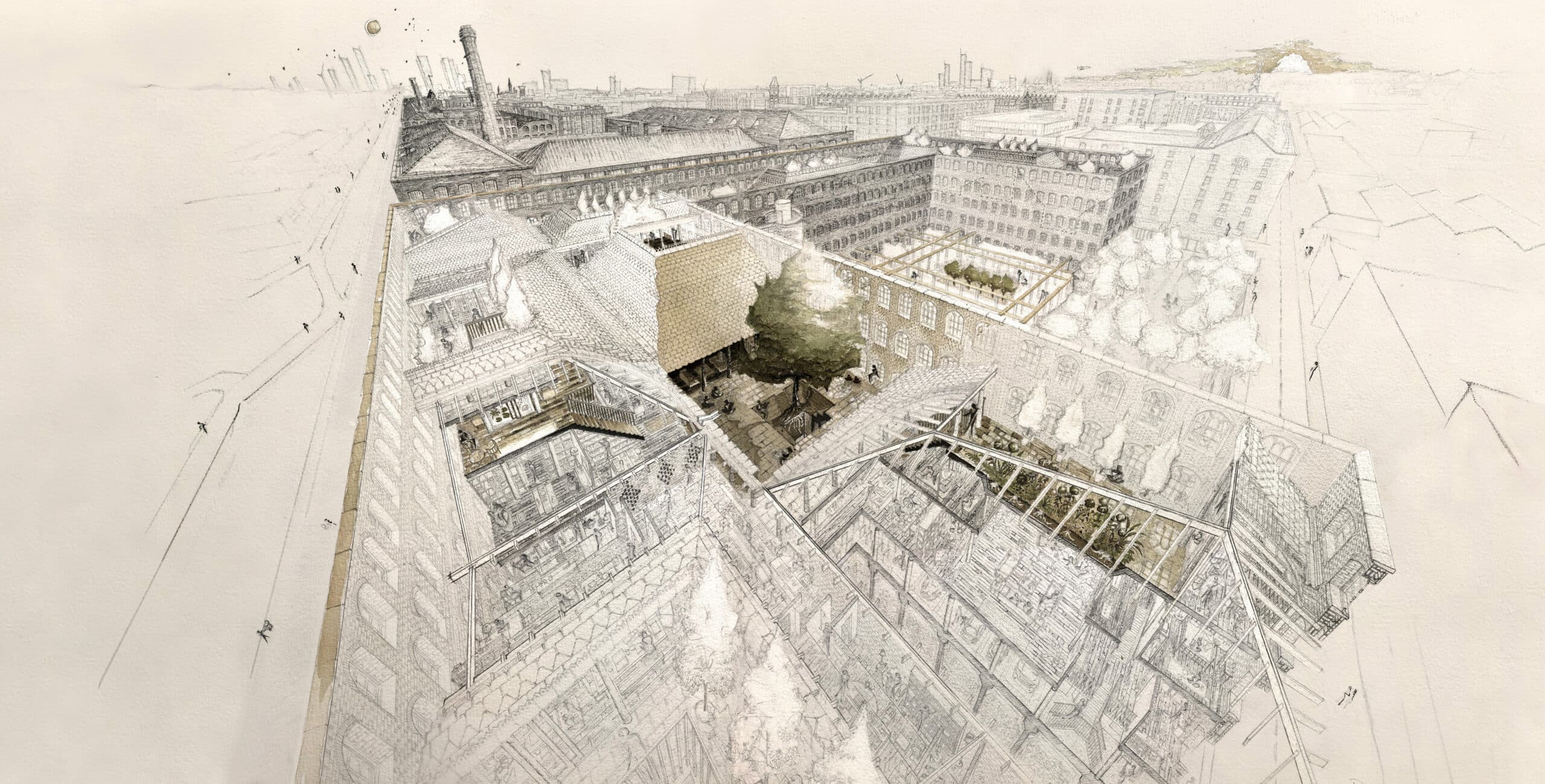
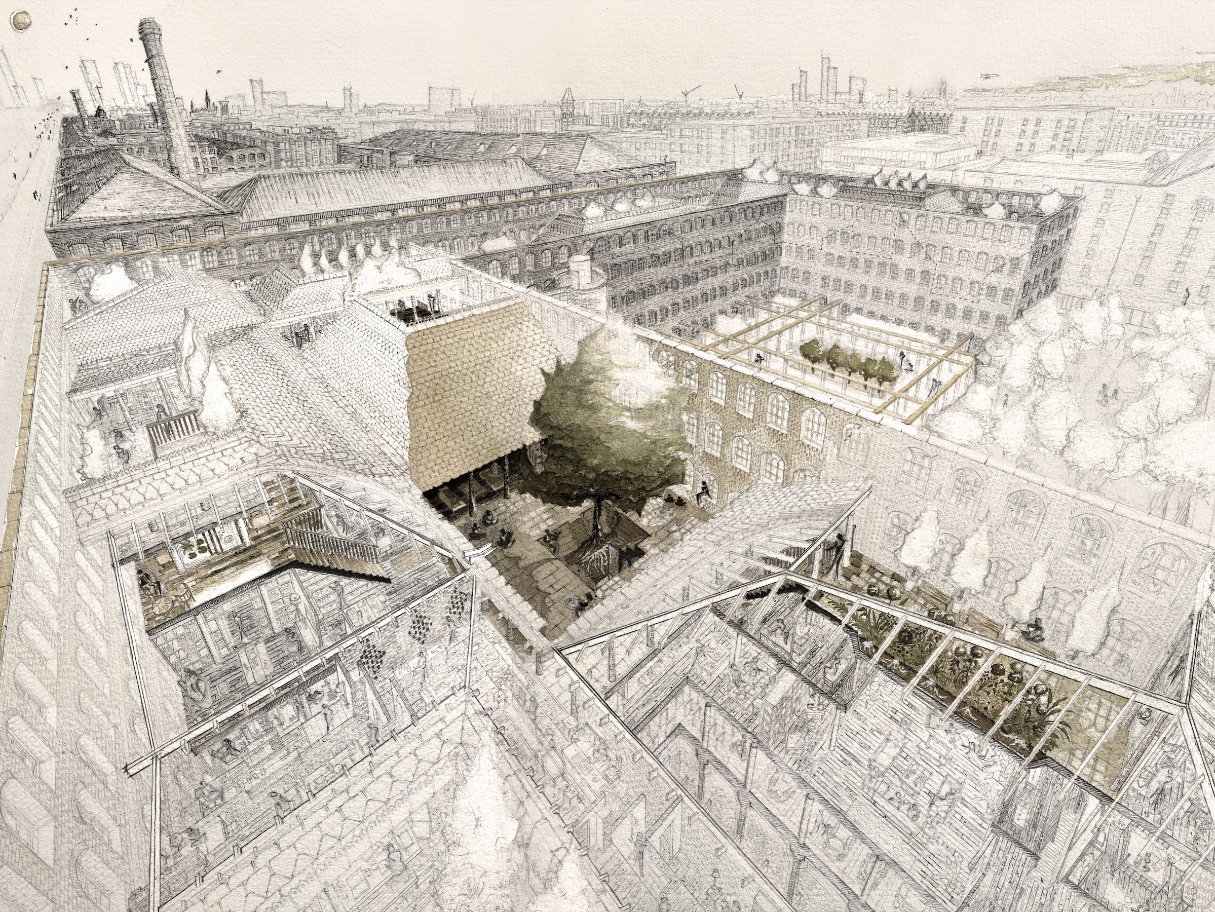
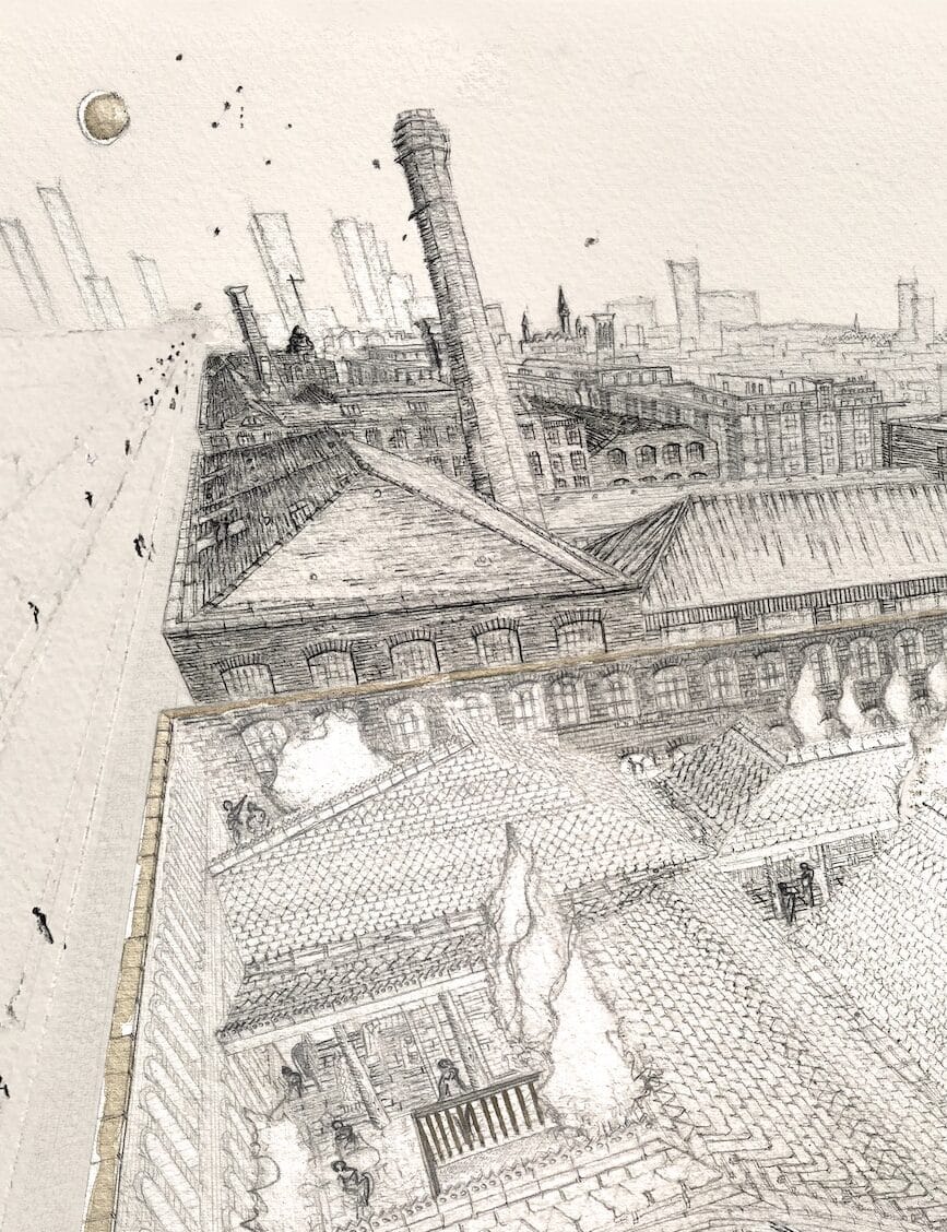
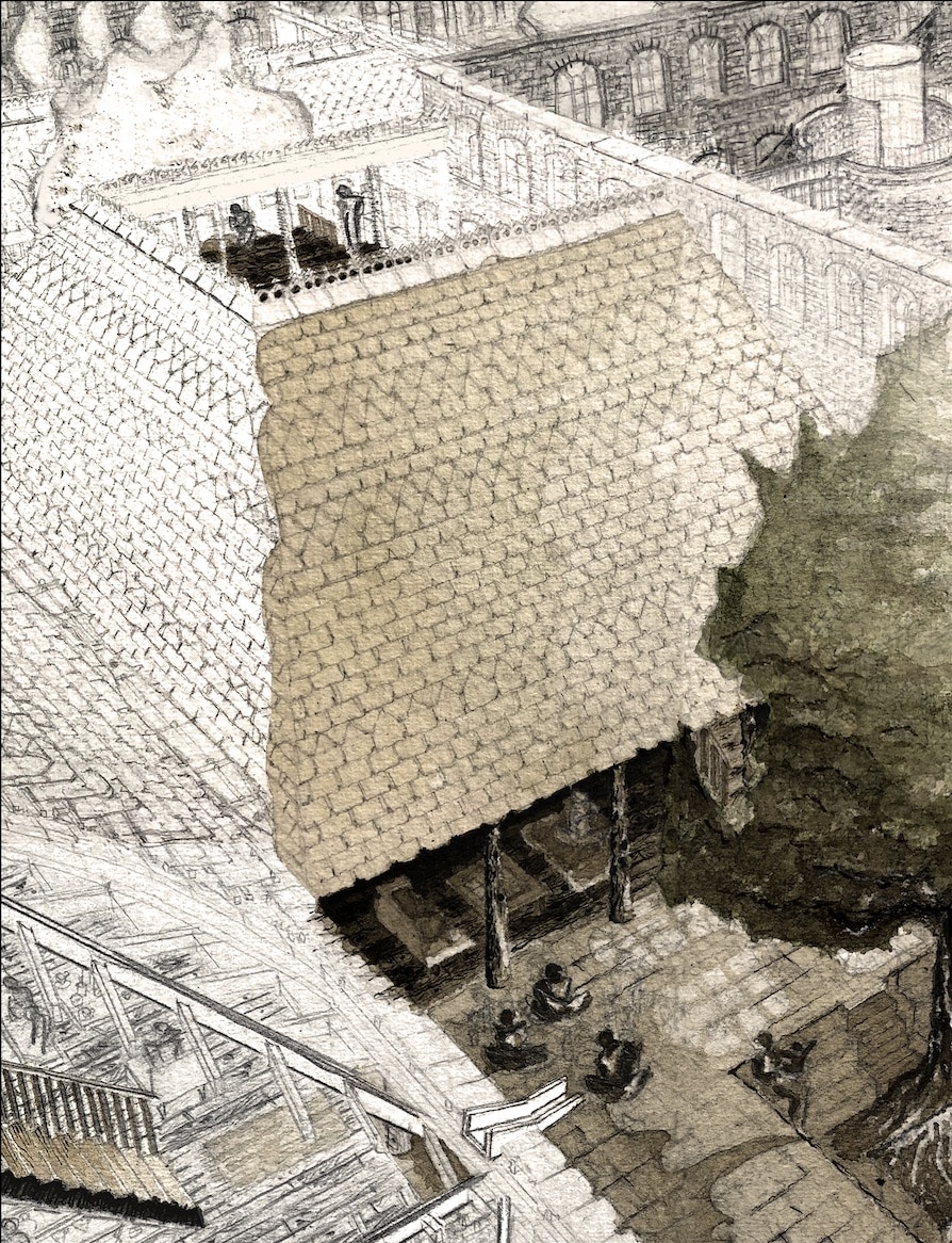
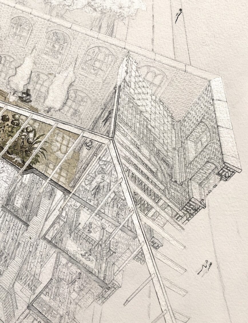
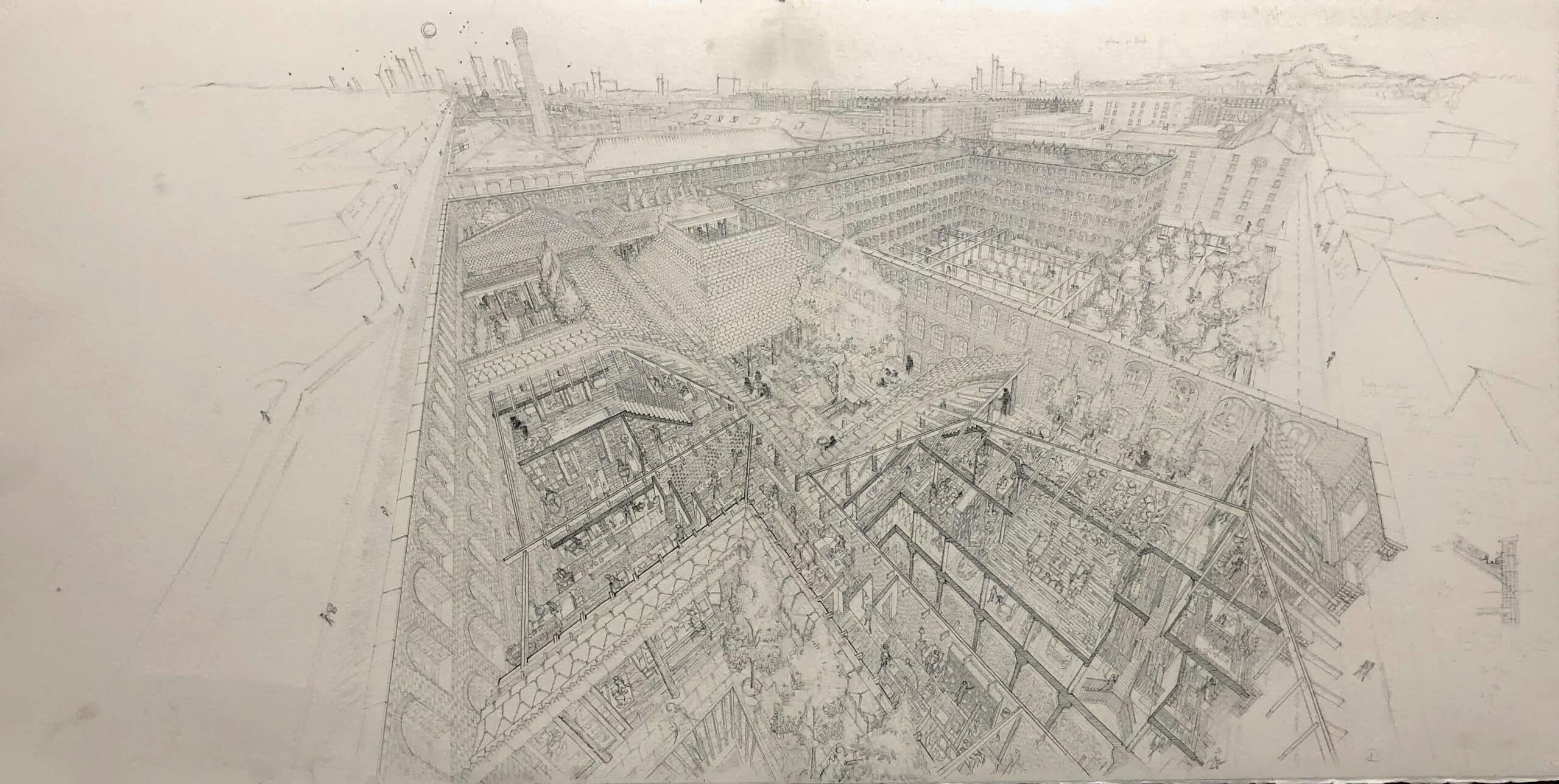
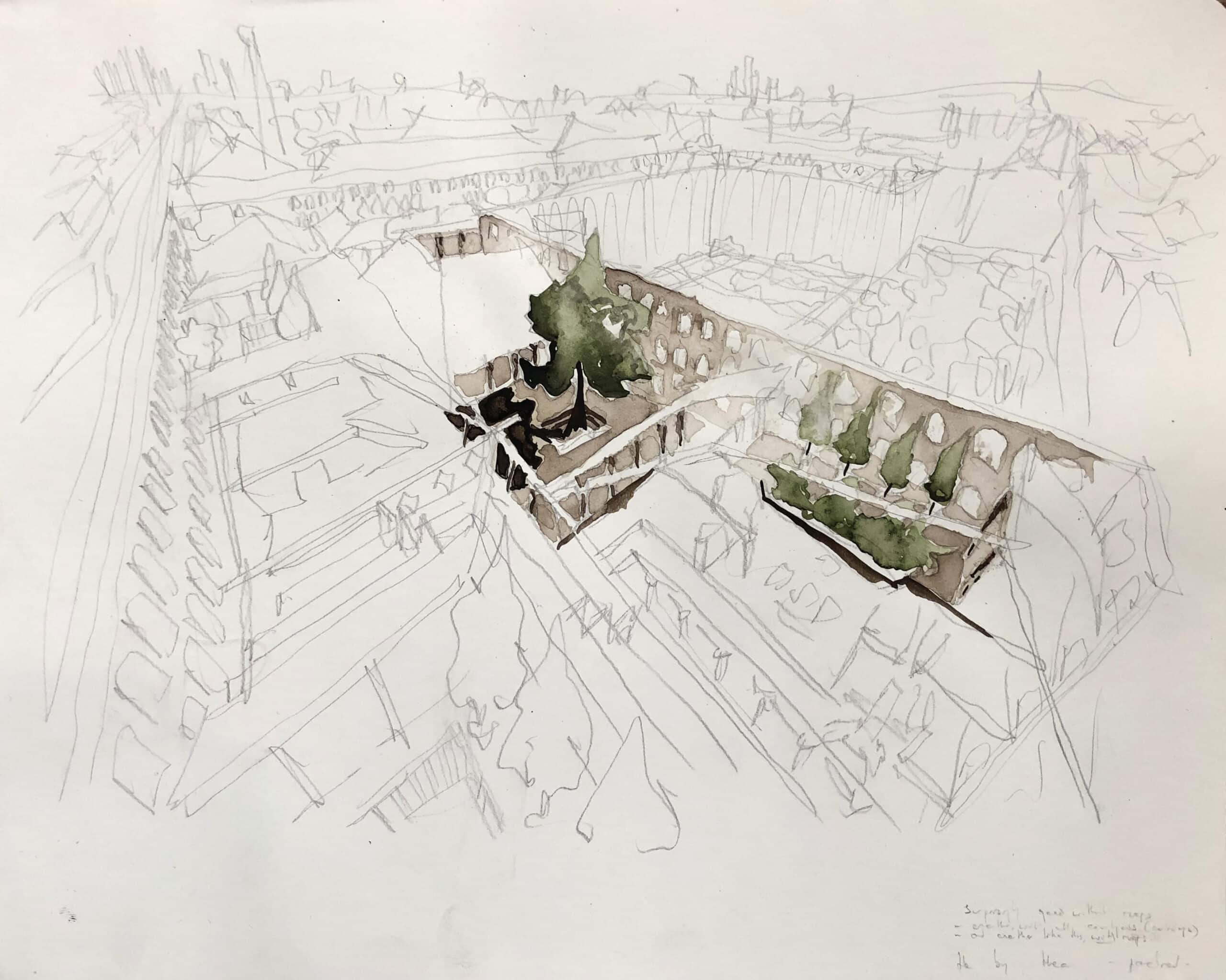
This drawing is a proposal for new courtyard dwellings that try to feed those roots; courtyard houses, set within the structure of a disused Manchester factory. An imagined design, on a semi-imagined site, for an as-of-yet-unsubmitted competition entry – the proposal takes advantage of these loose parameters to freely explore the principles of ‘primal architecture’; how they might be designed within the modern city, and how certain drawing methods can best communicate this.
At first glance
The design holds nothing back in honouring its brief. It includes the ancient typology of the courtyard dwelling, an emotional contrast between compressed dark spaces and freeing light spaces, an abundance of sensual natural and textured materials, planting as a focal point, and a combination of different sized open spaces to celebrate the instinct to interact with one another at a meeting place. The drawing follows suit. An obvious focus on the courtyards, heavy and soft shades of ink to express dark and light, fine-line detail for timber posts, sunlit treetops and an emphasis on the human figures.
Initially, it seems that the drawing needs to do no more than highlight all of the above in order to communicate its primal design principles. But such is the joy of a hand drawing, subtler suggestions are also woven into the scene and tucked behind the larger gestures.
At second glance
Pencil vs ink
Perhaps the most apparent technique at work is the separation of the ink drawing and the pencil drawing; seemingly uninterested in interacting with each other. Here, the pencil shows how the space looks, and the ink shows how the space feels. Although the practical elements of the building (in pencil) are acknowledged as critical and even try to impress with their technological detail, it is the primal factors (in ink) that make the lasting impression.
The ink drawing expresses the phenomenological principle that in any given space we experience only a moment of it, rather than the whole form at once (we do not experience a building in plan or section); further than this, it tries to speak of the reciprocal relationship of how the act of experiencing a space brings that part of the building to life, while it, in turn, breathes life into us.
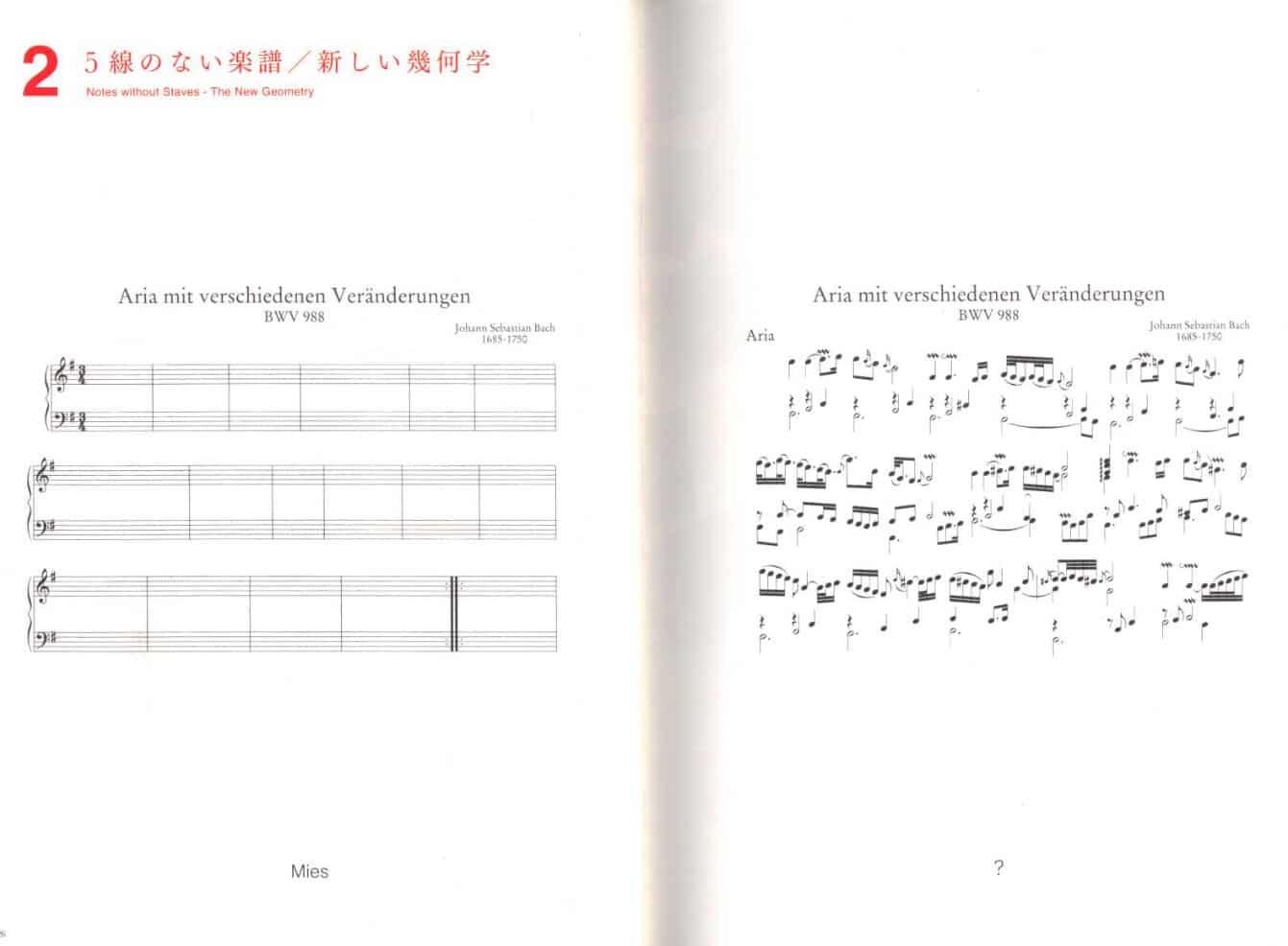
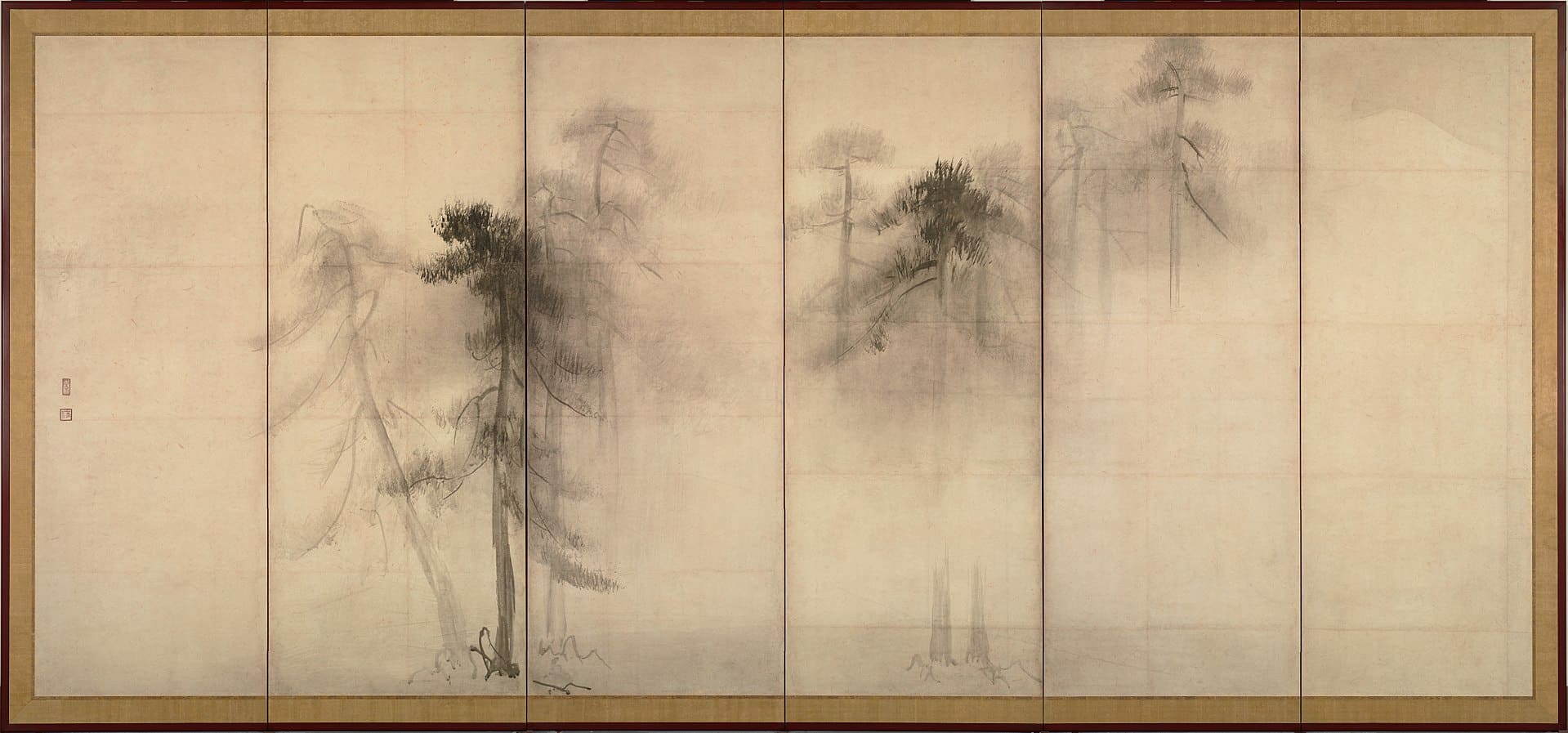
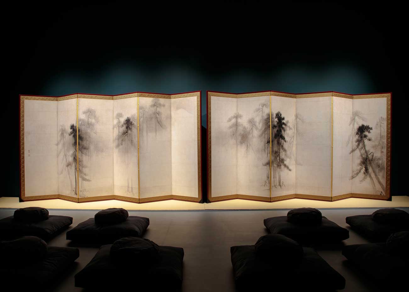
The decision to separate pencil and ink was partially influenced by Sou Fujimoto’s separation of staves and notes in Primitive Future. By freeing the notes of their practical structure we are reminded that, although the staves are ever-present, it’s the emotive resonance of the music that we actually experience. Likewise, for the Ancoats drawing, it’s the ink that shines brighter, as it is the music that moves us. Works from the sixteenth-century Japanese artist Hasegawa Tōhaku also had some influence; whose work could be said to remove the ‘staves’ altogether and express only the most delicate notes of the ‘music’. Perhaps I’ll be brave enough to go this far in the future, but for now, my inner-architect needs the context to be at least visible, if a little faded.
Water as a drawing tool
Water is unique as a drawing material because of its unpredictability. Inconstancies are expected when ink and water bleed; in the Ancoats drawing they are encouraged as the ink is trying to represent our less-tangible, often inconsistent, emotional experience of the world. The drawing can’t hide the influence that Victor Hugo’s, Château dans les arbres has had on it. His unpredictable water-stained sky and windswept trees accept the primal inconsistencies of nature, even finding beauty in the human ability to thrive within the unpredictable storm. Similar moods are found in his writing, supporting the idea that these drawing techniques aren’t accidental but that drawing and text both try to distil a certain philosophy; ‘Be like the bird that, passing on her flight awhile on boughs too slight, feels them give way beneath her, and yet sings, knowing that she hath wings.’ [3]

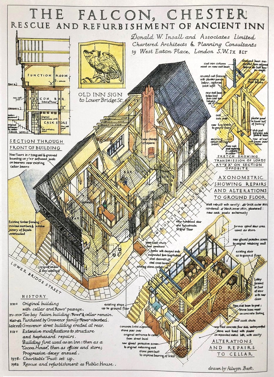
Peeling back the roof
A technique borrowed from the axonometric drawings seen in Donald Insall’s manifesto Living Buildings; it is intended to show not only the human life inside the building but also show the life of the building itself – complete with skeleton, muscles, skin, and always breathing. [4] By showing the building as an organism, the temporality of the building and its need for wellbeing are alluded to. Here again, the symbiosis of the human and their surroundings, breathing life into each other.
Easter Eggs
It’s hard to resist burying a few hidden meanings within the detail. Giving away a few examples:
- Although the surrounding context is drawn with some level of accuracy, special stress – a tone or two darker – has been given to any surrounding buildings that are based around a courtyard or plaza, echoing the core principle behind this design.
- The chimney of the neighbouring Murray’s Mill is a fraction higher than all of the skyscrapers in the distance; a rebuttal (a touch passive aggressive, I’ll admit it) to the rise of the over-pragmatic under-sensory glass towers quickly filling the horizon.
- Dashed lines on the elevations of the buildings in the foreground assist the reader in understanding the form of the building behind, briefly adopting the language of an architectural drawing in an otherwise representational(ish) drawing.
- Looking at the design of two public gardens at ground level: one consists of a small woodland with a clearing in the centre, the other, an ordered walkway with a line of neat trees in the centre – a nod to the two parts of Fujimoto’s idea that ‘the conclusion of emulating clearings in nature, is to fill a man-made clearing with nature’. [5]
- The stars around the moon merge with the people at the end of the road; alluding to our earliest (pre-primal) origins as ‘star stuff’ (to borrow a term from Carl Sagan). [6]
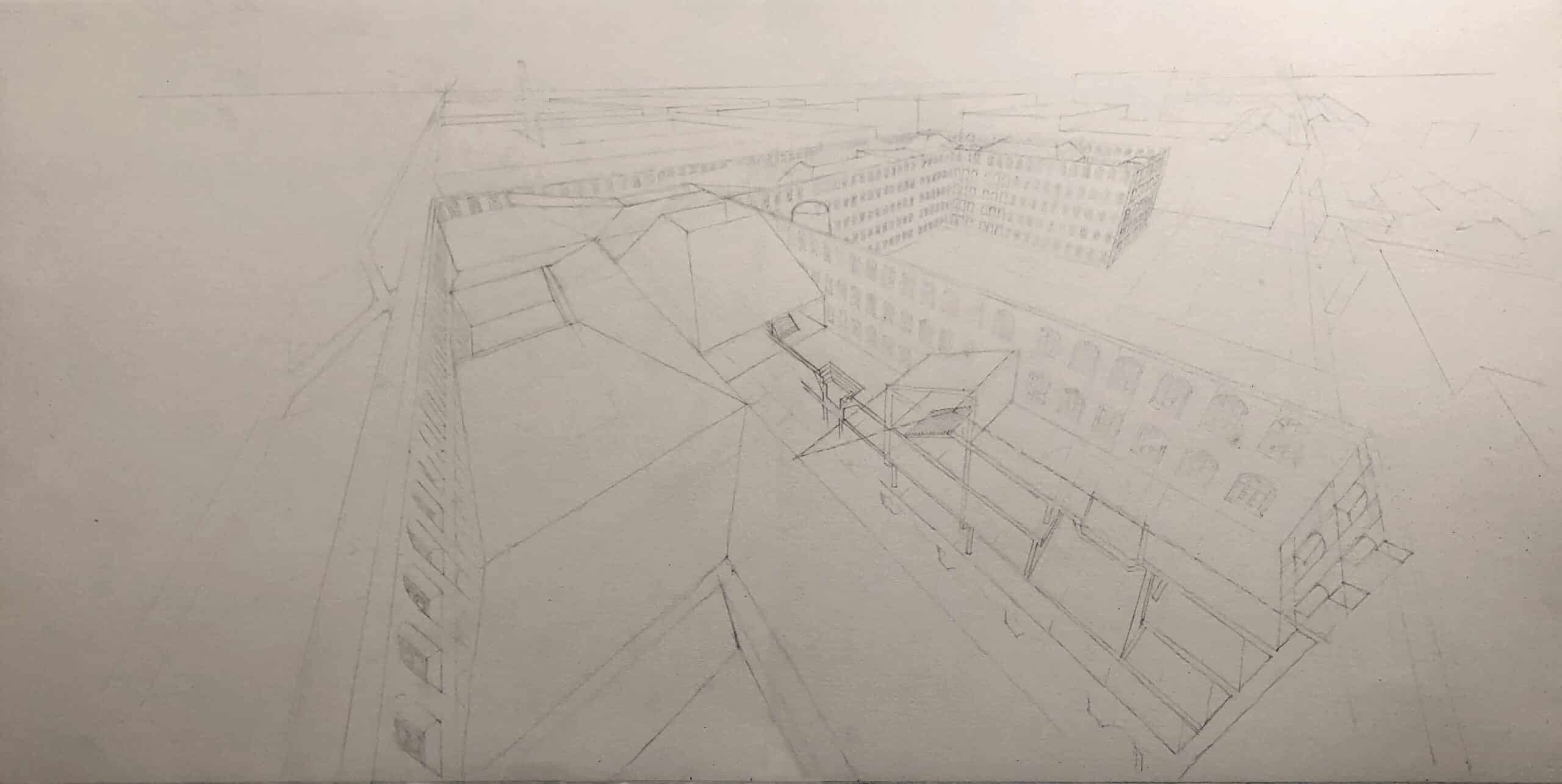
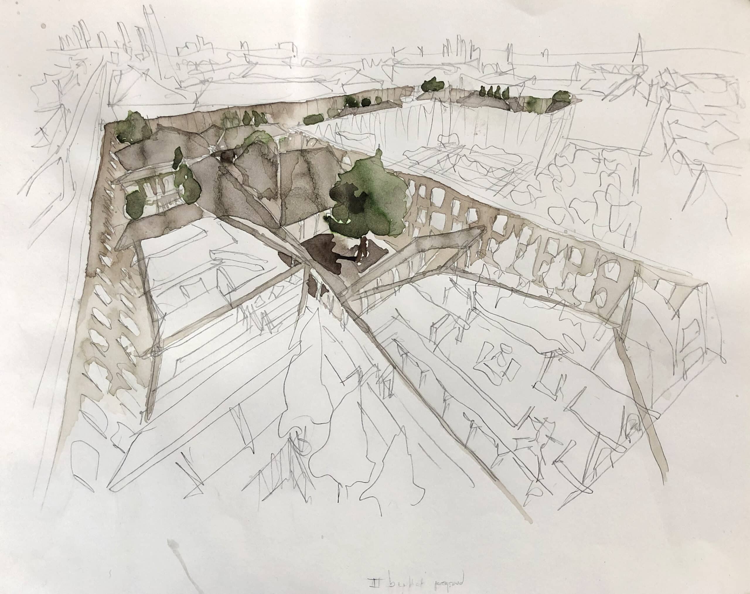
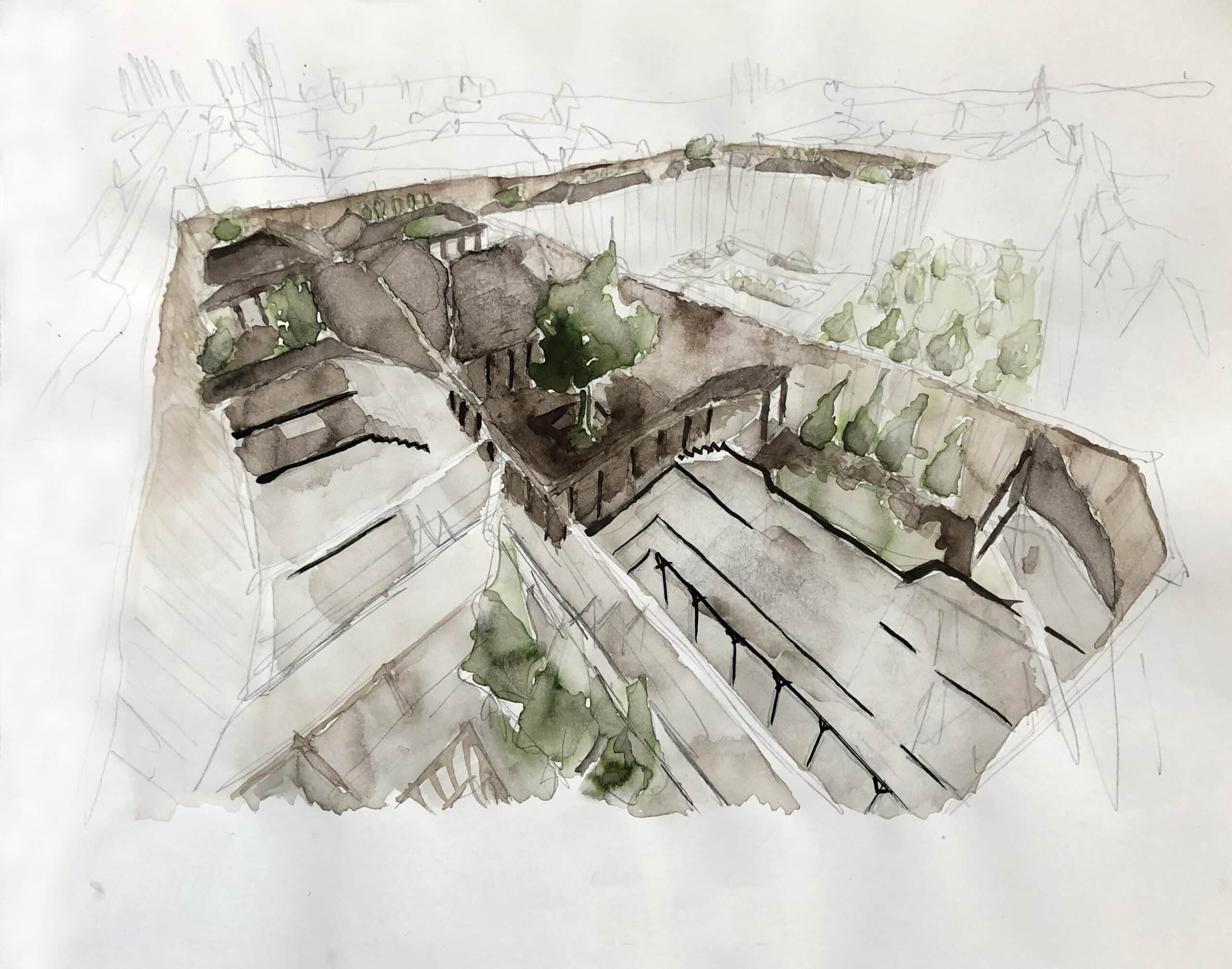
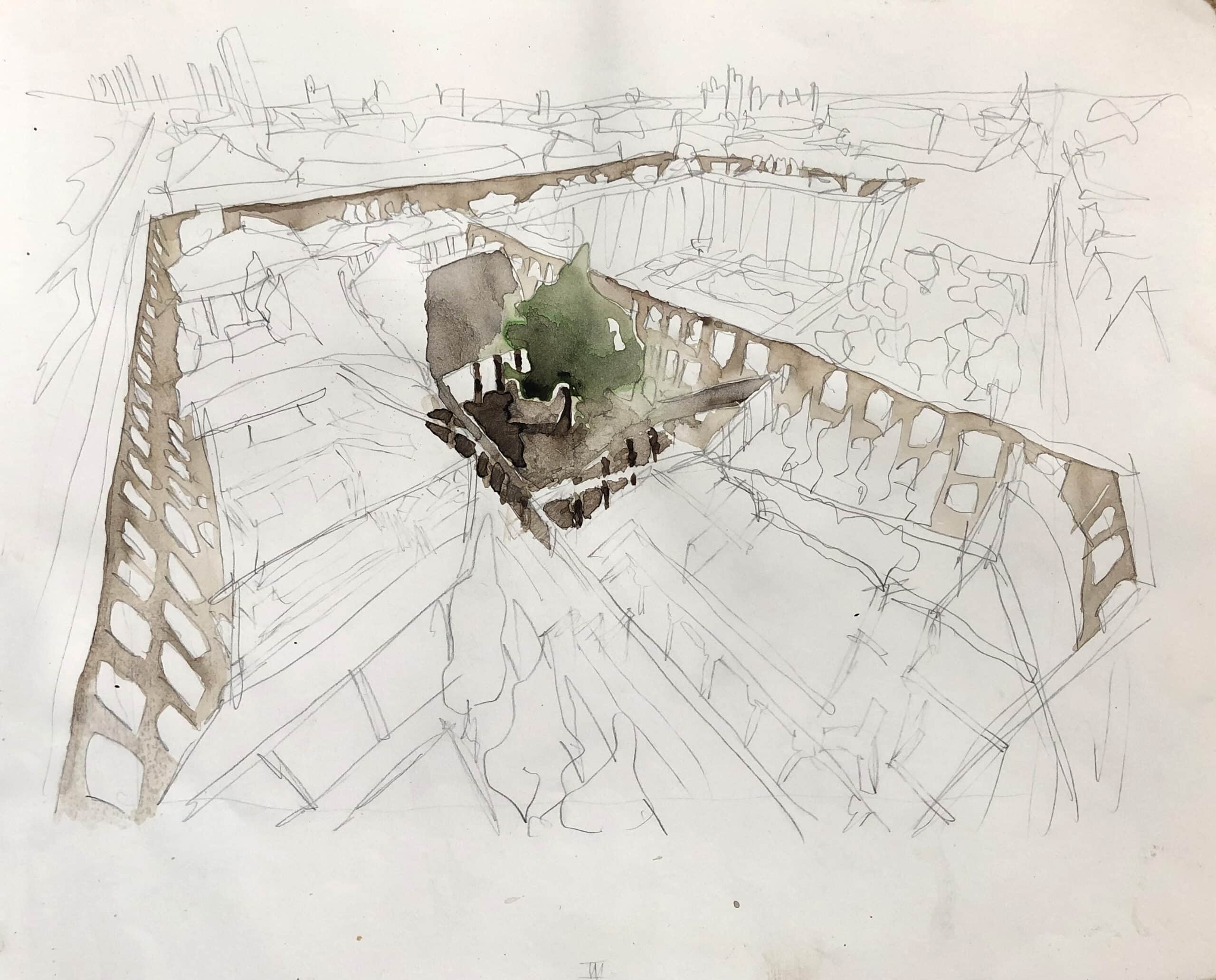
Designing in perspective
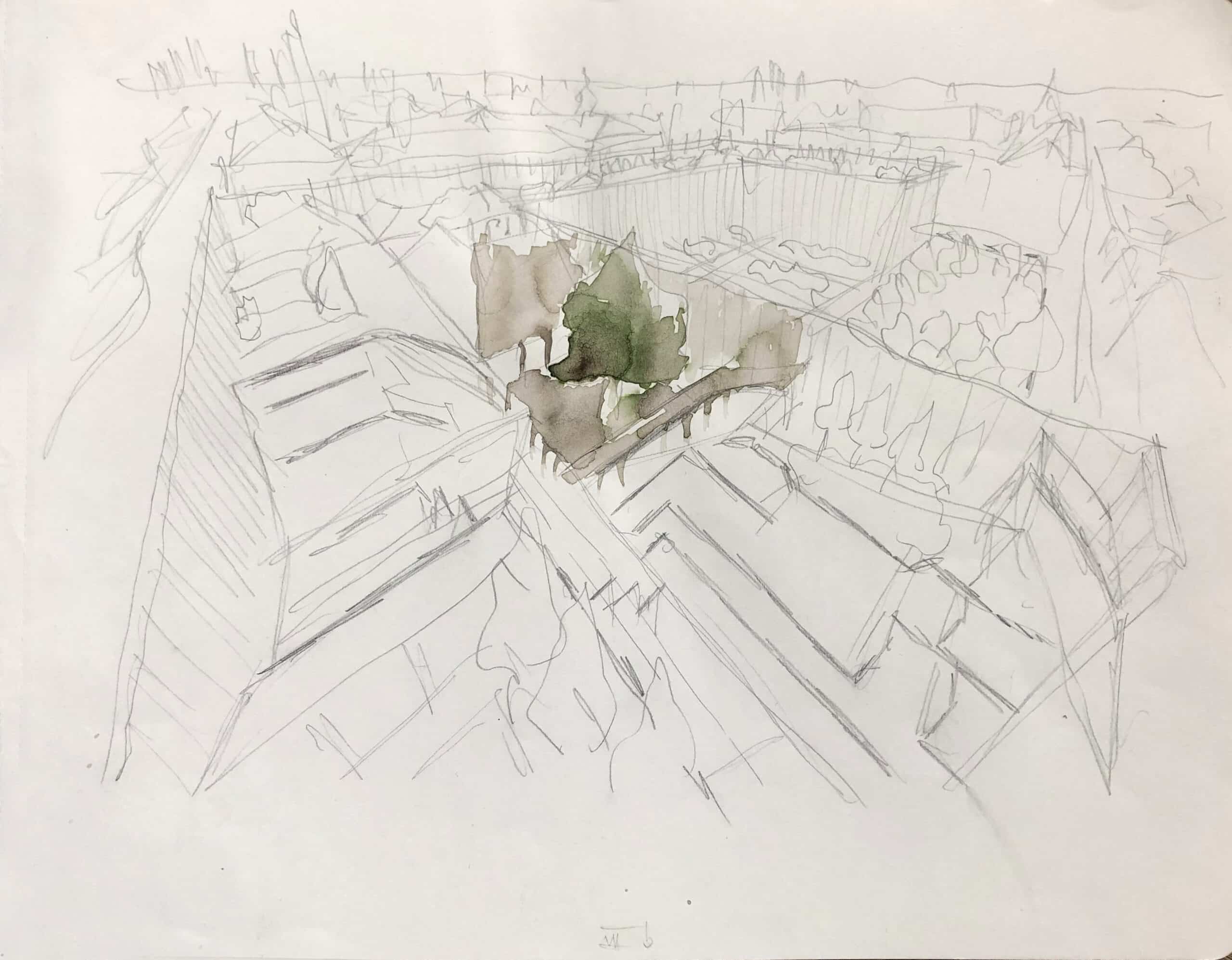
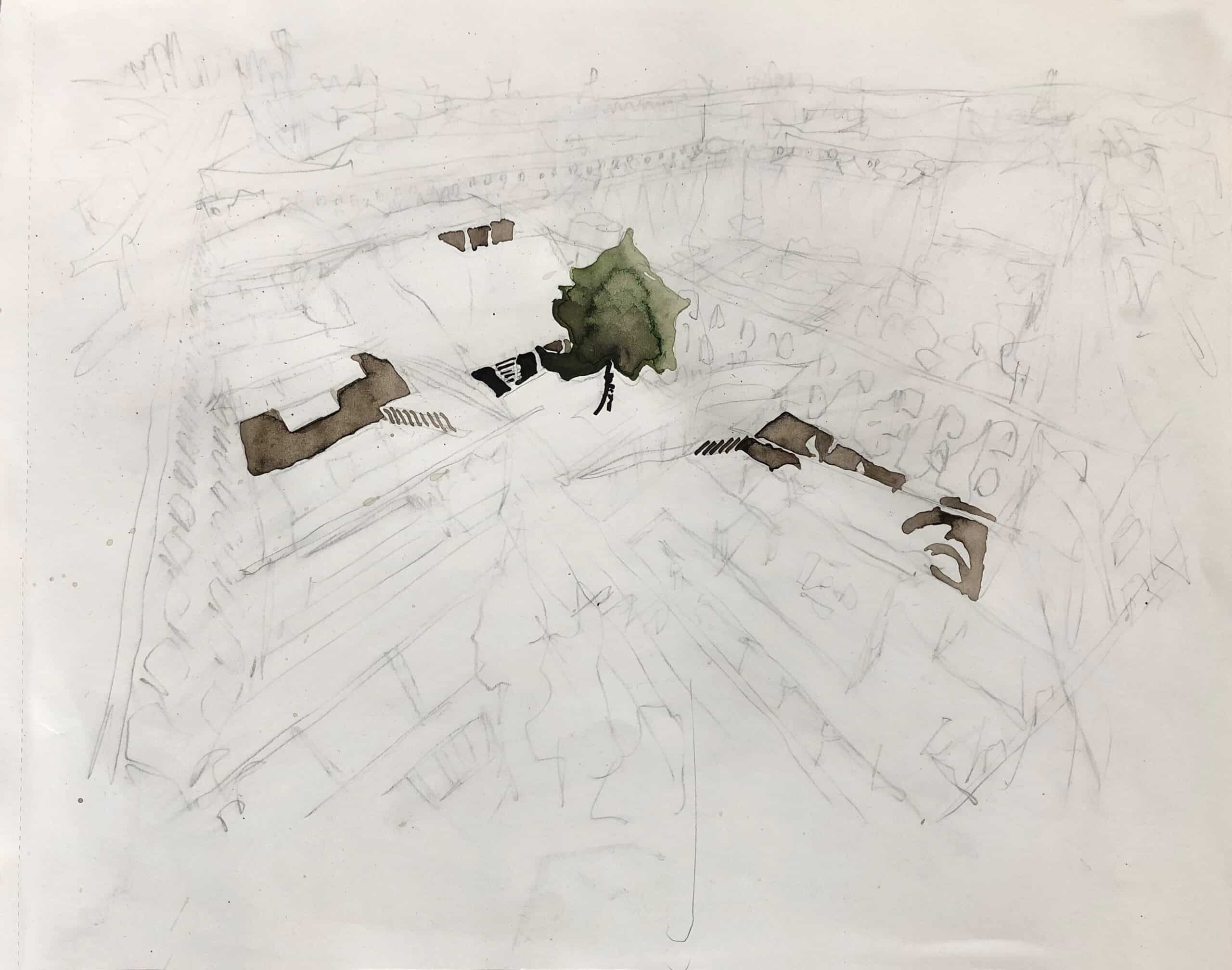
The work in progress sequence below shows the evolution of the drawing. This was done without a plan, section or computer model as a guide; as such any architectural design was done in perspective as the drawing evolved. An advantage of this method is that all design decisions are done with the drama of a perspective drawing in mind; variation is abundant, multiple levels are linked by multiple staircases, a lift is slotted into the remains of the brick chimney (centre-stage rather than hidden in some corner), roofs are tall and strive for character, and rooms flow into each other without corridors to allow for maximum levels of human interaction. When the design of the building and the design of the drawing are developed together, they seem to feed off each other, inform each other, and lift each other into animation.
The work of Hasegawa Tōhaku described previously is actually drawn onto six folding screens, which stand by being opened in a zig-zag arrangement. This angles the panels and gives the impression of the branches reaching towards and away from the viewer. I like to think that they were painted onto the screens in their upright arrangement so that Hasegawa was drawing quite literally in perspective.
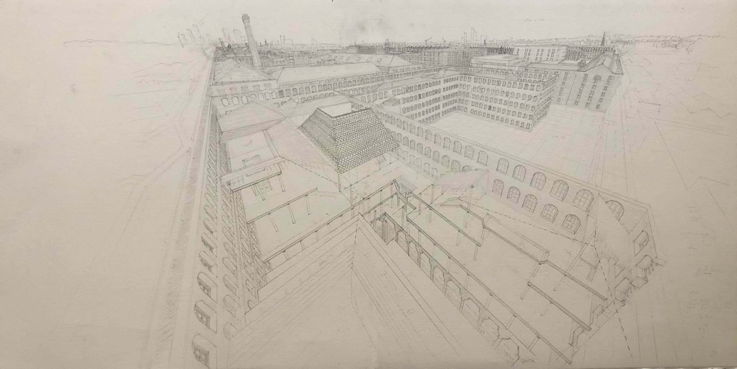
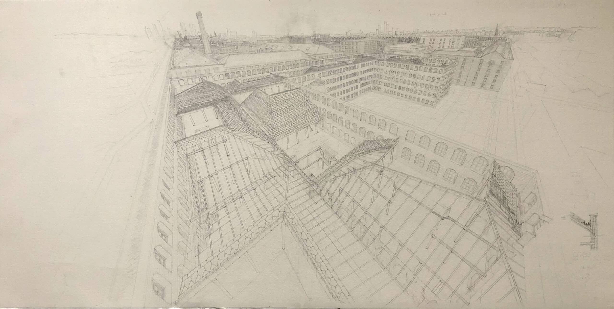
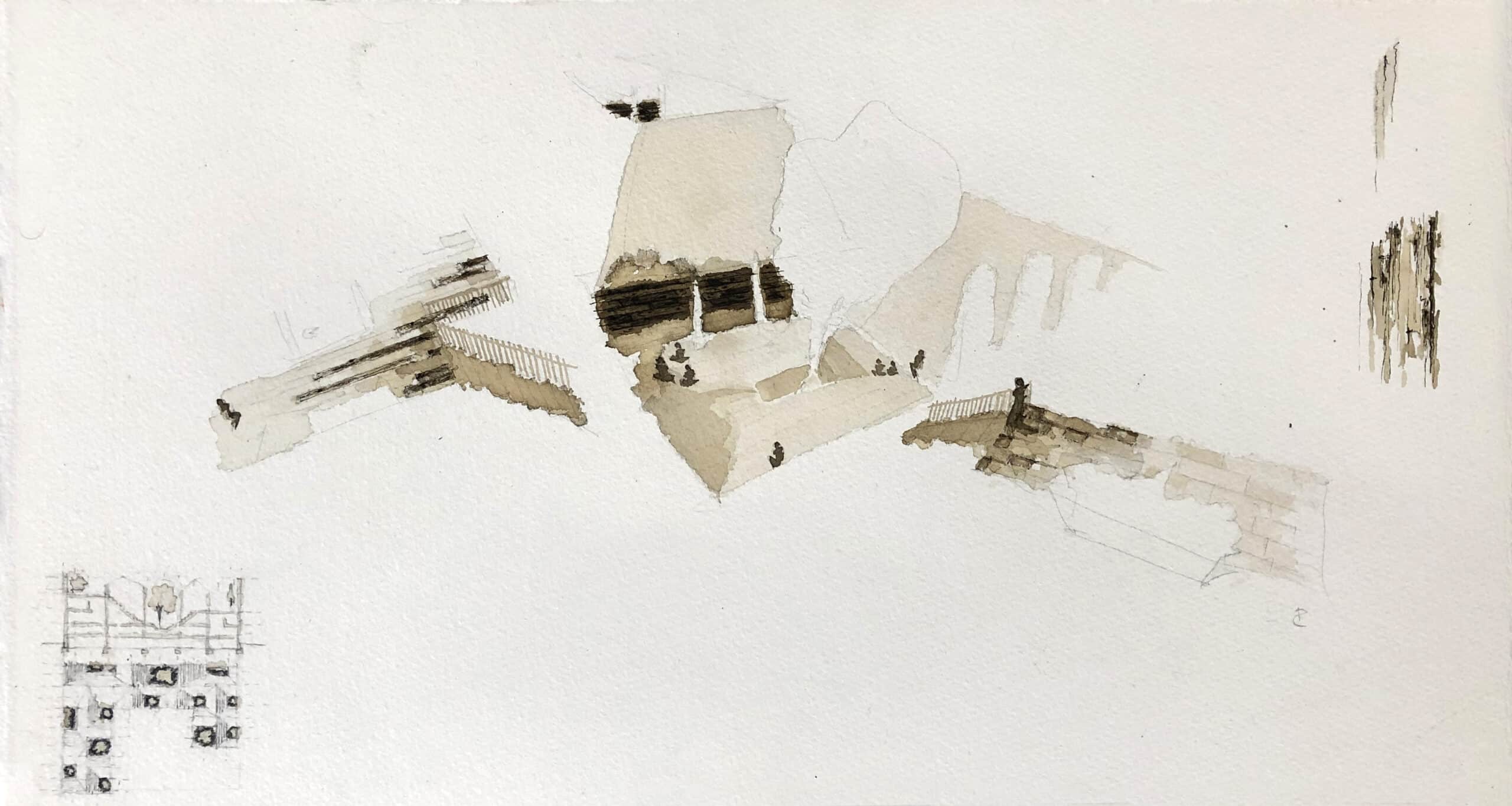
Choosing a focal point
Lastly, decisions about which elements to highlight in ink were only made once the pencil drawing was set in stone. Only then the very last level of information was draped over it; the textures, the tones, the leaves, the light, and the key players at the centre of the drama.
As can be seen from the images below, the spotlight was shone on various parts of the building before it settled. The most effective experiments were those that isolated one or two simple ‘experiences’ through the building, turning a large and complex scene into a drawing of a more human scale. Staying close to the original phenomenological interpretation, the ‘winning’ test (bottom right) aims to represent a single journey through the spaces as if a person had just moved between three of the courtyards and only the things that they experienced along the way have come to life. This method creates a thread of time through the building but also has the time-less effect of expressing multiple principles (darkness, light, natural materials, planting, human interaction, historic typologies) into one single moment. In this way only one, intimate, impression of the building feels ‘real’ at any one time; just as we might experience any individual part of our lives. Or as Merlau-Ponty eloquently puts it;
‘We see the depth, the smoothness, the softness, the hardness of objects; Cézanne even claimed that we see their odour. If the painter is to express the world, the arrangement of his colours must carry with it this indivisible whole, or else his picture will only hint at things and will not give them in the imperious unity, the presence, the insurpassable plenitude which is for us the definition of the real.’ [7]
Postscript; trial and error
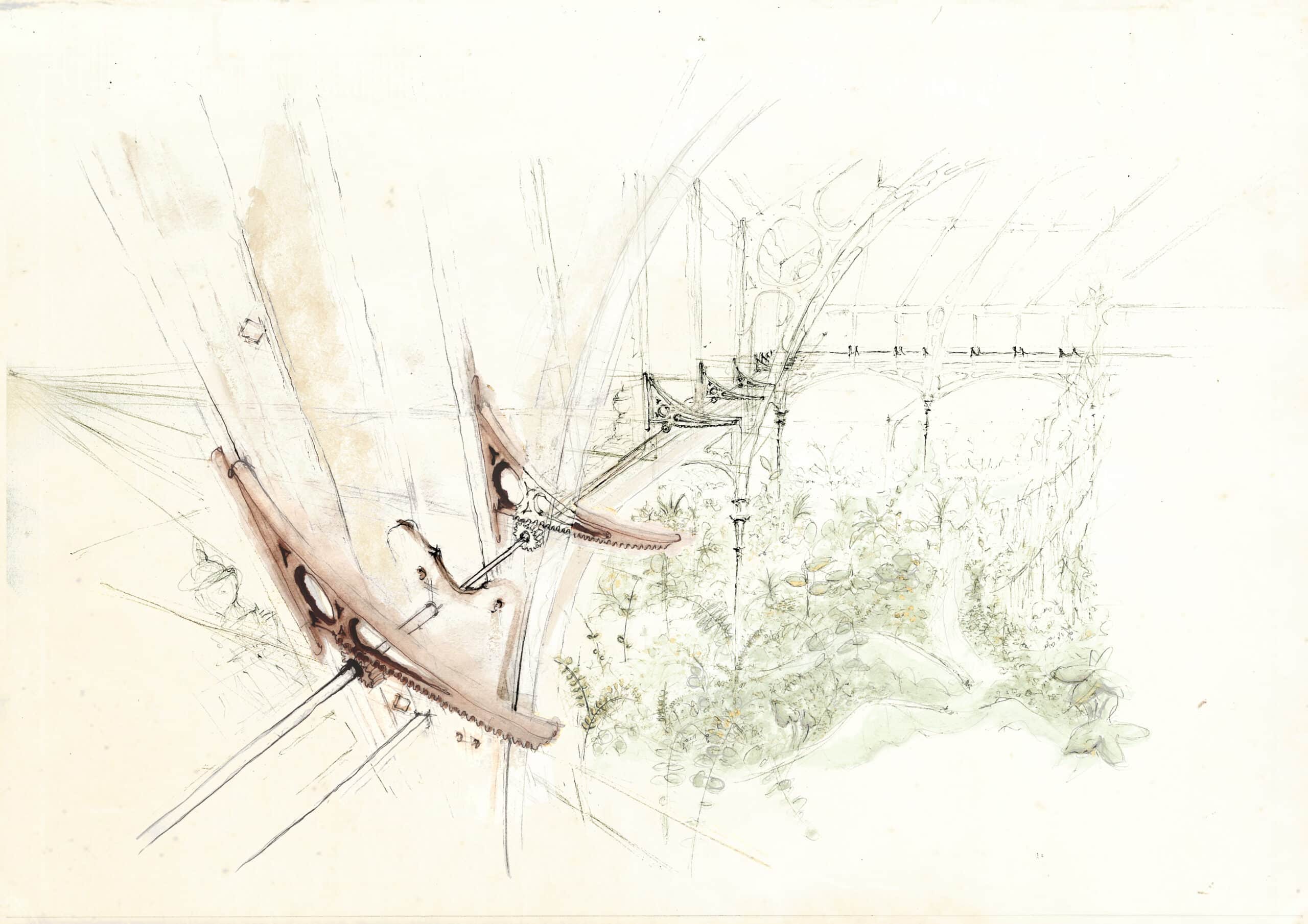
Some of my earlier attempts at capturing these practical vs. primal principles are shown below. In the drawing Temperate House, Kew Gardens (done as part of a conservation project at Kew by Donald Insall Associates) the focus was on the high-level mechanical actuators designed by Decimus Burton. In this drawing, little was given away about the abundance of gorgeous foliage below (perhaps an odd decision for an internationally famous garden), and in this respect, it might have lent too much towards an acceptance of the practical and away from primal. The second example is A Clearing in the Woods for a competition entry in 2019. This time, the aspiration to promote the primal and natural took precedence over realism; instead, it imagines an architecture grown out of the earth and woven directly into the trees. Although an enjoyable exercise in light and leaf, it did little to tackle the necessary and pragmatic ways to actually build a ‘primal design’ in a real-world environment – which after all, is the final aim.
Rory’s drawing, Manchester Courtyards: a proposal for Ancoats, won first prize in RIBA Journal’s Eye Line 2021 competition. More information here.
Notes
- Juhani Pallasmaa, The Eyes of The Skin (Chichester: John Wiley & Sons, 1996).
- Geddes. L, Fear of a smell can be passed down several generations, New Scientist, 2013.
- Victor Hugo, Be Like the Bird…( from Les chants du crepuscule) (Bruxelles: E. Laurent, 1836).
- Donald Insall, Living Buildings: Architectural Conservation, Philosophy, Principles and Practice (Melbourne: Images Publishing Group, 2009).
- Sou Fujimoto, Primitive Future (Tokyo: INAX-Shuppan, 2008).
- Carl Sagan, Cosmos: A Personal Voyage (The Shores of the Cosmic Ocean), 1980.
- Maurice Merleau-Ponty, Sense and Non-Sense, (Evanston: Northwester University Press; 1964, Reprint edition).
