The Fun Palace: Light Adaptation

Techniques of architectural drawing have been developed according to the physics of light and our perception of its effects. From the origins of two-dimensional representation – often mythologized in the act of tracing a projected silhouette on a flat surface – to practices of atmospheric simulation in rendering, recognized patterns of light have become essential in the communication of architecture’s spatial quality through its presentation in drawing. Logics of light facilitate the translation back and forth between two and three dimensions, flattening geometry through projection and producing illusions of depth through shade and shadow.
Rendered drawings have utilised the depiction of light and its consequences to translate experiential qualities of depth and distance to the abstraction of two-dimensional representation. Primary devices of the technique, including the parallel projection of shadows and the simulation of atmospheric depth, both rely on points of light as a primary source of effect. For this reason, nighttime renderings are rare in comparison to ones depicting daytime conditions. When the sun goes down, another source of lighting must be identified in the drawing or one of two things happen: the lines collapse back into two-dimensional abstraction or the white of the page turns black.
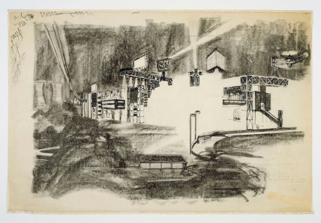
Cedric Price’s 1964 rendering of the Fun Palace at night [above], seems entirely artificially lit. Within a site darkened by nightfall, the architecture appears to be glowing. The drawing depicts a structure plugged into the city’s transit networks and charged with electricity to the point of overload. Through such connections to transportation and electrical infrastructures, Price proposed the project could maintain high levels of communication with the city and its people. The architecture of the Fun Palace was considered informal, constantly undergoing change in response to the needs of its patrons. Through its organisation and effect, it was to elicit and trigger public response. A central technology for this communication came in the form of screens and bright lighting through which the activity of the site was to be communicated outward. Light was to serve as a visualization of the architecture that superseded clarity of the form itself.
While numerous sources of light are identifiable in the rendering, the brightest portion makes none visible at all. Attitudes toward electric lighting well established by the 1920s ceaselessly aimed canons and projectors at building facades to guarantee they would retain public attention amongst the increasing brightness of the city. In the case of the Fun Palace, sources of light don’t project onto the architecture, but instead erase it. Not only is the lighting itself made invisible by its blinding effect, but so is all structure surrounding it. Left in its place is nothing. The night is erased, and we are left to look at the space of the page.
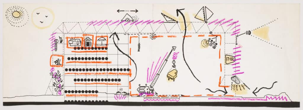
Other drawings of the Fun Palace offer a different approach toward the depiction of light. Iconographic diagrams were often employed by Price to describe architectural features, functions, and systems. In the case of the Fun Palace, these diagrams include special attention to sources of light [below]. In the form of a line drawing, light is represented through visualisations of its emission. Concentric circles of radiation surround light sources including both performance lighting rigs and the sun itself. Whereas these diagrams serve as a graphic visualisation for how light is transmitted through radiation, the 1964 nighttime rendering describes its effect.

Not only does the representational decision to effectively blind the viewer betray commonly held beliefs in the lighting of architecture, but it also ignores those associated with techniques of rendering. Typical use would show light to highlight some surfaces and cast shadows on others. Through these relationships, the viewer of an image can track both direction of light and sequence of depth between objects. In removing the ability for a viewer to perform this kind of logical deduction to understand space, Price attempts to relate the image to other ways of experiencing. The attitude that he takes is perhaps less related to techniques of drawing than it is to modes of optical perception.
Human responses to light first occur at a physiological level. When the retina dilates in response to environmental stimuli, an individual’s perception shifts as objects become either more or less visible. A few moments of exposure soon after, begin to trigger release of hormones affecting embodied and longer lasting perception. Any person who has stepped into an installation by James Turrell – or a nightclub for that matter – would understand the capacity of constantly shifting lighting conditions to defamiliarise perception of a relatively stable physical environment. While lighting may certainly affect the way we perceive our surroundings, representational analogues fail to capture the state of flux and confusion our senses are subjected to under moments of intense shift and contrast. Price’s rendering attempts to depict a view of the Fun Palace precisely in the middle of one of these periods of light adaptation. The dark is too dark to observe detail, and the light is too bright to look at. Some elements of the architecture come into focus, but most are left in question. While the image sacrifices clarity of the architectural form, it introduces a perceptual dynamism that offers a different means of producing ‘experiential’ qualities of a rendering than those typically associated with the representational technique.

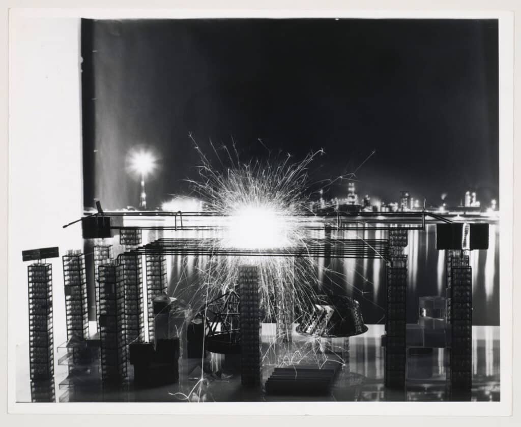
What results in the image is a type of contrast that very closely mimics conditions familiar to photography. The effect of light on representation perhaps has the most direct consequence in the camera – where technical attention to exposure times and aperture settings serve as the only means of mediating light before it is transposed onto a photo-reactive surface. An immediate similarity can be noted in a comparison between the 1964 nighttime rendering and photographs of a Fun Palace model taken the same year by Richard Rosser [above]. Price’s dynamic model, photographed against a nighttime backdrop, features the addition of an ignited sparkler. Under the duration of a single exposure, the sparkler itself, along with the architecture within a short radius surrounding it, are lost in a cloud of sparks. The high intensity sparks accumulate to the density and brightness seen in the image over the course of time necessary to properly expose the building component. Price’s rendering takes advantage of this photographic attitude toward exposure to dramatise intensity and contrast between the project and its site. In this regard, we could consider the Fun Palace in this rendering to be ‘overexposed.’
The translation of this desired effect from photography to drawing is quite literally a messy one. As opposed to the process of photographic developing that does not consume different quantities of material depending on the darkness of an image, drawings on white paper require significant material investment to turn black. The 1964 nighttime rendering of the Fun Palace is darkened through charcoal with detail drawn in through black ink. This type of material composition is rather conventional for architectural representation, but the proportions between pigment and page prove to be quite different. In terms of both labor and the amount of product needed, drawing a dark sky comes at a high cost. I had previously described the rendering as a representation of light erasing both darkness and architecture, but the means by which the drawing was produced are quite the opposite. Light is made visible through a number of gaps and patches not touched by charcoal or ink. To preserve the boundaries between the opacity of the charcoal and the purity of the untouched areas of the page, a fixative is applied as a final coating to the rendering. This additional layer of protection serves as a reminder of just how static the material of drawing is despite goals for its representation to simulate dynamic experience for the viewer.
Chase Galis is a Master of Architecture candidate at Princeton University and a current editor of Pidgin.
This text was submitted in the long form category (1000-1500 words) of the Drawing Matter Writing Prize 2020.
