Drawing, Movement and Medium: Michael Webb in Conversation with Mark Dorrian, Episode 2
– Mark Dorrian and Michael Webb
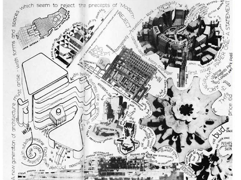
Mark Dorrian: I’ve loaded some images – Michael, by the way, doesn’t know what’s coming up. After showing this, the drawing of the building, I thought it would be useful to show a couple of slides about the context in which this project then appeared. The Furniture Manufacturers Building is a fourth-year student project and the Sin Centre, Michael’s thesis project, followed. It’s difficult to think of another two closely consecutive student projects that had such effect – which were done inside the academy and had such impact outside. So, here is the project in the first Archigram broadsheet. Actually, just talking about John Outram, there’s a John Outram project at the top left-hand side – I think there, the Concert Hall. And then here is Michael’s Furniture Manufacturers Building in the centre. Peter Cook I suppose composed this. David Greene’s Mosque from Nottingham University is here too…
Michael Webb: Yes.
MD: … and also a project by Timothy Tinker. Something that’s striking about the way Michael’s project appears here is the way that it starts to interact with the graphics and with the terms that are applied to the image. It’s almost as if the terminology becomes an element of the architecture itself – or at least the graphic form of the terms do. So, we have – I’m not sure if you can read it very easily in the audience – ‘SKIN’; ‘MOVE’; ‘TUBISM’ at one point. And so, thinking forward I suppose, there begins to be a use of graphics that gets integrated into the architecture – I mean the kind of coding of the sectors of the Sin Centre ramps, for example …
MW: Oh yes. You might ask yourselves: ‘How does a project done in a school in 1958 end up at MOMA New York in 1961?’ It has to be a strange set of circumstances, but I think I’ll delay answering that question and how it happened until the lecture tomorrow night. That’s a teaser to make sure they come back. [laughter]
MD: Watch this space, we can talk about that in detail…
MW: It was sheer luck. It had nothing to do with innate talent or anything. [Image of Furniture Manufacturers Building in the MOMA exhibition projected]. We’ve got Soleri on the right: it looks like – Mesa city. You know Soleri was a guy working in the desert like John the Baptist. The John the Baptist of architecture, eating berries and so on.
MD: And this is the side elevation of the…
MW: The end elevation of the Furniture building, that’s right.
MD: I think there’s another as well …
MW: I’ve not seen these before actually.
MD: So, if anybody’s interested, these images are from the archive of the exhibitions on the MOMA website. This is the 1961 ‘VisionaryArchitecture’ show that was curated by Arthur Drexler. And things like Frank Lloyd Wright’s Mile-High Tower are here, Kiesler’s Endless House too. There is a particular one that I’d like to ask you about – the project in the middle, which is Louis Kahn’s urban design project for Philadelphia, because that’s a project that you’ve talked about in relation to the Sin Centre – particularly the parking silos in the Kahn scheme.
MW: Oh yeah, that’s right.
MD: I was wondering if this was where you came across the project – in the MOMA exhibition – or if you already knew it?
MW: I never went to the MOMA exhibition. Coming across the Atlantic then was a major undertaking … I mean, you needed money and things like that. But I think the notion… see what he had in the Philadelphia Project was this revitalisation of downtown. So, you had parking towers around the edge and the idea was that you would drive in from the suburbs and the parking towers were rather like streets wound up inside the building, which was a phrase he used. And then you had people movers, vehicles, buzzing around the city which would take you from those parking towers to where you worked. I don’t know if any of you have seen the movie, My Architect, made by the son of Louis Kahn? A beautiful film, everyone should see it! But there’s a guy, a city planner in Philadelphia, questioned about Kahn and the project for Philadelphia that he did and he’s saying: “It’s an absolutely crazy project. Whoever is going to want to drive in and then have to negotiate this incredible tower, with the streets going up inside it, then have to have to go down, then get a people mover? Everyone wants to go straight to work and park very close to their building.” But it’s a beautiful project – the notion of a city with all of these wound-up streets.
MD: In the drawing here, it seems incredibly monumental in a sense that you have these vast silos and drums and geometric objects. But if we come to the next one … Do you know this drawing Michael, the one that’s on the screen now?
MW: Yeah, I can see it. [laughter]
MD: [laughs also] Ah so… you know this particular drawing?
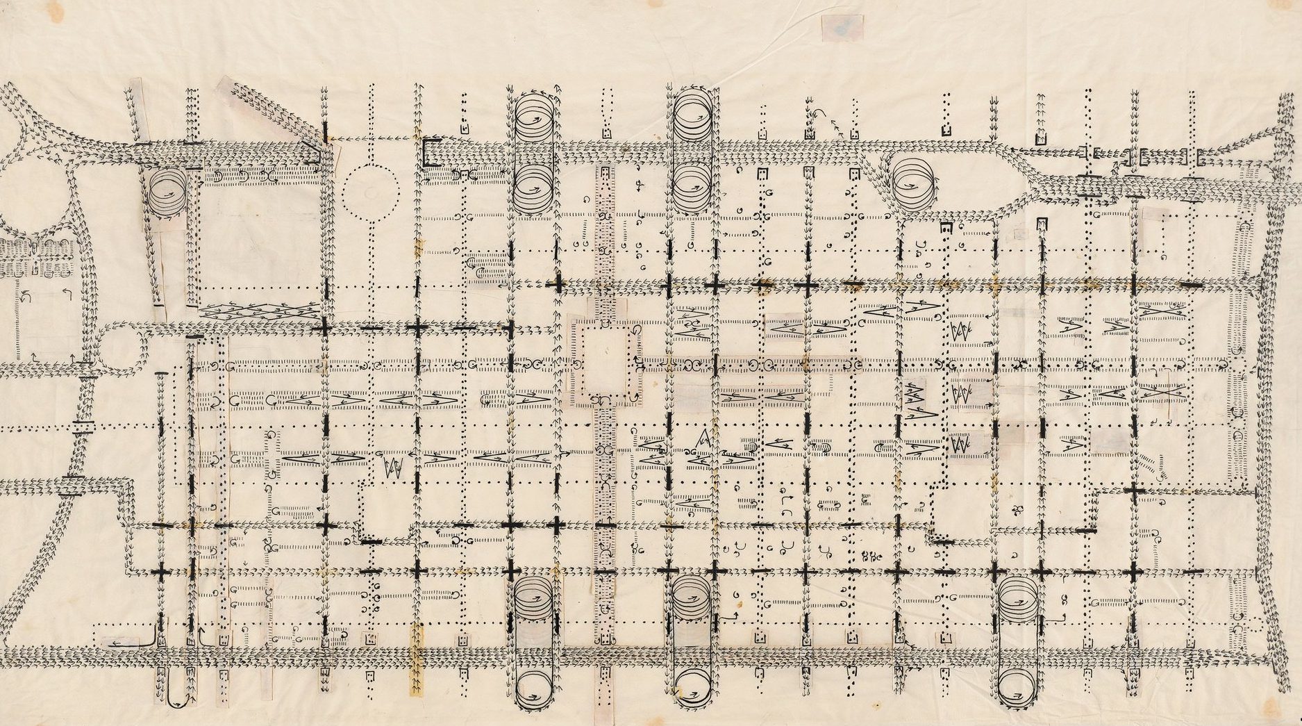
MW: Oh, a very famous drawing, a wonderful drawing. Made with arrows, there are no streets drawn, they just drew the arrows in the direction of the traffic.
MD: Yes, so this is Kahn’s notational drawing of the traffic circulation. The drums are at the top and bottom and you see the vehicles spiralling up. I think it’s kind of interesting that on the one hand there is this monumental representation of the building and then there is this very dynamic notational demonstration of the project as well. I thought this was a nice way of moving the conversation toward the thesis project, which is the Sin Centre. I think, from what I understand Michael, that the project originally began with an idea for an entertainment centre that would rework Alexandra Palace in London.
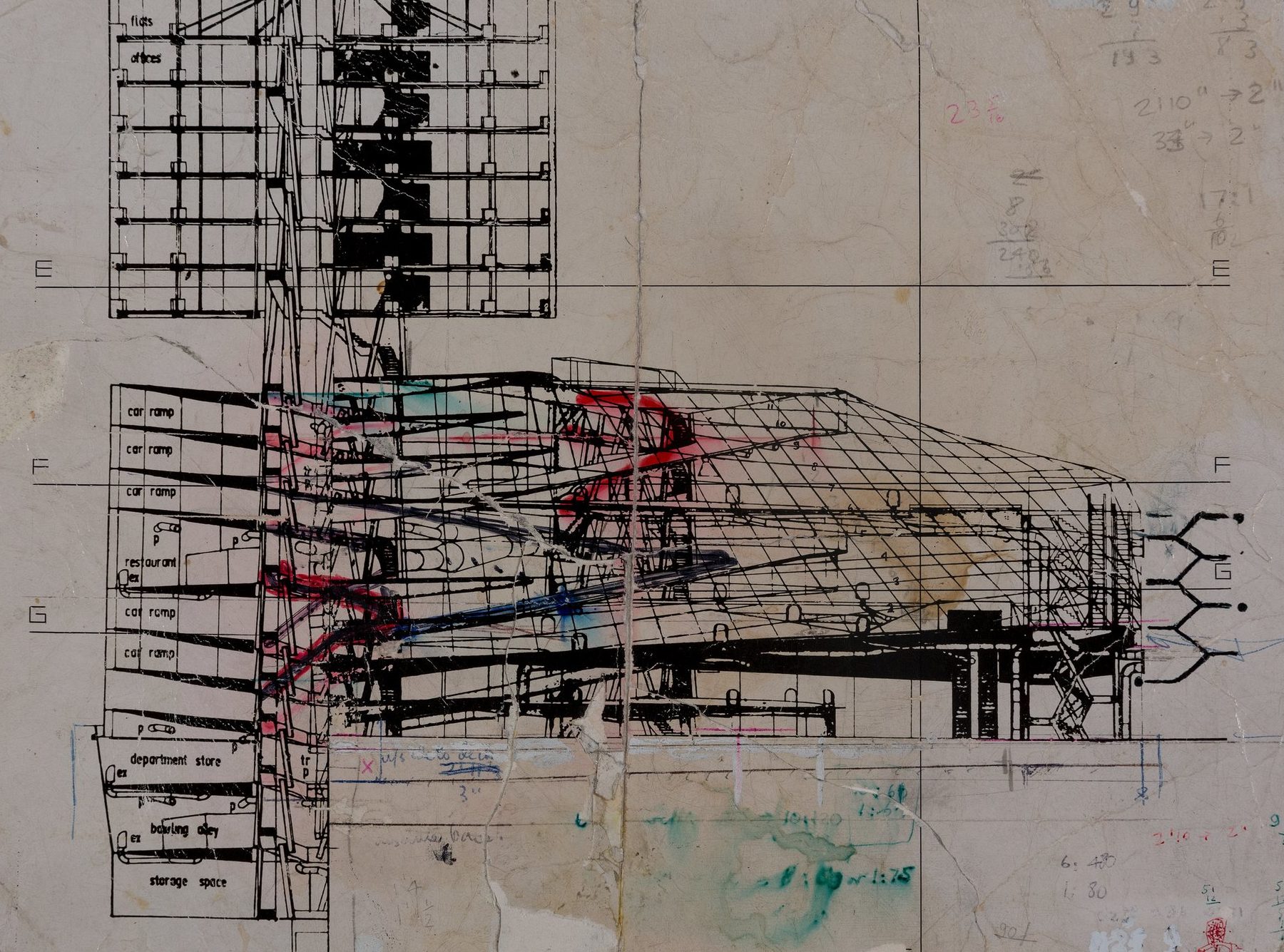
MW: Well I failed my thesis at least twice. The third time gave up halfway through. And Mark is right that the first utterance of the design was for a site in a palace in the north of London, Alexandra Palace, rather akin to Crystal Palace in the South. But the project was eventually placed right in the middle of London near Leicester Square. And the reason they kept failing it is – actually they were quite right, I have to confess – because if the building were built as it’s represented here it would tie itself into a knot and everyone inside would be squeezed. There’s nothing really to resist the huge pressure created by the tension membrane roof. You see the roof there that’s sectioned, made up of squares? That’s a glass roof and I made a model of it, umm, yes… [trails off to laughter]. Actually it’s interesting that you should bring that up because there it is, the tension membrane roof, and because it’s being pulled I made it – I don’t want to get into too great a detail given the time we have – but I made it out of paper clips, and if you snip them twice what you have is a double hook. Right? [gestures] Like that – yes? And then you used washers – and by the way, I must stop diverting from the direction I am taking, but Richard Rogers loved washers. I just saw a picture of the Pompidou yesterday, he had lots of washers. It was a reminiscence of childhood when he made models out of Meccano. But anyway, washers connecting the paper clips together and then you need a frame round the edge, so I had about half-inch by half-inch base wood and I tensioned up the hooks and the washers and of course the frame started bending in. So, then I had to put a one-inch by one-inch member to reinforce the half-by-half. By the time I had finished I had a huge bulk of timber which was necessary to resist the inward thrust of the roof. So, you would need something incredibly heavy round the edge. It was just as well because there – you see – the pins, the hooks and the washers are merely to create the right shape, and then you cut out squares of plexiglass and put them on and then lift, and it’s all done, and then lift it off. But there’s no tension, it’s just the rigid member then. I think Mark’s point over the cup of coffee we had earlier this morning about the shape of it, about the fact that it’s subtly curving, somewhat comes into play here.
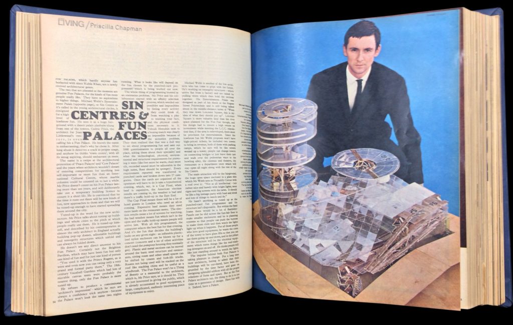
MD: The image that we’ve got now is a photograph of Michael with the Sin Centre model from a 1964 – I think – article in the Sunday Times magazine. It was titled ‘Sin Centres and Fun Palaces’ because there’s also discussion of Cedric Price’s Fun Palace project, which he had developed with the radical English theatre director Joan Littlewood and other collaborators. In the history of the ways that the Sin Centre has been talked about, it has often been related to the Fun Palace – or at least there is assumed to be some kind of affinity between the two projects. I think there was an issue of the Architectural Association Journal published the same year – I believe you’d started to teach at the AA, Michael – that was themed as ‘Buildings for Pleasure and Leisure’ and Sin Centre and the Fun Palace both appear in it. But also, when Reyner Banham in his Megastructures book writes about the Sin Centre and the Fun Palace, he relates the two again though in a sense he actually puts the Sin Centre in advance as he calls it the prototype British project for a palais ludique. Could you say something about the relationship between the Fun Palace and the Sin Centre, Michael? Was this something that was just a coincidence, in terms of the journalist making the connection, or is there a deeper story?
MW: No, I think there’s actually very little connection between the Fun Palace and the Sin Palace. Except for the name – that’s where the connection lies. Originally, Pricilla Chapman, who wrote the article in the Sunday Times, was publishing this building only. It was going to be called ‘Sin Centres’. Then at the last minute she heard about the Fun Palace, which had just been published in the AA magazine or something like that and got very interested in it. And – to be utterly frank – I think she wanted to scrap the article about the Sin Palace and focus on Cedric’s project [laughter]. But it had already gone to press, the pages and photos dealing with the Sin Palace, so … But I think she met Cedric, and of course Cedric, although only six years my senior, was very charming – unlike Michael, who was then and probably still is now, a rather callow, shy, insecure youth – very self-assured, and had black slicked-down hair and I think he started whispering sweet nothings into her ear like ‘flexibility’, ‘expendability’, you see. And she was absolutely swept off her architectural feet. My building has nothing very much that’s flexible in it. It’s really about the thrill of driving into a building – that’s what I was fascinated by. Because it comes from a … – may I say this without…? – … it comes from a childhood memory of going to a seaside resort, and seeing a car driving up a ramp onto the roof of a building and parking there. And I thought that was beautiful – the idea of a car driving into a building and engineering the building so it could happen safely, i.e. with separation between the area for the cars and for the people. So, you have wired glass walls that you walk through to get into the building. But if this building sponsored any sort of architecture at all, maybe it’s Lebbeus Woods’ ‘Free Space’, because what I’ve done is really to create ramp structures up which cars drive and pedestrian structures – like the one in the front there, very crude model this I admit – which are escalators that bring people up into the building proper. But it’s all about driving at high speed into a building and observing cars driving round the circular ends and then crossing over and so on. But what also very much became inspirational for me in terms of the building was my first flight in a Boeing 737. I think it had just come out then, the very first production model. Now get this, the engine was set under the wing of course, but right at the back of the wing – because now with the aircraft the engines are projecting out in front of the wing. But the beauty of the engine being at the back of the wing was that if you sat at a certain seat you could see the flaps fold out when you came into land, but also the thrust reversers on the back of the engine cowling would open out to reverse the thrust. So, you had the flaps folding down and the thrust reverser deploying and what a magnificent sight that was. And this beautiful polished … I’m going to say al-u-min-ium rather than al-oo-minum which I’m used to now, being in America so long. Aluminium always sounds to me much more al-u-min-ium-like than al-oo-minum. You know, it’s funny how it sounds in my mind more beautiful: al-u-min-ium … early racing cars and so on. But this is really a shitty model [laughter].
This text has been published to celebrate the addition to the Drawing Matter collection of the first element of a new model, made by Michael Webb, of the Sin Centre.
