James Malton
Trees and Clouds: the picturesque, perspective and aquatint
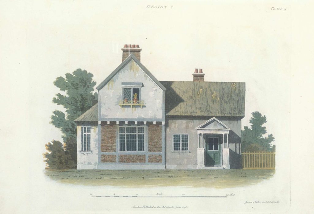
An early architectural use of aquatint was James Malton’s 1798 book An Essay on British Cottage Architecture: Being an Attempt to Perpetuate on Principle, That Peculiar Mode of Building Which Was Originally the Work of Chance. Malton took his authority from Uvedale Price’s An Essay on the Picturesque, as compared with the Sublime and the Beautiful; and, on the use of studying pictures, for the purpose of improving real landscape of 1794 which pointed out that the aesthetically interesting irregular forms of vernacular buildings came from their piecemeal construction, and their ‘roughness’ from the patina of decaying materials. Malton then planned small houses and villas, with something of the appearance of farm labourers’ cottages, irregular in form and with flaking render and decaying thatch.
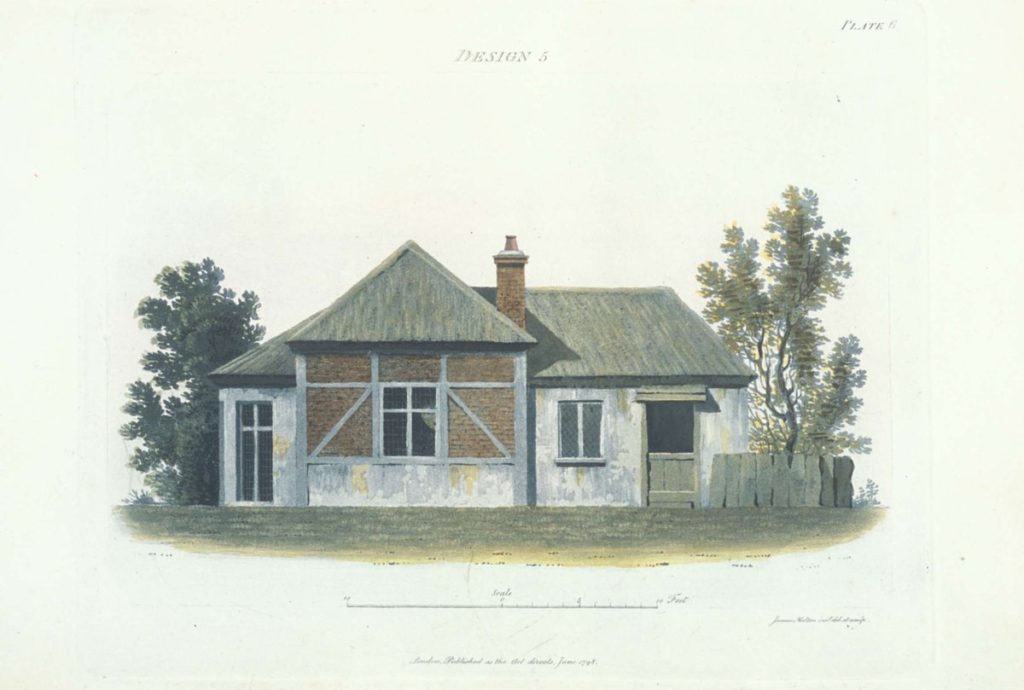
John Plaw was the first architect to publish his designs in aquatint in 1782. He also showed the possibilities of depicting buildings in landscape with the new tonal printing technique, but his designs were highly symmetrical in a classical taste. Malton’s designs, engraved by himself, were much closer to the taste for the picturesque in the observation of vernacular building. His designs were asymmetrical in plan, as might be expected of small functional rural buildings that did not allow for the volumes to produce the symmetrical designs which were the core of architectural techniques. His text, however, claimed ‘irregularity’ as a principle of picturesque planning, for which he had good authority in the works of Price and Richard Payne Knight, as well as John Nash and Humphry Repton’s experiments in the 1790s. ‘Irregularity’ understood as asymmetrical site specific planning was itself highly contentious, but made more so by Malton’s representations. Aquatint not only allowed the depiction of foliage and a rural setting, as it had for Plaw, but also of building materials, and Malton’s designs showed mixtures of poor materials such as brick-nogging, weatherboards, and thatch, which suggested expedient and haphazard construction. He also showed those materials decaying, with the thatch mouldering and render flaking from the walls. Malton’s book was highly controversial and he was attacked for a perverse imitation of poverty, a poverty that his critics saw in both the haphazard building form and the admixture of weathered materials. The irregularity of the picturesque was seen by many as an betrayal of both symmetry and durability. Malton quickly backed down and produced a second book, Rural Retreats (1802) where he showed himself capable of highly symmetrical schemes in clean materials, represented in carefully delineated perspectives with elaborate foliage and dramatic skies by virtue of his increasing confidence with aquatint.
