Back in December 2018, I received an email with a pdf containing 8 compositions in 1:200 from fala atelier. These were ‘comprehensive drawings’ that they were experimenting with for their 2G publication. They simply wanted to know which I liked, and what I thought about them. Some differ from the ones actually published in the magazine, some do not. They were trying to explore possible composition methods and forgo the usual conventions of expressing a project. When I first worked with them a few years back, their graphics were pretty straightforward, but seeing them continue to push the boundaries using the usual set of drawing tools is fascinating. The following text is an extended version of my reply (with some new drawings!).
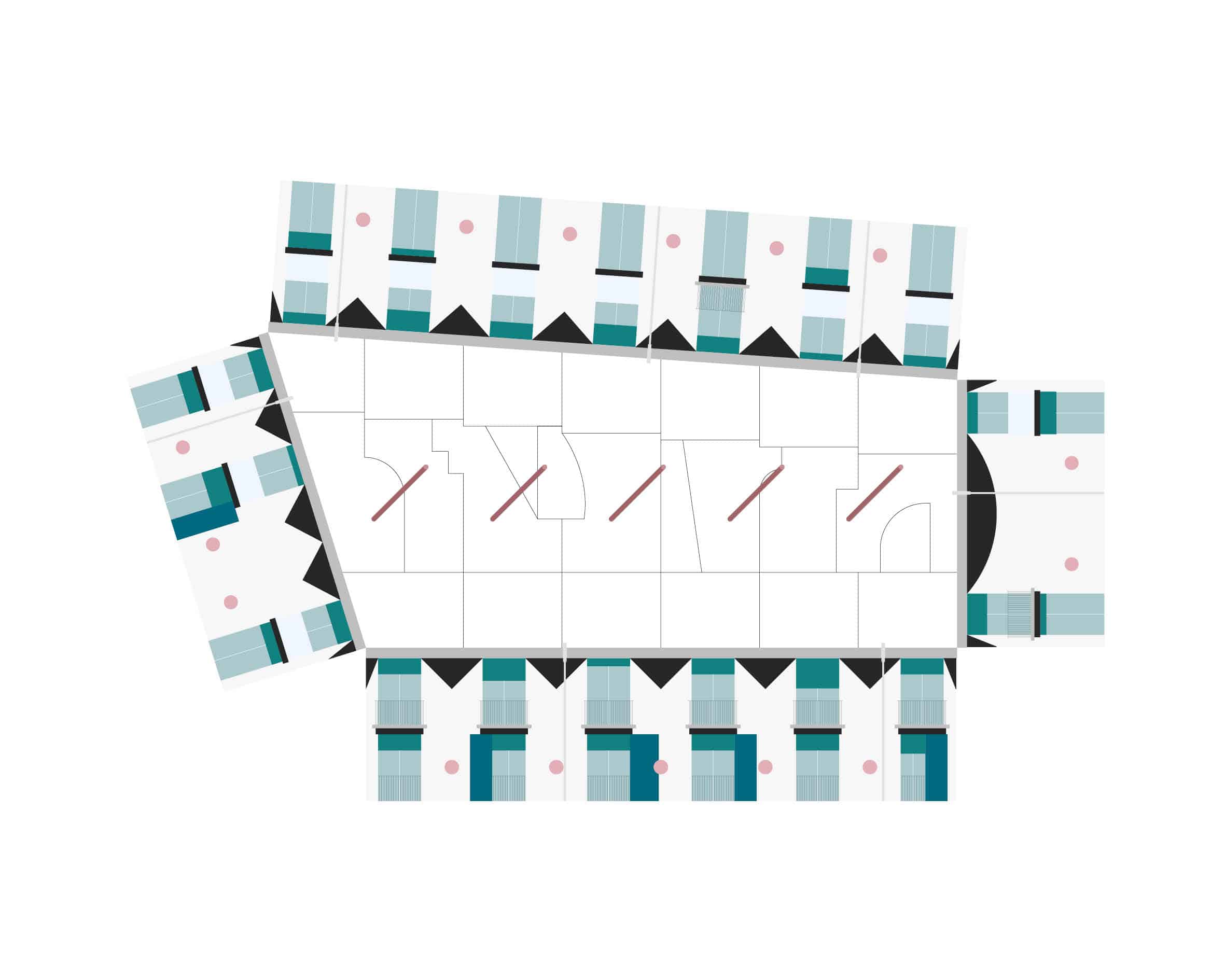
Out of all the compositions, one stood out to me the most. It was one that remained unpublished (other than a single collage accompanying Kersten Geers’ text in 2G). My background knowledge of this specific project is limited. I can only deduce the space through this comprehensive drawing and the collage. What makes each of the 8 compositions standout is how each are inherently unique. Each questions how to see, read, and express a project. They all share the same vocabulary, but their grammar is structured in a way that reinforces the core concept of the project. Depending on this concept, the final form can differ vastly.
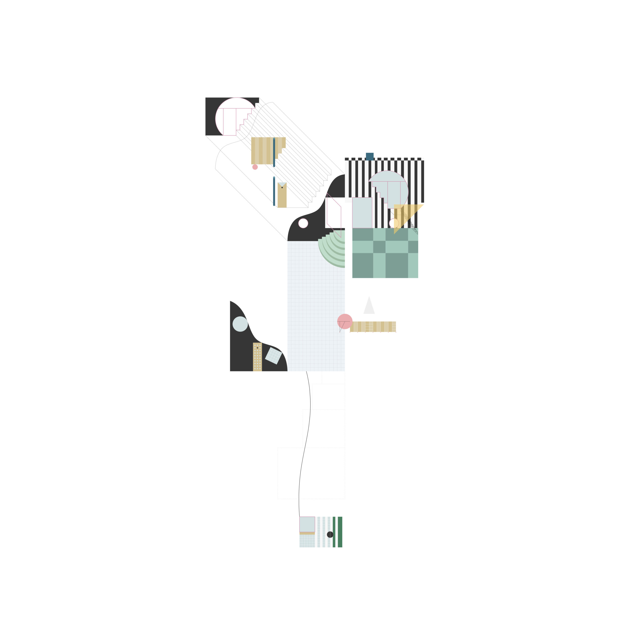
My initial reactions to the compositions were of pure delight. The compositions, formulated by Lera, push us to see more than what is simply visible. They are much more than exploded drawings. A unified composition of fragmented and carefully placed parallel projections of the building breaks free from its commonly perceived built form. By keeping all the figures in a parallel projection (either in a top-down oblique, military oblique, cabinet oblique, cavalier oblique, etc.), the figures retain their objectivity and measurability. We can perceive the figures as another true form of the project itself, or perhaps the truest form on the most conceptual level. A single comprehensive drawing is a plethora of graphical projections that best highlight the space, elements, kinks, tropes, and the composition of the figures as a whole. There is no pure hierarchy of which parallel projection to use. Why be restricted with one single way of drawing, reading, and communicating a complex space? Why not use them all? Since each objective perception functions within its own set of rules, what happens when one juxtaposes multiple forms? I believe they become a form of ‘simultaneous perception’. When confronted with so many conflicting parallel projections, one is left a bit confused on where to start, where to read, what little clues to take in, figuring out the intent, and so forth. It feels like going back to the basics. The viewer has to break free from the customary rules that taught us how to read, and they must learn to consciously read. To consciously break the sentence apart word by word, maybe even by the letter.
Architectural plans (floor plans, sections, construction details, elevations, etc.) are not always meant to be read by everyone. They are a form of language that our profession communicates with. But what if these comprehensive drawings are drawn and shown to only the people that know the project deeply? They don’t need any excess information, just enough to read the most relevant elements. It’s a form of abbreviation. Normally we need the floor plans, sections, and elevations to fully understand a building. The controlled information is spread across each of these drawings. We can only read them separately. The comprehensive drawing tries to abbreviate them (not all, but the most relevant) into a single graphic.
This type of drawing does not show all the information about every little detail that exists within the building, but shows what truly forms the project. Many of fala atelier’s projects are interventions; one can either draw the intervention with the existing building or without. They chose without. They chose to keep it completely autonomous. Everything within the frame is relevant. Everything not shown is not. The figures within the frame further emphasise the intervention as a separate universe that coexists simultaneously with and without the existing building. If it is a new standalone building, it is still expressed in planes, and rarely as a volume. The unfolded juxtaposing planes represent their project and working method closely.
Only the interior of the core rooms make up the drawings. Certain rooms are not shown, especially those behind doors. We never know what lies behind them, but it doesn’t matter. The entrances, for example, are never shown with the back side of the door. We only see the elevation of what we see before we enter the building. Like every good system, exceptions are required. For some projects (housing projects), we see more than the core room, but those rooms are only drawn with a single line (like a floor plan) to show the sub-divisions. While the white wall, being the default (and cheap), is part of the background. It doesn’t even need to be drawn (unless as an exception), but rather accentuated by coloured doors, windows, mirrors (in forms of planes), by patterns, or a single black line on the floor or on the ceiling.
Every element (plane, pattern, line) is used to the maximum of its abilities. They are essential, never decorative. The composition doesn’t negate them, it reaffirms their presence. This is a vital tool for fala atelier to conclude, develop, or even revisit a project. It helps them to differentiate the elements that make or break the project. When these comprehensive drawings are catalogued next to one another, the office is able to see if there is an on-going theme that it is consciously or subconsciously developing.
While looking at these compositions, I kept thinking of them as ‘mental compositions’, where a complex architectural mind can visualise an entire project at once. But seeing them being stored in a folder called ‘comprehensive drawings’, maybe that is the better word for these sorts of graphics. In less seriousness, they could also be a ‘treasure map’ for visitors of all the quirks, elements, and tropes. An adventure of goodies ready to be discovered.
Jack Huang is a young architectural practitioner in Vienna, Austria.
This text was entered into the 2020 Drawing Matter Writing Prize.Click here to read the winning texts and more writing that was particularly enjoyed by the prize judges.
fala atelier: Seriously Playful
– Jack Huang
Back in December 2018, I received an email with a pdf containing 8 compositions in 1:200 from fala atelier. These were ‘comprehensive drawings’ that they were experimenting with for their 2G publication. They simply wanted to know which I liked, and what I thought about them. Some differ from the ones actually published in the magazine, some do not. They were trying to explore possible composition methods and forgo the usual conventions of expressing a project. When I first worked with them a few years back, their graphics were pretty straightforward, but seeing them continue to push the boundaries using the usual set of drawing tools is fascinating. The following text is an extended version of my reply (with some new drawings!).
Out of all the compositions, one stood out to me the most. It was one that remained unpublished (other than a single collage accompanying Kersten Geers’ text in 2G). My background knowledge of this specific project is limited. I can only deduce the space through this comprehensive drawing and the collage. What makes each of the 8 compositions standout is how each are inherently unique. Each questions how to see, read, and express a project. They all share the same vocabulary, but their grammar is structured in a way that reinforces the core concept of the project. Depending on this concept, the final form can differ vastly.
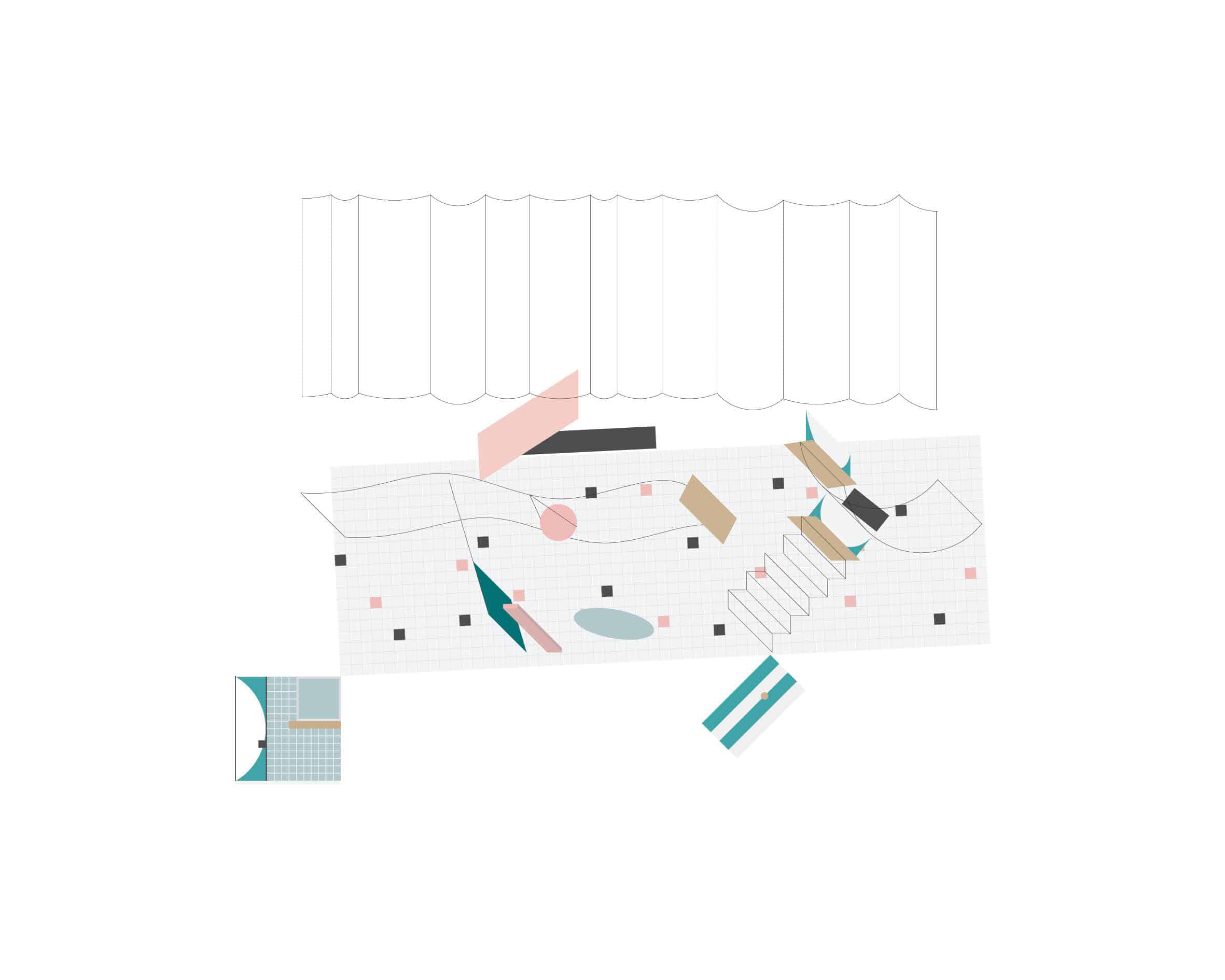
My initial reactions to the compositions were of pure delight. The compositions, formulated by Lera, push us to see more than what is simply visible. They are much more than exploded drawings. A unified composition of fragmented and carefully placed parallel projections of the building breaks free from its commonly perceived built form. By keeping all the figures in a parallel projection (either in a top-down oblique, military oblique, cabinet oblique, cavalier oblique, etc.), the figures retain their objectivity and measurability. We can perceive the figures as another true form of the project itself, or perhaps the truest form on the most conceptual level. A single comprehensive drawing is a plethora of graphical projections that best highlight the space, elements, kinks, tropes, and the composition of the figures as a whole. There is no pure hierarchy of which parallel projection to use. Why be restricted with one single way of drawing, reading, and communicating a complex space? Why not use them all? Since each objective perception functions within its own set of rules, what happens when one juxtaposes multiple forms? I believe they become a form of ‘simultaneous perception’. When confronted with so many conflicting parallel projections, one is left a bit confused on where to start, where to read, what little clues to take in, figuring out the intent, and so forth. It feels like going back to the basics. The viewer has to break free from the customary rules that taught us how to read, and they must learn to consciously read. To consciously break the sentence apart word by word, maybe even by the letter.
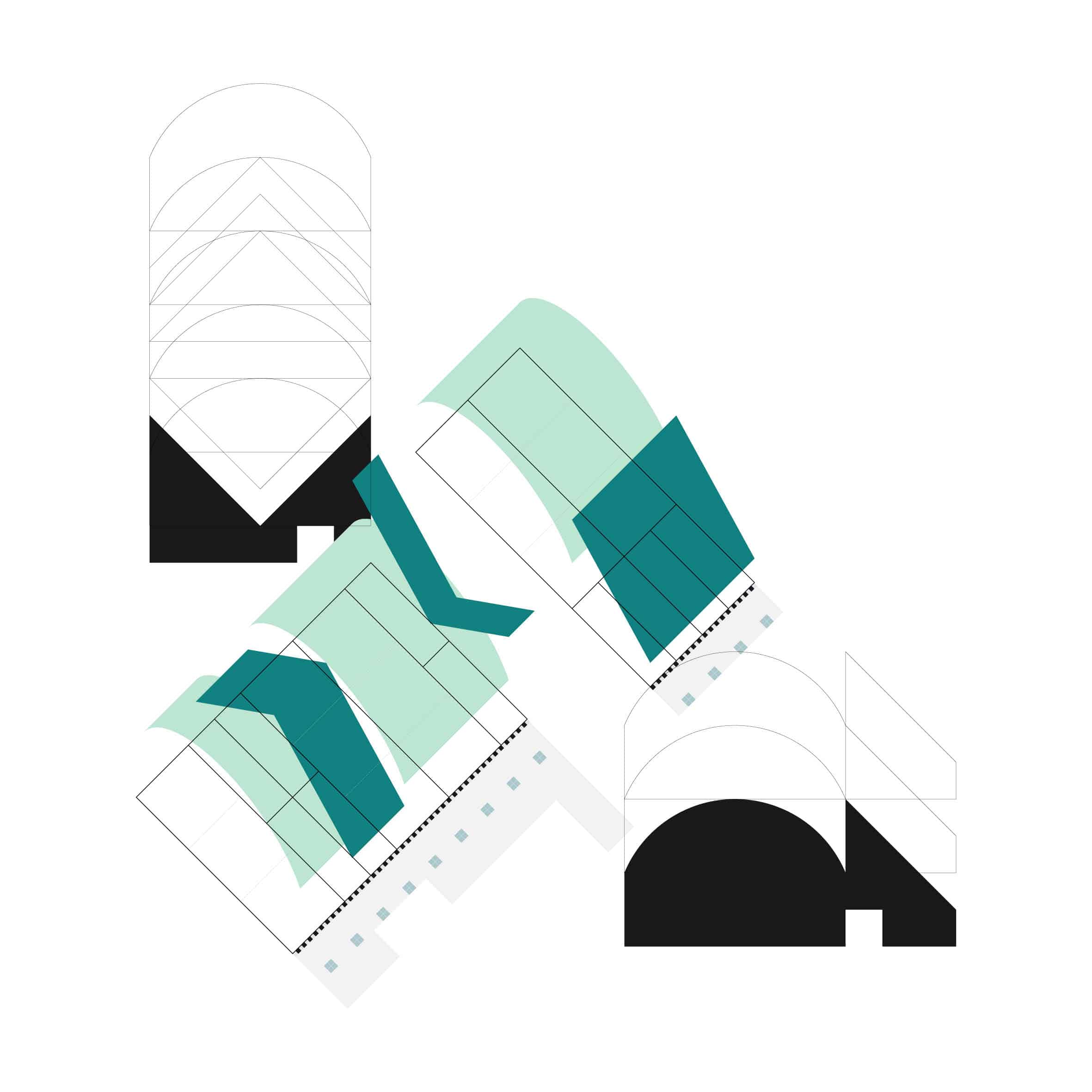
Architectural plans (floor plans, sections, construction details, elevations, etc.) are not always meant to be read by everyone. They are a form of language that our profession communicates with. But what if these comprehensive drawings are drawn and shown to only the people that know the project deeply? They don’t need any excess information, just enough to read the most relevant elements. It’s a form of abbreviation. Normally we need the floor plans, sections, and elevations to fully understand a building. The controlled information is spread across each of these drawings. We can only read them separately. The comprehensive drawing tries to abbreviate them (not all, but the most relevant) into a single graphic.
This type of drawing does not show all the information about every little detail that exists within the building, but shows what truly forms the project. Many of fala atelier’s projects are interventions; one can either draw the intervention with the existing building or without. They chose without. They chose to keep it completely autonomous. Everything within the frame is relevant. Everything not shown is not. The figures within the frame further emphasise the intervention as a separate universe that coexists simultaneously with and without the existing building. If it is a new standalone building, it is still expressed in planes, and rarely as a volume. The unfolded juxtaposing planes represent their project and working method closely.
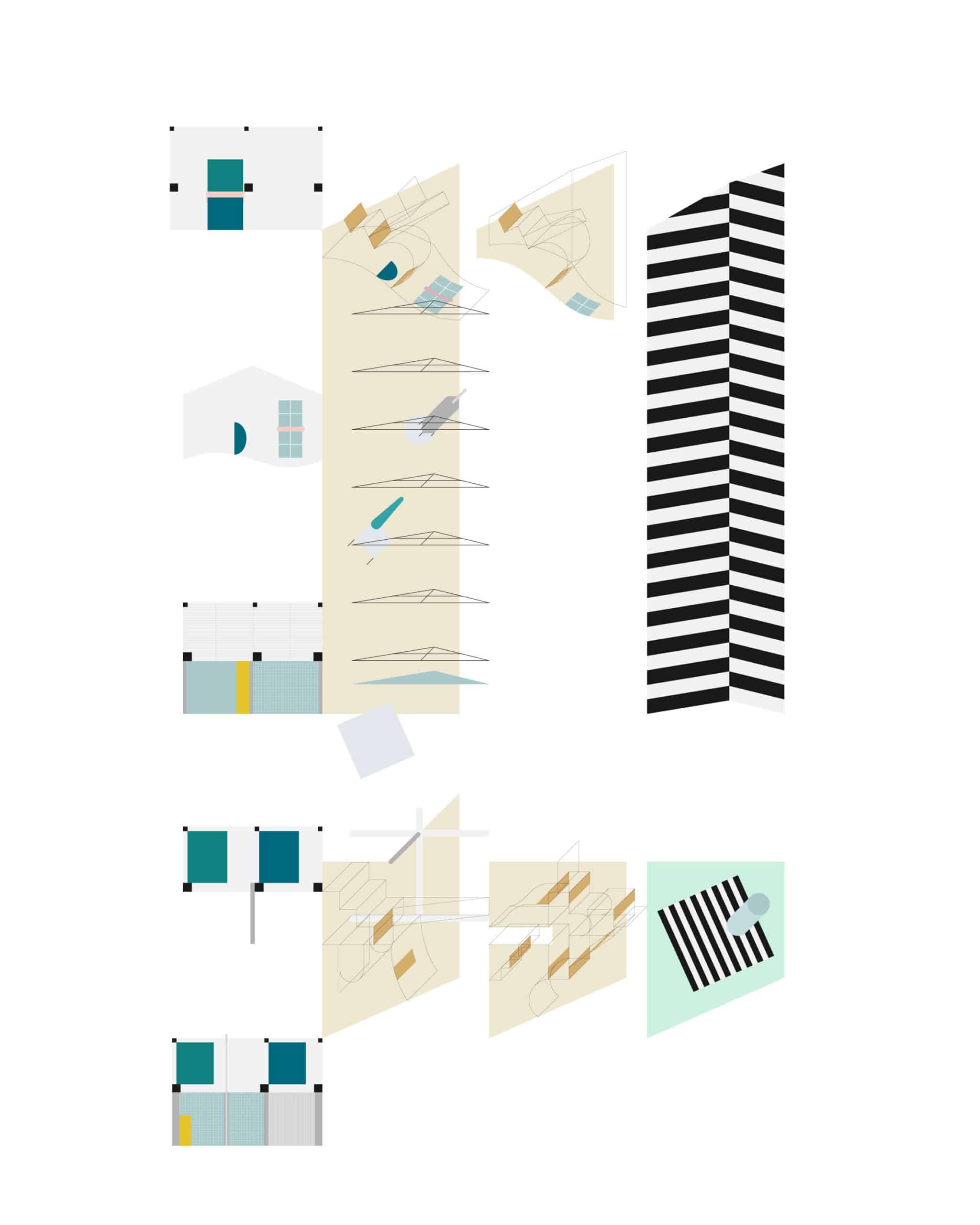
Only the interior of the core rooms make up the drawings. Certain rooms are not shown, especially those behind doors. We never know what lies behind them, but it doesn’t matter. The entrances, for example, are never shown with the back side of the door. We only see the elevation of what we see before we enter the building. Like every good system, exceptions are required. For some projects (housing projects), we see more than the core room, but those rooms are only drawn with a single line (like a floor plan) to show the sub-divisions. While the white wall, being the default (and cheap), is part of the background. It doesn’t even need to be drawn (unless as an exception), but rather accentuated by coloured doors, windows, mirrors (in forms of planes), by patterns, or a single black line on the floor or on the ceiling.
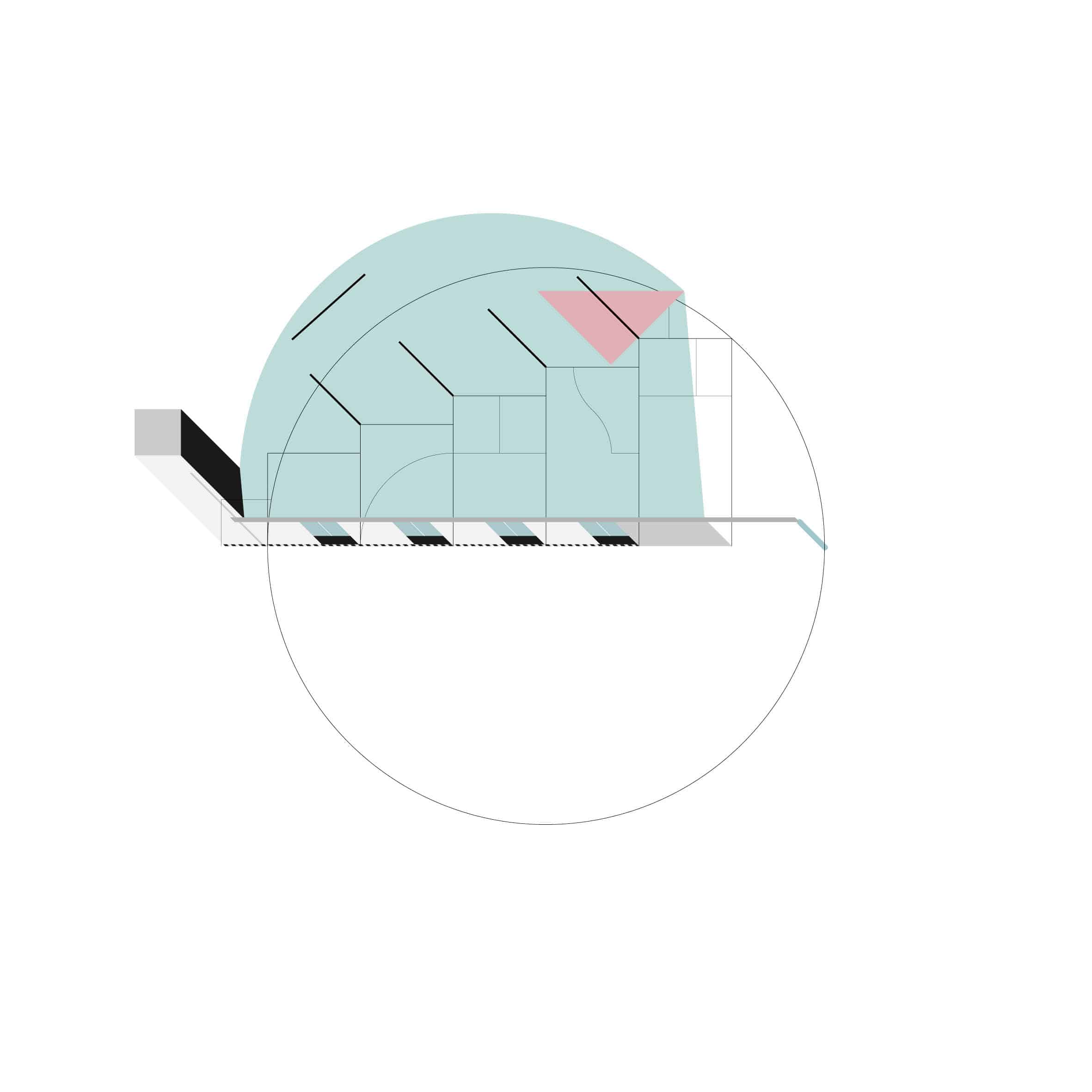
Every element (plane, pattern, line) is used to the maximum of its abilities. They are essential, never decorative. The composition doesn’t negate them, it reaffirms their presence. This is a vital tool for fala atelier to conclude, develop, or even revisit a project. It helps them to differentiate the elements that make or break the project. When these comprehensive drawings are catalogued next to one another, the office is able to see if there is an on-going theme that it is consciously or subconsciously developing.
While looking at these compositions, I kept thinking of them as ‘mental compositions’, where a complex architectural mind can visualise an entire project at once. But seeing them being stored in a folder called ‘comprehensive drawings’, maybe that is the better word for these sorts of graphics. In less seriousness, they could also be a ‘treasure map’ for visitors of all the quirks, elements, and tropes. An adventure of goodies ready to be discovered.
Jack Huang is a young architectural practitioner in Vienna, Austria.
This text was entered into the 2020 Drawing Matter Writing Prize. Click here to read the winning texts and more writing that was particularly enjoyed by the prize judges.
Related...
Assemble: Collective Authorship
– Giles Smith and Adam Willis
Writing Prize 2020: To Measure a Croissant
– Emily Priest
Alternative Histories: fala atelier on Louis Kahn
Category
drawing histories drawing techniques & materials commentaries, rants & reflections
Period
c21st
Architect
fala
Medium
drawing
Tags
drawing matter writing prize 2020