The Least Computerized of Men
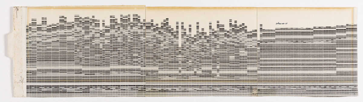
Some drawings in the collection lend themselves to speculation. With no right or wrong answers, the questions asked are afforded a naïvity. Harry Schwalb’s 1968 ‘Computerized Graphic of New York Skyline’ is one such drawing. It’s compelling; it looks good, it looks complicated. It has a date, a title, and an author, but we don’t know how or why it was made. When shown to archive visitors, it often sparks a detective’s response. Why was it made? How was it made? Who was it made for? What is it trying to do/say? The classic Drawing Matter Inquisition.
The title suggests it was made using a computer. Speculation as to the state of computer technology in 1968 ensues. Was it made using some kind of sonic measuring device? Was a camera set in motion on a boat? Is it a survey? What did the New York Skyline look like in 1968? Was it made for publication? The list goes on. The physicality of the drawing gives few clues. On the reverse, scribbled in pencil at the top of the sheet is ‘WRONG BACK’ followed by a long list of numbers and chemical names. Turning it back over then prompts a whole new set of questions. Is the image on the front related to the numbers on the back? And if so, what kind of machine is creating the image? How is Sodium Silicate related to the New York Skyline?
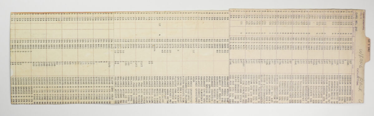
Schwalb was born in 1925, fought in WWII, studied at the University of Pittsburgh, and spent much of his adult life working as the creative director of a company called Fisher Scientific, a laboratory supply and biotechnology company started in Pittsburgh in 1902. He held the job as creative director (about which little is written beyond the title) for four decades. Alongside this job, he made and showed his own work as an artist, wrote about art regularly for the Pittsburgher and Pittsburgh Magazine, and was a contributing editor for ARTNews in New York.
In an attempt for more information, I tried emailing people I found on the internet. After several rounds of enquiries, someone put me in contact with a friend of Schwalb’s who I messaged on Instagram asking if he could tell me more. He soon replied:
Dear Martha
You are correct, it is a particularly fine drawing and a little unusual for Harry (he was a good friend of mine). It’s quite early, done when he was the curator of Fisher Scientific.
At about this time Pittsburgh was undergoing a renaissance with important modernist buildings to attract his attention (viz the ALCOA building). He was friends with an architect, Harry Grant who drawings remind me of your Schwalb. (Ruled lines).
In his later career Harry’s graphic work is less linear, more observational and often fanciful and witty.
He was much loved here but enjoyed his trips to New York.
Best, Graham Shearing
A follow-up message read:
‘He was the least computerized of men!‘
A potential nail in the coffin for the trail of speculation.
Newspapers were the next source. Schwalb appeared to have been a regular contributor to the Pittsburgher and his name was often mentioned in its culture section so I read on. It wasn’t promising. One review read:
Harry Schwalb, whose exhibit of ink drawings opens Wednesday at the Arnot Art Gallery, has been fighting a losing battle with humor.
He finds it impossible to draw anything without spoofing it – either gently or downright spitefully.
As if to illustrate the point, he howled gleefully as the packers uncrated one of his drawings at the gallery this morning.
‘Look!’ he roared as he spotted a drawing of a bunch of grapes which the packers had dropped against a wall.
‘They put it upside down. It looks like a drunk Christmas tree. I’ll have to retitle it.’
And another:
Schwalb insists there is humor in all of them. They can be appreciated without defining the humor. But Schwalb’s definitions are worth requesting.
I continued to read through reviews in which Schwalb’s work was shown. There I found it. In the Castle News of 1968:
But what does that block series of horizontal shaded lines make you think of? Why, New York, of course, with its endless roofs cutting into the skyline. And sure enough, it pleases you to notice Harry Schwalb has listed his entry, ‘New York, New York.‘
The real nail in the coffin.
So our drawing’s a prank. It’s called New York because it looks like New York, simple as. Maybe Schwalb found it in a pile at Fisher Scientific, the cast-off from a chemical test, turned it over, presented it as art. Who knows?
This doesn’t render it useless, however. The efficacy of Schwalb’s drawing does not lie in its addition to an honest architectural history, but rather in its ability to generate questions. And it still generates questions. We still don’t know how it was done. It still looks like a skyline.
*
Martha Cruz is a Collection Researcher at Drawing Matter.
