The Wobbly Line: Asplund, Johansson and the Influence of Tessenow in Sweden 1915–1925
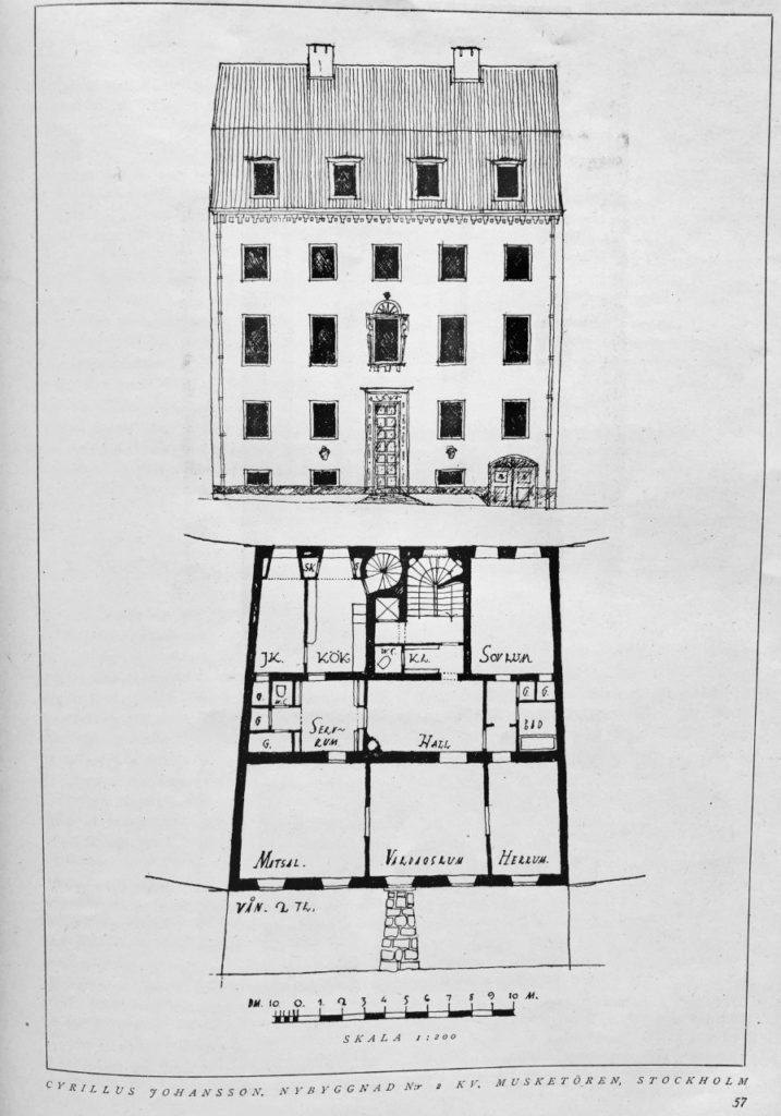
There is a drawing in a 1923 issue of the Swedish trade journal Byggmästaren (The Master-Builder). It is part of a presentation of a new three-storey house by the architect Cyrillus Johansson. To illustrate his text the architect has included photos and a drawing of the front elevation and a plan of the second storey, marked on the façade as the ‘piano nobile’ with higher ceilings and a centrally placed oriel window. The drawing style is remarkably simple, almost childish. Wobbly lines indicate the tiled roof and ornamental details around the oriel and the cornice are mere scribbles. No ruler has been used to draw the windows which is notable as this is a building on one of the most prestigious new addresses in Stockholm: Tysta gatan (The Quiet Street).
The crooked quiet street was the result of a 1911 change to the Stockholm masterplan, a reaction to the strict nineteenth-century grid of five storey buildings and designed by Stockholm’s city architect P.O. Hallman, whose plans verge towards the picturesque in both scale and character. His working-class districts are similar, but with multifamily houses. This style evolved from studies of the medieval and pre-industrial city, which exerted an influence in Nordic countries and Germany in the first decades of the twentieth century. Craft and the ‘touch of the hand’ was highly esteemed and can be seen in both interior decoration and on exteriors. The Swedish preference during the 1910s and 1920s was for wood panel facades in single-family houses. In urban settings such as Tysta gatan rough lime-stucco washes over a visible brick structure seem to be a conscious choice to evoke the textured surfaces of medieval town houses, in preference to the smooth and regular. These rough surfaces, which are also expressed in the drawing, match the broken vistas of the curved street and irregular forms of the houses. Ornament is used sparingly.
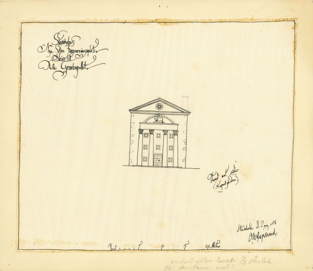
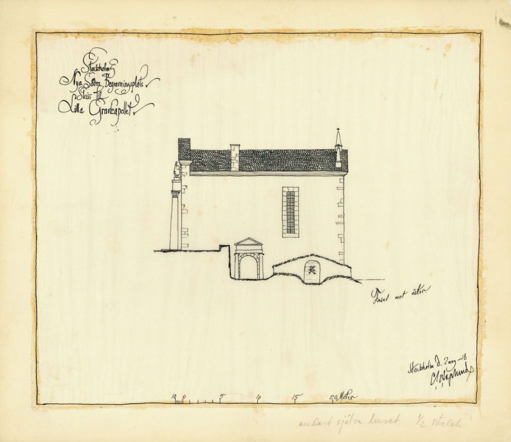
Cyrillus Johansson’s drawing style is very similar to Erik Gunnar Asplund’s first classicist designs for the elevations of his Woodland chapel in Skogskyrkogården (the Woodland Cemetery). Again, in Asplund’s drawing no ruler seems to have been used, the style is very informal and almost naïve. Seemingly on purpose, so as to emphasize the informality of the presentation, the whole front façade elevation is at a slight angle to the frame and the scale bar at the bottom of the page. In grey pencil a chimney has been added to the ink drawing of the front façade, with a note scribbled ‘chimney included!’
The sketch of the front elevation shows a stone chapel with what seems to be four giant Corinthian columns, each 8 metres high, framing the main façade, which faces south. The whole building rises about 14 metres – small but imposing. The sketch of the eastern façade shows an elongated window, irregularly placed, and a slightly off-centre portico around the sous-terrain entrance to the basement. Tucked in against the façade is a cellar partly covered by earth and grass used as a mortuary. The proposal was turned down by the city of Stockholm, deemed as being too expensive.
Asplund’s casualness was perhaps because he was thinking about important matters. Soon after these drawings were made, he departed for Denmark on his honeymoon. It was in Denmark that he found the inspiration for the Woodland Chapel as we know it today. The built design is a seemingly archaic Nordic ‘hut’ with twelve white wooden columns and a hipped roof covered with black wooden shingles. It is directly inspired by Liselund Castle, built in the 1790s by a French nobleman and his Danish wife. The architect, Andreas Kirkerup, who also designed the castle grounds, gave the neo-classical building a thatched roof with wide eaves to convey a sense that one was living the ‘simple country life’ and to blend the building into the landscape.
Like Liselund, the Woodland Chapel was designed to fit into its surroundings and to appear like a vernacular structure. Asplund covered the chapel roof with shingles to blend into the woods – a roofing method seldom used in Swedish traditional architecture – and reused the earth covered cellar from his first design. He surrounded the chapel plot a low wall, a common feature of village churches.
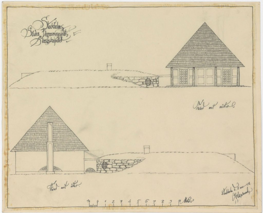
In preparatory sketches, one sees that Asplund intended the words ´Memento mori´ to form part of the wrought iron gate, and a small statue of Jesus to welcome the visitors with open arms. Ultimately the statue became the golden Angel of Death by Carl Milles. Asplund designed every little detail of the interiors, including the light wooden chairs, and a skull around the keyhole. A Gesamtkunstwerk. Interestingly, the final sketches to present the new, thoroughly designed but more modest proposal for the Woodland Chapel were done in the same informal style as the first proposal. In December 1918 Gunnar Asplund handed in the new sketches. The lettering is ornate, yet the drawings are very simple. The new proposal was approved, and the Woodland Chapel built and inaugurated in 1920.
The influence for the wobbly drawing style used by Johansson and Asplund might come from a German book published in 1916, the richly illustrated book Hausbau und Dergleichen(Housebuilding and Such Things) by the architect Heinrich Tessenow. It was widely circulated in Sweden at the time. Tessenow’s architecture in this book could be summarised with the formula: asceticism under a pergola. It is very austere, but this austerity is literally framed by pergolas with blooming flowers around entrances and on garden side patios. An idyllic idea that the simple life needn’t be without beauty.
The stripped-down facades in Hausbau und Dergleichen are illustrated in a very restrained style of drawing – a far cry from the rich and magnificent ink washes of the École des Beaux Arts still practiced at that date. Tessenow uses a uniform contour line that economically registers form and detail. There are usually no values, just black and white. He lets the sky be the white of the page, often eliminating cast shadows. Roof tiles or brick walls are loosely indicated by careful, wobbly ink lines or dots and curved marks scattered across the surface. Sometimes there will be a subdued but skilful cross-hatching enhancing the texture of a wall in shadow and creating the effect of stark sunlight hitting the stucco surface by leaving other walls blank.
The windows are often drawn without the aid of a ruler, just as Gunnar Asplund and Cyrillus Johansson do a few years later. The rounded window corners and irregular lines convey a feeling for materials and craftsmanship. These architects strived for simplicity in a world that to them seem to be steeped in far too much ornament. In Hausbau und Dergleichen Tessenow decidedly prefers the square window to the rounded arch window, claiming that anyone can see that the rounded arch window, although technically fine, is a less pure form than the square.
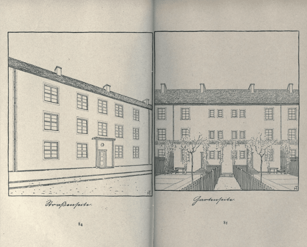
Tessenow also believed that domestic housing, not the civic building, should form the basis of architecture. This errs from classicist dogma, since classicism ultimately is based on civic architecture: Greek temples. Tellingly another of his books is entitled Handwerk und Kleinstadt (Handicraft and the Small City, 1919). A major Swedish craft exhibition, Hemutställningen, was organised in 1917 by curator and design theorist Gregor Paulsson. It was very much in tune with Tessenow. Among other things a combined kitchen-living room interior for workers by Asplund was shown. The whole idea was to bring art and craft into the life of the working class. In his 1919 book Vackrare vardagsvara (More Beautiful Everyday Things) Gregor Paulsson even quotes Tessenow.
The drawing styles of Asplund, Johansson and Tessenow all reflect this craft credo that looked back to a simpler life. Craft would counteract the effects of mass production and misery and alienation of the industrial working class. It is a simplification with different roots to modernist rationality and cult of the industrial, yet both Paulsson and Asplund would later follow the modernist path. The drawings of these architects in the years around 1915–1925 are strikingly simple, in contrast with both today’s photorealistic 3D renderings and the meticulous washes of the Beaux-Arts School. However simplistic, almost naïve, these drawings are, they resulted in some of Stockholm’s most beautiful and admired buildings. The touch of the hand trumped the perfect line of the ruler. For a while.
