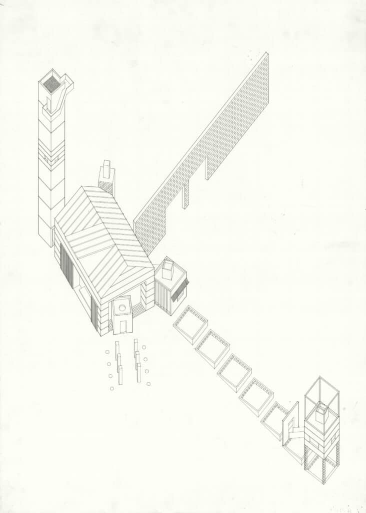
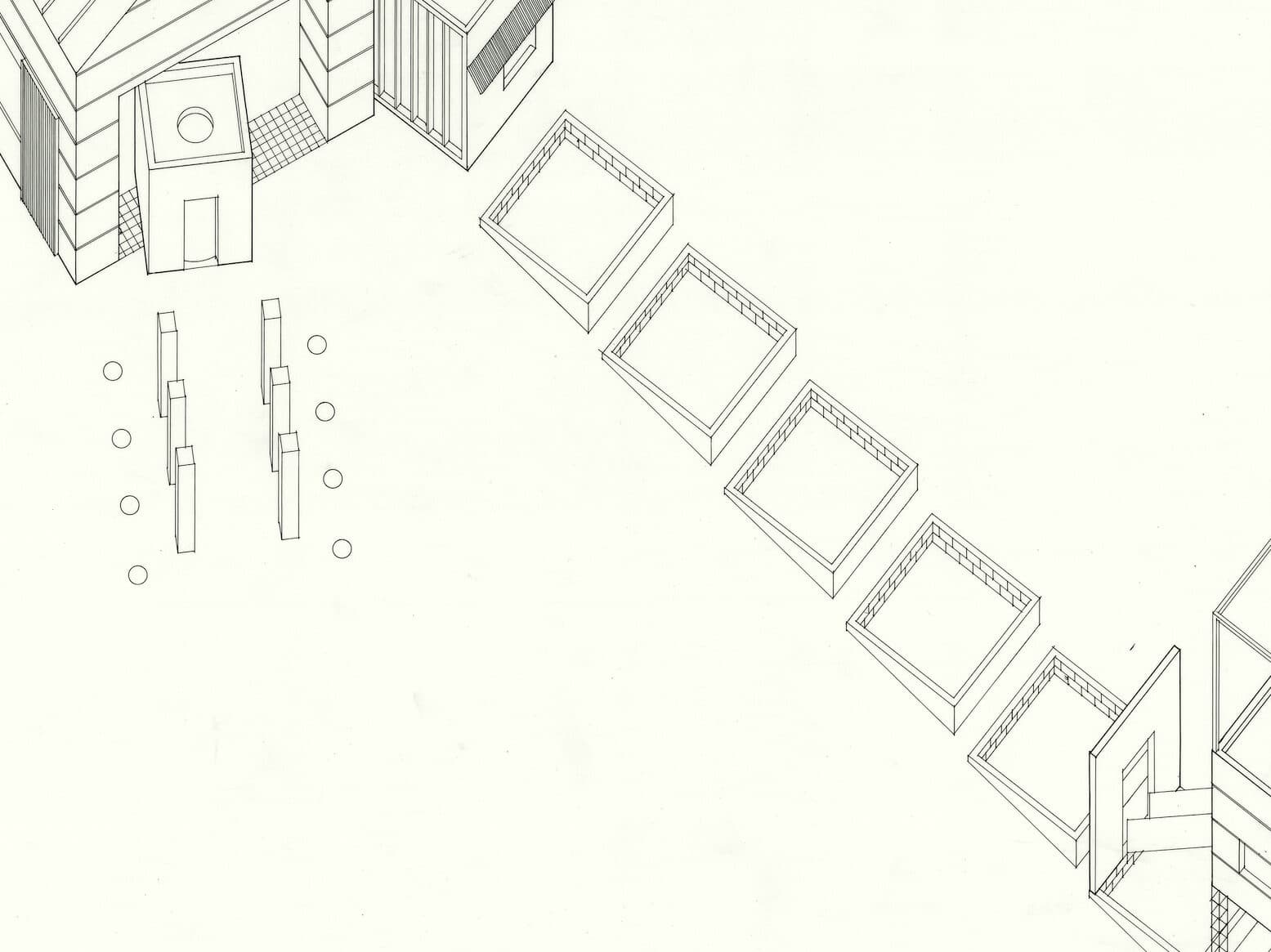
The following is a conversation between Marco Moro and Craig Moller, New Zealand-born architect and author of the drawing pictured above. Moller made the drawing while in a design studio taught by Mark Wigley in 1985, while the latter was about to finish his doctoral thesis within the newly established PhD programme at Auckland School of Architecture.
Craig Moller: This drawing comes from my second professional year at the School of Architecture in Auckland, what we might technically call the third year of university since the architecture curriculum consisted of a five-year degree at the time. The design studio was run by Mark Wigley, and it was supposed to be quite short. From memory, it lasted no more than three weeks. Things have changed over time, but we had a series of studios lasting two, three, or five weeks. I think five weeks was then the longest. You went through the crit scenario in the course of the studio, but the ending materialised only at the end of the year when you collected all your studio projects into one folder, and that was actually when the final submission was made. Of course, what you did have between the last design studio of the year and the final submission was a period when you could work on your presentation, and it was precisely during this interlude that this drawing was produced.
Marco Moro: From my conversations with Julia Gatley, architectural historian and Head of the School of Architecture and Planning (2016–2018), I learned that the background against which the production of drawings reached its peak corresponds to a full-fledged pedagogical transition period, namely a ‘theoretical turn’ that gradually expanded its influence in national and international academic circles, giving the sense of disruption in the supposed centre-to-periphery distribution of official culture. I guess Mark Wigley’s investigation on the ‘deconstructive possibilities of architectural discourse’ played a crucial role in this transition. How did it affect the work in the studio?
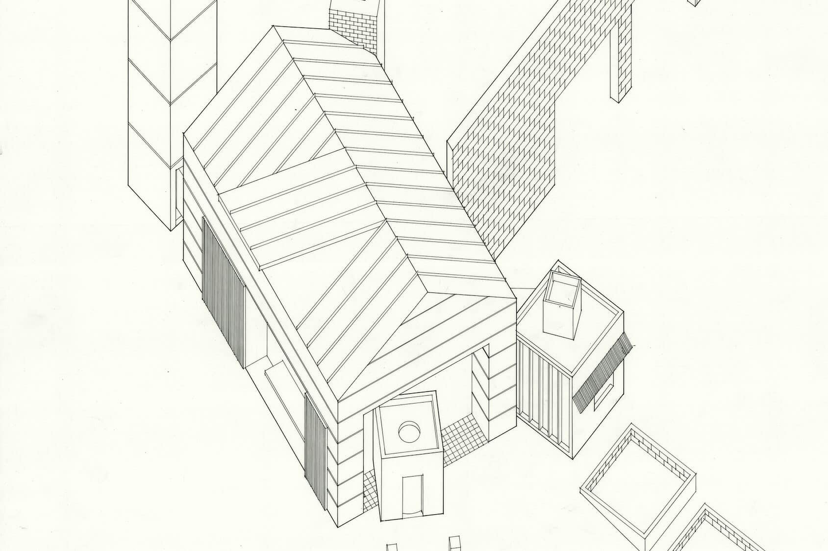
CM: Well, keep in mind that this drawing comes from the second-year studio, when your knowledge and your skills were still kind of developing, so that you can discern a certain degree of naïvety here. Mark Wigley ran this studio when he was finishing his doctoral thesis on Derrida’s work. The first thing I remember about the studio is that he required us to do every drawing, whether they were free-hand or executed with hard line, as axonometric. He didn’t want us to draw in plan, or in section, let alone the perspectival sketches, which were fairly dominant in the school at the time. His view was of course that when you draw an axonometric representation, you draw all the drawings in one: you draw the plan, you draw the section and so on. The second thing about the studio that I recall was that we had to focus on the combination of what he would call ‘two architectures’. Indeed, what we had to identify were two types of architecture, and we had to look at how we might combine those two types. Firstly, I was interested in Donald Judd’s sculptures. I think that most of his sculptures are untitled, but he did a sculpture comprising eight cubes. Sometimes these sculptures were exhibited in art galleries, sometimes situated in the landscape. And for this last reason, I thought they could have architectural connotations. The second architecture I chose consists of what we might call the ‘archetype’ of the hay barn, which in the New Zealand context is a lightweight framed building – it might have a steel or a timber frame – most often clad with a corrugated metal profile roofing. The hay barn epitomises a simple piece of architecture, quite monochromatic, with its standard openings framed with those barn-like sliding doors often mounted on the outside. So, those were the two types of architecture that I was looking at and their hints, or references if you like, to the cubic nature of something architectural with the Donald Judd sculptures and the archetype of pitched-roof barn-like form. In terms of the programme or function, I can’t remember anything about it, whether it was a requirement or not.
MM: I am intrigued by the term ‘reference’ you just mentioned. If it’s true that this drawing coincided with a more critical approach to architecture, it happened under the ascendancy of academically challenging theory courses taught by the new entries in the staff roster to have mostly grown up in the local context. New Zealand critic Andrew Barrie recalls that, a among them, Sarah Treadwell and Wigley’s supervisor Mike Austin began to teach a course entitled Contemporary Architectural Positions, and Ross Jenner, who holds his PhD on Italian Modernism from the University of Pennsylvania supervised by Joseph Rykwert, a few years later would have initiated the journal Interstice that, despite its irregularity, incited the development of a theoretical discourse in New Zealand. I’ve been wondering to what extent these other occurrences have influenced your drawing. Were you perhaps assigned explicit references in order to guide a more serious attitude to history and theory?
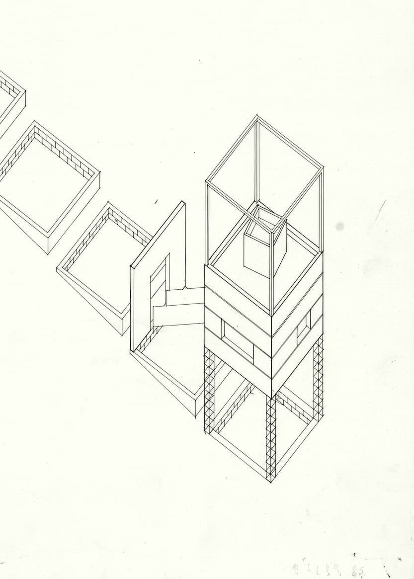
CM: No, we weren’t. It was up to each student to find his or her own references. In my specific case, I remember that some of the early house projects by Frank Gehry started circulating at the time. For instance, I found the Venice Beach House in California to be extremely interesting, to the point that a reinterpreted version of its remarkable lifeguard-tower studio space intruded in the bottom right corner of the drawing. Even the masonry that you can see diagonally crossing the composition doesn’t derive from the hay barn, and it’s even less inspired by Judd’s sculpture. I guess it comes from something else that caught my attention as a student. What is interesting in the New Zealand context from back then is that there still was an extraordinarily long time between what was being talked about in Europe or America and its arrival in New Zealand via printed media. We realised that many of the things we were discussing in the mid-80s were perhaps conversations initiated in the second half of the 70s in New York, Venice or London. Obviously, the immediacy of the internet was not available, and any information we got from current publications was probably several years out of date. Bear in mind that the most recent information we had was from periodicals, which took some time to be shipped to New Zealand; that means that for us as students the architecture school library became life-giving, because it was the place where all the knowledge and the latest information were available. Contextually, in terms of the Auckland School of Architecture at the time, I can say that the academic environment actually transformed itself in the 80s – I mean, not the entire school. But there was a difference between what was being talked about, discussed and examined at the school in the 70s compared with the conversations floating around in the mid-80s. I guess that we could talk about the rise of the analytical approach, rather than an experiential approach. Peculiarly, the dominance of experiential approach was to be found in its complicity with the perspective view, through which you can look at how you feel in a specific spatial condition, whereas the axonometric is very much a mode of representation that emphasises the drawing’s analytical properties.
MM: What seems to me is that the analytical approach you are talking about not only began to be practised from the selection process prescribed in the brief, and critically applied by you students to the sources of inspiration in the way you described. But the same slippage of information you perceived at the time played a fundamental role in convincing you that every reference could have been better interrogated analytically, rather than measuring its updating level. Consequently, the axonometric assumed an undisputed role on these premises, as you said before, even without resorting to conventional drawing projections…
CM: Yes, that’s how I came up with this drawing. I remember that in terms of the final submission for the studio there was a moment when we drew the plan of our design proposal, but with it came after-effects. Everything was essentially conceived and formulated in axonometric sketch-form, and the drawing you see here constitutes the final A1 produced for the ending of the course using Rotring Rapidograph pens. I must say they are the same ones I still use today! Aside from all that, people like Peter Eisenman and James Stirling had both used the axonometric as a way of describing their architecture, albeit in a quite different way. I remember that my impression of Stirling at the time, and even now, is that his use of the worm’s-eye sectional axonometric was focused on describing the architectural promenade, which was one of the most recurring figures in his architectures. Peter Eisenman was instead the one who best showed the analytical potential of the axonometric representation to dissect and describe his work. While Mark Wigley was doing his PhD in 1985, Eisenman was invited to contribute as one of the thesis’s external examiners, and it wasn’t too long afterwards that Mark was involved in the Deconstructivist Architecture show at MoMA. Deconstruction, with its desire to challenge or subvert established notions, was part of the discussion at the time, although it was not necessarily conceived as the School’s mantra. Honestly, I wasn’t too aware of what Mark Wigley was doing in his research, since he didn’t ask students to read any texts by Derrida! Moreover, what has to be noted as one of the most distinguished characteristics of the Auckland School is the wide variety of its educational offer, which remains still true today. If I talked to contemporaries of mine about our educational paths, they certainly would recall quite different experiences, depending on which studio they engaged with. I’d say that all the tutors I did engage with, particularly in the second, third and fourth years, were often interested in architectural theory that privileged analytical approaches rather than an experiential or perceptive approach. So, what is glaringly obvious in hindsight is that in 1985 my entire studio presentation was an ink axonometric drawing and very little else!
MM: Well, the concern with representation as the source of a critical stance on architecture had a long tail, but I’d put forward a first thought that keeps our conversation anchored to your drawing and how you produced it. It seems to me that the use of materials represented in the form of minutely differentiated hatches makes the drawing much less abstract than one might expect on the premises you are illustrating, even questioning the axonometric analytical properties. Or perhaps, the axonometric became that privileged territory in which analytical approaches could easily be extended up to those aspects more inherent to construction. By the term construction, I do not mean just skills in materials processing, knowledge of construction methods, and experience in the maniacal elaboration of details. What I’m referring to is, rather, the more complex and profound sense of something that I would like to call a ‘politics of construction’, embodied in the Kiwi culture that progressively evolved not only because of technological progress, but also as a response to the organisation of all the resources necessary to build architecture within its marginal condition. Did you already have some knowledge about constructive aspects at that stage? Was it required in the studio brief that gave rise to this drawing? Or was this obsessive pursuit of crafted details just a reminiscence from the tradition of the ‘Drawing School’, as the Auckland School of Architecture was labelled when its highly sophisticated approach to representation became its distinctive trait?
CM: From what I remember, Mark recognised that degree of obsession with Kiwi architectural construction culture, and he was kind of alarmed that it could represent an element of resistance to architecture in New Zealand. Hence, I’m pretty sure that all this knowledge about construction wasn’t part of the studio. But it was definitely part of the ‘two architectures’ I chose for the drawing, and of all the other fragments that compose it. As I said earlier, Gehry’s work was an inspiration to me at the time, even those projects he had never built. I guess the lingering outcome of this fascination was a certain notion of materiality. His work is often based around materiality or a particular material, and it’s still true today. I must say that materiality was very important to me in the drawing, and in terms of my architectural references. I was obviously aware of how to describe the New Zealand hay barn, and how to put all the constituents of its materiality on paper, as I mentioned before: light timber frame, metal cladding, wide openings. The other material that I chose was the concrete from Donald Judd’s sculptures. I think at the time Judd had recently circulated works with his compound in Marfa in architectural publications.
MM: Following this, some images of that compound reappeared several years after its foundation and the date of your drawing in the pages of the Italian magazine Lotus (no.73, 1992), accompanying Judd’s controversial article on the ambiguous role of museums in contemporary society entitled ‘The Two Cultures’, quoting the influential lecture by the British scientist Charles Percy Snow from 1956. However, what is interesting is that the initial pages of that same issue were dedicated to the brand-new section of the Fifth Venice Biennale, curated by Francesco Dal Co who introduced some innovations challenged by the vision of a more international event. The first novelty concerned the well-known inclusion of the national pavilions in the event, which among others saw the participation of Austria with the works of Coop Himmelb(l)au, the United States exhibiting projects by Eisenman and Gehry, and Switzerland with a retrospective by Herzog & de Meuron. The second, much less known, concerned the exhibition of 43 schools of architecture from all over the world, and the institution of the prestigious Venice Prize dedicated to them. The jury, including Arata Isozaki and Hans Hollein among others, assigned that prize to the Auckland School of Architecture, which literally broke into the debate from the edge of the world with its powerful illustrative apparatus. I guess you know this part of the story much better than me…
CM: Sure, that installation explored the themes of drawing, representation, lightness and ephemerality combining a timber-and-paper fragile construction with dazzling students’ drawings on the walls and pavements around Corderie dell’Arsenale. Somehow, the result of what you have suggested is a more complex complicity between drawing and materiality. The Venice Prize was the most important moment of international recognition accorded to New Zealand architecture, with students from Auckland beating students from Yale and from a range of other leading universities. But anyway, I wasn’t part of that. Ironically, I was studying at Yale at the time! After graduating from Auckland, the typical thing for New Zealand students was to spend a couple of years in the UK, because it is quite easy to get a working visa for two years. That’s why most people do it. I was really interested in doing more study, so I went to America, Yale University, for a two-year master’s degree. Since I already had a professional degree from Auckland, it meant that I could just choose from a range of elective courses. One of those I took was the perspective drawing class! It was taught on Friday afternoons by one of the local architects in New Haven. He was working in the office of Cesar Pelli, who had previously been the Dean of the School. He seemed to be offhand and casual, but I soon realised he knew exactly what he was doing. It was not an easy school to get into as a student, but no easier as a staff member either. The second course I took was that of History of Modern Architecture by Francesco Dal Co. He came over for a block period and taught this course in the evenings at Yale, and I think he has been doing that for a number of years. I do remember him talking about how he had been taught by Carlo Scarpa, and also a lecture about his classmate Mario Botta. But above all, I had the opportunity to deepen my knowledge on Aldo Rossi, whose theories had the greatest influence on the way I draw. In fact, I’d say I was aware of the hay barn as the very local archetype here in New Zealand. Of course, what sits behind it is the notion of typology: that is what I have got from Aldo Rossi, although what most intrigued me in Rossi’s theory was not so much his Architecture of the City, but the book that I really enjoyed was his Scientific Autobiography. I remember when I was reading it a lot of what he said resonated with me at the time, and I am still kind of interested in that notion of typology as a background for everyday activities. At least in my own interpretation, you can always argue that what you really need for dining is a table, for instance. You don’t necessarily need the room. Or it could be every kind of room, but what you really need is the table for discussion, food and living. This is what I learned from Rossi, the notion of the classic archetype, which has been used in many different ways by different cultures and religions to house a space for some sort of activity. Hence, I was interested in that and in the archetype of the hay barn.
MM: Starting from the contrast you suggest between Rossi’s theories, I wonder if you had the impression of doing a formal exercise, despite the notations of empirical materiality that we have discussed, or if you also conceived this drawing as a liveable space. Or even more, could we interpret it as an instigation for alternative ways of inhabiting New Zealand landscape? I’m asking because you said before that there was no assigned programme. Likewise, if this sort of ambition really existed in this drawing, I’ve been wondering if it was possibly stimulated by the work of Ian Athfield, one of the most successful local architects in those years, whose village-like house-and-office stretching up and down a steep site in the northern suburb of Wellington was offered as a visionary model for co-living and co-working, shifting the attention from functions and objects to rituals and attitudes. Again thanks to Julia Gatley, who introduced me to the members of the studio still occupying portions of the complex, which has some 40 people working in it and 25 living in it, I had the opportunity to take a stroll around it and I was really impressed by the fact that its complexity cannot simply be reduced to a pioneering mixed-use idea. Conversely, it seems to materialise the formal-based additive process of Rossi’s paratactic compositions, as Ezio Bonfanti used to call them, namely a set of finite and autonomous ‘pieces’ and ‘parts’ assembled without any possibility of identifying a hierarchical subordination.
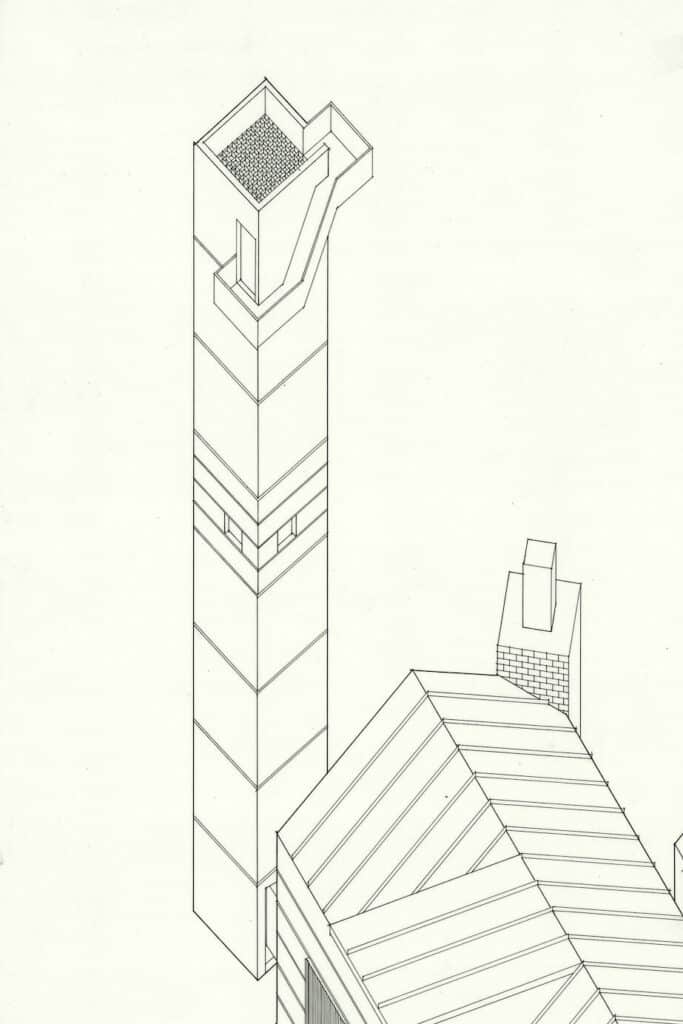
CM: Of course, I was aware of Ath’s work. Those who are familiar with New Zealand architecture know that he has become a key figure over time. He was a friend of my father, so I knew him personally and I remember that in the year before this drawing I visited his house-and-office in Wellington to interview him for one of the school’s assignments. I think what he has done is very interesting, particularly with the project of his house – let’s even say amazing, but I wouldn’t see him as an influence for my thinking or what I was doing at the time, in particular in this drawing. At the same time, I’d say that the paratactic process given by the juxtaposition without any hierarchical subordination has certainly influenced the making of this drawing. When I said no programme, it was what I recall from Mark Wigley’s studio. What you finally have is a house, and of course the house was consisting of the main space, which is the barn, the building in the bottom right corner that is a study space, and then there is the observation tower at the back. From memory, I had the bathroom in the bottom of the tower, kind of intercepting the adventurous peregrinations of inhabitants. Hence, there was a kind of a programme, but I guess what better represents this drawing is the notion of a one-room-building, which I was and still am really interested in. The church is a classic example of a one-room-building, which is essentially one space with an activity in it. The self-contained study down at the back of the garden is equally a one-room building. I still use this idea in the studios that I teach at the school, looking at the one-room building rather than having an architecture of functional relationships and connections between spaces. I am somehow following the Adolf Loos principle that the house is so complicated that it cannot be architecture but classified as a building.
MM: Adolf Loos lights up another point in the constellation which placed your drawing in the theoretical framework you described…
CM: Yes, it does. I’d say that with this drawing there is a notion of a one-room building sitting there. The shed was the living kitchen space, I can’t remember where the bed was, and then the other buildings or the other spaces, if you like, were in some ways self-contained one-room buildings. I can see those three elements as three separate areas of the house, if we decide to assume housing as the programme.
MM: Well, architecture developed a passion to rework the blank slate of the house, as claimed by Mike Linzey in the accompanying text published in Italian for the Venice installation we have talked about. And even Mark Wigley, at one point, seemed to have recognised in the New Zealand peripheral condition some sort of privilege for participating in the architectural debate by ‘deconstructing’ it. But, while it is quite evident that such a discursive approach had a significant impact on the way in which the drawing was conceived, the most intriguing thing emerges from the counter-arguments deriving from the way in which the drawing was produced. First, you designated the New Zealand hay barn the main character of this composition, juxtaposed with fragments from Donald Judd sculptures and Gehry’s early houses among other reminiscences from your own memory, and this choice is revealed to be anything but irrelevant in the way the drawing infiltrates constructive and material intuitions into the exquisite ‘pieces-and-parts’ axonometric. Secondly, although it didn’t have the ambition to solve the problem of suburban residentiality as more explicitly evident in Athfield’s work, this composition shows more than a tongue-in-cheek version of a formal exercise speculating around the idea of housing. Hence, what really struck me from our conversation is how this drawing has counter-argued one of the most influential theoretical turning points by acting from within its rules. Finally, since some people think God is in the detail, let’s go to my third provocation, based on the angled lines repeated in the sequence of the cubic elements arising from the ground. Although any feature from the context is represented in the drawing, consistently with the analytical approach we have talked about, the sole inclination of those lines is enough to insinuate the idea of a composition that, again, is anything but abstract. It appears instead situated in a specific landscape, giving the idea of a site…
CM: Yes and no. I can’t say whether this drawing is responsible for this fact, but it is true that the discourse on deconstruction in New Zealand inevitably intersected with its territorial, geographical and geological data. As I recall about that kind of architectural investigation at the time, there wasn’t a site. They weren’t site-specific. However, when I did my presentation in the final submission that included this drawing, I did select a site. It was on the Chatham Islands, which are part of New Zealand. Maybe you are not too familiar with the area as it’s not a very well-known part of the country. When we talk about New Zealand we almost talk only about North Island, South Island and Stewart Island, whereas apart from these three there are a number of other islands forming part of the country. The Chatham Islands are 800 kilometres off the east coast of the South Island. It is quite a distance away, and it was unfamiliar to me too at the time! I believe there is a permanent population of about 600 people. It’s pretty basic, but I had located this project on that island because of its rural nature, and the fact that it was part of New Zealand in some ways, but it wasn’t in other ways. If you like, it was between New Zealand and the rest of the world – which was also the same principle according to which I positioned my proposal for Mark’s studio, namely between the New Zealand hay barn and the Judd sculptures, let alone all the other pieces from my memory. I believe the same was true for the architectural theory discourse that informed this drawing, which was not necessarily a theory of New Zealand architecture, but a theory about architecture which had begun to include New Zealand.
Architecture at the Edge
– Craig Moller and Marco Moro
The following is a conversation between Marco Moro and Craig Moller, New Zealand-born architect and author of the drawing pictured above. Moller made the drawing while in a design studio taught by Mark Wigley in 1985, while the latter was about to finish his doctoral thesis within the newly established PhD programme at Auckland School of Architecture.
Craig Moller: This drawing comes from my second professional year at the School of Architecture in Auckland, what we might technically call the third year of university since the architecture curriculum consisted of a five-year degree at the time. The design studio was run by Mark Wigley, and it was supposed to be quite short. From memory, it lasted no more than three weeks. Things have changed over time, but we had a series of studios lasting two, three, or five weeks. I think five weeks was then the longest. You went through the crit scenario in the course of the studio, but the ending materialised only at the end of the year when you collected all your studio projects into one folder, and that was actually when the final submission was made. Of course, what you did have between the last design studio of the year and the final submission was a period when you could work on your presentation, and it was precisely during this interlude that this drawing was produced.
Marco Moro: From my conversations with Julia Gatley, architectural historian and Head of the School of Architecture and Planning (2016–2018), I learned that the background against which the production of drawings reached its peak corresponds to a full-fledged pedagogical transition period, namely a ‘theoretical turn’ that gradually expanded its influence in national and international academic circles, giving the sense of disruption in the supposed centre-to-periphery distribution of official culture. I guess Mark Wigley’s investigation on the ‘deconstructive possibilities of architectural discourse’ played a crucial role in this transition. How did it affect the work in the studio?
CM: Well, keep in mind that this drawing comes from the second-year studio, when your knowledge and your skills were still kind of developing, so that you can discern a certain degree of naïvety here. Mark Wigley ran this studio when he was finishing his doctoral thesis on Derrida’s work. The first thing I remember about the studio is that he required us to do every drawing, whether they were free-hand or executed with hard line, as axonometric. He didn’t want us to draw in plan, or in section, let alone the perspectival sketches, which were fairly dominant in the school at the time. His view was of course that when you draw an axonometric representation, you draw all the drawings in one: you draw the plan, you draw the section and so on. The second thing about the studio that I recall was that we had to focus on the combination of what he would call ‘two architectures’. Indeed, what we had to identify were two types of architecture, and we had to look at how we might combine those two types. Firstly, I was interested in Donald Judd’s sculptures. I think that most of his sculptures are untitled, but he did a sculpture comprising eight cubes. Sometimes these sculptures were exhibited in art galleries, sometimes situated in the landscape. And for this last reason, I thought they could have architectural connotations. The second architecture I chose consists of what we might call the ‘archetype’ of the hay barn, which in the New Zealand context is a lightweight framed building – it might have a steel or a timber frame – most often clad with a corrugated metal profile roofing. The hay barn epitomises a simple piece of architecture, quite monochromatic, with its standard openings framed with those barn-like sliding doors often mounted on the outside. So, those were the two types of architecture that I was looking at and their hints, or references if you like, to the cubic nature of something architectural with the Donald Judd sculptures and the archetype of pitched-roof barn-like form. In terms of the programme or function, I can’t remember anything about it, whether it was a requirement or not.
MM: I am intrigued by the term ‘reference’ you just mentioned. If it’s true that this drawing coincided with a more critical approach to architecture, it happened under the ascendancy of academically challenging theory courses taught by the new entries in the staff roster to have mostly grown up in the local context. New Zealand critic Andrew Barrie recalls that, a among them, Sarah Treadwell and Wigley’s supervisor Mike Austin began to teach a course entitled Contemporary Architectural Positions, and Ross Jenner, who holds his PhD on Italian Modernism from the University of Pennsylvania supervised by Joseph Rykwert, a few years later would have initiated the journal Interstice that, despite its irregularity, incited the development of a theoretical discourse in New Zealand. I’ve been wondering to what extent these other occurrences have influenced your drawing. Were you perhaps assigned explicit references in order to guide a more serious attitude to history and theory?
CM: No, we weren’t. It was up to each student to find his or her own references. In my specific case, I remember that some of the early house projects by Frank Gehry started circulating at the time. For instance, I found the Venice Beach House in California to be extremely interesting, to the point that a reinterpreted version of its remarkable lifeguard-tower studio space intruded in the bottom right corner of the drawing. Even the masonry that you can see diagonally crossing the composition doesn’t derive from the hay barn, and it’s even less inspired by Judd’s sculpture. I guess it comes from something else that caught my attention as a student. What is interesting in the New Zealand context from back then is that there still was an extraordinarily long time between what was being talked about in Europe or America and its arrival in New Zealand via printed media. We realised that many of the things we were discussing in the mid-80s were perhaps conversations initiated in the second half of the 70s in New York, Venice or London. Obviously, the immediacy of the internet was not available, and any information we got from current publications was probably several years out of date. Bear in mind that the most recent information we had was from periodicals, which took some time to be shipped to New Zealand; that means that for us as students the architecture school library became life-giving, because it was the place where all the knowledge and the latest information were available. Contextually, in terms of the Auckland School of Architecture at the time, I can say that the academic environment actually transformed itself in the 80s – I mean, not the entire school. But there was a difference between what was being talked about, discussed and examined at the school in the 70s compared with the conversations floating around in the mid-80s. I guess that we could talk about the rise of the analytical approach, rather than an experiential approach. Peculiarly, the dominance of experiential approach was to be found in its complicity with the perspective view, through which you can look at how you feel in a specific spatial condition, whereas the axonometric is very much a mode of representation that emphasises the drawing’s analytical properties.
MM: What seems to me is that the analytical approach you are talking about not only began to be practised from the selection process prescribed in the brief, and critically applied by you students to the sources of inspiration in the way you described. But the same slippage of information you perceived at the time played a fundamental role in convincing you that every reference could have been better interrogated analytically, rather than measuring its updating level. Consequently, the axonometric assumed an undisputed role on these premises, as you said before, even without resorting to conventional drawing projections…
CM: Yes, that’s how I came up with this drawing. I remember that in terms of the final submission for the studio there was a moment when we drew the plan of our design proposal, but with it came after-effects. Everything was essentially conceived and formulated in axonometric sketch-form, and the drawing you see here constitutes the final A1 produced for the ending of the course using Rotring Rapidograph pens. I must say they are the same ones I still use today! Aside from all that, people like Peter Eisenman and James Stirling had both used the axonometric as a way of describing their architecture, albeit in a quite different way. I remember that my impression of Stirling at the time, and even now, is that his use of the worm’s-eye sectional axonometric was focused on describing the architectural promenade, which was one of the most recurring figures in his architectures. Peter Eisenman was instead the one who best showed the analytical potential of the axonometric representation to dissect and describe his work. While Mark Wigley was doing his PhD in 1985, Eisenman was invited to contribute as one of the thesis’s external examiners, and it wasn’t too long afterwards that Mark was involved in the Deconstructivist Architecture show at MoMA. Deconstruction, with its desire to challenge or subvert established notions, was part of the discussion at the time, although it was not necessarily conceived as the School’s mantra. Honestly, I wasn’t too aware of what Mark Wigley was doing in his research, since he didn’t ask students to read any texts by Derrida! Moreover, what has to be noted as one of the most distinguished characteristics of the Auckland School is the wide variety of its educational offer, which remains still true today. If I talked to contemporaries of mine about our educational paths, they certainly would recall quite different experiences, depending on which studio they engaged with. I’d say that all the tutors I did engage with, particularly in the second, third and fourth years, were often interested in architectural theory that privileged analytical approaches rather than an experiential or perceptive approach. So, what is glaringly obvious in hindsight is that in 1985 my entire studio presentation was an ink axonometric drawing and very little else!
MM: Well, the concern with representation as the source of a critical stance on architecture had a long tail, but I’d put forward a first thought that keeps our conversation anchored to your drawing and how you produced it. It seems to me that the use of materials represented in the form of minutely differentiated hatches makes the drawing much less abstract than one might expect on the premises you are illustrating, even questioning the axonometric analytical properties. Or perhaps, the axonometric became that privileged territory in which analytical approaches could easily be extended up to those aspects more inherent to construction. By the term construction, I do not mean just skills in materials processing, knowledge of construction methods, and experience in the maniacal elaboration of details. What I’m referring to is, rather, the more complex and profound sense of something that I would like to call a ‘politics of construction’, embodied in the Kiwi culture that progressively evolved not only because of technological progress, but also as a response to the organisation of all the resources necessary to build architecture within its marginal condition. Did you already have some knowledge about constructive aspects at that stage? Was it required in the studio brief that gave rise to this drawing? Or was this obsessive pursuit of crafted details just a reminiscence from the tradition of the ‘Drawing School’, as the Auckland School of Architecture was labelled when its highly sophisticated approach to representation became its distinctive trait?
CM: From what I remember, Mark recognised that degree of obsession with Kiwi architectural construction culture, and he was kind of alarmed that it could represent an element of resistance to architecture in New Zealand. Hence, I’m pretty sure that all this knowledge about construction wasn’t part of the studio. But it was definitely part of the ‘two architectures’ I chose for the drawing, and of all the other fragments that compose it. As I said earlier, Gehry’s work was an inspiration to me at the time, even those projects he had never built. I guess the lingering outcome of this fascination was a certain notion of materiality. His work is often based around materiality or a particular material, and it’s still true today. I must say that materiality was very important to me in the drawing, and in terms of my architectural references. I was obviously aware of how to describe the New Zealand hay barn, and how to put all the constituents of its materiality on paper, as I mentioned before: light timber frame, metal cladding, wide openings. The other material that I chose was the concrete from Donald Judd’s sculptures. I think at the time Judd had recently circulated works with his compound in Marfa in architectural publications.
MM: Following this, some images of that compound reappeared several years after its foundation and the date of your drawing in the pages of the Italian magazine Lotus (no.73, 1992), accompanying Judd’s controversial article on the ambiguous role of museums in contemporary society entitled ‘The Two Cultures’, quoting the influential lecture by the British scientist Charles Percy Snow from 1956. However, what is interesting is that the initial pages of that same issue were dedicated to the brand-new section of the Fifth Venice Biennale, curated by Francesco Dal Co who introduced some innovations challenged by the vision of a more international event. The first novelty concerned the well-known inclusion of the national pavilions in the event, which among others saw the participation of Austria with the works of Coop Himmelb(l)au, the United States exhibiting projects by Eisenman and Gehry, and Switzerland with a retrospective by Herzog & de Meuron. The second, much less known, concerned the exhibition of 43 schools of architecture from all over the world, and the institution of the prestigious Venice Prize dedicated to them. The jury, including Arata Isozaki and Hans Hollein among others, assigned that prize to the Auckland School of Architecture, which literally broke into the debate from the edge of the world with its powerful illustrative apparatus. I guess you know this part of the story much better than me…
CM: Sure, that installation explored the themes of drawing, representation, lightness and ephemerality combining a timber-and-paper fragile construction with dazzling students’ drawings on the walls and pavements around Corderie dell’Arsenale. Somehow, the result of what you have suggested is a more complex complicity between drawing and materiality. The Venice Prize was the most important moment of international recognition accorded to New Zealand architecture, with students from Auckland beating students from Yale and from a range of other leading universities. But anyway, I wasn’t part of that. Ironically, I was studying at Yale at the time! After graduating from Auckland, the typical thing for New Zealand students was to spend a couple of years in the UK, because it is quite easy to get a working visa for two years. That’s why most people do it. I was really interested in doing more study, so I went to America, Yale University, for a two-year master’s degree. Since I already had a professional degree from Auckland, it meant that I could just choose from a range of elective courses. One of those I took was the perspective drawing class! It was taught on Friday afternoons by one of the local architects in New Haven. He was working in the office of Cesar Pelli, who had previously been the Dean of the School. He seemed to be offhand and casual, but I soon realised he knew exactly what he was doing. It was not an easy school to get into as a student, but no easier as a staff member either. The second course I took was that of History of Modern Architecture by Francesco Dal Co. He came over for a block period and taught this course in the evenings at Yale, and I think he has been doing that for a number of years. I do remember him talking about how he had been taught by Carlo Scarpa, and also a lecture about his classmate Mario Botta. But above all, I had the opportunity to deepen my knowledge on Aldo Rossi, whose theories had the greatest influence on the way I draw. In fact, I’d say I was aware of the hay barn as the very local archetype here in New Zealand. Of course, what sits behind it is the notion of typology: that is what I have got from Aldo Rossi, although what most intrigued me in Rossi’s theory was not so much his Architecture of the City, but the book that I really enjoyed was his Scientific Autobiography. I remember when I was reading it a lot of what he said resonated with me at the time, and I am still kind of interested in that notion of typology as a background for everyday activities. At least in my own interpretation, you can always argue that what you really need for dining is a table, for instance. You don’t necessarily need the room. Or it could be every kind of room, but what you really need is the table for discussion, food and living. This is what I learned from Rossi, the notion of the classic archetype, which has been used in many different ways by different cultures and religions to house a space for some sort of activity. Hence, I was interested in that and in the archetype of the hay barn.
MM: Starting from the contrast you suggest between Rossi’s theories, I wonder if you had the impression of doing a formal exercise, despite the notations of empirical materiality that we have discussed, or if you also conceived this drawing as a liveable space. Or even more, could we interpret it as an instigation for alternative ways of inhabiting New Zealand landscape? I’m asking because you said before that there was no assigned programme. Likewise, if this sort of ambition really existed in this drawing, I’ve been wondering if it was possibly stimulated by the work of Ian Athfield, one of the most successful local architects in those years, whose village-like house-and-office stretching up and down a steep site in the northern suburb of Wellington was offered as a visionary model for co-living and co-working, shifting the attention from functions and objects to rituals and attitudes. Again thanks to Julia Gatley, who introduced me to the members of the studio still occupying portions of the complex, which has some 40 people working in it and 25 living in it, I had the opportunity to take a stroll around it and I was really impressed by the fact that its complexity cannot simply be reduced to a pioneering mixed-use idea. Conversely, it seems to materialise the formal-based additive process of Rossi’s paratactic compositions, as Ezio Bonfanti used to call them, namely a set of finite and autonomous ‘pieces’ and ‘parts’ assembled without any possibility of identifying a hierarchical subordination.
CM: Of course, I was aware of Ath’s work. Those who are familiar with New Zealand architecture know that he has become a key figure over time. He was a friend of my father, so I knew him personally and I remember that in the year before this drawing I visited his house-and-office in Wellington to interview him for one of the school’s assignments. I think what he has done is very interesting, particularly with the project of his house – let’s even say amazing, but I wouldn’t see him as an influence for my thinking or what I was doing at the time, in particular in this drawing. At the same time, I’d say that the paratactic process given by the juxtaposition without any hierarchical subordination has certainly influenced the making of this drawing. When I said no programme, it was what I recall from Mark Wigley’s studio. What you finally have is a house, and of course the house was consisting of the main space, which is the barn, the building in the bottom right corner that is a study space, and then there is the observation tower at the back. From memory, I had the bathroom in the bottom of the tower, kind of intercepting the adventurous peregrinations of inhabitants. Hence, there was a kind of a programme, but I guess what better represents this drawing is the notion of a one-room-building, which I was and still am really interested in. The church is a classic example of a one-room-building, which is essentially one space with an activity in it. The self-contained study down at the back of the garden is equally a one-room building. I still use this idea in the studios that I teach at the school, looking at the one-room building rather than having an architecture of functional relationships and connections between spaces. I am somehow following the Adolf Loos principle that the house is so complicated that it cannot be architecture but classified as a building.
MM: Adolf Loos lights up another point in the constellation which placed your drawing in the theoretical framework you described…
CM: Yes, it does. I’d say that with this drawing there is a notion of a one-room building sitting there. The shed was the living kitchen space, I can’t remember where the bed was, and then the other buildings or the other spaces, if you like, were in some ways self-contained one-room buildings. I can see those three elements as three separate areas of the house, if we decide to assume housing as the programme.
MM: Well, architecture developed a passion to rework the blank slate of the house, as claimed by Mike Linzey in the accompanying text published in Italian for the Venice installation we have talked about. And even Mark Wigley, at one point, seemed to have recognised in the New Zealand peripheral condition some sort of privilege for participating in the architectural debate by ‘deconstructing’ it. But, while it is quite evident that such a discursive approach had a significant impact on the way in which the drawing was conceived, the most intriguing thing emerges from the counter-arguments deriving from the way in which the drawing was produced. First, you designated the New Zealand hay barn the main character of this composition, juxtaposed with fragments from Donald Judd sculptures and Gehry’s early houses among other reminiscences from your own memory, and this choice is revealed to be anything but irrelevant in the way the drawing infiltrates constructive and material intuitions into the exquisite ‘pieces-and-parts’ axonometric. Secondly, although it didn’t have the ambition to solve the problem of suburban residentiality as more explicitly evident in Athfield’s work, this composition shows more than a tongue-in-cheek version of a formal exercise speculating around the idea of housing. Hence, what really struck me from our conversation is how this drawing has counter-argued one of the most influential theoretical turning points by acting from within its rules. Finally, since some people think God is in the detail, let’s go to my third provocation, based on the angled lines repeated in the sequence of the cubic elements arising from the ground. Although any feature from the context is represented in the drawing, consistently with the analytical approach we have talked about, the sole inclination of those lines is enough to insinuate the idea of a composition that, again, is anything but abstract. It appears instead situated in a specific landscape, giving the idea of a site…
CM: Yes and no. I can’t say whether this drawing is responsible for this fact, but it is true that the discourse on deconstruction in New Zealand inevitably intersected with its territorial, geographical and geological data. As I recall about that kind of architectural investigation at the time, there wasn’t a site. They weren’t site-specific. However, when I did my presentation in the final submission that included this drawing, I did select a site. It was on the Chatham Islands, which are part of New Zealand. Maybe you are not too familiar with the area as it’s not a very well-known part of the country. When we talk about New Zealand we almost talk only about North Island, South Island and Stewart Island, whereas apart from these three there are a number of other islands forming part of the country. The Chatham Islands are 800 kilometres off the east coast of the South Island. It is quite a distance away, and it was unfamiliar to me too at the time! I believe there is a permanent population of about 600 people. It’s pretty basic, but I had located this project on that island because of its rural nature, and the fact that it was part of New Zealand in some ways, but it wasn’t in other ways. If you like, it was between New Zealand and the rest of the world – which was also the same principle according to which I positioned my proposal for Mark’s studio, namely between the New Zealand hay barn and the Judd sculptures, let alone all the other pieces from my memory. I believe the same was true for the architectural theory discourse that informed this drawing, which was not necessarily a theory of New Zealand architecture, but a theory about architecture which had begun to include New Zealand.
Related...
Boompjes I
– Stefano de Martino
Sigurd Lewerentz: Siting the Axonometric
– Stan Allen
Category
design methodologies drawing histories drawing techniques & materials on their own work commentaries, rants & reflections
Period
c20th
Architect
Craig Moller
Medium
drawing
Tags
projection (axonometric isometric) presentation autographicals (editorial project)