Boompjes I
In the 1980s, the city of Rotterdam asked OMA to study its high-rise building and to illustrate their findings in a planning proposal. The site, selected in consultation with the Rotterdam Planning Department, was situated on Maasboulevard, near the Maasbridge – an angle between the river and the lower city grid, a ‘hinge’ between city and river. The study resulted in the Boompjes Towers project, which takes its name from the street and means ‘little trees’. It presents an alternative to conventional residential towers, the site chosen by OMA as a demonstration and the bridge being a part of their thesis, with the whole scheme becoming perhaps realisable.
In the following two episodes, Stefano de Martino – the lead draughtsman on the three-year project – recounts the making of the iconic triptych. De Martino worked closely with Rem Koolhaas, in a team that included Kees Christiaanse.
Boompjes
The Boompjes project, commissioned by the city of Rotterdam, started as a proposal for a small, awkward site entangled in infrastructure. The lack of zoning limitations and the pivotal location suggested a far greater potential than the apologetic back-slanting, receding skylines that had typified interventions until then. Rem saw the chance to expand the footprint by including the infrastructure, instead of dealing with the left-over tatters. It shifted the focus of the work from designing facades for a predetermined building to redefining a massing envelope that would operate at an urban scale—an appearance in the landscape. There was no programme, there were no plans. It was a tectonic exploration of form, articulation and presence—the gratification to work on a form by virtue of its own rules: scale, proportions, aspect, consistency.
Then came the commission for the bridgehead of the old Willemsbrug which was to be scrapped, next to the site. The bridge consisted of three sections—each one a steel truss—and Rem instinctively pivoted one upright. From then on the project took up the whole Boompjes, including the waterfront on the Maas, the remaining building sites, open spaces and quays, and its connections to the city.
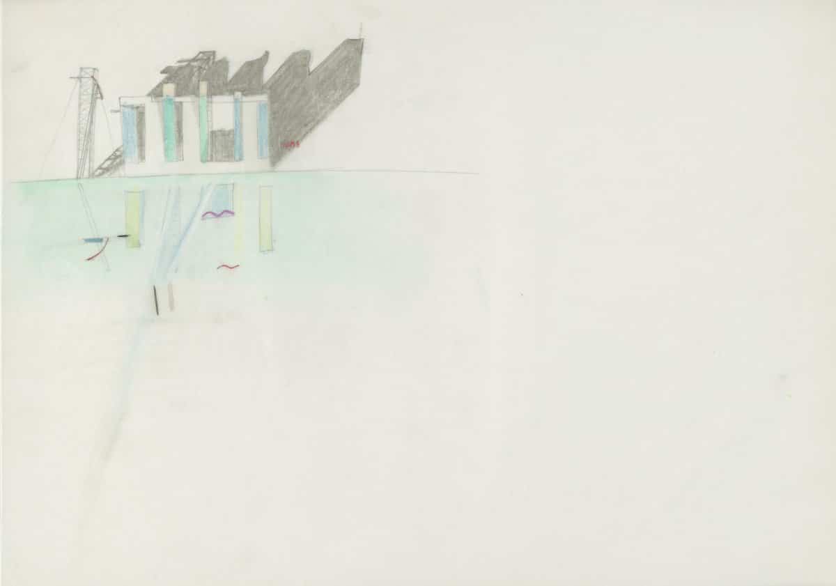
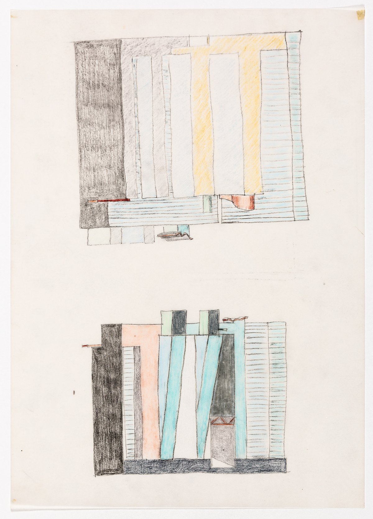
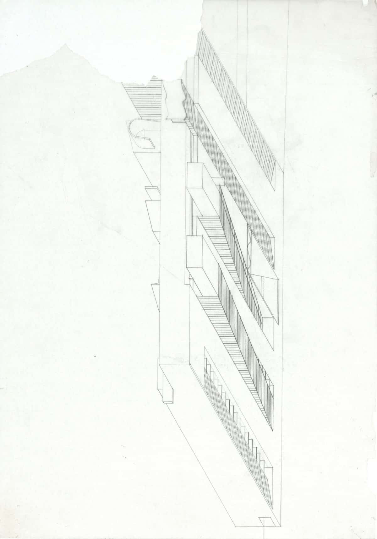
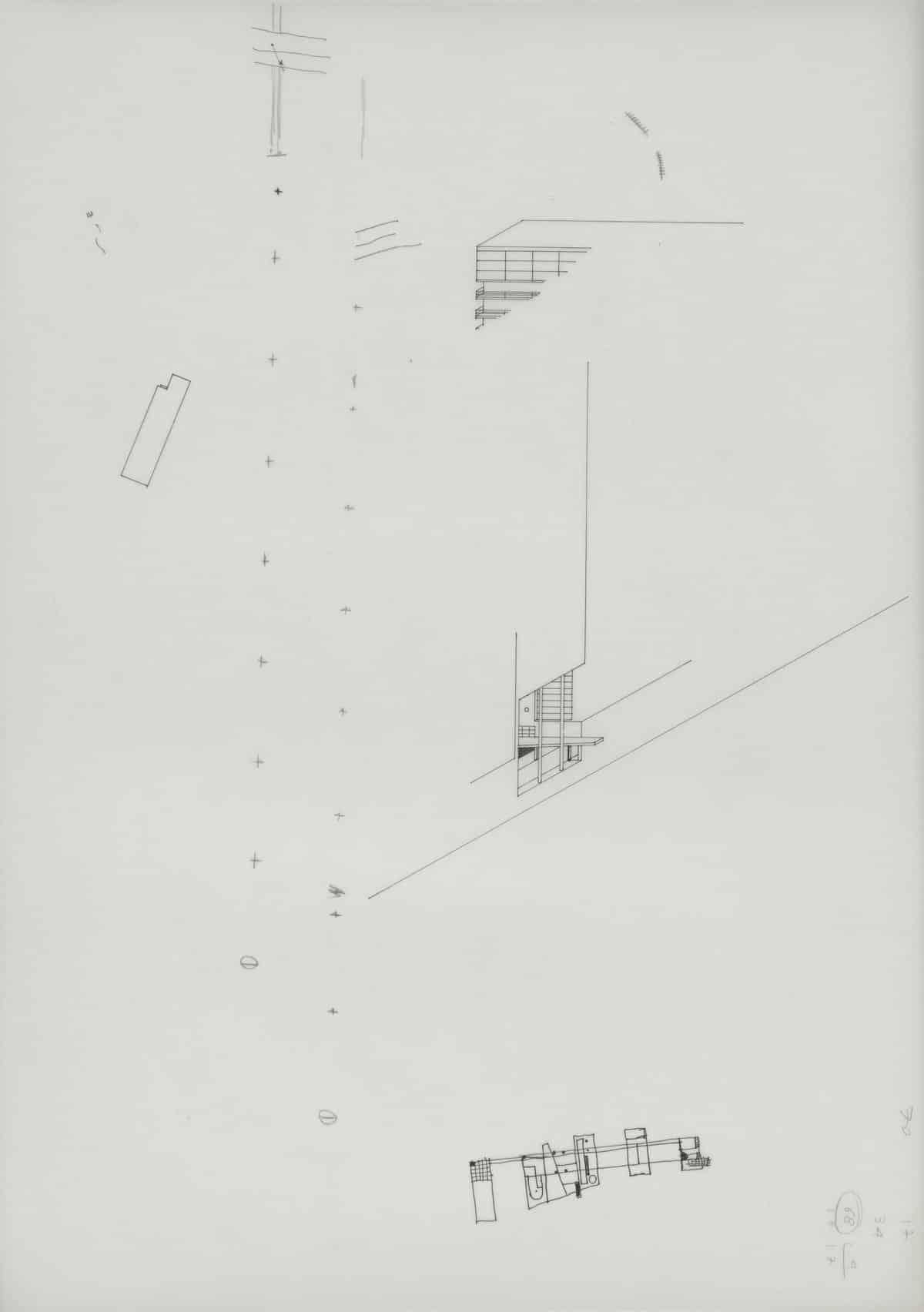
About the story of the drawings themselves and how they were produced: as always, there were a number of ideas that Rem and I exchanged, we sketched and discussed them and then I continued with drawings, variations and alternatives. The production of the drawings was almost entirely my work. They were all at 1:500, with a few exceptions. Along with that I made models at 1:500. There was a whole series of plasticine models that I understand haven’t survived because someone dropped them. So the external traits of the project, for the building and the bridge, developed in London. It was there that I started making the first projections. These were just A3s at different angles putting in evidence the effect of cuts, openings and the relation with the context. I still work very much in three dimensions, mostly axonometric or perspective, to test ideas and check how they would evolve or could be expanded.
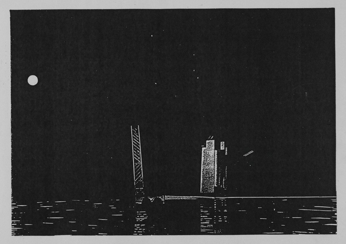
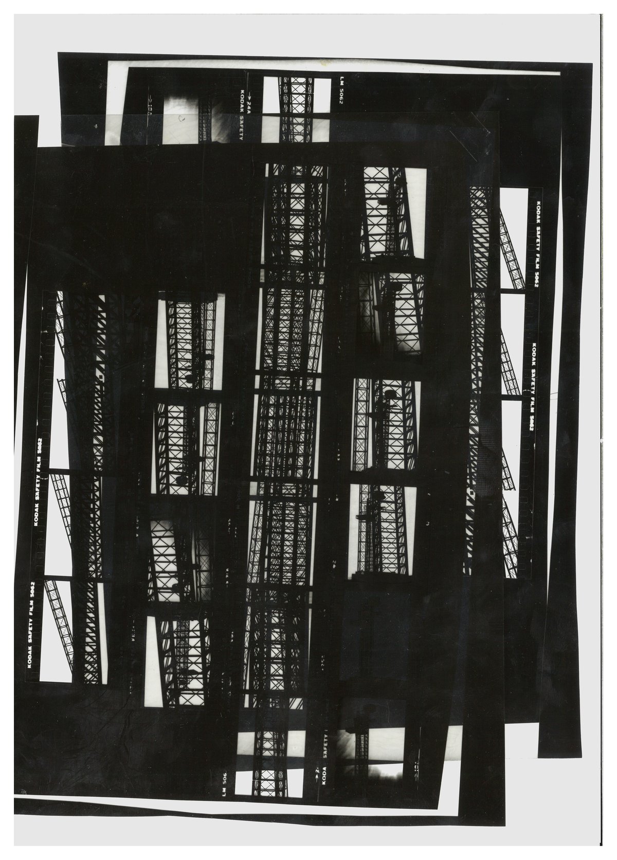
When I moved to Rotterdam where I spent some six months to work on the Nederlands Dans Theatre, I kept going back to the drawings for the Boompjes refining the design. Kees had a fantastic network of creative friends in Rotterdam, working out of a disused waterworks called Utopia. They made an exquisite metal model of the bridge. We worked with Hans Werlemann who made black & white photo studies of it. There was also a huge, bloated model of the Boompjes slab/tower that highlighted all its shortcomings more than its qualities. And there was a city scale model, maybe 1:2000, showing half of Rotterdam, that provided the distant view. These were all great tools to study different aspects of the project. Together with logistics, feasibility and engineering the design evolved. In a series of perspectives I started showing the ambience in and around the building—they made the cover of l’Architecture d’Aujourd’Hui and MODO.
We made all these proposals and presented them to the city of Rotterdam who were very enthusiastic about our approach. There was a ‘beauty commission’ who assessed the visual impact and merits of projects. They were concerned about the scale of what we were proposing, but once we presented the project—Kees and I attended—they were very happy. It was an encouraging moment, so we kept going. At this point in time, this project was the catalyst that provoked the re-emergence of Rotterdam as a city.
Drawing
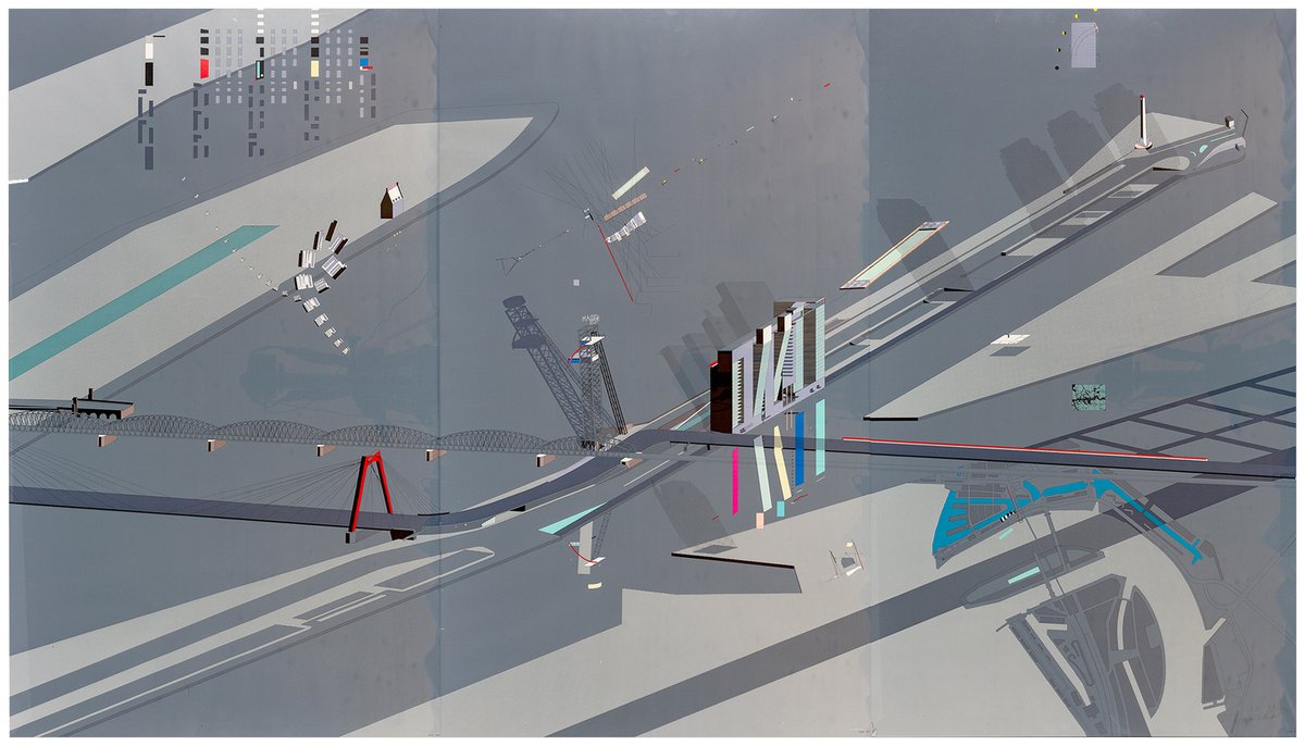
The triptych itself started with an A3 drawing of the building, gradually expanding it with the growing context and plot. Rem came with the idea of featuring different aspects of the whole project in one drawing. I devised a series of overlays floating over the main image to visualize all kinds of information. An otherwise classic aerial view became a multilayered panoply of information, a mash-up of scales and techniques.
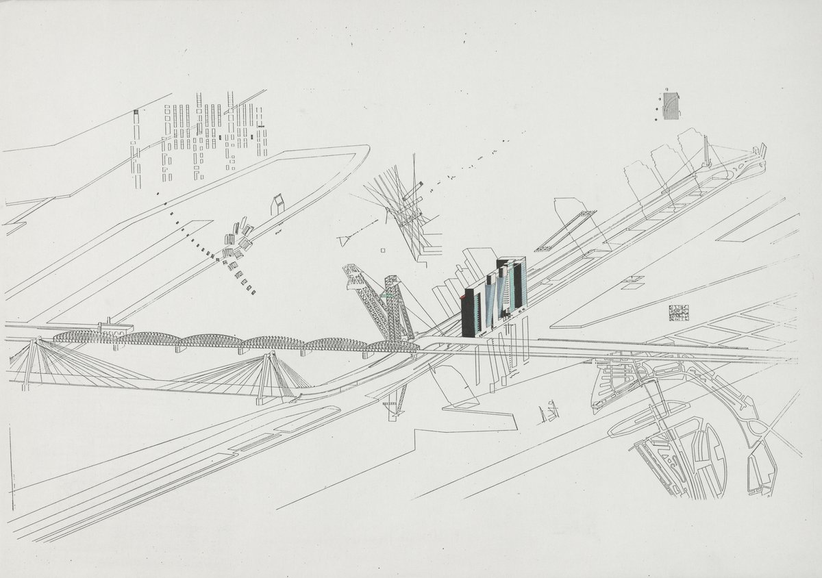
To begin, the drawing focused on the slab/tower and the raised bridge. Next, it included the entire context of the Boompjes: from Noordereiland to Scheepmakershavn, both bridgeheads of the scrapped bridge and the new bridge with its crazy chicane, the original harbour of Rotterdam—the Oudehaven with the Witte Huis, the tallest building in Europe in its day—the connection to the centre. I drew the Boompjes as a new site, the existing and planned structures as ghost images, and only the new interventions in three dimensions. The water, the vast, filthy, majestic Maas is the setting, and the project reclaims it for the city, with a series of interventions planned for the whole waterfront, with the recharged quayside and the floating pool. At that point the drawing started to reach the limits of my drawing board. The addition and editing of all these elements was part of the montage-like working process.
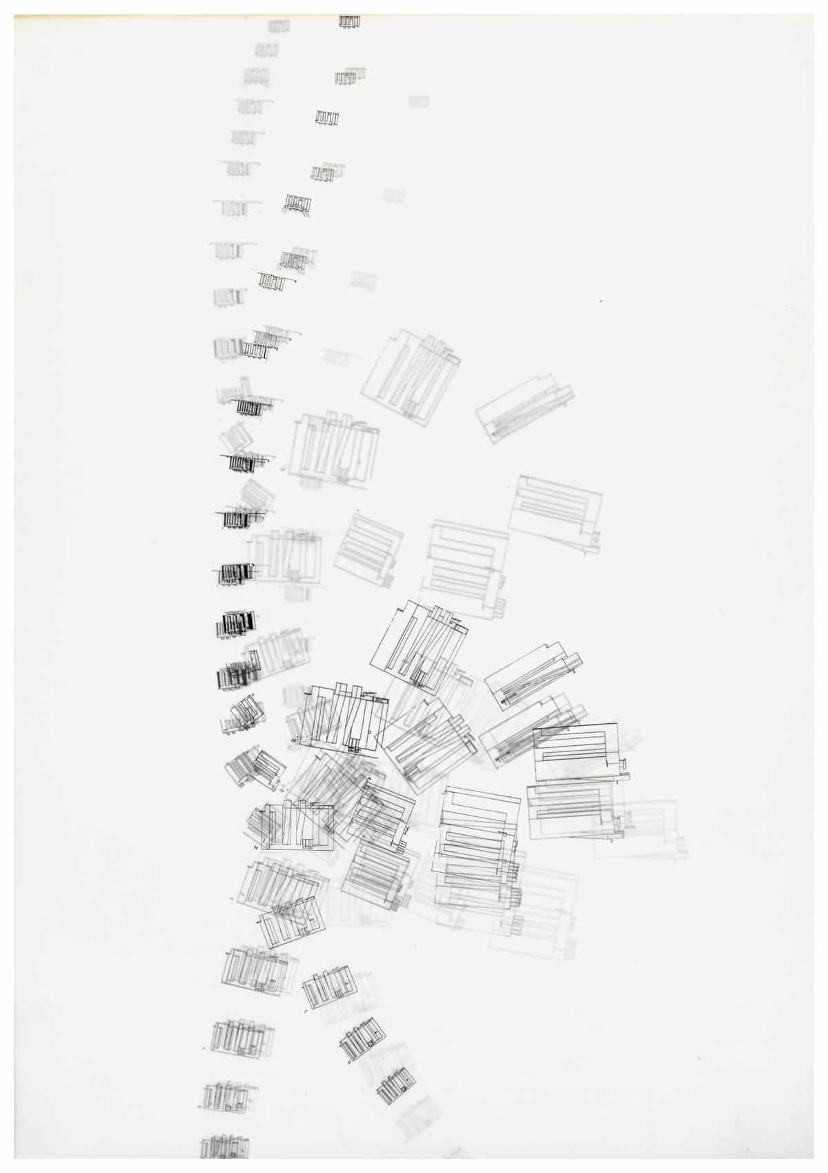
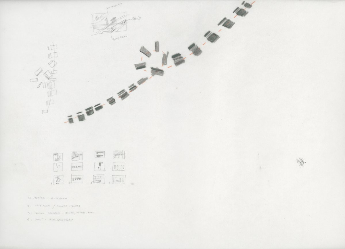
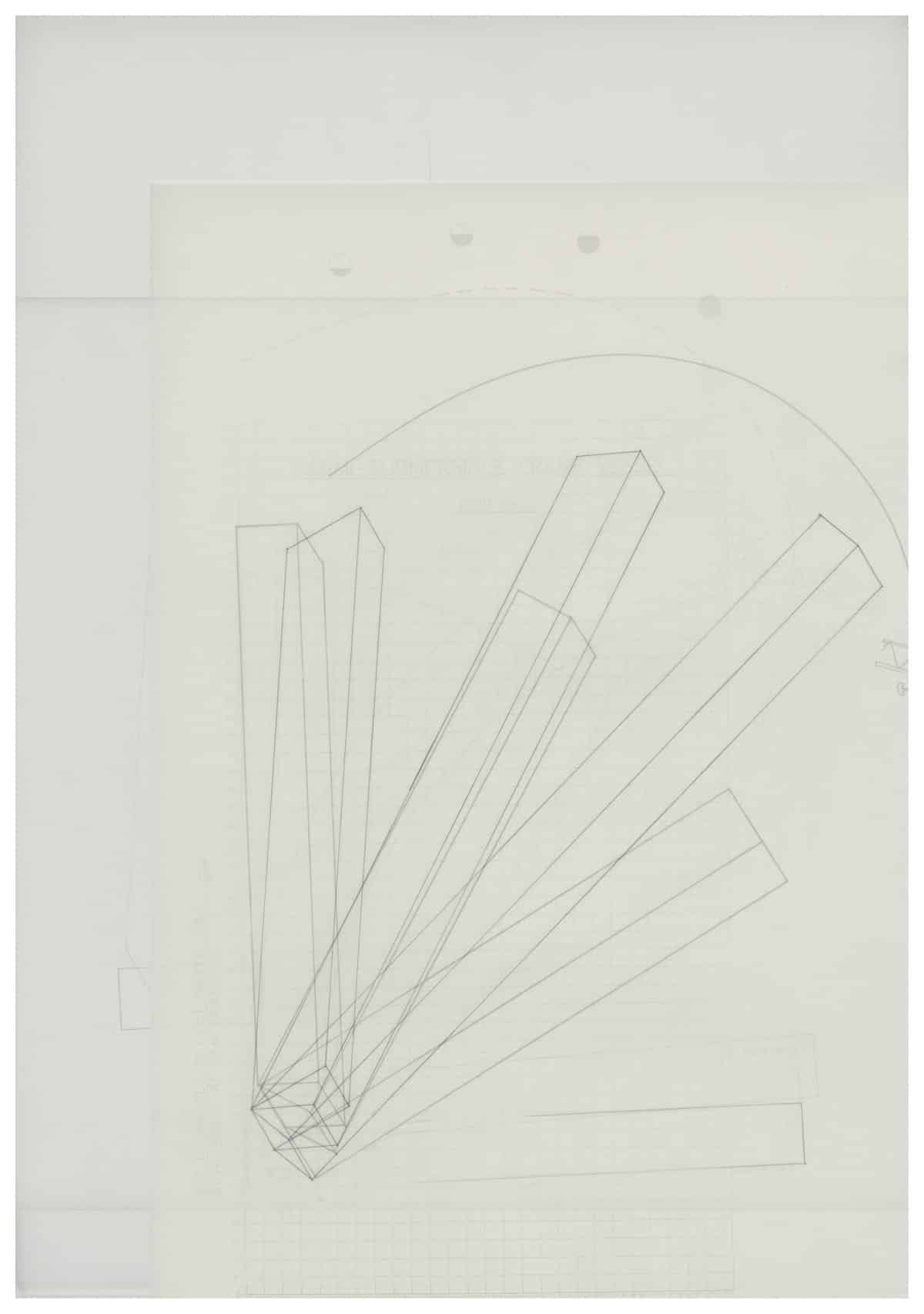
Rem wanted to show the building as you drove past it. Following the curves you would see the building from many different angles. From there I invented a set of perspectives that I called ‘autogrammes’. They show the building unfolding and collapsing as you drove toward it and swerved away over the bridge. Another diagram explains the transparency of the slab/tower and how the slanted towers reflect the water back into the city. In addition there was the idea of mapping all different footprints and all the various typologies from minimal accommodation to entire villas and public facilities that were in the building.
The city of Rotterdam also commissioned the artwork ‘Maasbeld’ by Auke de Vries that is hanging along the river from bridge to bridge. It is a magnificent piece of work, made of all kinds of bits of scrap metal hanging like a colossal laundry line in front of the quayside which also made its way into the triptych. All these pieces came together by that time.
At this stage the drawing consisted of loose A3-size pencil drawings laid out on this gigantic drawing board. It was still fluid and we could test how the whole composition would develop. Eventually I ran out of space on the drawing board and had to add two pieces of cardboard either side so I could patch together the drawing and begin to ink it in. The inking sheet was one colossal sheet of mylar—this wonderful material. I had a roll of mylar at one end of the table, and it went over the entire table and I rolled it up at the other end to make the whole drawing fit. That was all happening in Rotterdam and it was summer. I spent at least two solid months working on that drawing, just inking it in. The whole process of producing information—the pencil work—took over a year between things, so it had time to sit there and mature.
