Boompjes II
Triptych
This ink drawing was to be printed as a silkscreen and that is when the conversation with Bernard Ruygrok, the printer, started. His place in Amsterdam was amazing. We had several meetings to discuss colors because he had to do everything by hand. At some point I had a smaller version of the ink drawing printed on clear acetate so that I could have the line drawing on one layer and apply color behind it—like they would do with 17th- and 18th-century paintings on glass. So I could leave the line drawing on one side and work on the background, it made it more flexible. I played around with that and eventually gave a grey background to the whole thing and developed it from there, with a mixture of Letraset patterns, Pantone adhesives and acrylics.
I took that smaller version to Bernard who printed the first tests. They took quite a while because he had to cut all the stencils by hand, like redoing the whole drawing with a knife. It became clear it couldn’t be printed as one drawing, so it was decided we would print it in three pieces and that is how it became the triptych. We had reached the limits of the printing process. By making it a triptych we pushed the boundaries. But it was also appealing to make a triptych, to adapt such a classical form to this story—the idea of a subject and its supporting material. A triptych was perfect.
The first proof copies came back and we looked at them. There were Rem, Jan, Kees, Willem Jan, maybe others. We agreed there were too many colors, particularly around the building. I stuck some white tape on it and then it went back to Bernard who made a print run and that was the silkscreen. I think there was an edition of 200. There was also a limited edition of the grey-tone version of the central part of the triptych that we showed at the Max Protetch gallery in New York in 1982, together with the whole project.
That is pretty much how it went; the project had its own dynamic. As for its realisation, the city was very keen but they wanted us to find a client and that didn’t happen with our project. There was a potential investor who would have wrecked the project with a strange cocktail of requirements, so those discussions didn’t lead anywhere. By now I’m talking about the third year of the project. I was almost exclusively dealing with design, producing drawings, models, presentations, preparing exhibitions—while Kees was more involved in the logistical side of things, feasibility studies, consultants, talking to authorities and clients. Eventually the city sold the site to Shell. They had their own architect who exploited our envelope and produced a building without any of the qualities that had made our project such a ground-breaking proposition for this site, and for the city.
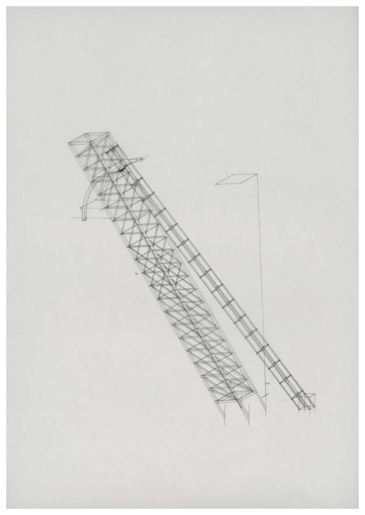
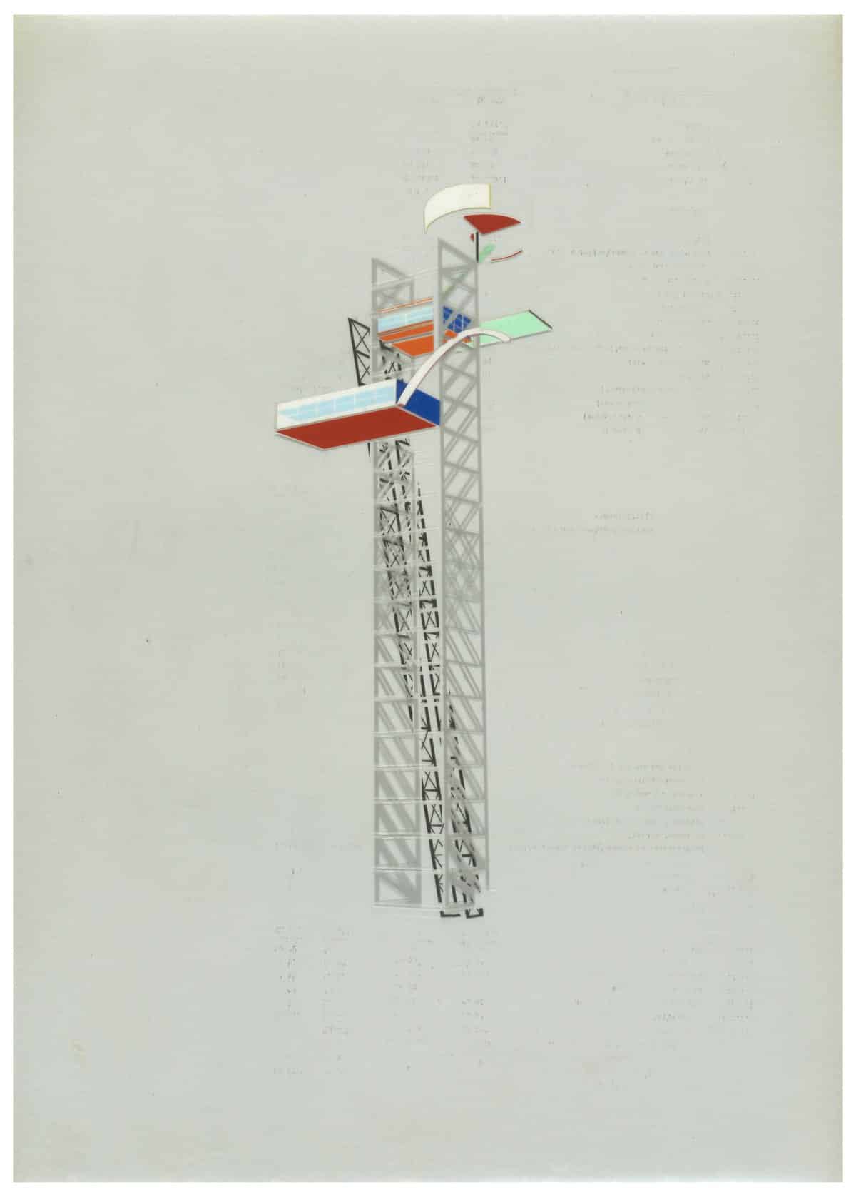
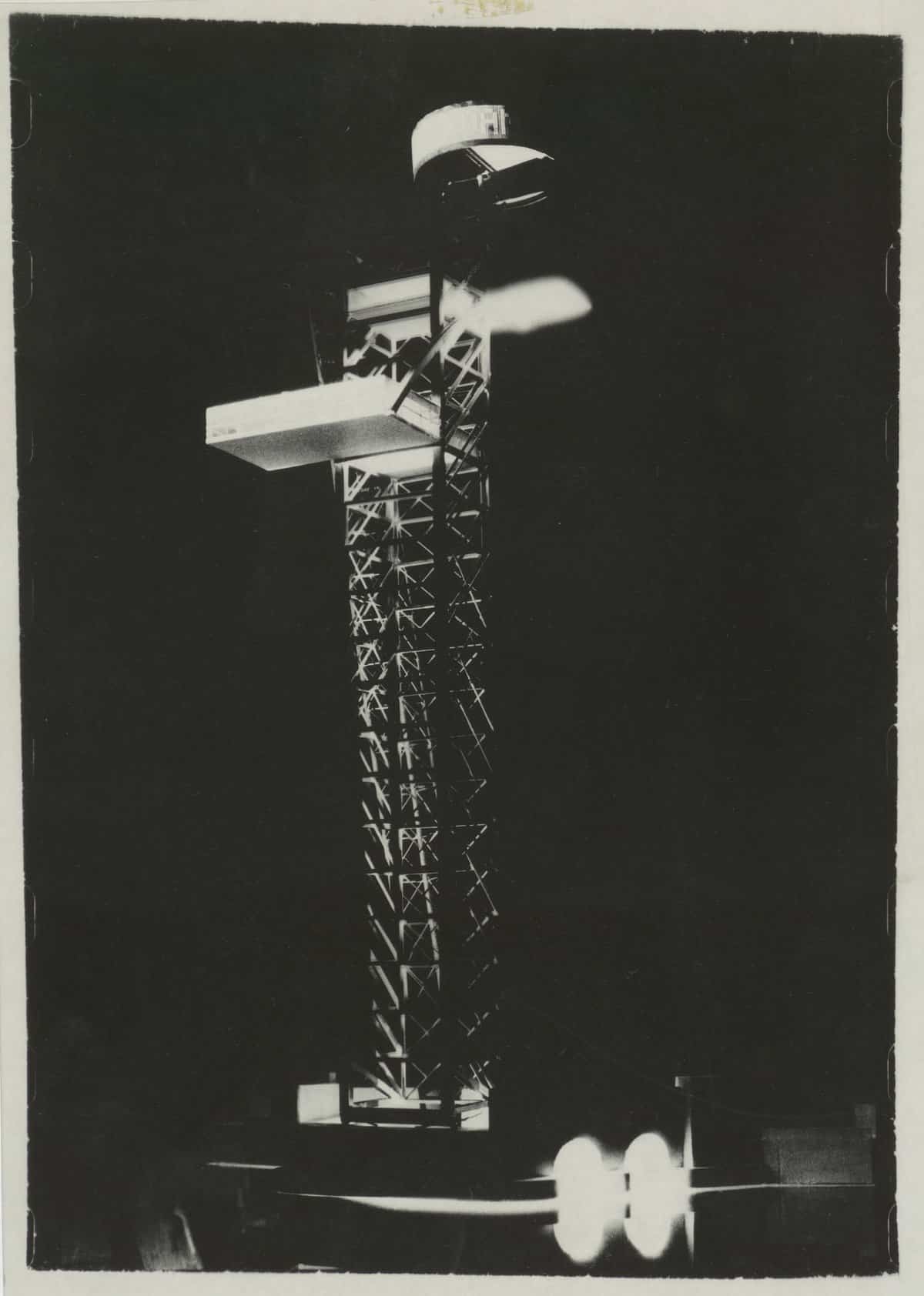
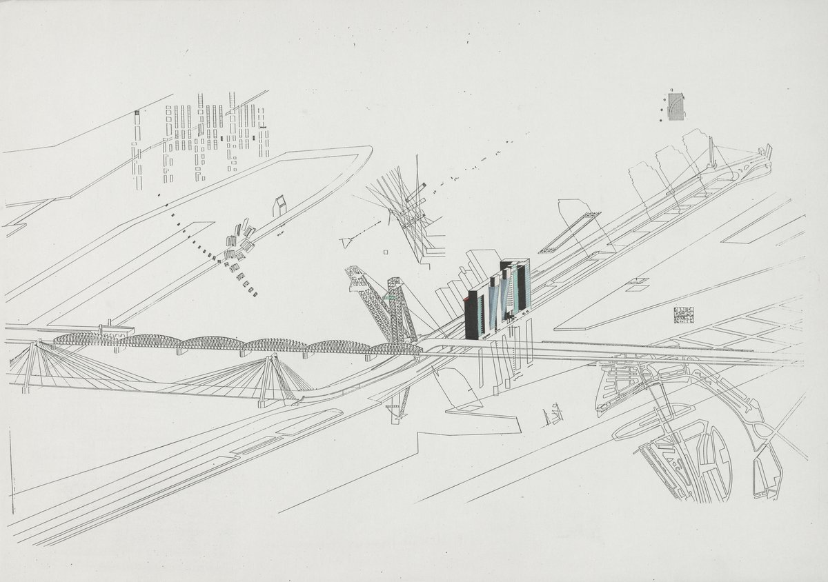
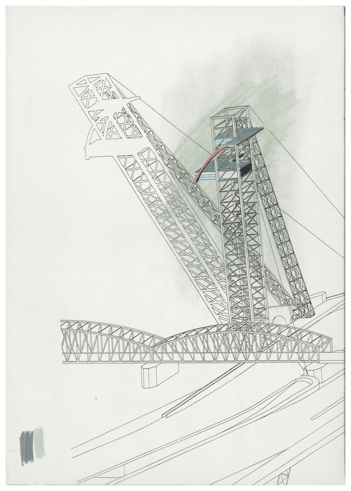
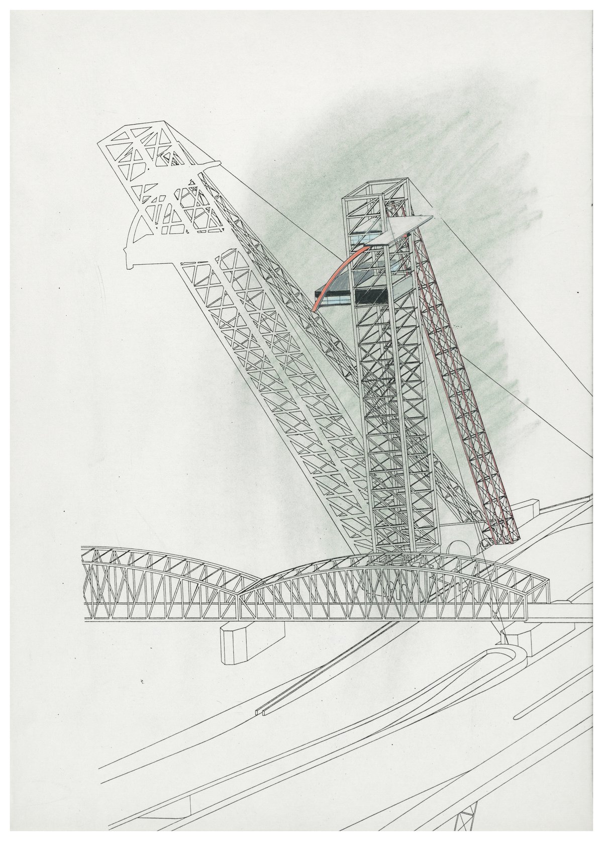
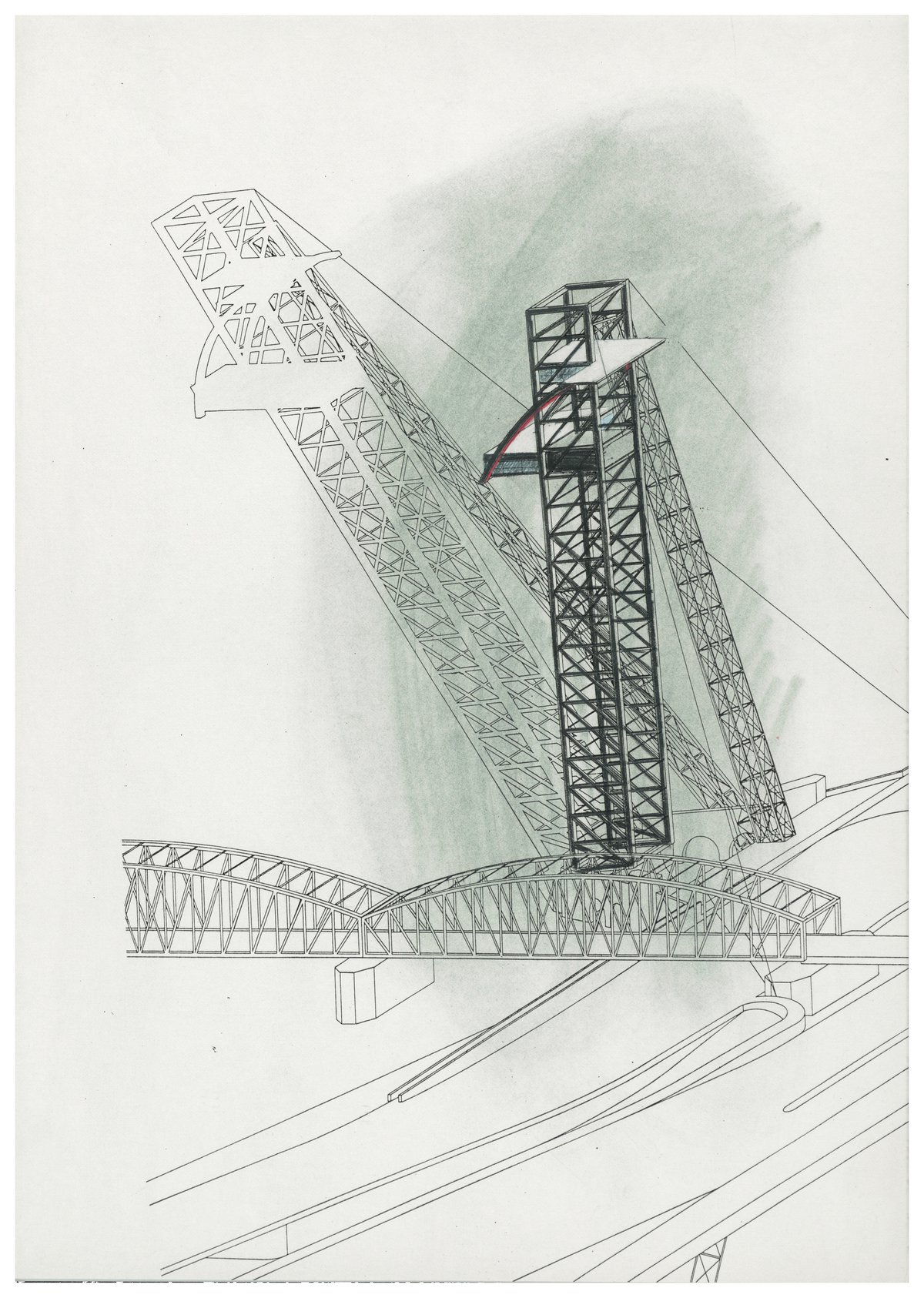
The Bridge
At some point we had many consultants especially for the bridge. The idea to raise the bridge was simple—put a hinge at the bottom of the bridge and lift it up. But how could we make usable space with this? A few additional elements came along and the access to the suspended glass box would have been a lift with a fire escape. The lift was going to be a diagonal thing—a strut to hold the bridge. Kees and I went to Switzerland for four days in the fall, to talk to cable-car manufacturers and see what they would make of it. They saw no problem at all. We went on to the only place that had snow at the time, Zermatt. We showed up in suits and raincoats with briefcases, and like that we went skiing. Fearless as he is, Kees who had never been on skis before, followed me down from the Matterhorn—he was furious but he got it in no time. A first adventure in bridge/towers.
As far as the bridge was concerned, Kees knew an excellent fish restaurant in The Hague. Rem, Kees and I had quite a few meals there talking to people who were excited about the prospect of a spectacular restaurant in a glass box hanging off the raised bridge. The discussions progressed quite well. There was also talk about a music club in the bridge head at water level. But the port had a deadline for scrapping the bridge—they had to remove it—the deadline wasn’t met, we didn’t have a firm offer to realize the project and the bridge was gone. All three sections of the bridge were removed and cut down to size. The moment this happened it was in the news—it was a momentous thing, because everyone knew about this project. Someone called the office and said had he known about this he’d have done it—typical. So the whole thing survived as a project.
It was a very exciting time, sharing a supercharged biotope with all the wonderful people in the office. The pressure was often intense. But the issues on the table were unimaginable, the discussions brilliant, and I had the privilege of concentrating on producing, of creating things, visualising and projecting an image, a possibility.
