fala: the single line
– fala
This is the first of eight articles in which the partners at fala examine different approaches to drawing and imagery within their practice as designers.
It started from a rather liberating decision to omit thicknesses. Gradually, all the information that wasn’t central to our thinking was removed, avoiding any celebration of detailing, because our details were never meant to be celebrated. Our construction is rather primitive and chunky. Our skylights leak and thermal bridges are frequent. The walls and slabs we build are usually made of the most affordable and/or straightforward stuff available. Their constructive truth is nothing to be celebrated either. Understanding them means understanding the use and experience value of their surface. Any notable details normally come out of mistakes that need to be solved or as a result of logistical conflicts.
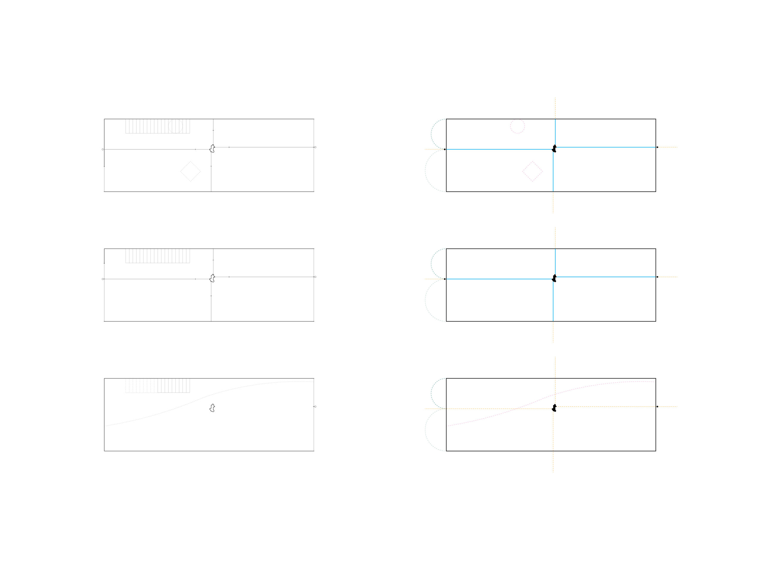
So window frames and door handles disappear, layers of cinder blocks, insulation and plaster are erased, and each wall becomes a line. It doesn’t matter if it is brick, stone or gypsum, or if it is 30 or 15 centimetres thick. No hierarchy, no distinction; each partition becomes a 100% black line of 0.5pt. Each wall is understood as a light, paper-thin surface, detached from its functional purpose. Doors and windows occur as subtle interruptions and are marked with two short ticks. Only columns and beams maintain a presence that refers to their actual dimensions. Plans are acted out with lines and points. Rooms and the relationship between spaces remain clear. Such plans can stay abstract or be properly furnished.
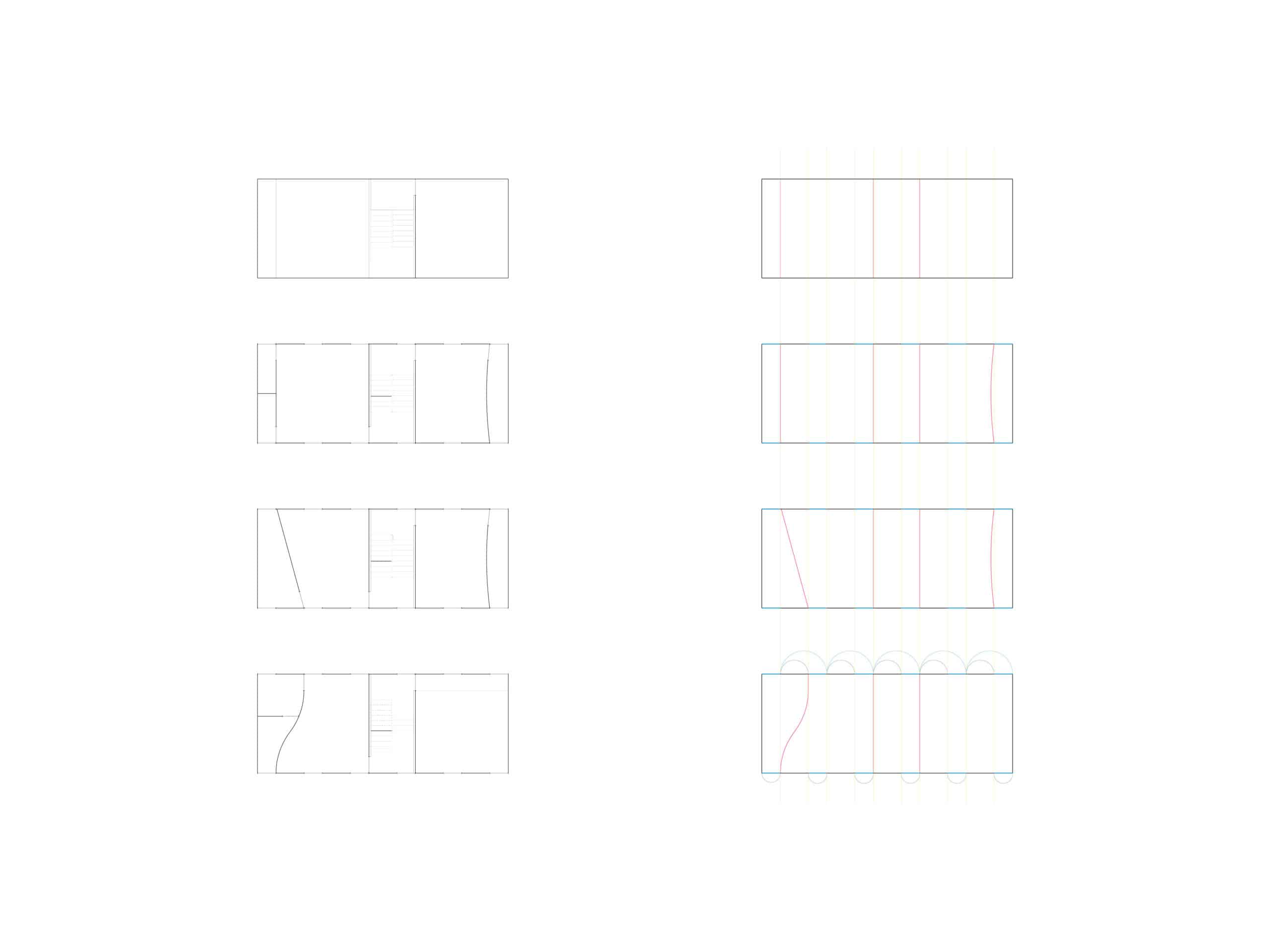
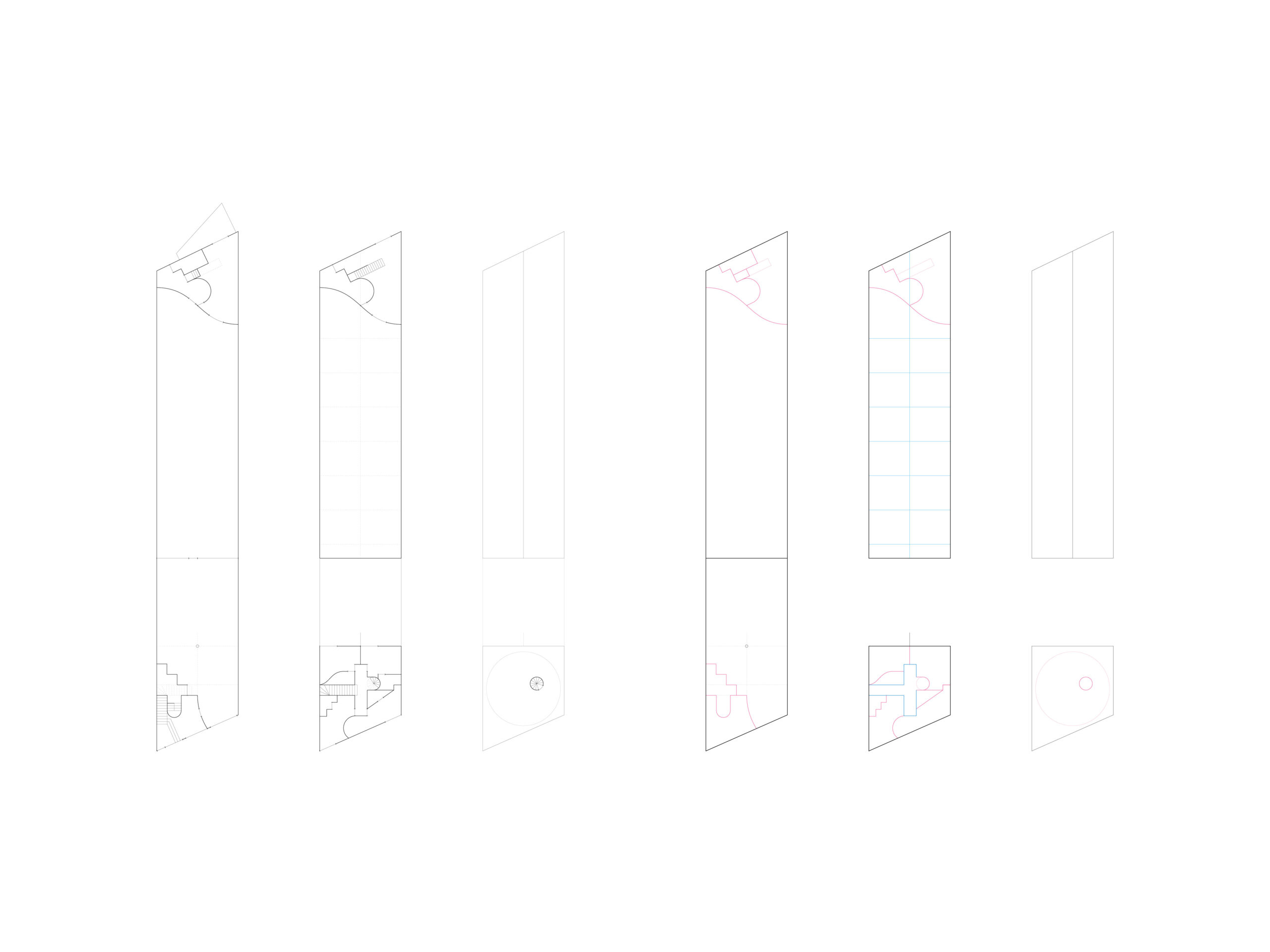
Single-line drawings are less precise and more accurate at the same time. Their truth relates to the project’s inherent logic. Its composition and geometry are prioritised over specific numbers and dimensions – a square room remains a square even when it might be a few centimetres off in the built object. Grids define divisions, pavements match and lines meet at one point. Ideas and intentions become clear. A single line is almost schematic, but we don’t want to call it a diagram. It is an abstraction of a plan.
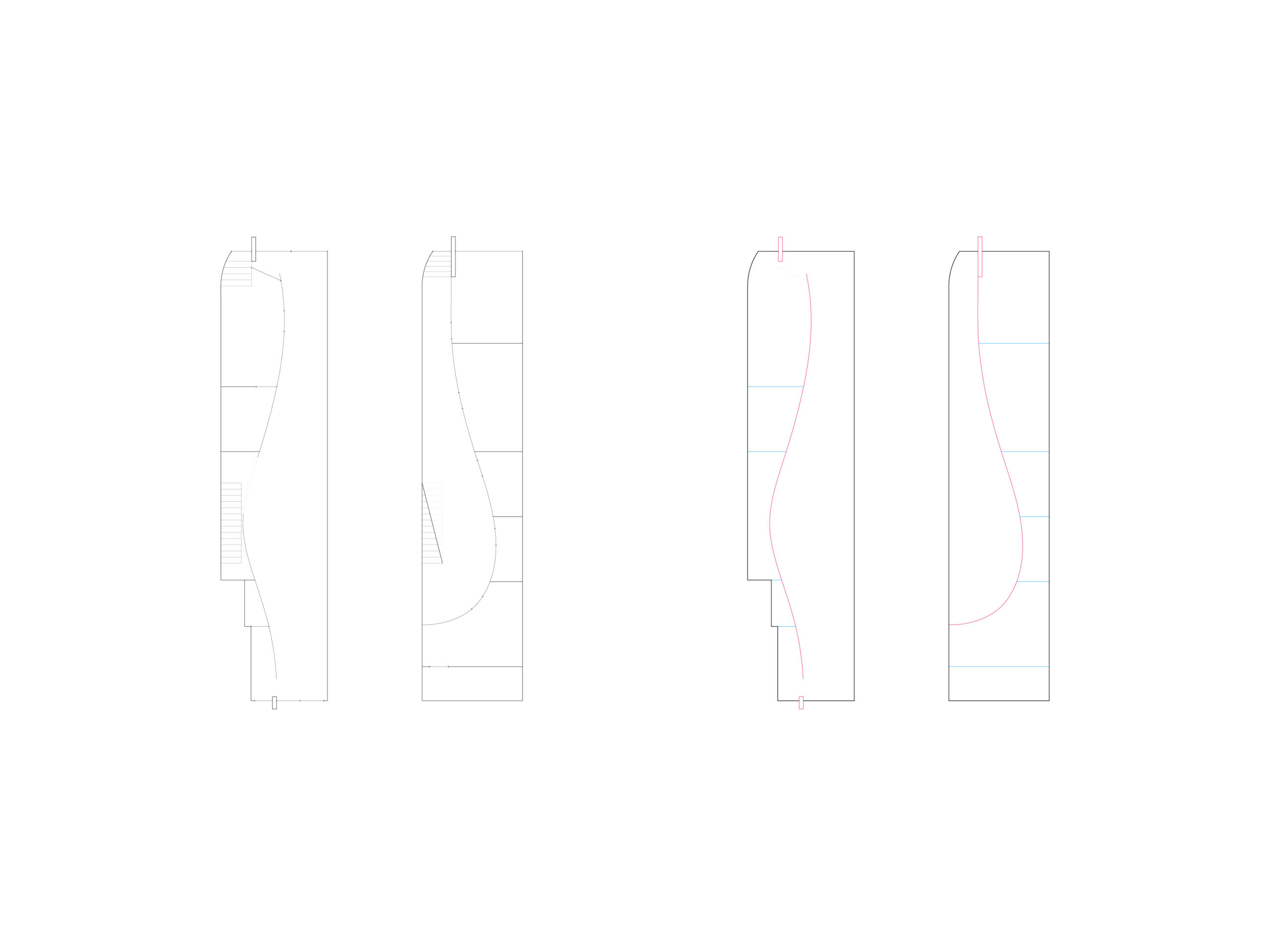
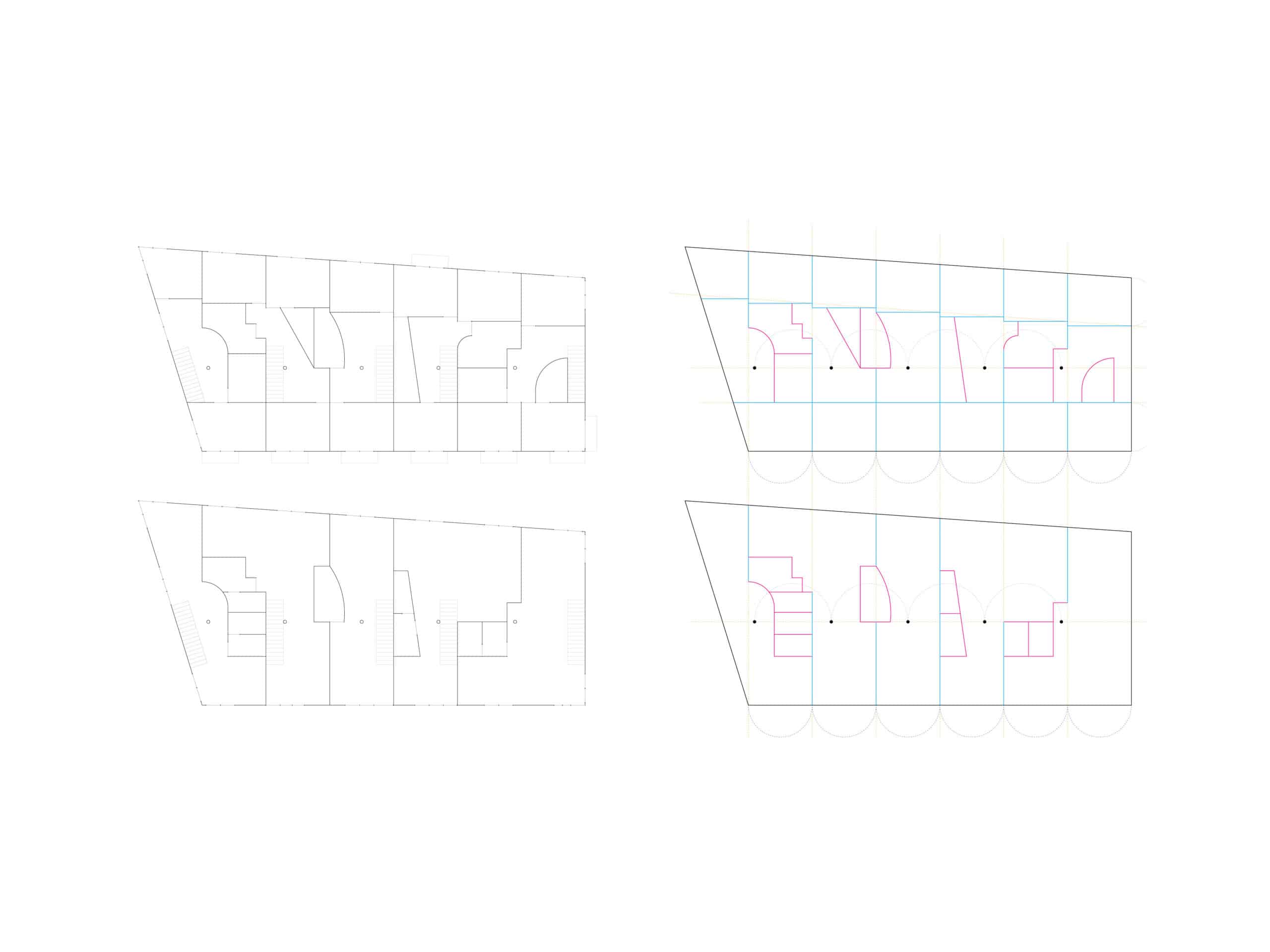
Single-line plans can be traced very far back in history, but for us, a certain array of Japanese iterations meant more: Toyo Ito’s drawings of so-called morphemes, Itsuko Hasegawa’s axonometric drawings and Atsushi Kitagawara’s crowds of elements. Within our work, the single-line drawing generated many other experiments. They became a starting point of the wireframe studies, for instance, and played an important part in the development of the comprehensive drawings. However, their closest relative are the drawings of rules and exceptions that aim to make compositional systems more readable. In these, plans are broken into layers that have different value within the system: existing perimeters, backdrop grids, elements following defined alignments, and elements that refuse the given order. Black, yellow, blue and pink differentiates each layer. The single-line drawing is didactic.

