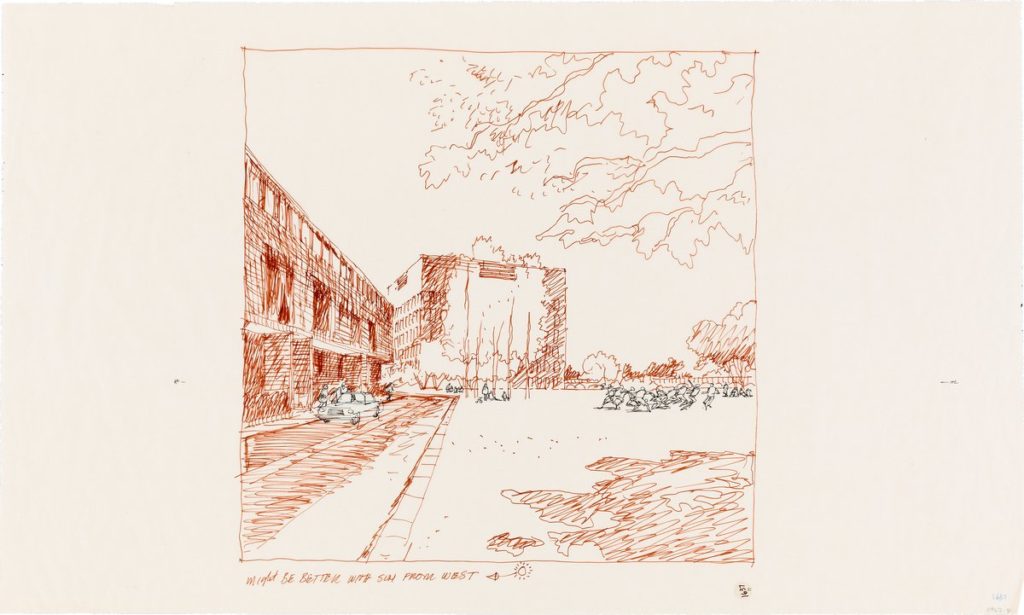
Better with Sun from West: US Embassy Moscow, The Commons
In an interview for the Chicago Architects Oral History Project, architect Charles Edward Bassett, the design lead in SOM’s San Francisco office, was asked by Betty J. Blum how architectural education changed in the US when modernism became accepted in architectural schools and the Beaux-Arts tradition side-lined. What happened when the programme became the paramount driver of architectural creativity? ‘The natural craft of teaching people how to express visually what they were thinking, went down the drain,’ Bassett replied. This is where Carlos Diniz, the architectural illustrator entered.
Bassett, turned regularly to Diniz not simply to illustrate a project but to seduce planners and clients through drawing. Diniz’s role was so key that on projects like the Headquarters of MCA Records in Century City, California, where Diniz was asked to imagine the completed building amidst mature landscaping, it was subsequently planted according to his suggestions. For the US Embassy Moscow which Bassett and the San Francisco office worked on during the early 1970s, Diniz’s skill as an illustrator, his understanding of how landscape could intercede into built work, or even how built work might be conceived, proved crucial in convincing not only the US State Department to green light Bassett’s proposal – akin to a university or creative industry headquarters – but also planners in Moscow.
Diniz’s creative process went through a series of iterations, from hand drawn perspectives to determine views and details such as foliage and trees to determining how much from the west should be present, such as the light and cars. He would then move toward a near-final detail view in ink and vellum, to prepare for the large presentation painting.
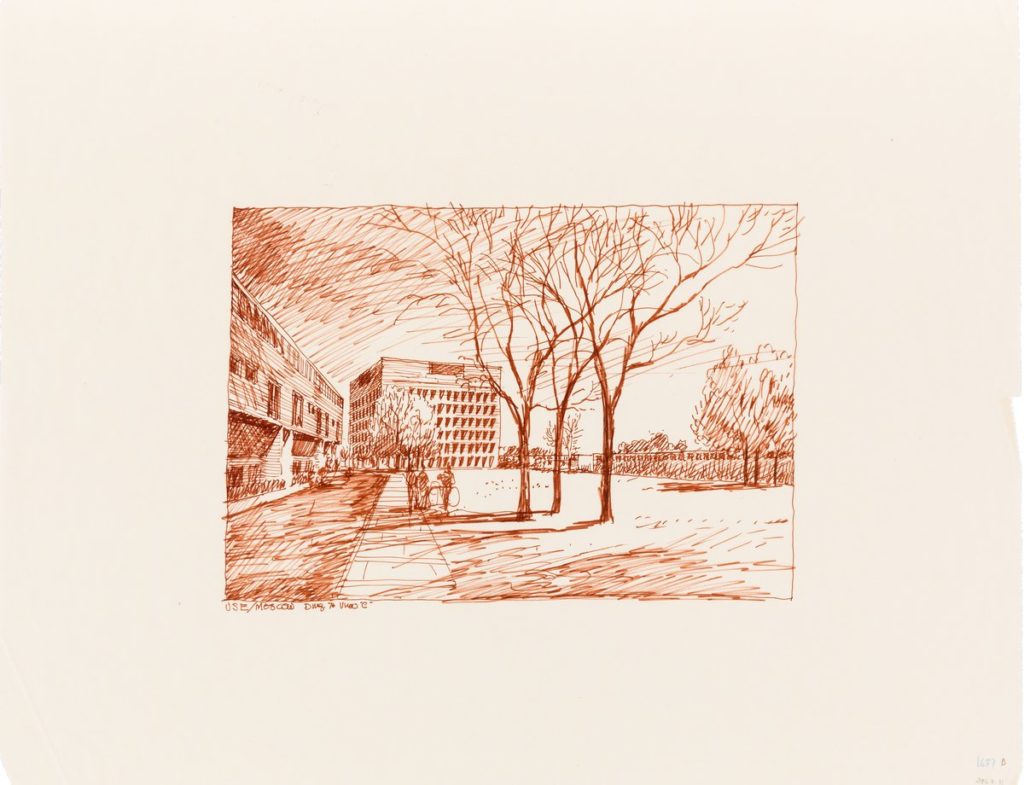
Diniz’s first responses to the architectural design were always freehand perspectives in terra cotta colored felt tip Pentel pen on drafting paper. As the final line drawing would be done in black pencil before a full colouring process, the terra cotta pen denotes a more speculative, less authoritative approach to the artist as much as the viewer. These sketches would then be reviewed by Carlos and the architect, with modifications and adjustments noted.
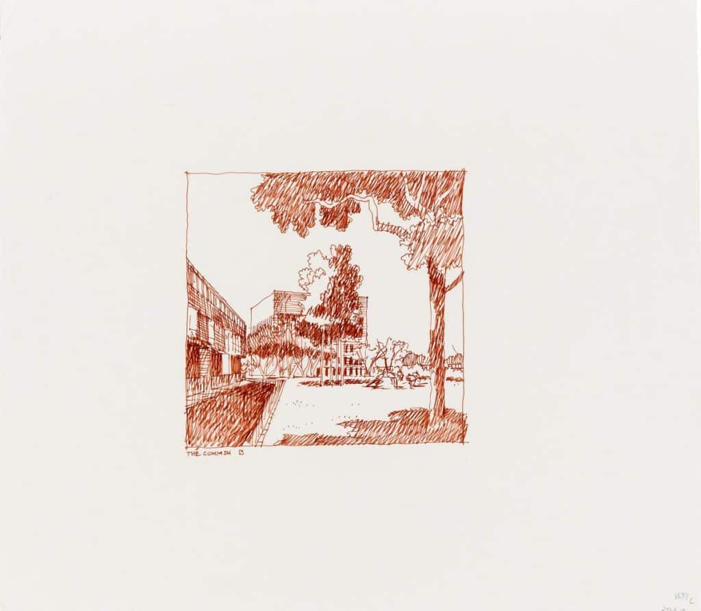
Bassett often employed Diniz to imagine his designs with the plantings fully matured. Here Diniz imagines the Chancery Building behind trees. Planners in Moscow had concerns that that building might challenge the scale of Kudrunskaya Square; the vast neo-classical Stalinist apartment building. Diniz uses trees in the foreground to diminish the scale of the building, which is also obscured by more trees.
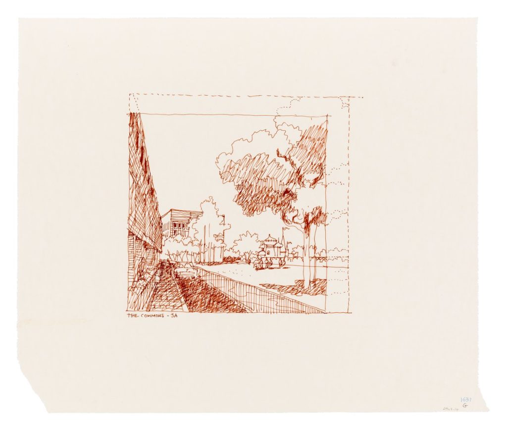
In the early drawings Diniz explores how to frame the perspective but also how to create a language that speaks to both Russians and Americans, who had to both approve the project. He draws the profile of trees like paper birches, native to both Russian and the USA. He places onion domes in the background. Here he settles on a lusher landscape that will focus the attentions of the US State Department and Muscovite planners away from the building.
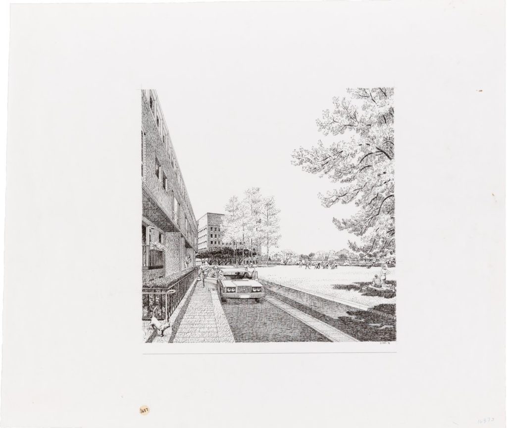
Once the view had been selected, a mechanical pencil drawing would be made following the principles laid out in the perspectives. Diniz would prepare a more finished pencil layout including details such as cars, about which he knew a great deal having initially settled on a career in car design. From this an ink line drawing was produced. Here he astutely adds not a US made car but a Volvo, made in neutral Sweden, to avoid upsetting Soviet sensitivities.
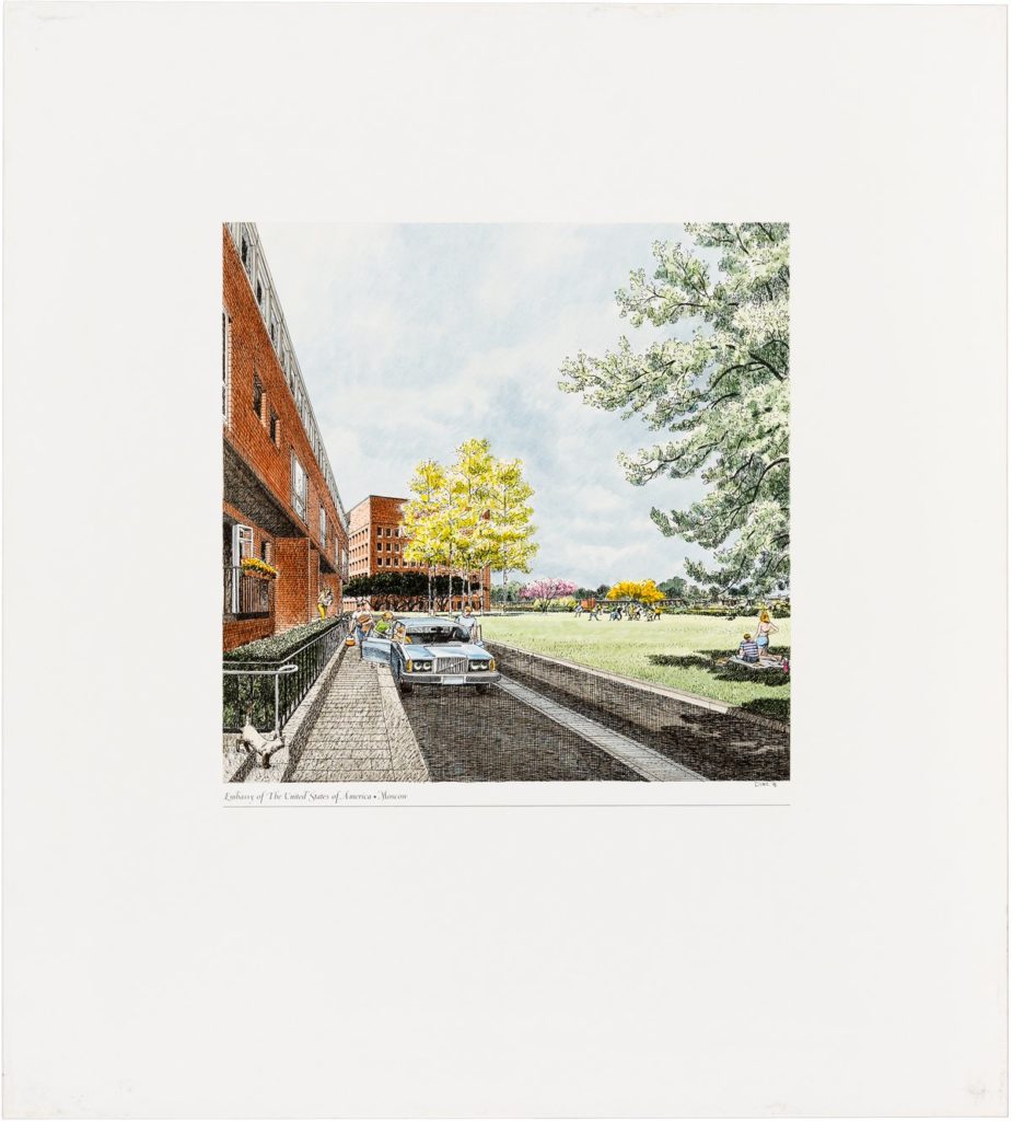
Once the ink drawings were completed they would be photographed and transferred onto a German photomural paper for painting. The paint was acrylic based and applied in transparent washes. The effect here is to highlight universal elements to clients and planners engaged in adversarial negotiations: trees and human figures. These lush, colourful original panels rather than a lithograph were presented to the client.
