biq: Revealing Construction
The French Modernist Auguste Perret is famously quoted as saying that ‘Construction is the mother tongue of the architect. The architect is a poet who thinks and speaks in terms of construction’. If this is the case, and given drawings are the primary communication tool for architects, it is perhaps surprising that we do not see more architects publishing their construction drawings to communicate their architectural approach or ideas. Perhaps many architects regard construction drawings and the construction process as a ‘means to an end’, rather than something to present. One practice who explicitly espouse their interest in construction is biq, a Rotterdam practice headed by Rick Wessels and until 2014 Hans van der Heijden, who now continues to explore the theme of construction whilst running his eponymous practice in Amsterdam.
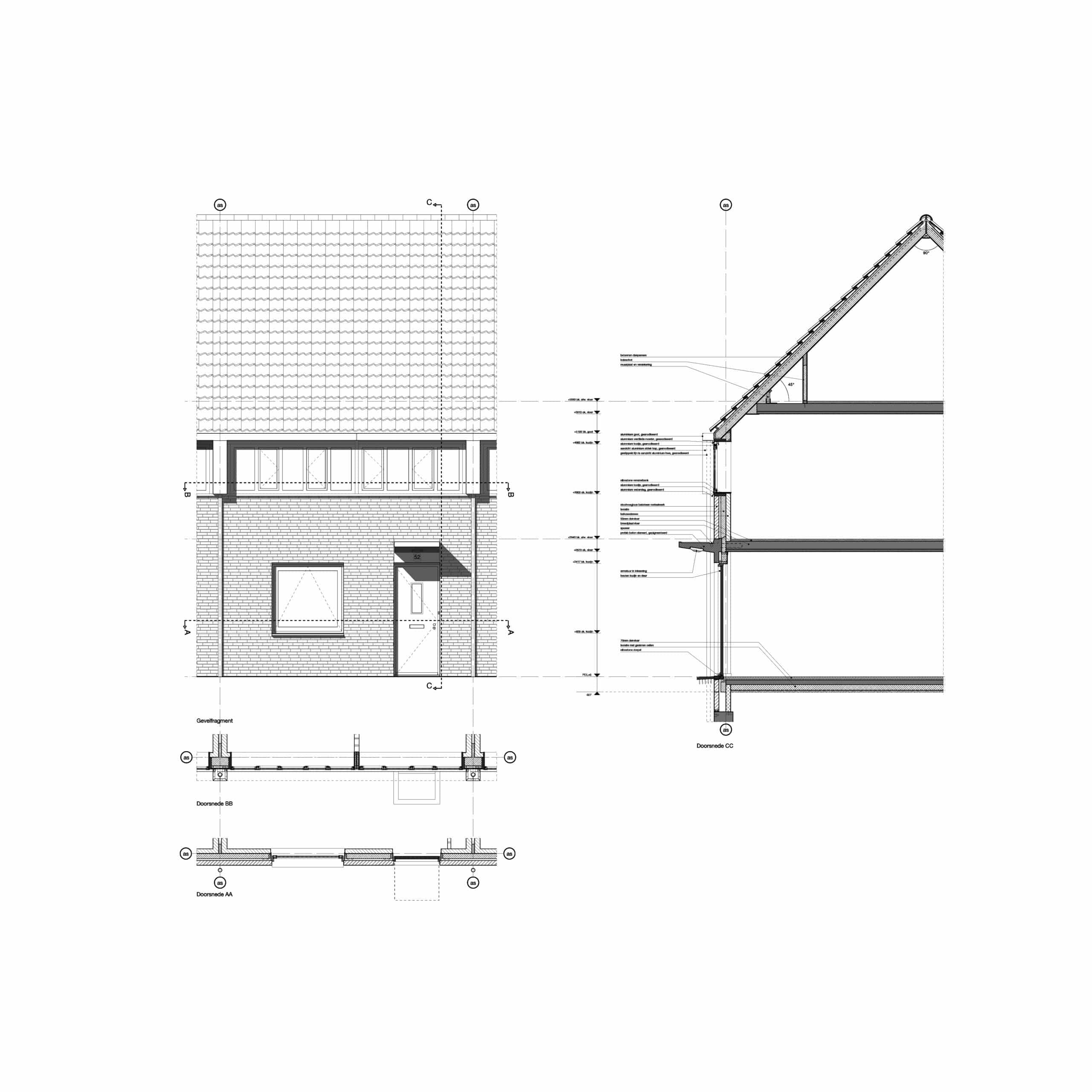
This interest is perhaps best reflected in one particular drawing, published online and in their 2013 monograph ‘Habitat, biq builds the city’, it is what the architects call an ‘elevation fragment’ and portrays an individual house within a masterplan project in Lakerlopen near Eindhoven. It is interesting because it is a hybrid drawing: a construction drawing complete with structural grids and construction notes, but also a presentation drawing, crisply presented for a monograph. The choice to present it in this manner reflects the importance that the practice places on construction and, on closer reading, reveals more about their approach to architecture in general.
The drawing represents the front facade of an archetypal house. This singular house is one dwelling within a larger masterplan scheme and forms part of what Hans van der Heijden has called the ‘the bulk of the city’ – that is, the normal housing that invariably constitutes the majority of the built environment. The masterplan uses this simple house type to form streets and only deviates where necessary to provide an appropriate urban response – houses differ where they turn the corner and blocks of flats front an important axis. Nevertheless, it is the typical house that is presented in detail and this standard type is the basis of the language of the masterplan. The emphasis on the typical or everyday does not stop at the urban scale – indeed, the minutiae of everyday life is represented in the drawing, a doorbell, letterbox and house number are carefully integrated into the composition and remind us of the domestic nature of the house. The practical canopy, graphically underlined on the elevation by the prominent shadow, also appears rigorously designed down to the integrated lighting and drainage (note the tiny gargoyle). The importance of the canopy, as a moment of transition between the public street and private domestic space, is further emphasised in the construction; we can see in the section that it is a bespoke precast concrete element rather than a standard or lightweight component.
This modest house clearly responds to a specific context and building type, and initially the picture of the house appears conventional. On closer inspection, however, the tightly controlled articulation and composition of the facade seem to lend the house an almost abstract appearance.
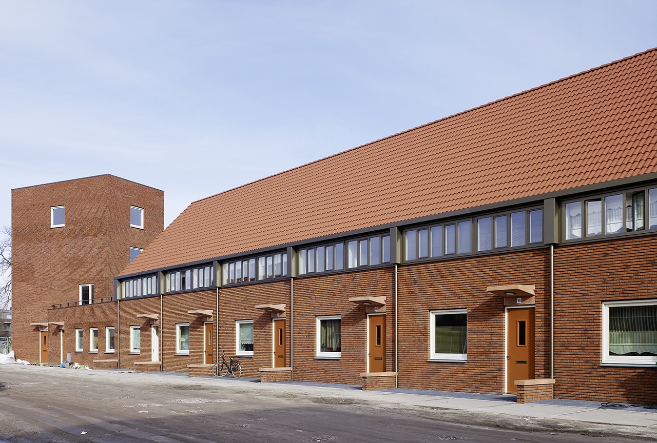
The pitched roof and brickwork have a tactile, familiar appearance but are drawn with precision. In contrast, the rainwater goods are crisp and meticulously articulated, the shadows emphasising their relief from the surface. The downpipes sit precisely on the gridlines at unusually regular intervals; accentuating the seriality of the single house in a row. The hoppers and gutter are strictly rectangular, precise and geometrical in appearance, and in combination with the distinctly modern strip window, form a ribbon separating the brickwork from the roof surface, at once denying and reminding us of a traditional eaves detail. The window is unusually square and its geometry is accentuated by its position in the centre of the brick panel.
Although the use of these standard elements ensures the building remains faithful to its type, the precise articulation, illustrated so explicitly on the drawing, gives it the iconographic appearance of a ‘house’. This approach to typology has been described in the architectural review as a ‘combination of traditionalism and Modernism’ that brings out ‘the potential for abstraction lurking in the former and the cosiness sometimes felt to be lacking in the latter.’ This abstraction seems indebted to the work of Aldo Rossi, especially here, in the use of the conventional-but-square window and the geometry of the archetypal pitched roof. The reference seems unavoidable, with the use of the crisp shadows that evoke Rossi’s own poignant drawings.
Recently Hans van der Heijden has associated his practice with a group of Dutch architects, namely Office Winhov, Monadnock and Happel Cornelisse Verhoeven, who make claim to a distinct way of practicing that they define in sharp contrast to the ‘superdutch’ trends of architecture in the Netherlands. As well as an interest in tradition and typology, one of their key concerns lies in construction and in particular the architectural potential of working with the reality of the construction process as it exists today. This drawing can be seen to epitomise that particular approach.
The gridlines and levels emphasise that this is not an abstract picture but a drawing of a house that will be situated on a real building site by a contractor. The architect has situated each element in space to create this particular artefact and these lines remind us of the time consuming discussions with a builder about the detail of setting it out both on the site, and in detail. The lines are crisp and consistent – this is an architectural drawing – materials are present but drawn not illustrated. Section lines, as well as door and window swings, are carefully considered but follow convention to explain the elements of construction clearly. The notes on the section are perhaps the most graphically obtrusive but they deliberately provide additional information – telling us not just what the facade looks like but what the facade actually is and how it is made. The elevation provides a striking image but we are reminded by the plans and section of the process and endeavour that goes into creating such a simple building.
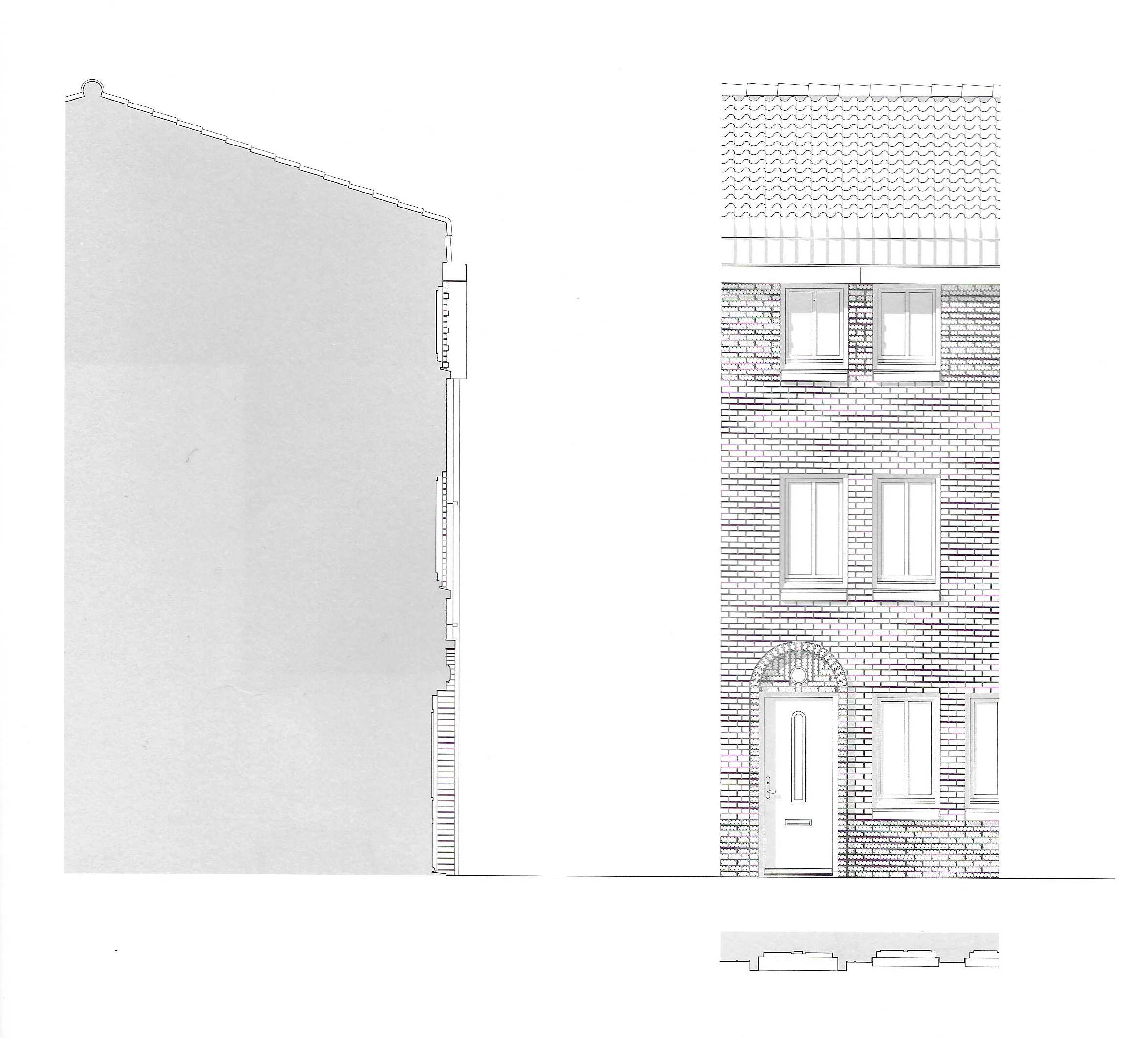
This is by no means a unique drawing (biq themselves published a similar drawing for an apartment building at Leidsche Rijn, Utrecht) but it does seem to reveal a particularly dense concentration of ideas. In Hans van der Heijden’s latest monograph Street Architecture the ‘elevation fragment’ is given a different treatment. It is used to explain the facade as a street facing piece of urbanism with less annotation and the detail of the construction blanked out in plan and section. This leads us to consider the facade as a piece of city in a more abstract sense, removed from its construction, perhaps allowing issues such as relief and composition to be discussed in a more isolated and concentrated way. Without any construction information, however, we lose the sense of these buildings being the product of an enthusiastic understanding of the construction process and its relationship to typology and urbanity.
Neil Middleton is an architect based in Edinburgh and has recently started his own practice, he has published a blog exploring rationalist architecture since 2012.
This text was entered into the 2020 Drawing Matter Writing Prize. Click here to read the winning texts and more writing that was particularly enjoyed by the prize judges.
