Calculated Aesthetics

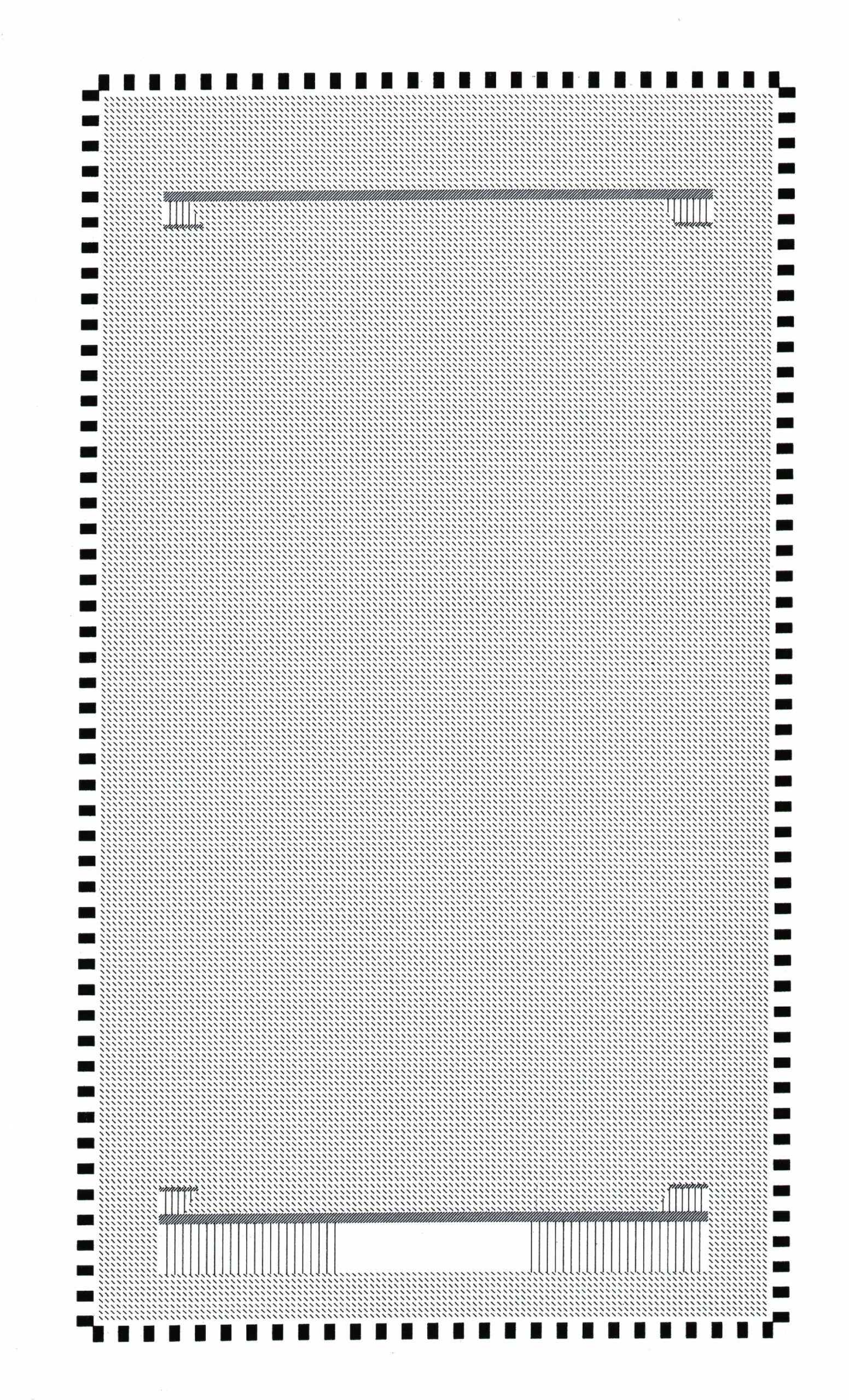
The floor plan of the Losone gymnasium (1990–1997) by Livio Vacchini is a computer drawing made through the repetition of four basic elements: a rectangular black solid, and three types of short lines – one vertical and two diagonals in opposite directions. The black solid is copied with equal distance 26 times on the short side of the building and 48 times on the long one, mirrored around the central axis of both sides. One type of the short diagonal lines is repeated over two long stretches and four shorter ones, situated at the top and bottom of the interior space and again mirrored on the longitudinal central axis. Short lines perpendicular to these stretches show two staircases at one end of the interior and one staircase at the other. The space inside the perimeter of the black solids is covered with a repetition of the other diagonal short line. However basic the means of drawing are, it is easy to recognise that the black fillings in the drawing represent massive columns in reality, which are tapered, in concrete, and 8 metres high, while the long stretches of short diagonal lines symbolize walls placed with a distance of approximately 6 metres to the shorter facades. In addition, the hatched floor indicates an interior space of 56 by 31 m. Between this hatched surface and the black solids is a slight distance that suggests the glass facade at the inside of the columns. The building seems to be directionless as the only visible circulation are the staircases at both sides, which lead to two underground volumes, where storage and changing rooms are placed, and to an upper viewing platform.
The apparent simplicity of both the drawing and the building relates to Livio Vacchini’s ambition to make architectural space by only using structural elements. To express this intention, he started to use the computer as his sole tool for drawing since the beginning of 1990s. [1] Yet his interest didn’t lie in exploring the possibilities of the realistic and three-dimensional drawings that were introduced through computer aided design. Instead, Vacchini’s drawings communicated his projects only through almost schematic plans, sections and frontal views, made with solid surfaces and hatches as in the drawing of the Losone gymnasium. Despite its flat, graphic appearance this drawing reveals Vacchini’s mental exercise of how to conceive a facade that is a direct consequence of the rationality of its structure. The cassette ceiling spanning the whole interior is not detectable as a roof from the outside, for it is held in between these columns instead of resting on them. The expected architrave on top of them is absent and the façade of the building becomes a succession of its identical and vertical structural elements.
In Vacchini’s work, the facade is not seen as the boundary between outside and inside but becomes the building itself, defining both sides by one principle. Thus, the facade of the Losone gymnasium is already – and perhaps most clearly – readable in the floor plan. One can imagine the natural light falling through the identical openings between the columns and changing the appearance of the interior almost by the minute. The massive concrete columns, shown as solid surfaces on the drawing, are perfect black stains and are the result of the calculations by the computer. They distance themselves from the uniqueness of a hand drawing and instead point to what matters most for the mental space of the architect. It is not about the idiosyncratic quality of a handmade drawing, but rather about the rationality of the drawing tool that has been used. Ultimately, the drawing is the outcome of rational calculation, which results in an aesthetic quality that defines the structural architecture of Livio Vacchini’s later work.
Drawing Matter would like to thank our friends at OASE for allowing us to feature this text on drawingmatter.org. It was first published in OASE #105: Practices of Drawing (2020), edited by Asli Çiçek, Bart Decroos, Jantje Engels and Veronique Patteuw; and designed by Karel Martens & Aagje Martens.
To order a copy of the journal, full of fascinating new insights into drawing, click here.
We would also like to express our gratitude to Studio Vacchini for permitting the publication of the floor plan of the Losone gymnasium.
Notes
- This drawing belongs to the second part of Livio Vacchini’s oeuvre which followed another path from 1990 onwards. Prior to this period Vacchini’s practice produced work that was often made in close collaborations and represented with conventional drawings.
