Daria’s Aria

Between 1939 and 1941 the French-born, Milan-based editor Daria Guarnati published seven volumes of a series called Aria d’Italia. Each issue formed a substantial monograph on a distinct facet of Italian life and culture. The inaugural Christmas edition was followed by the evocatively titled issues ‘Italy through Colour’, ‘Mediterranean Summer’, ‘The Beauty of Italian Life’, ‘The Beauty of Italian Arts’, ‘Arts of the Youth’, and ‘Italian Style in the Cinema’.
The issues featured hand-painted covers overflowing with flowers, paintings and open skies, and inside Guarnati commissioned the very best of Italian contributors – among them Curzio Malaparte, Giorgio De Chirico, Cesare Zavattini and Gio Ponti – to bring Italian art, literature and cinema to an international audience. The sophistication of this content was an attempt by Guarnati to elevate Italy beyond the folk arts (an association held by countries, such as the US and UK, which the Italian intelligentsia were at pains to correct). And while she certainly would have looked to the publications of her friends for possible inspiration – Ponti’s Domus and Guido Marangoni’s Casabella were both started ten years earlier – the formal effervescence that exploded from the pages of Aria was a new kind of song that few had heard before.

Aria d’Italia translated the richness of Guarnati’s dream by way of sumptuous full-colour interiors featuring multiple paper stocks (even pages printed on gold paper), handsome fold-outs and smaller booklets that were stitched directly into the binding. A single issue was its own gesamtkunstwerk suggesting that the colour, vibrancy and vision of Italy’s present and future could not be contained.
The issues were art-directed by the illustrator and graphic artist Federico Pallavicini. Hungarian by birth (née Friedrich Ludwig von Berzevicz; Pallavicini took his mother’s maiden name when he moved to Italy), he was studying at the School of Fine Arts in Vienna when his friend, the architect Josef Hoffmann, introduced him to the Demel pastry shop. Pallavicini began designing everything for the patisserie, from famously elaborate window displays to wrapping paper and cake boxes. In Italy, the ‘last romantic’ (as Hoffmann called him) counted Domus, Belezza and Guarnati among his clients.
Perhaps having to do with the war or a change in publishing ambitions – because Guarnati was also publishing contemporary literature, including early editions by Kurt Suckert (aka Curzio Malaparte) – Aria was short-lived. Today these copies of the magazine are difficult to locate, but traces of its vivid approach can be found in two other publications. The most immediate reincarnation manifested in Ponti’s Stile, a monthly art magazine launched the same year Guarnati closed Aria, and which featured an almost identical line-up of contributors, with Ponti himself writing under, apparently, 22 different pen names.
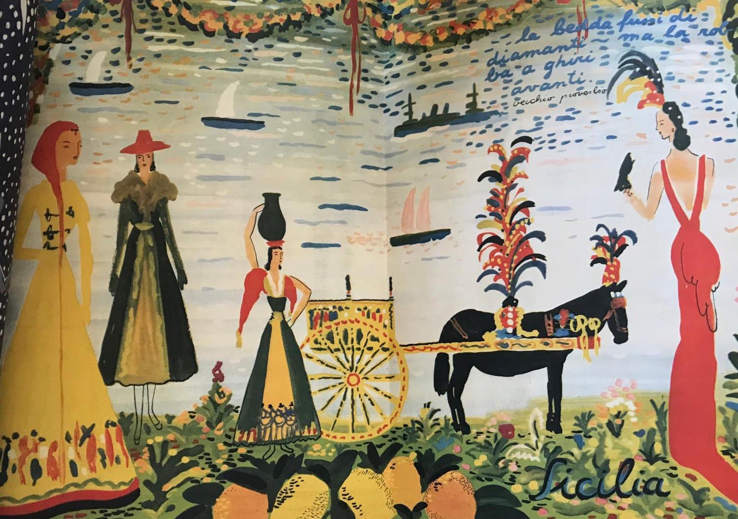
Guarnati’s vision also found its way to America, in the form of the iconoclastic Flair, founded and edited by Fleur Cowles and bankrolled by her husband, Gardner Cowles, publisher of then hugely popular Look magazine. As associate editor, Fleur had transformed Look from a sensationalist barbershop rag into an up-scale family magazine. But her ambitions went beyond publishing traditional fodder for traditional readers. Fleur’s Flair, much like Daria’s Aria, was backed by an entourage of celebrated writers and artists and intended to ‘appeal to a class instead of a mass audience’.

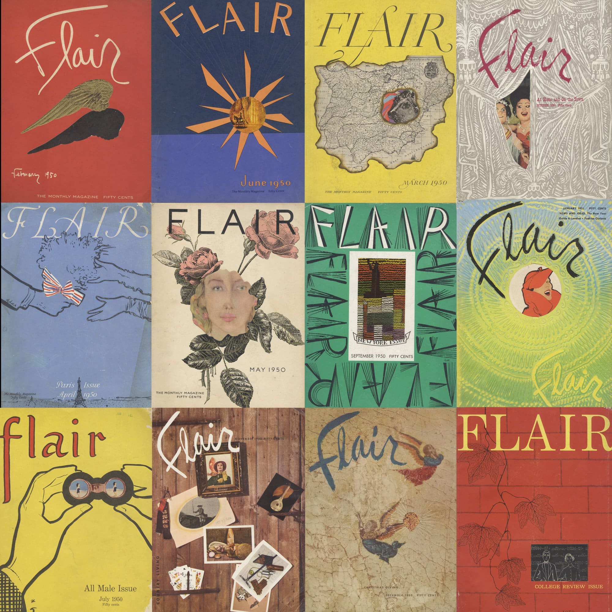
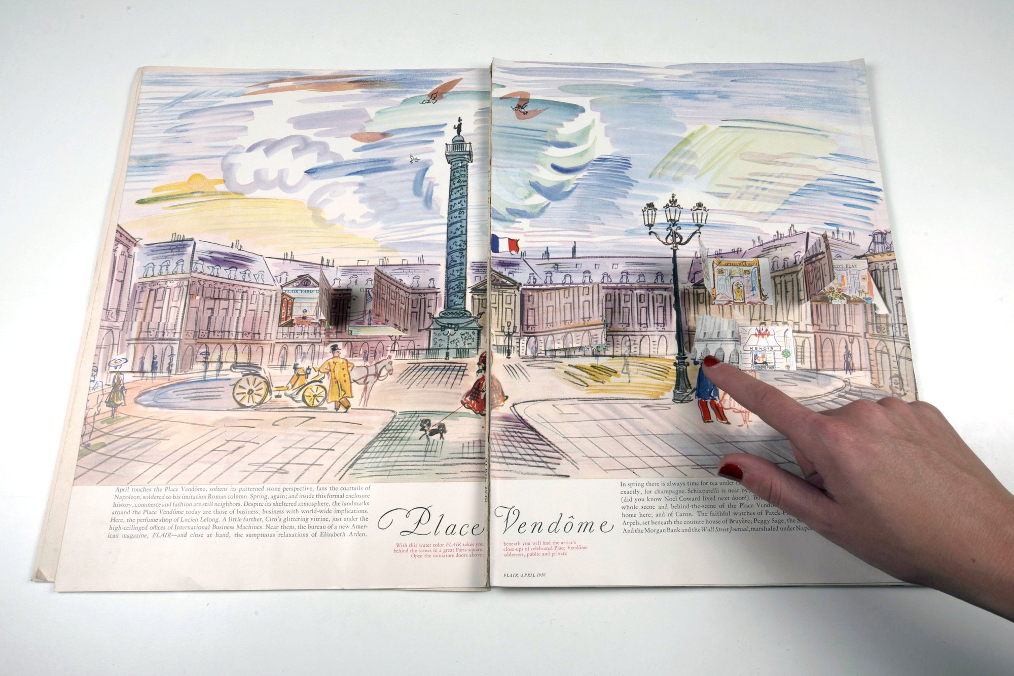
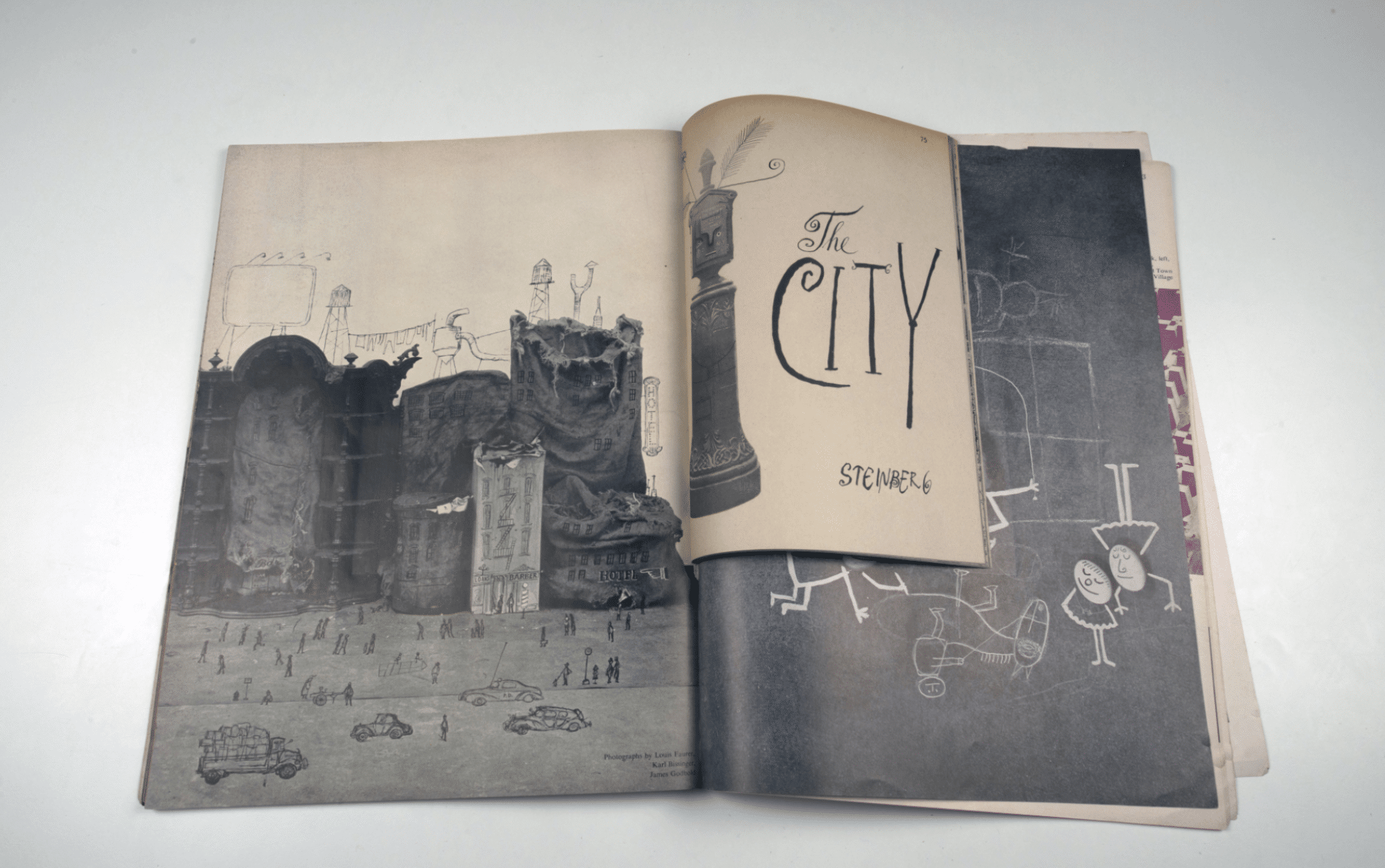
In her memoir (aptly titled She Made Friends and Kept Them, for by the time she died, Fleur’s pals numbered among Cary Grant, Joan Miró and the Queen Mother – described as her ‘best friend’), Cowles writes of visiting ‘Europe to see the finest book and magazine publishers who were reproducing the kind of adventures in paper and print that I dreamed of for a genuinely new magazine’. In Milan she discovered Guarnati and Pallavicini who were making Aria d’Italia practically by hand, and on a shoestring budget. Cowles arranged for passports and brought both to New York to translate their brand of carbonated modernism for American readers. [1] For the European imports, this was a chance to manufacture a vision at mass scale. And indeed, the colour, texture, fold-outs and pop-ups, not least variety of contributors – from Jean Cocteau to Saul Steinberg – made Flair the emigré cousin of Aria. Pallavicini saw Flair through its first and only year; after 12 issues and $2.5 million in debt, the magazine went bust.
But Guarnati had already returned to Milan, and in 1954 she brought out the Aria d’Italia masthead for one swan song – a special issue devoted to the work of Gio Ponti. By this time international audiences were paying attention to Italian design, thanks mostly to Ponti’s own ebullient efforts. For a publication that celebrated the Bel Paese, nothing embodied the dream of postwar Italy a colori better than the ‘man who works strenuously; who writes, draws, builds, travels, and loves life; who belongs to no school but only to the consistent maturing of his efforts; a man who lives and works in the happy comprehension of his epoch and is part of it; and who is thankful for life’.
Publication coincided with Ponti’s first retrospective in the US, and it is structured as a series of visual meditations by the architect on his life and work, tracing his ‘contribution from an architectural point of departure through the emancipation of expression’. The work is organised in chapters that build up a portrait of the artist-designer-architect, with the first half dedicated to his formation through variations on the academy: through visual essays he explores how his early forays into building and the decorative arts give ‘evidence of his strong addiction over a period of years to a descriptive, literal, classical academicism’. Meanwhile, a group of Mediterranean projects suggest another scholarly influence – that of un’accademia naturalista. A long ‘Intermezzo’ deftly shows how the human form has evolved his design thinking. Early figurative portraits are simplified into a recognisable graphic language that he applies back onto the body (through costume), or into his architecture (as staffage in drawings, or as frescoes on walls).
But if the first half of the issue presents a visual reflection on the fundamental Ponti, then the second half serves as a manifesto for something more powerful – not just the application of ideas across all realms of living, but the potential for design and the creative arts to yield a transcendental experience. In typical Pontian fashion, he writes about his architecture and design throughout this section in mantras:
‘Not interior decoration, but production for interiors.’
‘Not the mechanisation of civilisation, but the civilisation of machines.’
‘Classical education, not classical derivation.’
‘Only expression, not architecture.’
Ponti conjures the image of a mystic with these aphorisms, and as a result the accompanying layouts seem to spring to life fully formed. But behind the scenes, there was a hands-on, down-and-dirtiness to how he expressed himself (at least editorially), evidenced in the mock-ups of the magazine, a number of which are held in the collection of Drawing Matter. [2]


While not every page in the final publication is represented in this group of layouts, many show Ponti’s iterative process as an editor as he tries out different compositions for one particular idea. Working to a pre-made three-column grid (‘Aria d’Italia – Libro Ponti’ appears on every header), he draws directly onto the pages in pencil, ink and watercolour, sometimes going into great detail to depict the photograph that will eventually be resized, cropped and printed in the drawing’s place. He re-draws his own drawings. He re-translates his completed projects back into drawings. And when a layout doesn’t seem to work, he redraws his re-drawings.


The essence of his architecture comes through especially in these re-translations and re-drawings. Determined lines that mark out possible image placements give way to gestures that reveal a remarkable understanding of the power of an image. Using watercolour he determines the best crops to depict his Milanese office and tower projects, showing a detail of shining windows and an unbreaking grid that look as if they could go on forever. In other instances he paints the background in a dark grey wash to allow a three-dimensional form to protrude – it is a volume in space, but it is also grounded and with the bare-minimum of clues to indicate that it is not just a box, but a building. Strangely Ponti’s re-drawings of people or figures seem the most naïve – they can be too detailed, as if drawing more of the person will help the architect see them better.

What I like most about these mock-ups is Ponti’s approach, his way of making every spread a collage of not just his life but a reflection of the world around him. Body text and captions are represented using cut-outs of articles from English-language magazines and newspapers. Ponti then pastes these scraps into place below his own drawings. Some are cut so completely out of context that they read like surrealist poetry, while other lines are turned upside-down. This final issue of Aria is translated into four languages, and the combination of Ponti’s own graphic expression with these discombobulated English excerpts suggests to me a kind of concerted effort by the architect to meet an audience he has not yet completely reached somewhere in the middle.

In some instances, Ponti overpaints onto his clippings. A detail of a facade of balconies (possibly from his hospital in Milan?) emerges over a cartoonish-looking ‘FOREIGN AFFAIRS’ (above). Maybe this was simply a case of using whatever scrap was to hand, but 1954 was the year the world’s biggest movie star (Marilyn Monroe) married the world’s most famous athlete (Joe DiMaggio). It was the same year that the Paris Agreement was formed, and that Boeing unveiled the 707 – the plane that launched the Jet Age. It was the eve of the Vietnam War, and Joseph McCarthy was deep in his witch-hunt for communists. Ponti, whose letters to the world numbered in the tens of thousands by the time he died, would have been reading these stories in the magazines which he in turn used to write his own.


Other examples show Ponti painting over an entire page and allowing more of the texture of the world below to seep into his creation. A monumental looking building with glowing windows (above, left) is painted over a layout presciently titled ‘HOW MORE OIL IS GOING MORE PLACES’, an uncanny pairing given the reliance of postwar architecture on the production of the natural resource for facades of glass and steel. Or on another page with more glossy architecture (above, right), Ponti paints his building so that it is clearly rooted to a ground plane while also seeming to continue, forever, straight off the page. The underlying image is turned upside-down, but you can just about discern pairs of wings and jet engines. Below his building are planes, flying in the sky. Who knew an old stash of clippings could communicate so vividly and directly the desires of Ponti and the moment in which he was working – a need for limitlessness in a world that architecture was not just content to sit within, but had to reflect upon.
Notes
- Thanks to John Morgan for the inspired ‘carbonated modernism’.
- Guarnati kept these sheets with her until her death. They were found with a collection of Ponti’s illustrated letters to her over the years.

– Niall Hobhouse