fala: collages
– fala
This is the sixth of eight articles in which the partners at fala examine different approaches to drawing and imagery within their practice as designers.
fala started with collages. An abundance of images populated the internet; at some point, an online presence was decidedly claimed. Collages were the closest we could get to actual spaces and volumes. We didn’t know how to render properly. Photoshop was our way to solve that. A fascination for Office, Dogma, Point Supreme, and Baukuh were starting points. After a few attempts we mastered the tool in our own way. fala and collages became synonymous overnight. All questions and publications hinted that that was our direction, while we were just getting excited about our first built work. Collages slowly became the ‘enemy’ we created ourselves, a quixotic windmill of sorts. Its possibilities were exhausted. The method had to be questioned and reinvented.
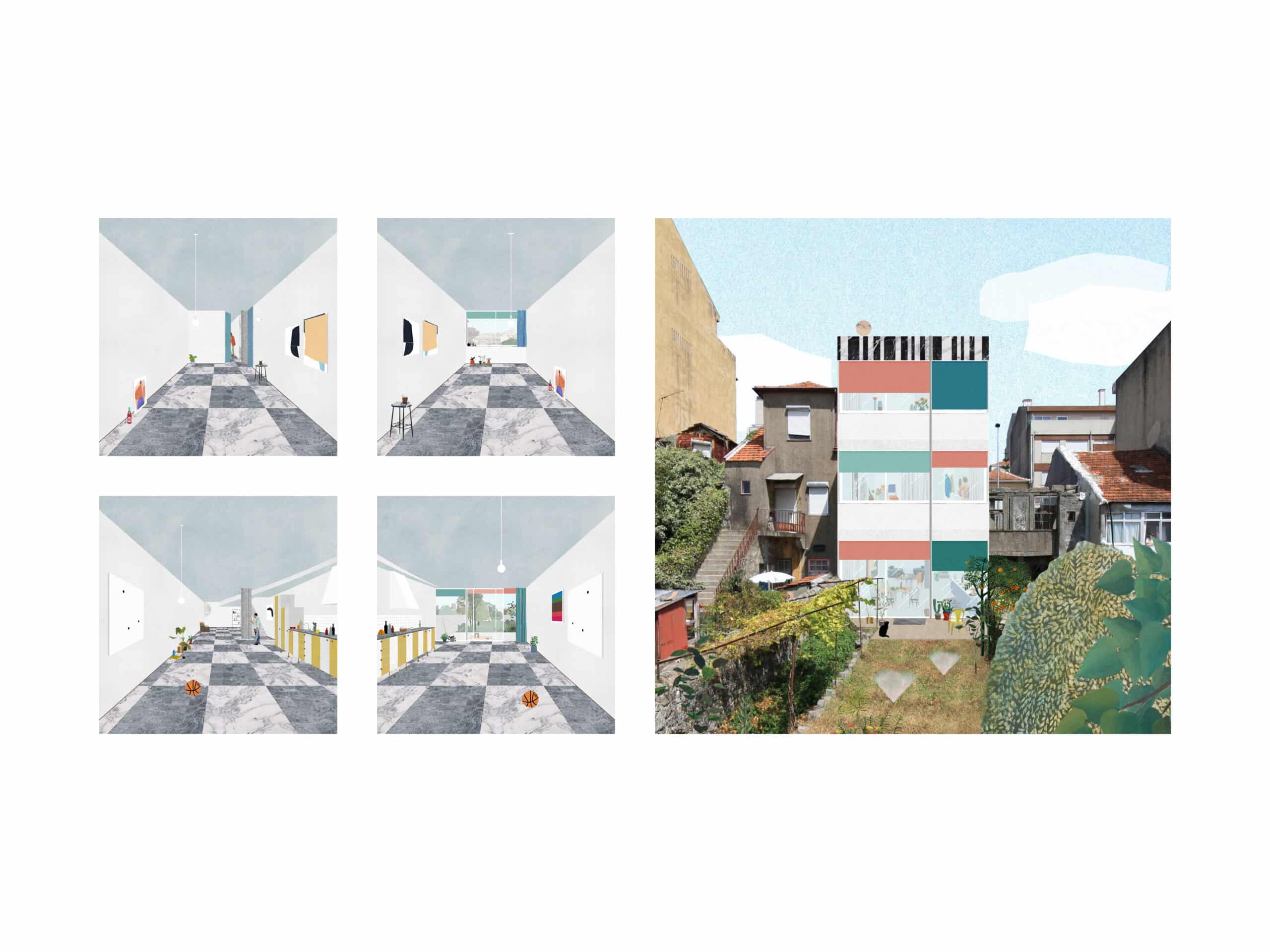
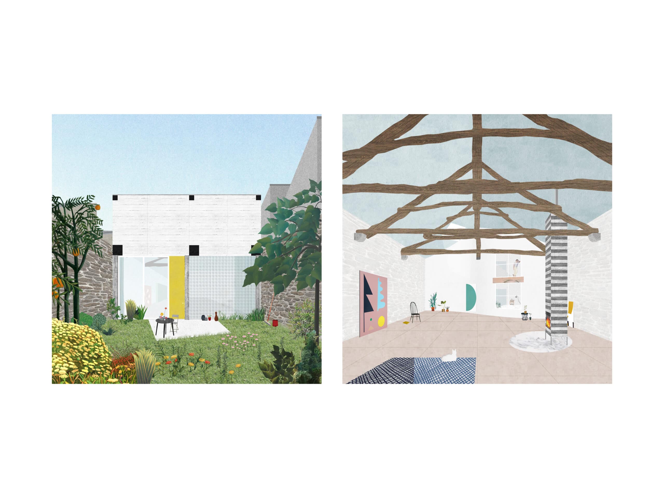
Today, a collage begins as a precise two-dimensional drawing. It is no longer a central perspective that comes from a three-dimensional model. It almost doesn’t care about reality, instead focusing on its own frame of reference. The composition of the image is defined within a fixed frame. The process of arranging the lines and building such an image is made up of trial and error. Alignments, 45-degree lines and precise geometries matter. All the elements are considered, but their dimensions can get a bit distorted. It moves away from being a perspective drawing; it is not an axonometric either. A collage turns into a miscellaneous combination of frontal and angular projections. It establishes its own rules and proportions. It stops being heavily populated with objects and furniture. It carries on rather plain and unoccupied. It stays open and equivocal – functions and dimensions are not assigned. A house can be an office; an office can be a garage; a garage can be a gallery.
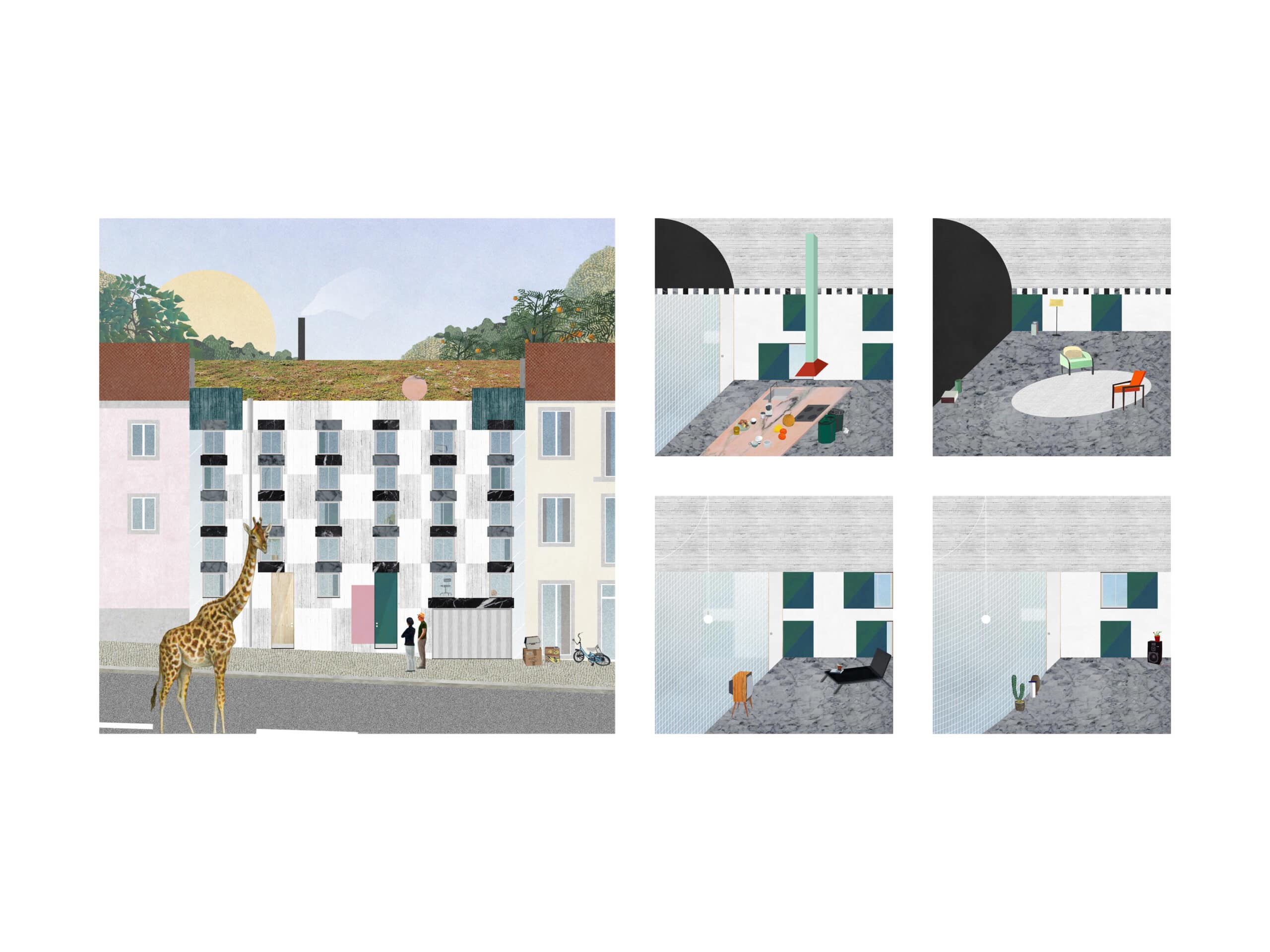
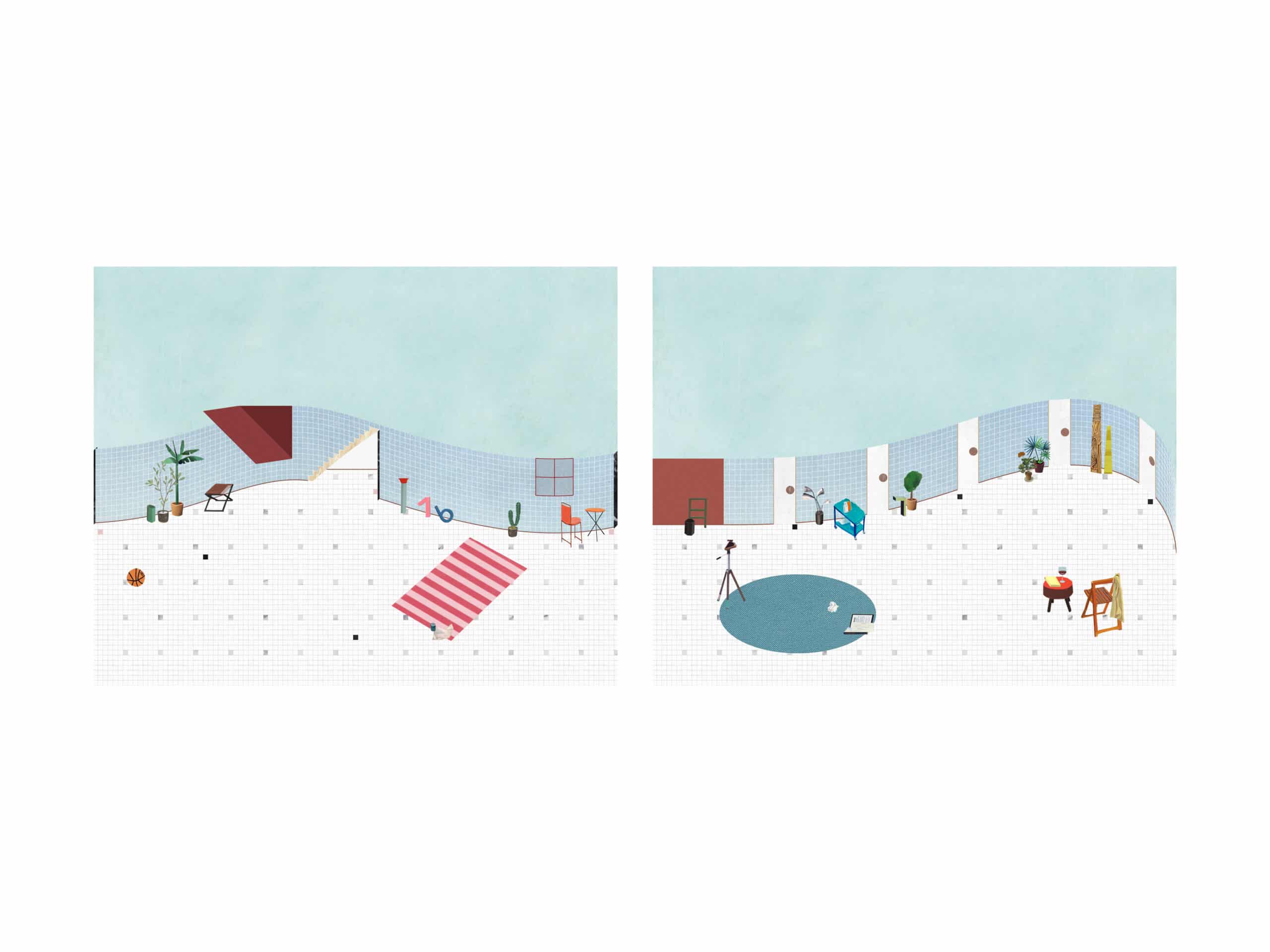
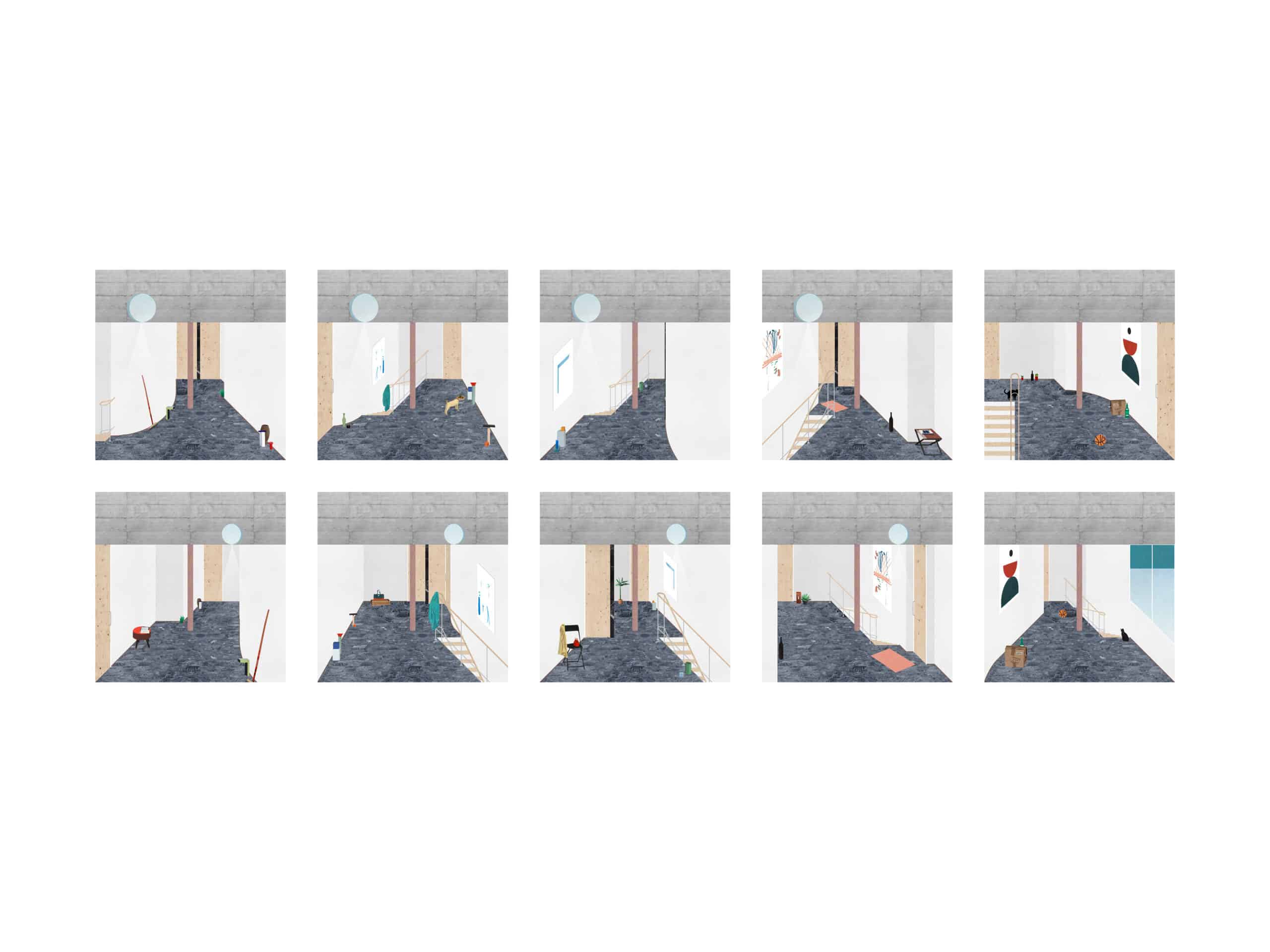
Collages are an exercise in systems and sequences of spaces. A set of rooms or elevations in one project is carefully elaborated into an exact number of relatable images. The frame is fixed, the viewpoint is settled, corresponding walls, columns and beams remain in place, and textures, patterns, and pavements repeat throughout the series. Materials become textures and are precisely juxtaposed and related. The project is narrated through a set of images that highlight its structure, consistency, and occasional exceptions.
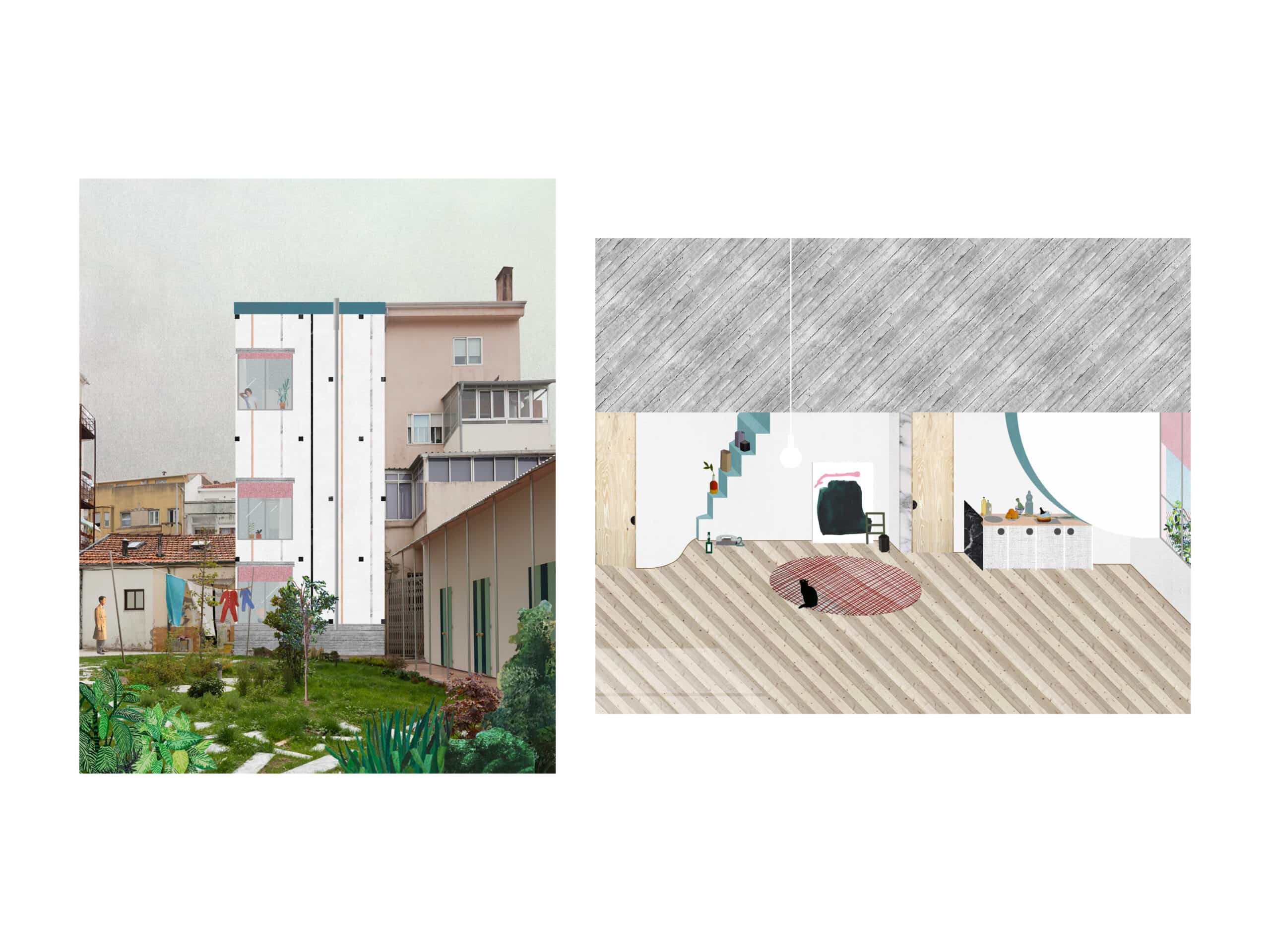
The relationship with the frame is at times challenged. Backgrounds and contexts are left out and projects’ elevations occupy the entire shot. Surroundings tend to be minimised or much less detailed and photographic precision is of no interest. Collages continuously move towards abstraction. Again, as in moving from conventional drawings to single lines, unnecessary noise and clutter are removed. It focuses on the main idea of the project to build up flattened space. It’s never didactic. The collages rather require a bit of deciphering and guessing. Ambiguous images encourage new interpretations.
Read more about fala’s use of paper collages here.
