Harvey Wiley Corbett on Architectural Models of Cardboard
19 September 2019
Between April and August 1922 the American journal Pencil Points printed a four-part series by the architect Harvey Wiley Corbett on architectural models that were made of cardboard. According to Corbett, cardboard was a medium for modern times, providing an economical and labour-saving way for the architect to produce models for study and presentation.
Corbett’s was the second article on architectural model-making to feature in the journal, founded as an independent publication in June 1920. About a year-and-a-half before Corbett’s piece appeared, Frederic Hirons contributed an article on models which highlighted their utility to draughtsmen to visualise the third dimension in a way that drawing could not offer alone: ‘No matter how lively an imagination [the designer] may have’, Hirons wrote, ‘the truth of the old saying “seeing is believing”, holds very firmly so far as the use of models is concerned.’ In his own article, Corbett stressed the capacity of architectural models, with the help of photography, to allow his clients to ‘see’ – and to believe. Various techniques could be used to convey the ‘correct impression’ of a building by simulating how it would look from the point of view of the person in the street.
What follows are a number of extracts and their accompanying photographs from Corbett’s series in Pencil Points. The passages have been excerpted to give a general sense of both the construction and the use of models in Corbett’s architectural practice as representational devices.
I. The value of a model
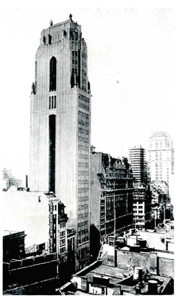
‘The value of an accurate model as an aid to study while designing a building is, I believe, beyond question. Such a model, enabling the architect to see his design as it will work out in three dimensions, supplies the deficiencies of his imagination. I, for one, cannot visualise a design as clearly as my eyes can see it in a well-made model. Furthermore, I believe that many other men are in the same class as myself, for if the architects of some of the important buildings I have seen could have clearly imagined in advance of construction just what their buildings would look like, I am sure they would not have built them quite as they did.’
II. Making Models
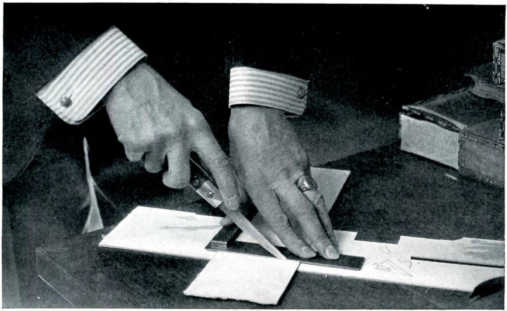
Corbett dedicated a large part of his article to describing the process of making a cardboard model. In the fourth and final part of the article, he discusses the use of layout sheets, an aspect of his process excluded from the earlier instalments because, he explains, he was waiting for one to pass through the office in the ‘regular course of work’.
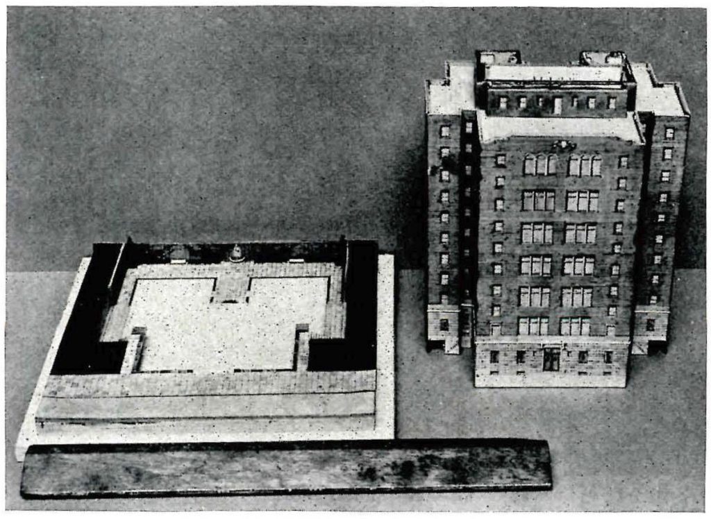
As illustrated below, these layout sheets are flattened skins of buildings drawn onto watercolour paper and separated into different parts to be cut-out, mounted to cardboard elements, and then assembled into larger structures. Small lettering and arrows on the layout sheet, just visible in the example illustrated alongside the article, indicate where to cut and where to fold.
In addition to the building, Corbett also used watercolour paper and cardboard to create some of the ‘accessories and entourage’ of a model – contextual details such as street cars or trains – while other accessories, such as organic elements like trees or grass, were produced using sponges (for trees) or green-painted sand (for grass). Columns and capitals, however, required different methods of production. As he explains in the fourth part of the article, these cannot be ‘rendered’ in the same way and instead require a combination of machining shafts combining them with disks of card for doric capitals or folded paper for ionic volutes (he avoids mentioning how to approach a Corinthian capital!):
‘At one time I thought that I might find small sticks ready turned to use for columns and one day I was delighted to see in the window of a store in a downtown street, slender, round sticks that seemed to be of about the size I needed. I went in and asked about them and was told they were lolly-pop sticks and when I inquired about buying some, I was told that the smallest quantity sold was ten thousand. However, when I explained my purpose I was presented with a number. But I found them useless, they are not of even diameter and are not straight enough, though machine turned they vary surprisingly. At last I hit upon the way of making columns shown in the photograph. A vise is clamped to a board and a hand drill is clamped in the vise, pointing upward at an angle of about 45 degrees. In place of the drill a slender square stick of white wood is inserted in the chuck.
Holding a piece of sandpaper around the stick with the fingers of my left hand, I revolve the stick by turning the drill and wear away the corners until I have a round column of the diameter I want and with the proper entasis. I have been asked if there is any danger of holding the sandpaper too tightly – there is not, for it gets very hot.’
III. The ‘Correct Impression’
For Corbett, the primary purpose of a cardboard model was for the presentation of a design. As such, his article concluded with an explanation of how models and photography can be made to work together to preempt how a building will look once built. Achieving this, as he outlines, requires solving a number of technical obstacles:
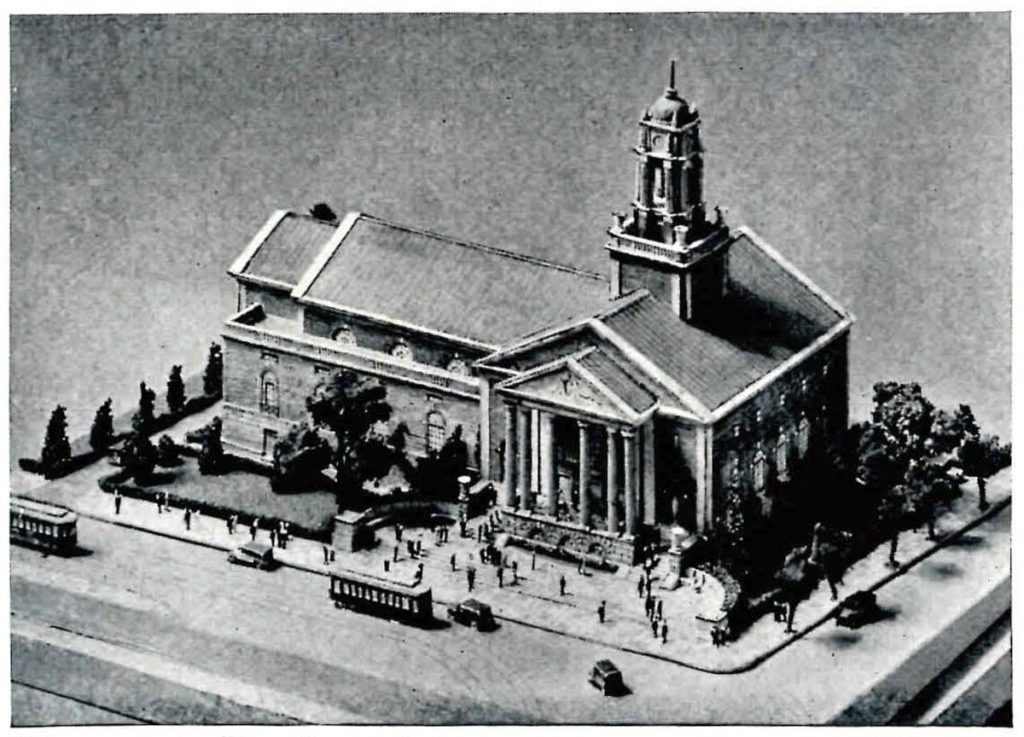
‘While well-made cardboard models properly used are of great value to the architect in studying and in presenting the design for a building, there are a number of ways in which they may mislead the architect or fail to convey a correct impression to the client. One finds out some of these things about architectural models as one uses them – I did. For instance, three views of one model are presented here, each of which gives quite a different impression of the building from the others.
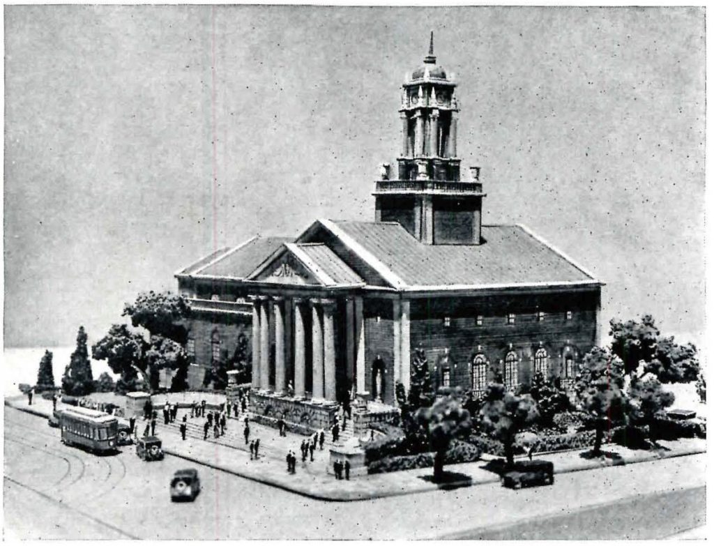
On this page is a photograph that shows the model as it is casually viewed, standing on a table at some distance from one and considerably below the eye level [left]. Excepting for the slight distortion due to the photography this gives one an idea how the building would look when seen from a low-flying airplane or possibly from a tall building some blocks away, a point of view that we need not concern ourselves about very greatly.
What we do want to know and to show the client is, what the building will look like when seen as most people will see it, from the street and at no great distance. In order to see it in this way I must, of course, place my eye at the point at which the observer will stand, measuring the distances in the scale of the model. Therefore, I take the model in my hands and hold it so that my eye is only a little above the base of the model and only a few inches from the corner of the building. At that range one does not see very satisfactorily and a client is likely to see even more badly or hardly at all, understandingly.
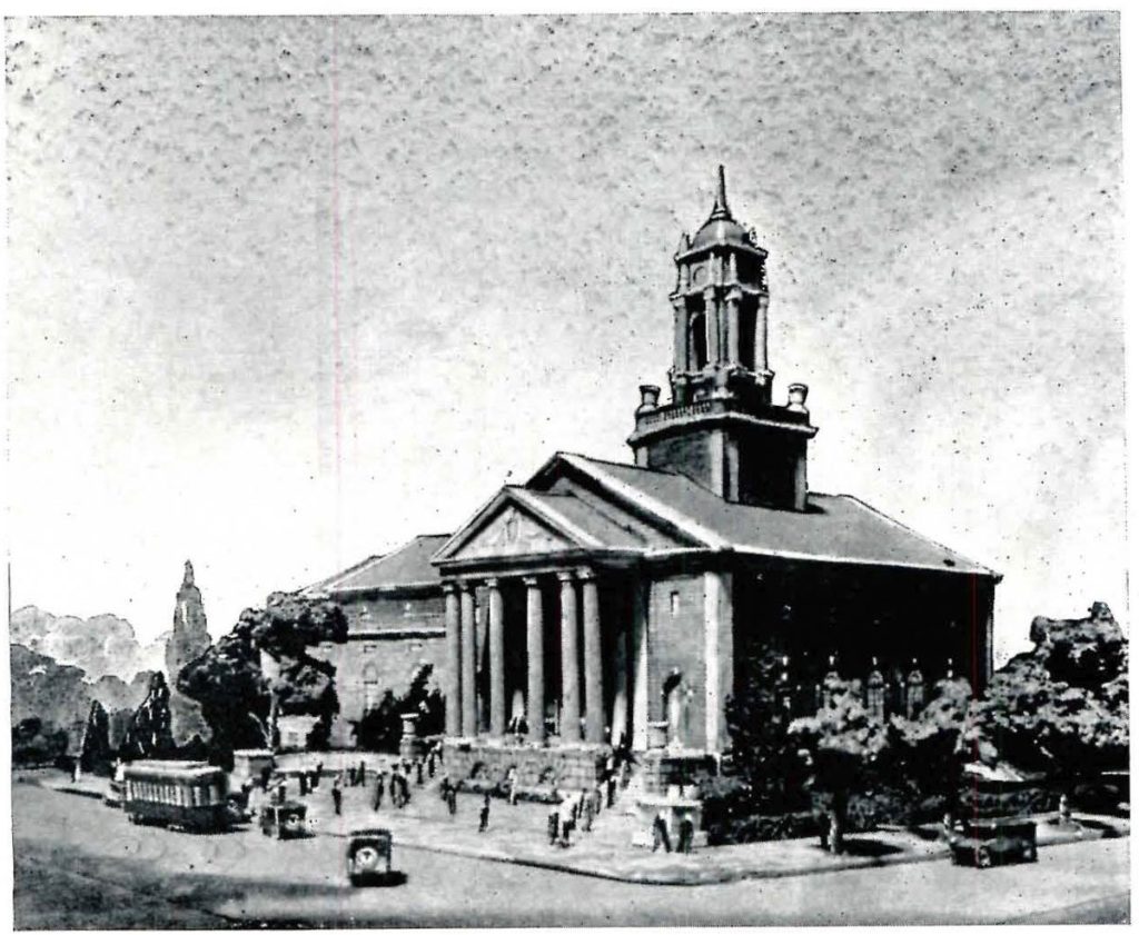
Photography seems to afford a way out so the photographer places his camera as close to the model as his lens will work and produces such a picture as the one shown on the lower part of page 14 [centre]. This is not satisfactory, for the observer is placed too high and at too great a distance. The distance from the nearest corner of the building to the centre of the lens in this case was nine inches, and since the scale of the model is one-thirty-second of an inch to the foot, that means a distance of two hundred eighty-eight feet-more than twice the distance the building will usually be seen from. The camera lens fails us, and as in the cases described in the instalment of this article in the April issue we resort to pin-hole photography, with the result seen in the photograph reproduced on the upper part of page 14 [right] – a photograph taken from a point of view from which the building will be seen very often. The pin-hole lens in this case was only four inches from the nearest corner of the building, equivalent, in the scale of the model, to one hundred twenty-eight feet, which is a fair approximation of the distance one would be away from the building if viewing it from the street corner diagonally opposite. Now if we examine the three photographs with the purpose of studying the design by means of them, we will find from the pin-hole picture that the tower and portico will count much more effectively than one would have been led to believe from an examination of the photograph on this page. Furthermore, the pin-hole picture gives an impression of the mass of the building rising before one and above one while the other photographs lack this impressiveness and realism and make the building look rather like a toy.’
Harvey Wiley Corbett on Architectural Models of Cardboard
Between April and August 1922 the American journal Pencil Points printed a four-part series by the architect Harvey Wiley Corbett on architectural models that were made of cardboard. According to Corbett, cardboard was a medium for modern times, providing an economical and labour-saving way for the architect to produce models for study and presentation.
Corbett’s was the second article on architectural model-making to feature in the journal, founded as an independent publication in June 1920. About a year-and-a-half before Corbett’s piece appeared, Frederic Hirons contributed an article on models which highlighted their utility to draughtsmen to visualise the third dimension in a way that drawing could not offer alone: ‘No matter how lively an imagination [the designer] may have’, Hirons wrote, ‘the truth of the old saying “seeing is believing”, holds very firmly so far as the use of models is concerned.’ In his own article, Corbett stressed the capacity of architectural models, with the help of photography, to allow his clients to ‘see’ – and to believe. Various techniques could be used to convey the ‘correct impression’ of a building by simulating how it would look from the point of view of the person in the street.
What follows are a number of extracts and their accompanying photographs from Corbett’s series in Pencil Points. The passages have been excerpted to give a general sense of both the construction and the use of models in Corbett’s architectural practice as representational devices.
I. The value of a model
‘The value of an accurate model as an aid to study while designing a building is, I believe, beyond question. Such a model, enabling the architect to see his design as it will work out in three dimensions, supplies the deficiencies of his imagination. I, for one, cannot visualise a design as clearly as my eyes can see it in a well-made model. Furthermore, I believe that many other men are in the same class as myself, for if the architects of some of the important buildings I have seen could have clearly imagined in advance of construction just what their buildings would look like, I am sure they would not have built them quite as they did.’
II. Making Models
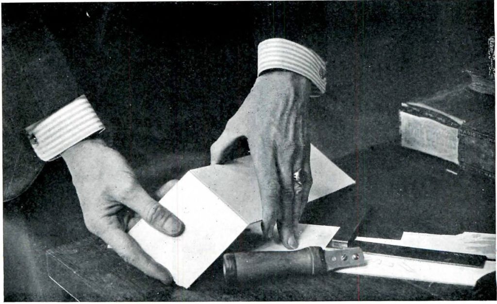
Corbett dedicated a large part of his article to describing the process of making a cardboard model. In the fourth and final part of the article, he discusses the use of layout sheets, an aspect of his process excluded from the earlier instalments because, he explains, he was waiting for one to pass through the office in the ‘regular course of work’.
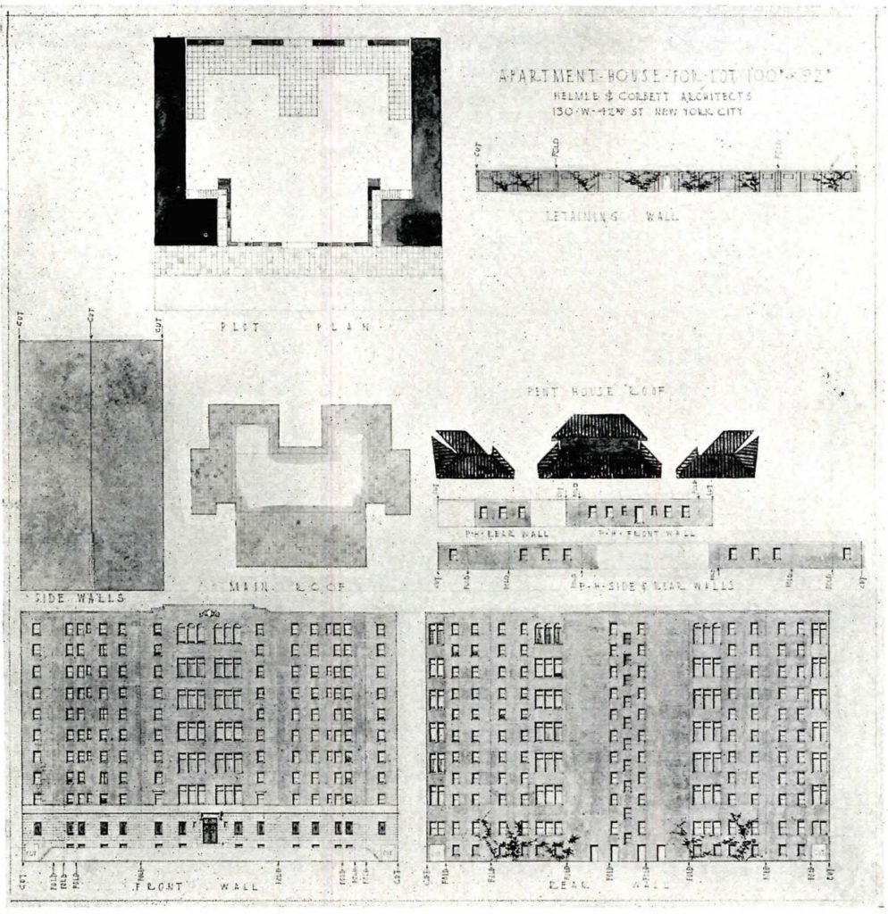
As illustrated below, these layout sheets are flattened skins of buildings drawn onto watercolour paper and separated into different parts to be cut-out, mounted to cardboard elements, and then assembled into larger structures. Small lettering and arrows on the layout sheet, just visible in the example illustrated alongside the article, indicate where to cut and where to fold.
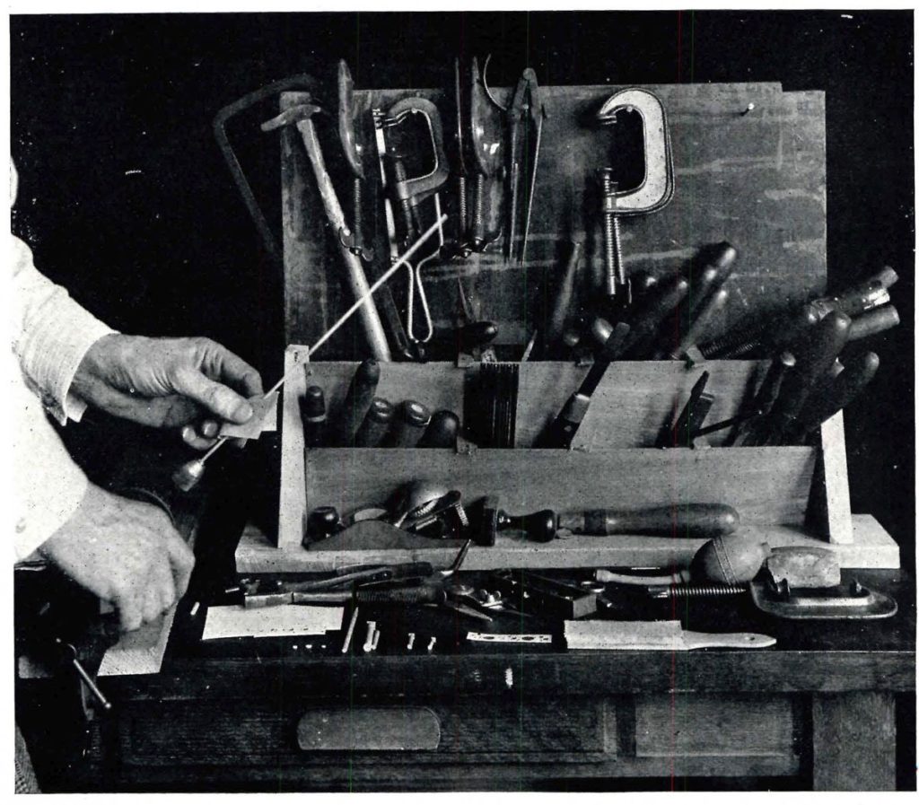
In addition to the building, Corbett also used watercolour paper and cardboard to create some of the ‘accessories and entourage’ of a model – contextual details such as street cars or trains – while other accessories, such as organic elements like trees or grass, were produced using sponges (for trees) or green-painted sand (for grass). Columns and capitals, however, required different methods of production. As he explains in the fourth part of the article, these cannot be ‘rendered’ in the same way and instead require a combination of machining shafts combining them with disks of card for doric capitals or folded paper for ionic volutes (he avoids mentioning how to approach a Corinthian capital!):
‘At one time I thought that I might find small sticks ready turned to use for columns and one day I was delighted to see in the window of a store in a downtown street, slender, round sticks that seemed to be of about the size I needed. I went in and asked about them and was told they were lolly-pop sticks and when I inquired about buying some, I was told that the smallest quantity sold was ten thousand. However, when I explained my purpose I was presented with a number. But I found them useless, they are not of even diameter and are not straight enough, though machine turned they vary surprisingly. At last I hit upon the way of making columns shown in the photograph. A vise is clamped to a board and a hand drill is clamped in the vise, pointing upward at an angle of about 45 degrees. In place of the drill a slender square stick of white wood is inserted in the chuck.
Holding a piece of sandpaper around the stick with the fingers of my left hand, I revolve the stick by turning the drill and wear away the corners until I have a round column of the diameter I want and with the proper entasis. I have been asked if there is any danger of holding the sandpaper too tightly – there is not, for it gets very hot.’
III. The ‘Correct Impression’
For Corbett, the primary purpose of a cardboard model was for the presentation of a design. As such, his article concluded with an explanation of how models and photography can be made to work together to preempt how a building will look once built. Achieving this, as he outlines, requires solving a number of technical obstacles:
‘While well-made cardboard models properly used are of great value to the architect in studying and in presenting the design for a building, there are a number of ways in which they may mislead the architect or fail to convey a correct impression to the client. One finds out some of these things about architectural models as one uses them – I did. For instance, three views of one model are presented here, each of which gives quite a different impression of the building from the others.
On this page is a photograph that shows the model as it is casually viewed, standing on a table at some distance from one and considerably below the eye level [left]. Excepting for the slight distortion due to the photography this gives one an idea how the building would look when seen from a low-flying airplane or possibly from a tall building some blocks away, a point of view that we need not concern ourselves about very greatly.
What we do want to know and to show the client is, what the building will look like when seen as most people will see it, from the street and at no great distance. In order to see it in this way I must, of course, place my eye at the point at which the observer will stand, measuring the distances in the scale of the model. Therefore, I take the model in my hands and hold it so that my eye is only a little above the base of the model and only a few inches from the corner of the building. At that range one does not see very satisfactorily and a client is likely to see even more badly or hardly at all, understandingly.
Photography seems to afford a way out so the photographer places his camera as close to the model as his lens will work and produces such a picture as the one shown on the lower part of page 14 [centre]. This is not satisfactory, for the observer is placed too high and at too great a distance. The distance from the nearest corner of the building to the centre of the lens in this case was nine inches, and since the scale of the model is one-thirty-second of an inch to the foot, that means a distance of two hundred eighty-eight feet-more than twice the distance the building will usually be seen from. The camera lens fails us, and as in the cases described in the instalment of this article in the April issue we resort to pin-hole photography, with the result seen in the photograph reproduced on the upper part of page 14 [right] – a photograph taken from a point of view from which the building will be seen very often. The pin-hole lens in this case was only four inches from the nearest corner of the building, equivalent, in the scale of the model, to one hundred twenty-eight feet, which is a fair approximation of the distance one would be away from the building if viewing it from the street corner diagonally opposite. Now if we examine the three photographs with the purpose of studying the design by means of them, we will find from the pin-hole picture that the tower and portico will count much more effectively than one would have been led to believe from an examination of the photograph on this page. Furthermore, the pin-hole picture gives an impression of the mass of the building rising before one and above one while the other photographs lack this impressiveness and realism and make the building look rather like a toy.’
Related...
Six Architects on their Dream Desks
– Roz Barr, Biba Dow, Elizabeth Hatz, Emma Letizia Jones, Stephanie Macdonald and Helen Thomas
Category
design methodologies drawing techniques & materials office cultures on their own work commentaries, rants & reflections
Period
c20th
Architect
Harvey Wiley Corbett
Medium
drawing model photograph print
Tags
civic & municipal commerce domestic presentation publication