Montage-Entourage; Or The Politics Of The Seam
The following text is a version of chapter three from Reality Modeled After Images: Architecture and Aesthetics after the Digital Image by Michael Young, published by Routledge © 2021. Available from Routledge.
Portions of this chapter were initially developed in the essay ‘The Aesthetic Recycling of Cultural Refuse’ published in Writing Architectures: Ficto-Critical Approaches (Bloomsbury: London, 2020).
In discussing architectural images there is an aspect that initially seems secondary or of lesser importance. Yet every image engages this issue at some level, whether it is an abstract orthographic drawing or a hyper-realistic perspective rendering. If this question is ignored, the image will often be called out as too abstract, too self-referential. Yet, when it is engaged, this issue will also most likely be what is noticed, what is commented on, even before the architecture. The issue I am referring to is how all the stuff of the world — the trees, furniture, devices, bowls, pillows, knick-knacks, cars, lamps, rocks, animals, and people — is represented. These items are not typically designed by the architect and are often the last things added to a representation, but they are crucial to how an architectural image is received. To make the situation even stranger, there is little in the way of considered argumentation about the roles played by these things that populate architectural images. Seen as mere scale figures, blandly dismissed as ‘not architecture’, called out for cultural biases, or generally treated as kitsch accoutrement, they are rarely recognised for the different ways they operate within architectural representation. The discipline gathers these marginalia together under the term entourage. [1]
This chapter argues that, for much of the past century, architectural entourage has operated within the aesthetic paradigm of montage. There are two implications that follow from this. First, entourage is typically considered as something added, assembled into an architectural image in order to alter the interpretation of the design. It consists of elements extracted from multiple sources combined to image an environment, a convergence where different ontologies mix. Montage is fundamentally a question of cutting, sampling, and mixing media tied to technologies of reproduction. What changes over the course of the century is that media techniques begin to scramble the relationships between architecture and entourage, an exchange that produces significant problems for how images are to be evaluated as critical or commercial, speculative or documentary, disciplinary or popular. Although there has always been ‘visionary architecture’ that operated primarily through the drawing rather than the materially constructed building, with the montage of entourage, the design of architecture became the design of worlds through the manipulation of objects and environments as assembled fragments of reality. This leads to the second implication.
Throughout the twentieth century, from expressionism to cubism, surrealism to conceptual art, minimalism to pop, architecture associated itself with avant-garde art movements by appropriating aspects of their aesthetic techniques. Quite often these associations also brought with it the discourse surrounding the artform. Montage was a key technique for the emergence of modern media theory (Walter Benjamin), theories on the autonomy of art (Theodor Adorno), the project of critical theory (Manfredo Tafuri), and theories of the avant-garde (Peter Bürger). Architecture found that in its relation to montage, aspects of these arguments could be brought to bear on its representations, and through this, the imaging of architecture could engage social, technological, ecological, political commentary and critique. Criticality is entwined with a general concern for exposing artifice, and in the context of montage, this issue found an association in the visibility of the seam between disparate parts, and the role this seam can play in expressing or obscuring the artifice of an assemblage. The revelation of the seam became both literally and metaphorically associated with ideas of honesty and awareness versus seduction and distraction. As all images of reality experienced through our digitally mediated interfaces are a species of assembled montage, the relationship between the aesthetics and the politics of montage is as charged as ever. For architectural images, the seams that receive the greatest attention often concern the entourage, in other words, the seams between architecture and everything considered not architecture.
Entourage Stories
The date and location of its introduction into the architectural image can be debated, but many of the issues concerning entourage first appeared in painting. For late medieval and early Renaissance painters, figures and their groupings were a primary focus of the artwork. This is the istoria that Leon Battista Alberti discusses in Della Pittura. [2] Groupings of figures conveyed narrative through gesture, posture, and formal composition within genre conventions. A neoclassical painting by Jacques-Louis David, The Lictors Bring to Brutus the Bodies of His Sons (1789), displays these issues in their most academically formalised manner. The story depicted is one from classical antiquity in which Brutus defends the Roman Republic at the cost of his conspiring sons’ lives. In the politically charged context of Revolutionary France, the painting presented a poignant allegory of sacrifice and civic duty. Interpreting it required viewers to know not only the story itself but also the conventions and codes that structure its organisation. For instance, the central column row vertically divides the two primary emotional registers of the narrative while also supporting a fabric drape that highlights the figures’ expressive gestures. Much of the architecture operates just below the threshold of attention, organising the picture plane, modulating light, framing action, suggesting depth, and establishing mood and atmosphere. What matters are the human figures, their emotions, their interactions, their narrative.
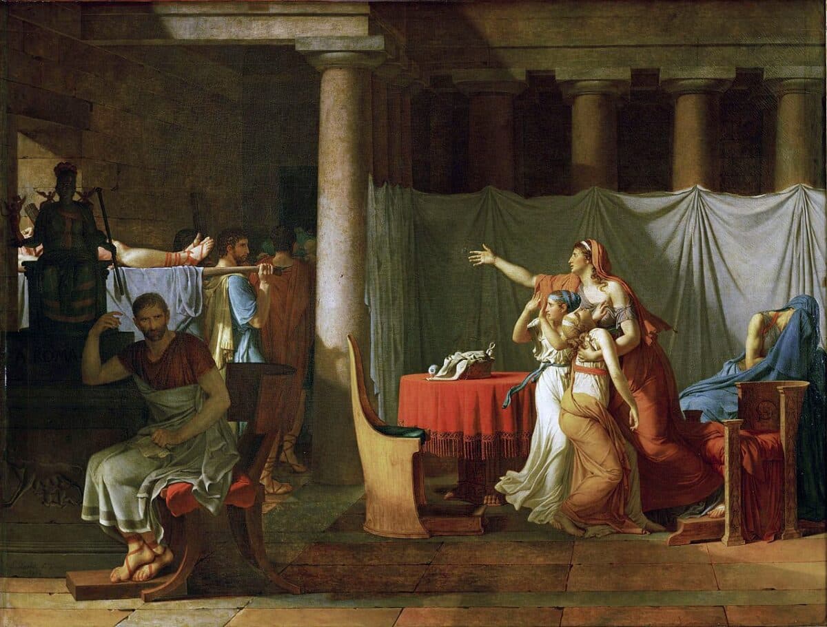
3230 mm × 4220 mm. The Louvre.
The eighteenth century brought to Northern Europe a renewed interest in classical Greece and Rome, inspired in part by the discovery and excavations of Herculaneum and Pompeii. The influx of tourists to Rome and other sites along the Grand Tour created a market for etchings and engravings of ancient sites. Consider Giovanni Battista Piranesi’s Vedute di Roma (1750–1778), the popular series of prints he sold to visitors of Rome as his primary means of livelihood. Piranesi’s Vedute were images produced for reproduction. The emergence of the architectural representation as a commodity, with a value outside of its notational function in the building process, required both technologies of reproduction and a consumer audience. As art historian Basile Baudez describes, ‘This period, in which people started collecting as souvenirs drawings and prints of places they visited, saw a profound change in the way buildings were represented, because the architects tried for the first time to create effects that would appeal to non-architects’. [3] The introduction of vegetation, of material qualities, of context, lighting, and the human figure into an architectural representation reflected this shift in audience.
The ‘rendered views’ of architectural sites at this time combined different aesthetic positions. While the choice in depicted subjects was dominated by a neoclassical reverence for antiquity, the aesthetic conventions used to represent them were often drawn from the picturesque (in the cases of Piranesi and Étienne-Louis Boullée, evoking the sublime). The picturesque is typically seen in architecture and landscape as an attempt to alter the environment to resemble painting. [4] Art historian David Marshall explains that for the eighteenth century aestheticians Uvedale Price and William Gilpin, ‘The picturesque represents a point of view that frames the world and turns nature into a series of living tableaux. It begins as an appreciation of natural beauty, but it ends by turning people into figures in a landscape or figures in a painting’. The human figure was indeed an essential element of the picturesque image but did not serve as the narrative subject, as in neoclassical painting. People in a picturesque painting are instead objects: they give scale, lend familiarity, and aid in visually domesticating the landscape. The wildness of nature becomes casually ordered, the rigidity of architecture softened, roughed up, and broken into irregular ‘natural’ forms. [5] Images in the picturesque mode might include ruined fragments of buildings, vegetation, geological outcroppings, and scale figures positioned somewhere in the middle ground – objects that allowed viewers to project themselves into the scene. This was the aesthetic sold to tourists in the late eighteenth century and its influence can be seen in postcards to this day. But the picturesque also conditioned the emergence of entourage as an architectural concept, one that would become ingrained in the pedagogical practices of the École des Beaux-Arts. Writing in the early twentieth century, Nathaniel Cortland Curtis notes that the role of entourage at the École was related specifically to the representation of landscape and context:
According to the generally accepted usage of the atelier, the term entourage embraces all features of landscape architecture immediately surrounding the building…
Compared to building architecture the latter compositions may be said to be analogous to informal and picturesque types of building plans, which although they are possibly as much arranged as the more regular types of symmetrical and unsymmetrical partis, are by nature of their programs and the special effects sought not subject to strictly formal rules. [6]
There are several key differences that distinguish the entourage of architectural images from the human figures found in genre paintings. First, the hierarchy is reversed, with architecture becoming the object of focus and the figures serving as support context. The perspective views in Paul Letarouilly’s Edifices de Rome moderne (1840) provide apt examples. In these renderings, human figures interact with the architecture and thus reveal possibilities for inhabitation. Their gestures do not establish a narrative but instead draw the viewer’s eye, directing attention to particular features of the design. This reversal of foreground and background is a matter of attention. While the entourage is still literally ‘the foreground’ and the architecture ‘the background’, the entourage serves to redirect attention onto the architectural environment. [7] These figures are radically different from those in neoclassical painting for they act more like objects – sculpture, furniture, vegetation – than like people we might encounter in social settings. They are also informally arranged, in contrast to the symmetry and formal stasis of the architectural interiors that surround them. Letarouilly’s rendering emphasises the difference between architecture and entourage, giving the figures shade and shadow while representing the architecture through linework alone. This distinction pulls the two entities into different realms, almost different ontologies, yet allows them to somehow share the same space.
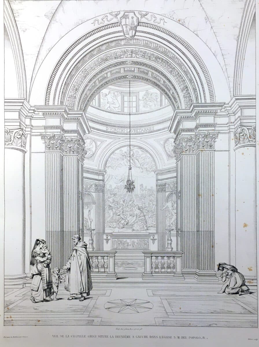
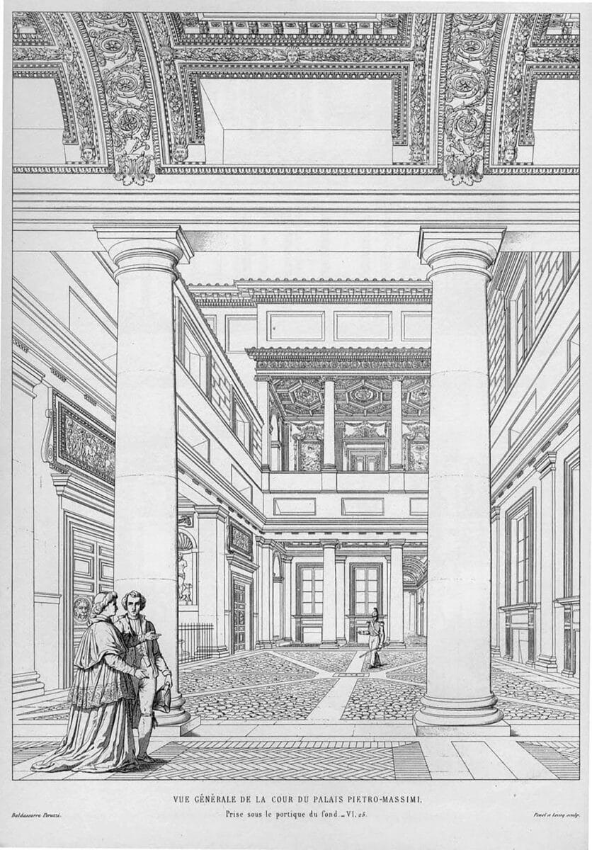
Entourage engages three issues: familiarity, scenario, and audience. First, familiarity. At a basic level, figures, vegetation, and recognisable objects give scale to the representation. But there are also other issues at stake in the aesthetics of the familiar – questions involving habitual behavior and modes of attention towards daily life. Entourage domesticates natural surroundings while loosening up more controlled architectural environments. It makes the artificial appear more natural and more real, the wilderness more manageable and more understandable. Second, it creates a scenario. Entourage renders social events and programmatic inhabitation, but it does so in service of evoking attitude, demeanor, and interaction – encoding what architects would describe as the relations between program and context – rather than overtly narrating a story. Scenarios also raise the issue of ‘lifestyle’, and thereby the many design questions that are too often ignored or dismissed by the discipline of architecture, such as interiors, furniture, textiles, fashion, and gardens. Lastly, entourage frames an audience. This is at one level a question of content. What environment, landscape, urban scene is imaged? What objects occupy these scenarios? Who is it that lives and inhabits these spaces? How these questions are answered reveals much regarding the biases of the designer and the assumptions of who the image is addressing. Furthermore, an audience is more than an abstract, generalised group of viewers, for it also involves networks of communication and technologies of reproduction. An image in a book or journal is different than one produced for a client presentation or the legal processes of a design review board. Finally, the way ‘the entourage‘ is differentiated from ‘the architecture’ is also largely determined by whom the representation is intended to engage. An architect can indicate if the image should be engaged as a disciplinary critique or a commercial promotion largely by how the entourage is represented, a discussion to which we will return later in this chapter. These three aspects of entourage – familiarity, scenario, and audience – assist the argument the architectural image is attempting to formulate and play an important role to determine how the politics of the project is interpreted.
A Cultural-Economic Exchange
In From Ornament to Object, Alina Payne reframes early twentieth century architecture’s rejection of ornament as less a total banishment than a shift in location. With modernism, the cultural meaning traditionally conveyed through architectural ornament is displaced onto the designed and manufactured objects of daily life. [8] In the modern mode of nomadic inhabitation, objects are carried from place to place as signifiers of personal sensibilities, demanding that architecture become more neutral, less decoratively busy, and ‘calmer’, as Le Corbusier claimed in The Decorative Art of Today. [9] (This attitude can be seen both in his perspectival renderings and in the staged photography of his completed buildings.) [10] Early twentieth century architecture may have driven ornamental meaning out of architecture and into objects, but decoration was maintained in the clean, often white, ‘a-tectonic’ articulation of surfaces. A later chapter will explore the relationship between ornament and decoration, but here it will suffice to locate their essential difference: while ornament attracts attention, decoration diffuses it. In this, ornament becomes the objects in the foreground and decoration the surfaces in the background. And if we believe that the role of ornamental significance is now to be found in objects, this means that, for the rendered image, the communicative import of ornament is transferred to the entourage. Furniture, dinnerware, lighting fixtures, trees, plants, artwork, ashtrays, and even things like automobiles and airplanes – commodities, in short – are asked to carry the significance formerly conveyed by architectural ornament. By borrowing images of objects that are also, thanks to advertising, encoded as signifiers of social aspirations, architectural renderings also adopt the lifestyle aspirations attributed to these objects. As this suggests, the implications of entourage extend well beyond simple matters of scalar reference for the architectural image exists within the commodity exchanges of capital wither it wants to or not.
For Boris Groys, innovation is defined as a ‘cultural-economic exchange’, wherein value is transferred between two realms. ‘One result of every innovation is that certain things in the profane realm are valorised and enter the cultural archive, while certain cultural works are devalorized and enter the profane realm.’ [11] This process of creating ‘the new’ is an exchange that alters the dividing lines established and policed by disciplines and institutions. [12] Most artists refine and extend accepted, archived, and valued traditions. An approach that safely assures reward. When the tradition appears to stabilise, however, the incentive to innovate appears. This can occur through a devaluing (negative adaptation), a revaluing (positive adaptation), or both, a shifting of ideas and objects between realms simultaneously. [13] The most innovative objects and ideas are those that exhibit the most extreme tension in the transferences between the two realms. The profane realm consists of that which is considered outside culturally valued traditions, its content continually changing. Essence, authenticity, reality, nature, reason, desire, spirit, the unconscious, the primitive, the mechanical, the kitsch, the digital: these concepts have all served at different historical moments as the content of the profane realm. Groys argues that these terms are often mistakenly seen as sources of innovation in themselves as they are used to classify and evaluate art once it is accepted into the cultural archives; what matters is not the specific source idea, but how innovation occurs through the exchange. To consider ‘ornament’ as the objects of everyday life is to heighten the importance of the entourage inserted into an architectural image. In Groys’s terms, this can be understood as a cultural-economic exchange that shifts value from the ornamental articulation of a building into the social scenarios performed within the fiction of the image.
There is a legacy throughout the twentieth century for these combinations between different cultural registers. As Beatriz Colomina astutely observes, ‘The dichotomy between high art and mass culture, construed as a relation of opposition and exclusion […] is undermined by Le Corbusier’s work. His use of publicity material and clippings from newspapers next to images extracted from art books represents the intrusion of the materials of “low culture” into the realm of “high art”, an intrusion that, if it cannot be considered a direct, avant-garde attack on the institution of art, nevertheless undermines its ideology of autonomy from the realm of everyday life.’ [14] The desire to blur and question the distinctions between ‘art’ and ‘life’ is one of the recurring themes in twentieth century art. For architecture, this desire is doubly charged, for it not only takes place in the representations that architects produce but also in the lived experiences of architectural environments as built.
The twentieth century was changed by the mass-produced commodities of industrial production and transformations in technologies of reproduction. The photographic print allowed for the appropriation of images as cut fragments that could be juxtaposed to create new relationships. Through montage, the images of everyday reality were used to question traditional values such as author, originality, composition, and precedent. The assemblage of cut images of reality became material objects in reality. By combining found technologically reproduced images – extracted from photo journals, advertising, newspapers, or online image databases – montage revalues what are typically considered kitsch images. Entourage became montaged as an assemblage of image-objects; selected, extracted, and inserted.
Reality Fragments
Peter Bürger argues that ‘a theory of the avant-garde must begin with the concept of montage that is suggested by the early cubist collages. What distinguishes them from the techniques of composition developed since the Renaissance is the insertion of reality fragments into the painting, i.e., the insertion of material that has been left unchanged by the artist’. [15] There are two claims juxtaposed by Bürger in this passage. First, that historical avant-garde art begins with a fragment from reality, selected, extracted, and inserted into the context of ‘art’. This point and its connections to cubism may seem more directly tied to the physical objects used in collage by Picasso and Braque than the photographic images of photomontage, but the principle remains, montages assemble fragments from different realities. These fragments are an interruption into the realm of representation, they create a conflict, a tension, and as such, heighten attention to the ruptures between different ontologies. Second, the fact that these fragments are not transformed or manipulated by the artist, challenges techniques of composition as traditionally defined through notions of authorship and conventions of formal organisation. As Bürger explains,
The avant-gardiste work neither creates a total impression that would permit an interpretation of its meaning nor can whatever impression may be created be accounted for by recourse to the individual parts, for they are no longer subordinated to a pervasive intent. This refusal to provide meaning is experienced as shock by the recipient. And this is the intention of the avant-gardiste artist, who hopes that such withdrawal of meaning will direct the reader’s attention to the fact that the conduct of one’s life is questionable and that it is necessary to change it. Shock is aimed for as a stimulus to change one’s conduct of life; it is the means to break through aesthetic immanence and to usher in (initiate) a change in the recipient’s life praxis. [16]
‘The principle of montage’, claims Manfredo Tafuri, ‘had always been linked to the theme of activating the public’. [17] For Tafuri, this technique was crucial to the historical avant-garde’s address of the modern metropolis, industrial commodity production, and capital accumulation: ‘The law of assemblage [legge del montaggio] was fundamental. And since assembled objects belong to the real world, the painting became the neutral field into which the experience of shock, suffered in the city, was projected. Indeed, the problem now became that of teaching not how one should “suffer” that shock, but how one should absorb it and internalise it as an inevitable condition of existence’. [18] Montage aids in the production of a conscious public by revealing the artifice of the industrialised world, ‘shocking’ the blasé flaneur into participation in the processes of modernity. This idea can be found in various forms in the work of several twentieth century thinkers, including Sigmund Freud, Walter Benjamin, Theodor Adorno, Clement Greenberg, as well as Tafuri and Bürger. For these theorists, montage had the capacity to place the fragmentary pieces of modernity in dialectical tension, a task also pursued by critical theory itself.
Let us review the implied sequence here. The aesthetics of montage creates a rupture between two or more images in juxtaposition, the inability to resolve this combination at the level of shared reality, cultural conventions, or clear intended meaning is experienced as a ‘shock’ by the viewer, this impact raises awareness of the artifice of modernity, and finally, this awareness politically activates the viewer to behave differently in ‘one’s conduct of life’. That this chain of linked associations can occur is accepted, that it must occur is doubtful, for there are several contingent variables. First, raising awareness is not always enough to politically motivate the public. ‘Understanding does not, in and of itself, help to transform intellectual attitudes and situations. The exploited rarely require exploitation of the laws of exploitation. The dominated do not remain insubordination because they misunderstand the existing state of affairs but because they lack confidence in their capacity to transform it’, states Jacques Rancière. [19] Second, as noted by Bürger, the aesthetic effects of shock are impermanent. [20] What occurs initially is bound to diminish over time and will affect different audiences in different contexts in different ways. Lastly is the question of the seam, literally. The entire chain of associations is based on the presence of a juxtaposition between fragmented images. There must be a gap, an edge, a disjunction in the montage. But what if the physical seam is not visibly present as a material artifact on the surface of the artwork? What if it takes effort on the part of the observer to identify the artifice? What if the fragmentation is conceptual as opposed to material? What if the desires of the artist are exactly to problematise these seams between art and life as opposed to demonstratively expose or seductively conceal them?
The Presence of the Seam
The Berlin Dada is where the implications of this new aesthetic paradigm first became apparent. The montages created during the first decades of the twentieth century appropriated found photographs and assembled them to spark an alternative imaging of the world. [21] Sharp dialectical juxtapositions positioned images as material figures jacked into tense often absurd relations with each other at formal, material, conceptual, and semiotic levels. The initial engagement of architectural representation with montage can be seen in the work of Ludwig Mies van der Rohe, Ivan Leonidov, and Oscar Nitzchke, among others. Embedded within the early twentieth century avant-garde art movements of Dada and constructivism, these architects bore their influence in what historian and curator Martino Stierli describes as their ‘quest for alternative means for the production of visual knowledge beyond established conventions’. [22]
One of the questions fundamental to the aesthetics of montage is the presence of the seam in the final artwork. The exposure of the seam of construction with sharp disjunctive adjacencies is one of the traits associated with Dada montage, and it is often this expression of the assembly that is aligned with critical theory’s efforts to reveal the artifice of modernity. The visibility of the seam heightens the sense that the montage is an abstract production, that it belongs among the industrial mechanical productions of modernity. If the tectonic of the artwork is laid bare for the viewer to inspect its construction, the viewer is invited to critically break apart and analyse the dialectics of juxtaposed images, processing the shock through intellectual contemplation. There is thus an ethical implication here: to reveal the seam is to be truthful about artifice; to hide it is dishonest and seductive. From this claim, it follows that if the assembly is disguised and its seams concealed, then the artwork will not only be less provocative, less political, and more traditional but also suspicious.
Borrowing a distinction put forward by Croatian musicologist Viktor Žmegač between ‘demonstrative (open, irritating) and integrative (disguised) montage,’ Stierli writes,
While demonstrative montage displays the breaks and ruptures (and makes use of them for the production of meaning), integrative montage seeks to conceal the heterogeneous nature of the image and avoids the dialectical juxtaposition of elements. In the visual arts, demonstrative montage is often employed in order to convey political or polemical messages… Whereas Ernst’s disguised collages continued – albeit satirically – the tradition of the organic work of art of the nineteenth century and its illusionistic space, the Dadaists opposed the traditional idea of art with an exposed, openly imperfect visual configuration. As Žmegač notes: ‘Whereas covert montage does not break open, but rather affirms the idea of the “organic’” work of art that is sealed by means of illusion, provoking montage resists the conventions of organological aesthetics.’ [23]
The montages of Max Ernst are used here as examples of a disguised seam, thus organically traditional and not politically radical. Ernst worked through a plethora of collage and montage techniques in the production of his art, which included novel inventions such as frottage, grattage, and decalcomania. Stierli categorises Ernst’s production as integrative montage because the seam of assembly is often disguised on the surface of the material. The suggestion that this makes the work less provocative or political may be too quick of an assignation, for I would argue that Ernst’s montages are disjunctive and shocking, in part because the combinations of disparate elements are smoothed into a more naturalistic illusion. The work does indeed create a rupture, but the seam is displaced from the surface of the medium onto a conceptual domain, leading the viewer to question the world conjured by the montage. At one level Ernst’s work is a celebration of immersive illusion, yet at another, it implicates its own medium as an absurd media machine of reproduction and deception. It is this questioning of separations and the doubt that is raised regarding what is illusion, what is real, what is artifice that becomes the aesthetic argument.
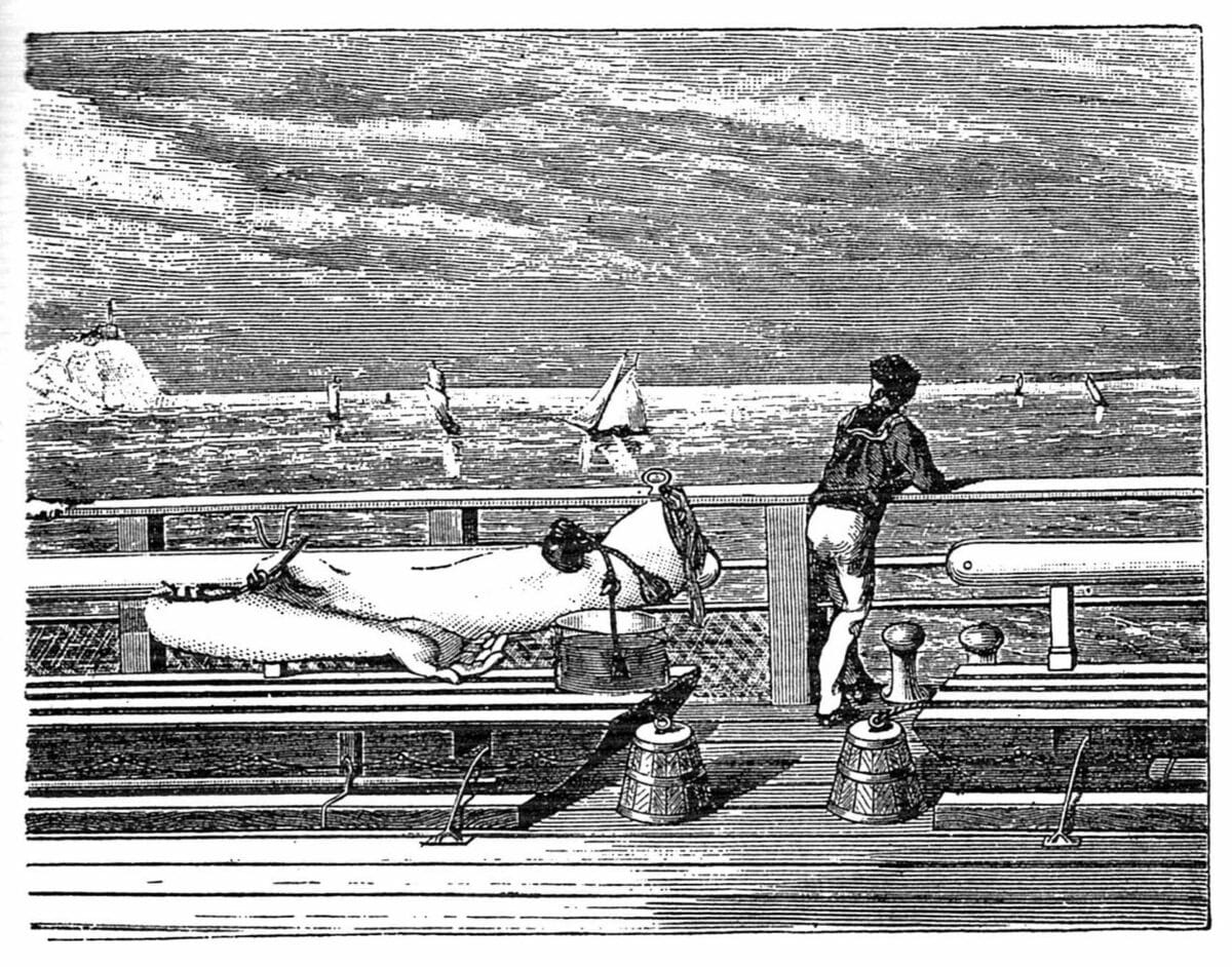
Ernst’s montages conceal their seams subtly, allowing the fragments to fuse into hybrids and chimeras belonging to a strange, other world momentarily intersecting with the quotidian. [24] For his image novel La femme 100 têtes (1929), Ernst mined late nineteenth century popular journals, drawn to the textural qualities of their etchings and engravings. These images thus not only revalue the kitsch artifacts of disposable reproductions but also use the visual traces of mechanical reproduction as the aesthetic expression of the artwork itself. The objects of a previous era and the nostalgic patina of former media are radically deployed in a collision that hints towards what would now be considered as counterfactual histories or parafictional art. The explicit embrace of the technological residue of reproduction would prove similarly important for the montages of 1950s pop art. Art which would further investigate the ambiguity between the concealment and revelation of the seams between art and life.
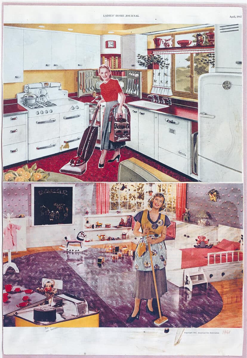
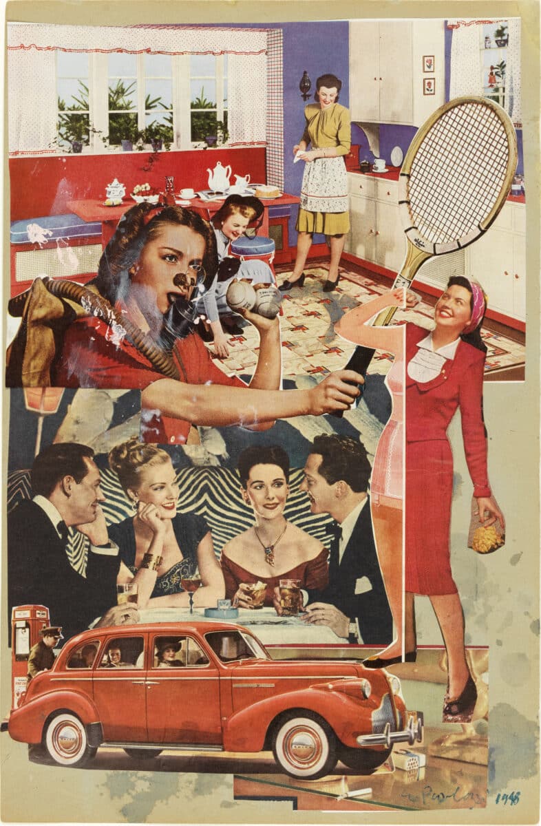
The transformation of Dada techniques into pop art, crystalizing initially around the Independent Group in London in the 1950s, reflected a shift in political ideology and a deeper engagement with commercial advertising. The photomontages of Eduardo Paolozzi, John McHale, and Richard and Terry Hamilton used Dadaesque dialectical juxtapositions but altered the terms of the social critique. [25] Their source material was derived from the bourgeoning advertisement and lifestyle magazine culture of the 1940s and 50s. Pop montage extracted idealised images of the everyday, especially from the domestic interior and its ever-changing range of commodity accouterments. Prime examples include Paolozzi’s montages of the late 1940s such as It’s a Psychological Fact Pleasure Helps Your Disposition (1948), or the now-famous montage, titled Just What Is It That Makes Today’s Homes So Different, So Appealing?, created by Richard Hamilton, Terry Hamilton, and John McHale for the Independent Group’s 1956 exhibition ‘This Is Tomorrow’. According to architectural historian Pablo Martinez Capdevila,
What makes this home so ‘different and appealing’ is, precisely, everything that is not home: the set of consumer goods ready to meet any need, any desire, in short, the market. A market that, as was felt even then, was beginning to have an unlimited dimension, to occupy everything. While Banham persuaded us that ‘a house is not a home’, Hamilton, by presenting in his collage the commodification of all spheres of life including leisure and intimacy, shows us a home that, dissolved in the market, has ceased to be. [26]
At face value, pop montages such as Paolozzi’s bluntly express the artificiality of their assembly and thus fall on the demonstrative side of the dialectic. Yet the image also coheres a familiar inhabitable environment and has affinities with Max Ernst’s mode of surrealism. The scale of elements, perspectival alignments, color and resolution, and figural profiles are managed to fluctuate between revealed and concealed seams. This tension creates an artwork that sometimes calls attention to the flat surface, the material support, and at other moments presents naturalistic illusions of spatial recession. Pop montage is concerned less with dismantling the modern media machine than it is with redirecting its effects. Media becomes coauthor as the artist intervenes in the constant flow of imagery by selecting, sampling, and recombining. Pop montages thus flicker between abstract contrasts and apparent naturalism, as does any magazine advertisement or television viewing experience. This is its aesthetic argument, the provocation of its exchange. The tensions and frictions embedded in pop montage are as much concerned with the subconscious illusions and allusions of everyday media as they are with proposing an overt conceptual critique. These pop montages were also clearly assemblages built out of the commodities of daily life, when seen through architectural imaging it is entourage that is montaged.
Montage-Entourage
The most well-known architectural montages in the first half of the twentieth century are most likely those of Ludwig Mies van der Rohe. Although there are important differences in the approaches to these representations over his career, there is a consistency to the stance regarding the seam between entourage and architecture that is maintained from the early Friedrichstrasse towers (1921), through the layered interiors perspectives of the Resor and courtyard houses (1937-45), and even the large interior of the Chicago Conventional Hall (1954). This is a dialectical juxtaposition of abstraction and realism. Often this is manifest by art objects and furniture cut out as full colour photorealistic objects floating in the abstract lines of a drawn architectural environment. Other situations heighten the difference between the architectural proposal and the environment, as seen in the contrast between the traditional urban context and the Friedrichstrasse skyscraper, or in the fragment of nature as two-dimensional image montaged as the floor to ceiling window wall of the Resor House interior. (A scene from John Huston’s Treasure of the Sierra Madre, complete with cowboys.) In these montages, the juxtapositions of abstraction and realism, artifice and nature, are used to heighten the distinction between architecture and entourage. Martino Stierli interprets the Resor montage as follows, ‘Mies’s drawing not only illustrates the transformation of nature into an object of aesthetic consumption, a landscape, it also includes a definition of what architecture is. For even though architecture is radically reduced to almost nothing, its existence is nevertheless strongly asserted by the way it is distanced from the space of nature – and from the “atrocities” (to quote Reinhold Martin) of the outside world in general. Both these later visualisations, in their relation to nature, and the early Friedrichstrasse project, in its relation to the metropolis, seem to assert that modern architecture is that world’s other’. [27]
The sharp seamed contrasts of Mies’s montages would continue throughout the second half of the twentieth century and are still in practice today, but there was a shift in the discursive use of montage in the 1960s where a number of architectural practices were directly influenced by the pop montages of the Independent Group. Archigram, Hans Hollein, Superstudio, and Archizoom, among others, fundamentally rearranged architectural representation. This work has been thoroughly studied since its emergence and it is unnecessary to rehearse the particulars of these architects’ careers, for what concerns us here are the ways these practices altered the technical, aesthetic, and conceptual relationships between montage and entourage.
What I wish to propose is that the innovations of these practices constitute a form of exchange in line with Groys’s arguments. They revalue the ‘profane’ elements of the everyday and devalue the ‘sacred’ disciplinary conventions of architectural representation. If entourage was traditionally added to renderings in order to allow the architecture to be understood as the culturally valued artifact, then architectural representations inspired by pop montages shifted value from the architecture itself to the landscapes, objects, and scenarios performed by the entourage. Even though each group of architects addressed their work to different issues and held differing political positions, they each in their own way devalued aspects of traditional architecture while at the same time revaluing the transitory, image-objects of the everyday as important determinants of environmental aesthetics. The three issues of entourage, which I identified earlier – familiarity, scenario, and audience – can be used to frame these transformations.
First, to familiarity. In the images created by Archigram, Hans Hollein, Superstudio, and Archizoom, an unstable relationship is proposed between what is and what is not architecture, what is real, and what is fictive – a line of valuation the discipline had traditionally sought to maintain. The device of defamiliarisation initially posited by the Russian formalist poet and theorist Viktor Shklovsky is often mentioned with reference to montage, where language is used as-found, appropriated, and combined in ways that radically alter its familiar meanings and sense. [28] For Shklovsky this was one of the fundamental tasks of aesthetics, to elongate and intensify attention by making the familiar strange. [29]
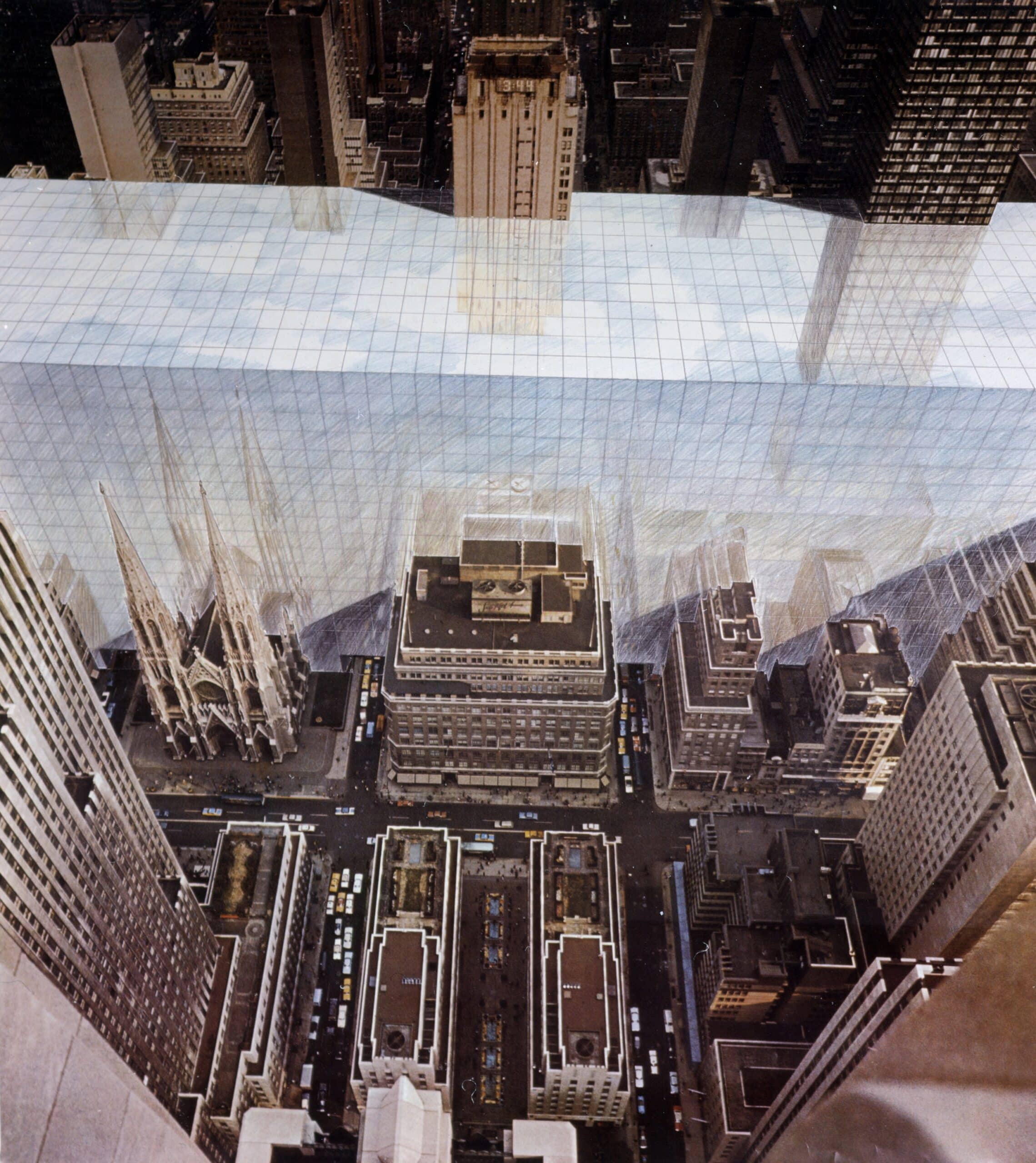
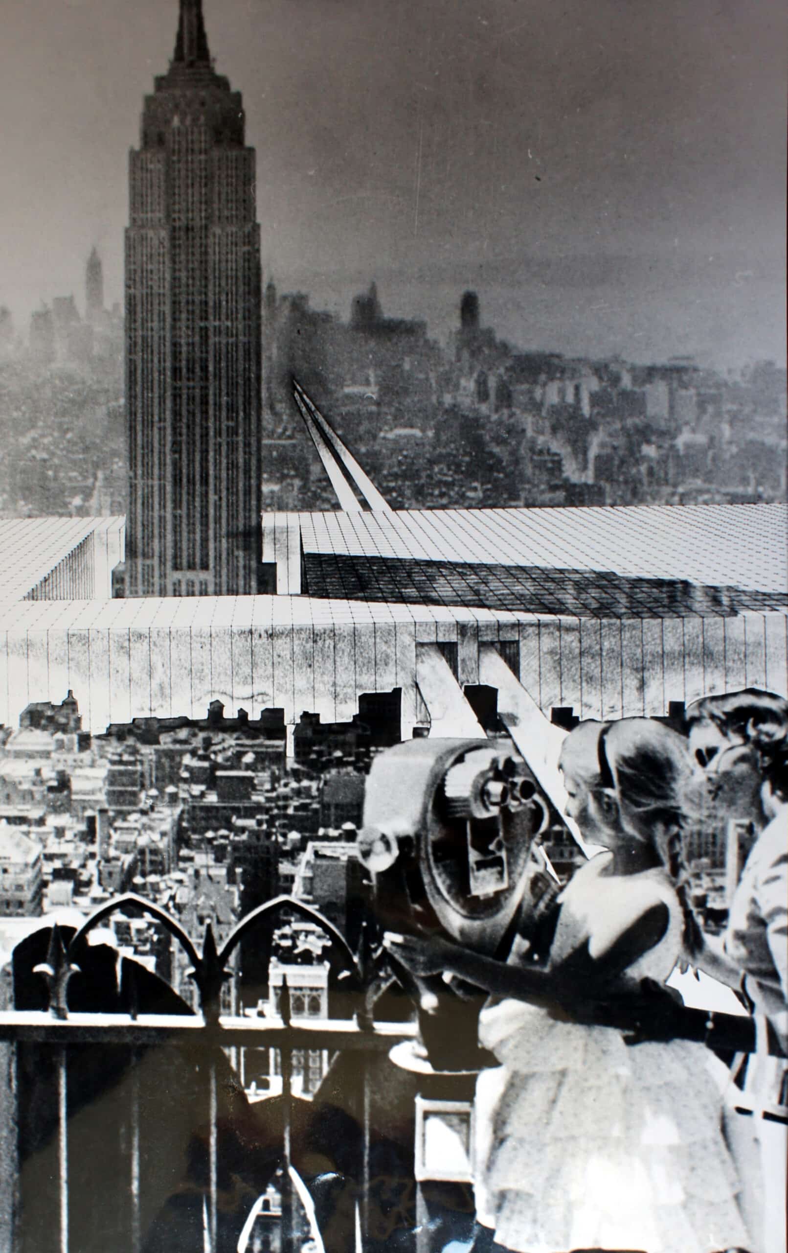
‘The new objects are at once things and images of things: the dream car is a car and the projection of a car, the new monument is the image of the monument’. [30] This statement launches the trajectory of what would become the architectural collective of Superstudio. The montages produced by Superstudio, such as those for their Continuous Monument project (1969–71) pitted abstraction against the photographic image of ‘the real’. The stark difference between the gridded surfaces and the fragments of photographs extracted from tourist postcards is what encouraged interpretations of these projects as critical commentary for they appear to confront the commodification of spectacle with the brutal abstraction of technological artifice. It is important to note, however, that what allowed this friction to occur was not only the sharp difference between the two aesthetic orders but also Superstudio’s intense efforts to situate the gridded intrusions within the image so that these volumes of abstraction are perceived to exist in the world, not just on the surface of the representation. ‘Such composition’, architectural historian Craig Buckley notes, ‘required a careful and consistent adjustment of the grid to the scale and perspective of each photographic landscape. While such photomontages might appear to place an architectural object in a location, the effect was arguably the reverse; the repetition of the grid-monument enabled readers to conceive of entirely distinct landscapes cut from different sources as part of one continuous project’. [31] These effects required that the entourage of clouds, sky, and buildings be convincingly reflected in the abstract surfaces, a realism rendered on abstract planes. Without the fluctuation between realism and abstraction, the juxtaposition of aesthetics would lack much of its provocative strangeness. The reflective grid intervenes to create doubt, to estrange the real, to transform the wasteland of a southwest American desert, the grit of an industrial British streetscape, and the pleasure of a Mediterranean beach into a sequence of objects collected along a continuum. Manhattan becomes entourage.


With the early work of Hans Hollein, specifically, his Transformations series of 1964 – Aircraft Carrier in a Landscape, Highrise Building, Sparkplug, and Urban Renewal in Manhattan – the scalar mismatch of the mechanical objects inserted as entourage into expansive landscapes makes them appear as monumental megastructures. Buckley describes the impact of these montages as tied to the shock effect of defamiliarisation through scale. [32] Both the context and the inserted object were appropriated as species of ready-mades. These are indeed photographs of an aircraft carrier and a landscape (the title is a literal description), but their positioning in relation to each other transforms both and, in the process, throws into question the familiarity of the image-objects. The scalar indeterminacy and estrangement occur in the viewer’s perception rather than in the assembly of the material. Take a look at the original montage for Aircraft Carrier in a Landscape alongside the image as reproduced for publication and exhibition. It is art historical convention to study the original work for the way it bears the material traces and aura of authorial contact. Yet with montage, as a technique of mediation intended for reproduction, the relationship between original and reproduction is different, such that it is possible to see the reproduction, the intended artifact, as the ‘original’ and the physical collaged object as process. Aircraft Carrier in a Landscape requires a seamless surface to create its estranged realism. The viewer is to believe it, and to simultaneously doubt this belief.
Scenario is the second issue. Entourage in these montages is no longer simply in support the architecture, it becomes equal as generator of the character of the environment. These objects and figures, machines and screens, create episodic scenarios, drawing attention to aspects of contemporary society, which are extracted and accelerated. The intensification of the mediated event becomes the environment.
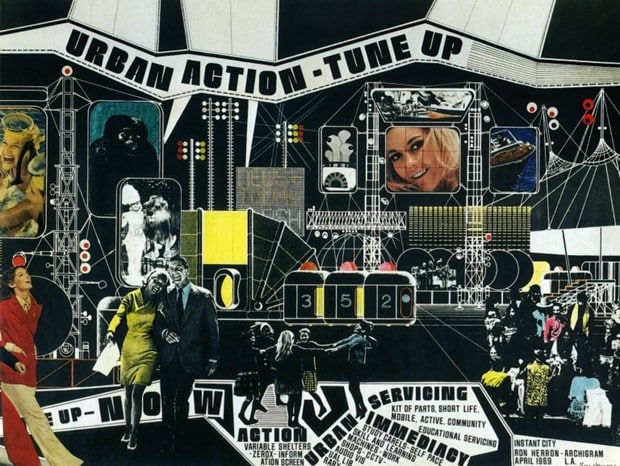
As part of Archigram’s Instant City project (1964–71), Ron Herron’s montage-entourage of people, machines, and building-like objects fashion scenarios of animated commodity exchange. The environment is composed of lines, with color display screens flickering, networking, and electrifying the city. The city is an assemblage of image-objects, transiently mixing to produce lifestyle desires. [33] In the space of these montages, the valuation of the commodity and the devaluation of the traditional building is expressed through a flattening of the hierarchy between image and building, architecture, and entourage. Consider the screens: they structure the background yet projected onto them is entourage. This means that not only is the environment inhabited by entourage, it is also created by projections of entourage. What is more, the frontality of the graphic text suggests a reading of the montage itself as an image projected onto a screen that we are looking at (not just through). The scenario presented is thus one of total immersion into fluctuating mediation.
Archizoom likewise developed scenarios that drew from the traditions of pop montage. In the representations produced for No-Stop City (1968) and its extension, Residential Parking Lot (1971), the background is radically abstract, blank, and neutral, while the entourage is bizarre, surreal, and kitsch. Environment is rendered as system, as the organisational matrix allowing commodity objects to collect and rearrange themselves as they desire. [34] Offering speculations on emancipation and imprisonment that critiqued the contradictions of modern technological life, Archizoom saw commodity objects as having as much, if not more, impact on the character of human environments as did architecture. To this effect, the blankness, abstraction, and formlessness of the endless horizontal spread of No-Stop City proposes architecture as the playing field of continual renewal through commodities. The models for the No-Stop City: Interior Landscapes are assembled scenarios. The combinations of objects – natural and artificial, interior and exterior, custom and mass-produced, technological and primitive – create an environment through an endless reflected montage of multiplied entourage, a scenario in which all that remains is objects and a gridded field for their distribution.
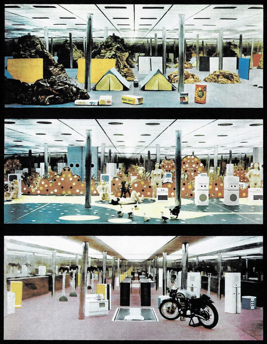
Lastly is the question of audience. These images were not intended for construction, nor were they directed toward potential clients. And nor were they art objects intended for museum collections, though they have often been exhibited and collected. They could be called discursive, yet their arguments are presented outside the coded conventions of traditional architectural representation through the mediations of popular images, advertising, graphic novels, cinematic storyboards, and film itself. Nowhere is this clearer than in the use of entourage.
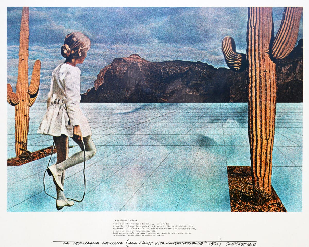
Superstudio, The Fundamental Acts – ‘Life-Supersurface’ – The Distant Mountain, 1971. Image courtesy of the C.Toraldo di Francia collection.
Let us look at the ‘The Distant Mountain’ montage from Superstudio’s The Fundamental Acts project (1971). The Fundamental Acts was a film project, and this image presented here is a storyboard fragment. In this montage, all that appears altered here is the insertion of a new ground, the reflective gridded ‘supersurface’ that frames and isolates the cacti and girl jumping rope, transforming the world into a collection of entourage. If ‘The Distant Mountain’ were a montage intended for an art audience – Martha Rosler’s House Beautiful (Bringing the War Home) (1968–72), from the same time period, comes to mind – this hypothetical juxtaposition might, in Jacques Rancière’s words, ‘present itself as that which brings to light the hidden link between two apparently foreign worlds’ (a critical disjunction that, in the case of Rosler, allows the viewer to make connections between the atrocities of the Vietnam war and the complicity of suburban American lifestyle). [35] If ‘The Distant Mountain’ were created for an architectural audience, on the other hand, the entourage would be in service of the architecture; figures would give scale, divert attention away from themselves, reinforce the character of the design, and describe its programmatic use. If ‘Happy Island’ were a commercial advertising montage (the source material for both Rosler and Superstudio), the entourage would be used to create desire for the object, for the lifestyle, for travel, for a promised future. A project like Supersurface is all three – art, architecture, and advertising – a crossing that has become the norm today, given the contemporary dissemination, consumption, and monetization of imagery through social media, and it is a combination that architecture is still not comfortable with.
Audience was destabilised by these mediations of montage-entourage. This can be seen in the inability to determine whether these images constitute critical projects or fantasy spectacles. With Archizoom’s No-Stop City, architecture is reduced to systems of environmental management and then expanded to encompass an entire world as an endless interior landscape. The project has often been interpreted as a critique of modernist homogeneity and technological rationalisation, and yet the images evoke an aesthetic pleasure, even joy, in shifting attention from environment to object to environment made from objects to no objects at all. This ambiguous stance can be found in the work of all four practices under discussion here. Remarking on the ambiguous criticality of Superstudio’s work, Buckley writes, ‘Superstudio’s ambitions were critical yet in a mode that was neither one of opposition nor of negation but of deliberate exaggeration and exacerbation’. [36] It is not obvious in any of these projects as to whether the audience – that is, the viewer – should take their mediations as literal, as critical, as speculative, as complicit.
A productive way to understand these projects is to see them as directed less at a specific audience than at the possibility of building a different audience through aesthetics’ capacity to ‘redistribute the sensible’, in the words of Rancière. [37] The use of mass media expanded the influence of architecture outside of its traditional representational boundaries, a shift in how architecture conceived its engagement with popular culture. The images produced by Archigram, Hollein, Superstudio, and Archizoom proved hugely influential and are now culturally valued, exhibited, published, copied, and discussed; they have entered the archives of the institution, also influencing cinema, furniture, and industrial design, videogame environments, graphic design and countless other imagery in popular culture. They were not always treated with such respect, however; in fact, when these projects were first put forward, they were viewed with suspicion by the institutional establishment charged with defending culture from the dangers of seductive images deployed in the service of capital. The images of these architectural collectives were targeted specifically by Manfredo Tafuri. ‘Carnaby Street and the new utopianism are thus different aspects of one phenomenon. Architectural and supertechnological utopianism; the rediscovery of the game as a condition for the public’s involvement; the prophecies of ‘aesthetic societies’; invitations to establish the primacy of the imagination: such are the proposals of the new urban ideologies.’ [38]
Critical Montage
Art is now called upon to give the city a superstructural face. Pop Art, Op Art, analyses of the city’s imageability, and esthetique prospective, all these things converge toward a single objective: that of dissimulating the contradictions of the contemporary city, resolving them in polyvalent images, figuratively glorifying that formal complexity which, when read with the proper parameters, proves to be nothing more than the explosion of the incurable conflicts that elude the plans of advanced capitalism. The recuperation of the concept of art is thus useful to this new task of covering up. Just when industrial design assumes the lead in technological production, influencing its quality for the purpose of increasing consumption, Pop Art, by recycling its residues, places itself at its rear guard. This, however, corresponds precisely to the twofold demand now made of the technologies of visual communication. An art that refuses to place itself in the vanguard of the cycles of production, demonstrates, well beyond all verbal challenges, that the consumption process extends to infinity, and that even rubbish, when sublimated into useless or nihilistic objects, can assume a new use value, thus reentering, if only by the back door, the cycle of production and consumption. [39]
This passage from Tafuri’s 1969 essay ‘Toward a Critique of Architectural Ideology’ lays out in no uncertain terms a position regarding aesthetics and the architectural image. The act of critique requires an unveiling to reveal the true underlying forces. The montages of ‘Carnaby Street’ (Archigram) and ‘new utopianism’ (Superstudio, Archizoom), recycled popular culture to conceal and thus become complicit with capitalist ideology. For Tafuri, these representations provided no critical edge, no revelation of power structures, no shock, no seam, only seduction through images.
Tafuri valued montages that were clear in their critique. For him this was the art of die Neue Sachlichkeit, it was the films of Sergi Eisenstein, the montages of Mies; these provided the shock of critical awareness. [40] For Tafuri, the montages of Superstudio, Archizoom, and Archigram were an aesthetic wash covering up advanced capitalism. The difference could be attributed to the diminishing shock provided by the technique of montage. It could also be the evolution of capitalism appropriating the aesthetics of the avant-garde for its own aims. Or it could simply be that Tafuri was unable to accommodate pop art within the discipline of architecture. These are all possibilities, but there seems to be something else here as well.
These architectural montages from the 1960s no longer located the ‘seam’ of the montage in the materiality of the medium, but instead in the concepts that the projects speculated on. The seam for these architects was between reality and representation, and it reflected the state of modernism in which they were immersed. Tafuri is right to critique them, for there is danger in their ambiguity. These images flirt with an inability to distinguish fiction from reality, spectacle from critique, commercial from disciplinary architecture. There is also the danger of losing the expertise and power that lies in the management of building through architectural conventions of representation. The images produced by these practices are as influenced by the ‘profane’ realm of film, television, graphic design, and advertising as the ‘sacred’ realm of plans, sections, and elevations. They are not aimed to facilitate the construction of a building, but to meld into the flow of modern media, problematically blurring distinctions the discipline tries so hard to defend. As stated above, these montages attempted to create a new audience for architectural ideas, in this they were innovative through their transgressions.
We know the outcome. From our contemporary situation in the early twenty-first century, the architectural montages of the 1960s and 70s have become the basis for how a politically engaged architectural project should appear. This is a testament to how these representations succeeded in their ‘cultural-economic exchange’, redefining the boundaries of what is valued as architectural representation. This transformation was not easy, it involved a radical change in the theoretical discourse around social, computational, and ecological issues; it involved all the complexities of what is meant by post-1968 Europe, and it involved the images, publishing, and projects of Rem Koolhaas/OMA. These stories have been told countless times and they shall not be rehashed here. What I would like to address in the remainder of this chapter are a few reflections on these debates as they playout within the discourse on digital images.
Interestingly, but not completely surprising, the 1960s architectural montage is now considered to be critical and the digitally rendered montage to be suspicious. What is critiqued today are the smooth, photoreal, digital montages that consume our attention within our electronic screens. Again, it is a question of the seam.
Realism and the Seam
All architectural images are now a form of montage assembled through rendering engines, Photoshop, and the image database of the internet. These digital processes of image construction allow multiple objects to sit together in a seemingly coherent space. Perspectives can be distorted, resolutions resolved, scale adjusted, light-shade-shadow naturalised, color balanced, and seams erased. Many of the seams in twentieth century montage are the remnants of imperfect media transfer. Photography captured images as chemical reactions to light then fixed to paper. These are physical objects which were cut, spliced, and combined to produce new configurations. The material frictions between these actions create seams. In a computer, the transfer between the different functions of mediation is handled automatically and internally. The digital image is no longer an index of luminosity as chemical reaction, but instead a sampling of photon energy. This is typically treated as the font of digital artificiality, but a digital image is simply a montage of discrete luminous pixels, the seamed artifice concealed in the assembly of every digital image.
The artificial ‘naturalising’ of photorealism that digital composites can create is understandably viewed with suspicion. If criticality comes from exposing the artifice that is creating the illusion, what would this look like for digital mediation? What would a digital seam look like? A number of propositions have been offered: low-resolution compression, abrupt jumps in image qualities, rough cut-outs, scale mismatches, cartoon graphics, exaggerated color palates, multiple vanishing points, and so on. These are all ways of calling attention to digital artifice, many are also in the aesthetic lineage of pop art. In this there is a kind of recursive nostalgia where the digital montage renders ‘seams’ to look like pop art techniques, which in the 1950s were aesthetic intensifications of kitsch advertising, borrowing techniques from 1920s avant-garde photomontage, which were initially conceived of as a rejection of representational conventions in favor of the unaltered reality photo fragment selected, extracted, combined, and made available by technologies of mechanical reproduction. Jesus Vassallo reminds us that, ‘Today, the same digital workspace and associated family of programs is used by photographers, filmmakers, graphic designers, architects, and artists of all disciplines. Such shared workspace enables transfers of technique and content between different disciplines that were previously impossible or at least less fluid.’ [41] All disciplines cut and paste.
The presence or absence of the seam is more than a simple technological residue it is a conscious decision. The ‘seam’ that receives the most intense scrutiny in architecture is conventional and traditional, Beaux-Arts even. This is the question of how the imaging of the architecture relates to that of the entourage. As a generalisation, if the entourage is imaged as ‘photoreal’, then the architecture is made more abstract; if the architecture is realistically rendered, then the entourage is abstractly shaded or cut out. There is nothing more suspicious than an image that montages entourage as seamless with the architecture – a slick kind of fantasy produced to persuade the general public. A clear juxtaposition between entourage and environment, by contrast, signals that the architect intends the image to be seen as advancing a disciplinary project, not a marketing pitch.
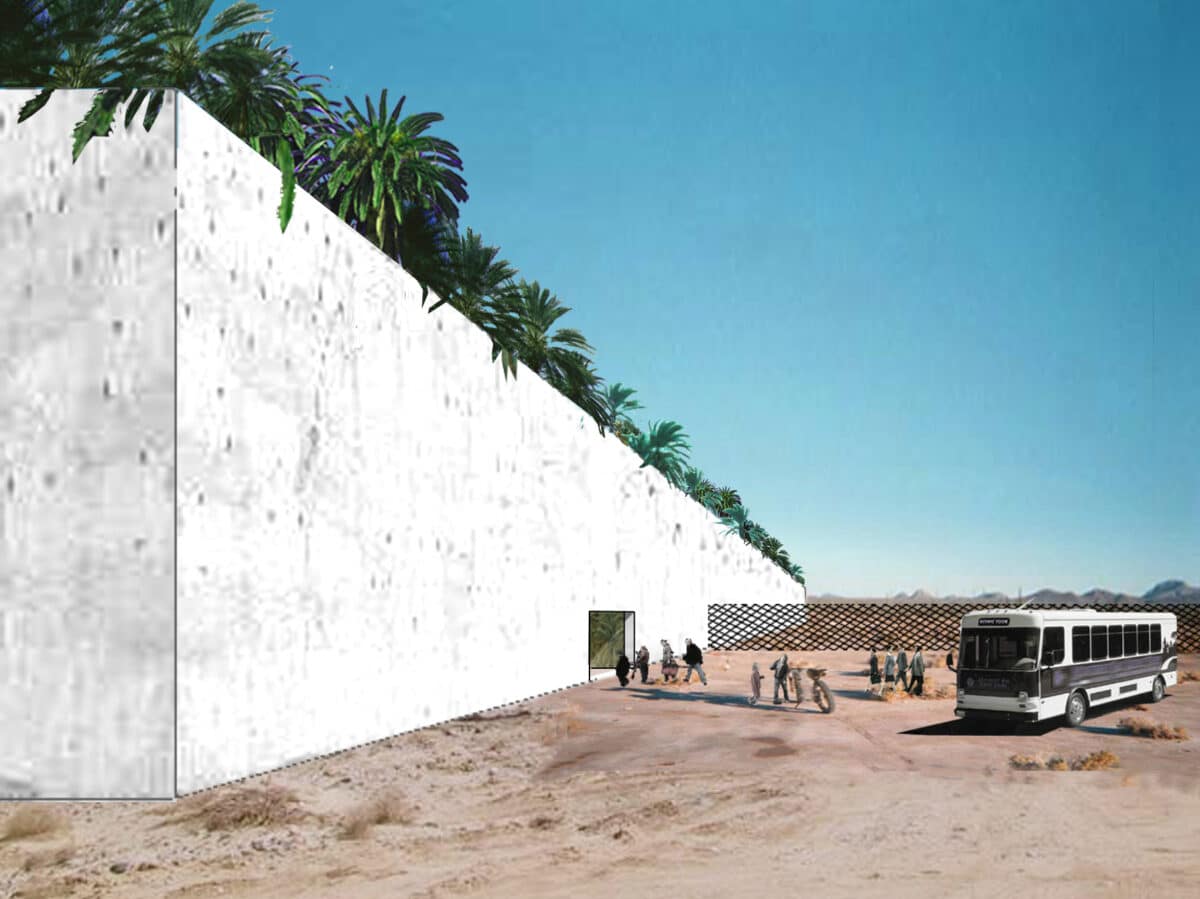
OFFICE Kersten Geers David Van Severen.
Take the rendering shown here from the Border Crossing (2005) by OFFICE Kersten Geers David Van Severen. The allusion to the architectural montages of the 1960s is clear especially as filtered through projects such as Koolhaas’s Exodus, or the voluntary prisoners of architecture (1972). The Border Crossing montage consists of four distinct image-objects. Two are photoreal (the palm tree tops and the desert/bus/people). Two are abstract (the wall and the fence). The architectural elements hover between drawing and rendering. Linework can be seen at the edges of the wall, with an out-of-scale, low-resolution concrete texture map stretched across its surface. These elements are ‘the architecture’, the border separating desert from garden. But they also disrupt the realism of the image and thus clearly signify that this is a critical project. There is also a disjunction between the flat frontal elevation with a rapidly vanishing perspective that does not quite match the lines of diminution suggested by the view. The wall looms large, but its presence serves to draw attention to the people, the bus, the desert, and the palm trees – to the narrative told by the entourage. All these elements combine to create an image that expressly does not want to be read as deceptively real, for if the image were too realistic, it might dilute and confuse its political message. Criticality, in this instance, is telegraphed by a clear dialectical juxtaposition between graphic elements and photo-naturalism.
To emphasise entourage is to elevate human activities and diminish the formal expression of the architectural object. This is part of the legacy of the architectural montages of the 1960s. Architecture clears a space for the events of social life. Architectural form is suppressed to ensure the legibility of the critique playing out as narrative. Yet if this is the only interpretation, we have a diminished understanding of what was truly ‘radical’ in these montages. When entourage becomes the avatar of political concerns within the utopian realm of the representational, the distinction between architecture and entourage is comfortably maintained. A much more provocative position would be to challenge this distinction entirely repositioning architecture itself as a species of entourage and flattening the hierarchy that arbitrarily divides the world into these two categories. In many ways, it is rhetorical to claim that this is a position that one may chose, the decision has already been made. The images of reality as produced, disseminated, and consumed online are all seamless montages of environments created by everything that is not-architecture. Importantly, this is not an artifice that is susceptible to the same techniques of revelation as historically practiced, but that does not mean that seams no longer matter.
The Speculative Doubt
There are a handful of artists (Philipp Schaerer, Filip Dujardin, Olalekan Jeyifous, Cédric Delsaux, Bas Princen, to name a few) that have been exploring digital image montage as speculations through the aesthetics of realism. [42] When one looks at an image such as Bildbau No 2 (2007), by Philipp Schaerer, it initially appears to be a photograph of a real building. The profile of the building may seem a little odd, but the image presents itself to the viewer as a view of reality. It is only by tracing a series of curious details that intensify and elongate attention that we recognise it as a digital montage. Schaerer has constructed it from dozens of digital images, using Photoshop to conceal the seams of the assemblage. I would argue, however, that the seam is not actually removed; it is displaced and exchanged.
In this montage, the seams of artifice are shifted from the surface of the medium into the reality that the image creates. For instance, material weathering is the result of real materials chemically interacting with the environment. In the Bildbau No 2 weathering is sampled and copied as a repeatable pattern. This is absurd, given that weathering would never repeat itself identically across a material. There are also multiple marks on the building’s surface that seem to be the traces of construction notations, of assembly, of labour. Upon further inspection, these are revealed to be copies of the same image fragment stretched and deformed. Lastly, an entourage of tables, trashcans, and lampposts are reflected in the windows, yet the objects themselves appear nowhere in the foreground. Such logical ruptures make the viewer aware of the artificiality of the assemblage, but only after the viewer has accepted the image as a photographic depiction of a real building. The differences between this image and the ‘critical’ images discussed above is that in Bildbau No 2 the seam is implied in the reality depicted, rather than broadcast on the surface of the support medium (it is digital after all). The sowing of doubt in the very realism of the fictional image can be considered its critical act.
Traditional physical collage techniques expose the disparity of the fragments being put together and in doing so call attention to the impossibility and precariousness of the ensemble. Because the union is impossible, traditional collage becomes a provocation, a disruption of the real. Digital collage on the other hand is seamless, concealing its own traces, and thus merging portions of the real into a plausible alternative. While traditional architectural collages operate in a rhetorical mode, the stealthy manipulations involved with digital postprocessing are more ambiguous when it comes to revealing their ultimate intentions. [43]
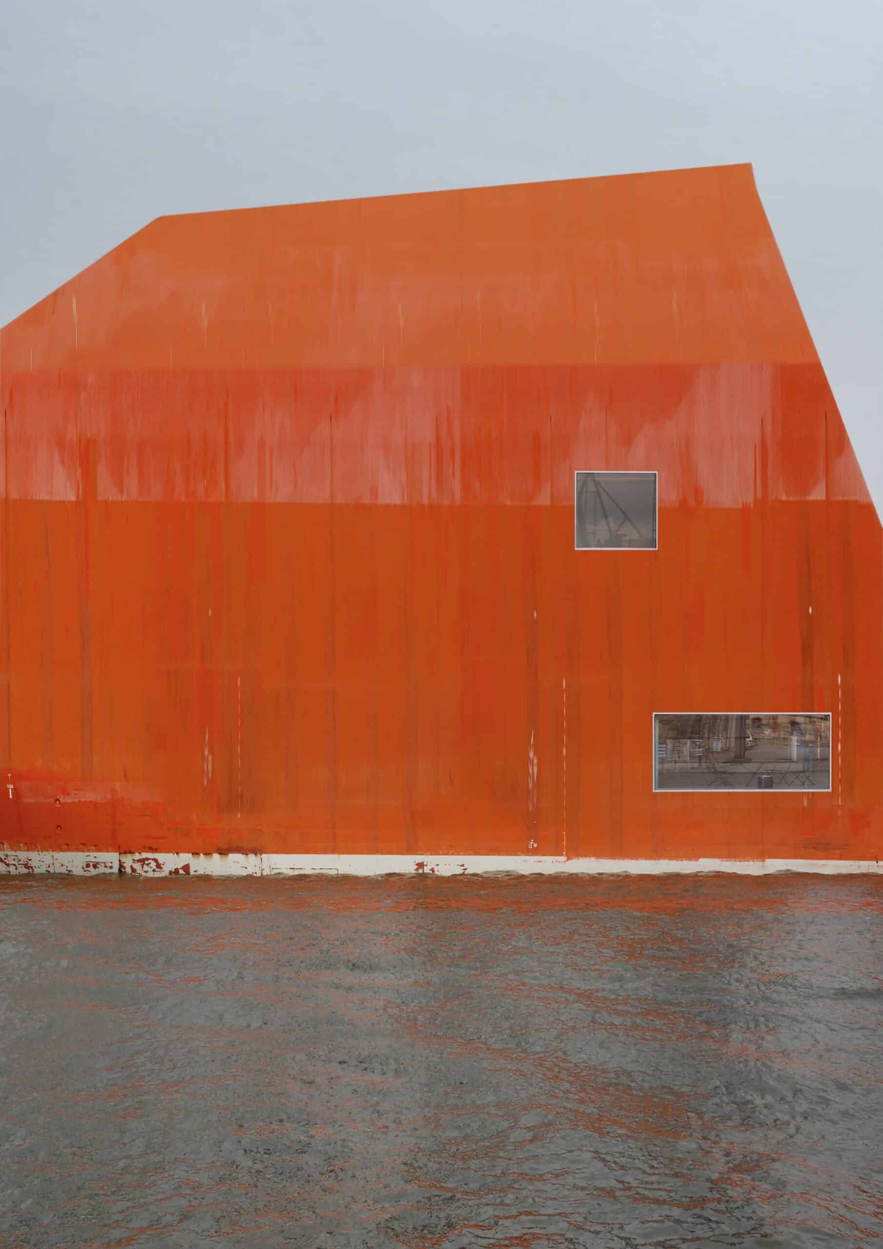
The digital art of Philip Schaerer and others proposes another lineage derived from the architectural montages of the 1960s and ’70s. Seizing on the ways media constructs and distorts what is seen as real, it jacks open possibilities for transforming our engagement with the world through aesthetics. This proposition recalls what Carrie Lambert-Beatty has termed ‘parafictional’ art. [44] Rather than displaying the seams of artifice on the material surface of the assemblage, parafictions create frictions, tensions, and problematic gaps, challenging viewers to reconcile the juxtapositions posited by the artwork. As Lambert-Beatty writes in her essay ‘Make Believe’,
In this information regime, the challenge is not only to be vigilantly skeptical. As Paul Virilio has said, control operates now not through the censure of true facts, but through the ‘over-information’ surrounding them. In the ocean of data we dip into to resolve both looming decisions and passing inquiries (and of course, to investigate parafictions themselves) the problem may be less how to remember to be skeptical, than how to decide when one has been sufficiently so. What is due epistemological diligence? When does one decide that something is – in the epistemologists’ phrase now codified as Wikipedia’s primary criterion – true enough? It’s this, perhaps, that separates the implications of parafiction from stereotypically postmodern assertions of the inaccessibility and relativism of truth or the real. In experiencing most parafiction – where the fictional hangs on the factual – one is evaluating not only whether a proposition is fictional, but what parts of it are true… Parafictions train us in skepticism and doubt, but also, oddly, in belief. [46]
What constitutes a seam within a digital image becomes a pressing question as we are constantly inundated with images on devices that never leave us, selling us as composite realities, as data sets rendered by machines for machines. There are several ways we can respond to this condition: we can reject, we can critique, we can engage. If we choose to engage, we will have to understand the aesthetics of doubt and how architecture can operate in its fluctuations. At one level, this is a question of the relation between architecture and entourage, as an exchange between the sacred and the profane. Architecture can no longer be comfortable with being defined as or defining that which is ‘other’. If reality is a seamless montage of media, architecture is simply an object entangled in multiple relationships like cars, clouds, trees, tables, and people.
Notes
- See Richard A. Moore, ‘Academic Dessin Theory in France after the Reorganization of 1863’, Journal of the Society of Architectural Historians 36, no. 3 (October 1977): pp. 145–174; and Jean Paul Carlhian, ‘The Ecole des Beaux-Arts: Modes and Manners’, Journal of Architectural Education 33, no. 2, ‘Beginnings’ (November 1979): pp. 7–17.
- Leon Battista Alberti, On Painting (1435), trans. John R. Spencer (New Haven, CT: Yale University Press, 1956).
- Basile Baudez, ‘François Soufflot le Romain’, Drawing Matter, June 22, 2019.
- David Marshall, ‘The Problem of the Picturesque’, Eighteenth-Century Studies 35, no. 3 (Spring 2002): p.414.
- David Punter, ‘The Picturesque and the Sublime: Two Worldscapes’, in The Politics of the Picturesque, ed. Stephen Copley and Peter Garside (Cambridge: Cambridge University Press, 2010), p.222.
- Nathaniel Cortland Curtis, Architectural Composition (Cleveland: J. H. Jansen, 1923), p.208.
- Andrew Atwood has developed a fascinating reading of figures in relation to background/foreground attention in his book Not Interesting: On the Limits of Criticism in Architecture (Los Angeles: AR+D Press, 2018).
- Alina Payne, From Ornament to Object: Genealogies of Architectural Modernism (New Haven, CT: Yale University Press, 2012).
- Le Corbusier, The Decorative Art of Today (1925), trans. James Dunnett (Cambridge, MA: MIT Press, 1987), p.137.
- Alex T. Anderson, ‘On the Human Figure in Architectural Representation’, Journal of Architectural Education 55, no. 4 (May 2002): p.243.
- Boris Groys, On the New, trans. G. M. Goshgarian (1992; London: Verso, 2014), p.139.
- Ibid., p.127.
- Ibid., pp.83-84.
- Beatriz Colomina, Privacy and Publicity: Modern Architecture as Mass Media (Cambridge, MA: MIT Press, 1994), p.220.
- Peter Bürger, Theory of the Avant-Garde, trans. Michael Shaw (Minneapolis: University of Minnesota Press, 1984), p.77.
- Ibid., p.80.
- Manfredo Tafuri, The Sphere and the Labyrinth: Avant-Gardes and Architecture from Piranesi to the 1970s, trans. Pellegrino d’Acierno and Robert Connolly (Cambridge, MA: MIT Press, 1987), p.59.
- Manfredo Tafuri, ‘Toward a Critique of Architectural Ideology’ (1969), trans. Stephen Sartarelli, in Architecture Theory since 1968, ed. K. Michael Hays (Cambridge, MA: MIT Press, 1998), pp.17–18. See also Manfredo Tafuri, Architecture and Utopia: Design and Capitalist Development, trans. Barbara Luigia La Penta (Cambridge, MA: MIT Press, 1976).
- Jacques Rancière, Aesthetics and Its Discontents (Cambridge: Polity, 2009), p.45.
- Peter Bürger, Theory of the Avant-Garde, p.80.
- Martino Stierli, Montage and the Metropolis: Architecture, Modernity, and the Representation of Space (New Haven, CT: Yale University Press, 2018), pp.6–7.
- Ibid., 135.
- Ibid., pp.5-7.
- Max Ernst, La Femme 100 têtes, 1929.
- John-Paul Stonard, ‘Pop in the Age of Boom: Richard Hamilton’s “Just What Is It That Makes Today’s Homes So Different, So Appealing?”‘ Burlington Magazine 149, no. 1254 (September 2007): pp.607-620.
- Pablo Martinez Capdevila, ‘The Interior City: Infinity and Concavity in the No-Stop City (1970–1971)’, Cuadernos de Proyectos Arquitectónicos 4 (March 2013): p.132.
- Stierli, p.167.
- Viktor Shklovsky, ‘Art as Device’ (1917), in Theory of Prose, trans. Benjamin Sher (McLean, IL: Kalkay Archive Press, 1991), pp.3-4.
- Ibid., p.6.
- Superstudio – Adolfo Natalini, Cristiano Toraldo di Francia, Gian Piero Frassinelli, Alessandro Magris, Roberto Magris ‘Superarchitecture II’ manifesto poster (1967), translated in Buckley, Graphic Assembly: Montage, Media, and Experimental Architecture in the 1960s (Minneapolis: University of Minnesota Press, 2019), pp.241–242.
- Ibid., p.263.
- Ibid., p.145.
- Hadas A. Steiner, Archigram: The Structure of Circulation (New York: Routledge, 2009), p.32.
- Capdevila, p.131.
- Rancière, Aesthetics and Its Discontents, p.47.
- Buckley, p.244.
- Jacques Rancière, The Politics of Aesthetics (London: Bloomsbury Academic, 2006), pp.16-19.
- Tafuri, ‘Toward a Critique of Architectural Ideology’, p.30.
- Ibid., p.29.
- Stierli, pp.216-219.
- Jesús Vassallo, Seamless: Digital Collage and Dirty Realism (Zurich: Park Books, 2016), p.171.
- Ibid.
- Ibid., p.175.
- Carrie Lambert-Beatty, ‘Make Believe: Parafiction and Plausibility’, October 129 (Summer 2009).
- Carrie Lambert-Beatty, ‘Believing in Parafiction’, EP 2, ‘Design Fiction’ (2016).
- Lambert-Beatty, ‘Make Believe’, p.78.
